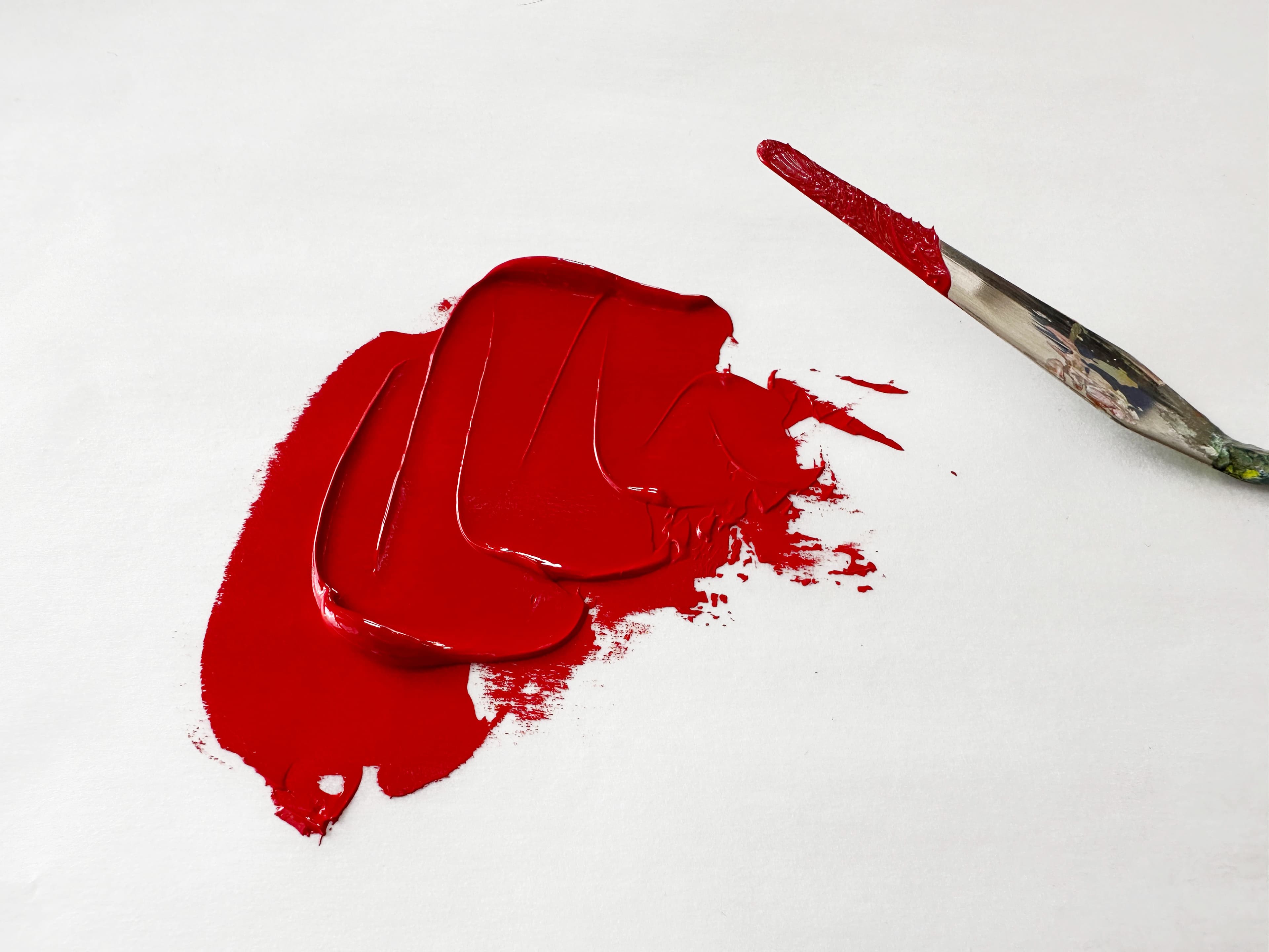
Pigment Spotlight: Pyrrole Red PR254
From Pastel Pinks to Fast Cars: A High-Performing Lightfast Red
Featured Paints
From luxury cars to rosy pinks-- today we're talking about a specific kind of Pyrrole Red. Is this color really the highest chroma red? How does pyrrole red compare to cadmium red? And is this really the color used by Ferrari? All this and more!
Pyrrole Reds PR254
There are several Pyrrole Red Pigments and we'll be focusing on PR254
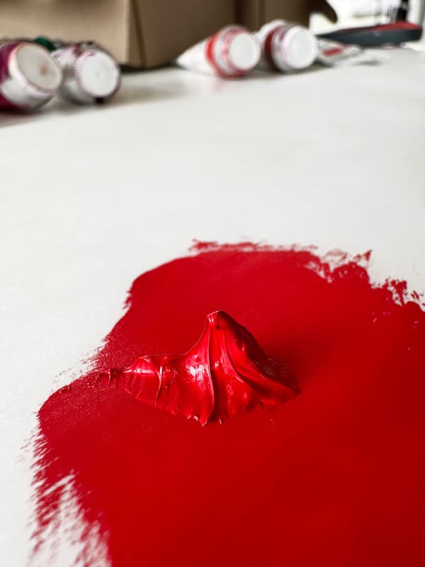
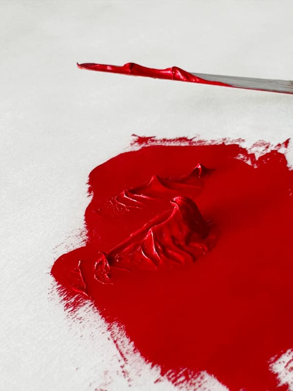
Pyrrole Red (PR254) Pigment Spotlight
A look at the use of Pyrrole Red in Oils
Pyrrole Red. This is a red pigment that is both rich and bright-- as all bright reds are also fairly deep in value. It's close to what we think of when we say "primary red" (though of course there is no such thing). It's actually one of three main Pyrolle pigments commonly found in artist paints, and this article will only be focusing on one of them, PR254. (The other two are the slightly oranger PR255 and another deeper pyrrole, PR264). Pyrrole Red PR254 is powerful, abundantly available, and surprisingly lightfast. We're in love with it's firey nature and it's no slouch in mixes. A powerful red that is sometimes used in lieu of Cadmium Red Medium, we actually have a use for both pigments on our palettes. Pyrrole Red, pigment code PR254, also has a cousin, sometimes called Pyrrole Scarlet, pigment code PR255, which leans just a bit oranger and has a different result in tints. We'll be taking a look at Pyrrole Red from the perspective of a painter as well as how we use it. We also have a few painterly insights from the Great Book of Color.
The pigment shown here is a Pyrrole Red (DPP) from Kremer pigments.
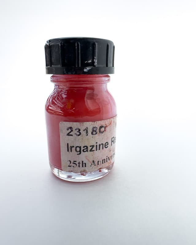
A bottle of PR254 pigment from Kremer Pigments. Irgazine Red DPP (#23180) also known as Pyrrole Red. Kremer offers several slightly different varieties of PR254.
Pyrrole Red PR254 and How it's Used in Oils
How this power-pigment compares to other reds
Usually we do cross-brand paint reviews on Paint List but today we're going to zoom out an give you an overview of how a pigment is used in oil paints. If you're a long-time painter you already know that pigments are one of the keys to unlocking the world of paint. Tubes of paint should include pigment codes on the back of the tube that tell you what they're made of-- this is important for understanding toxicity, lightfastness and other properties of the paint. Even clues to how the color will behave in mixes can be decoded this way, as pigments have patterns in the way they work on the palette. There are a lot of good resources out there for studying dry pigments, and so we're going to focus on how this pigment is used in oil painting: areas of the gamut where it's helpful, notes on mixes, how it compares to similar pigments, and also how it tends to be used by paintmakers in blends.
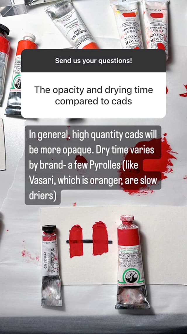
Today we're looking at Pyrrole Red PR254. Pyrrole Red is somewhere between semi-transparent and very transparent depending on the brand. PR254 is a cool red- meaning it is less orange than Cadmium Red Light. However Pyrrole Red PR254 is "redder" than most magentas and crimsons- PR254 is close to what some would imagine as a 'primary red' though that is an imperfect theoretical concept. Drying time can vary enormously from brand to brand. We'll be comparing Pyrrole Red to Cadmium Reds, some of which may have a similar hue in masstone.
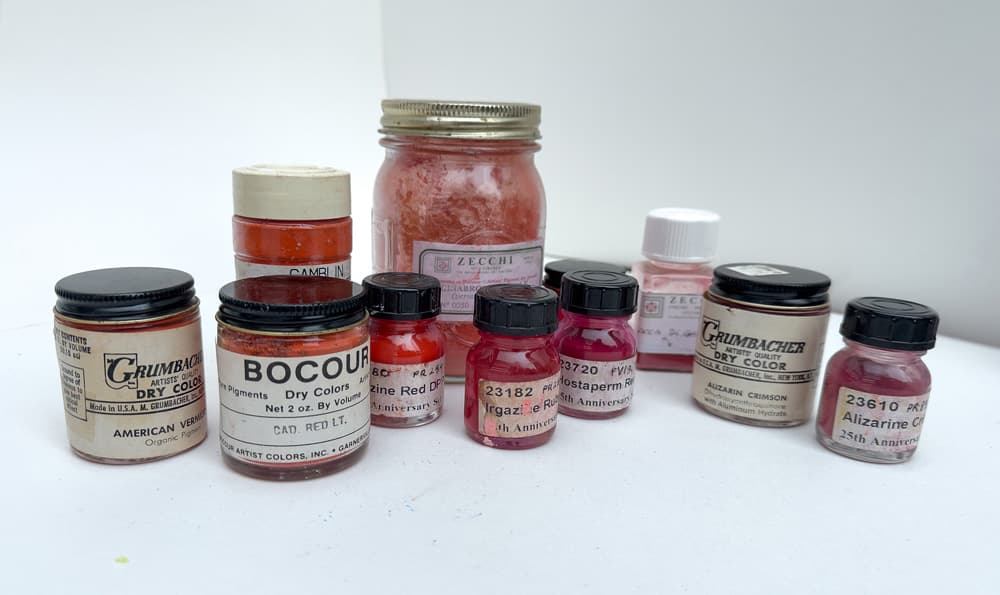
Pyrrole Red amidst the other red pigments. Pyrrole is third from the left in the front- just to the right of the vintage Bocour bottle.
Questions about Pyrrole Red from Fellow Painters
Opacity, Tinting, Temperature and Comparisons
A Red by any other name...
The Many Names for Pyrrole Red
Pyrrole Red can be found under a lot of different names-- not just "Pyrrole Red". Some of those include Basic Red, Bright Red, or Permanent Red, just to name a few. Also there are a lot of different takes on how to spell Pyrrole, such as Pyrole and Pyrrol. There is not a lot of standardization regarding how this name is rendered in the paint aisle. Also be sure to check other tubes labeled things like Pyrrole Scarlet- some of these may be a cousin pigment such as PR255.
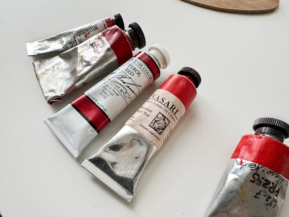
Various Pyrrole Reds. The reds to the left are PR254 while Winsor and Newton PR255 (which is oranger) is to the right. The PR254s vary in their consistency, hue, binding oils, and dry times- just to name a few ways in which colors vary by brand even if they are made with the same pigment.
Varying Names for Pyrrole Reds Across Brands
Here are a handful of paints made with Pyrrole Red, which go by various names
Search for more Pyrrole Reds
Discover more paints made with Pyrrole Red
High chroma, bright, and clear in mixes
Great at full strength, cool in tints
When working on a large color mixing project, I tubed over a thousand precision-matched mixes, and I found myself reaching for full strength Pyrrole Red in masstone to match one of the highest chroma red colors. Pyrrole Red PR254 shows a different mixing behavior than Cadmium Red Medium in tints, as well an ever so slightly different masstone, and the two have different opacities. PR254 is a terrific red-- not a perfect replacement for any other pigment-- but then again, no other pigment seemed to perfectly replace it.
From bottom to top, we start with the closest complement,Viridian PG18. For this we used Michael Harding's, though there is not a lot of variety in hue among premium brands. This made a far better complementary blend than the related Phthalo GreenPG7, which was a bit more chromatic and didn't grey out as well.
Next we have a swatch of Cadmium Red by Michael Harding, (more on cadmium comparisons with Pyrrole Below). We were surprised how similar this cadmium was was to Pyrrole Red, though the tints were a little warmer.
Next we have three Pyrrole Reds (M. Graham, Williamsburg, and Vasari. The small dollops of bright pink set alongside these show the a cooler pink: Quinacridone Magenta PR122, also by Michael Harding. PR122 is included to show that even though Pyrrole Red is cool, it's not nearly as cool as Quinacridone Magenta.
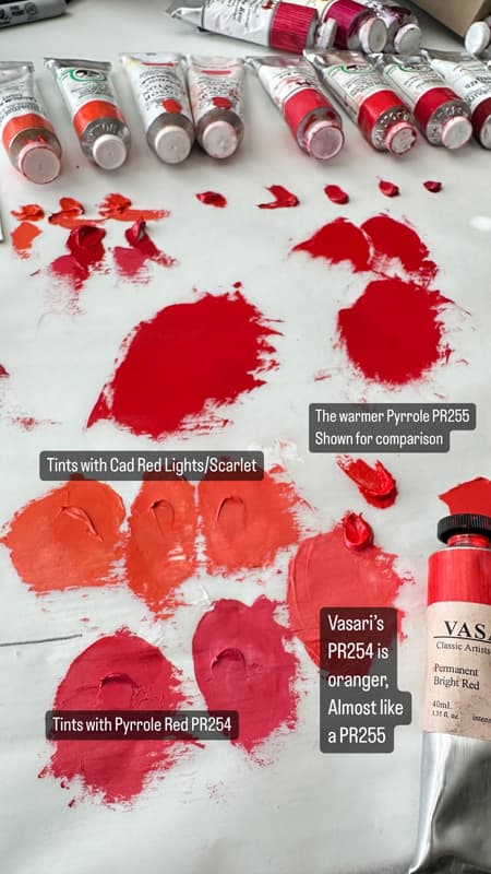
The Vasari PR254 bears special mention because it was significantly warmer than other Pyrrole Reds we've tried. As a side note, Vasari actually offers two PR254 paints. Vasari's Permanent Red Bright PR254 was quite similar to Pyrrole Scarlet, which has a different pigment, PR255, which is shown next to it- this one is Scarlet Lake by Winsor and Newton.
Lastly, we show Pyrrole Red PR254 deepened with several Quinacridones. Quinacridone Rose PV19 by Michael Harding, Quinacridone Magenta PR122 by Michael Harding and Permanent Magenta, a different PV19 Violet, by Winsor and Newton. These are just a few of many ways Pyrrole Red can be deepened. All tints are made with Williamsburg Titanium White.
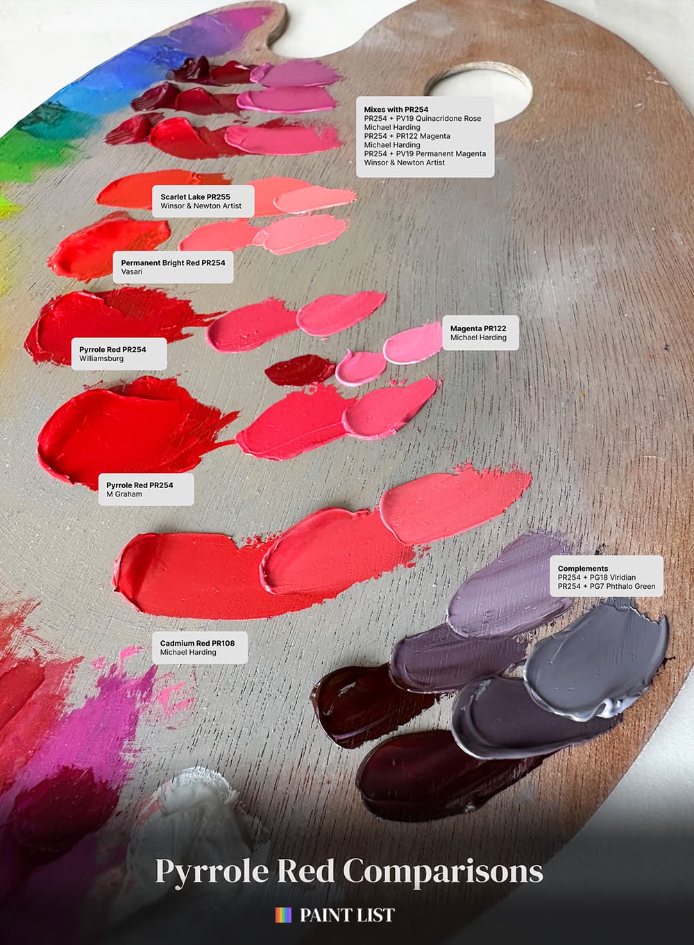
Comparisons of Pyrrole Red PR254 with Cadmium Red Medium as well as a few Quinacridones. To gauge how it behaves in tints we included the slightly less chromatic Cadmium Red, the cooler PR122 Quinacridone Magenta, and the slightly warmer Pyrrole Scarlet PR255.
Super Chromatic Masstone and Punchy Pinks
Using Pyrrole Red in Application
Ok so here we get into secrets of the Paint List and some tips on how to use this paint in application. When we think of Pyrrole Red, we think first of it in masstone: an ultra punchy red that really sings as a stand-alone color. While the name means firey we wouldn't really think of fire to describe this color because it's a rather cool red. When mixed in tints (or used in watercolors) Pyrrole red has a cooler-red undertone- some call this a blue undertone but that can be a little confusing, so we like to just call it cool-- a red that leans one notch toward magenta without being magenta.
Pyrrole Red also shines when using it to make high chroma pinks. (You can make even cooler-toned Candyland pinks with PR209, Quinacridone Red- which is not shown here). In terms of color temperature, PR122 is cooler (a very cool magenta) while PR255-- the other Pyrrole Scarlet which is warmer, leans more orange than Pyrrole Red.
Though the name Pyrrole derives from a word for fire, this red is so cool that we don't actually associate it with fire. The cousin pigment Pyrrole Scarlet or PR255 is more of a red-orange, and in tints it has more of a warmer, coral nature.
In contrast, Cadmium red makes more neutral red tints, while Pyrrole makes slightly clearer pinks than Cadmium.
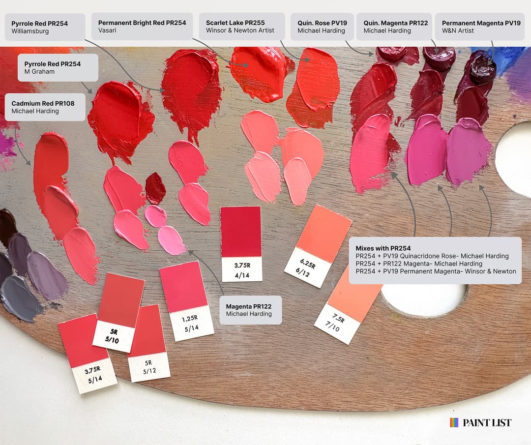
Closeup of Pyrrole red tints with a few Munsell chips for comparison. Pyrrole Red PR254 is a cool red that is warmer than Quinacridone Magenta PR122 and cooler than Pyrrole Scarlet PR255
Paints Mentioned on the Palette
Paints featured on our palette of tints and complements
Closeup on Tints
From Pink to Coral to Salmon- Where to Locate PR254
When talking about Pyrrole Red, everything is contextual, so let's look at where its tints fall in the progression from red to orange. Tints with Titanium White bring out different qualities in a pigment, so we swatched quite a few and arranged them in spectrum order in the Great Book of Color. Both PR254 and PR255 are indispensable for tints and it can be very handy to have both colors if you want to make pastel pinks. Generally PR254 is cooler, however there is one exception which we'll talk about later regarding Vasari. Generally speaking, PR255 is oranger and will also make more coral tints where PR254 makes a bit pinker/redder tints.
From PR254 we can also go the opposite direction to delve into cooler pinks with a handful of quinacridones (e.g. PR209, PV19 rose, and PR122). When it comes to making bright pink-purples, a quinacridone magenta would be a better choice than PR254.
Overall PR254 Pyrrole Red is good choice for middle reds. It is more lightfast than PR112--as beautiful as that color is--Pyrrole Red is also less reactive, so Pyrrole Red would be our choice for middle-red tints.
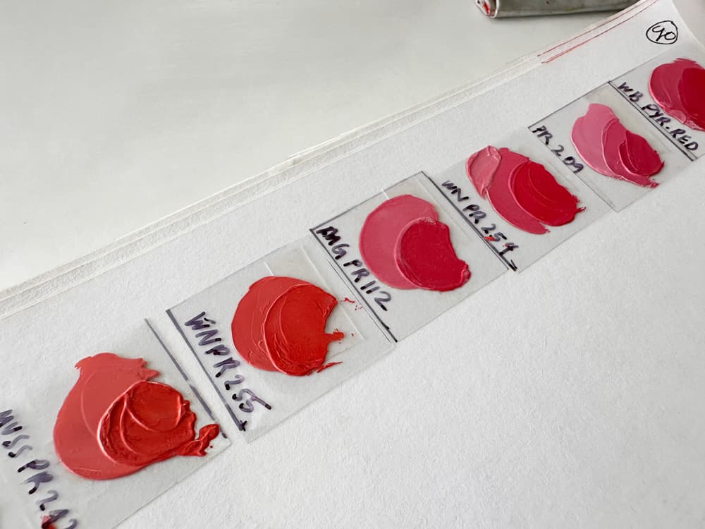
A series of paints made into tints and arranged in spectrum order. Both PR254 and its cousin pigment PR255 are shown in this lineup.
Complements and Crimsons
Pyrrole Red's Role in the Gamut
When using this color in the color mixing project, I got to know it as quite disctinct from some of the cadmium colors, such that using one to replace another wouldn't occur to me. There is a clear and cool note to Pyrrole. Until mixing a color system with color targets I had not realized what a zoo the reds are when it comes to color mixing. Titanium white tends to spin reds blue, and so adding titanium white to a color will tend to spin the hue into another color's territory. More explanation is needed here which goes beyond this article. In regards to Pyrrole specifically, it was interesting to see the way paintmakers used this in blends as it paralleled some of my own color mixing research. I often found myself deepening and modifying Pyrrole Red PR254 to make some adjacent low notes in the reds and magentas. Incorporating quinacridones, crimsons, and some quinacridone violet were natural ways of migrating this color from its star role as "brightest red" into lower notes.
Also there were a few places where I needed to modulate this color ever so slightly oranger by mixing it with its cousin color, PR255. As an aside, PR255 is harder to find as a single-pigment paint. Pyrrole Red also has a role as a complement in mixes with Viridian and Phthalo Green Blue Shade (PG7), though of the two Viridian was nearer to grey.
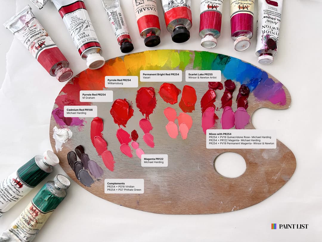
Ways to use Pyrrole Red PR254: From Reddest-Red to merry pinks to deep crimsons
Pyrrole Red Blends that Modify the Red with other Reds
Paintmakers deepen Pyrrole Red by Mixing it with other Oranges, Crimsons, Magentas
Differences between brands
Brand comparison yielded More differences than we would have expected
It is usually said that color does not tend to be a major differentiator between brands however we did notice differences between the handful of PR254s we happened to have. (For context the color range among Pyrrole Reds is not as intense as the differences we see among cadmiums).
Among three we happened to look at, Williamsburg is one of the deepest/coolest Pyrrole Reds, M Graham's was a bit higher chroma in appearance when wet, and Vasari's Permanent Bright Red, looked so much like PR255 -- the oranger Pyrrole-- that we wrote them a note inquiring about the pigment code. It is in fact Pyrrole Red PR254 despite the warmer hue. In fact, Vasari actually sells two versions of PR254, the Permanent Bright Red and also Basic Red, which is a bit less intensely pigmented.
There are also differences in opacity and viscosity/consistency from brand to brand. We noticed that Williamsburg formulated Pyrrole Red to be fairly stiff, whereas Winsor and Newton's PR254 (not shown here) had more give. Williamsburg had a heft and gorgeous pigmentation to the paint, but for a particular color mixing project where a large quantity was needed we found it to be a bit too stiff, however it was gorgeous and robust.
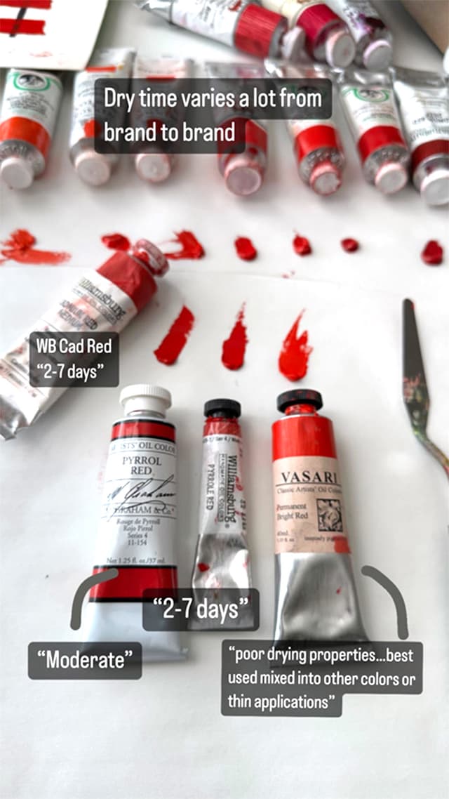
The brands differ quite a bit in drying time. Williamsburg notes that their version dries in 2-7 days, while Vasari includes a note of caution for long dry times.
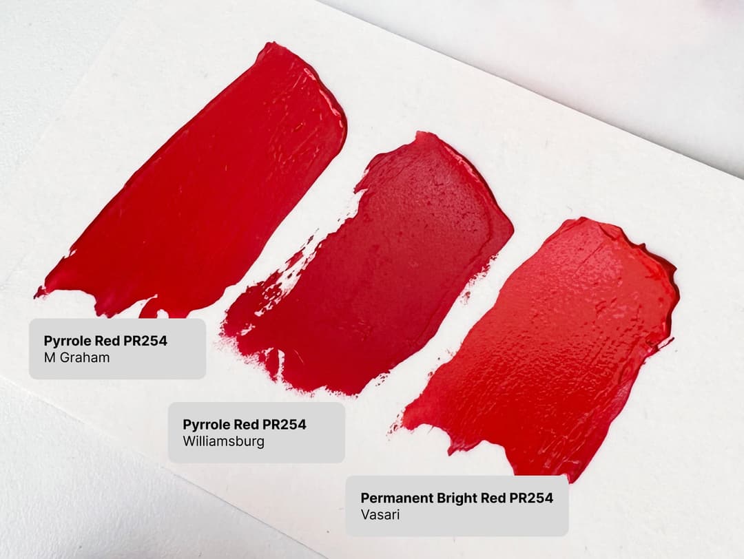
Some of the differences between Pyrroles in tints. Vasari's Permanent Bright Red, while PR254, has a hue between the cooler PR254s and the warmer PR255's. It also has a longer drying time than some other Pyrroles.
Featured Pyrrole Reds and Scarlets
Some of the Pyrroles mentioned in the article
Can Pyrrole Red Replace Cadmium Red?
Where Pyrrole Red Fits In a Wide Gamut of Cadmium Colors
The short answer is maybe. Not really--but kinda. There are a few issues in terms of hue and even bigger issues with opacity, as Pyrrole is less opaque than the high quality cadmiums.
Pyrrole is by no means the only pigment used in efforts to replace Cadmium Red, which tells us that there is not a unanimous vote among paintmakers as to which pigment is best at trying to replace Cadmium Red in terms of color and behavior-- and a sort of hint that perhaps none of the contenders are overwhelmingly satisfactory. However in applications where moisture is involved to any degree Pyrrole has the advantage of being more weatherfast (both colors are lightfast, but weatherfastness also encompasses moisture, and Cadmium Red is more vulnerable to moisture).
In general, from a color perspective we really don't love hue approximations. For those newer to painting, when a color is labeled "hue" it means that it is using pigments that are less expensive to approximate a more expensive color. So usually we steer clear of these blends as mixes are less ideal in a lot of ways and rarely does the Hue do a satisfactory job of fully replacing the original pigment.
Pyrrole Red and Cadmium Red are indeed different- however out of all the attempts at cadmium replacements, it seems that Pyrrole may come closest to Cadmium Red Medium, depending which particular Cadmium Red Medium we're talking about since there a huge variety of cadmium colors from brand to brand.
As an aside, another color PR112 (Napthol Red) is a popular choice for approximating cadmiums as well, but PR112 doesn't have the same lightfastness as Pyrrole and can also be a bit reactive in different mixing whites (see Golden's recent lightfastness testing). Both Pyrrole Red and Cadmium Red Medium tend to have good lightfastness, so that's a vote for Pyrrole over Napthol in general.
In comparine Pyrroles to Cadmium Red Mediums, though we noticed differences, Pyrrole Red PR254 seemed most similar in masstone to Michael Harding's Cadmium Red or Old Holland's Cadmium Red Vermillioned. Williamsburg's Cadmium Red Medium was also very close. (Bear in mind when making this comparison, we're talking about the standard cool-red Pyrrole Reds made with PR254, not the slightly warmer version of the pigment used by Vasari). Also, as we mentioned before Pyrrole tends toward more transparency or semi-transparency where high quality Cadmium Reds will be more opaque.
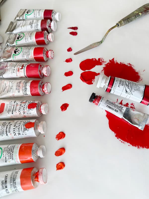
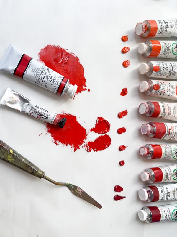
A lineup of cadmiums from Cadmium Red Light to Cadmium Red Mediums, to Cadmium Red Deep. Pyrrole Red PR254 seemed most similar in masstone to a couple of cadmium red mediums, though not all cadmium red mediums.
Pyrrole Red vs. Cadmium Red
There are a lot of different Cadmium Reds, so Pyrrole Red doesn't approximate all of them. Here's where Pyrrole Red fits in the rainbow of cadmiums
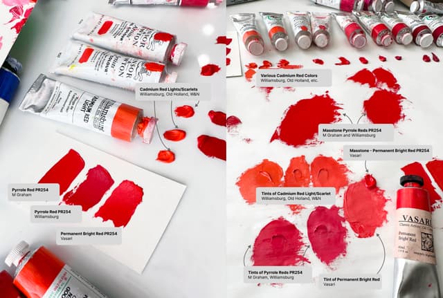
Genuine Cadmium Reds vs. Pyrrole Red
Pyrrole Behaves Slightly Differently in Mixes
In our experience, in order to achieve similar results to Cadmium Red when using Pyrrole, a few more colors may need to be added to soften the Pyrrole's high chroma, which is doable, however the two pigments feel different in practice.
The range of Cadmium Reds is huge and the term "cadmium red" encompasses quite a few colors from brand to brand-- these include deep reds to bright primary-esque reds to red-oranges. Pyrrole does a better job of approximating some cadmium reds in masstone than others. In order to approximate Cadmium Red, Pyrrole Red may require a few more colors-- as evidenced by some of the blends listed on the tubes of hues made with Pyrrole (e.g. paintmakers often add PO73, PY184, PR101, or PR112 depending on the manufacturer).
Here's a comparison from Williamsburg on Pyrrole Red vs. Cadmium Red.
We also mixed M Graham Pyrrol Red and Williamsburg Cadmium Red with a yellow, in this case Old Holland Scheveningen Yellow Lemon, and we noticed the difference in the two pigments. It's hard to articulate precisely but the Pyrrol retained a bit more pink while the Cadmium Red, which had a similar masstone to the Pyrrol, warmed more readily.
As a brief note on paint blends labeled 'Cadmium Red Hue'-it's helpful to pay attention to the pigment content. In one case, expensive cadmium is merely cut with the less-costly Pyrrole. Many of these cadmium approximations incorporate a handful of pigments to try to achieve similar results to a cadmium red- sometimes using as many as four pigments.
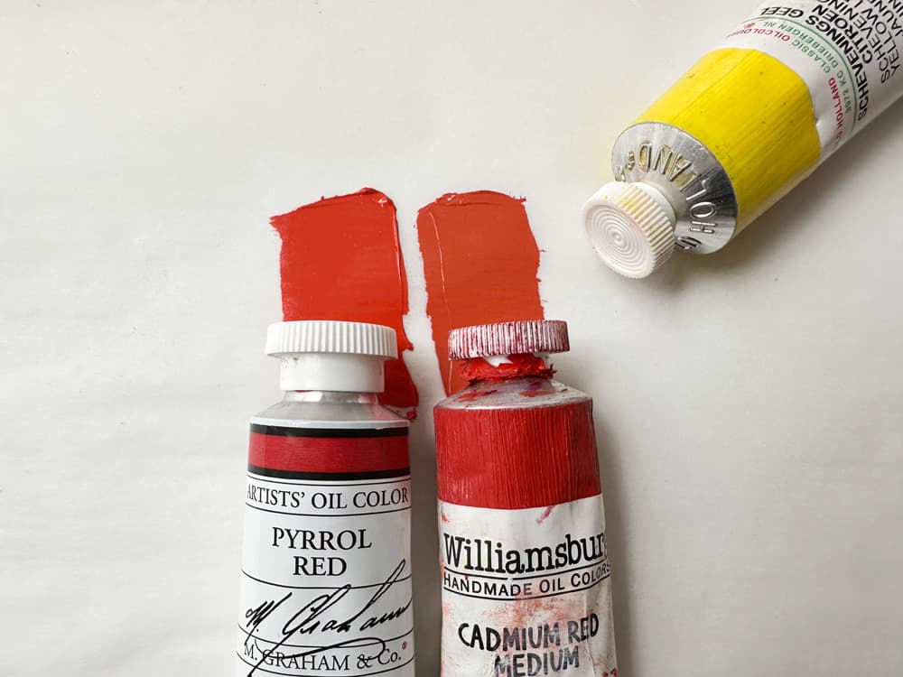
Pyrrole Red and Cadmium Red Medium have different mixing behaviors. The Williamsburg took on a different vibe in mixes with Old Holland Scheveningen Yellow Lemon
Cadmium Red Imitation Hues that Use Pyrrole Red
Not all Cadmium Red Medium Hues use Pyrrole, however it's a popular choice
Pyrrole Red in Blends
A Note from the Pages of the Paintmakers
We have a long history of painting with this color, but we also love to look for patterns in how paint makers use this color as it can sometimes shed additional light or spark ideas as to how to use it as artists. As we mentioned we've found in our painting practice that this color shines in pinks as well as full strength as one of the punchiest high chroma reds out there. It also has an interesting role to play in complement blends.
Pyrrole Red's use in Blends When not used in a cadmium hue replacement, we found it used in very similar ways to how we've found ourselves using it- with adjacent pigments on the color wheel in the oranges and crimsons. We also noticed some blends with oranges which were not super lightfast, so watch for that among the additional pigments. We have also found ourselves combining it with quinacridones. One highlight is Rembrandt's Permanent Madder Light. Holbein's Carmine is a color we found ourselves mixing before we knew Holbein made this, but it does contain PR177, so depending how stringent one is on lightfastness that may or may not be appealing, however PR177 does deepen Pyrrole Red nicely. Interestingly Williamsburg's Canton Rose was one of the few convenience blends to include white.
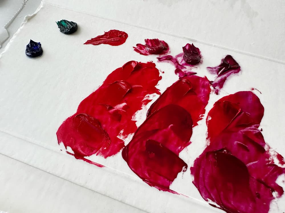
Three deep reds using Pyrrole Red PR254 as a starting point. Here we mixed Pyrrole with three magentas: Michael Harding PV19 rose, Michael Harding Quinacridone Magenta PR122 and Winsor and Newton Artist PV19
Pyrrole Red in Blends
Some of the many blends found by paintmakers which include Pyrrole Red
If it's good enough for Ferrari
High Saturation and Stellar Lightfastness
We found ourselves describing this red as "rich, cool, and powerful," which is pretty much the image that Ferrari goes for, too. Though of course we mean rich in terms of saturation, cool in terms of leaning not so orangey as far as reds go, and powerful in terms of tinting strength. This red is super high chroma, lightfast, and yes, it is actually used on Ferraris. Based on DPP, Diketo-pyrrolo pyrrole red, is a fairly recently-invented pigment, and yet it seems to stand up well in terms of lightfastness (Kremer gives theirs an 8/8/8 on the blue wool scale which equates to top marks). This high-performance color was actually used on Ferrari's in the early 2000's. (More info here). So with an endorsement like that, it's no wonder we keep it on our palettes.
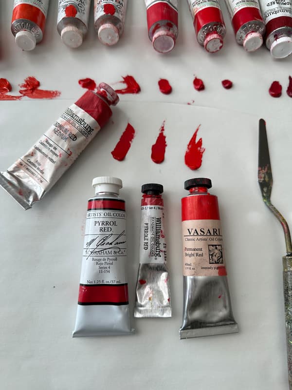
Three kinds of Pyrrole Red, PR254 along with an array of cadmiums
Pyrrole Red
Paints made with Pyrrole Red, PR254
Resources
Resources for further research
Jackson's compares three different kinds of Pyrrole (PR254 and two others) to various cadmium reds in oil, acrylic, and some watercolor. Particularly interesting for opacity. Virigl Elliott on Pyrrole Red (and other reds) Art Is Creation list of Reds Pyrrole Red in watercolor from handprint.
Pyrrole Red PR254 across brands
More Pyrrole Reds to explore
