
The Great Book of Color
Saving the Lost Wisdom of the Painters
An Escape from the Flames
A Historic Disaster and a Passion for Preserving Lost Knowleges
"Is that ...dust"? Jonathan asked as he looked out the window.
It was December 30, 2021, a bright and windy morning between Christmas and New Years. I stepped into the airy vaulted living room in our third-story apartment, which had walls of windows in three directions. The Rocky Mountains stretched across the west, a view of the road leading to the nearby town of Superior, Colorado ran from the south, and nestled between them, were the trees of Downtown Louisville, Colorado. Jonathan had just begun to make the morning French press coffee as he pulled up the shades to let in the sunlight. His arm stopped in mid-motion, and his gaze was fixed out of one of the big windows toward the mountains. "I can't tell if that's dust... or smoke," He said. "Here, take a look--out there to the west," and added, "You can't miss it."
We had moved to Louisville (pronounced Lou-is-ville) earlier that year. Before moving, I had made a video interview about my passion for lost knowledges, especially as they relate to painting and color theory. I had created about 800 pages of handwritten research on painting and pigments which had transformed my painting practice. Some of the sources for the research had since disappeared- as they sometimes do in the internet age- and I had been working on organizing this important information by hand. Since then, along with painting portraits, I had mixed and tubed about a thousand hand-calibrated mixtures of oil paints based on a historical color atlas. I had just finished that enormous color mixing project not long before Christmas, along with starting a new series of large-scale paintings.
I stepped toward the window where Jonathan had been, and saw what had caught his eye- there was a brown column rising into the air. "That's smoke," I said.
We kept an eye on the growing cloud in the west, and thought the fire would surely be put out. Meanwhile, angry bursts of wind blew over filled garden planters and banged dumpster doors on the ground below. The cloud at first was brown, then blue-black. At times there were alternating puffs of greasy black, which were then haloed with a nasty sulphur-yellow. The cloud began to overtake the sky. I paced the living room and watched now to the west, now to the south as the situation developed. Jonathan attentively scanned social media for updates. The whole western sky had been swallowed by an advancing, choking cloud of oppressive slate blue which loomed over our apartment. Fast forward to a few hours later when in a nightmare situation, the fire, driven by 100-mile-an-hour winds, devestated everything in its path.
As the smoke cloud grew, I began to pack up some of the recently-finished tubes of paint, purely out of what I thought at the time was an abundance of caution. Heart pounding, and trying not to breathe the acrid air too deeply, I had raced them down three and a half flights of stairs to our car only to pound through another three and a half flights back up, and then repeat the process all over again. Confronted with the thought that I might need to save some belongings from the smoke, I grabbed a couple of rare color atlases and the four volumes of the Great Book of Color, about 800 handwritten pages of my research.
Even though it was midday, our apartment grew dark. The nearby town of Superior had been evacuated. I gazed at the steady bumper-to-bumper string of headlights coming from the south- the 35,000 evacuees. My head throbbed as the toxic smoke filled our apartment. Our windows creaked in the angry wind. "I think we need to go," I said, not knowing that something had gone wrong with our official evacuation notices and we did indeed need to go. We sadly taped a sign on the hallway-facing door of our apartment for the first responders who might need to clear our building and locked the door behind us. One of the videos from day can be found here. After we had left, a mandatory evacuation order was issued for our location. Notices were given from the Chief of Police and Fire Command. Then we read a dire confirmation on what was then Twitter, "If you're in Louisville, this is a life threatening situation. LEAVE NOW! " from the National Weather Service.
We didn't know at that time that this was the most destructive wildfire in Colorado history, that two people had lost their lives, and that thousands of pets perished, while over a thousand homes and businesses were destroyed and countless others were damaged. We didn't know then that so many other people needed to be evacuated and hadn't received notices, or that it was only because of first responders who put themselves at risk to save others that so many peoples' lives were saved.
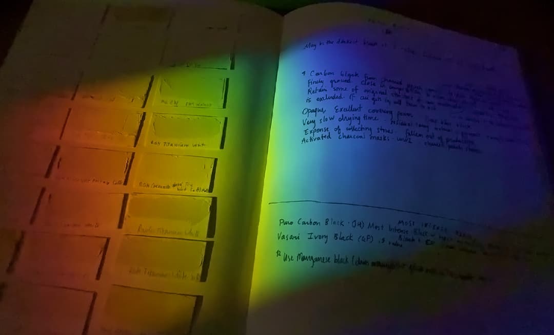
The Great Book of Color, Volume 1
Aftermath, Resilience, New Inspiration
The Catalyst for Sharing Lost Knowledge with the World
As far as our little apartment, a toxic cocktail of chemical smoke and ash, driven by hurricane-force winds, covered everything except for what we were able to take with us when we evacuated-- and one of those few things was the Great Book of Color. (A bizairre story unfolded regarding what later happened to some of my paintings. Nearly all of them were lost to smoke damage. It seems that some of the carefully wrapped ones-- which did sadly still have exposure to the fumes from the fire-- may have survived after I later disposed of them, which was an exceedingly strange turn of events).
The moment of evacuation, when I was confronted with nearly losing all of the research along with everything else, proved to be a catalyst. That experience illuminated how fragile the transmission of knowledge can be and clarified the importance of sharing this knowledge with fellow artists.
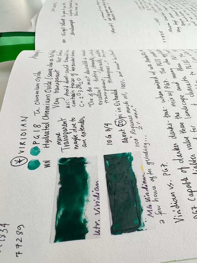
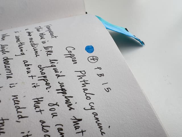
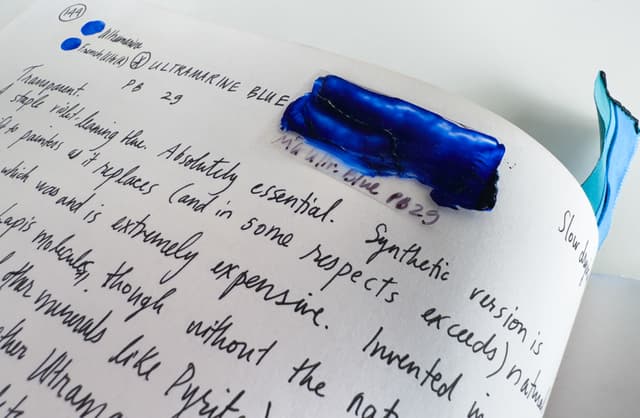
Pages from the Great Book of Color
On a handful of important artist pigments
Sharing Lost Knowledge
Pigment knowledge from two generations of painters
The facets of color theory and painting go far beyond pigments. The work in the Great Book of Color has continued. It has now grown to nearly seven volumes and is comprised of hundreds of pages. However, Volume 1, which was dedicated to pigments (and was one of the volumes endangered in the Marshall Fire), would have been impossible to replace had it been lost.
Here is a bit of background on how I came to make the Great Book of Color and why I believe information on pigments should be shared. My art career began at sixteen when a painting of mine was shown on Capitol Hill in Washington, D.C. for a year. When I studied at RISD (Rhode Island School of Design) as well as when I studied studio art at Colorado State University, I was not able to find the information that I personally wanted for my art practice. So I had to set out to find it myself.
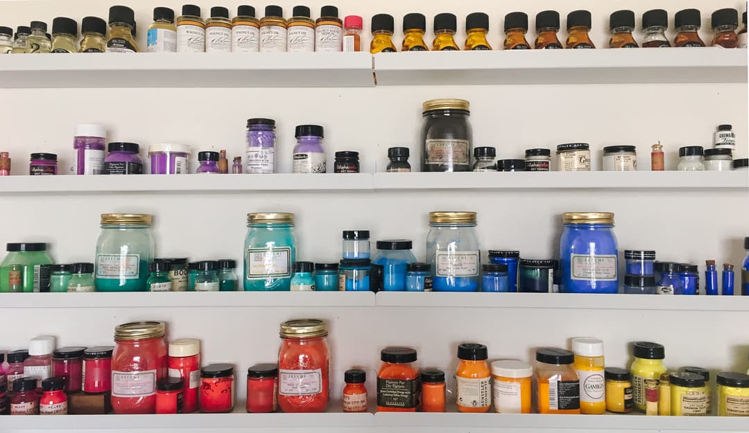
Pigment knowledge is essential to painters. The Pigment Dictionary is the first volume of the Great Book of Color
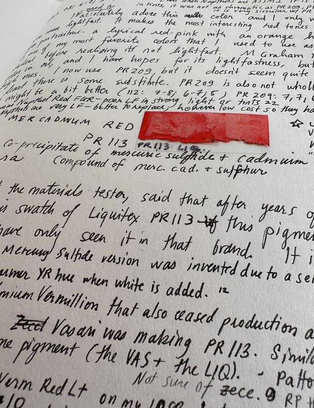
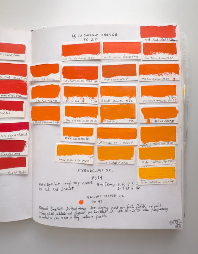
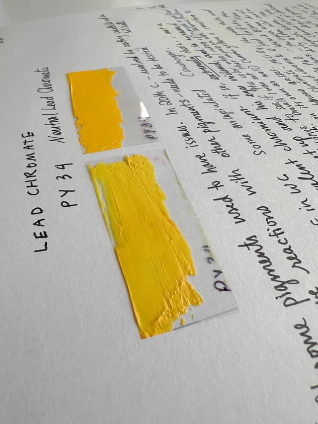
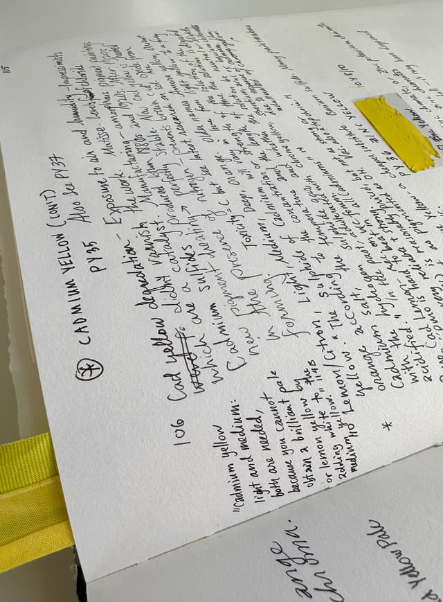
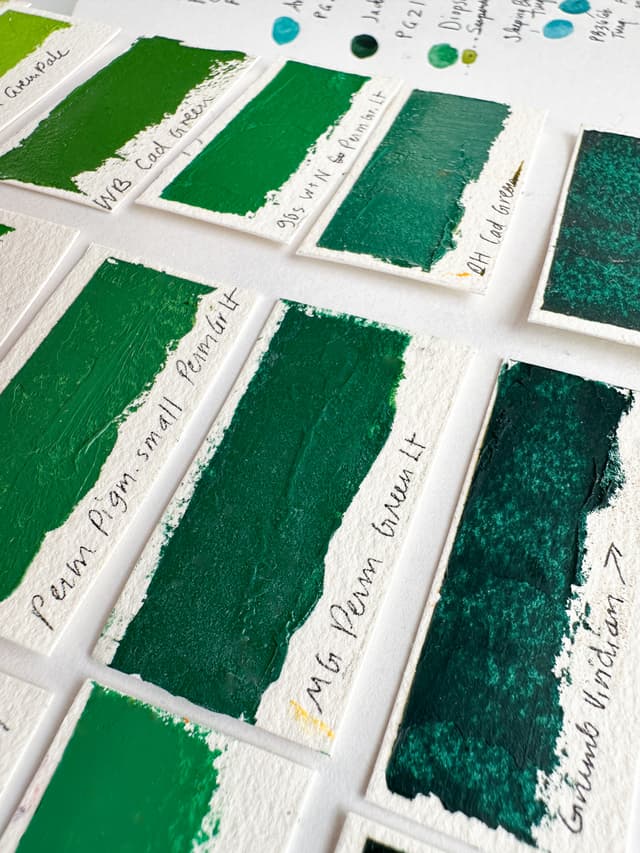
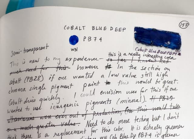
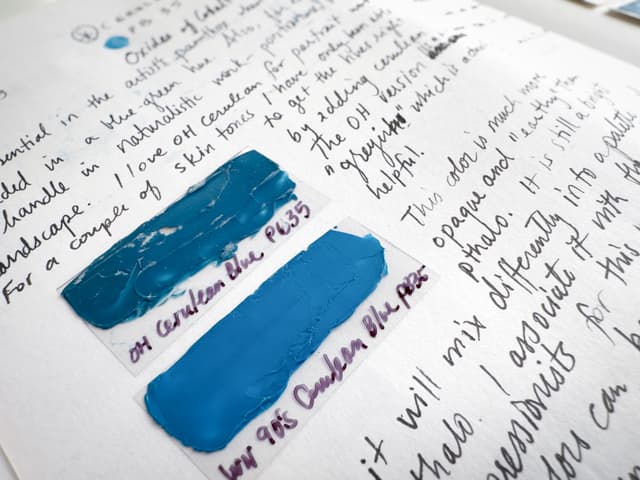
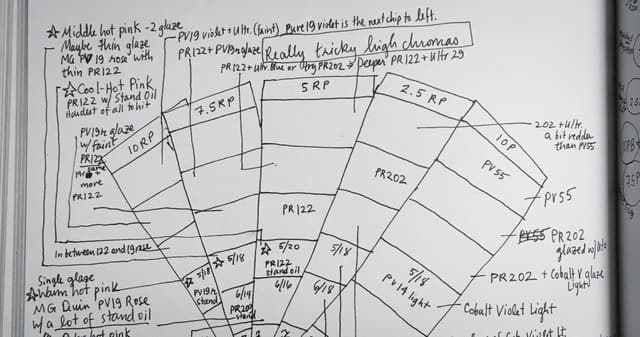
Just a few of the irreplaceable pages of the Great Book of Color
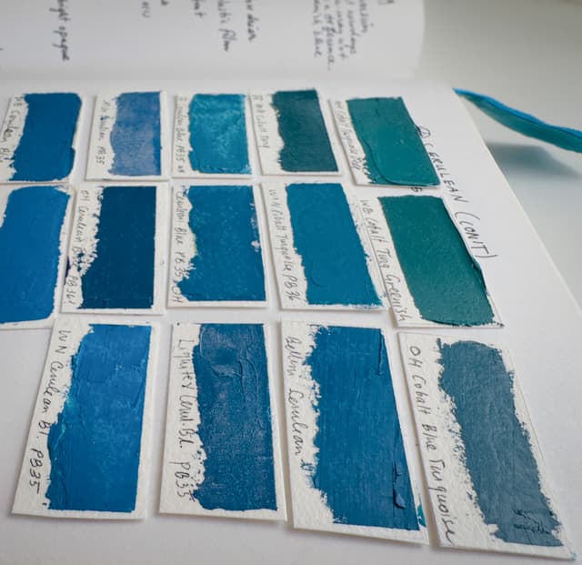
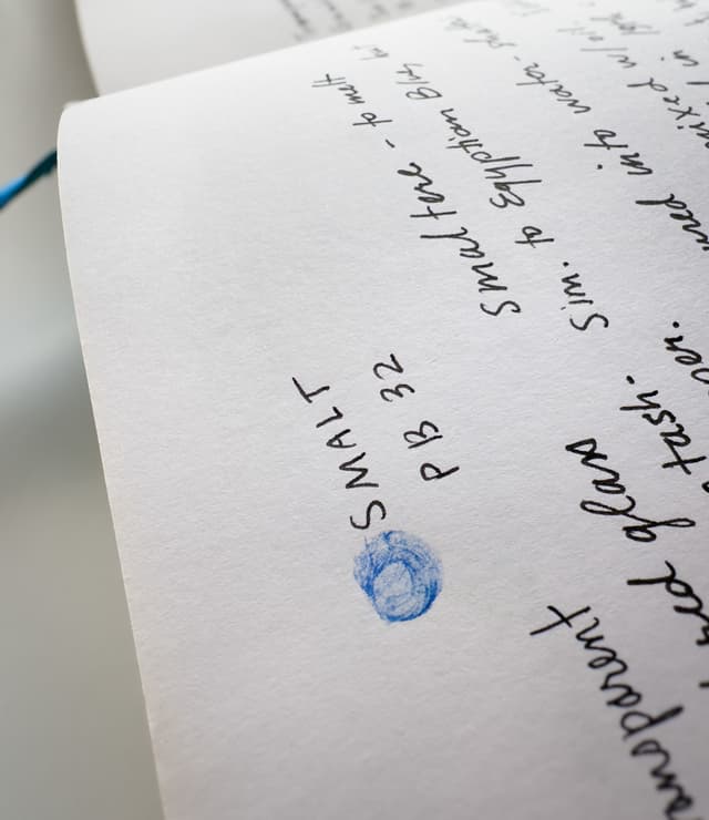
A wealth of knowledge from many sources that provides a springboard for articles on the Paint List
The Great Book of Color in Practice
A Practical Example of this Knowledge Applied to Painting
As a portrait artist, so much attention is given to the details of the face. Everything has to be just right. The fundamentals recorded in my notebooks enabled me to level up on this painting, which is shared as an example of how all of this comes to bear on one's artistic practice. I was thrilled when this painting was nominated for consideration for the BP Portrait Show in 2020, and I was invited to ship it to the National Gallery in London. While the painting did not ultimately become part of the show, by an incredible turn of events, the intense packing and in particular the double-boxed Airfloat box I had purchased for it ended up protecting this work from the Marshall Fire smoke. Out of all of my work it is the one piece from before the fire that I still have.
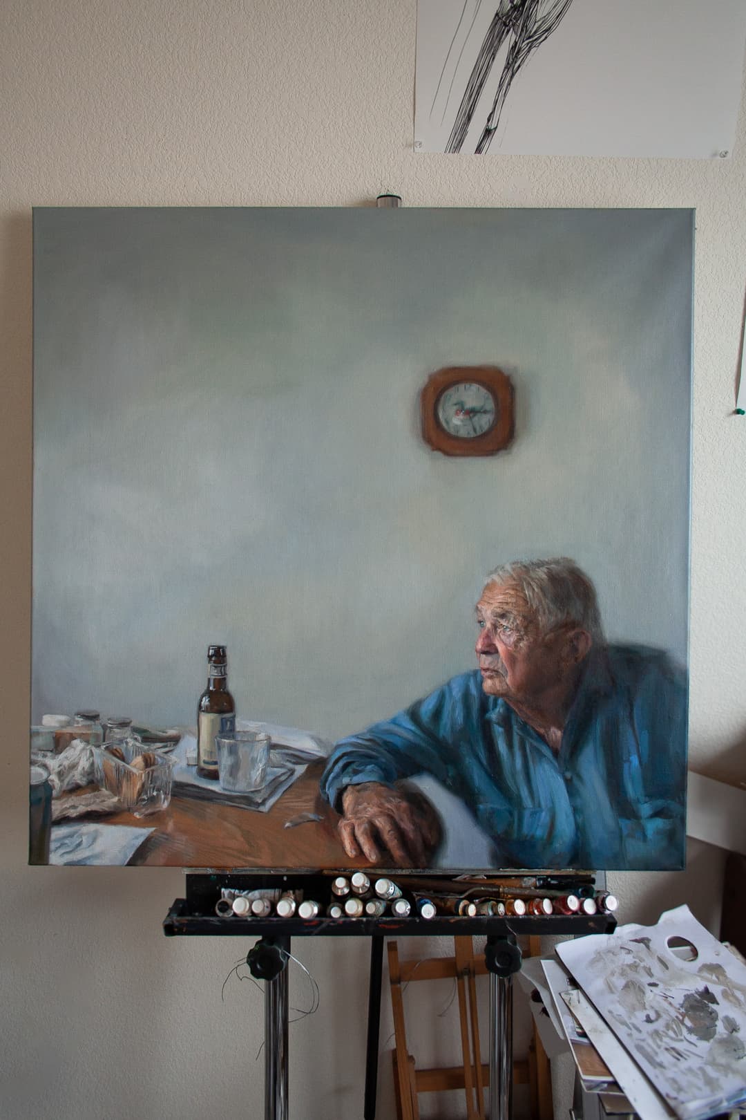
Painting Process - Great Book of Color in Application
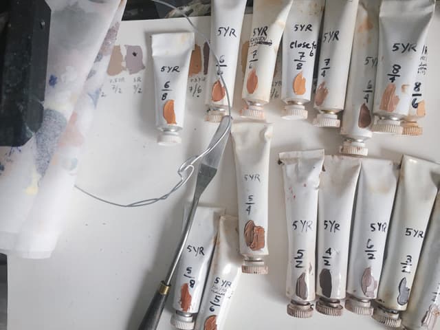
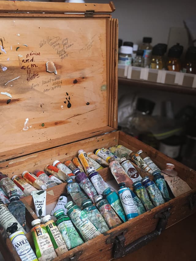
A few studio shots from a painting where the information in the book was applied. The book is a constant work in progress
Preservation of Knowledge in a Time of Technical Upheaval
Digital Disappearances: Lost Wisdom of Communities
During the time between art school and now, as I became a professional painter, I have become increasingly concerned with lost knowledge in the arts. Clearly, we are in a time of technological upheaval, and that some mediums of knowledge-sharing are more at risk for disappearing than others. In the early to mid 2000s, an interesting medium for sharing experiences with art materials arose as painters came together in forums. Artists, conservators, and materials experts shared decades of experience with materials, and many of those repositories of collective knowledge are now gone. One of the major resources was led by a former head of the ASTM (the American Society for Testing and Materials - the subcommittee for artist materials, on which I currently serve). When that resource disappeared a valuable treasure trove was lost.
When I found a Munsell forum filled with practicing painters, I learned as much as I could with the intuition that like so many other valuable online resources, the forum may not last forever. I added the comments of the great painters to my Pigment Notebook. I visited university special archives. I ordered rare books from Interlibrary Loan, some of which were in French. I consulted expensive volumes written by European conservators. I visited museum shows. I filled the Great Book of Color with conversations from pigment experts, conservators, authors and chemists I'd met as well as my own observations from twenty years of painting. This became Volume 1 of the Great Book of Color. Pigment knowledge is for every artist, and I believe that together we can all learn more. You can find a searchable Pigment Notebook, which is abbreviated from the original, that I've shared here on Paint List.
An Amalgamation of Many Sources
Art is the Queen of the Sciences
There is much more to the Great Book of Color than can be included in any one article. Pigment knowledge is foundational to art practice, and all painters everywhere need to understand the materials they work with. Two resources which I strongly suggest you consult while they are still here are the work of David G. Myers at Artiscreation.com and the Artist's Guide to Watercolor Pigments by Bruce MacEvoy at handprint.com. There is a lot of conflicting information about pigments, however these are two sources that provided the foundation for my own understanding, which has been supplemented by countless other books. I advise you to build your understanding in the same way-- by consulting many sources. In other words, I would not advise relying solely on what is found here, as there is always much more to learn and this is an evolving discipline.
My voice, and the Great Book of Color, are just one in a much larger chorus, and I urge everyone who reads from the Great Book of Color to do their own research. For example, there are several disciplines from which painters need to seek information for themselves. I must also add that my expertise is as a painter-- for example, I'm not a toxicologist, nor a chemist, nor a conservator, so please seek that guidance from the relevant professionals. Painters benefit from conversing with experts in a number of disciplines. Leonardo Da Vinci once famously said that "Art is the queen of the sciences," and it makes sense that artists need to familiarize themselves with several branches of sciences simultaneously. In fact he went further and said, "Art is the queen of all sciences communicating knowledge to all the generations of the world."
As a quick pigment reference I have created a brief guide to artists pigments where a person can look up information, which is based on some of the pigments in the Great Book of Color. It's called Unlocking the Palette with the Pigment List, A Painter's Secret Superpower.
Antique Pigments
The Pigment Dictionary, Great Book of Color, Volume 1
Every Color of the Rainbow
The Great Book of Color is a distillation of the wisdom of the painters. What follows in this article is a taste of some of the topics The Great Book of Color contains along with some of why the fundamentals are important to share.
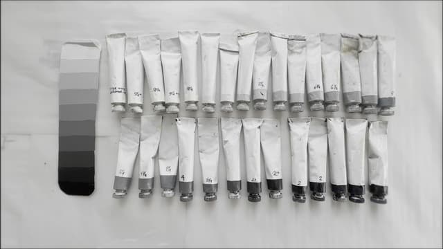
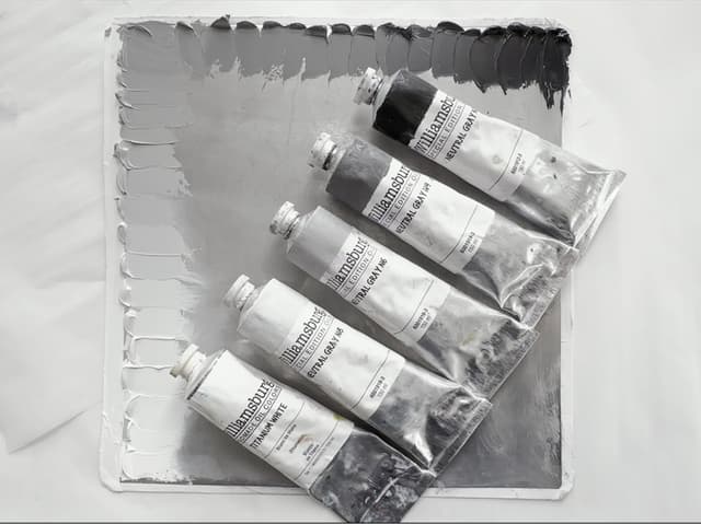
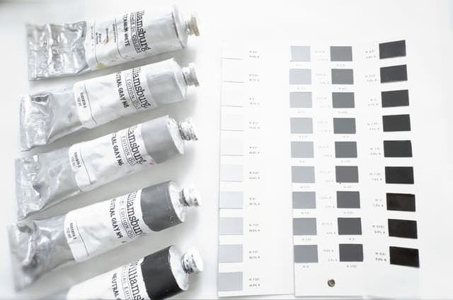
In the book, I also created many paint swatches for recent and historical paint colors with a myriad of pigments. The handwritten Pigment Notebook also contains Munsell Data, information from little-known schools of thought on realistic painting practice, and the craft of mixing one's own true Neutral greys as well as how to use them.
The legendary Gunzorro, also known as Jim Harris, once wrote of a "Fairly Stable Rainbow." It is in pursuit of that rainbow and the quest to explore every area of the palette that I began the journey into creating what would become the Pigment Notebook. I've made an abbreviated version avaiable here. My hope is that it will in some way aid your exploration of the palette, too. Here on Paint List, we'll continue to share excerpts in the form of articles on the pigments themselves.
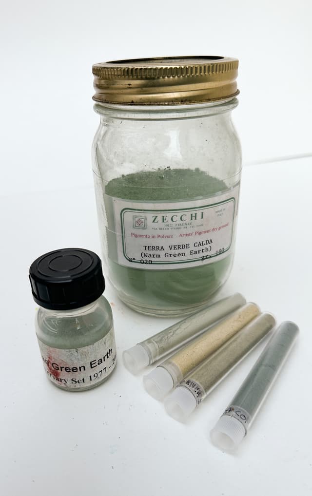
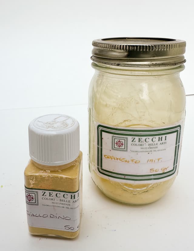
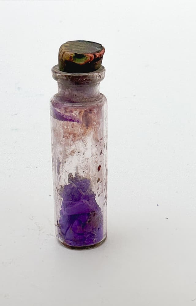
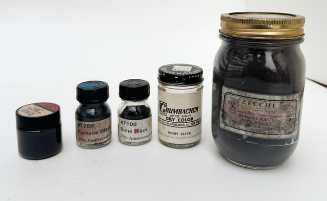
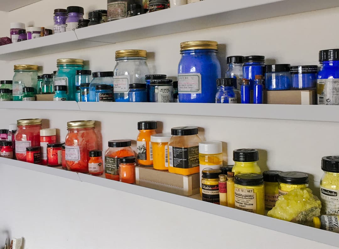
What follows is a brief overview of some of the elements contained in the Great Book of Color starting with photos of both common and rare pigments in artists paints.

The Great Book of Color
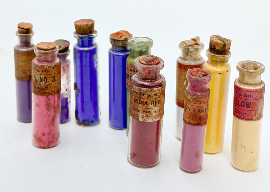
Historical Pigments, tools of the Old Masters
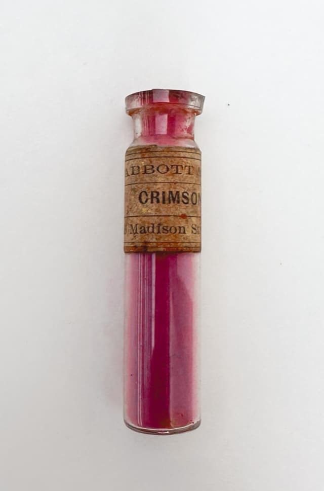
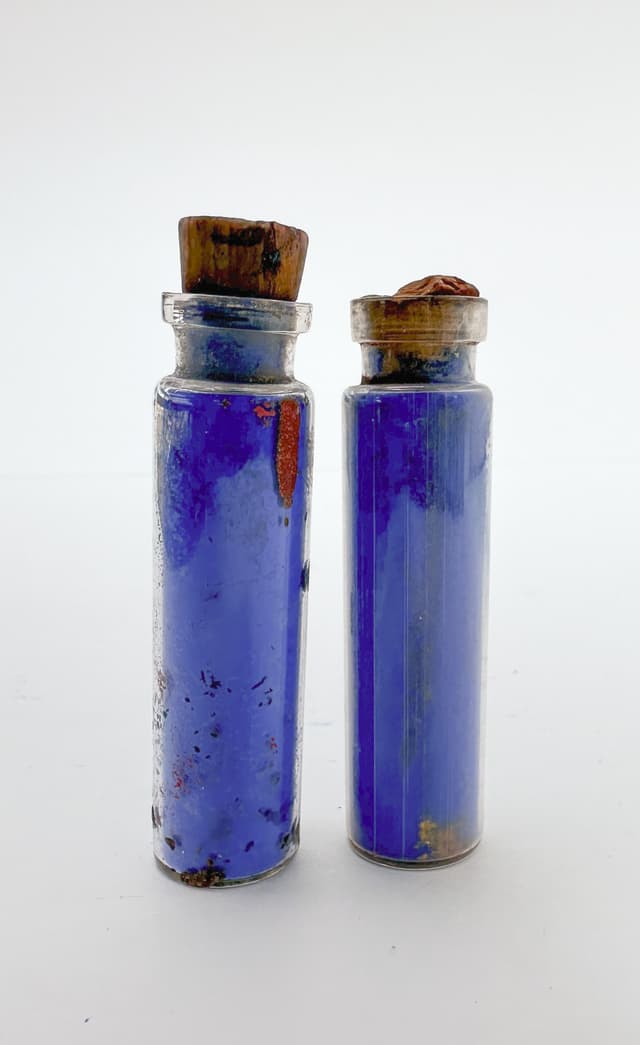
While the most primary pigments are earth tones, these antique pigments are found in art history. Every pigment has a story, and the history of pigments interfaces with both the history of people groups and of technology
How to Connect Pigments to Your Painting
The Painter's Superpower
On the back of each tube of paint is a small code which gives a painter a great deal of helpful information.
The code reads something like "PY35". That tells a person the pigment used, and from that you can derive the chemical composition, important information about lightfastness, toxicity, and even its mixing behavior. For many pigments, something of its hue and transparency can also be guessed, which helps as paint names are not standardized. So the pigment information is one of the most important pieces of information on a paint tube.
Pigment codes start with "P" for Pigment. The next part of the letter code tells a person the basic color category of the pigment. The code reads as follows: PR = red, PO= orange, PY= yellow, PG= green, PB= blue, PV= violet, PBr= brown, PBk= black, and PW= white.
There are a few instances, especially in the yellows, where the pigment is actually orange or even green, but those are the exceptions. In any case though, the letter and number combination precisely identify a given pigment. This is very important in blends because sometimes a paintmaker will use a color in a blend which might not be as lightfast as the others.
A person can then look up "PY35" in a database like artiscreation, handprint, or the list we've compiled here Unlocking the Palette with the Pigment List, A Painter's Secret Superpower.
Please note that binding oils are an important component of a paint as well. Unfortunately the array of additives, stabilizers, or extenders are not often mentioned on the paint tube. These other ingredients may affect paint (and also the lightfastness of a pigment as well as the long-term stability of a paint film) in unexpected ways.
Fine art pigments
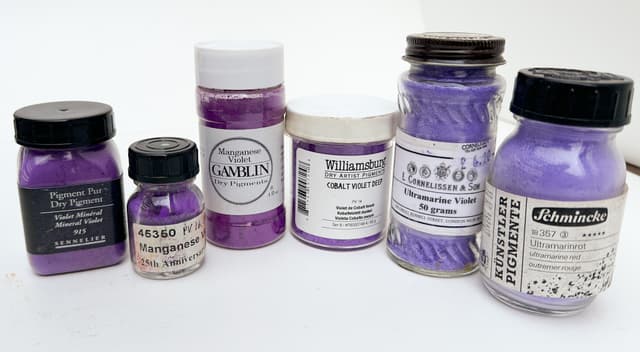
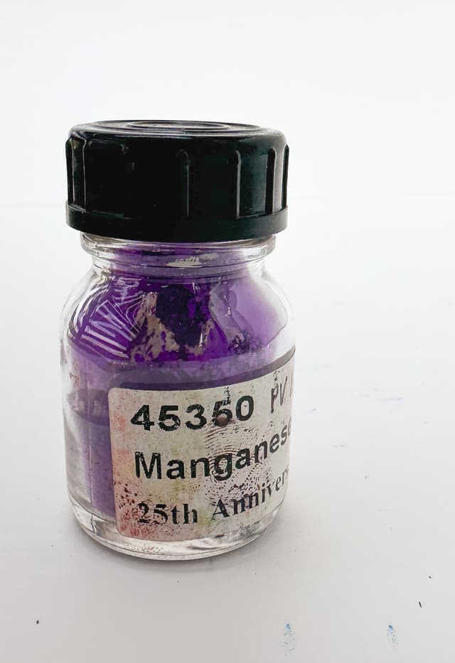
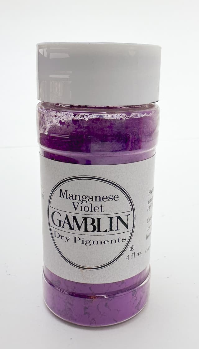
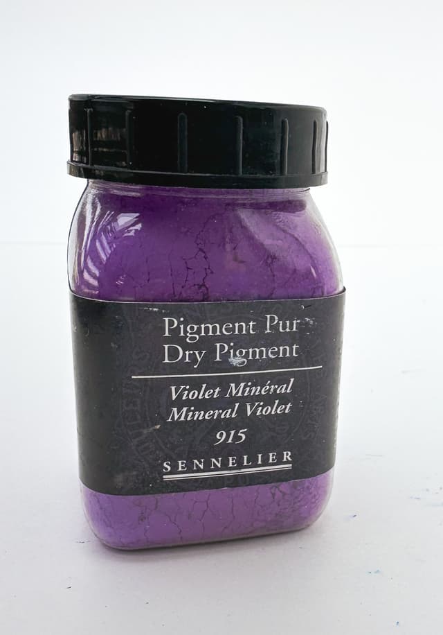
A Cabinet of Purple Pigments
Some of the common purple pigments include Cobalt Violet, PV14, Manganese Violet PV16, and Ultramarine Violet, PV15

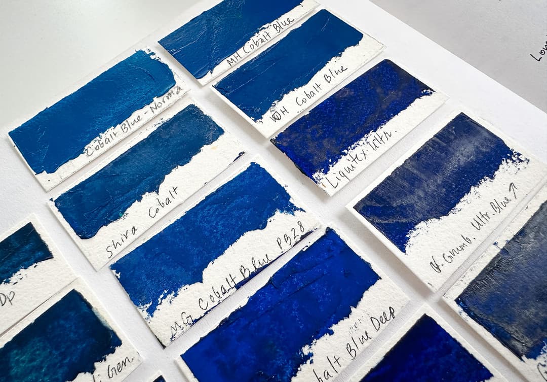
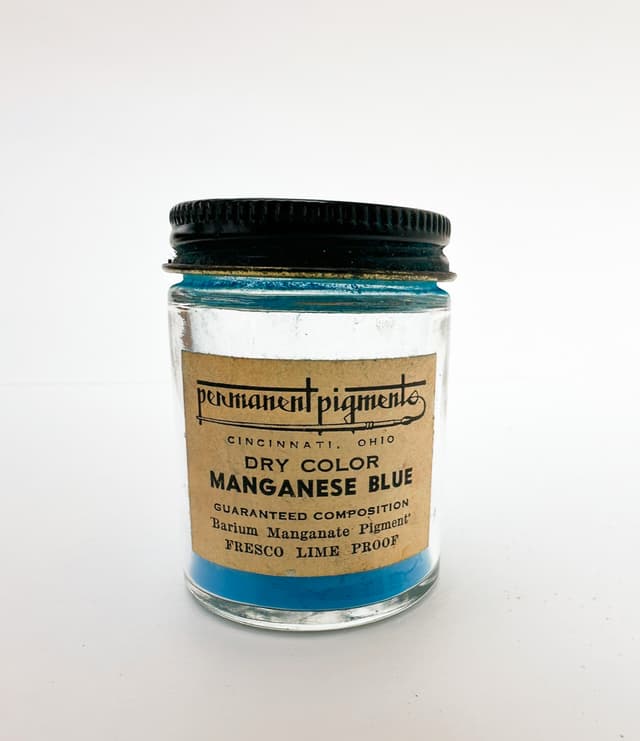
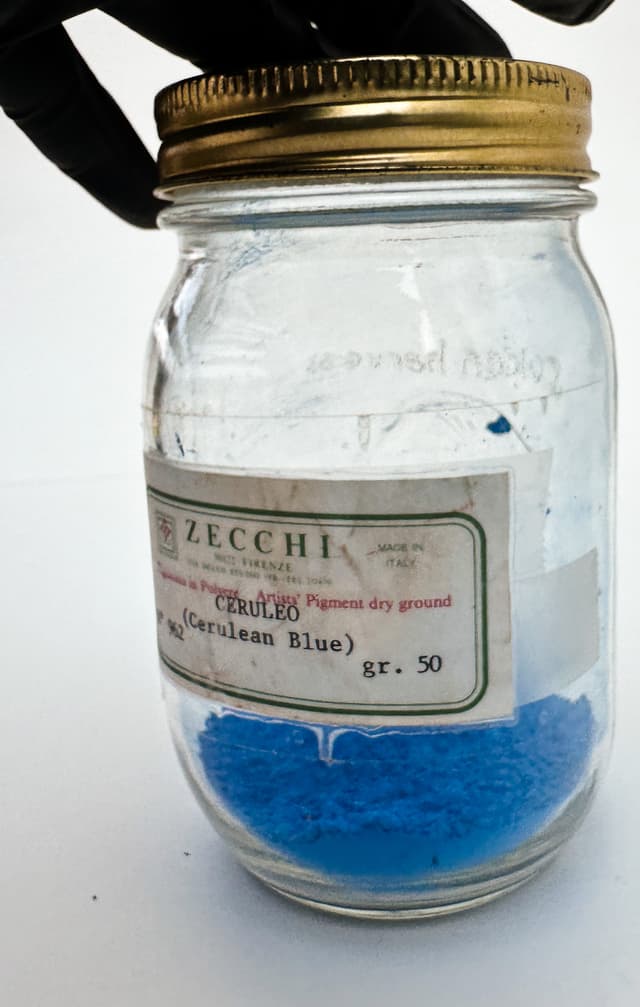
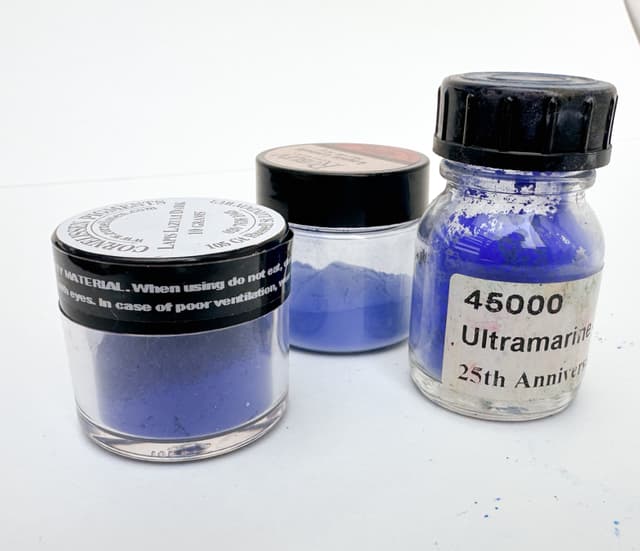
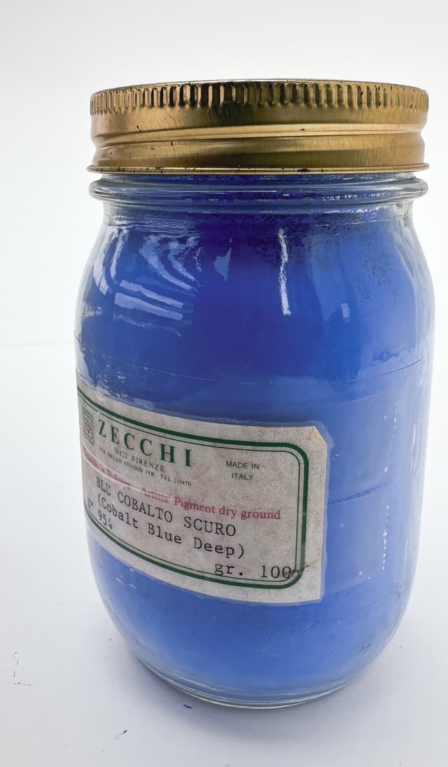
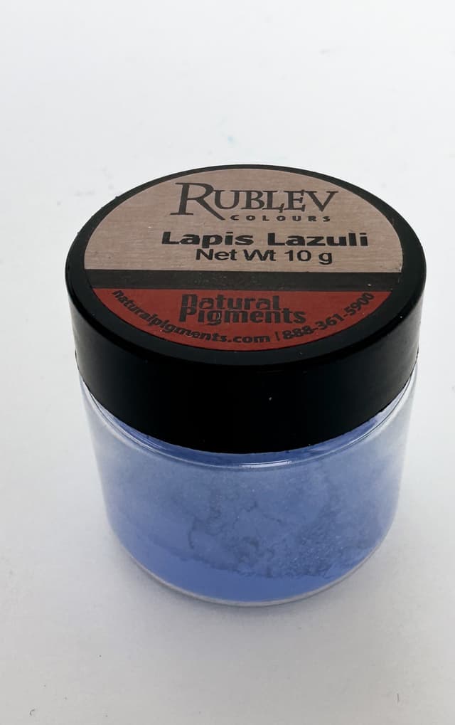
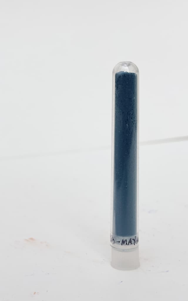
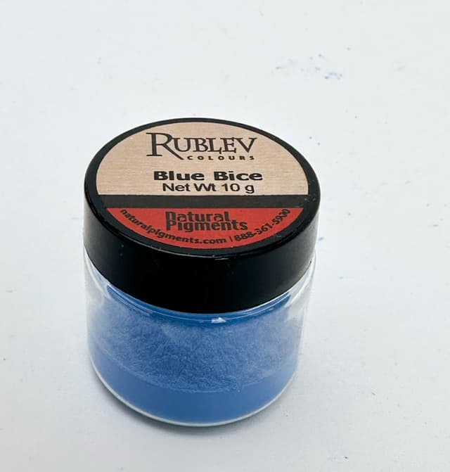
Beautiful Blues
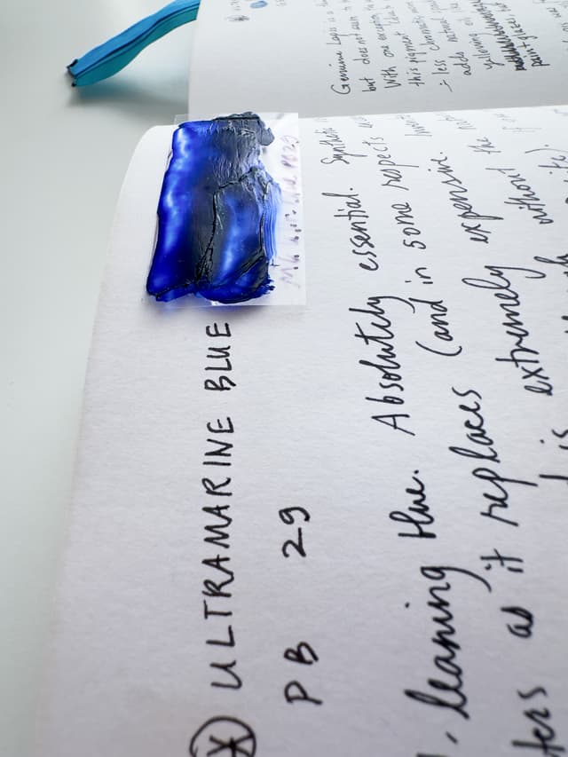
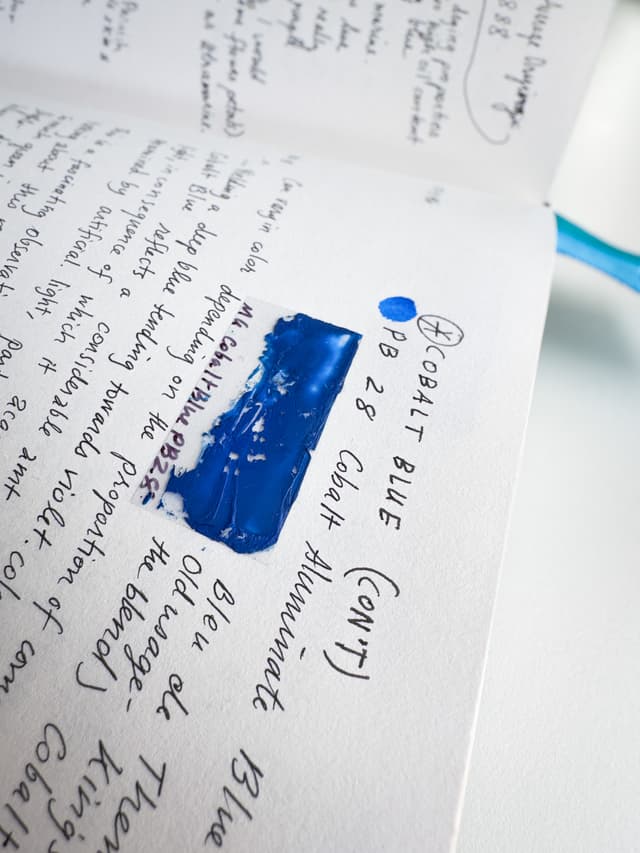
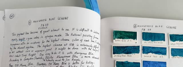
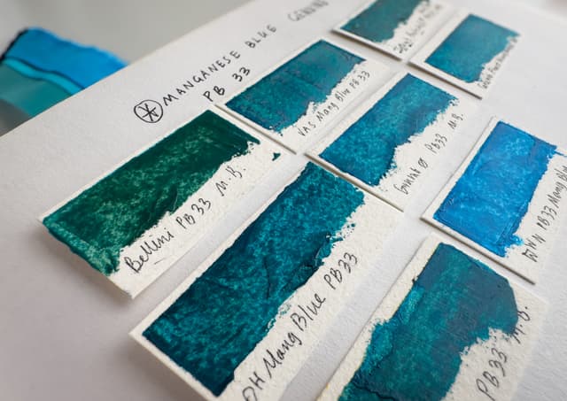
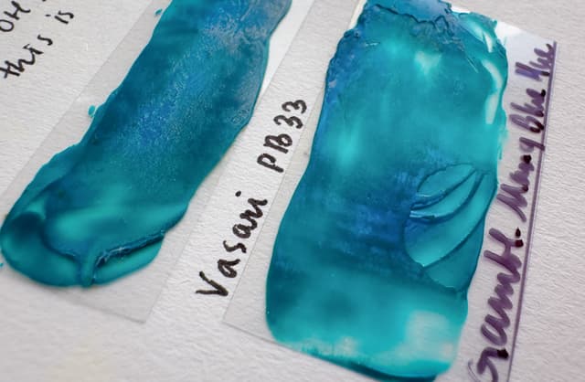
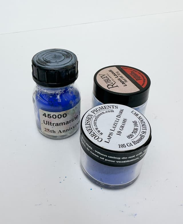
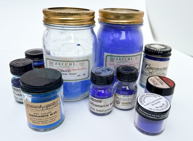
Some frequently discussed blue pigments include Ultramarine Blue PB29, Cobalt Blue PB28, Prussian Blue PB27, and a few historical pigments such as Manganese Blue Genuine PB33, Bice, Maya Blue, and Historical Lapis Lazuli Genuine
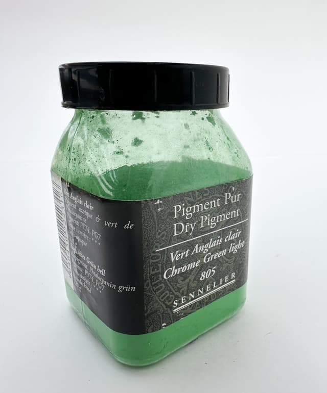
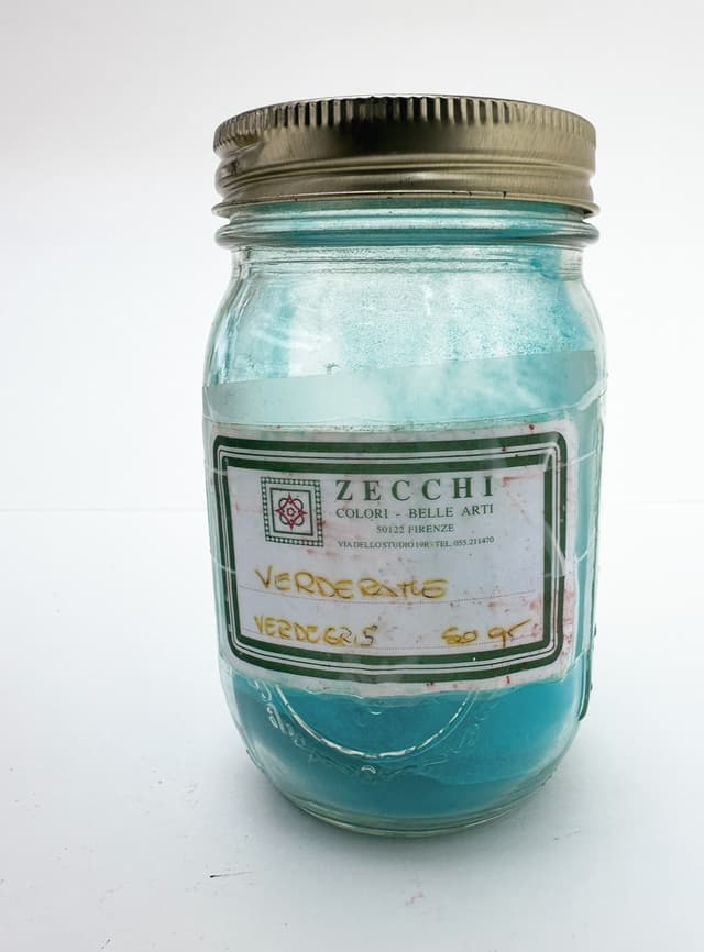
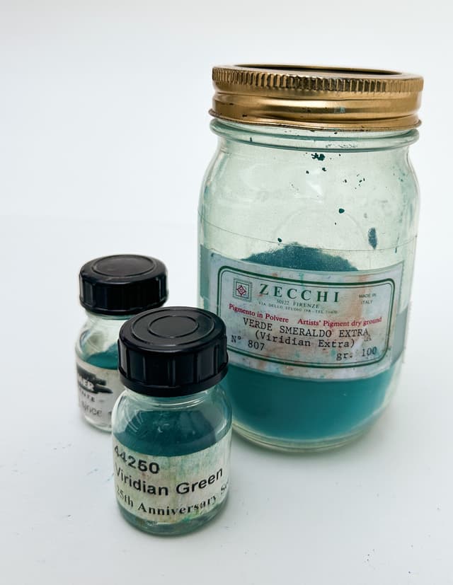
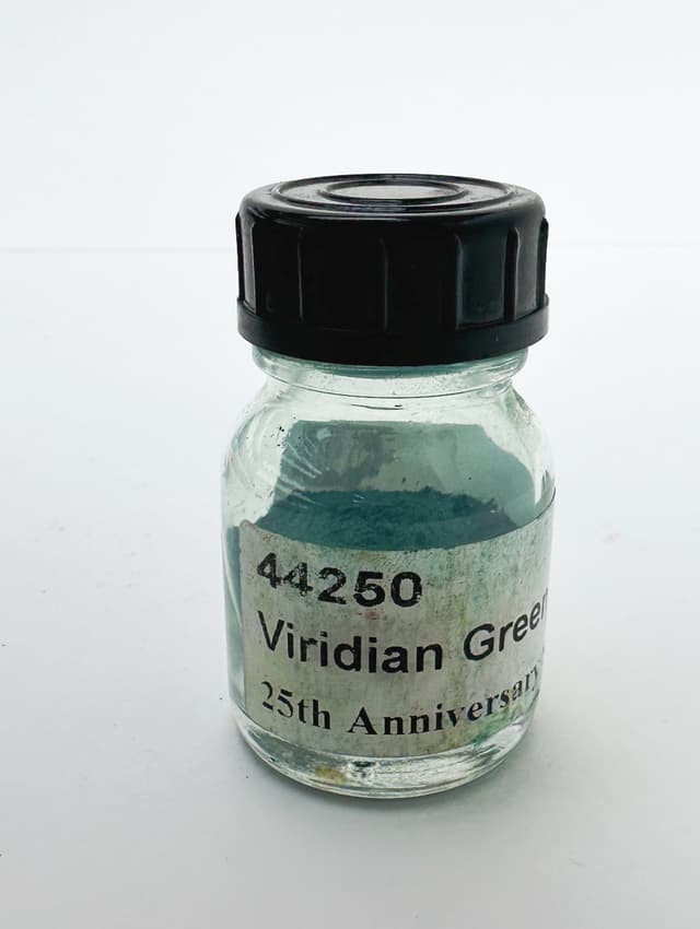
Gorgeous Greens
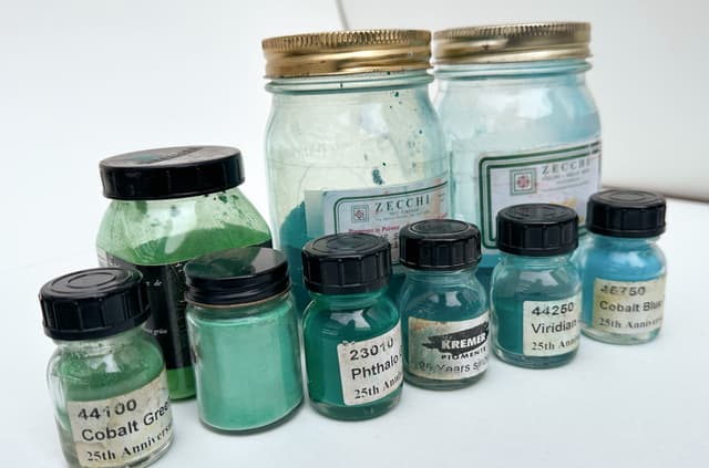
While green can be mixed, green pigments such as Phthalo Greens PG7 and PG36, Cobalt Greens (PG50, PG19, or PG26), or Viridian PG18 are commonly found on painters palettes.
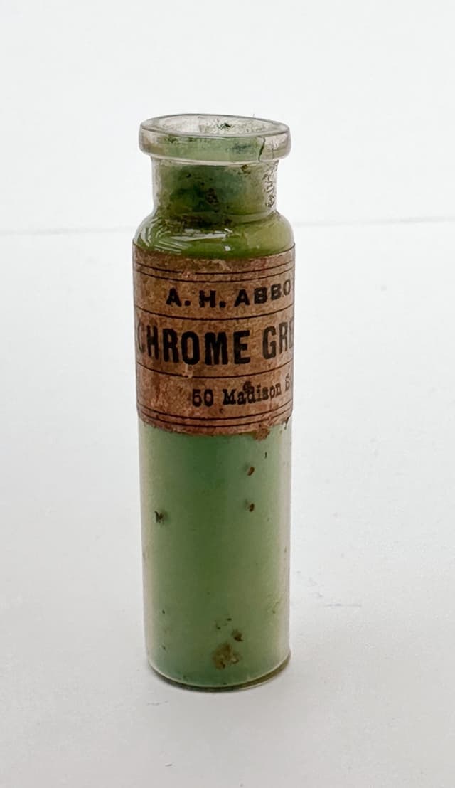
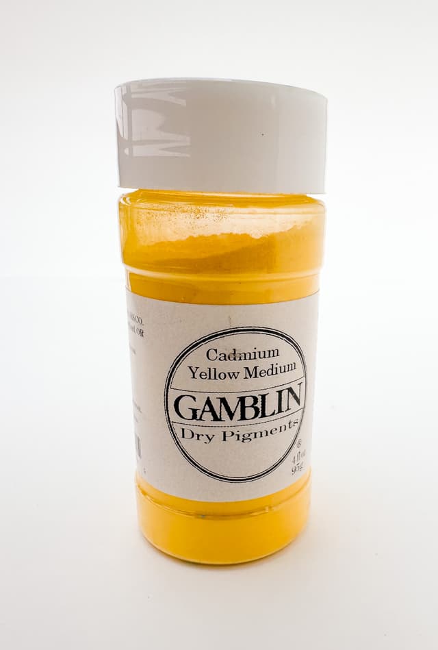
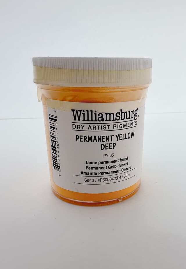
Daffodil Yellows
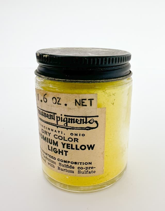
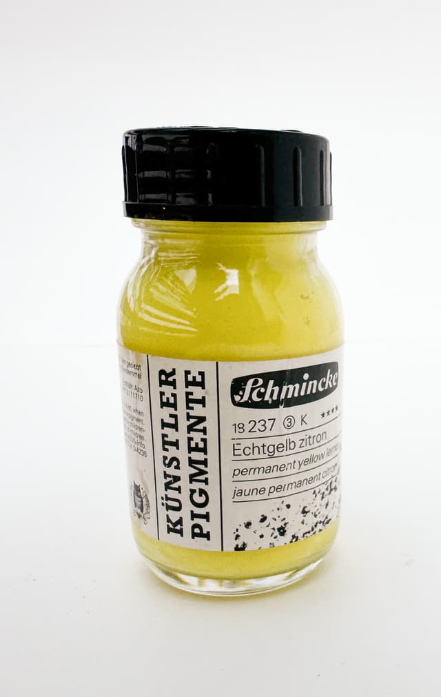
No palette can do without yellow pigments. A wide range of Cadmium Yellows PY35, common Hansas PY3 and PY65, rare Strontium Yellow PY32, and interesting Nickel Azo PY150
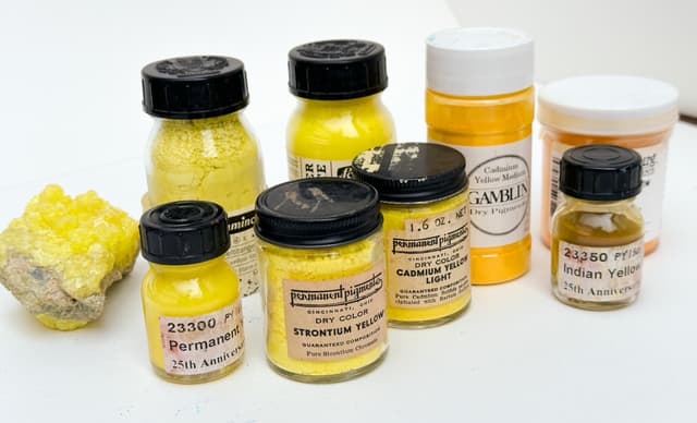

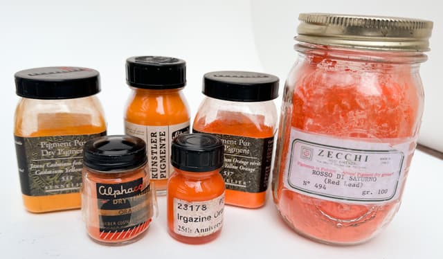
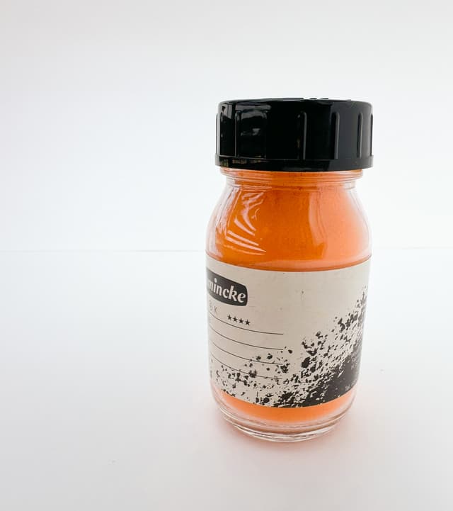
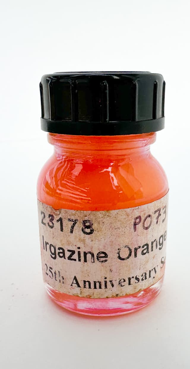
Piquant Oranges
We love Cadmium Orange PO20. Super-chromatic Pyrrole Orange PO73, historical Red Lead (technically a red) PR103, and Benzimidazolone Orange, PO62 are just a few orange pigments.
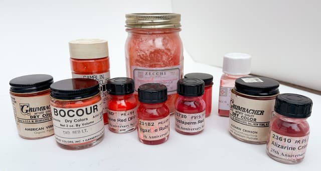
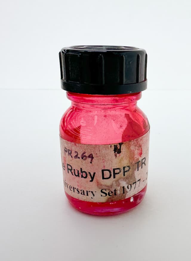
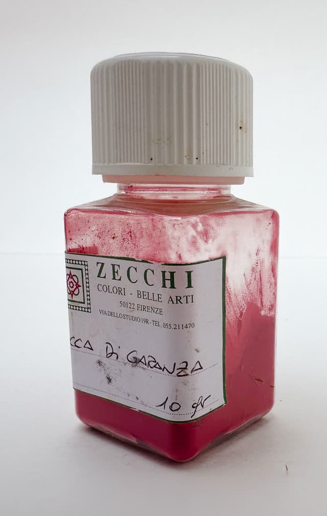
Essential Reds
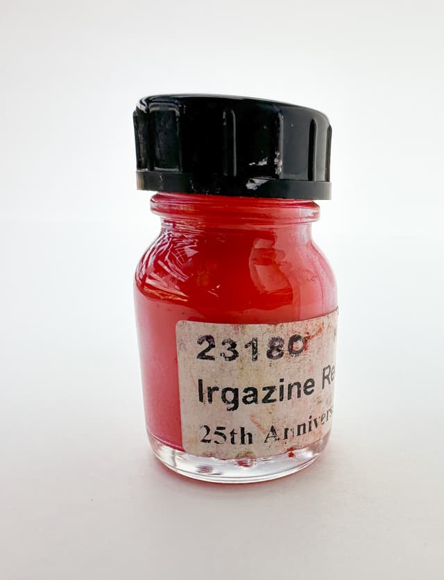
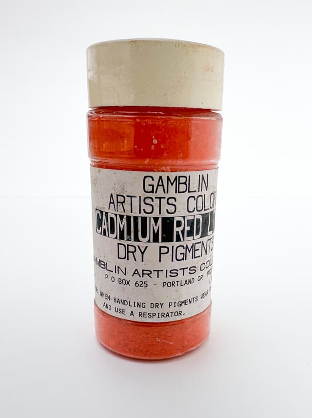
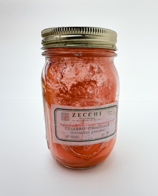
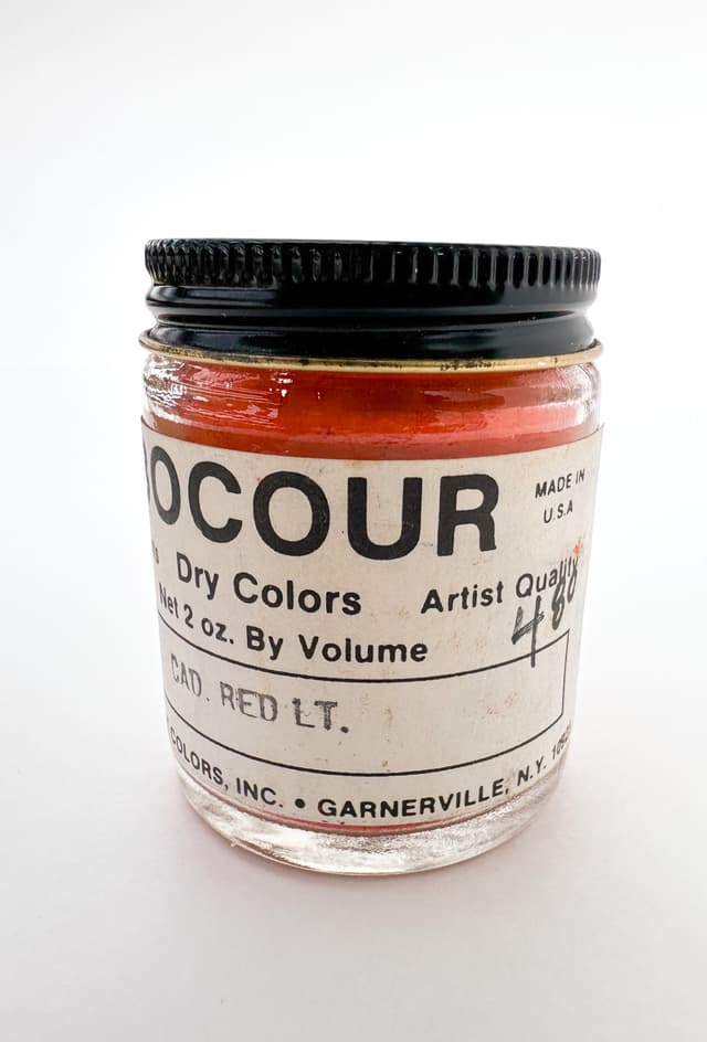
Cadmium Reds (PR108) range from Bing Cherry to Summer Tomato, Ferrari PR254, and the Magentas PV19 and PR122, and the historical (fugitive, and recently discontinued) Alizarin Crimson Genuine PR83
Pigment Information That is Relevant to Fine Artists
A curated book of knowledge that specifically serves the needs of fine artists
For oil painters, there are a couple of areas of the pigment world which matter greatly to us, but which are less-relevant to some other industries which use the same materials. For example, some pigment information is more oriented toward industrial coatings, ceramics, or other applications.
For painters elements such as precise surface color, lightfastness, reactions with various mixing whites, the interaction of the binding oil and pigment, and whether the pigment forms stable paint films (i.e. one wishes to avoid cracking or reliquification), the color mixing behavior, and color complementaries are all of importance.
In this constantly growing work-in-progress, I set out to find the various pieces of knowledge about pigments which are most relevant to painters. This began in my own painting practice and I believe it is of immense value for other painters as well.
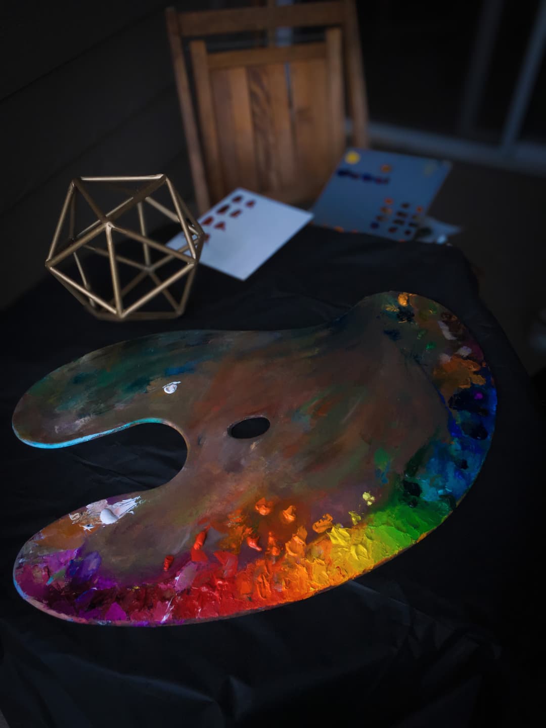
Color explorations, a palette, and some complementary color studies in progress
Specificity Using Frameworks like CIE, or Munsell
A concrete language for color
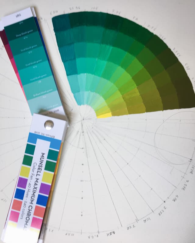
Color is such a subjective experience that shared frameworks for describing it become important to painters. The Munsell System in particular has been of immense value to me in structuring my thought and language around color, as has CIE LAB and CIELch models. The point of using LAB or Munsell is not to get overly technical, but rather to communicate concretely about colors with a shared context and frame of reference. Many paint colors are actually out of gamut for screens, so pictures cannot be relied upon to convey color knowledge. The Great Book of Color documents the ongoing journey of using color systems to understand and clarify language about color as a painter and apply it practically to painting.
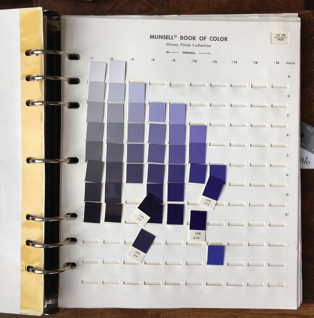
Studies in Pigment and Color with Munsell
One of several frameworks for qualifying color for painters
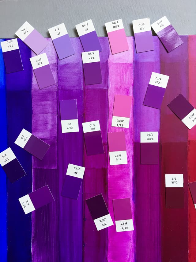
.jpg&w=640&q=75)
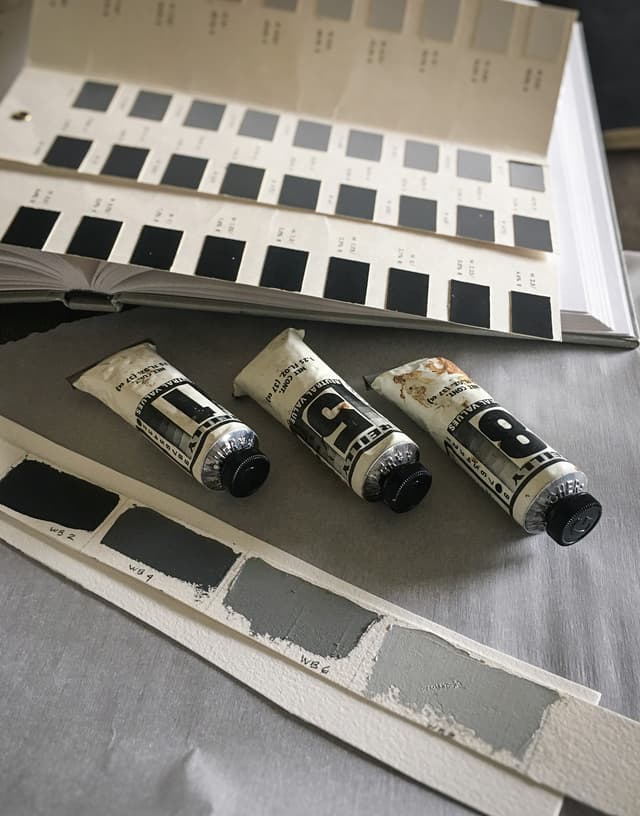
In Addition to Pigment, Binding Oils
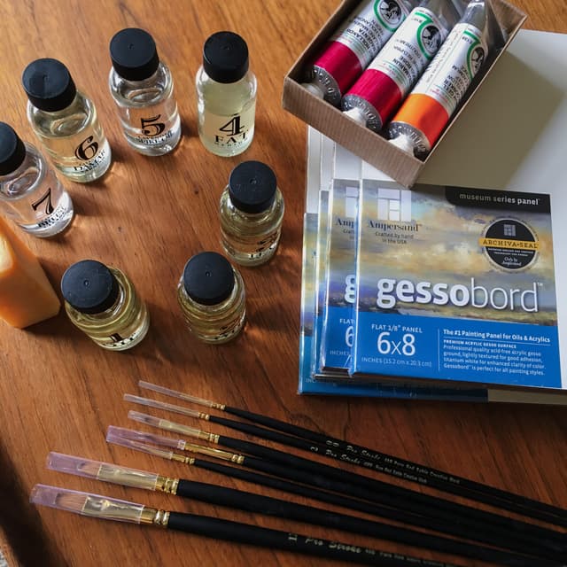
Linseed, Poppyseed, Walnut and More
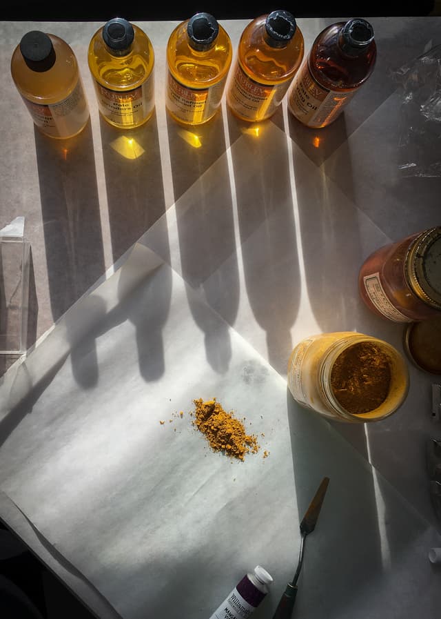
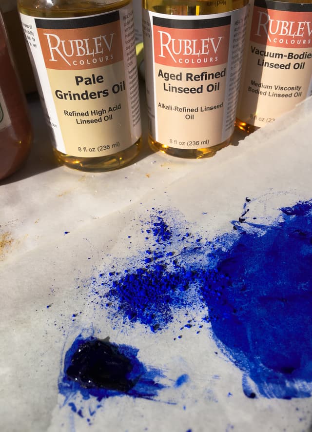
The handwritten Pigment Notebook would not be complete without a nod to the importance of the binder. My own interaction and journey with pigments has been focused on lightfastness due to some experiences I had at RISD. Many painters are aware of the effects of yellowing, but little was discussed in my fine art education about other impacts of binding oils. Golden Artist Colors has released some fascinating research that implies that choice of binding oil may actually affect the lightfastness of certain pigments.
Several years ago I took a class from Natural Pigments called Painting Best Practices, in which binding oils were discussed, especially in relation to paint film strength. In short, linseed oil forms the strongest paint films, however sometimes artists opt for other oils such as Poppyseed or Safflower for other reasons (drying time, less yellowing, or even -- in some cases, sensitivities or allergies).
I encourage all artists to educate themselves on the benefits and drawbacks of different oils as well as look into the emerging research on pigment interaction.
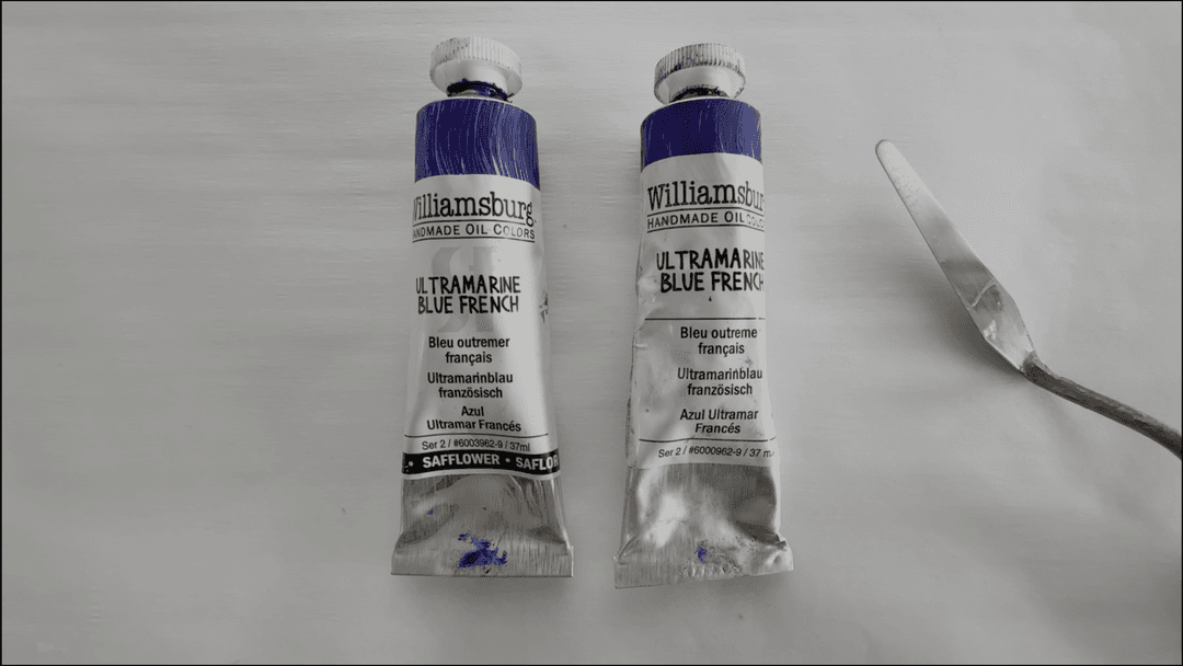
Ultramarine Blue Deep in safflower oil and linseed oil
Studying oil paint chemistry and binding oils
Delving deep into the ingredients of paint. One thing the Old Masters knew was how their paint works and the various properties of each pigment and oil
Information on Paintmakers and Brands
The wisdom of the painters weighs in
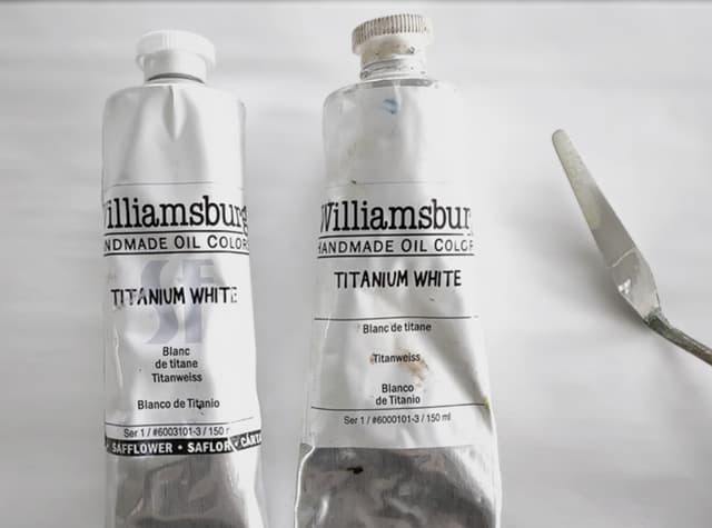
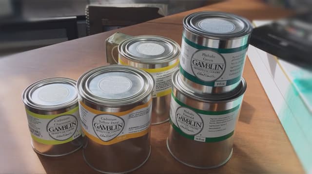
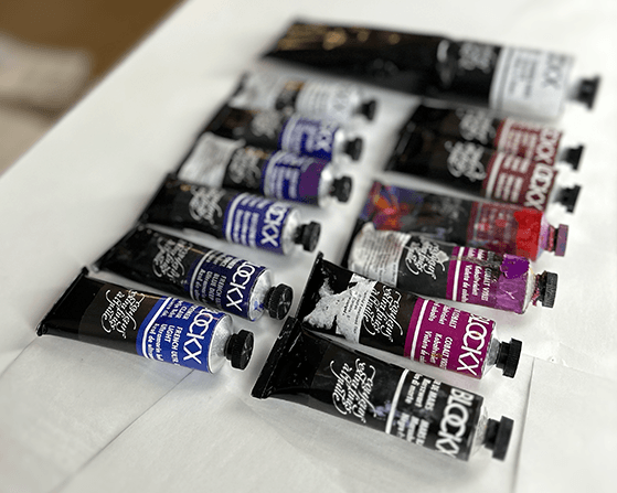
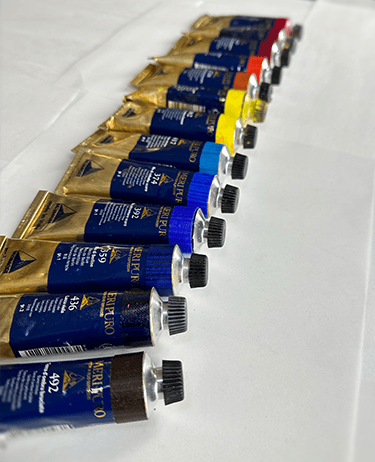
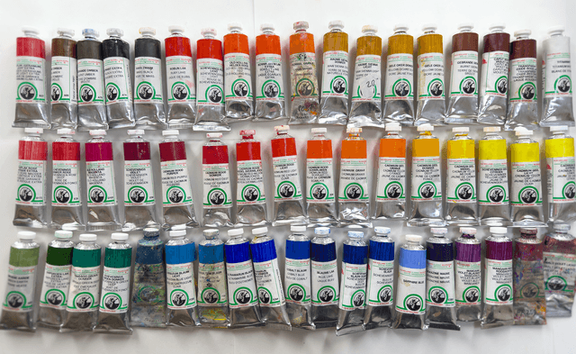
The Great Book of Color contains not just my own journey with brands, but also includes listening to a great many other painters. When setting out to discover the world of oil paints, a lot of the discussion focuses around brand names and the reputations of various paintmakers. There is no substitute for one's own experience, but listening to the great painters weigh in on their experiences was invaluable. To this I added my own, and eventually developed a knowledge of brands through custom-mixing and tubing a thousand colors. However, that project came later and was informed by this background of expertise. The research gleaned over the years in the Great Book of Color also informs what we share in brand reviews on the Paint List, such as our recent review of Williamsburg.
From the Williamsburg Review
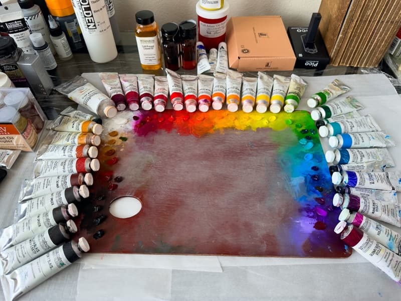
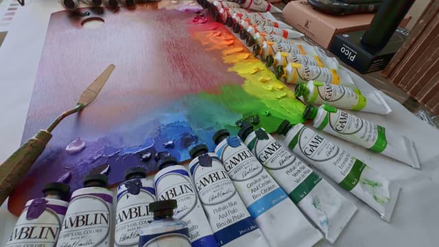
Some of the many paint brands discussed in the Great Book of Color
From impasto to gliding, from additive rich to additive free, from all around the world
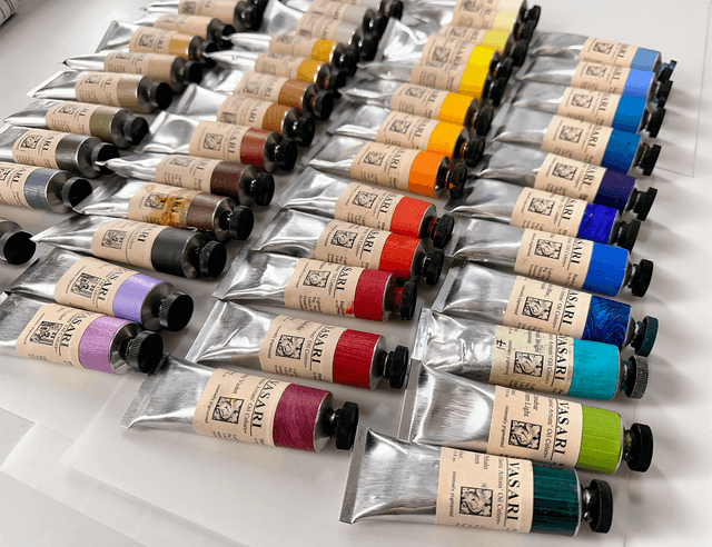
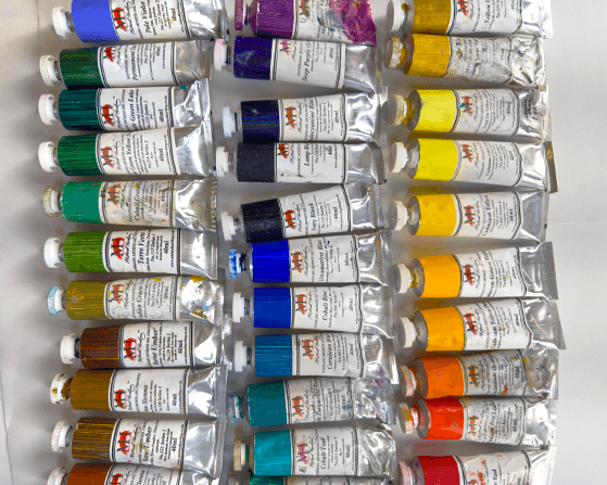
Artist Paint Lightfastness
Emerging research on lightfastness- an evolving topic in the Great Book of Color
There are several interesting researchers who have done independent tests on lightfastness. Bruce MacEvoy of Handprint in watercolor, painter Virgil Elliott who has authored a book on oils, and Jim Harris (also known by his forum name Gunzorro) all come to mind. The work of these legends needs to be preserved and also furthered, as there is much work yet to come.
Lightfastness is an exciting area of paint science that every painter would do well to follow. The current methods for estimating a paint's lightfastness do not necessarily give an accurate picture of a paint's anticipated performance. There have also been changes in the pigment industry as far as manufacturing processes that may affect lightfastness, and paint companies often rely on published tables of lightfastness without actually testing their products.
New research from Golden and also Rublev/ Natural Pigments suggest that perhaps the mixing white, the binding oil, as well as the additives or even extenders (inert pigments) added to a paint may affect how it behaves. This wealth of information is part of the evolving work that is recorded in the Great Book of Color.
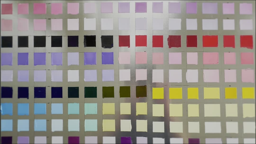
Lightfastness testing is for everyone- it doesn't have to be complicated to give valuable information to painters
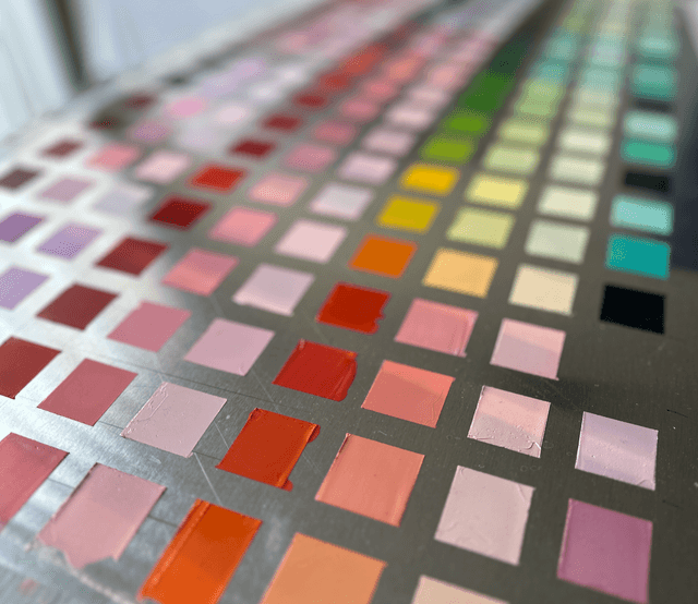
In-Studio Lightfastness Tests
We encourage all painters to test their paints and share their results
.jpg&w=640&q=75)
The Unexpected Role of Mixing Whites
Paint Film Stability, Drying Time, Cracking and More
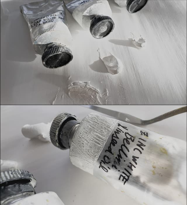
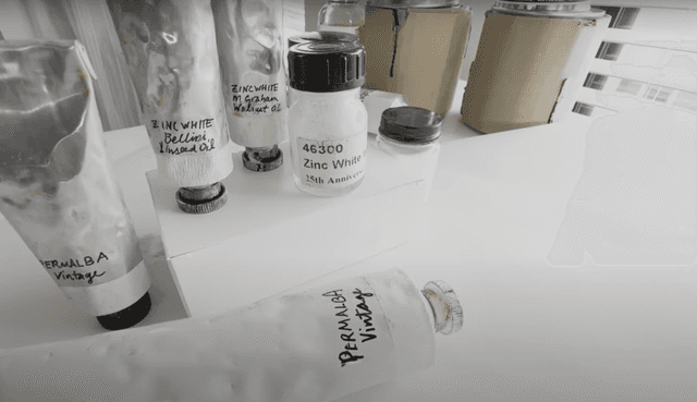
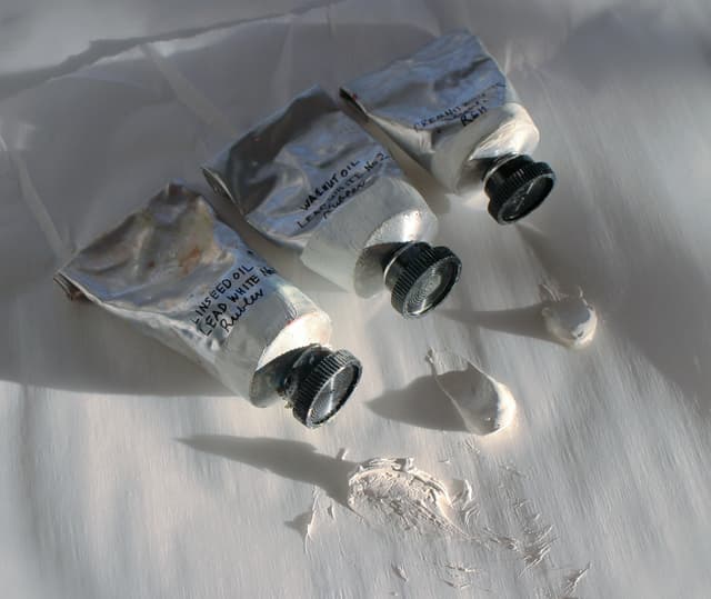
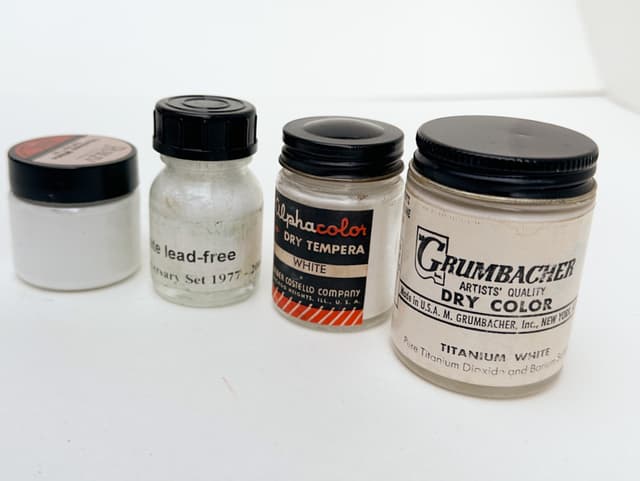
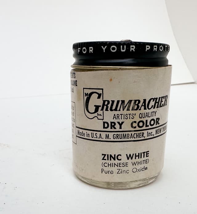
All white paints have their benefits and drawbacks. In the Great Book of Color the various studies on white paints as well as their behaviors are discussed and the experiences of various painters, experts, and chemists are discussed. Unfortunately, no white paint is perfect and there are many tradeoffs when choosing a white paint for a given application. Whether it's the early embrittlement of zinc, the softness of titanium, or the yellowing and toxicity of lead, the quest for a better white paint is ongoing.
What nobody saw coming was that certain pigments behave unexpectedly in all of the above white colors. See Golden's Lightfastness Research for the latest. I made the Great Book of Color and then co-founded the Paint List to help sort through this information and apply it cogently to my painting practice. My hope is that it will empower your painting practice, too.
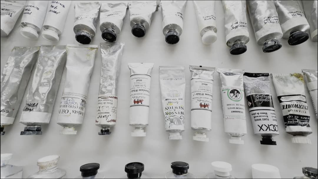
An array of white paints
Various white paints made of different white pigments
Zinc White PW4 (vintage and modern samples) and toxic Lead White PW1
Rare Pigments, Discontinued Colors, New Discoveries and Formulation Changes
From Quinacridone Gold to YInMn Blue
One of the things recorded in the Great Book of Color are various changes in the paint industry. Often this is due to pigment discontinuations and formulation changes. However, there are also those wonderful moments when new pigments are added.
A sense of history is important to painters as we are largely dependent on shifting winds in other industries when it comes to pigment availability. The demand for a color in automotive or other major coatings industries will impact whether that color is available on our palettes. We track the pigments as they come and also as they go, and always cherish a hope that the winds may change again and certain pigments may be resurrected even if they seem to be extinct in our time. Every pigment is representative of a technology and a whole body of knowledge that led to its creation as well as its role in art.
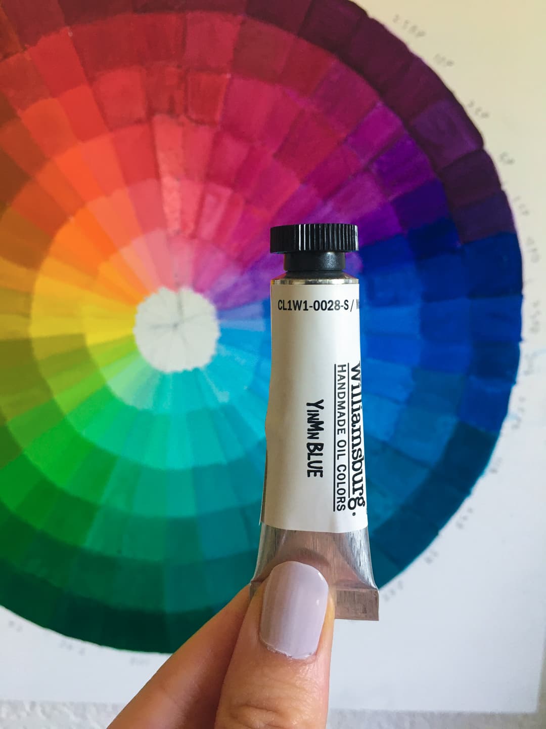
The New YinMn Blue
Fabulous Cobalt Violets - Some endangered, some extinct
We will miss PV49- the electric violet shown here
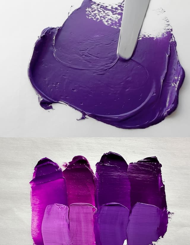
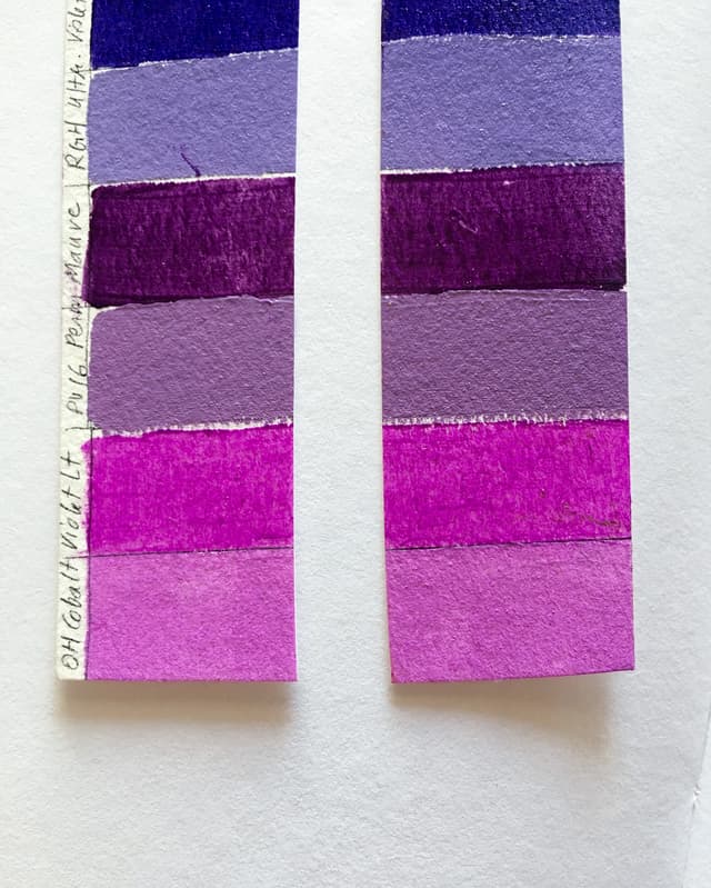
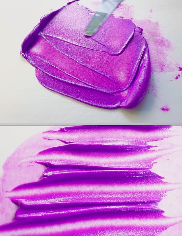
Historical Paints
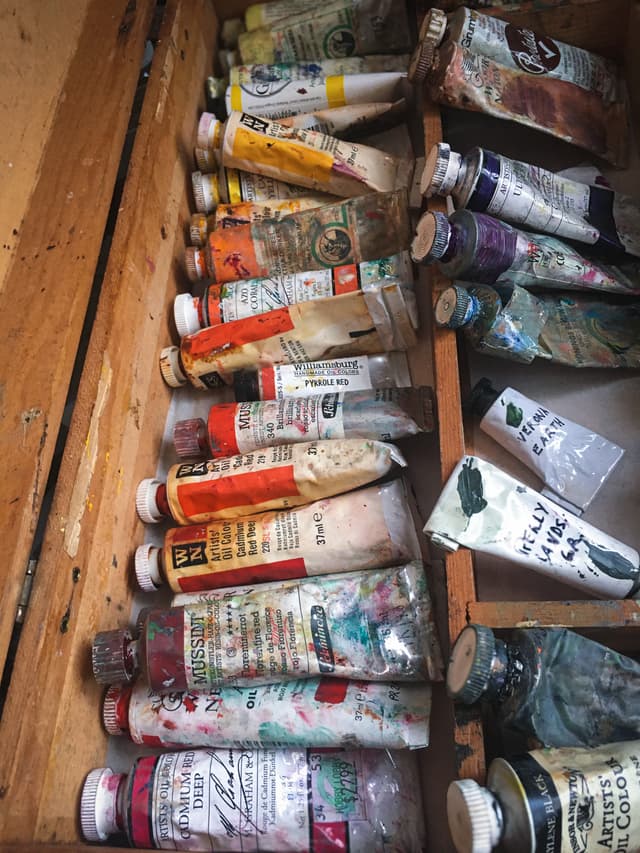
20th Century oil paints that one might still encounter
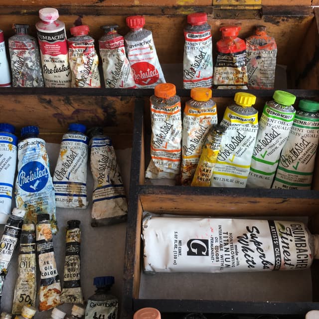
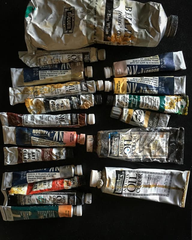
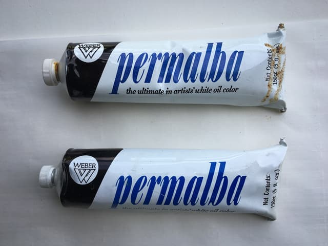
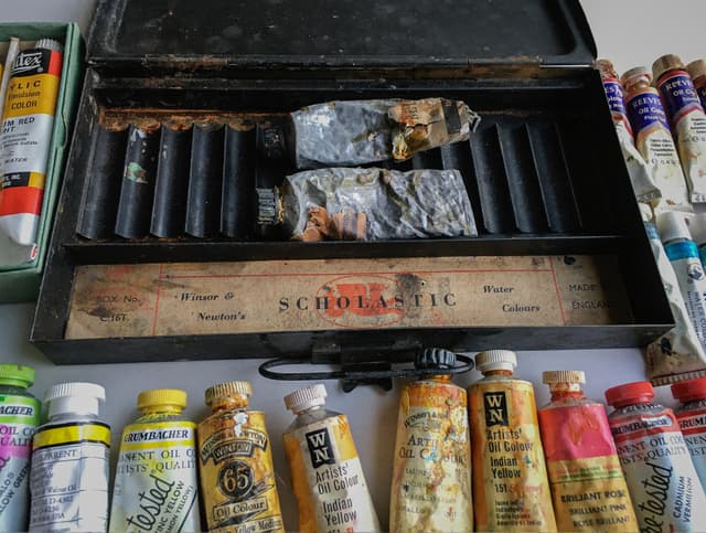
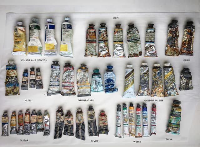
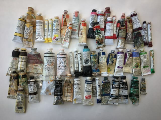
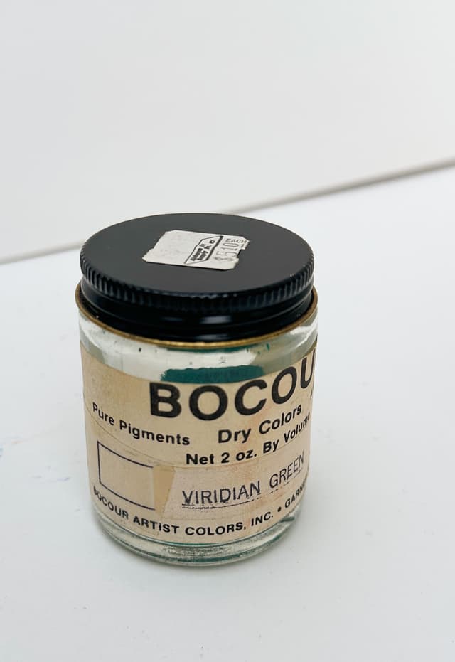
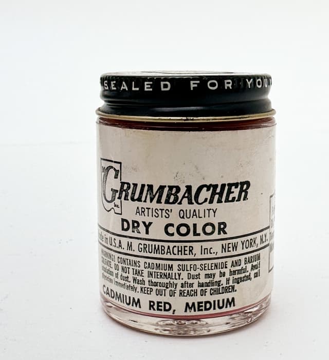
One of the things I explored in the Great Book of Color had to do with historical paints. Legend, lore and song attend some of these paints, and I was also curious about the various hints and anecdotes told by older painters. Many of these paints are still available on the secondary market (such as ebay) and some still linger around in old paintboxes. To study these historical paints I purchased many of them myself and included them in my swatches throughout the Great Book of Color. New research is going on regarding 20th century oil paints and whether they will be stable throughout the centuries to come. I love to hear from conservators and will continue to integrate their findings into the ongoing work that is the handwritten Pigment Notebook. I've made a shorter, searchable version available here.
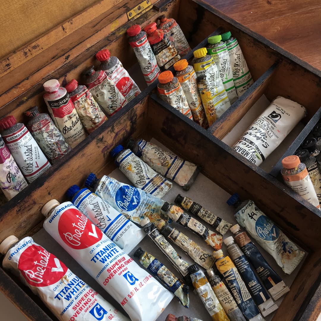
Historical Oil Paints
Historical Paints which can still be found in many paintboxes
Studies on these are part of the Great Book of Color
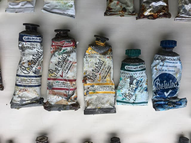
Antique Earth Tones
Studies on the older earth tones which were mined in past times are part of the Great Book of Color
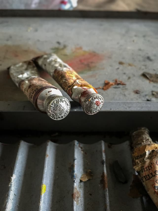
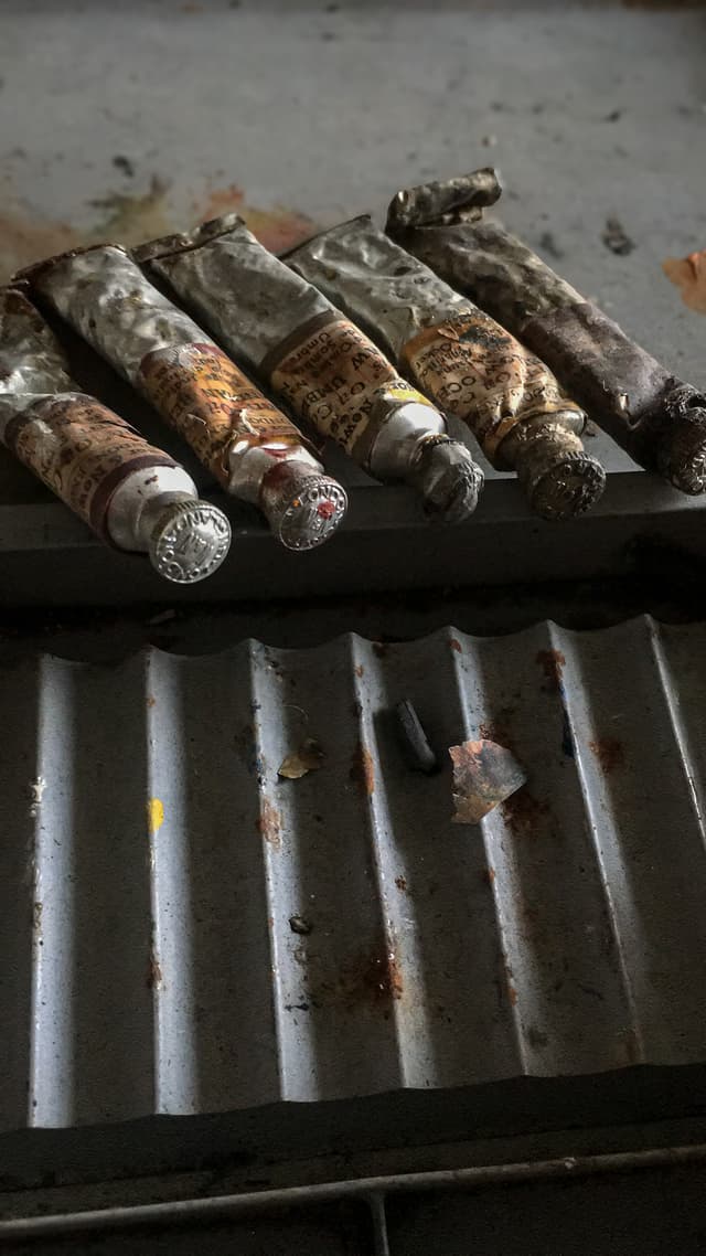
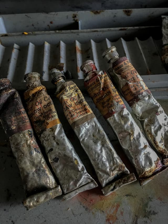
Historical Pigments
The pigments available to artists change over time
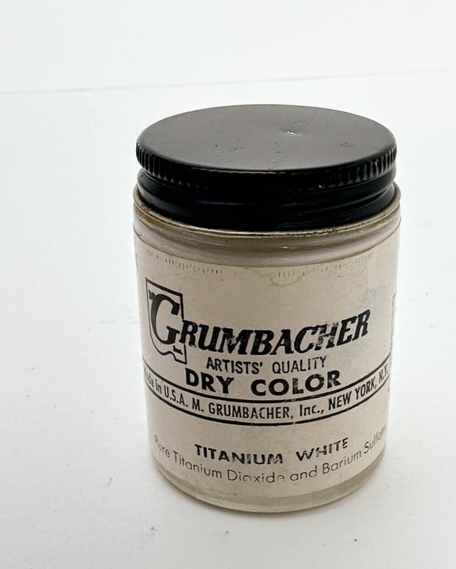
...And More
Pigments are just volume one of seven in the Great Book of Color
Pigments are just the beginning of the Great Book of Color, and these fundamentals are important to all painters. It is the fundamentals that I believe need to be shared because they affect us all regardless of style or artistic intent. From there a person can branch into a myriad of personal directions.
Volume 1 goes further than we can discuss here with information on applying Munsell, managing chroma, and theorists such as Chevreul, Itten, Ostwald, and the great artists themselves fill its pages. One of the best ways to find out more about the pigments in the Great Book of Color is to subscribe to our newsletter. We will be publishing the basics on pigments as well as connecting those entries to the paints on the Paint List.
May your understanding of paint be enriched like never before as you unlock the palette.
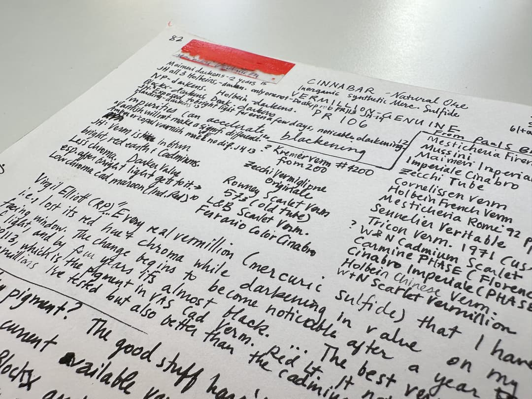
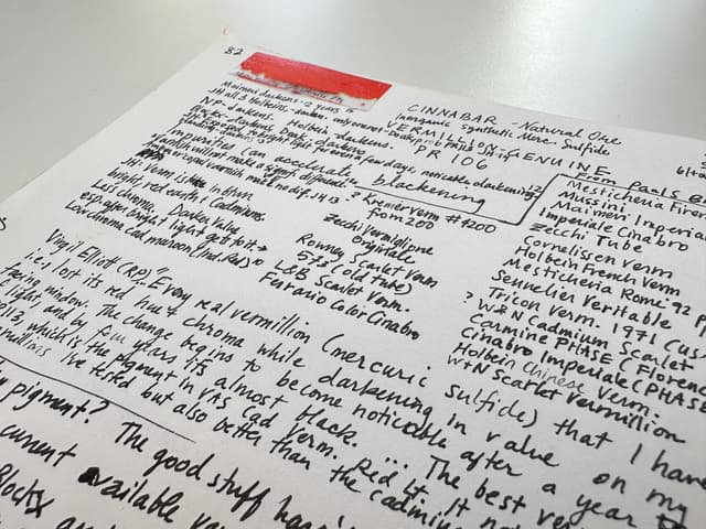
A page on historical Vermilion from the Great Book of Color
How to Apply the Great Book of Color to Your Painting Practice
From out of the fire to your studio: the pigment list
So from that fateful day when we evacuated the fire, we've been bringing it to life in the form of Paint List. As a very basic resource, we've made Unlocking the Palette with the Pigment List: A Painter's Secret Superpower. Right now this is like a directory, and from here we'll be linking articles inspired by the Book of Color as they are published.
Starting with a page that lists the pigments in one place allows you to just do a Command+F or Ctrl+F on Windows to look up the pigment codes found on the back of your paints. From there you can begin to research them and also supplement this with information from artiscreation.com or handprint. Where we have further resources from the Great Book of Color on a pigment, those will be linked to the Unlocking the Palette pigment list.
Also check out the paint review articles, and as always, Happy Painting!
Build Your Knowledge of the Rainbow
.jpg&w=640&q=75)
.jpg&w=640&q=75)
.jpg&w=640&q=75)
.jpg&w=640&q=75)
