Unlocking the Palette with the Pigment List
A painter's secret superpower
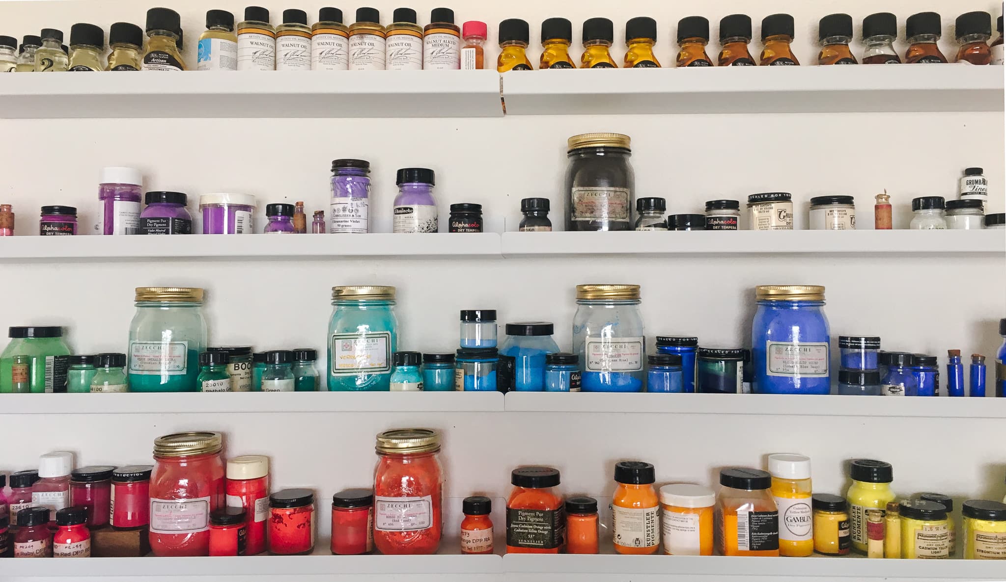
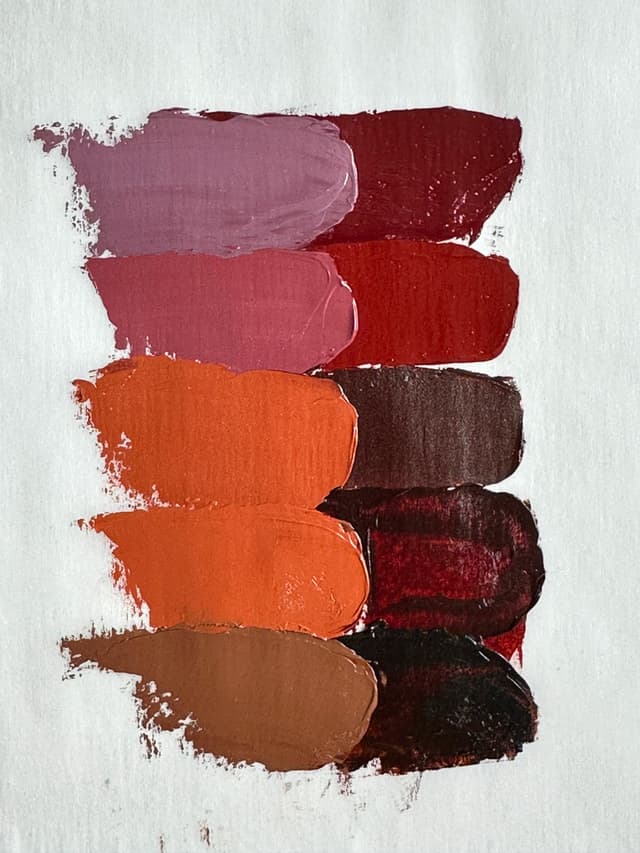
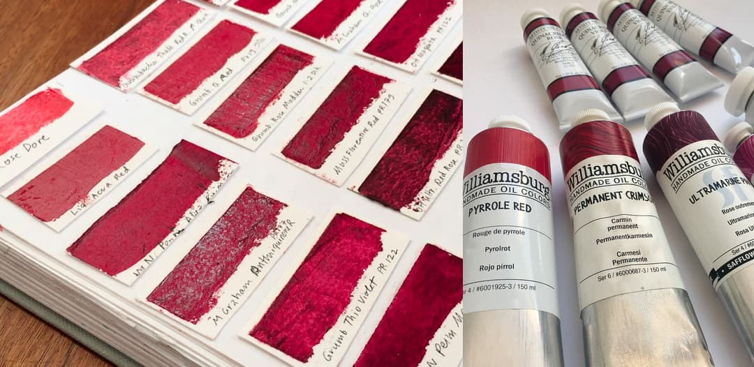
Featured Paints
A Quick List of Artist Pigment Codes
A Painter's Secret Superpower
Below is a list of the main pigments that are used in artist paints along with a little bit of information about each one. To find out more about a pigment, you can look it up in the Pigment Notebook.
Here we take a quick look at the rainbow of artists' paints and the pigments that give them their fabulous color. Rich reds, off-the-charts-oranges, luminous yellows, verdant greens, cool blues, and mysterious violets along with pale ivory, intense black, rich brown, and ice white. Understanding pigments are one of the things that can elevate your painting more than almost anything-- from color mixing to studio safety, this knowledge is crucial. However there is so much to know that this is an incomplete source, more like a directory to give you a jumping-off point for your own explorations.
Understanding pigments can help you to gauge a color's
-Lightfastness -Toxicity -Color Mixing Behaviors
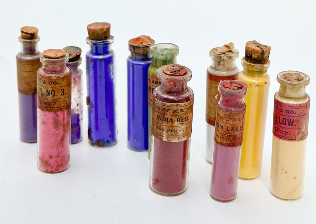
Antique pigments, A.H. Abbott & Tyl
But first! What is a pigment?
Paint is made of pigment and binders
In short, pigment or dyes give paint its color. In simplest terms, think of colored powder which is combined with a clear binder to make paint. Colloquially we tend to call all of the colorants pigments, but there are some fine points of distinction here. There are lots of resources online that delve into the various categorizations of pigments, so we will not go into the categories of pigments here. Below you'll find a list of pigments in artist paints with a few words about each.
However, we do get some questions about what pigments are not. Pigment codes are not -RGB or hexidecimal codes (those are used by graphic designers) -Pantone Colors -LAB colors
The above are systems that describe colors, while pigments describe materials. Some pigments are minerals or semi-precious gems, some pigments are dyes (for instance derived from roots), and some are synthetic chemical concoctions that you might encounter in printing inks or in a chemistry lab.
In other words, in some cases a spot color (think RGB, Pantone, LAB, whatever you might use to describe a spot color with a spectrophotometer) could be made with various mixtures of several different pigments. Concerns like lightfastness or toxicity may inform which pigments are used for a given application.

Paint in its simplest form is pigment and binder


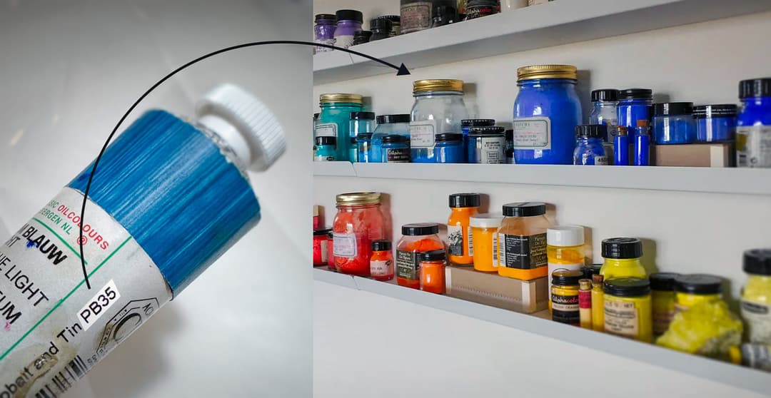
How to Find a Pigment Code on a Paint Tube
All reputable paints will list the pigment codes for the materials they use
Every one of the tubes of paint in your paint box should have a pigment code on the back.
Paints that are a blend of colors should list every pigment in the blend. It is a major red flag when a brand does not list their pigment codes.
Here's a quick primer on how to decode them. The "P" stands for pigment, followed by a letter that stands for the main color grouping. So we have
PR = red, PO= orange, PY= yellow, PG= green, PB= blue, PV= violet, PBr= brown, PBk or PBlk= black, and PW= white
and this is followed by a number. The numbers are just indicative of the order in which the pigment was added to the Colour Index, which is made by the Society of Dyers and Colourists. There is also something called the C.I. number, which can give a little bit more information about a colorant but these are not usually published on paint tubes.
Sometimes a person will encounter the same pattern where the letter N is used instead of P. This is another convention where natural dyes and other materials are sometimes listed as Natural Red, or NR, Natural Orange, as NO, etc. This custom follows the same pattern as the pigments but with an N for natural instead of a P for pigment, so the code reads NR, NO, NY, NG, NB, NV, NBr, NBk (or NBlk), and NW.
The pigment code on the back of a paint tube is one of the most important pieces of information on the tube. It's so important that we made the Pigment Notebook to make it easy to look up these codes and learn about the pigments in your paint. However it is rarer to find these codes in modern paints as the colorants tend to be less lightfast.
All reputable paint brands have a code that indicates which pigment is used to make a given color
Supplement this with your own research
Pigments are serious business
Far more could be said about every one of these pigments, so we recommend supplementing this resource with your own research as there is much more to discuss about each pigment than we go into here. Pigments are serious business and we make no warranties nor guarantees on the completeness or accuracy or even up-to-dateness of this continually evolving field of information-- you're responsible for doing your own research and also for developing your own best practices in the studio. Two resources we have enjoyed are artiscreation.com, written by David Myers, and a guide to watercolor pigments from Bruce MacEvoy, which will also apply to many oil and acrylic paints, though lightfastness can vary based on media. Though no one site has everything there is to know about pigments, these provide a good beginning point. There you can find more information on toxicity, Blue Wool Scale tests, and chemical composition. Also our understanding of lightfastness in oils is evolving, and the interactions of pigments in the same mix may have a greater effect than was ever previously realized.
In terms of health and safety, this is a complex and rapidly developing field which goes beyond our expertise. As we always remind readers, we are artists, and so we recommend seeking expertise from the toxicology experts. Monona Rossol, an art materials specialist and chemist who teaches at the University of Delaware has written several books. The 2001 edition of her book, The Artist's Guide to Health and Safety is one resource, but we encourage artists to seek up-to-date information which can be obtained by contacting her through her site. We also recommend consulting MSDS sheets as well as supplementing this with additional third party independent research on health and safety because that stuff really matters.
Quite a few artist pigments have never been directly studied for toxicity, so the absence of a safety warning does not mean a pigment is automatically safe. Many important artist pigments are toxic. Some hazards (lead, cadmium, cobalt, chrome, etc.) are well-known while others seem to lag in artists' awareness. We have been surprised to hear new research on several organic dyes and pigments which we were recently informed are likely to be carcinogenic, when previously no threat had been studied, so we treat all pigments with greatest care, according to best practices.
We made this quick look up so that you can find a pigment code quickly -- just type command+F or Ctrl+F to jump to a particular pigment.
We've compiled a list of many pigments used in artist paints in this brief listing. This is a very abbreviated key to help decode the most powerful piece of information on a paint tube- the pigment code. For those who are not as familiar with the pigment code, it's the little marking on the back of the paint that says something like "PY35." From that you can identify the pigment, and from there begin to research the lightfastness, sometimes the hue, the chemical properties of the pigment, and a whole lot more.
Please note that binding oils as well as the collection of additives, stabilizers, or extenders used in a paint may affect lightfastness in ways not discussed here. Specifically the choice of mixing whites has a surprising effect on certain pigments in oil painting. See Golden's research for more.
We have slightly higher requirements for lightfastness than some painters do. Ideally we do not like to see any falloff of lightfastness in tints (all 8's on the blue wool scale is ideal), as most of an oil painting is mixed with white unless one is using glazing techniques. So, when we say lightfastness is moderate, this refers to around a 6 on the blue wool scale, or even worse a 5. For some that is still acceptable, but we have fairly stringent requirements.
Please note: this guide does not discuss health and safety. Many important artist pigments are toxic. More detailed information on safety can be found in the manufacturer's MSDS sheets, and we always recommend supplementing these with additional third party research.

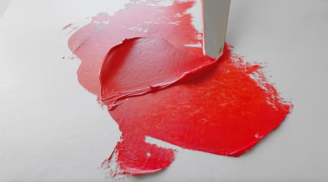
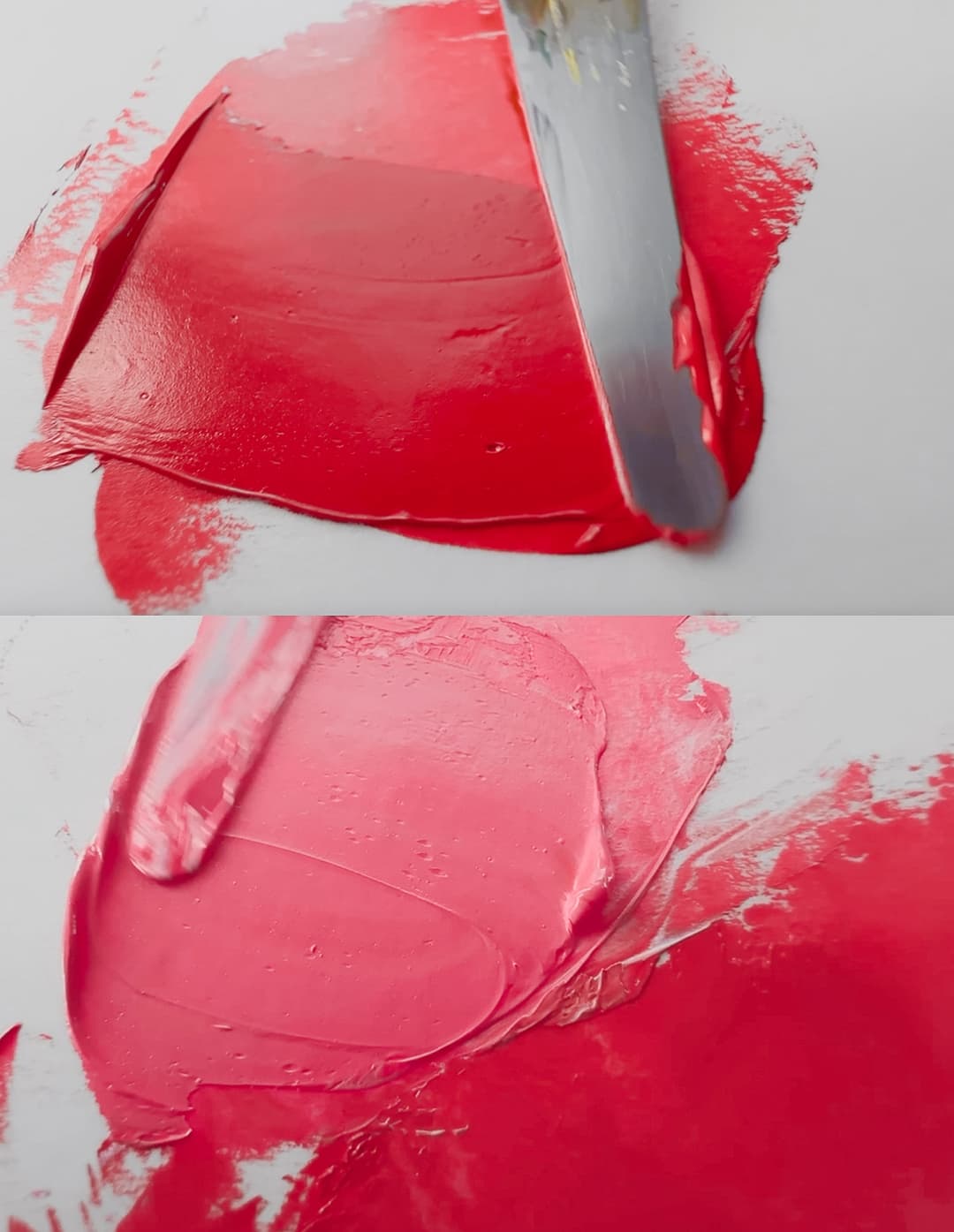
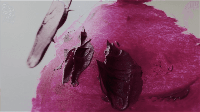
Red Pigments
The red group of pigments spans the deep, cool crimsons to near oranges. From deep cherry, to Ferrari, to tomato, we're always looking for the ability to hold color in sunlight when it comes to the red section. There are historical notes from Rose Madder, 20th century staples like the cadmiums, and even a few unusual ones like Potter's Pink.
Lightfastness is important in any pigment, however, reds are an area where we are especially attuned to look for paints that won't fade in tints. Many gorgeous reds do not hold up well enough over time to be considered for artist's paints. There are a few beautiful ones that artists love so much they are willing to bargain on the lightfastness, come what may.
There are several which, in our opinion shouldn't be made into artists' paint. Just by happenstance, these paints start our foray into red pigments currently in use by paintmakers.
PR3 - Toluidine Red. The first numerical pigment to be considered starts off a whole section of inadequate pigments. This abominable color has a blue wool scale of 3/8 (about ASTM IV category). If you are new to this, the way it works is higher the blue wool scale on a scale of 1-8 the better- eight is the best. For us, sevens mean moderate. Sixes are lower than we would use. A three for lightfastness is quite low.
Monona Rossol also writes that it may be a carcinogen as well as about potential serious health issues that could arise, so please consult her writing if you choose to use it.
PR5 - Naphthol Red DK. (One of several Napthol reds). Moderate to inadequate lightfastness. We were surprised to see this color found in a currently available Cadmium Red Imitation hue by a major art supplier, and they listed good lightfastness. Perhaps they found a better source for the pigment, but it might be worth doing one's own lightfastness tests.
This is another case where Monona Rossol's work about potential serious health issues that could arise, such as methemoglobinemia, so please consult her writing on pigments.
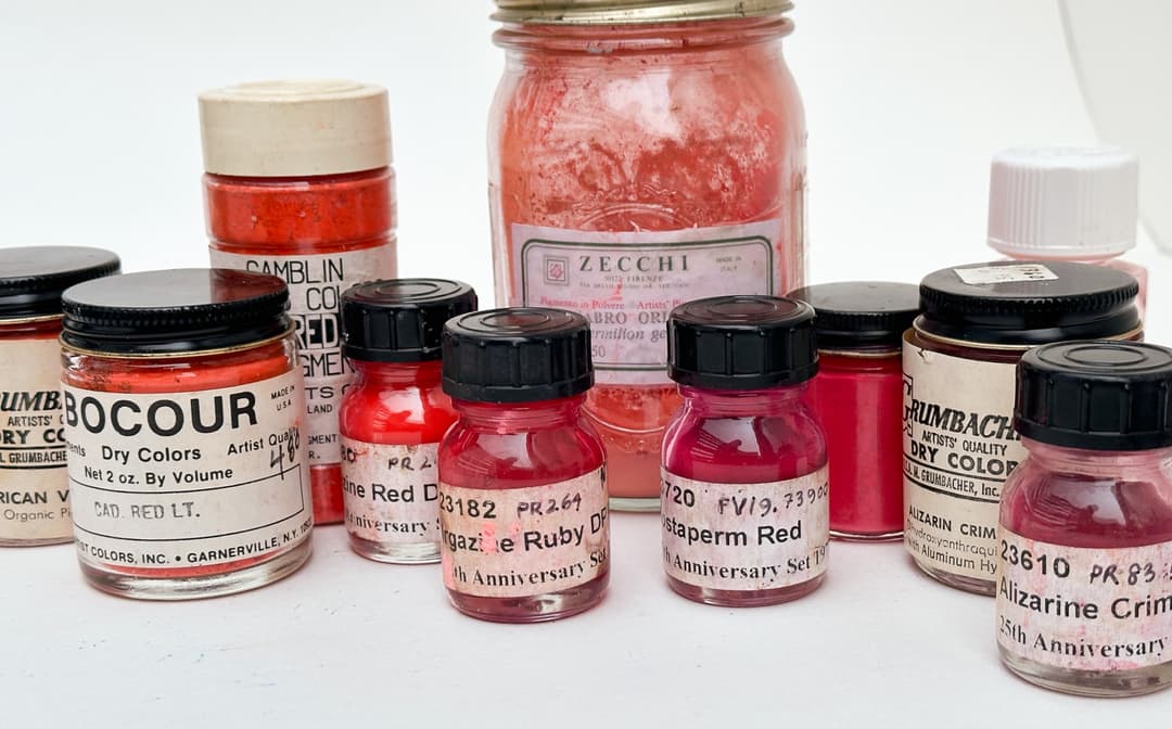
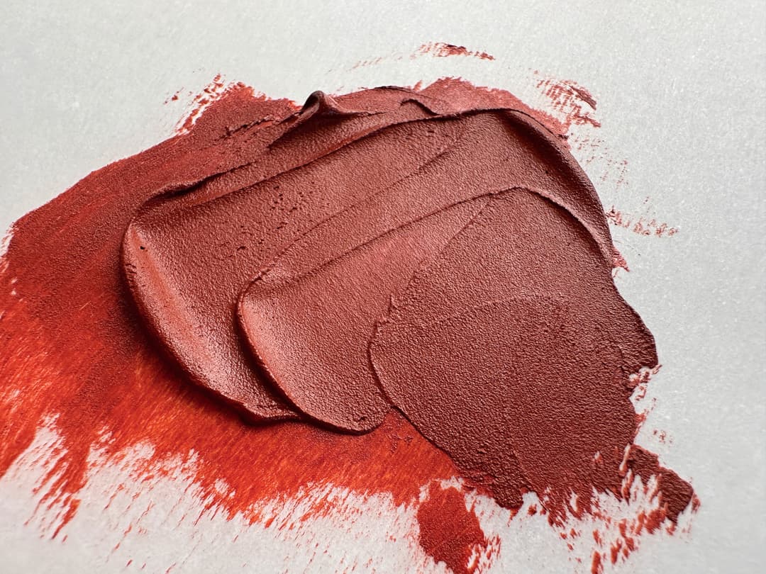
An array of red pigments covering the gamut from magenta to red-orange
Red Lakes and Historical Crimsons
Hard to know what's meant by these terms
Precise identification eludes the casual reader of National Gallery Bulletins and this interests us very much. NR3 and NR4 are both historical pigments made of insects, but the term Red Lake could refer to a variety of precise pigments.
This interesting and somewhat diverse class of terms have a way of leaving one wanting more in terms of clarity when reconstructing the palettes of famous painters. The names of the red lakes or red lac as it is sometimes called, display a specificity (like cochineal). Yet the terms can seem to rearrange and melt into one another again (is cochineal the same as kermes?) in one's peripheral vision.
Here we refer to the laked pigments of madder (also see notes on NR9), cochineal (NR4) - that much-discussed insect, and kermes, another often-mentioned insect and its associated dye (NR3)- which also has a way of blending into the cohcineal-natural-crimson-lake-listings in conservation history. Specifically, the term Red Lake could refer to reds made from Madder, the plant Rubia tinctorum L., Conchineal insects, Dactylopius coccus, and Kermes insects, Kermes vermilio. However the list does not stop there.
Some of these historical lakes have held up surprisingly well but many have faded (the Mona Lisa used to have red sleeves) and Van Gogh's purples made with eosin- another vibrant red lake- have turned from violet to blue. So while interesting research may be done on their composition and manufacture, as well as inquiry into why some red lakes have not faded so badly, historical red lakes on the whole are not considered lightfast.
On another note, were shocked to hear that there is a possibility that cochineal (NR4) may actually be a carcinogen along with other anthraquinones and that more testing is needed. While the dye produced from cochineal insects has not specifically been evaluated for this, it is similar to other anthraquinones that have been found to be carcinogenic. Other natural reds-natural alizarins or rose madders made from madder or chayroot (including NR6, NR8, NR9, NR10, NR11, and NR12) may also be carcinogenic. The topic of health and safety goes beyond our expertise at the Paint List, so please see the work of Monona Rossol and other experts for information.
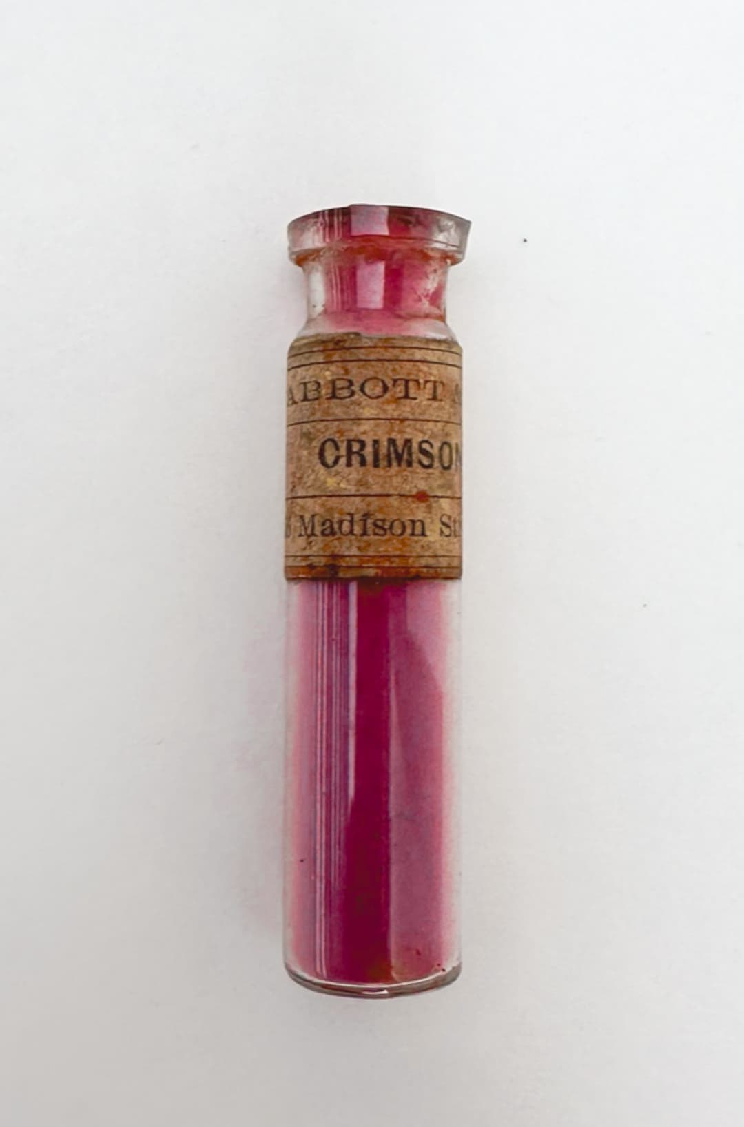
A historical crimson of unknown composition - about what we find to be the case when "red lake" is mentioned in art history literature
PR9 and NR9- Different things!
NR9 is the old school Rose Madder
PR9 - Naphthol AS Red (one of several napthols). We were surprised to find PR9 in oil paints currently available on the market - especially because these are primarily found in Cadmium Red imitations, and their lightfastness is not that good. This pigment has only moderate lightfastness- it is given an ASTM II in oil but depending on the paintmaker's pigment supplier, it may only get 5's in tints on the Blue wool scale. In watercolor, Bruce MacEvoy calls it very fugitive, and notes it is ASTM III in watercolor. However, his tests showed even worse performance- something like IV. We primarily noticed this pigment in student lines, and to make matters worse the PR9 was sometimes found alongside other pigments that also performed poorly.
Once again, Monona Rossol's writing raises awareness about potential serious health issues that could arise with this pigment, as it may metabolize to a carcinogen, so please consult her writing for more.
NR9- Madder Lake - Rose Madder Genuine. Four oil colors are currently made with this historical pigment. This is a lovely historical hue. We had a vintage tube, and it had a sort of "glazes only" quality. It was sometimes streaky but a rather high chroma pink (nothing like PR122). Something like a milky transparency, a transparency in masstone. The light gets around the edges when looking at in masstone, and this shows that filmy quality.
Depending on exactly how it is manufactured, its properties may vary. Pigment NR9 is sometimes called Alizarin or Purpurin (genuine Madder Lakes contain both Alizarin and Purpurin), and there is some interesting literature on how the purpurin fades out (weirdly, despite the resemblance to the color name purple, purpurin is an orange color which is fugitive).
Reports on the lightfastness of natural madder in oils vary tremendously. Virgil Elliott notes that the thickness of its application may affect its permanence and that it may fare better unmixed and at full strength rather than a glaze. How this pigment is manufactured as well as the precise process may matter a lot. Some vintage paints in oils from Winsor and Newton are surprisingly beautiful with a filmy/milky pink consistency. However we would not rely on this as a lightfast pigment. Agreement is pretty uniform that genuine Rose Madder fades.
It requires a high amount of oil to turn it into an oil paint and tends to be a slow drier.

Vintage Winsor and Newton Rose Madder. This is one of the deeper versions of genuine Rose Madder that we've seen in oils.
Mistaken Identities -PR19 or PV19?
A Frequent Pigment Mixup
PR19 but Also see PV19 - Quinacridone Rose. This is an interesting case of a pigment that might not exist. If you see PR19 double check, because it might be a typo meant to be PV19 instead. This color is listed on artiscreation as Arylide Maroon, and very interestingly, it simply lists this pigment as obsolete without much information at all.
Its seems that "PR19", when found as a pigment listing for a paint, may actually be a typo in some cases for PV19. When we checked, we saw that it was listed for St. Petersburg Masterclass oils as well as a Utrecht magenta blend which is very likely PV19. In regards to Utrecht, their brochure listed PV19 while the Blick site stated PR19. Our guess in the Utrecht case is that it's PV19 Rose - the pink version. See PV19 in the violet section, as this pigment can be either red or violet.

M Graham Quinacridone Rose is PV19. A couple of pigments like PV19 have two natures-- one rose and one violet. So while the pigment code PV would suggest pigment violet, this version of PV19 looks red or magenta
Some Quinacridones that look red actually actually have a pigment code listed under the violets- like PV19
Sometimes the red version of PV19 is incorrectly listed PR19. PV19 comes in a pink form, often called Quinacridone Rose
Roguish Reds
Pigments you may wish to avoid
Has anyone really made enough jokes about the Rouge Rouges? (English Rogue -- pronounced like "roag") and french Rouges, meaning reds? Probably not. But that is unfortunate. The English noun rogue means, "a person whose behavior one disapproves of but who is nonetheless likable or attractive" or, "(of an elephant or other large wild animal) living apart from the herd and having savage or destructive tendencies." So now that you have the image of a runaway elephant in mind, we can turn to its use as an adjective, "denoting a person or thing that behaves in an aberrant or unpredictable way, typically with damaging or dangerous effects." That would be apt here, as these reds can be beautiful but tend to harbor bad lightfastness, which may only be found out later. Where this begins to be relevant is that moment when, like me, you might find have found yourself buying an exceptionally beautiful Japanese watercolor full-pan set only find out those beautiful reds were none other than the inadequate PR48:4 or even perhaps the rotten Lithol Bordeaux PR63:1. Needless to say those paints will be replaced.
PR22 - Naphthol Red Bright (one of several Napthols). Not recommended for artist's paints due to poor lightfastness. This dips into the bottom category of ASTM III, which is below the dividing line for even for other peoples' standards in paints. Thankfully we did not see it in oil, but we were shocked to see it in no less than 10 commonly available acrylics. However we mention it here as some artists combine oil and acrylic workflows in their paintings.
Another problematic red, we found a caution in Monona Rossol's research about potential serious health issues that could arise when this pigment is metabolized, as a derivative may create a carcinogen, so please consult her writing.
PR23 - Naphthol Red Dark. A pigment whose lightfastness descends to ASTM IV- not suitable for artist paints- also flagged for potential health problems. It is currently found in six acrylic paints made by major manufacturers and at least one watercolor.
In Monona Rossol's writing, this is a suspected carcinogen, and has caused kidney damage in rats, along with metabolizing to cause something related to methemoglobinemia, so please consult her work for more information.
NR31- Dragon's Blood. Uncommon in artist pigments, and not found in oils, but it can be found. A. Gallo writes, “Dragon’s blood is a surprising red made from the resin of the Daemonorops draco plant and other rattan palms. This exotic red was used by the early Greeks, Romans and Arabs in art and medicine." ASTM IV, so not lightfast. It is based on a tree resin.
PR48:4 - Permanent Red 2B. It is a great irony of life that so many things named "Permanent" are just the opposite. This color has moderate to inadequate lightfastness and may fade to a 5 in tints depending on the supplier. Surprisingly, it is found in three oil paints by major paintmakers.
Monona Rossol writes that this may cause methemoglobinemia and has more warnings about it in her writing on pigments which also apply to other forms of PR48 as well.
PR63:1 - Lithol Bordeaux. This Monoazo crimson pigment has inadequate lightfastness (as low as 3 in tints, and really not all that much better in other categories). It is found in at least one artist oil paint line despite the poor lightfastness.
In Monona Rossol's research we noticed a note about potential serious health issues that could arise when this pigment is metabolized, as a derivative may create a carcinogen, so please consult her work.
PR81:1 - Rhodamine 6G FIAT What appears to be a bright, chromatic pink, this one only showed up in watercolors. Unfortunately too low in lightfastness to be suitable for artist's paints. A sinkingly low ASTM IV. In addition it is an animal teratogen, maybe a mutagen (?), and possibly a carcinogen according to Monona Rossol's latest writing, and may have even worse inclusions, so see her work for more.

Pigments made into watercolor, including PR48:3, PR48:2, and PR63:1
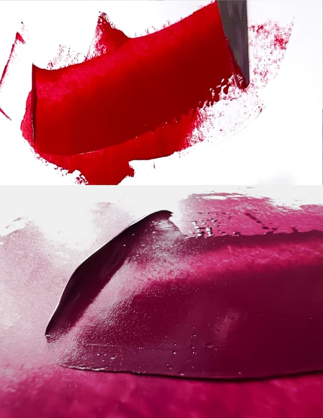
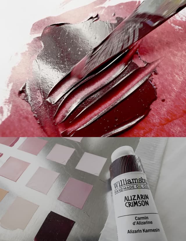
Highlight: Historical Alizarin Crimson
PR83 - Alizarin Crimson (Genuine). The "genuine" part must now be added since the pigment is now discontinued and imitations already abound. This is a rich gem-like crimson that is has been incredibly difficult to replace. It is baffling that it is so difficult to replace exactly. Alongside its beauty, painters have been plagued with a quandary: what does one do about its terrible lightfastness? PR83 is often used as a fading pigment by which to judge the lightfastness of other colors- unfortunately Alizarin tends to loose its lightfastness that reliably. In addition to the fading this pigment has issues with cracking, which is less often discussed, but nonetheless reported to be an issue. It requires a lot of oil to turn it into an oil paint.
Another issue which many never thought to consider is that chemically, both artificial and natural alizarins are actually incredibly similar to cancer-causing anthraquinones. It may also cause allergies. Monona Rossol's work on pigments contains more information.
Alizarin Crimson was beloved in the 20th century, and many painting books recommended it despite its poor lightfastness. That issue seems to be even worse in watercolor than in oil. So, due to its performance it cannot be recommended, but in any case it is now in the process of actually disappearing by way of discontinuation.
In 2023 or 2024 it was phased out by pigment makers, however some paint companies still have supplies of this traditional mainstay. It is incredibly difficult to replicate this pigment, and part of its mystery is a brown note hidden in the crimson. It is a deep dark red, which is an area of the palette where painters can always use more pigments. Many companies have turned to PR177 as a permanent Alizarin. However, Virgil Elliott's tests revealed that in time PR177 also fades, despite the name "Permanent."
Some recommend PR264 Pyrrole Rubine as a replacement. Old Holland also has an interesting imitation blend to approximate genuine Alizarin.
PR83:1 - Synthetic Alizarin Lake. This is a less commonly listed variation of Alizarin Crimson, however artiscreation.com posits that perhaps actually it is this variety that is often found in tubes labeled PR83.
PR88 - Thioindigoid Violet. Speaking of extinct pigments, this plum color is also unfortunately no longer available. It has decent to good lightfastness.
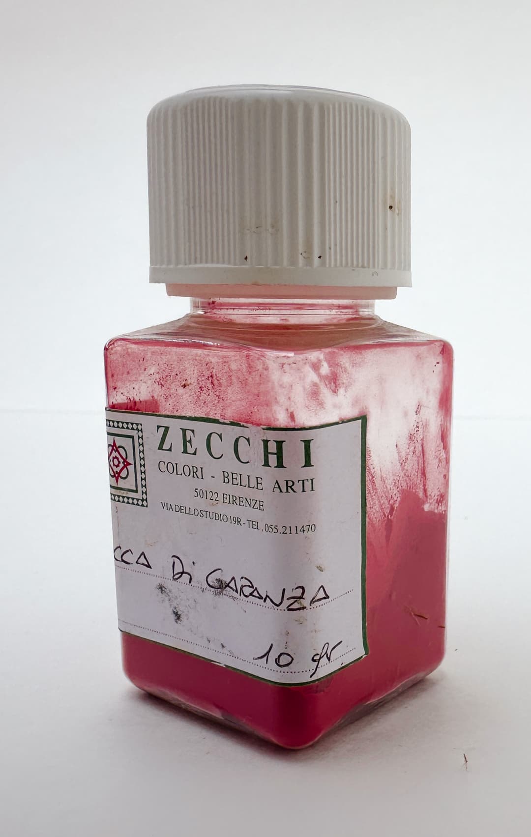
Lacca Di Garanza historical pigment from Zecchi, historical Alizarin Crimson.
Alizarin Crimson
Now discontinued, previously a star of 20th century palettes, and still fades
Red Earths
Rock Solid Reds for Lightfastness
For natural red earths, PR101 and PR102, there are two main varieties: natural and synthetic. However these cover a huge array of colors and consistencies. The natural ones may have a bit more nuance, and many that we've tried have a large particle size (read grit). The synthetic ones, sometimes labeled Mars Red, can have an extremely fine particle size.
These are useful in all manner of mixtures- to complement blues, to mix flesh tones, to create deep dark passages at low lightnesses or to create glowing chroma. Along with other earths (see yellow earth and brown earth) these earth tones have played a central role in art history and human cultural production.
The names for red earths often derive from places where certain red earths were historically mined. Each place has a distinctive set of qualities which helped to form the traditional names. "Venetian Red" or "Pozzouli Earth" harken to places where these colors were found. A cannon has arisen around these names such that synthetic colors with similar properties may borrow from the geographic names, but unfortunately this is not a guarantee as there is no standardization. These names are discussed below and may apply to synthetic or natural earths.
PR101 - Synthetic Iron Oxide Red. Also known as Red Oxide or Synthetic Red Ochre. This pigment group includes a huge variety of synthetically made red earths, oranges and violet-browns. Particle size can vary considerably and with the synthetic version it can sometimes be very small- though this is by no means a guarantee. Some brands, like Williamsburg, publish guides to the grainyness of their colors, while other brands rely on the brand vibe to convey the degree of homogenization among their colors (for example, some brands are known to make very smooth colors overall).
The Artist's Guide to Health and Safety has more information about health issues associated with pigments which contain Iron. Her updated work can be found through her site.
The PR101s are a wide-ranging bunch, and they can be red, brown, orange, violet or even greenish. They are super lightfast. Sometimes the name Mars will be present in the paint name. Colors like Mars Red or Mars Orange will usually be made of pigment PR101.
PR101:1 - Red Hematite. This is a fairly rare pigment code to find. A subset of PR101.
In general the synthetic red earths tend to be powerful colors.

One of many versions of Synthetic Red Earth. This one is called Mars Red by Zecchi
A Wide Range of Colors, One Pigment Code
Synthetic Red Earth, PR101, comes in a variety of shades from orangish to reddish to nearly purple


PR102
PR102 - Natural Red Iron Oxide or Red Ochre. These can come in almost any color of earthtone (brown, red, orange, yellowish or even greenish). There is a lot of variety. Sometimes the particle size is a bit larger than the synthetics, but this is not a given. These are pigments of outstanding permanence and lightfastness.
Natural Red Ochres are associated with paints that tend to be fairly opaque. Sometimes natural red ochres have a character that is just not matched by a particular synthetic pigment due to various other naturally occuring components in the pigment. Sometimes natural colors are a bit more softened than their synthetic counterparts. For many reasons the natural versions of these pigments retain their charm.
Naming conventions in the synthetic red earths are often derived from art history and from their natural red earth counterparts (see also PR102, Natural Red Iron Oxide). Each name has a general pattern of what to expect from the pigment but there is no standardization.
Some issues could arise from working with Iron pigments, but we also saw a note about Silica (respiratory hazard) that could be in natural iron oxides, PR102. See the Artist's Guide to Health and Safety. The author's updated work can be found through her site.
All different colors of PR102
Another case of one pigment code, many colors.
The natural red earths PR102

Common Names for Red Earths, PR101 and PR102
A few names are common among synthetic red earths.
Transparent Red Iron Oxide: The most common name among PR101 paints. These colors tend to be distinct deep brown reds with gemlike transparency when thinned. They tend to be low in lightness and high in chroma for their depth.
Mars Red: The name "Mars" connotes that the earth pigment is synthetic. These are often powerful colors compared to natural earths. Some are opaque and about half do not have an opacity listed. Perhaps it is because some of the transparent versions tend to be labeled "Transparent Mars Red."
Mars Violet, Caput Mortuum: This is a synthetic earth violet or dark red. Like all PR101s these colors have excellent lightfastness and medium to low chroma. It will not produce bright tints like a synthetic violet would, but it makes some enchanting, subtle mixtures - good for flesh tones at times and also for realistic painting. Caput Mortuum is a related color name that actually translates to 'dead head.' These are low lightness red-purples, and many of them are opaque. In his work on Traditional Oil Painting, Virgil Elliot notes that Caput Mortuum requires a lot of oil, whereas Mars Violet is only listed as having an only moderate requirement.
Venetian, Pozzuoli, and Pompeiian Reds: All these are distinct, but their use in modernity varies. A group of colors that ranges through the warm red-oranges, these tend to be rather chromatic. Their natural counterparts sometimes have a large particle size, but whether this is mirrored in the synthetic varieties is not a given. They tend to be associated with a bit more of an orange, though some varieties will tint a bit pinker than others. Natural versions have more nuance in the transparency, but for some reason we tend to think of these as opaque. They are gentler tinters than other red earths. Overall lovely to work with. Again this varies from brand to brand. Among current paints, most of the synthetic versions are opaque, while the natural versions tend to be listed as semi-opaque or semi-transparent. In Traditional Oil Painting Virgil Elliot notes the rather lean oil requirements of Venetian Red, which make it more suitable for the lower layers of a painting.
English Red, Light Red: This color grouping tends to be a little redder (less orange) than the Venetian Reds, but it varies from red-orange to red. Many of the synthetic versions are opaque and have good covering power. The term "Light Red" in earths refers to a similar color and opacity. The color of Light Red is a relative term as many of these are not light at all, but rather a kind of burnt red orange. While the synthetic Light Red paints tended to be opaque, the natural versions tended to be semi-opaque or semi-transparent. English red is named for a variety of red ochre from England that became famous.
India Red, Indian Red, Persian Red: This grouping tends to refer to very intense, opaque reds that lean a bit cooler (at least for red earths) with a lower lightness and high covering power. This is often an intense opaque red earth with a lot of presence. They tend a bit redder than many Venetian reds and some are quite deep. Even among natural Indian Reds (PR102) most are opaque. Indian reds do not require as much oil to make into a paint, which may make them more suitable for the lower layers of a painting.
Burnt Sienna: One of the quintessential artist's colors, Burnt Sienna has diverse applications in all styles of painting from flesh tones to landscape to abstracts, this warm brown is everywhere. The same paint name is also found among the PBr7s, as well as many natural red earths, colour index PR102. Burnt Sienna is a warm middle brown which often shows rosiness in tints. It It is brown and a red at the same time. Burnt Siennas range from transparent to semi-opaque, however it is also possible to find opaque versions. Natural versions (PR102) are often named French or Italian depending on their origin and may have larger variety of particle sizes.
Mars Brown: Even though this is a PR101 (pigment red), they are sometimes brown. These colors tend to be intense, and it is fairly common for them to be opaque. Perhaps this is because the transparent versions tend to get labeled Transparent Brown Oxide. This color requires a lot of oil to make it into a paint.
Terra Rosa: A red with a faint purple note, these tend to be lighter and redder than Mars Violets/Caput Mortuum. The ones we've tried have tended to be powerful and opaque.
Orange Oxide: Despite being made of PR101, these paints are orangeish. Transparent versions get named Transparent Oxide Brown. Among the Orange Oxide PR101s, it is a little more common to see transparency.
There are other names besides these, but those are some of the major categories. These categories may also be applied to similar colors made with brown earths (PBr7) as well.

A variety of PR101 and PR102 Red Iron Oxide pigments from L. Cornelissen & Son
Historical Reds
PR104 - Molybdate Orange, Chrome Orange, Chrome Red, American Vermilion. Currently made by Rublev, this is an bright orange that is also toxic -extremely toxic. It contains Chromium VI. Please see the Artist's Guide to Health and Safety for more information about health issues associated with Chrome and Lead. The author's updated work can be found through her site. This color has mostly been discontinued, but Rublev's version is stated to have "silicate-coated (encapsulated) grade with very good lightfastness." However it is toxic and can easily be substituted.
PR105 - Red Lead, also called Minium or Surik. Very poisonous. A color which was popular historically. Rublev carries this as an oil paint, and it is one of the few paints of theirs to contain an additive as it has a short shelf life (as in maybe several months) when made into oil paint, and the additive will extend it a bit. This color is very toxic (Natural Pigments says to use utmost care to avoid exposures to this pigment- see their site for more details and as always be sure to do your own third party research). The dry pigment is reported to be reactive, and light may blacken it. However it does seem that binding it in oil may have some sort of protective effect. Even in oil it may have some sensitivities to the environment and may also perform poorly in mixes, though we have not verified this.
More information on hazards from lead pigments can be found in the Artist's Guide to Health and Safety. Her updated work can be found through her site.
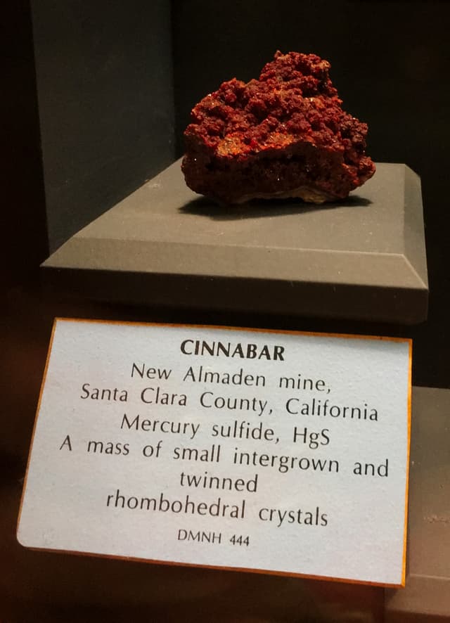
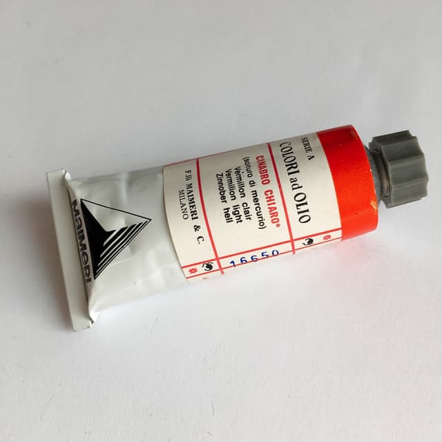
PR106 - Vermillion (Genuine), Mercuric Sulfide. A bright red indistinguishable in masstone from some cadmium reds, however it mixes a bit differently and tends to be semi-opaque. The natural mineral is called Cinnabar. Debate about its lightfastness has tended to be one of those things which "springs eternal". We were fascinated to see lightfastness tests from the legendary Gunzorro (one can find his vermilion tests here). Similar findings were echoed independently by Virgil Elliott. Unfortunately this pigment which has captivated painters does indeed seem to darken with enough light exposure. Whether it is because of a wet or dry process or adulteration with another pigment would require lab testing. We have heard that the sometimes-quoted ASTM designation of I has to do with the length of the ASTM exposure, and that perhaps were the exposure a bit longer vermilion would undergo the blackening that it so often exhibits.
Perhaps notably, Natural Pigments mentions that glazing madder lakes over Vermilion may help to mitigate this tendency to darken. There is discussion that the way it is manufactured may make a difference to its lightfastness as well as a note that the natural mineral may be better than the manufactured versions. This is one of the physically heavier pigments.
Controversy also (strangely) rages over just how toxic it is, but we would err on the side of caution and list this as a toxic pigment. Furthermore, Monona Rossol in her work on pigments notes that it may sometimes be contaminated with lead. More information on hazards from mercury as well as lead pigments can be found in the Artist's Guide to Health and Safety.
Several different color varieties of this pigment may be found depending on where it was mined or how it was manufactured. Cinnabar is the name of the rock form of this pigment, while genuine Vermilion is the name of the paint. Famous mines were in Monte Amiata. It is rumored that the finest qualities of real vermilion have not been available for a very long time, at least not since the closing of the famous Monte Amiata mines in Spain.
It has become difficult to ascertain the quality of various tubes of Vermilion as they are sometimes cut with fillers or may even have Cadmium Red standing in for the genuine pigment. It's said that some of the duller versions of vermilion may be substandard representations of what this pigment can be, or perhaps used to be. On the other hand there are some brilliant cadmiums that are difficult to distinguish from the better versions of vermilion which poses a different challenge. There may be some simple studio tests for distinguishing genuine vermilion from cadmium.
Also it is said that genuine vermilion is very slow drying, which is interesting because it has rather lean oil requirements when made into a paint, according to Virgil Elliot's book In Traditional Oil Painting.
In terms of hue, the great Gunzorro once described PR106 as somewhere between red earths and the cadmiums. There are at least two different main color groupings within Vermilion. The two colors of vermilion tended to be the orangey, and the Chinese, which was a cooler red. The former color is associated with the Imperial kind (or Monte Amiata Imperiale) which made warmer pinks in tints.
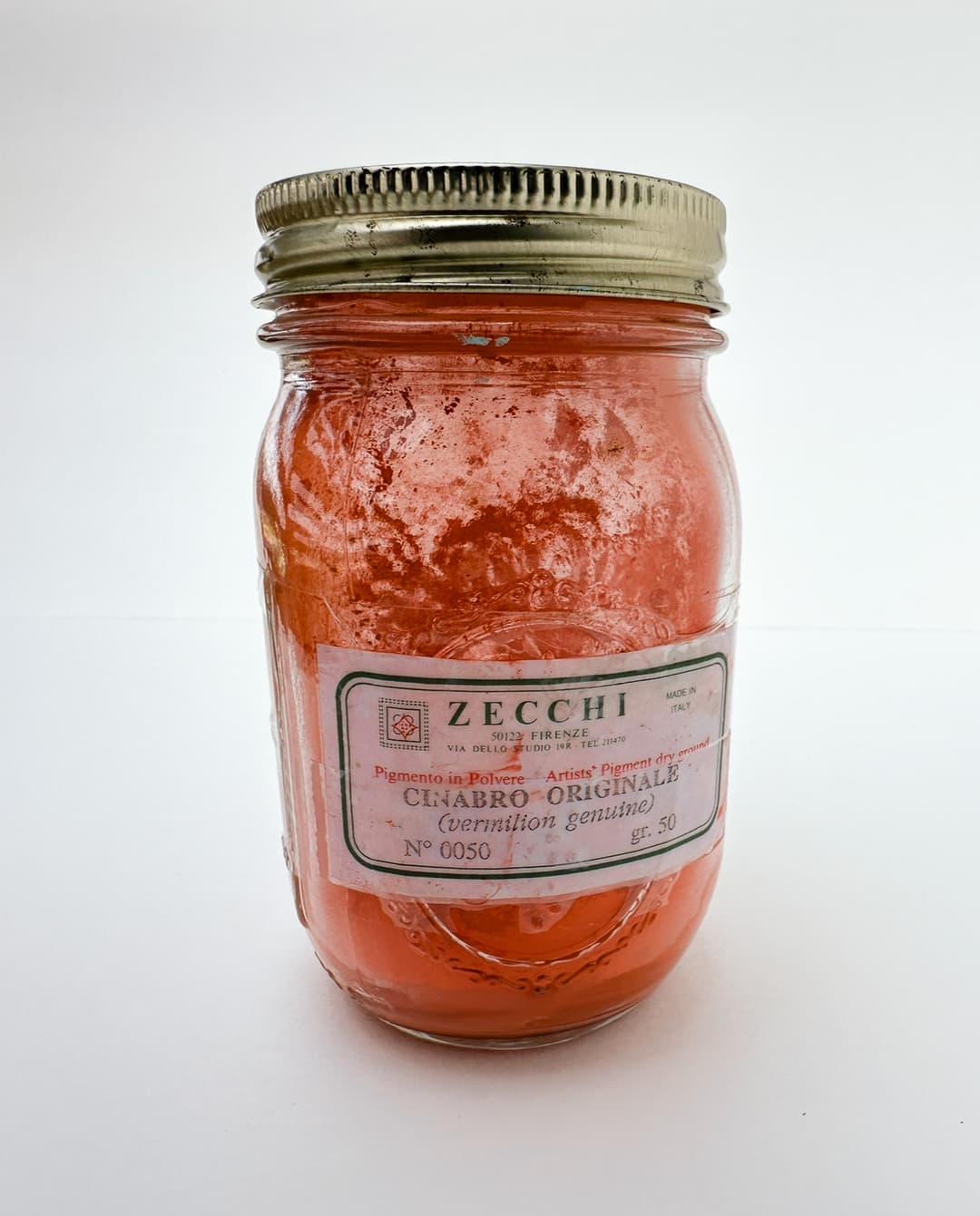
Genuine Cinnabar, Cinabro Originale from Zecchi Pigments
Genuine Vermilion
Vermilion in rock form, A possibly genuine vintage tube of real Vermilion
Cadmium Reds
High-Performance Lightfast Reds with Exceptional Covering Power
PR108 - Cadmium Red. Cadmium Selenosuphite or Cadmium sulfoselenide. A smashing pigment that is opaque, high chroma, and lightfast, though please handle according to best practices for toxicity. The color can range from red-orange to a rich bright red, to a moody maroon. Classic Cadmium Red is available in Light, Medium, and Deep and gets solidly excellent marks for lightfastness. Bear in mind though that prolonged exposure in direct sunlight (i.e. for years) will eventually darken them. (For a super-lightfast and sadly extinct specialty version of Cadmium Red see below). One of the great things about the opacity is a hard to define quality in the presence of these colors- their opacity sends the color back to the eye with a centered, authoritative confidence.
A handful of Cadmiums can create a built-in rainbow section of the palette. Of course interstitial notes can be mixed between them, and we recommend this for beginning painters. However at full strength a series of cadmium reds and red-oranges can create a pleasing representation of the palette colors at high chromas. From this gorgeous series of progressively warming notes the cadmium reds flow seamlessly into the cadmium oranges.
Cadmium is a carcinogen that also causes kidney damage, so we always treat it with respect as a toxic pigment. More information on hazards from cadmium pigments can be found in the Artist's Guide to Health and Safety. Her updated work can be found through her site.
One potential painting-related drawback is if a person is looking for high chroma tints-brighter tinted red-oranges for example. Cadmium Red can be a bit chalky in tints, however a couple of varities we tested were a bit brighter than the others. The note of desaturation it takes on is not necessarily a bad thing in realistic work. At full strength, it is one of the most chromatic colors at several hue angles.
The cadmium reds are one of the main pigment groupings for oil paints. Most cadmium reds will bear the pigment code PR108, however some will have PR108:1 as a sort of less expensive version. We have read that the degree of redness relates to the amount of selenium as well as differences in heating.
Also, as a quick reminder that lightfastness does not mean the same as weather-fastness. Cadmium reds are sensitive to moisture.
This pigment spans red-orange to cherry reds to deep purpleish maroons. Paint makers will name their colors Light, Medium, or Deep to distinguish the major hue groupings. On either end of the gamut one may find Cadmium Red-Orange or even Cadmium Maroon. For more on cadmium reds, see these articles with paint comparisons: Cadmium Red Deep and Medium, and Cadmium Red Light and Medium.
There is some controversy over the degree of toxicity of these paints (artiscreation lists PR108 as a B, meaning there is toxicity), and always we err on the side of caution. We treat them with the respect we give to toxic pigments.
One interesting thing is that in his work on Traditional Oil Painting Virgil Elliot specifies cadmium reds and the related cadmium-barium reds as having rather lean oil requirements, which relate to their use lower levels of an oil painting. If additional driers have not been added, they do tend to dry slowly.
PR108:1 - Cadmium-Barium Red, a cadmium red made in a more inexpensive way. Seen sometimes in student brands. The health warnings for cadmium red apply also to PR108:1. See above.
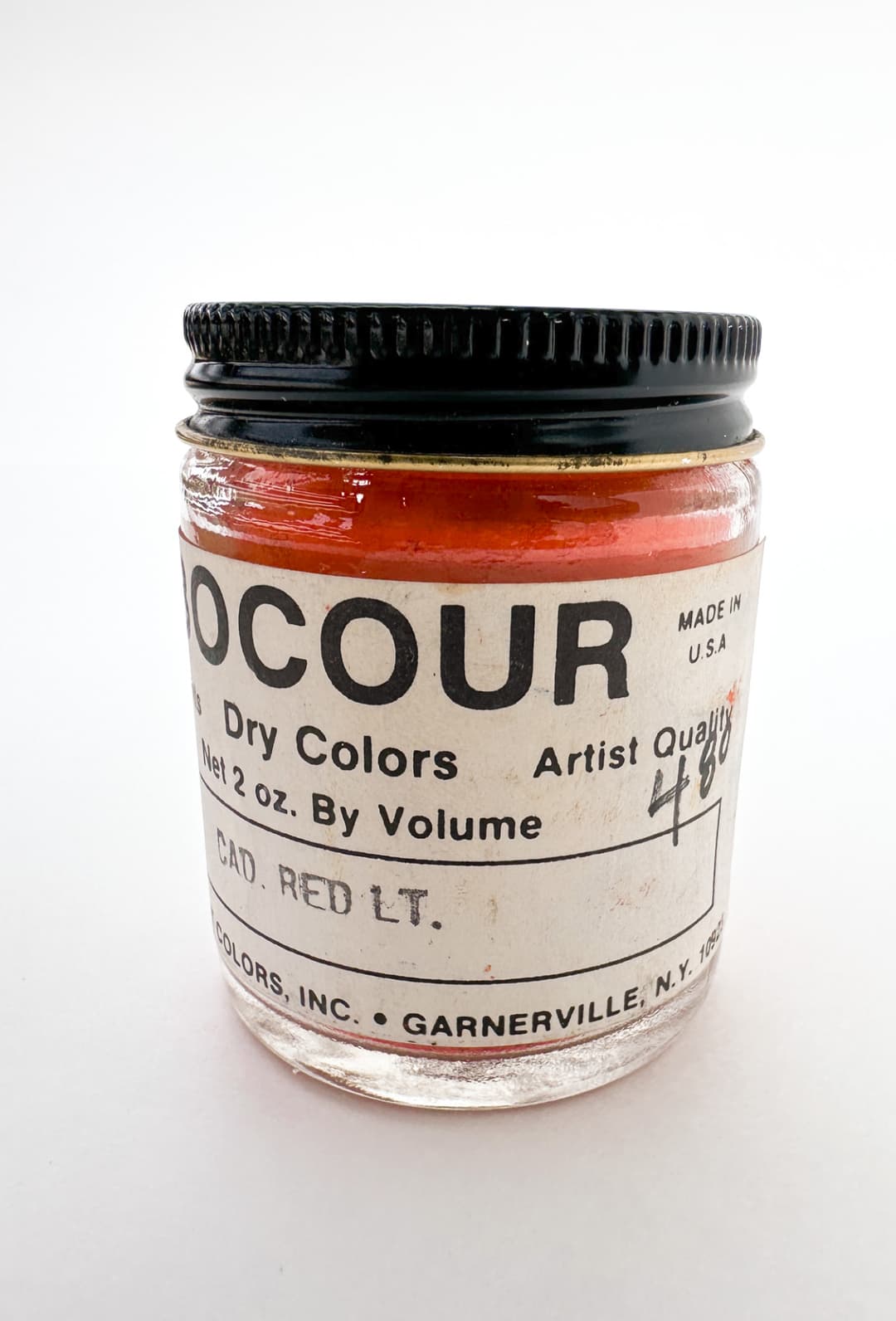
Vintage jar of Cadmium Red Light from Bocour
Cadmium Reds
High Chroma Lightfast Reds
Napthol Red
PR112 - Naphthol Red AS-D (one of several Napthols out there). This pigment crops up everywhere, and it is gorgeous in tints, but not nearly as chromatic as some of the other reds when lightened. Still this makes a lovely ingredient for certain pinks.
We were shocked to find out in Monona Rossol's writing on pigments that it has a similarity to dyes that cause cancer, may metabolize to a carcinogen, and cause methemoglobenemia as well as other problems-- see her research for more. It is often found in cadmium replacements, so its own toxicity is interesting to note.
Unfortunately Napthol Red PR112 also fades more than we would like to see in an artist color. Also, in oil this color showed surprising reactivity with lead white and will shift color in minutes. See Golden's Lightfastness Testing in Oils for more.
I used to absolutely adore this color and I only wish it were more lightfast. It makes the most interesting red tones in skin for portraiture- a lyrical red-pink with an orange hint. It was one of my most favorite colors that I used to use as a student before I found out it was not lightfast.
Napthol Red in oil
An Extinct Superlightfast Red
Mysterious Mercadmium
PR113 - Mercadium Red. An extinct pigment which deserves special note as a super-lightfast red. We'd call it very toxic (artiscreation gives it a D meaning, "Extremely Toxic, only attempt working with these pigments (especially the dry form) in laboratory like conditions with proper safety equipment "). Plus more information can be found in the Artist's Guide to Health and Safety for pigments containing cadmium and mercury (and possibly barium depending on the formulation). Her updated work can be found through her site.
While cadmium reds have excellent lightfastness in general, this one is famous for having even more lightfastness in a test of extended light exposure done by Virgil Elliott. At one time Vasari offered this as a color, however they no longer carry it.

Vintage Permanent Pigments Mercadmium Red PR113
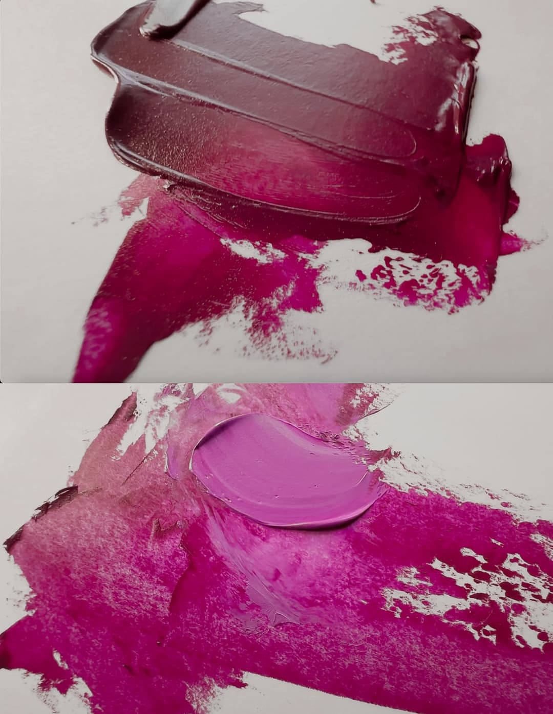
Quinacridone Magenta
PR122 - Quinacridone Magenta. This is a staple pigment for any palette- able to get higher chroma light reds and red purples when mixed with white than many other pigments. It creates smashing purples and lovely tints, and it has excellent lightfastness depending on the supplier. It can also help to tune reds towards crimson.
This was the first addition to my palette after painting with a strict limited palette for some years. Quinacridone Magenta opened up new areas of the gamut for red-purples. I now paint with a range of Quinacridones at various hue angles in addition to this one, but if I could only choose one, this would be it. This color is an exceptionally cool magenta which is useful in tints and also in mixes for purples and fuchsias.
Of the available options in the magenta range it has some of the most promising lightfastness, however this may be something to look into and test from brand to brand. The Artiscreation lightfastness scales show some variations. One hopes to find the versions which are excellent and receive the highest ratings.
Whether painting with a split-primary palette or a very abbreviated power-palette of just a few CMYK colors, Quinacridone Magenta is one of the most important pigments. A crucial component for purples and red-violets.
Like many transparent colors it tends to be a slower drier.
Quinacridone Magenta, PR122, a palette staple
More Reds
PR123 - Perylene Scarlet. Moderate lightfastness, not lightfast enough in tints to suit our liking. Not recommended.
Monona Rossol notes that it has an anthraquione-like structure (potential for being a carcinogen) as well as a risk for inhaling the dust. Please see her work for more.
PR144 - Azo Condensation Red. Looses just a bit of lightfastness in tints.
PR146 - Naphthol Red AS. Somewhere between decent and fugitive, this pigment is not recommended. Additionally, in Monona Rossol's research it states that when this pigment is metabolized, a derivative of PR146 may create a carcinogen, so please consult her writing.
PR149 - Perylene Red, Anthraquinone Red. One of several. Transparent. Not recommended due to moderate lightfastness- might go as low as a six.
Monona Rossol notes that it has an anthraquione-like structure (potential for being a carcinogen) as well as a risk for inhaling the dust. Please see her work for more.
PR166 - Azo Condensation Red. Not recommended, lightfastness is moderate.
PR168 - Anthradquinone Scarlet. This color was recently discontinued, but may be available again for a time. It's a beautiful bright red with a note of orange in it, transparent and useful in madder approximations. Old Holland has several interesting blends made from this color. The high lightfastness marks- hard to find in a transparent red- may or may not translate to oils. It's a slower drier.
It may be carcinogenic, as it is similar to anthraquinones that have been listed as probably carcinogenic (please see Monona Rossol's research work for more information.
In watercolor it seems to behave fairly well for lightfastness. However in oil it is more of an ASTM II instead of ASTM I but it may vary by brand. Some sources give this color solid 8's (highest marks) on the blue wool scale.
PR170 - Naphthol Red AS (one of several). This is a gorgeous red that made some stunning pinks, but lightfastness can vary widely. In general its is not recommended due to its moderate (meaning not good enough) lightfastness. There appear to be two forms of this pigment, and one is more lightfast than the other.
May be related to health problems, such as methemoglobinemia, as well as some other things. See Monona Rossol's work for more.
PR175 - Benzimidazolone Red HFT. Sometimes called Benzimidazolone Maroon. The lightfastness is reported to be good, though itmay loose just a little in tints depending on the pigment supplier.
PR176 - Benzimidazolone Carmine. Lightfastness may be decent to moderate.
Quinacridone Magenta
A rockstar magenta that leans blue
Fascinating Crimsons
PR177 - Anthraquinone Red, This is a widely used red in "Alizarin Crimson Permanent" and other substitutes for fugitive Alizarin. It's very transparent.
This color, along with other similar anthraquinone pigments, may be carcinogenic. While this specific pigment has not been tested, other similar pigments have been listed as "reasonably believed to be carcinogenic." Please see Monona Rossol's research work for more.
Even though it received an ASTM I designation, it is reported to eventually fade. In Virgil Elliott's long term lightfastness tests revealed interesting things that go beyond the regular ASTM testing from the 1980s. He performed many interesting tests, and one of his six-year test panels can be found here.
So, while some pigment suppliers make a product that can receive all 8's (excellent) on the blue wool scale, this pigment does appear to fade eventually with long-term exposures which go beyond usual lightfastness testing.
This is a rich, lusterous, sparkling red with depth in a helpful area of the spectrum. It is transparent and chromatic at a low lightness. If you use this color it might be helpful to do your own lightfastness tests since among suppliers it seems to vary a bit.
PR178 - Perylene Red (distinct from Perylene Maroon). Lightfastness is decent to moderate. May be better in watercolors, however it may fade in tints.
Monona Rossol mentions that this pigment has an anthraquinone-like similarity (potential carcinogen) may cause methemoglobinemia, and be associated with health problems- please see her work for information about powder/dust hazards.
PR179 - Perylene Maroon. Valuable as a transparent red. In thicker glazes it can appear similar to Anthraquinone Red (PR177), but in thinner glazes a different nature is revealed. It feels like a cross between Alizarin Crimson and Quinacridone Violet, and has a tiny bit of desaturation to it. A helpful color where deep, chromatic reds and violets are needed. Some versions are very slow drying, but worth it. This color tends to be transparent and is reported to have excellent lightfastness.
This color has a structure that is similar to the anthraquinones (possible carcinogens) so please consult Monona Rossol's work for more information.
PR184 - Permanent Rubine F6G. Not recommended due to moderate lightfastness. Ranges from decent to fugitive.
PR187 - Permanent Pink FL. This is the famed Carl's Crimson. A LF rating of II. This is a fun red that makes some interesting tints and blends. However the ASTM II rating is not as high as we'd like to see, so we would not wholesale recommend it based on moderate lightfastness.
PR188 - Naphthol Scarlet Lake.
In Monona Rossol's work on artist safety this pigment may metabolize to create a carcinogen, and can possibly cause methemoglobinemia. See her writing on pigments for more information.
PR202 - Quinacridone Crimson. This is stellar color which has at least two different natures. When I first found this pigment, I fell in love with the bright purple-magenta color since certain forms of it are reported to be very lightfast (some have solid 8's on the blue wool scale). It is fairly rare in oil paints. Since then I have had trouble finding the more purple version as it was replaced in the paint line where I had found it by the more magenta kind.
This is a color I'd recommend as a standalone pigment- not necessarily for mixing, but rather for its beauty on its own.
PR206 - Quinacridone Burnt Scarlet. Unfortunately this was recently discontinued. It made an interesting complement to certain greens, and was a fascinating color in its own right. We explore this pigment in an article on Discontinued Pigments.
PR207 - Quinacridone Scarlet. A gorgeous light red which was also recently discontinued. This red had good lightfastness and was smashing in tints. Quinacridone Scarlet has a delicate quality reminiscent of PR209. This pigment was part of an article on Discontinued Pigments.
Quinacridone Red, PR209
PR209 - Quinacridone Red. We love this color so much that the ASTM rating of II just hurts to see. If it's from a supplier where you can avoid those blue wool scale 6's that's one thing, but this beauty seems to have a definite risk of fading depending on the supplier. This color is a merry red that makes gorgeous tints. It has transparency to it. May be better in for lightfastness in watercolor than in oil.
PR214 - Fastogen Super Red 2R. Decent to excellent lightfastness.
PR221 - Pigment Red 221. This is listed as ASTM II, so that is a bit lower than we like to see.
PR233 - Chrome Tin Pink (Potter's Pink). This is a wild color in artist's oils which is fairly rare. It is a dull pink- the dry pigment looks a lot more lively than the paint. However it is reported to have good lightfastness. More often found in watercolor than oil.
PR242 - Disazo Condensation Scarlet. This is a fascinating orange-red which is fairly rare in oils. It makes beautiful high chroma tints. It also has good to excellent lightfastness. However, the version by Schmincke Mussini is a slow drier.
**PR251** - Pyrazolo-quinazolone scarlet. Good to excellent lightfastness.
Quinacridone Magenta, PV19. While not listed among the reds, this pigment can be made into a paint which almost looks like PR209 - Quiancridone Red. PV19 has two forms, the reddish one shown here and a more plum colored violet.
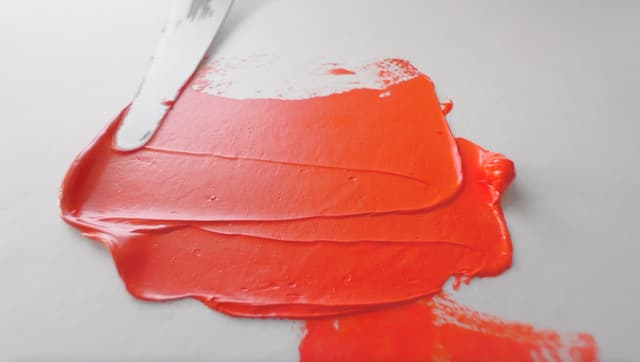
Pyrrole Reds
Gorgeous high-performance, lightfast red PR245
PR254 - Pyrrole Red (more below) and its companion,
PR254 is Lightfast, soaring chroma, and used on Ferrari's. What more could a person want. This is actually a fairly good approximation for certain brands of Cadmium Red Medium. It is a very intense color. We did a deep dive on Pyrrole Red. We made comparisons to cadmium red, explored its complements, and also its use in mixes.
PR255 is an equally awesome, though lesser known, Pyrrole Scarlet. Why would you want PR255 in addition to PR254? It makes smashing, chromatic tints that lean a little oranger than PR254. We love this color. Excellent lightfastness.
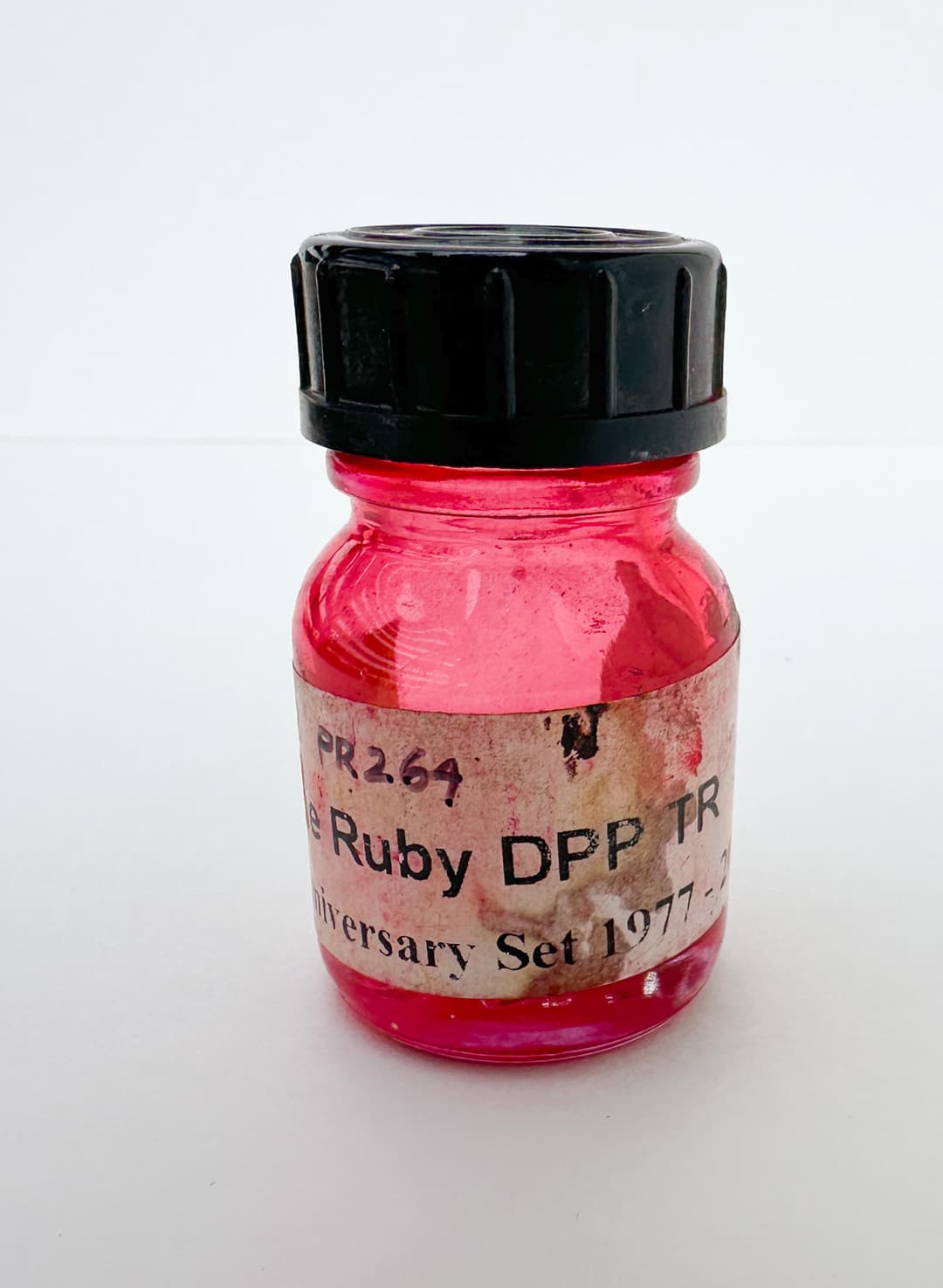
For the more magenta Pyrrole Rubine PR 264, see below.
Intense Pyrrole Red, PR254
Ruby Reds, some chromatic some dusty, some crimson
PR259 - Ultramarine Pink. An enchanting red-purple with excellent lightfastness. This is a super fun color to add if you have already explored most other areas of the palette. As soon as we tried this pigment there was no going back, as one cannot have too many lightfast red-purples.
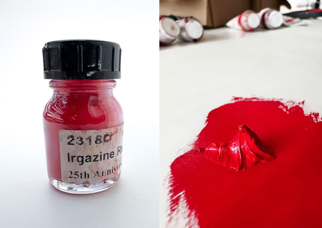
PR264 - Pyrrole Red Rubine. Excellent Lightfastness. This is recommended by some as an alternative to Alizarin Crimson.
PR272 - Pigment Red 272. Also a pyrrole, this one has good to excellent lightfastness.
PR287 - MayaCrom Red R2051; related to the modern discovery of Maya blue.
PR290 - Sicopal Red. Fairly rare in artist pigments. Said to have excellent lightfastness. An orangy red used by Roman Szmal and also Cobra water mixable oils. Non-staining, granulating.
PR298- YInTiCo - This fabulous color is lightfast, has opacity, and is an enchanting raspberry. It also has infrared reflective properties.
Orange Pigments
A category with rounded edges
Where does orange begin and end? This is a pigment category that borrows a bit from yellow (some PY pigments are definitely orange) as well as its other neighbor, reds (red lead fits right in). This is a category without a ton of lightfast options, and only a handful of the pigments used in artist's paints are really fit for them in our opinion.
Again the pigment listings begin with a few not-fit-for artist-paints pigments.
PO5 - Hansa Orange RN. Sometimes labeled Permanent Orange, unfortunately it is not permanent at all, and has moderate lightfastness. It's currently offered in oils by two paintmakers. Sometimes the blue wool ratings show fading as bad as 4 in tints, and even the better versions are still looking at 5's and 6's. In her latest work, found via her site Monona Rossol mentions that this is listed as a carcinogen and also has toxic impurities.
PO13 - Benzidine Orange. Low lightfastness and also toxicity issues. Monona Rossol writes that it may be contaminated with PCBs --also please see her work regarding issues with a cancer causing compound (we advise artists to research benzidine in artist pigments). Unfortunately, a reputable artist pigment manufacturer uses this as a single-pigment imitation of Cadmium Orange. It also crops up in a handful of convenience blends- at least six- by another paintmaker. This color has shockingly low lightfastness in tints, as low as 3 on the Blue Wool Scale.
PO16 - Benzidine Orange. We advise all artists to research Benzidine in artist pigments regarding toxicity as it is serious. Monona Rossol's work on safety and artist pigments mentions that along with being contaminated with PCBs there are concerns about cancer causing chemicals. This color is actually used by a modern paintmaker in oils. It has abominable lightfastness and is reported to fade to a 2 or 3 on the blue wool scale.
Even though oranges may be mixed from reds and yellows, there are times one wishes for pure orange- perhaps for complementary mixing or for the highest chroma the painter's gamut can offer.
For a high quality orange, genuine Cadmium Orange is surprisingly vital for this role as it brings both knockout chroma as well as opacity from the marigold notes to bright orange.
A merry array of oranges
Cadmium Oranges
PO20 - Cadmium Orange (genuine)
Genuine Cadmium Orange, PO20, is surprisingly difficult to emulate or replace. A gorgeous, opaque, high chroma range of oranges. In discussions revolving around cadmium alternatives the lack of a suitable orange is acutely felt. When painting realistically a range of less chromatic oranges can absolutely be mixed from cadmium yellow deep and Cadmium Red Light. However there is actually a chroma boost from cadmium orange that is hard to match. It was years into our painting journey when we realized just how irreplaceable this color is, and once you really begin to study the chroma difference, it's hard to go back. (This is sometimes becomes especially clear in a medium like gouache). The opacity and overall character of cadmium oranges make them a wonderful addition to the palette.
However do handle with care and research the proper precautions as it is made of cadmium, a carcinogen which also causes kidney damage, so handle appropriately. In the Artist's Guide to Health and Safety Monona Rossol writes about the hazards of pigments containing Cadmium as well as Selenium.
This is a pigment which requires a high oil content- something to keep in mind if painting in layers. They do tend to dry slowly unless of course driers have been added.
Cadmium Oranges come in several color notes from a near macaroni orange to middle orange to red orange. More on Cadmium Orange can be found in our brand comparison in oils.
PO20:1 - Cadmium-Barium Orange, a version of cadmium orange that is less expensive to make. The same health warnings apply (see above).
Cadmium Oranges
PO20
A surprisingly necessary pigment for a range of high chroma opaque oranges

More oranges
PO34 - Pyrazolone Orange. According to Monona Rossol's work, this is a very concerning color and one which is likely carcinogenic. We advise all artists to research benzidine in artist pigments for toxicity. Surprisingly this color is used by at least three major paintmakers in oil as single-pigment color. Depending on the supplier the pigment ranges from inadequate lightfastness to poor, and even in the better ratings it's not that good. It's also found in blends by about six paintmakers and sometimes it is paired with other pigments that also have lightfastness issues. Artiscreation notes that Lightfastness may be slightly improved in redder versions. However the performance is reported to be not very good. Unfortunately several paintmakers use this color in their paints.
PO36 - Benzimidazolone Orange HSL. Offered by four major oil paint manufacturers as a single-pigment color and that increases to about six companies when it's found as part of a blend. The lightfastness for this color varies widely according the supplier. It would be advisable to do lightfastness tests if it is a color you like to use. From some pigment suppliers the lightfastness is excellent, and for others it is merely moderate. Williamsburg describes their version as, "Strong, somewhat sour, tomato-like red orange," and cites the ASTM I rating.
Monona Rossol's work mentions that this is one of the pigments which may metabolize to cause methemoglobinemia-- please consult her work on pigments for more information.
PO36:1 - Quite possibly a variant of PO36 used by Michael Harding. See above for the same health cautions that apply to PO36.
PO43 - Perinone Orange. Moderate lightfastness, best to do some research if this pigment is part of your workflow. Only one major manufacturer uses this as single-pigment paint in oils, however five other paintmakers have used it in a long list of blends. Lightfastness can dip to a five on the blue wool scale in some cases, so best to do one's own tests. Please take extra caution if using the dust -- consult Monona Rossol's work for more.
PO48 - Quinacridone Burnt Orange. Unfortunately this interesting pigment has been discontinued, however as of recently it was offered by four major paint brands, and may still be found in a few sap green blends. Along with Quinacridone Gold, PO49, it was smashing for botanicals and all kinds of realistic subjects. It's like a supercharged, chromatic, rich, dark stained glass-like color, like a super-charged chromatic Burnt Sienna. It has excellent lightfastness in oil.
PO49 - Quinacridone Gold. Radiant, especially in mixtures to create botanical greens. A complex transparent yellow. This color is unfortunately extinct, and there was great mourning when it left the art supply store shelves especially in the world of watercolor, though it was available in other binders. A wonder from the the automotive industry, which we still hope will bring it back someday, there isn't anything exactly like it. We've done some tests on pigments which can come close. If you're purchasing it, be on the lookout for imitations. Real Quinacridone Gold is interesting to try.
PO59 - Pigment Orange 59. Also known as Paliotol® Orange, this color is a transparent golden yellow orange and has excellent lightfastness. Currently it is offered by just one paintmaker in watercolor.
PO60 - Benzimidazolone Orange HGL. Used mostly in industrial application, described as a reddish orange. Slow drying but excellent lightfastness. Monona Rossol mentions that it may metabolize to an aniline. See her writing for more information.
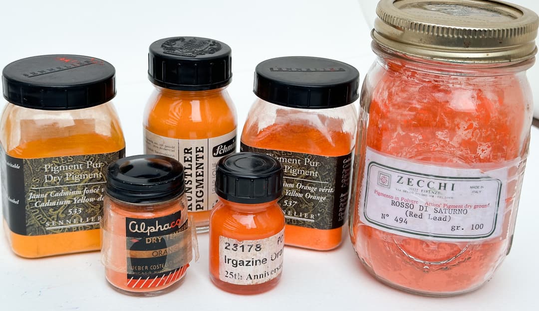
PO61 - Isoindolol Orange, also known as Irgazin® Orange L. This color has moderate to excellent lightfastness depending on the pigment supplier, so one may wish to do one's own lightfastness testing. It's offered by one paintmaker in oil and acrylic, and turns up in a few blends in watercolor.
PO62 - Benzimidazolone Orange H5G. This is a color that turns up in a handful of the attempts to replace Cadmium Orange. It doesn't have the same high chroma, nor does it have the same opacity as cadmium orange. However, setting the cadmium discussion aside, in its own right this is possibly interesting pigment.
From a health and safety standpoint it may metabolize to a mutagen, and or cause methemoglobinemia according to Monona Rossol so please consult her work for more information.
It seems to have good lightfastness overall with a slight fall off in tints- we wish it were even a little more lightfast as it's a nice, not-quite-highest-chroma orange. Even though Gamblin describes this color as the same masstone as Cadmium Orange, we'd disagree based on their version of it, which does not share the same high chroma as PO20. We'd say this color is slightly less chromatic than cadmium orange.
PO64 - Benzimidazolone Orange (one of several). A rarely found artist pigment, used by one paintmaker in oils. Moderate lightfastness.
PO65 - Benzimidazolone Orange (one of many kinds). This one is fairly rare in artist paints. It's Used by Old Holland in Golden Barok Red. It has decent lightfastness.
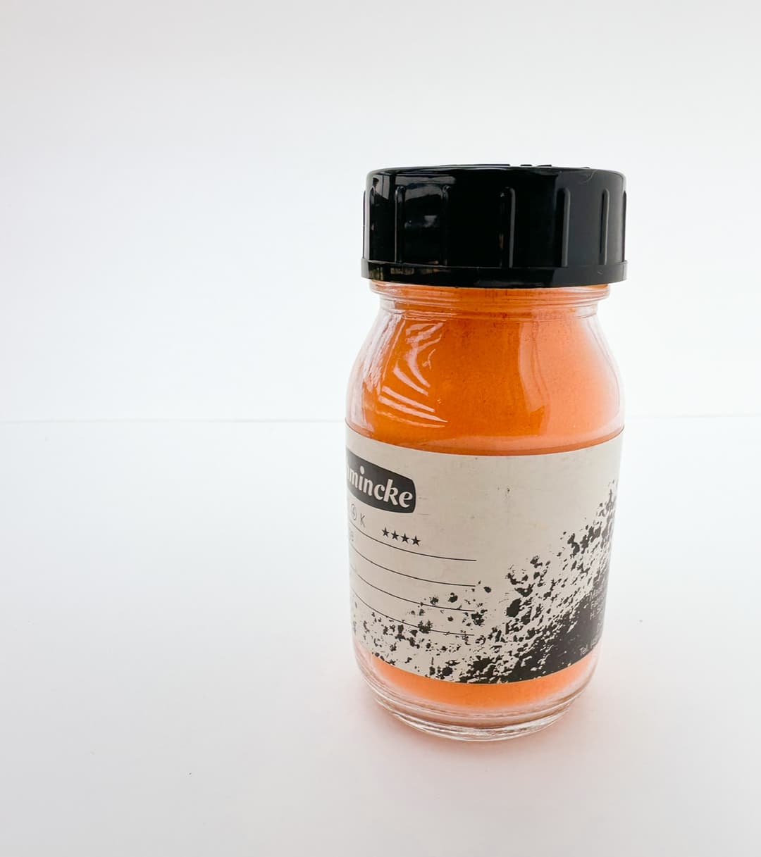
Schmincke Norma Orange
High power oranges
PO67 - Pyrazoloquinazolone Orange. This is a nice red-orange that tints well, meaning it retains high chroma in tints. It does not turn as pink in tints as PO73 does, which is a slightly redder pink. PO67 doesn't seem to move Munsell hue much in tints, and is a bit oranger/yellower overall than PO73 with a bit less chroma as well and a bit more opacity. Even so, it has a bold bright middle orange in masstone. It is not officially rated by the older ASTM standard, however it does appear to be somewhere around an ASTM II in watercolor. In oil a couple of paintmakers give it high marks, so it may be worth doing your own lightfastness tests using the mixing white of your choice.
PO71 - Pyrrole Orange. Sometimes known as Transparent Orange or Transparent Pyrrole Orange. It's a deep, bright red orange. Some sources list this as ASTM II, others as decent to excellent on the blue wool scale. This is one of several DPP pigments (see below). Much more commonly found in watercolor than oils, PO71 is offered by only one major oil and acrylic paintmaker, however about 8 paintmakers offer it watercolor.
PO72 - Hostaprint Orange H4GL 32. This is listed with a lightfastness of excellent. It is rare to find it in paints, and one watercolor maker has included it in their line. however artiscreation advises doing one's own tests depending on the binder to see how it performs.
PO73 - Pyrrol Orange. Also sometimes known as Irgazin® DPP Orange and sometimes maybe even Cosmoray Orange. This seems to be an important synthetic orange- a possible alternative to the redder forms of Cadmium Orange, but it is less opaque and is also unfortunately a bit more reactive than was once thought.
Aside from the reactivity, it creates gorgeous light orangy-pink tints-- this is a good color if tints of cadmium red are desired-- it does in practice what many hope for from a cadmium. In other words, it fulfills that hope that one has when adding white to a cadmium. Pyrrole Orange makes what may be the very best red-orange tints with a hint of a pink undertone.
In masstone it's a stunner and has blazing high chroma.
Most give this pigment high ratings for excellent lightfastness, however there were some strange curveballs found in oil paints. In the recent testing by Golden, PO73 seemed sensitive to mixing whites and binding oils, specifically Safflower Oil. This may be significant as several companies offer this pigment in a safflower oil blend. For more, consult Golden's recent research on lightfastness in oil paints.
PO86 - Bismuth Vanadate Orange. This is a newer pigment and is thought to be highly lightfast. It's offered by at least one watercolor maker at the time of this writing.
PO107 DPP - The term DPP may refer to one of several pigments. DPP lacks a pigment code but may be Cosmoray Orange (Irgazin DPP)- the name Cosmoray can sometimes be conflated with PO73, so you might need to disentangle the two. According to Artiscreation, It may also refer to PO107 or PO108 (experimental). Both are reported to have excellent lightfastness. At the time of writing, it's offered by at least one major watercolormaker.
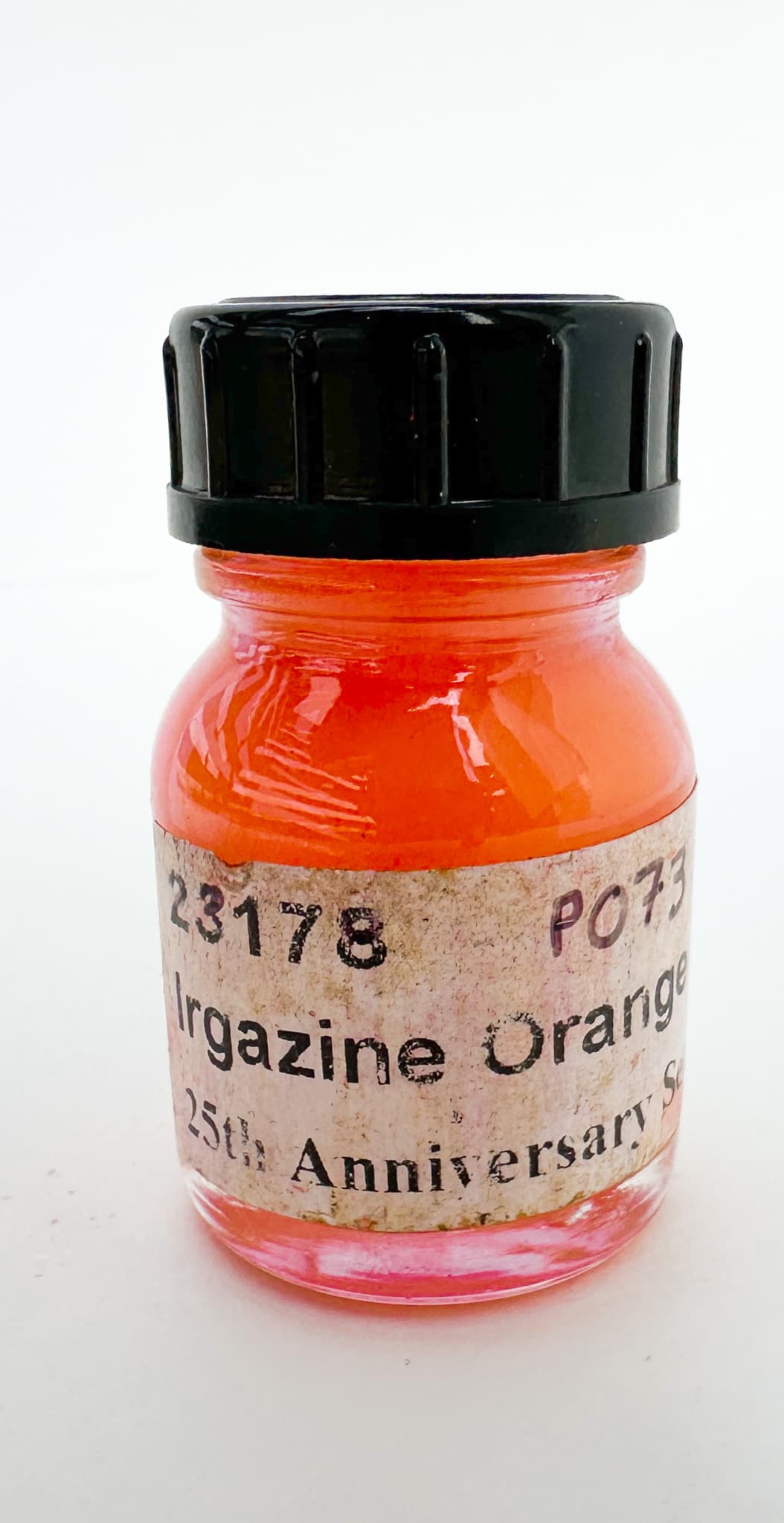
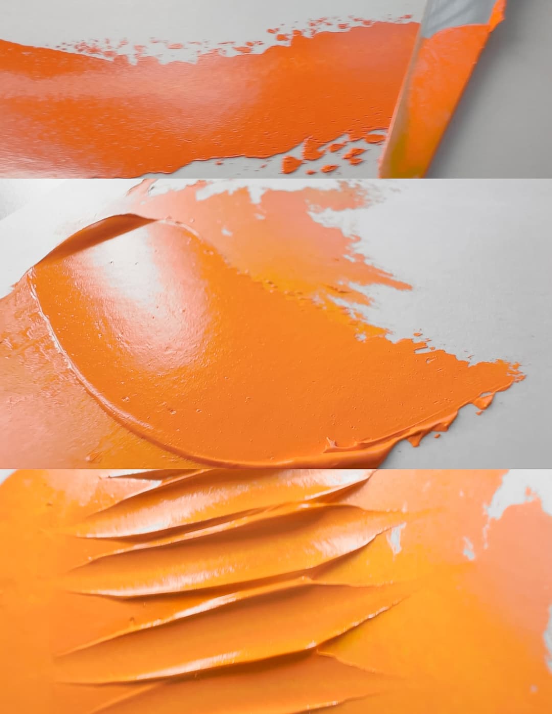
Powerful (and reactive) Pyrrole Orange
Yellow Pigments
Sunshine, Daffodils, and Marigolds
Perhaps surprisingly this is also an area where colors abound, but suitable colors may be harder to find when one takes a closer look. The quest for opacity and lightfastness leads us always back to the cadmium yellows.
We've been grateful for Golden's work in sounding the lightfastness alarm regarding a couple of unexpected areas of the yellow gamut. Some of the Hansas started giving less than desirable lightfast readings, due possibly to differences in their pigment manufacture, and so Golden made changes to their lines. Golden also alerted the paint world to issues with some versions of PY83, particularly transparent ones.
Yellow pigments
Spotlight on Hansas
The Hansas are an area where you'll want to keep an eye on the lightfastness. They can vary from brand to brand. Also check out Golden's recent Lightfastness Testing. Oil painting occasions special challenges, so once again they rose to the occasion in their lightfastness testing with different mixing whites in oils.
PY1 - Hansa Yellow G. This has only moderate lightfastness, and sometimes the lightfastness can be very poor. Additionally it may release carcinogens, as well as cause methemoglobinemia, see Monona Rossol's work here for more information. Handprint recommends PY154 instead.
PY3 (Also known as PY3 10G).- Hansa Yellow 10G. We were surprised to hear that this is suspected to be a carcinogen. Additionally, it may possibly cause methemoglobinemia. Monona Rossol's research has more information.
Hansa Yellow's lightfastness is moderate in tints. This is one of the brightest Lemon Yellows. However there has been some variability in the lightfastness of Hansa Yellow pigments over the years, depending on the way they are manufactured, and its old assignment of ASTM II may not reflect the current pigment market. Artiscreation mentions "PY 97 or PY 154 are similar and more light fast, PY175 is a nice lemon yellow too." Tends to be a slow drier.
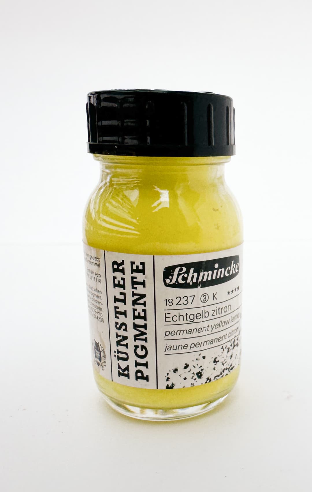
A bright hansa lemon yellow by Schmincke
Wild Yellows
PY14 - Diarylide Yellow AAOT, an Azo Yellow, Disazo Type 11 Toluidide. Lightfastness is reported by third party sources to be poor-- quite fugitive. This pigment may actually descend to a blue wool scale of 1 on a scale of 8, with 8 being good and 1 being basically falling off the bottom of the scale.
In addition to poor lightfastness this may metabolize to a known carcinogen, see Monona Rossol's work to learn more. She notes that it may also be contaminated with PCBs.
We were very surprised to find this pigment in artists oils. One manufacturer, who is quite well thought of, mentioned its stability and reports the lightfastness of their version as ASTM II, so perhaps there is some variety.
We wondered if there is some discrepancy somewhere, as artiscreation reports quite sorrowful lightfastness testing for PY14 with the low end of moderate for masstone and dramatic fading in tints. We wondered if there was a typo somewhere, and we checked the six digit code reported by the manufacturer (21095). It does indeed seem to be PY14 and both sources mention that the color is used mainly in printing. Perhaps doing one's own lightfastness tests would be useful.
PY17 - Dairylide Yellow 17. One company offers this as a single pigment paint and it also finds its way into a few blends. May metabolize to a carcinogen, and may also be contaminated by PCBs. See Monona Rossol's research for more information.
NY13 and NY14- Stil de Grain Genuine. This isn't a color name that gets used a lot, as the original is made from one of several sources. Historically there have been a handful of overlapping names surrounding the terms "Yellow Lake" and NY13 and NY14 are some of them. There a process involving quercitron bark (NY13), and unripe buckthorn berries (NY14), and both are fugitive. The name space still inspires paintmakers though. Dutch pink is another name that gets used, and sometimes causes a bit of confusion when painters find out it is yellow or brown. Artiscreation has an interesting discussion on NY13 and NY14 regarding the plants involved and the usage of the name Stil de Grain throughout history. We were amazed to find a recent Schminke version of this color available at Jackson's.
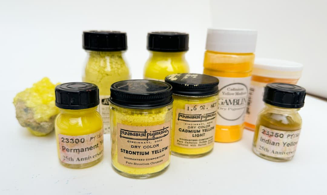
NY20 - Also known as Indian Yellow Genuine. It's sometimes debated whether this color actually exists, or at least if it was made in the way that is commonly told and re-told. A warm transparent yellow. The color at least does in fact seem to be real--regardless as to whether there was basis in the stories told of how it was manufactured. Golden has pictures of an actual sample of genuine Indian Yellow, or Magnesium salt of euxanthic acid. This is the infamous yellow that was allegedly made from cows made to eat mango leaves. A wide range of transparent yellows are available to artists, and so the name applies to a great many paints of other pigments.
NR24 - Genuine Gamboge. Traditional gamboge fades badly, and similar to Indian Yellow, the name Gamboge applies to a wide range of other yellow-orange pigments. Genuine gamboge is made of a resin from Garcinia trees. It is transparent. In addition to its lightfastness issues, Artiscreation mentions that it is poisonous.

Mussini just came out with two historical colors, one of which is Stil de grain, NY13. Available at Jackson's
Historical Yellows
PY31 - Barium Chromate, also known as Baryte yellow or in older literature as lemon yellow of even ultramarine yellow. This is a very rare color in oils, and is currently only produced by Michael Harding. Blockx used to manufacture this color, but the Blockx version has not been seen available in the United States for some time. It is an enchanting green-yellow. However this fascinating color is also toxic. It often has a greenish note to the pale yellow.
Its toxicity is listed as C class, meaning "Hazardous, use appropriate precautions for handling toxic substances, especially if working with the dry powder; Do not ingest; Avoid dust & spray." See the Artist's Guide to Health and Safety for information about the hazards of pigments containing Barium and also pigments containing Chrome.
PY32 - Strontium Chromate. This is likely extremely toxic.
A lively, hard-to-find bright yellow, which is prized by some painters. The quality may vary a lot depending on the pigment and the way the paint is formulated- we have two samples which have fared quite differently. One of the two was a very slow drier. It has a bright yellow character - the paint we have tried in oil is similar in hue to a cadmium yellow lemon. Artiscreation mentions that "may turn greenish due to the partial conversion to chromium oxide."
Artiscreation classifies it as a "B" for toxicity, however please always err on the side of great caution- we would also consider this pigment toxic though we are not toxicologists. See the Artist's Guide to Health and Safety for information about the hazards of pigments containing Strontium and also pigments containing Chrome. We have read this pigment is extremely toxic.
PY34 - Lead Chromate. A very toxic pigment that contains both lead and chromate. A carcinogen. Once when I met a chemist at an art demo and mentioned chrome yellow, his eyes widened and his eyebrows leapt up and he warned me of its extreme toxicity due to Chromium IV/ hexavalent chromium. Artiscreation lists the toxicity as "C", meaning "Hazardous, use appropriate precautions for handling toxic substances, especially if working with the dry powder; Do not ingest; Avoid dust & spray." See the Artist's Guide to Health and Safety for information about the hazards of pigments containing Lead and also pigments containing Chrome.
Besides this there are other reasons to wonder about this color as it is known to darken- though modern means of manufacture may help to mitigate this somewhat by coating the particle. Of the two modern paints we've tried they had masstones similar to colors in the cadmium yellows, though they did mix differently than cadmiums. Of the two we've tried, the primrose variety showed some color shift, possibly due to the sample we made having been later stored in the dark. We have heard of differences in manufacture that can mitigate darkening somewhat, however that goes beyond the scope of this article, and we feel the drawbacks outweigh any benefit. Please treat this pigment with extreme caution. Our experience with this pigment tends to be a slow drier, though we have read that it is a fast drier in other places, so it is not clear what gave rise to that difference.
We recently learned from an older manuscript that these toxic chrome yellows used to be used to adulterate more expensive cadmium yellows. So be aware that they may be hanging out undisclosed in old tubes of paint. They were also used to give a little boost to ochres, a trend that Rublev nods toward in their Chrome Ochre blend, which shows an awareness of this chrome-ochre convenience blend. We mention this as the health hazard of a chrome yellow may not have been disclosed on old tubes of yellow ochre, nor on old tubes of cadmium yellow. People may not realize how toxic these could be.
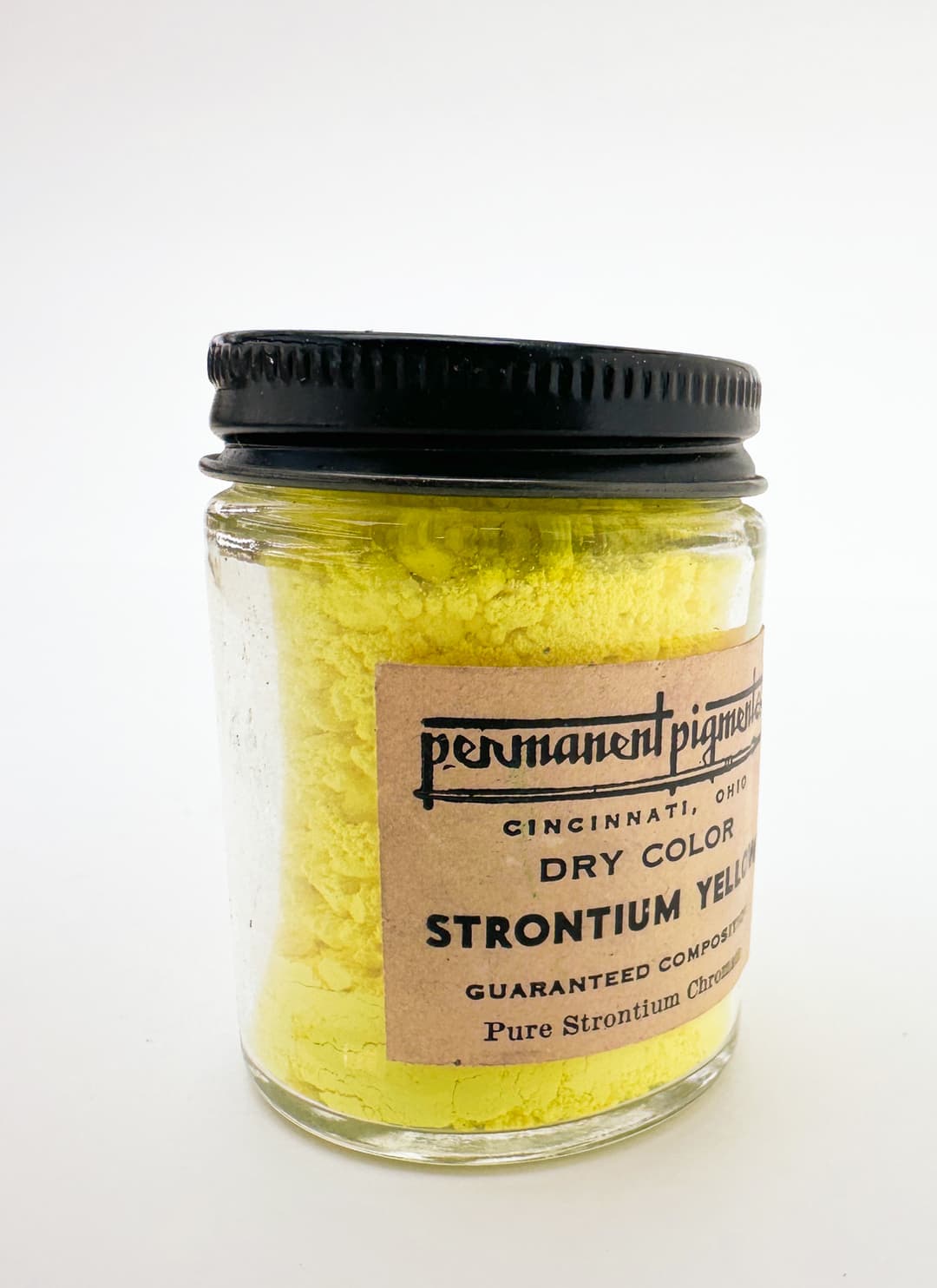
Vintage Strontium Yellow
Cadmium Yellows
Stars of the high chroma palette
Jim Harris (aka Gunzorro) once wrote of a "fairly stable rainbow." For our paintbox, this is one of our main top choices for the core notes of yellow.The opacity and high chroma are some of the reasons we adore cadmium yellow. It comes in Light, Medium, and Deep.
To get an idea of the color ranges for these names, we compared a few cadmium yellow lights in oils. Here are some comparisons of cadmium yellow deeps and mediums.
PY35 - Cadmium Zinc Sulphide. Glorious high chroma yellows ranging from bright citrusy lemons to middle yellows to warm marigolds. This pigment can almost dip to orange. Paintmakers offer them in Lemon, Light, Medium, Deep and Extra Deep. More information below.
Cadmium Yellows It can be helpful to have a wide range of cadmium colors as each one can provide a note of high chroma at a slightly different hue angle. This arpeggio of yellows provides a very good backbone for color mixing, and using a string of cadmium yellows one can easily find one's way around mixing greens, mixing oranges, and using the knowledge of these colors for any subject.
It is recommended by painters who favor the cadmiums to have a lot of different choices from a lot of different brands. The reason for this is not to benefit paintmakers, rather each paintmaker chooses the notes of color from a wide gradient of available choices from lemon yellow to marigold so the names Light, Medium, and Deep vary tremendously from brand to brand. Sometimes a Cadmium Yellow Medium in one brand will equate to a Cadmium Yellow Light in another. When starting out, a person can pick a Cadmium Yellow Light and a Cadmium Yellow Medium or Deep to simplify the options and learn color mixing.
We compare several Cadmium Yellow Lights in oils, as well as several Cadmium Yellow Deeps.
Something fascinating about cadmium yellows is the way the add lightness to a mix- especially Cadmium Yellow Lemon. For some applications a person wants transparency or does not want this lightening, so we would recommend other pigments for transparent yellows (see note on PY110, also PY150).
Debate has raged around the cadmiums, and they are listed as pigments with toxicity, so be extremely cautious with them. Lately we have seen a lot of resources suggesting the pigments are engineered to be far less toxic than just regular cadmium, however, we always err on the side of caution with pigments (there is no downside to being super careful) and so we always handle these with respect. According to the work of Monona Rossol, cadmium yellow is a carcinogen and causes kidney damage. The Artist's Guide to Health and Safety has more information about the hazards of pigments containing Cadmium as well as Barium, as well as information on Sulfides. They should not be sprayed and the dust should be avoided. It should go without saying, but absolutely do not ingest any pigment.
These are fairly lean oil paints as far as the oil required. Both cadmium yellow PY35 and the barium version PY35:1 are said to have a lower oil amount than some other colors. See Traditional Oil Painting for more.
While these are terrific pigments for lightfastness, they are vulnerable to moisture. Also as a historical note, there were some past issues with cadmium yellows due to the older forms of cadmium manufacture (pre 1920s). However these were changed and the result was favorable.
We've become fascinated by this color range- again, in part because it provides a built-in section of the rainbow for one's palette. This color tends to be a slower drier and is mostly opaque.
PY35:1- Cadmium Lithopone Yellow. It's helpful when paintmakers designate if they are using this, as it's a slightly cheaper pigment with slightly diminished tinting strength. Much of the above on PY35 applies to this color.
PY37 - Also cadmium yellow, a harder-to-find version, but about ten paint makers offer it in oil. See notes above on PY35. It is often said this is a purer form of Cadmium Yellow, but I had to turn to Artiscreation to find an answer of what this might mean. There I found, "Concentrated Cadmium Sulphide w/ below 15% Barium Sulfide." He also mentions that this variety tends to be a bit redder than PY35. The same health warnings for PY35 apply to PY37.
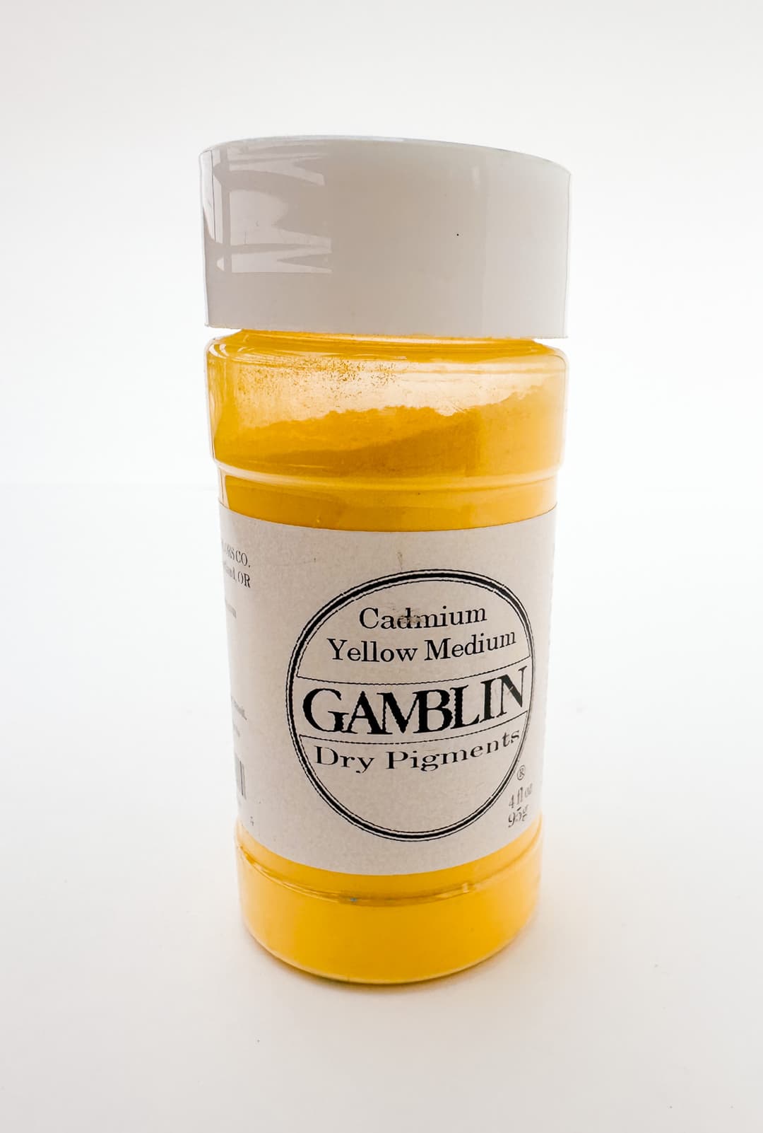
Cadmium Yellow Medium
More Historical Yellows
PY36 - Zinc Yellow. Zinc chromate (may also have some chemical variations- see Artiscreation for more). This color is a dull yellow with a note of green leaning. It is rarely used in artists paint and is currently not used at all. We include it here as some vintage tubes may turn up. This color is given a toxicity of B, so use care. The Artist's Guide to Health and Safety has information about the hazards of pigments containing Barium and also pigments containing Chrome.
PY39 - Orpitment, Realgar. This is extremely toxic. It is also reactive with other common pigments. These are listed for historical purposes only. We do not recommend using orpiment for any reason.
PY40- Cobalt Yellow, also known as Aureolin or Aureoline. Potassium Cobaltinitrite. This color was prized for being a transparent to semi-transparent yellow. Sadly, the lightfastness of this historical pigment was not as great as was hoped. Usually ASTM II is cited for Aureolin but in Golden's Recent Lightfastness tests it was one of several pigments that struggled in Safflower oil, WB Flake White, and Lithopone. It is one of the yellows that is sensitive to moisture and didn't respond as well to humidity either. Cobalt Yellow was discontinued, as discussed more here.
Monona Rossol's work mentions some health problems that can arise from it, see her research here. The Artist's Guide to Health and Safety has information about the hazards of pigments containing cobalt. This color may also cause methemoglobinemia.

Vintage Zinc Yellow by Winsor and Newton. Zinc Yellow is extinct.
Sorting out the Lead Tin Yellows
Also poisonous - a historical color
Also known sometimes as Giallorino.
There are three related pigments which can sort of blur together a bit, but they are distinct. Lead Tin Yellow type 1, Lead Tin Yellow type 2 or II, and Genuine Naples Yellow which is also a lead yellow, also known by the code PY41 (more on this below). The terms Lead Tin Yellow, Naples Yellow genuine, giallolino, giallorino, massicot, and litharge all need a little bit of clarity as they may or may not refer to similar things when people use them.
These colors are somewhat heavy in physical weight and mellow in the way they mix. They are more chill than most synthetics, most cadmiums, and have a semi-transparency to them. However they are poisonous and expensive.
Lead Tin Yellow Type 1 or Type I. This pigment doesn't have its own Colour Index pigment code, and is an important historical color. This color is toxic. Natural Pigments describes it as "Lead stannate, prepared from a heated mixture of lead dioxide with tin dioxide; Lead-tin oxide." This version is more commonly found in old paintings, and is associated with European painting. This tends to be a bit lighter yellow than Lead Tin Yellow (Type II), but it can also be made into an orange when heated. The Artist Handbook mentions that there are two types of Lead Tin Yellow Type I, a bright lemon yellow and a warmer middle yellow. In our experience, it is usually a buttery light yellow, or bright primrose yellow, but there are also very light whitish yellow versions (think warm white) of Lead Tin Yellow.
Lead Tin Yellow Type II or type 2, is "Lead-Tin Oxide Silicate, made by fusing lead, tin, and quartz." There is sometimes some lack of distinction between Lead-Tin Yellow Type II, which has no pigment code but has C.I. number 77629, and PY46 (sometimes called massicot or litharge, C.I. number 77577). A toxic yellow as well, Artiscreation notes that this is "redder and deeper...and more transparent" than type 1. Sometimes paints made with Lead Tin Yellow (Type II) are labeled Lead Tin Yellow Deep.
This color is actually distinct from both Lead-Tin Antimony Yellow as well as Genuine Naples Yellow PY41- another toxic lead yellow. More on PY41 can be found in the section below.
There is also another lead-related yellow orange called Litharge or Massicot, which of course are also toxic. A bit more on those can be found below under PY46.
Since the hue varies a lot it's one of those areas where the exact brand and batch will matter to the color of the paint.
Natural Pigments makes a Lead Tin Yellow Light. In modern times there are a lot of blends which are made to fill this color space, and the blends are usually made of far safer pigments. It's an interesting quirk that more blends are not named Lead Tin Yellow Hue, even if they get close to the color. This may have something to do with the fairly recent reconstruction of the genuine pigment and the history of its sort of re-discovery. However, regardless of the names, there are a lot of mild yellow mixes out there which fall in the neighborhood of Lead Tin Yellows. The historical pigment color comes in several hues. It is toxic.
Also shown here is an approximation for Orpiment, an extremely toxic pigment which seldom found (see above). Oripment's color range is also an area where there are a lot of blends out there to approximate this light yellow. The version here is a blend/hue.
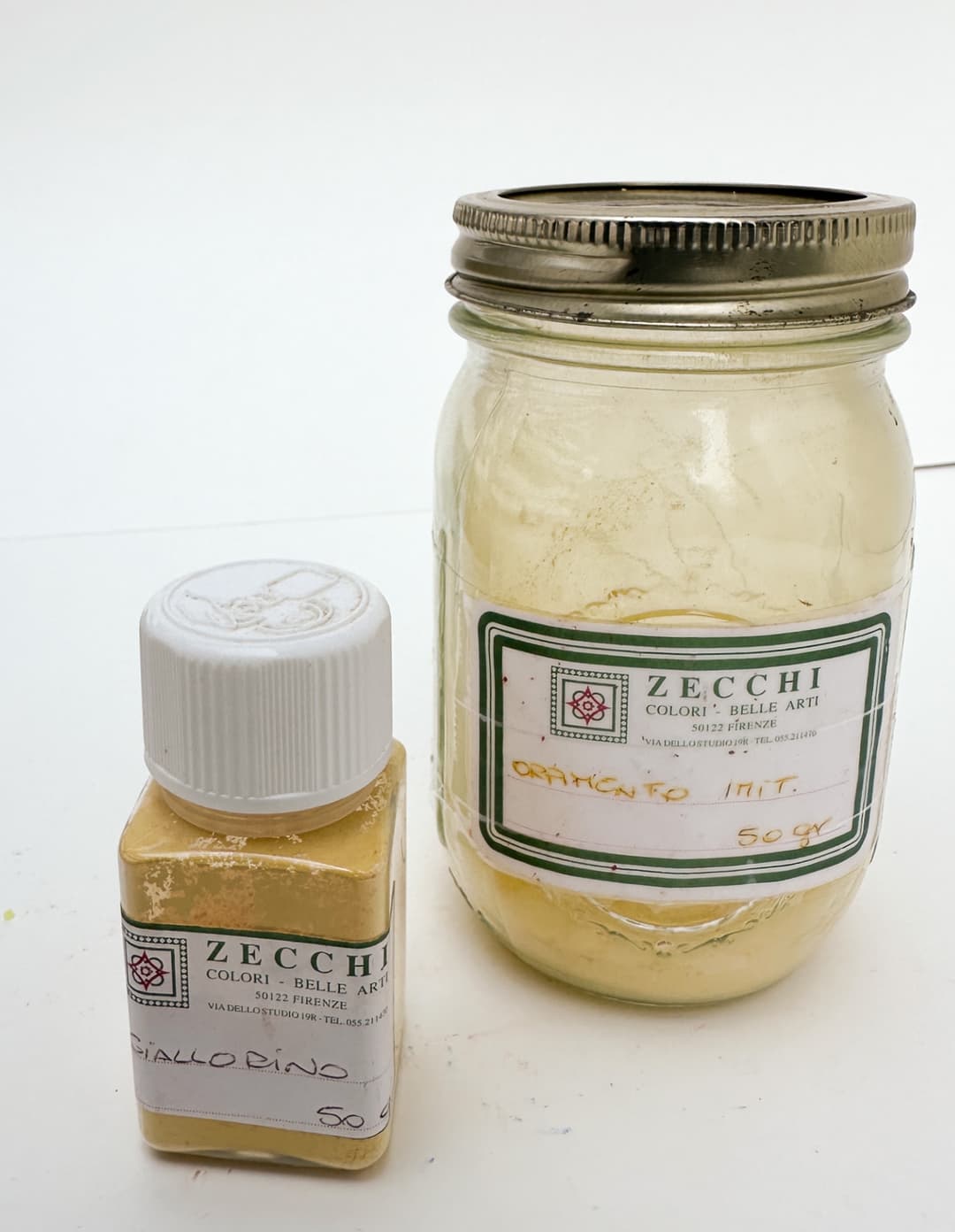
Giallorino our best guess is Lead Tin Yellow genuine. To the right is an imitation hue of Orpiment.
Cadmium Yellows
Stars of the palette
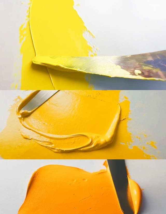
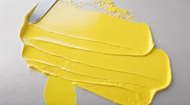
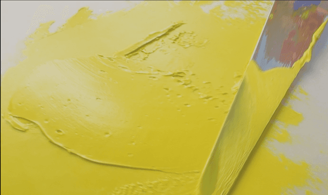
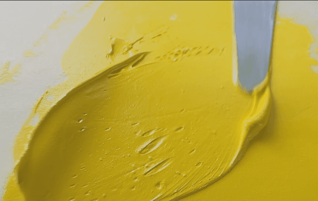
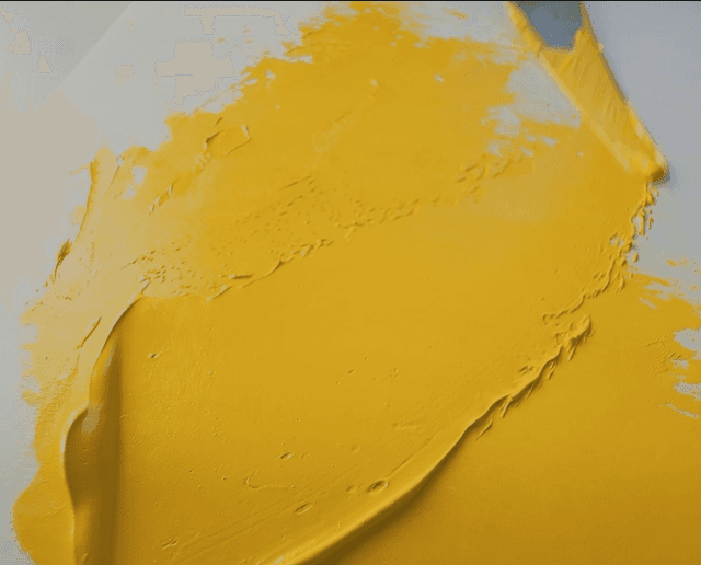
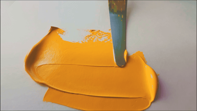
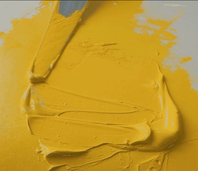
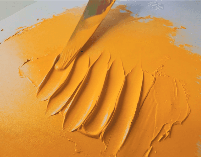
Actual Naples Yellow - Not a Mix
PY41 - Naples Yellow Genuine. Also knowns as Giallorino, or Antimony Yellow. A lead yellow. This is an interesting color which is very toxic. In color it ranges from a fairly opaque middle yellow with fairly high chroma to caramel brown. Most often when one sees the name "Naples Yellow" it will refer to a mix of other pigments in an approximation blend, since genuine naples yellow is a historical color that is both poisonous and hard to find. Part of the reason there are so many different blends of different colors is that there are many varieties of genuine Naples Yellow, but also because this name space has taken on a life of its own. Hue mixtures with much safer pigments abound, and we counted about 54 different combinations for blends that approximate this color in oils alone. The age old question is do you need the "real thing"?
There are a couple of shades of this color which can be found at Natural Pigments. We've tried a handful of these in a couple of our historical color quests. We started with a caramel version of this color and branched out into other kinds.
While it is interesting in mixes, artiscreation mentions, "When it comes into contact with a metallic iron or tin or zinc, Naples Yellow becomes gray. It is advisable to use a horn or wooden spatula in preparing and/or mixing the pigment," and quotes the Dictionary of Artists' Oil Pigments. While this color has a role in art history, its toxicity is a huge drawback. Monona Rossol's work has a section on health problems from lead as well as antimony in pigments in the Artist's Guide to Health and Safety. Her most recent research can be found through her site. Lead is toxic, and even though Naples Yellow Genuine is great for portraiture, we avoid lead in the studio and haven't missed it.
Genuine naples yellow tends to require a medium amount of oil, which is interesting in comparison to lead white which requires very little. In contrast to lead white, Naples Yellow Genuine has a fast drying time, though some have felt it was more of a medium drying time - opinions differ a bit. It is also a fairly heavy pigment.
PY46 Litharge. Lead Monoxide. This pigment is toxic. Sometimes Litharge and Massicot are used interchangeably but they are distinct. This is not usually used as a standalone pigment in oil, and the Natural Pigments site has information on the differences. The Artist's Handbook highlights its toxicity and instability.
Monona Rossol's work has a section on health problems from lead pigments in the Artist's Guide to Health and Safety. Her most recent research can be found through her site. Lead is toxic.
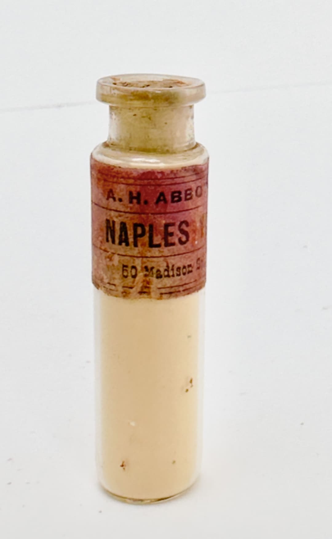
An antique bottle (possibly) Genuine Naples Yellow- if it's the real thing, it's very toxic
Spotlight on Yellow Earths
PY42 - Yellow Iron Oxide, (more below) and a similar pigment,
PY43 - Natural Yellow Iron Oxide
Sometimes the natural ochres are a bit softened compared to their synthetic counterparts due to naturally-occurring minerals that get labeled impurities but actually can be quite nice for the overall effect of the paint. We have heard that many (but not necessarily all) natural ochres may have a little bit of the synthetic in the pigment to ensure color consistency.
Some of the oldest pigments, Yellow Earths are foundations of the palette. Some of the common names for paints are Yellow Ochre, Raw Sienna, and Golden Ochre. There is a lot of variety in the names- you might also encounter Orange Ochres, Ochre Havane, Transparent Yellow Oxide or Mars Yellow. They can vary in transparency, color, and particle size.
Yellow Ochres tend to be lighter to mid-value caramel colors. They have excellent lightfastness and the synthetic ones may have a bit of opacity, though about half of the synthetic ones are semi-opaque. Among natural yellow ochres Semi-Opacity or Semi-Transparency is much more common. However this pigment group is best when it has a bit of lightness to it- not like the deep transparent paints labeled Transparent Yellow Oxide. Yellow Ochres may be labeled Lemon, Light, Pale, or Deep. Natural ochres may bear the name of their origin such as French or Italian. These colors, like all earth tones, have a wide variety of particle sizes (aka grittiness). They require a medium amount of oil which is interesting as Raw Siennas tend to require a bit more to make them into an oil paint, but are often among the faster driers.
Lemon Ochres are a smaller subset of Yellow Ochres that tend to be a little lighter or a little yellower in color. There is no standarization though in naming, so this is not a hard and fast rule. Some of the modern natural earth versions we've tried have a larger particle size.
Raw Sienna This is an established name space that is one of the major categories of earths. Strangely we did not notice many synthetic PY42 paints labeled Raw Sienna, though there are a few- perhaps this has to do with the tendency of synthetic paints to be opaque, whereas Raw Sienna ideally has some transparency. This is a pigment that requires a lot of oil. The Raw Siennas we've encountered tend to be similar to yellow ochre but they are more orange and sometimes a bit deeper in lightness. However, at least one older text which refers to natural Raw Sienna describes it as a greyish brown that leans cool and has transparency, which does not sound like the peanut-butter color we usually encounter. These days Raw Sienna seems to be a kind of second Yellow Ochre- a bit deeper and warmer. Natural versions of Raw Sienna tends to be at least Semi-Opaque, and more transparency is desirable.
Golden Ochre/ Gold Oxide/ Gold Ochre can range in color, so it's hard to determine based on paint name and pigment code alone. Among synthetic colors they tend to be opaque, and among natural colors they are usually Semi-Opaque. Where they are transparent this is sometimes (but not always) mentioned. We associate them with colors that are a little oranger than Yellow Ochre and Raw Sienna.
Ochre Havane is often an orange ochre that is opaque or semi-opaque.
Orange Ochres are some of our favorite colors for their mildness and versatility in mixes. Orange ochres tend to be fairly opaque.
Transparent Yellow Oxide: This color is an interesting one as it can be deep brown out of the tube and yet very chromatic in glazes. It reveals its color in tints. It is rare to find natural earth paints with this property, so it is often synthetic. This color version, while it shares the same pigment code with Yellow Ochres, can be used very differently in painting due to its different lightness and chromatic behavior.
Mars Yellow or Mars Orange: A color name which applies to the synthetic yellow oxides. It can be made to be opaque or transparent, or somewhere in between. This gets listed as a opaque pigment as the natural yellow oxides tend to have a lot more complexity but we actually associate it with transparency- it just depends. Sometimes the transparency is noted in the name (e.g., Transparent Mars Yellow), and modifiers like Light and Deep to describe the color are sometimes added as well. This is a pigment which requires a lot of oil.
Burnt Ochre many earths can be heated (or calcined) and they turn darker but also redder. Sometimes a reddish earth with be PY43, sometimes PR102 or PR101.
Brown Ochre There is an interesting class of ochres that are PY43 but they are more of a grey brown. These are interesting colors that widen the gamut for what yellow earth can mean. Many lean toward opacity but that is not always a given.
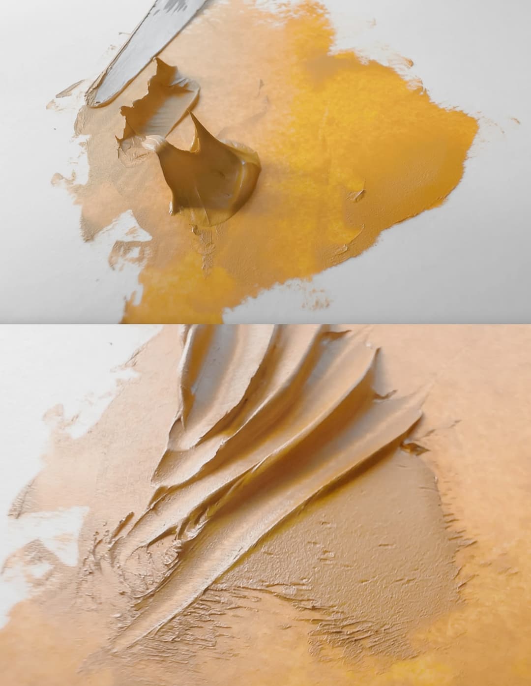
Yellow Ochre - A classic if ever there was one
Yellow Earths
Staples of Art History

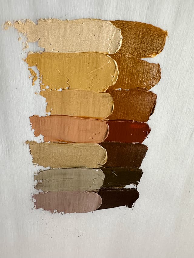
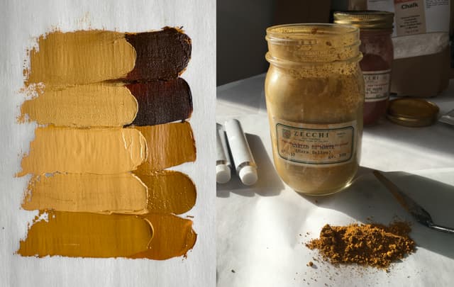
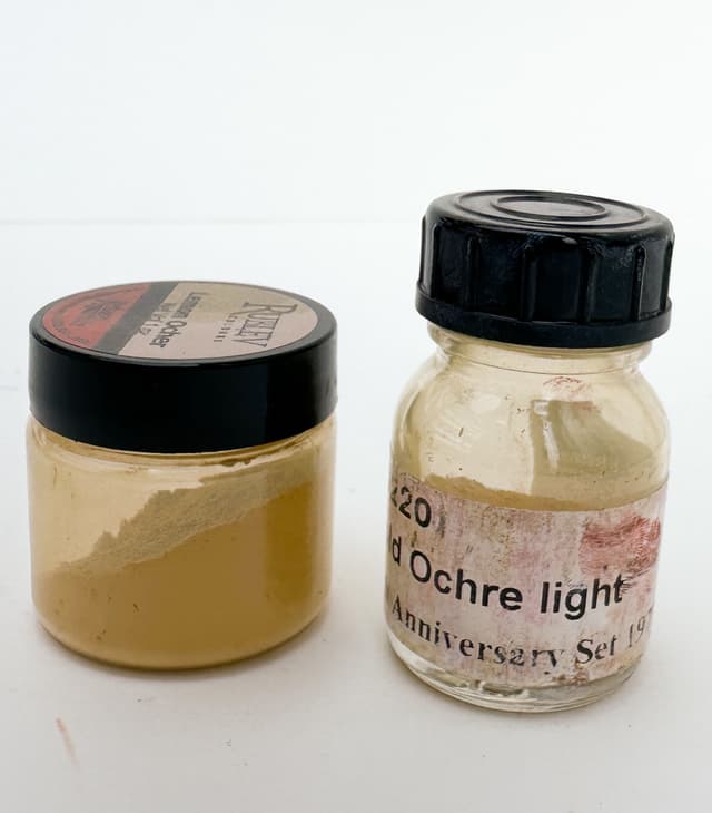
An Unsung Hero
A lesser known yellow that excels in lower-chroma blends
PY53 - Nickel Antimony Titanium Yellow Rutile or Nickel Titanate, sometimes called Nickel Titanium Yellow. This color is super useful for making lower chroma colors. It does have toxicity and is rated B, so please do be mindful and careful as you would with any other similarly rated pigment. It is pretty opaque, and well suited to direct painting methods.
Listed as a "B" for toxicity, we advise treating all pigments with great caution, and this one is no exception. Monona Rossol's work has a section on health problems from nickel and antimony pigments in the Artist's Guide to Health and Safety. Her most recent research can be found through her site.
This color excels in creating low-chroma mixes. In masstone it's an enchanting light yellow with a faint green in the overall color impression. It's not a replacement for Lead Tin Yellow, but it is a color that keeps us coming back. It's a hard-to-describe pale yellow color with secret-superpowers in mixing.
Nickel Titanium Yellow tube by Old Holland and paint from Williamsburg
Spotlight on Yellows
PY61 - Pigment Yellow 61. A lightfastness of of ASTM II puts it at moderate in Paint List terms. Not found in oil, and exists in at least one brand of watercolors.
PY65 - Hansa Yellow 65. One of several hansas, it's an orangey yellow or sometimes called Hansa Yellow Deep. Frequently found as a single pigment but also popular in blends. A slow drier. Depending on the supplier, this pigment can be decent or just moderate in terms of lightfastness. There were some interesting results from Golden's recent lightfastness testing in oils and it may be quite reactive to Zinc White and certain formulations of Lead White.
We were amazed to hear that this might be metabolize to a carcinogenic chemical and also cause methemoglobinemia. See Monona Rossol's work for more. The Artist's Handbook mentions that hansas are often heavily extended in less expensive paint ranges, and that the extenders reduce the transparency along with other problems.
PY73 - Arylide Yellow GX. This color was removed from Golden's paint blends for lightfastness issues, but it is used by four or five paintmakers as a single-pigment paint. It is generally a slow drier. Historically this pigment was rated as LFII, however changes in the way it is manufactured may be part of its trend toward LFIII. Golden opted to replace PY73 in their line with PY154. See their Hansa update for more.
We were surprised to see in the "B" class for toxicity, meaning it does have some. According to Monona Rossol's research, this color may metabolize to a carcinogen and also may cause methemoglobinemia. See Monona Rossol's writing for further information.
PY74 - Arylide Yellow 5GX. This is a very popular sunny hansa yellow with high chroma, but may have lightfastness issues. Lightfastness ranges from decent to moderate in tints, and depending on the supplier may be insufficient. A slower drier. Artiscreation mentions that the lightfastness may be better in opaque formulations of the pigment.
Like several other hansas, this color may metabolize to a potential carcinogen and could cause methemoglobinemia, see Monona Rossol's writing for more.
PY74LF - See above for PY74- also the same health note applies. The convention of adding LF is not in the colour index, however the distinction may account for the two formulations of the pigment. From artiscreation: "transparency depends on formulation. Comes in both opaque and transparent versions. It appears that the light fastness is better in opaque formulations."
PY75 - Arylide Yellow. Looses some lightfastness in tints, but otherwise decent lightfastness. This color is used in traffic paint, and Artiscreation mentions that it is possibly a good substitute for some chrome yellows (we would guess these are the warmer yellow-orange ones he is referencing). Rare as a single pigment oil, but found in a number of blends.
This color may metabolize to a potential carcinogen and could cause methemoglobinemia, see Monona Rossol's writing for more.
PY81 - This is a lemon yellow that is fairly rare in oils. Known as Diarylide Yellow H10G. It has an ASTM LF rating of II and is found for some reason in combination with Titanium White but not as a single-pigment paint in oils. There is at least one single-pigment paint in watercolors.
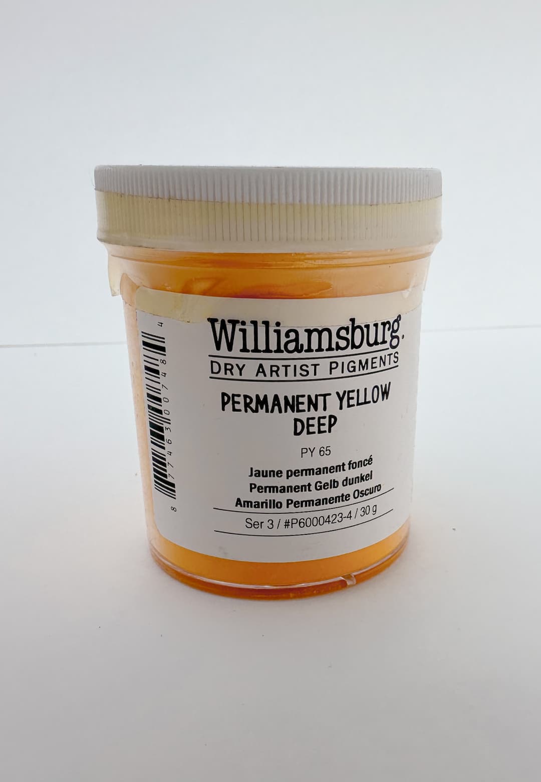
Hansa Yellow Deep from Williamsburg
More Yellows
PY83 - Diarylide Yellow HR. A pigment with two natures- and two lightfastness readings to match. We were shocked to hear this is a problematic pigment due to benzidine (we advise all artists to research toxicity and benzidine in their pigments). This pigment metabolizes to a carcinogen-- Monona Rossol alerted us to this in her writing, more of her materials can be found here. It sounds like contamination with PCBs may be likely. There are also thresholds for limiting the dust so please consult proper handling. This warm orange-yellow is a very tricky pigment with two varieties that vary a lot in lightfastness.
In regard to PY83's lightfastness issues, we're grateful to Golden for illuminating the differences. One kind of PY83 has excellent lightfastness and is more opaque while the other form is transparent and has poor lightfastness. Unfortunately the current ASTM only ascribes one lightfastness code, which is applied across types, so manufacturers will tend to simply appeal to single lightfastness reading in the table. It happens that the fading transparent version is mis-ascribed an excellent lightfastness rating. However the transparent version is so beautiful that Golden still uses it- just with the proper lightfastness ratings.
PY93 - Disazo Yellow 3G. Rare in artists' colors but listed as having excellent lightfastness. Artiscreation suggests it may be a good replacement for genuine Gamboge yellow. Sennelier calls it Turner's Yellow.
PY95 - Disazo Yellow GR. Rare in oils, it is a medium yellow that is used in a handful of blends. It may be a suitable hue for Gamboge. Listed as ASTM II.
PY97 - Diarylide Yellow FGL. Somewhat rare in oil paints. Maimeri ascribes the name Primary Yellow to this bright yellow color. Decent lightfastness but only at ASTM II. This color fades a bit in tints.
This pigment may metabolize to a potential carcinogen. This could cause methemoglobinemia, see Monona Rossol's writing for more.
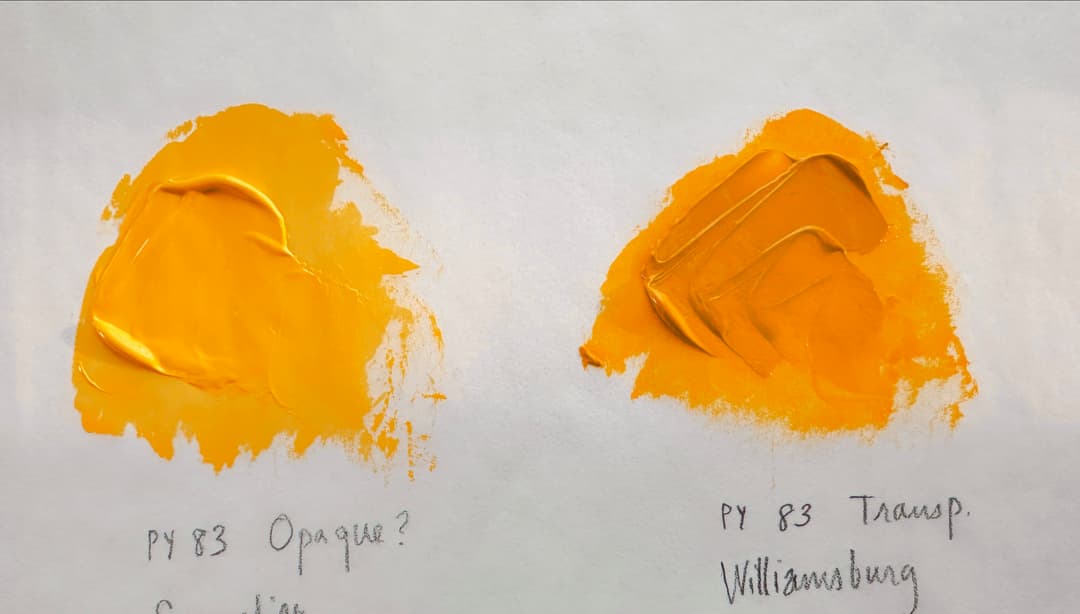
Spotlight on PY150
Interesting Yellows
PY108 - Anthrapyrimidine Yellow. Excellent lightfastness but it may be carcinogenic-- this specific pigment has not been tested but pigments of a similar structure have shown to be carcinogenic. Please see Monona Rossol's work on anthraquinone pigments for more. The lightfastness may vary across binders. It may be advisable to do your own lightfastness testing. May also be related to historical Indian Yellow (euxanthate- more info here). Currently this color is offered by at least one major watercolor maker.
PY109 - Isoindole Yellow. Excellent to decent lightfastness with a bit of fading in tints. Offered by two watercolor makers.
PY110 - Isoindolinone Yellow. This is a fabulous, under-recognized warm yellow that is incredibly useful in mixes. It also makes a great yellow for sap green convenience blends and is quite versatile. It is reported to have excellent lightfastness. The transparency of this yellow is a huge attraction. It is a slow drier though. Painter Kathleen Hudson noted that it can be used in mixes without adding a lightening effect to the overall mix (in contrast, cadmiums sometimes end up raising the lightness of a blend). We have found it be outstanding for mixing greens.
PY117 - Paliotol Yellow. A rare green-yellow which was unfortunately discontinued. Some sources listed excellent lightfastness, others decent to excellent. Currently it is still offered by one oil paint maker.
PY119 - Zinc Iron Yellow or Zinc Ferrite Brown Spinel. Good or excellent lightfastness. This color crops up in a few blends in oil paints. It is somewhat rare to encounter this one in oils. It's used as a single-pigment in a handful of watercolors, and the yellow is muted or sometimes even the tone of a red earth. It's sometimes called Spinel Brown or even Magnesium Brown. It is also in a few Gold Ochre imitation hues.
PY120 - PV Fast Yellow H2G. Lightfastness can vary. This is a rare pigment which appears to be in use by one paintmaker. A bright middle yellow.
PY128 - Azo Condensation Yellow, sometimes called Transparent Brilliant Yellow or Polyazo yellow. This is a transparent yellow worth getting to know though lightfastness is not perfect (7's and 8's on the Blue Wool Scale). It is a little bit difficult to find a good lightfast transparent yellow at this hue- Artiscreation suggests that perhaps it is an alternative to historical Cobalt Yellow or Aureolin.
PY129 - Irgazin Yellow, also known as Green Gold. This is a super mysterious and weirdly fascinating color. It's magic is not its masstone but rather what it does in mixes-- it is concentrated sort of like how yellow food dye often doesn't look yellow, but a drop of it in white brings out bright color. This transparent color is like the essence of deep yellow-greens, and it is actually necessary to expand the gamut. In masstone, it's actually quite green but it takes on more of a yellow in tints. PY129 shines in the low notes of the yellow-greens and allows some of the highest chroma low-lightness greens in oil paints. Toxicity is listed as B so handle with care. It has some things in common with PY150, which is a warmer counterpart.
Unfortunately in the recent Williamsburg lightfastness tests it displayed more reactivity than we would have hoped depending on the mixing white. In that round of testing, it looks to us that it did not respond well to a handful of things such as Lithopone, Safflower Oil, Zinc, or Flake White. Depending on the brand of Flake/Cremnitz Lead White, PY129 might not fare well. This was interesting news because PY129 is such a great pigment for a hard-to-replace area of the gamut and for us it may be worth it to use it in the ways wherein it performed well. See Golden's Testing for more.
PY138 - Quinophthalone Yellow, also known as Sulphur Yellow. It's lightfastness varies depending on the source- some list it as ASTM II and others reported as excellent. It's recommend to do one's own tests. The toxicity is reported as A, so low. This is a fairly rare pigment in oils, however it can be found from Holbein and Vasari. Vasari describes it as a cool yellow which mixes gently with others and they include it in their Basic Yellow, along with offering it as a single-pigment paint. In particular, they mention that it doesn't lighten a mix like a Cadmium Yellow can. On the other hand it also does not have as high of chroma as a cadmium. We have heard it described as a light bright yellow which differs from Vasari's description. In watercolors it does appear very bright in some brands.
PY139 - Isoindoline Yellow. There is a bit of fading in tints (7's and 8's for the Blue Wool Scale), however lightfastness is somewhere between decent and excellent. Sometimes made into a Permanent Yellow or even a Cadmium imitation hue. Tends to dry slowly. It's somewhat rare to find this pigment in a single-pigment paint in oil, however it shows up in a fair amount of warm marigold-colored blends, like Indian Yellow.
PY147 - Pigment Yellow 147. Polycyclic Anthraquinone. Lightfastness is decent. A fairly rare pigment found in at least one watercolor paint currently available.
PY150 - Nickel Azo Yellow. While it may look like a brown, this is a tremendous saturated yellow with depth which expands the gamut. It is incredibly useful- maybe almost indispensable for increasing the range of hues in oil paint and also for depicting lower-lightness high-chroma yellows.
As many painters will tell you, it can be difficult to descent down into the lower lightness steps of yellows. One may start out thinking it's as easy Grapevine dance only to find out it's more like a Viennese Waltz. PY150 is a color that can help maintain high chroma in difficult mixes.
All the while it maintains solid 8's (highest marks) for lightfastness on the blue wool scale. There may be a slight difference in lightfastness in Lead White.
This color goes through some fun spinning turns of its own as a person adds Titanium White. In masstone it looks like a dark brown, but it has hidden high chroma glazes and tints. Toxicity is a B, so handle with care. Monona Rossol's work has a section on health problems from nickel pigments in the Artist's Guide to Health and Safety. Her most recent research can be found through her site.
PY151 - Benzimidazolone Yellow H4G. Most manufacturers give this color solid 8's (highest marks) for lightfastness, with just one showing a bit of fall-off in tints. While common in watercolors, this is a fairly rare color to find as a single pigment in oils. It was recently made by Daniel Smith before they ceased to make oil paints. However, it can sometimes be found as a constituent of blends.
PY153 - Nickel Dioxime Yellow. Once highly prized, this color is now sadly extinct. It was highly transparent and had a golden yellow orange note in masstone with a bright sunshine when spread thinly. Favored by botanical artists for the gradient it offered but loved by all. It has an ASTM I in oil and a slightly lower rating in watercolor, however Handprint's tests were more favorable.
We were so sad when this was discontinued around 2012, as it was a yellow with a fascinating character- different in masstone than in tints and glazes. Whereas PY150 has a similar behavior from brown to cooler yellow, this color, PY153, gradated from orange to chromatic yellow. It was a very slow drier.
Monona Rossol's work has a section on health problems from nickel pigments in the Artist's Guide to Health and Safety. Her most recent research can be found through her site.
PY154 - Benzimidazolone Yellow 154. A famous yellow that is an alternative to Aureolin, also known as cobalt yellow, which is less lightfast. While not perfect, the lightfastness is between decent and excellent.
In Monona Rossol's work the chemical in PY154 may metabolize to create something that causes or is related to causing methemoglobinemia.
PY155 - Benzimidazolone Yellow 155. Somewhat rare to find, but one oil paint manufacturer offers this as a single pigment color. It is also found in several blends.
PY157 - Daipyroxide Yellow, Priderite Yellow. Nickel Barium Titanium Primrose Priderite. This is a rare pigment that is mostly discontinued. We loved it in Schmincke Mussini's Yellowish Green Ural (pre-2010 formulation). We were sad to see this fascinating pale yellow green go. It does have a toxicity rating of B, so handle with appropriate care.
PY159 - Zirconium Praesodymium Silicate Yellow. Not currently found in oils, however this is much more commonly found in watercolor, and several companies make it into a single pigment paint.
PY164 - Manganese Antimony Titanium Buff Rutile. This shows up in watercolor as a single pigment brown. One company offers it in oils.
PY168 - Azo Yellow 168. Currently one company offers this in watercolor.
PY175 - Benzimidazolone Yellow H6G. Though there is a slight fade in tints, this color has decent to excellent lightfastness. A cheery lemon yellow. It's quite popular in watercolor and also offered in oils and acrylics. It is a fairly common single-pigment color as well as an ingredient in convenience greens.
PY180 - Benzimidazolone Yellow (one of several). This color is not currently offered by any major paintmakers in oil, however it is offered by a couple of companies in watercolor.
PY181 - Benzimidazo Golden. Excellent lightfastness. Offered by one company in watercolor, the hue looks orange.
PY183 - Paliotol Yellow K227. Offered by one major company in watercolor.
PY184 - Bismuth Vanadate Yellow. A famous yellow which can come close to some cadmium yellows. This hue is typically portrayed as a cool yellow, however it is a bit warmer than we realized when we compared it with truly acidic lemons. It is light, bright, high chroma, and gorgeous overall. Monona Rossol's work notes that natural sources are likely to contain impurities. The Artist's Guide to Health and Safety contains a section on health problems related to pigments containing Vanadium and Bismuth.
PY189 - Nickel Titanate (not to be confused with PY53). Offered by one company in watercolor.
PY216 - Solaplex Yellow. A somewhat rare and interesting color. This is found in a couple of oils and watercolors, and is usually a chrome yellow replacement color. Monona Rossol's work has a section on health problems from titanium, tin, and zinc pigments in the Artist's Guide to Health and Safety. Her most recent research can be found through her site. She mentions there may be impurities from the tianium rutile.
PY223 - MayaCrom Yellow Y2351RS. Currently offered by at least one company in watercolor.
PY227 - NTP Yellow. Found from one company in watercolor. This is an interesting pigment that seems to be fairly new. Initially it looks as though it may have good lightfastness.
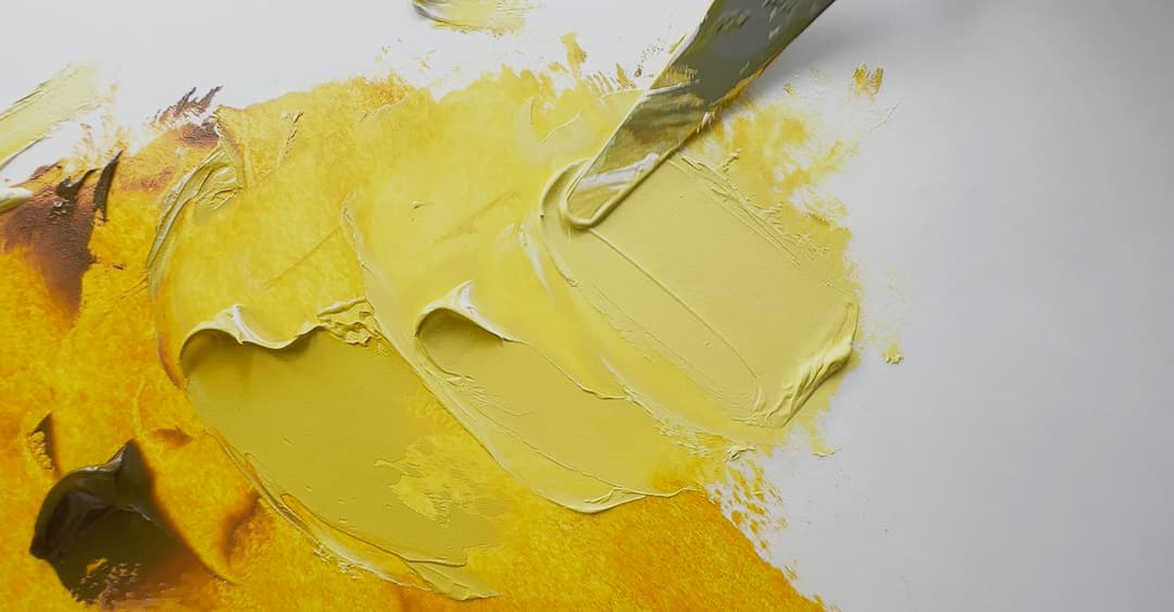
PY150 in oils. A remarkable transformation in tints with Titanium White.
Green Pigments
Few but Mighty
Some consider green a psychological primary, though a dazzling array of greens are readily mixed with blue and yellow. These greens have stellar soloist roles as well as in duets and trios with other pigments.
Often when speaking of lightfastness and greens, we're dealing with green mixes from a blue and a yellow. In those cases, often it is the yellow in the mix that one has to watch for lightfastness. However there are a few green pigments which fall short in the lightfastness category.
NG2- Natural Green 2, Extract of Ripe Buckthorn Berries, Rhamnus catharticus. This substance is charming but very fugitive. Sap Green is also the name of a popular array of convenience blends. (See also convenience blends).
PG8 - Nitroso Green. This color has the unfortunate honor of being one of the lowest performing modern colors for lightfastness in tints, with a perilously low blue wool rating of 2, depending on the manufacturer.
PG10 - Nickel Azo Yellow. A discontinued pigment. If you happen to find old tubes of this color, be advised it requires a Prop 65 Warning. Artiscreation has more information about when it was discontinued. Monona Rossol's work mentions it is similar to cancer-causing dyes and may metabolize to a carcinogen.
Volkonskoite. Green stone. Dichrome Trioxide Mineral. Monona Rossol mentions that depending on the origin, silica and/or asbestos may be present. Please consult best practices for its use.
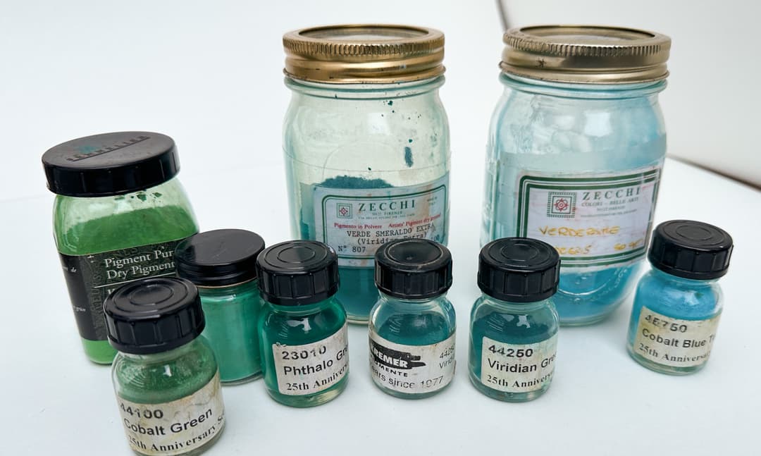
Green fine art pigments
Spotlight on Phthalo Green
The two phthalo greens, affectionately known as yellow shade and blue shade.
PG7- Phthalo Green Blue Shade. We have an article on Phthalo Green Blue Shade over in the articles section. One of the power pigments of the palette, this is a deep, transparent, high-chroma green that shows up in a staggering number of convenience blends from leaf greens to mints to green earths. This green is like some kind of mythical emerald that when broken into a million pieces creates an emerald rainbow of colors. It takes some work to divide it into all its may forms in mixes as it tends to be quite potent.
We found that Phthalo Green BS (as it's sometimes abbreviated) is frequently added to convenience greens of all kinds-- which makes it possible to mix your own convenience colors on the palette. This color also has a special role in teals and can help to mix approximations for some of the more expensive mineral-based colors. See also the note on Viridian. It tends to be dark, almost black in masstone, but reveals high chroma in tints and glazes. We have a deep dive on Phthalo Green as well as a comparison of PG7 paints in oils. It can sometimes be contaminated with PCBs, so please seek out Monona Rossol's information (her site can be found here) on phthalos and PCB contamination. Her book, the Artist's Guide to Health and Safety, contains information about the hazards of working with pigments that contain copper.
Phthalo Green only requires a moderate amount of oil, however it seems to frequently be found with modifiers, additives, stabilizers, and extenders.
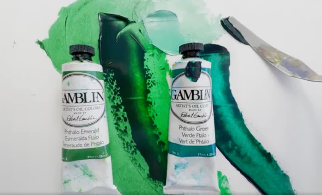
Two phthalo green varieties: Phthalo Green Yellow Shade and Phthalo Green Blue Shade
Convenience Greens
While not single-pigment blends, these still bear a mention
Names like Sap Green, Hooker's Green, Chrome Green, Permanent Green Light, Permanent Green Medium, Permanent Green Deep, Emerald, Verona Green, Veronese, and many others, these are blends of blue and yellow pigments. From Gamblin's Cadmium Chartreuse to Michael Harding's Bright Green Lake, from Old Holland's Cadmium Green, to Rublev's Cinnabar Green made with actual Lead Chromate, these greens have enduring popularity because a particular mix may save a person a huge amount of time mixing.
With convenience greens, always check the pigments-- especially the yellow component-- for lightfastness. Convenience Greens - blends of pigments that artists may find useful to have pre-made. The traditions around greens are a little less cohesive than other areas of the palette. Always check the ingredient pigments on a given tube of green for lightfastness and other considerations important to your painting practice.
Sap Green is a name with a long history. Usually it's a transparent color which is inspired by foliage greens. This means it has some chroma to it while being a fairly low to middle lightness yellow-green. However the colors for sap green vary as much as the formulations. In the past it was made of fugitive substances, but now it's common to find a warm yellow or even a brown or red earth that adds a note of complexity.
Permanent Green is a name that often designates some of the brightest green blends. These are usually high-saturation middle greens but they may range from deep green to leaf green to electric lime. Sometimes a paintmaker will add Light or Dark to the name. The lighter versions push closer to lime, while deeper versions can go fairly cool. Either way these are usually very bright spectral greens.
Cadmium Green will usually be a mixture of a cadmium yellow genuine and viridian. They can range from deep to yellow-green depending on the starting color of the cadmium (whether light, medium, or deep) and the amount of viridian. There is usually a bit of a softened appearance when comparing these to Permanent Greens, though they can still be quite high chroma. We've compared a few cadmium greens in oils to gesture at the range of colors.
Veronese Green tends to be on the cool side and sometimes has a bit of whiteness or teal in it. Phthalos are a popular component.
Hooker's Green tends to be a dark green favored in botanical work. Formulations have changed over the years but these days a warm yellow or even red iron oxide are popular additions.
Prussian Green used to be a convenience blend based on Prussian Blue, but these days may contain a phthalo instead. In modern times it's usually paired with a warm transparent yellow such as PY150 or PY110.
Some greens are named Cinnabar Green, not to be confused with the red-orange pigment Cinnabar or genuine Vermilion. The greens tend to be named light, medium, and deep, and usually have a note of desaturation in the form of an earth tone, but not always. This is an area where we see some ultramarine crop up in the blue component. This region of green contains some complex mixtures.
Emerald Green These tend to be fairly high chroma middle greens with a note of white in the mix.
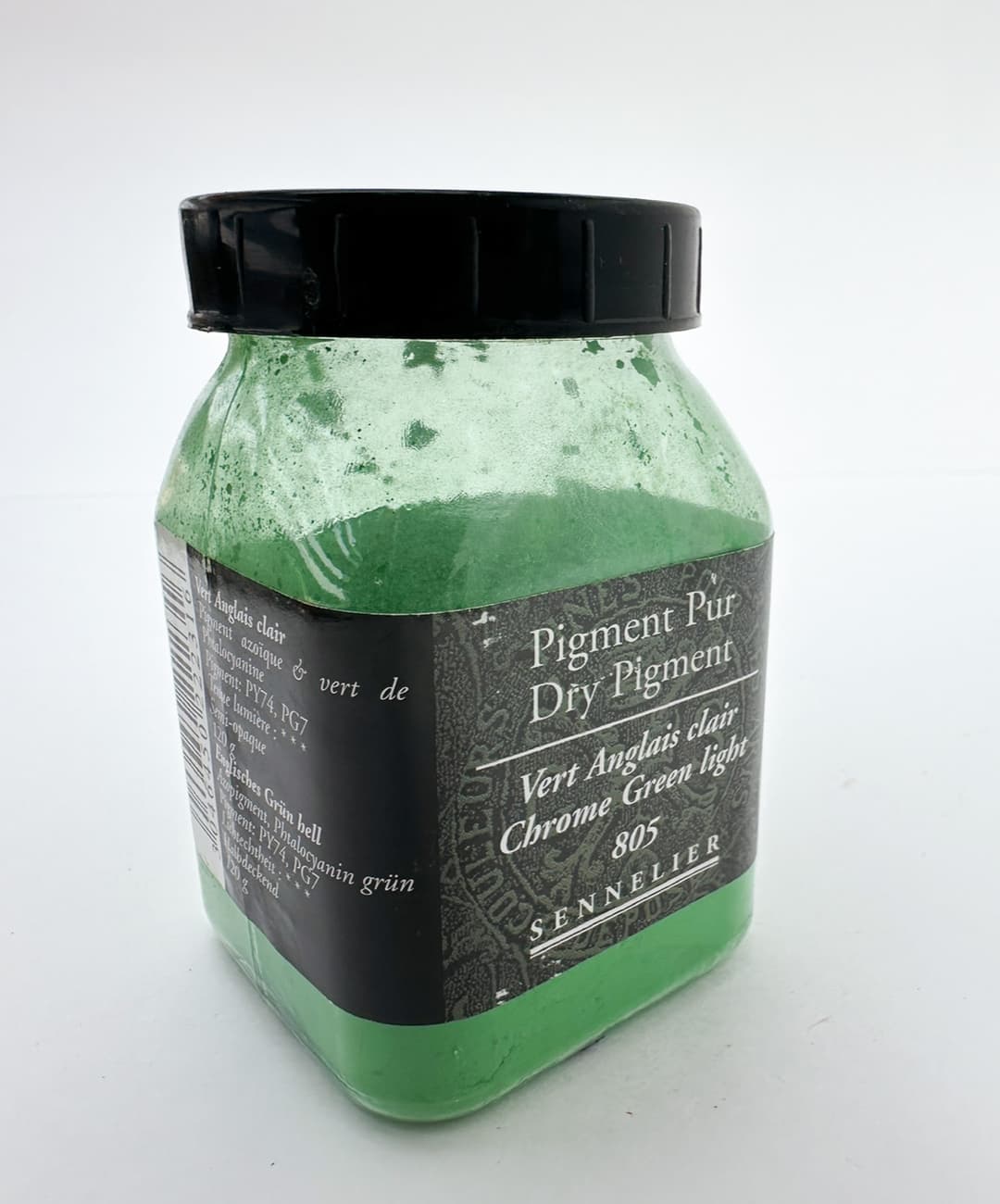
Chrome green light is a convenience blend of a yellow and a green pigment. Check the ingredients of convenience blends for lightfastness.
Greens with Staying Power
PG17 - Chrome Oxide Green, Chromium Oxide Green. Sometimes described as ,"The green of printed money." This is an interesting, heavy pea soup green, and evokes a memory of pond plants in its hue. However in handling this color always packs a significant punch and while some have complained of phthalos being very intense, this is a color I have found to be sometimes almost overwhelming in its opacity, however like all things when used in the places one wants it, it is fantastic.
A reliable color, as in very stable. Despite having chrome in the name, our understanding is that this pigment is not the same as other very toxic chrome pigments- however, our eyes widened when we read on artiscreation that if it is poorly made it may have free chromium, which would equate to a much more toxic situation. See the Artist's Guide to Health and Safety for information about the hazards of pigments containing Chrome-- in her latest work, Monona Rossol mentions this is Chrome III and has specific comments about that. So like all artist paints, use this color with respect.
One of the virtues of this color is that it is among the pigments that do not require much oil when made into an oil paint, so more suited to the lower layers of a painting. It has a medium to fast drying time.
PG18 - Viridian. Debate rages as to whether phthalo green replaces viridian, and we have found the answer to be not really. Though both are transparent the two have slightly different qualities. When mixing colors that are just shy of highest chroma (which happens a lot in realistic painting) viridian is a much more straightforward green to use. Phthalo can be used, but may take another pigment or two to counterbalance it and achieve a similar effect. Viridian is often paired with cadmium in cadmium green mixes, probably due to the copper in Phthalo.
One interesting quirk we've found is that some brands of viridian actually seem to shift in appearance when dried. Out of the tube they may look almost indistinguishable from phthalo green, however after drying the two may appear distinct.
Viridian has a very high oil content when made into paint, which may be important to keep in mind if painting in layers.
In the Artist's Guide to Health and Safety Monona Rossol has information on working with pigments containing Chrome, however in her latest work she distinguishes that this color has Chrome III.
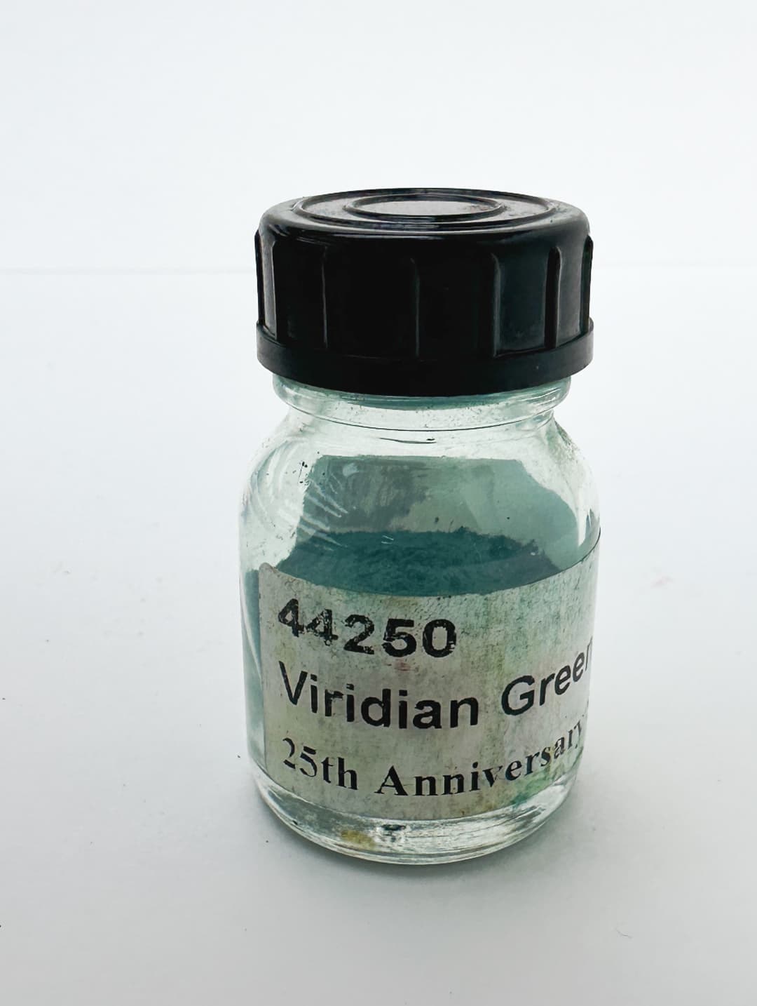
Genuine Viridian
Historical Greens
PG19 - Cobalt Green Pale. This is cooler blue-green counterpart to PG26 cobalt chromite green with a note of desaturation, but it actually comes in a range of green colors. Mineral-based pigments like this have greater opacity and different character than their modern counterparts and can be useful in mixes for realistic painting. (See also PG26). Cobalts tend to be fast driers.
This is listed as a "B" for toxicity, but we'd place it in the toxic arena. See the Artist's Guide to Health and Safety for information about the hazards of pigments that contain cobalt as well as those containing zinc. The author's latest work can be found through contacting her on her site.
Cobalt Green pale can be useful in tints.

Varieties of Genuine Green Earth
Phthalo Greens
PG7, the bluer shade of Phthalo Green
Genuine Verdigris
One of the poisonous ones.
PG20 -Verdigris. This color is an extinct pigment and for good reason as it is not very stable in artists' applications. Specifically, Verdigris is not that good for oil painting, though it was used in art history. This color is toxic, and also changes color wildly in oil paints.
An interesting exploration of this paint in oils was done by an artist who goes by the name Yellow Oxide here. Their explorations show a dramatic darkening when mixed with Cadmium Yellow.
The sample also changed color noticably without mixing- from a cobalt-teal green to a minty phthalo-like color. Even the dry pigment undergoes color change, eventually settling to a deeper green as is seen here.
This color is associated with toxicity and Artiscreation assigns a B. We treat it as though it were more toxic than that.
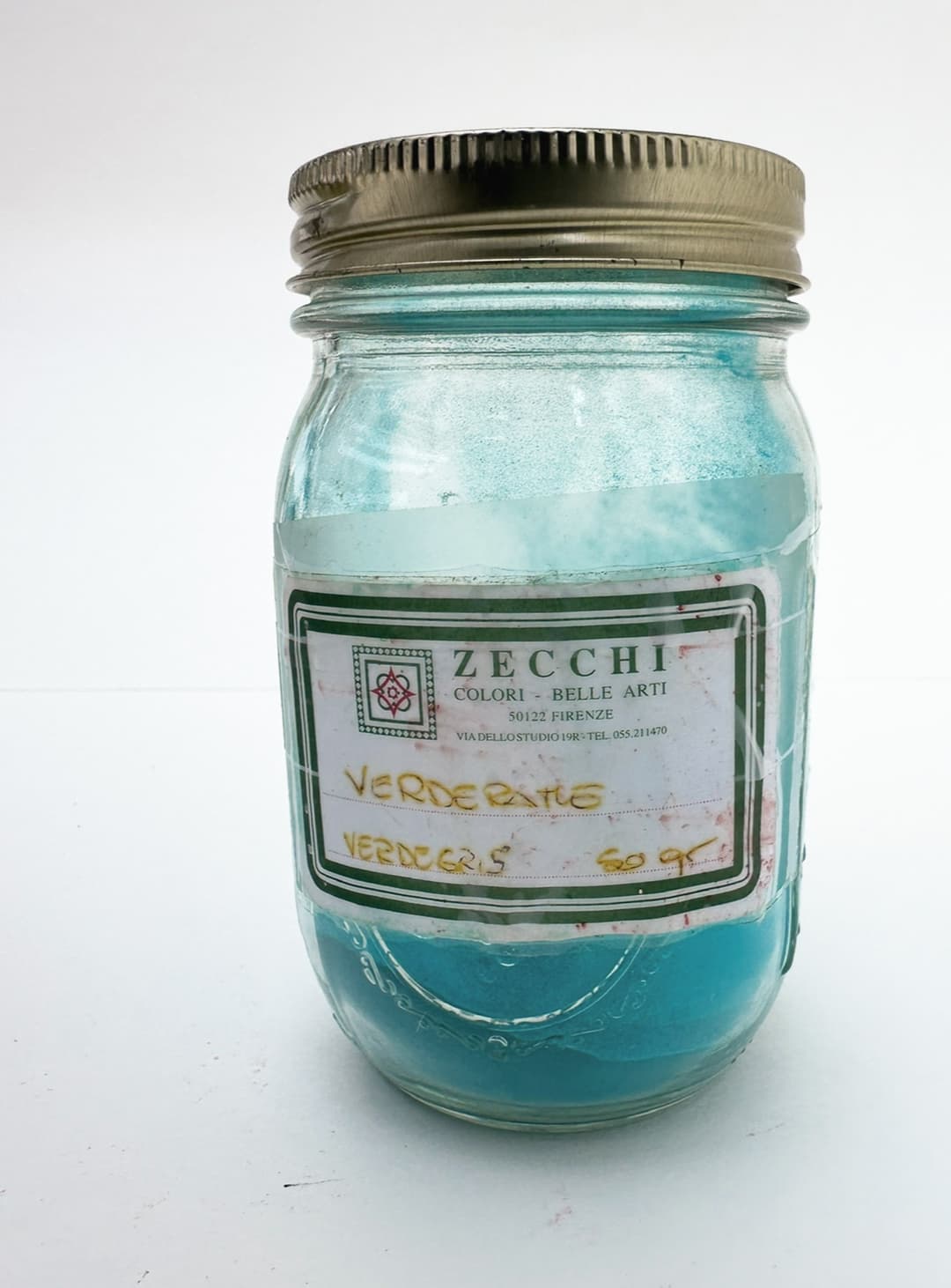
Verdigris from Zecchi pigments
More Green Pigments
PG21 and PG22 Extremely Toxic. Discontinued, obsolete. Paris Green, historical Emerald Green, Schweinfurt Green. This pigment should not be used for any reason.
PG23 - Green Earth. This is an increasingly hard-to-find color, which was historically used in verdaccio and underpainting for flesh tones. It is usually a gentle, lower chroma transparent green. Usually glauconite but can also be celadonite or other minerals. Unfortunately, many companies opt for blends of yellow iron oxide and phthalo green. We have it on good authority that every- or nearly every- PG23 out there commercially has a little tiny bit of phthalo green in it. However genuine green earth has a very mild quality. Some also have larger particle sizes, so be aware of that. We find that to be a feature, but some people require very smooth paints (for example, if you use a glass palette this could be a frustrating quality). Some of the more interesting green earths are found from Williamsburg and Rublev.
This pigment is requires a high amount of oil to make it into a paint, and tends to be a slower drier.
In her work on artist pigments, Monona Rossol writes that some forms of celadonite have structure form similar to cancer-causing minerals, so while PG23 is not labeled for that hazard, please do your research when working with this pigment.
PG26 - Cobalt Chromite Green. This is one of the palette secrets we like to share with dedicated realist painters, as this color has a useful role in mixing. While in masstone it is not exactly a showstopper- a dull green- in blends it is helpful for creating muted colors. Like many cobalts, it comes in a range of greens with some being warmer and some cooler.
It is rated a B for toxicity, so we'd place it among the toxic pigments. If it does contain some soluable chromium that's a toxic issue, so do avoid all contact with your mouth, don't breathe dust, etc. Please treat this with all due respect and caution just in case.
Some list this as a medium drier, and others as a fast drier.
In the Artist's Guide to Health and Safety Monona Rossol has information on working with pigments containing Cobalt and also a section on pigments containing chrome. Her most recent work can be obtained through her site.
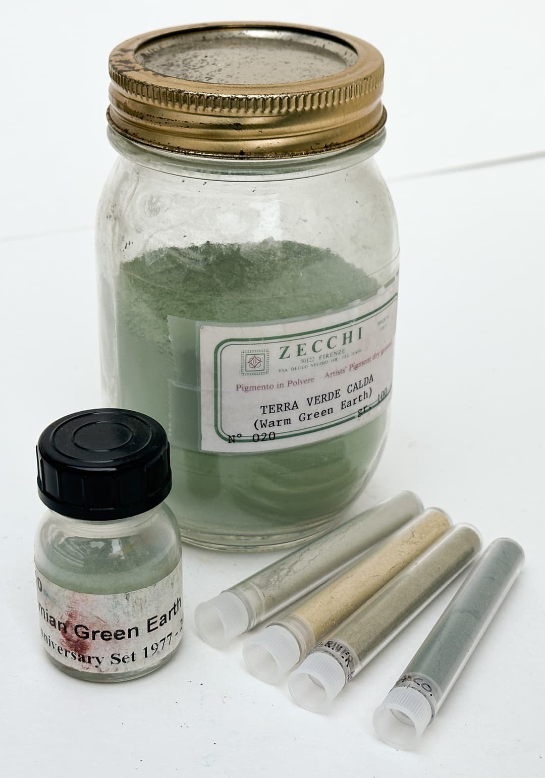
PG36 Phthalo Emerald
PG36 - Phthalocyanine Green YS or Yellow Shade. This is a merry, high-saturation emerald green which leans a bit more yellow. In mixes it is the queen of limes. We've used this color to make some of the highest chroma lime greens when mixed with yellow. This color is very dark in masstone, but when thinned for glazes or mixed into tints it is a gorgeous chromatic green. Robert Gamblin suggested that if only this paint had been invented earlier than the other phthalo, that PG36 would be the more popular. We find both greens to be indispensable for a high chroma palette.
While phthalos are less toxic than some other paints, be careful with tubes made before 1982 (or even 1986) as they may contain PCBs. Please also see Monona Rossol's work as well as the Artist's Guide to Health and Safety, which has information that relates to working with pigments which contain copper.
Similar to PG7, the feel of modifiers, stabilizers and extenders are often found in PG36 as well.
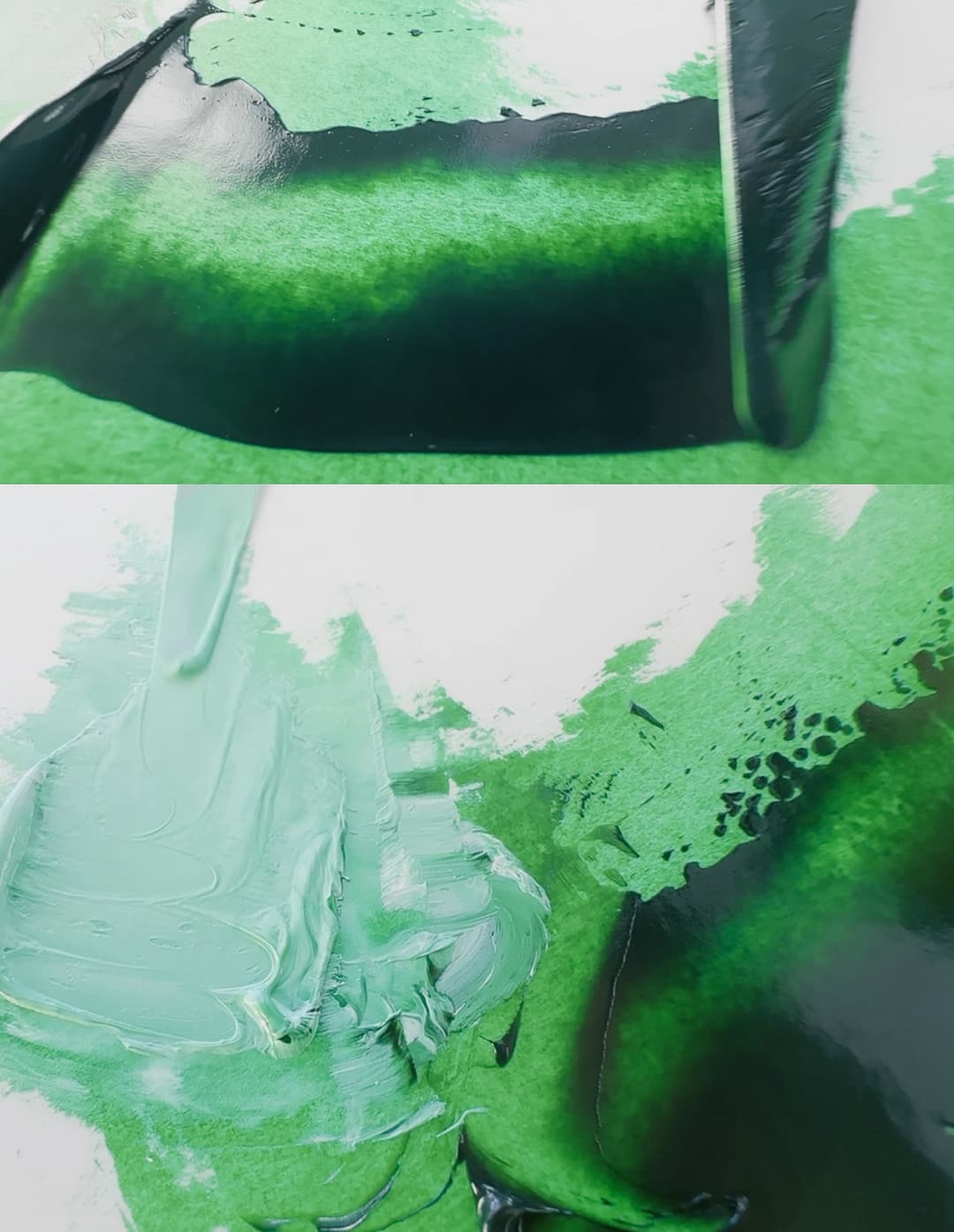
Gamblin Phthalo Emerald
More Cobalt Greens
PG39 - Copper Carbonate Hydroxide, otherwise known as Genuine Malachite. Malachite is a historical pigment which can be a little bit difficult to sell as an oil paint. Natural pigments at one time sold malachite in oils. It is fairly straightforward to mix an approximation. The degree of grinding matters with malachite as finer grinds will become lighter and less chromatic. Listed as toxicity B, meaning it does have toxicity.
PG50 - Cobalt Titanate Green. This is a superb teal green that is opaque and has some native lightness to to the color. Once a person starts to paint with this color it's hard to go back to a blend, though several good approximations have been created, most notably by Williamsburg when a lovely variety of the genuine pigment became unavailable for a time. This pigment comes in a range of teal and green colors, and it can be a bit tricky to sort out the exact shade from paint name alone. There is a notably greener variety that crosses out of the teals into a dark kelly green, though it's less commonly found. Like other cobalts, PG50 dries quickly.
This is listed as toxicitiy "B" but we would go ahead and list it as toxic. It is a great paint to experiment with once a person has mastered the basic palette, as it can yield some surprising colors in mixes. It is also extremely helpful in mixing those greens which are not the highest chroma, and yet are still chromatic.In the Artist's Guide to Health and Safety Monona Rossol has information on working with pigments containing Nickel as well as those containing Cobalt. Her most recently updated work can be found via her site.

Cobalt Teal
Cobalt Teal
Gorgeous in a solo role and also a stellar ingredient in lower chroma mixes
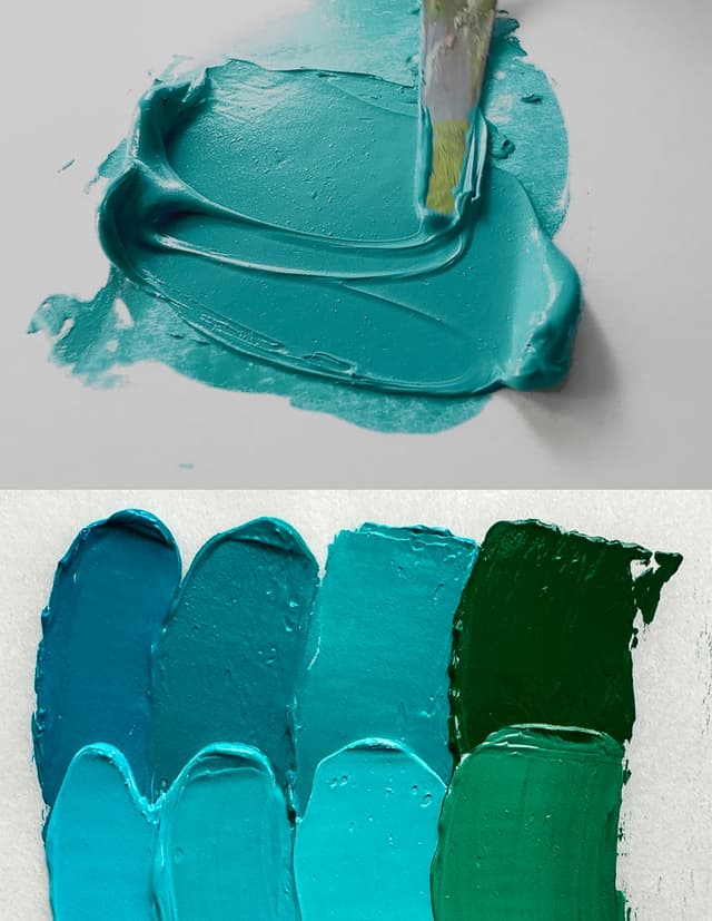
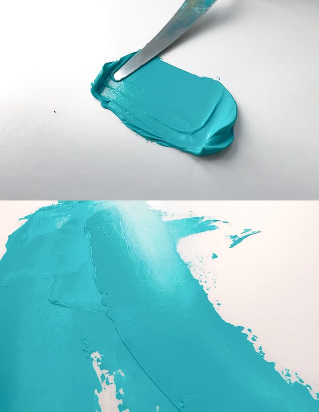
Blue Pigments
Sky in a jar
We love these magnificent blues.
Blue is one of the most elusive colors when it comes to naturally occurring pigments. There aren't many blues out there and so we prize each and every one. Unfortunately this section of pigments also beigns with colors that are not lightfast.
PB1 - Victoria Blue. Unfortunately this color has very poor lightfastness. It is not currently used in oils, though there is at least one watercolor that is made from it. Monona Rossol mentions that it is related to carcinogenic dyes, so please consult her work for more information.
NB1 - Natural Indigo, from one of several plants, but includes Indigofera tinctoria or Baphicacanthus cusia. The color range from Japanese Indigo, Persicaria tinctoria, is discussed in Natural Palettes by Sasha Duerr. As a pigment, Indigo may range in lightfastness but in general is thought to be a bit too fugitive for archival work (about ASTM III). We were saddened and surprised to learn that natural indigo can actually be quite toxic. See Monona Rossol's research for more.
PB71 - Zirconium Vanadium Blue. Excellent Lightfastness
Varieties of Cobalt Deep: PB72 - Cobalt Zinc Aluminate Blue, decent to excellent lightfastness with some fading in tints. A variety of Cobalt Blue Deep. Like all cobalts it has toxicity, and it is rated at "B" so handle with extra care and proper precautions.
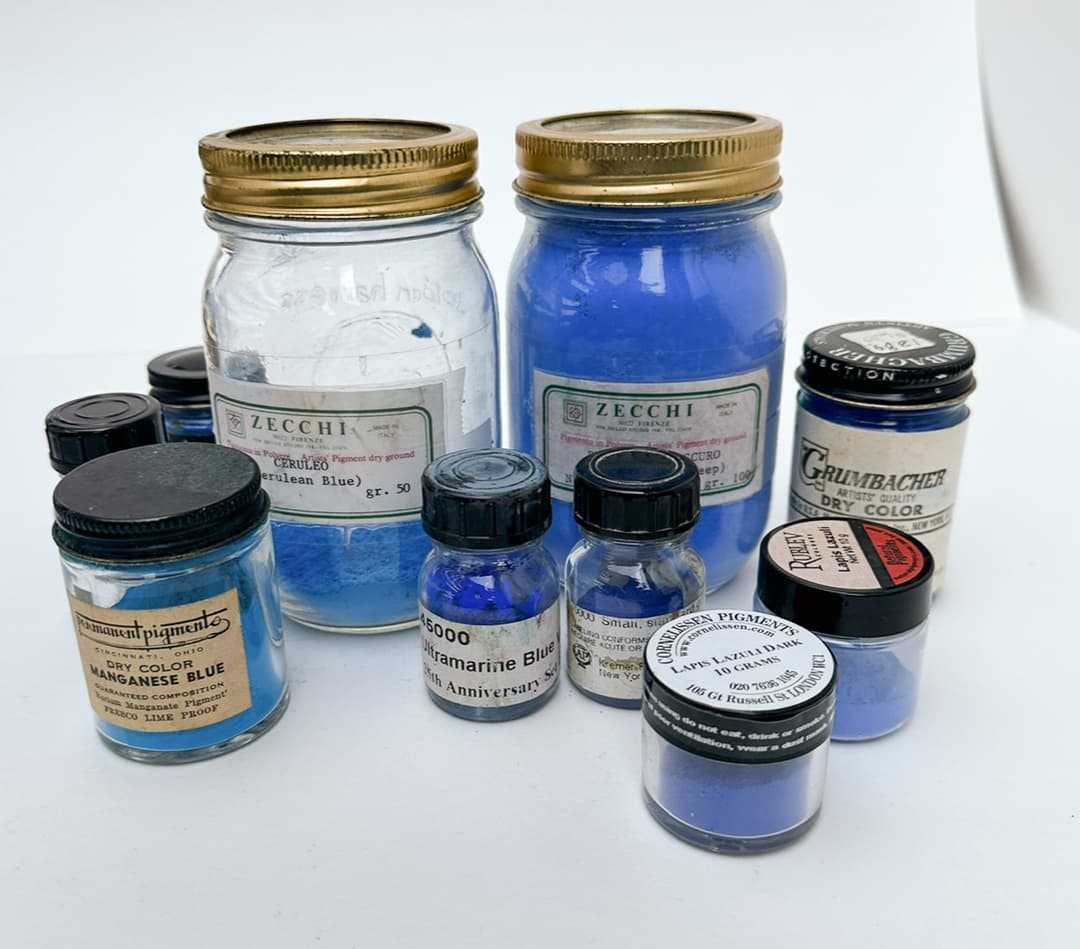
Blue pigments from Lapis Lazuli to Manganese Blue
Spotlight on Phthalo Blues
PB15 -Phthalo Blue is one of the essential colors to a modern high chroma palette, especially after the extinction of Manganese Blue. We have an in-depth article as well as a comparison of several different Phthalo Blues in oil. Phthalo Blue is a saturated transparent cyan or middle blue. It has a ton of different names, so it's helpful to search Paint List by pigment "PB15" to discover the way it is named across brands. When in masstone this color is almost black, and yet when thinned slightly or in tints this is one of the most powerful high chroma blues out there. Phthalo makes its presence known, and for some it's too intense. If phthalo is strong for you, we would suggest cutting it into a bit of white like Vasari's Video Blue. A tiny dot of this color will go a long way. Since any amount of phthalo in a mix gives a color a 'phthalo-y look' another strategy is to switch to genuine ceruleans and cobalts, which will mix differently than the phthalo blues. However for the highest chroma rainbows, phthalo blue is essential. These colors tend to have excellent lightfastness with a few exceptions.
Phthalo Blue is copper pththalocyanine comes in two main varieties, Phthalo Blue Green Shade and Phthalo Blue Red Shade. The Red Shade is a tiny bit more likely to mix toward a middle blue that leans toward indigo where the Green Shade is similar but leans more toward cyan. Thankfully the Green Shade is clearly marked PB15:3 because it is quite useful in mixing teals.
Sometimes a paint company will leave off the number after the colon, which is unfortunate, as the additional information helps artists. The Green Shade makes the best cyans as well as the cleanest, most chromatic teals when mixed with PG7 and white.
In terms of health and safety, these pigments contain copper. Please see the Artist's Guide to Health and Safety for information about the hazards associated with copper pigments. The author's most recent updated writing can be found through her site. See also the note at the bottom of this section on dioxins and PCBs.
Phthalo Blue requires a moderate amount of oil. Opinion is divided on its drying time with some saying medium to slow and others listing it as fast. It seems to frequently contain additives, stabilizers, and extenders.
PB15 - Phthalocyanine Blue (type unspecified). Sometimes a brand will simply omit the number after the colon. However the PB15 may also refer to a specific six digit code (74160) which is identified as the "a form", a combination that it shares with PB15:1 and PB15:2.
PB15:0 - Rare, but possible to encounter. Probably Red Shade.
PB15:1 - Phthalocyanine Blue RS, or Phthalo Blue Red Shade. Also the "a form" of the phthalo pigment with the number 74160.
PB15:2 - Phthalocyanine Blue, similar to Phthalo Red Shade. It shares the "a form" of pigment 74160. The manufacturer of the pigment may matter a bit- some versions show a little fading in tints, but overall decent to excellent lightfastness. In watercolor it has an ASTM II.
PB15:3 - Phthalocyanine Blue GS, Phthalo Blue Green Shade or just Phthalo Blue Green Shade. This variety is made from the "b form" of 74160. This makes the best cyans and teals. Depending on the manufacturer, lightfastness is either excellent or decent in tints. We did note in Monona Rossol's work a mention that strong UV can break this down into poisonous gasses.
PB15:4 - Phthalocyanine Blue NCF. This color is sometimes used in printing inks as well as in Manganese Blue Hue substitutes. It tends to be a light, transparent cyan and some brands even call it Phthalo Blue Light. This is listed as ASTM II is watercolor, and may fade a bit in tints. The "b form" of 74160.
PB15:6 - Phthalocyanine Blue. Rare but also found in artist paints. This may have less lightfastness (ASTM II) in watercolors. This is the "e form" of pigment 74160.
We've put together a comparison of [Phthalo Blue Green Shade] in oils.
Also included here is PB16 - Phthalo Turquoise also known as Heliogen Blue L 7560. Phthalocyanine Turquoise is called metal free phthalocyanine. This is a slightly greener shade of phthalo right out of the tube with excellent lightfastness. This pigment contains copper. Please see the Artist's Guide to Health and Safety for information about the hazards associated with copper pigments. The author's most recent updated writing can be found through her site.
While phthalos are thought to be less toxic than other some paints, avoid tubes made before 1982 (or even we have heard as late as1986) as they may be contaminated with PCBs-- and unfortunately it is not totally guaranteed that more modern phthalos will be free of these contaminants. Depending where a company sources their phthalo pigment it can be contaminated by PCBs and even dioxins, as countries do not all share the same regulations and standards. Please see Monona Rossol's work for more information. Handle all artist colors with care.
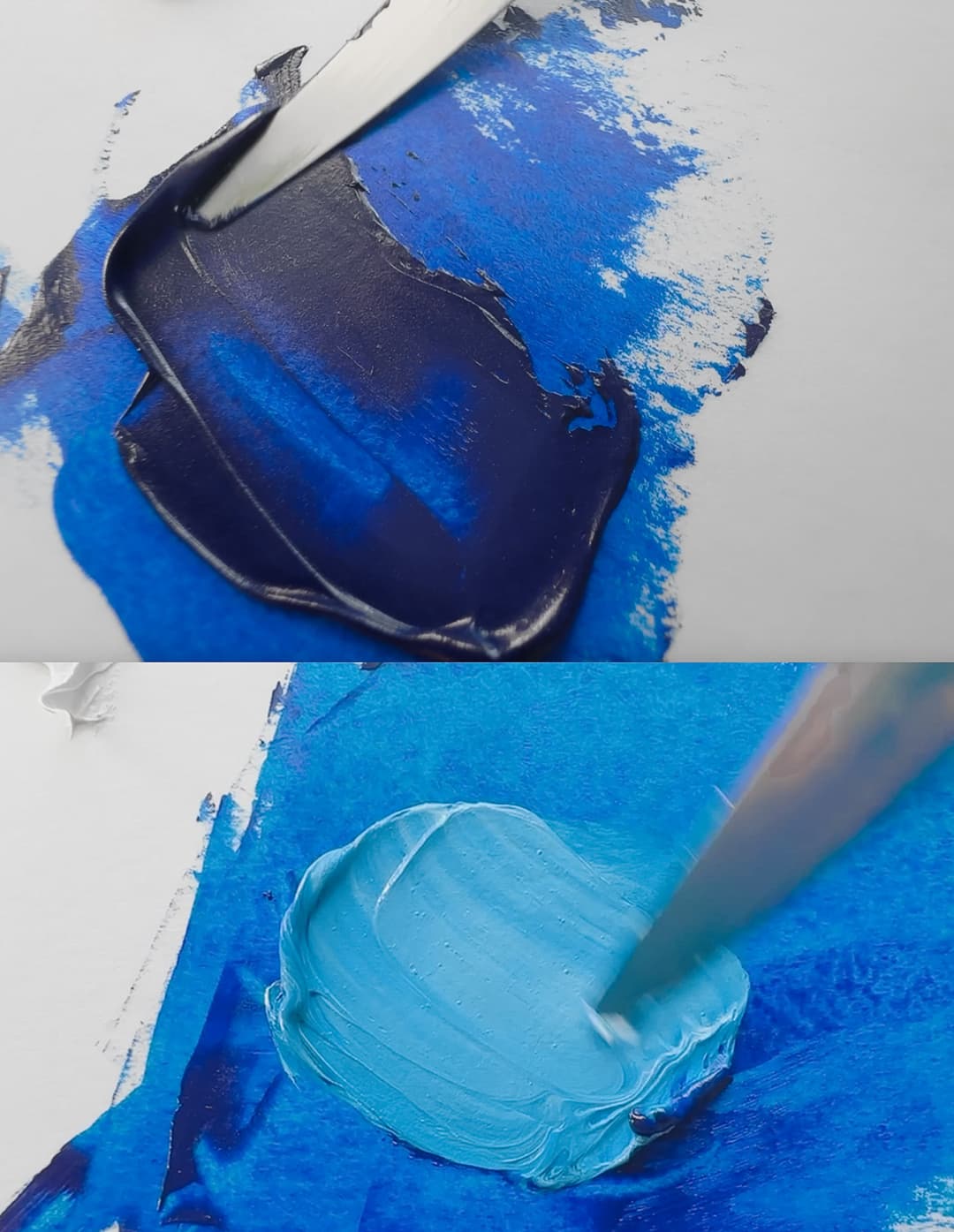
Phthalo Blue Green Shade
Phthalo Blue
Superstar Cyans
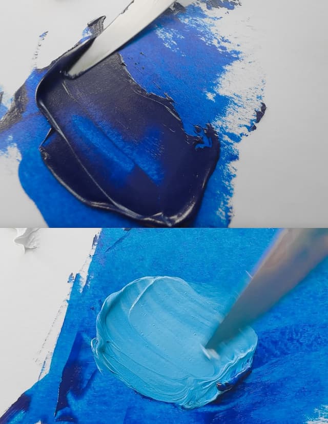
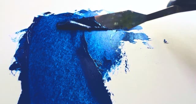
Famous Blues
Cobalt and Prussian
PB27 - Prussian Blue or Milori Blue. A color with a strange backstory, as its discovery involved blood. This is a moody, dark, transparent indigo that is great for marine landscapes as well as any darkened middle to low chroma color in the blues. Unfortunately it's lightfastness isn't what was once thought, as Prussian Blue is fairly sensitive to the mixing white involved. It's interesting that this was ever listed as ASTM I as certain pigment suppliers now list its performance in tints to be quite low (as low as blue wool scale 2)!
This pigment requires a fairly high amount of oil and yet it is a fast drier.
This color has a lot of related color names which fly under the flag of PB27 such as Antwerp Blue and several others. For toxicity please consult Monona Rossol's work, as there are some unexpected hazards.
PB27:1 - Prussian Blue (see above). This may refer to Brunswick Blue or Turnbull's Blue.
PB28 - Cobalt Blue or Cobalt Aluminate Blue Spinel is a fascinating addition to the palette. At one time called Thenard's Blue, PB28 is a beautiful middle blue that tends to lean toward the more blue-purple side, especially under certain lighting conditions. While some would mix approximations from phthalo and ultramarine, we enjoy a hard-to-describe quality about cobalt related to its reflectivity. Some list cobalt blue as semi-transparent, but we tend to think of it as semi-opaque relative to phthalo blue. Cobalt blue PB28 comes in a variety of colors ranging from teal to middle blue to deep blue. Most Cobalt Blues are of the middle blue variety.
In terms of health and safety, it is listed as toxicity class B, which means it is toxic, so do use great caution. The Artist's Guide to Health and Safety has a section about some of the hazards associated with cobalt pigments. The author's most recently updated writing can be found through her site.
Cobalt blue tends to have a very high amount of oil, and it is interesting that it still dries quickly due to the oil content, at least in linseed oil. Some give it a moderate dry time, but it does seem a bit faster than many others. Both factors -- the oil content and the drying-- are good to keep in mind if you are painting in oil and working in layers.
As opposed to other pigment categories where there might be a light, medium, or deep for each pigment, Cobalt does seem to have a range within PB28 but there is also a separate pigment for Cobalt Blue Deep, PB74, discussed below.
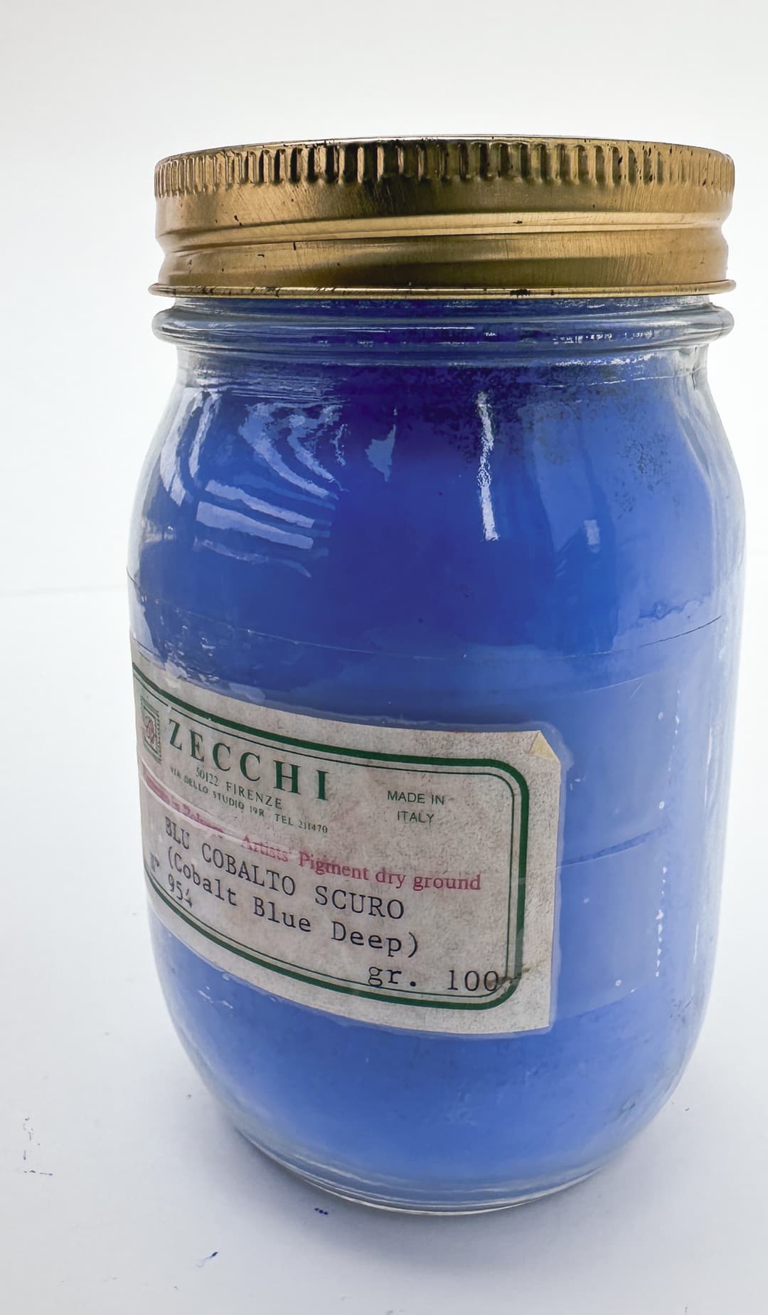
Cobalt Blue Pigment from Zecchi
Ultramarine Blue
Synthetic Ultramarine Blue- A Foundational Color of the Palette
PB29 - Ultramarine Blue. Of all the most essential colors of the palette, this one makes our short list. There is nothing like it. We're grateful for the discovery of synthetic ultramarine as it's hard to imagine what it would be like to be without a deep royal blue at the ready. This color is a blue that leans toward violet. It's transparent, dark in masstone, chromatic in tints, and transparent. We compared a handful of varieties in oils here.
There are two main forms which are slightly different- one is slightly more reddish than the other. Many paintmakers will name the redder version “French”. It has excellent lightfastness, however it does have a few tricks up its sleeve in oils. There is something called ultramarine sickness which describes some changes that can occur to the paint. However there don't seem to be any viable alternatives and for most intents and purposes ultramarine behaves itself. For some wildcards regarding ultramarine, see Golden's recent lightfastness testing.

A historical game-changer
Genuine Lapis Lazuli
Pigment made from a semi-precious stone
Genuine Lapis Lazuli shares the same pigment code as synthetic ultramarine blue. However the two are extremely different in practice. Genuine Lapis has a blue-grey note to it in all but the highest grades, and also reveals yellowing in oils more than we've noticed from regular ultramarine. Lapis may shine better in applications other than oils. However if you want to try it, it's made by Rublev and Michael Harding.
In terms of health and safety, Monona Rossol mentions limits for respirable dust called PNOS limits. Please see her work for more information.
Virgil Elliot's work on Traditional Oil Painting mentions that this color is moderate for how much oil it requires to be made into an oil paint. Some categorize ultramarine as slow drying, while others feel it's closer to the medium side of slow.

Genuine Lapis Lazuli
Lapis Lazuli
Lapis in pigment form, Genuine Lapis Lazuli in paint form, and lapis vs. synthetic ultramarine blue pigment
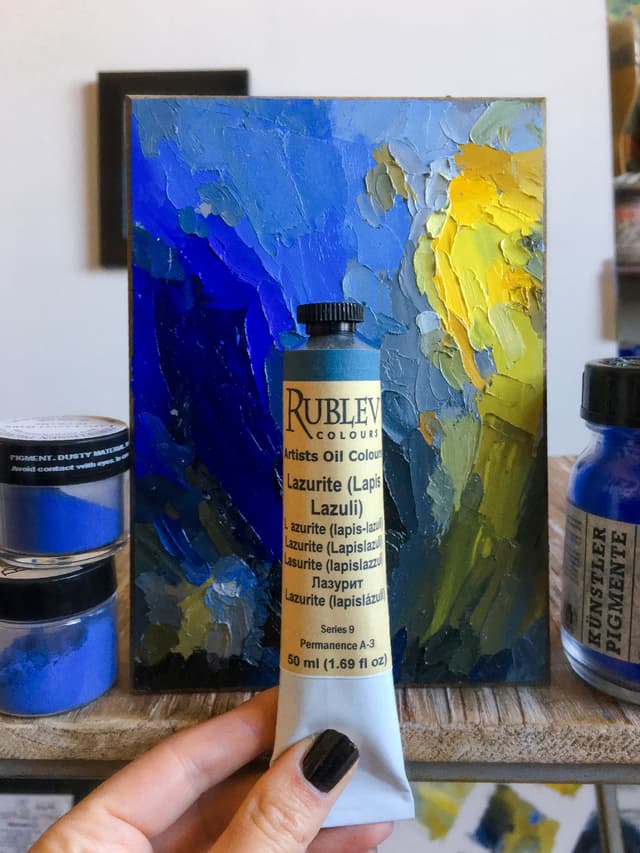
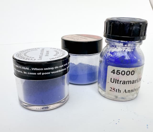
Off the beaten path: Historical Bice and Smalt
PB30 - Basic Copper Carbonate, Blue Verditer, Blue Bice, Azurite. This pigment code can refer to genuine Azurite in rock form (or the greener Malachite) which has been ground or to synthetic versions. Azurite in its natural form is rare in artist paints and is one of the historical mineral pigments. At one time, Natural Pigments made Azurite oil paint, however it is seldom available.
In general PB30 is not exactly perfectly suited to oil binders, and it is reported that this pigment may discolor in oil. This pigment is given a toxicity rating of B, meaning it does have toxicity, so do handle this fascinating pigment with caution. It does contain copper. Please see the Artist's Guide to Health and Safety for information about the hazards associated with copper pigments.
PB32 - Smalt (Genuine). Historical smalt is glass that has been colored by cobalt (technically "Pulverized and ground potassium glass colored blue by cobalt" according to Artiscreation). This color may darken in an oil painting and is not turned into oil paint. (As an aside, there is a currently-available paint out there named Smalt which should be labeled as a hue). The pigment is rated B for toxicity, so use with caution and use protective gear. Additionally, these pigments contain cobalt. Please see the Artist's Guide to Health and Safety for information about the hazards associated with cobalt pigments in general.
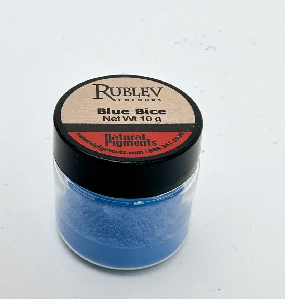
Blue Bice
Elusive, Extinct, Manganese Blue
A gorgeous cyan
PB33 - Manganese Blue (Genuine). An extinct pigment, we first began to miss this pigment when working in gouache, as it is an opaque medium. In more transparent media, phthalo blue can cover many use cases, however it doesn't perfectly emulate this missing cyan. We began to track down Manganese in oils and found this pigment to be quite enjoyable. Not irreplaceable, but certainly lovely. There is a bit of yellowing that happens, but in general a great color.
It does have toxicity due to manganese and barium, so take the proper precautions. The Artist's Guide to Health and Safety has information about the hazards associated with Barium and Manganese pigments. The author's most recent updated writing can be found through her site.
In general it is also a fast dryer.
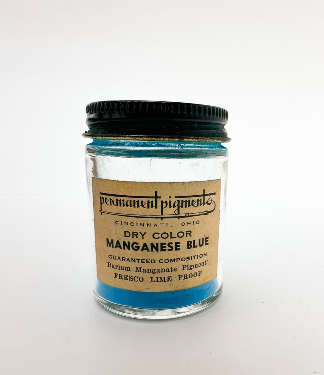
Genuine Manganese Blue, PB33
Cerulean Blue Genuine and Related Cobalt Turquoises
A Mixing Blue for Realism
PB35 - Cerulean Blue, Cobalt Stannate - Sometimes listed as Cobalt tin oxide or Oxides of Cobalt and Tin. A wonderful color which is softer in mixes than phthalo. This color is used by some painters who paint wet-on-wet rather than phthalo blue because of the way that it combines with other colors in naturalistic painting. As a pigment it's opaque or semi-opaque, but it is sometimes diluted, probably due to its expense.
It requires a high amount of oil to make it into a paint, and tends to be a slower drying oil paint.
This is in the B class for toxicity, so it does require careful handling and the precautions fitting for the category. It contains cobalt, so please see the Artist's Guide to Health and Safety for information about the hazards associated with cobalt pigments. The author's most recently updated writing can be found through her site.
It has excellent lightfastness, and under normal sunlight conditions this gets solid excellent marks. However in the recent lightfastness testing done by Golden there were some unexpected results when exposed to a special form of light. However this is generally considered a lightfast pigment regarding natural light.
PB36 - Cobalt Chromite Blue Green Spinel. Sometimes called Cobalt Turquoise or Cobalt Cerulean. Similar to cerulean blue in some ways as far as its behavior, though the hue of this color may be greener or deeper than Cerulean (PB35). There is an interesting diversity of color in this area with some Cobalt Turquoise colors as light and green, and others being pitched lower and bluer.
In terms of health and safety, these pigments contain cobalt and chrome. Please see the Artist's Guide to Health and Safety for information about the hazards associated with both cobalt and chrome pigments. The most recently updated information can be requested at the author's site.
It tends to be a medium to fast dryer.
PB36:1 - Zinc Cobalt Chrome Aluminum Spinel. Artiscreation includes an interesting note that this color is sometimes substituted for cerulean instead of PB35. It may have a lower cost due to having less cobalt. The same health warnings as PB36 (above) apply to PB36:1.
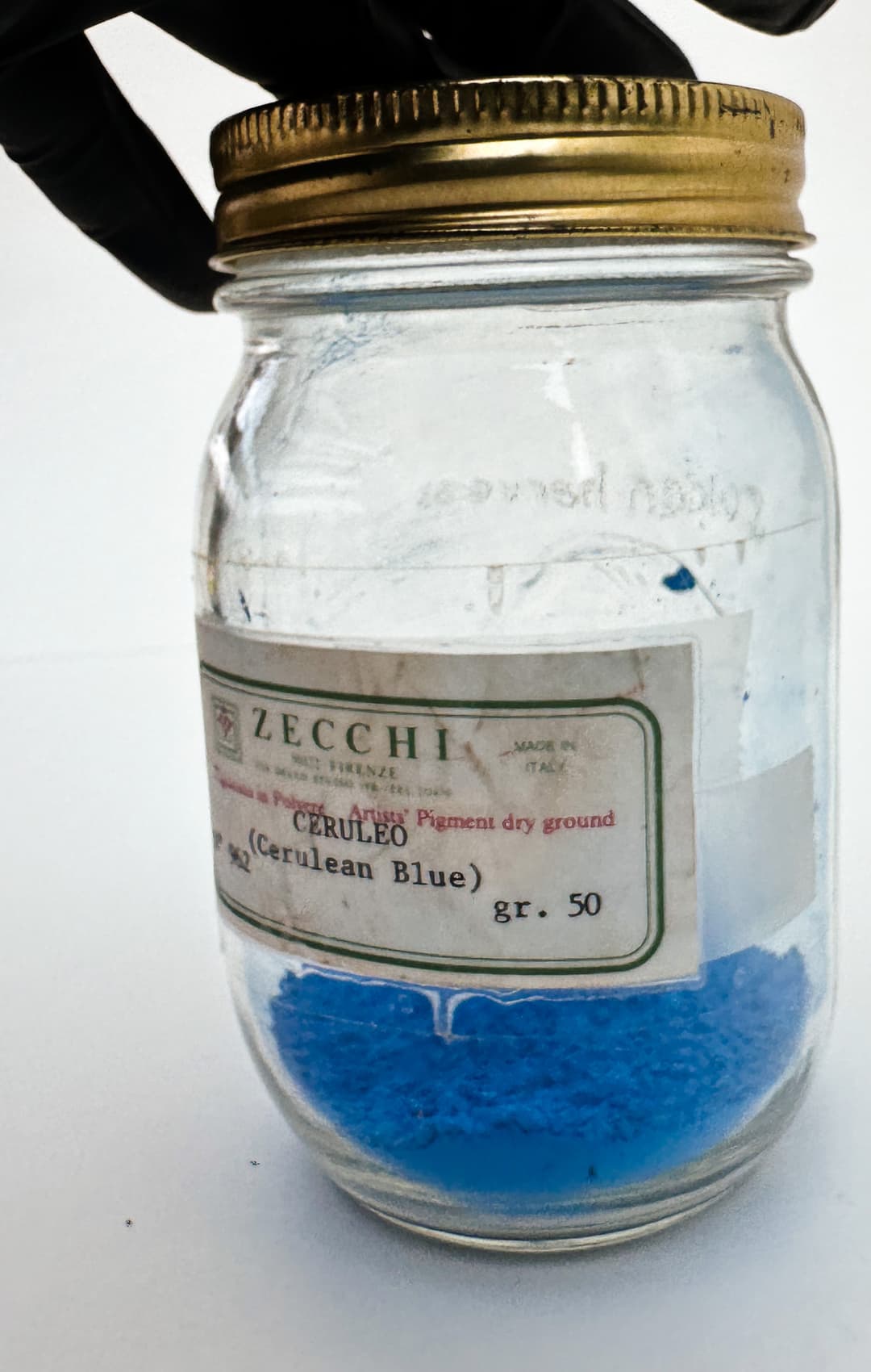
Cerulean Genuine, nothing quite like it. From Zecchi pigments
Indanthrene Blue
Deep and mysterious
PB50 or PG50 - This is very rarely listed as PB50, and there seems to be some confusion as to whether this is the right pigment for any paints that have it listed. See the health warnings and hazards for PG50 as well.
PB60 - Indanthrone Blue. A deep indigo which is excellent for complementary color mixing. We were very surprised to learn that it may actually be carcinogenic. Sometimes called Anthraquinone Blue, this color has not been specifically tested for toxicity, but it bears a chemical similarity to other anthraquinones which are believed to be carcinogenic. Please see Monona Rossol's research research for more information. This color leans more toward violet than phthalo blue and is well suited to moody marine landscapes-- overall a gorgeous color but handle with appropriate care.
PB66 - Indigo. (Synthetic). Opinions are divided on the lightfastness of this pigment. It ranges pretty widely. We were very surprised to learn that indigo may be extremely toxic-- see notes below on natural indigo as well. Please see Monona Rossol's work as her writing contains details and information on this important topic.
PB73 - Cobalt Silicate Blue. Rated as excellent for lightfastness, with all 8's on the blue wool scale. This is also rated at "B" for toxicity so handle with care. A variety of Cobalt Blue Deep.
PB74 - Cobalt Zinc Silicate Blue. The classic Cobalt Blue Deep. Sources give this excellent lightfastness ratings. However there may be some sensitivity to certain testing methods. Handle with care and take precautions due to Cobalt, Zinc and Boron. The Artist's Guide to Health and Safety for information about the hazards associated with cobalt, zinc, and boron pigments (all three). The most currently updated information can be requested from the author's site.
PB82 - MayaCrom Blue B2050. The breakthrough Maya Blue.
PB86 -the famed new YInMn Blue. This color is somewhat similar to cobalt blue, however mixing an exact match was a little tricker than it seemed at first. While it can be approximated by mixes, the real thing has infrared reflective properties. Monona Rossol notes that while "Promotors say it is not toxic, all three metal components are very toxic." We also did a piece on how to mix a quick hue of Yin Mn Blue.
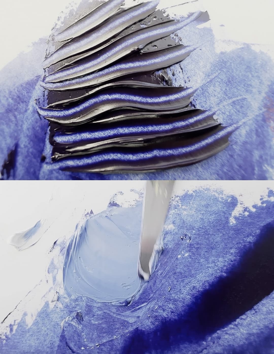
Indanthrone or Indanthrene Blue
Other Blues
Cobalt from Gamblin, Cobalt Blue Deep from Zecchi, Cerulean Blue from Zecchi and paint of a lighter hue from Gamblin
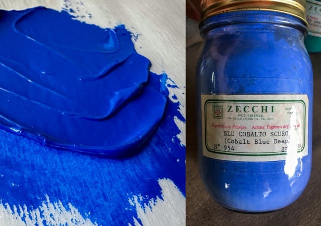
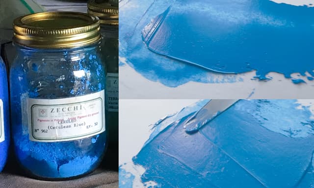
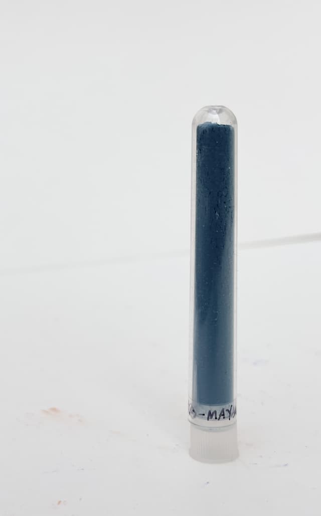
Violet Pigments
We only wish there were more of them
Every blue or violet pigment out there feels precious because there are so few of them, especially when it comes to lightfast options. These are fascinating counterweights in colormixing to the greens, and are interesting additions to just about everything.
One of the main issues among violet pigments is lightfastness. It seems that some of the most brilliant and beautiful violets out there fade too much for archival use.
Every now and then we do encounter a less-than-lightfast violet in oils, acrylic, or watercolors. There are more that are not listed here.
As so often happens, we start one out with ones that are a little bit less than awesome.
PV3 - M Methyl Violet or Methyl Violet 2B. A pigment with very poor lightfastness (ASTM IV) as well as toxicity of B, so use with care. This color is used by Schmincke.
Unfortunately this color is also a listed as a carcinogen- see Monona Rossol's work on pigments for more information.
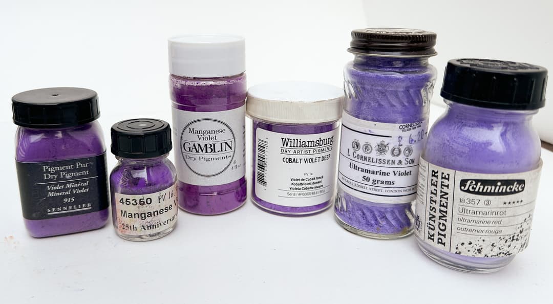
Violet Pigments
Cobalt Violets
Monet's choice
PV14 - Cobalt violet (Cobaltous phosphate). This fabulous violet comes in two forms- light and deep, though some brands have a color somewhere in between. (For other Cobalt Violet Light pigment varieties see also PV47 and PV49).
Cobalt violet comes in two forms, light and dark, and the lighter is more of an electric red-purple while the dark version is a deep middle violet. We tend to think of them as more opaque violets, but the pigment itself is fairly transparent- especially cobalt violet light. They are not strong tinters.
Cobalt violets were a favorite of the Impressionists, and the darker version of cobalt violet (as well as the more poisonous antiquated version of cobalt violet light) were used by Monet. PV14 is different from another color called Cobalt Violet from the past, which is Cobalt arsenite, and is very toxic. We do not see any reason for modern painters to use the cobalt arsenite version, but we mention it as it is important to exercise utmost caution regarding old pigments which may be extremely toxic.
PV14 has a toxicity rating of B, so it does have toxicity and should be treated with caution. For more information on the hazards associated with cobalt pigments, see Monona Rossol's book, The Artist's Guide to Health and Safety. Her most recent work can be found through her site.
In the past this color has been given the most stellar lightfastness ratings, and for a violet it is incredibly lightfast. However, new research from Golden suggests that it may be more vulnerable to a certain kind of light used in their testing methods than once was thought.
We have heard that cobalt violet has low oil requirements when made into a paint, however this is one of the colors where we've had the oil falling out of solution from our commercially prepared tubes which make it look oiler than it is. Despite the oil separation sometimes we've found it be a useful color with unique properties. Be advised that it is a very gentle mixer, i.e. not a strong tinter at all.
Like other cobalts it dries quickly, though some classify this as moderate when set against really fast driers like lead white. We have found this color incredibly useful for neutralizing greens, and overall is a very useful pigment.

Ultramarine Violet
A Secretly awesome complement to yellows
PV15 - Ultramarine Violet. This color can be a transparent indigo purple, a solid violet, or even a dull pink. Among paints labeled Ultramarine Violet the color can vary from indigo to violet depending on the brand, and if it labeled Ultramarine Red or Ultramarine Pink it's likely to have a different color appearance entirely.
PV15 is listed as having excellent lightfastness, though there may be some nuance to this depending on the mixing white. The indigo varieties are very helpful color for the mixes to neutralize yellow, if one is painting with complements, while the pink varieties are wonderful for toning down greens. This pigment is related to Ultramarine Red as well as Ultramarine Blue.
Monona Rossol mentions that this may qualify as a "nuisance dust" which does have thresholds for exposure and best practices associated with it. Her work can be found here.
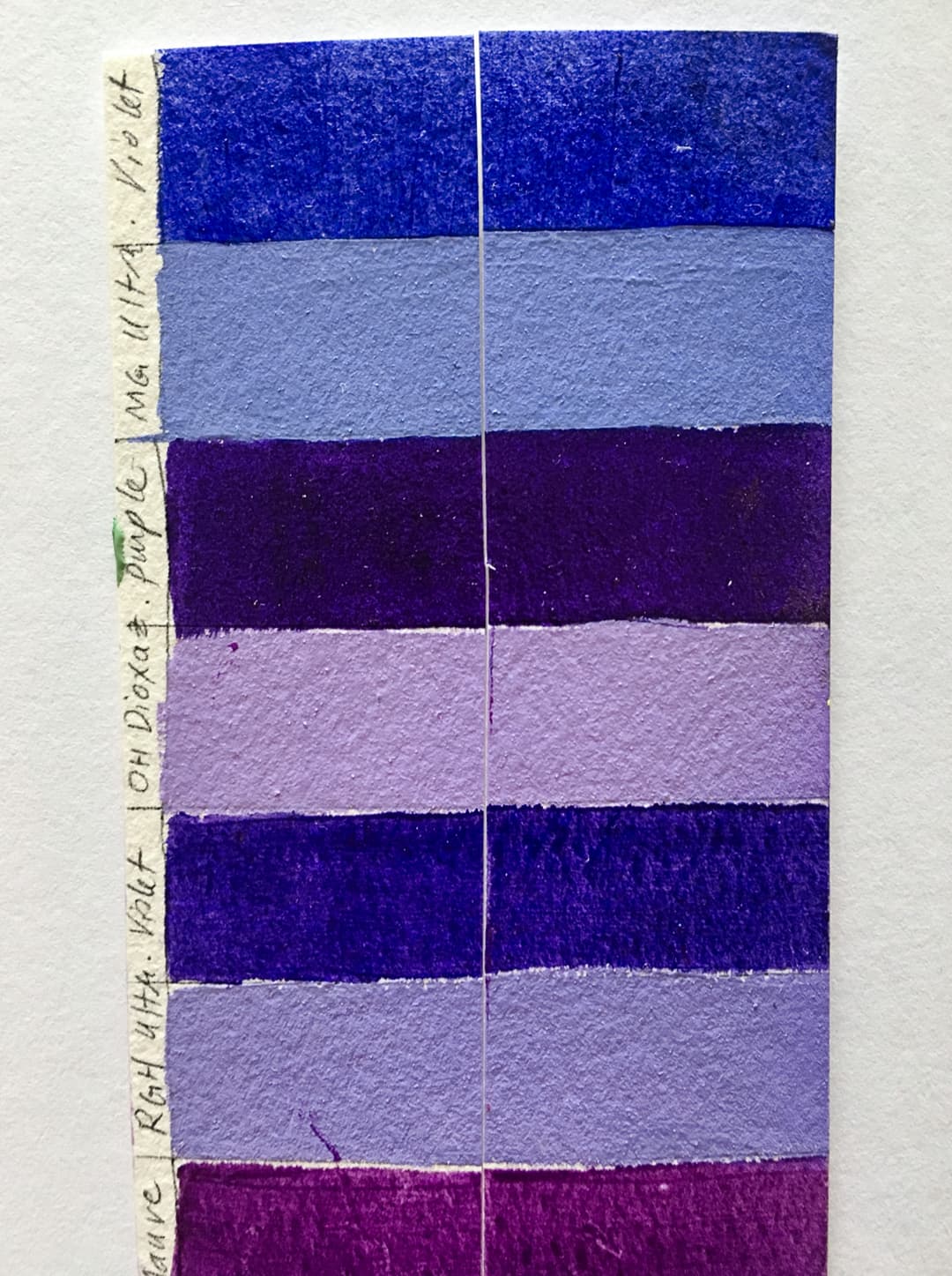
Manganese Violet
A violet for mixing
PV16 - Manganese Violet. This is a bit of a palette secret - we quite enjoy manganese violet along with cobalt violet. Years ago I read of a painter suggesting that this was one of those heroic colors that is underrated and they suggested using it in flesh tones. It does receive excellent marks for lightfastness. This color is superb as a mixing color to tame greens. It has some transparency to it, but usually for whatever reason when found in oil paint it's semi-opaque.
It does contain Manganese, which is probably part of the toxicity rating of B, meaning it does have toxicity. For more information on the hazards associated with manganese pigments, see Monona Rossol's book, The Artist's Guide to Health and Safety. Her most recent work can be found through her site.
This is among the pigments that has a very high oil content, however manganese acts as a drier. Both factors should be taken into account if painting in layers.
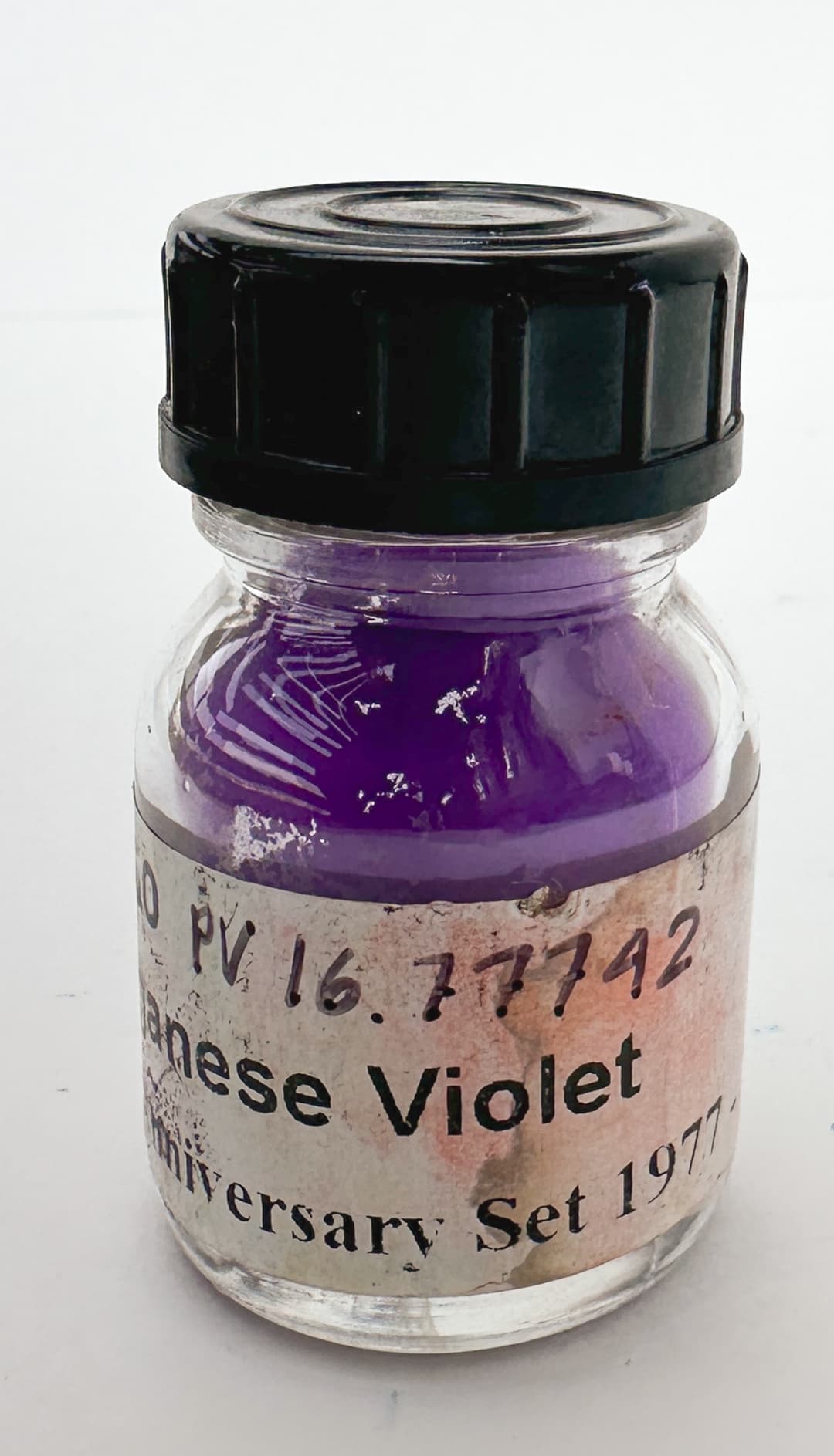
PV19 Quinacridone Violet or Quinacridone Rose
PV19 - Quinacridone Violet. There are two forms of PV19, one is a bright electric rose and the other is a plum-like purple. The lightfastness does vary from brand to brand, so this is an area where it is important to do your own lightfastness testing. It varies from decent to excellent, though it can have some diminished lightfastness in tints (speaking of 7's and 8's on the blue wool scale). Lightfastness may be different in watercolor than in oils.
Both the red and violet versions are transparent and they to be slow driers.

Two colors with one pigment code, PV19. Quinacridone Violet and Quinacridone Rose
Various Violet Pigments
Manganese Violet, PV16, A Variety of Violets, Cobalt Violet, Dioxazine Violet, Cobalt Violets
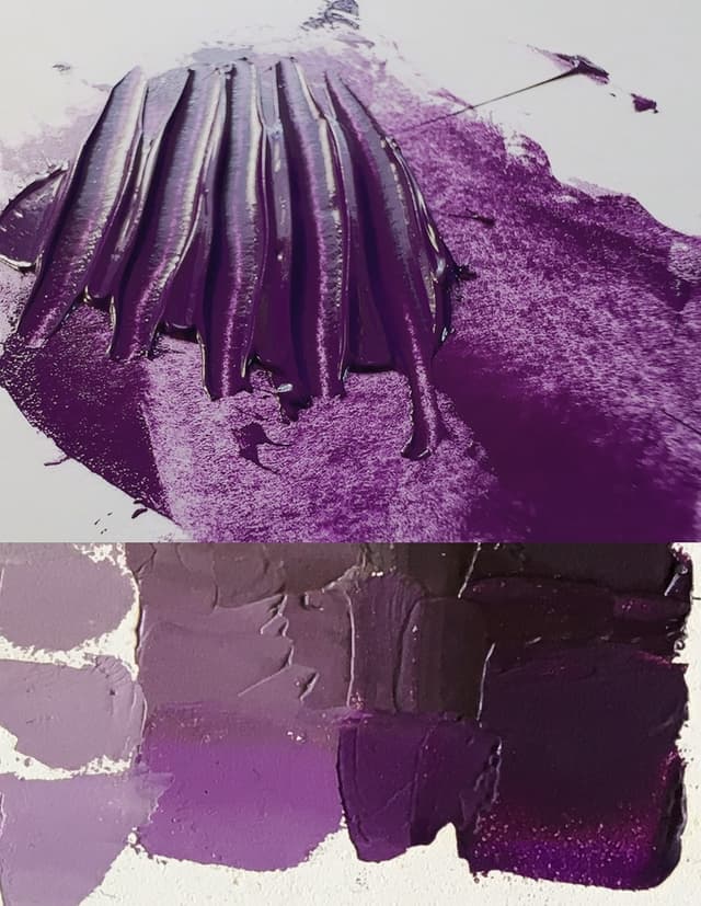


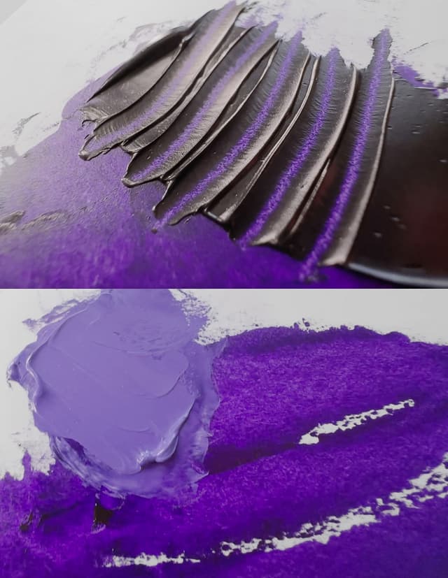
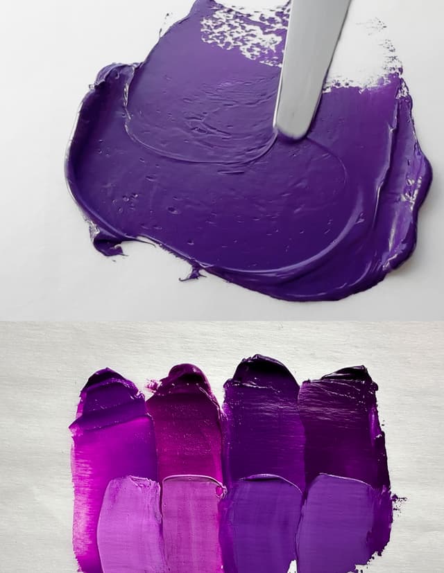
Dioxazine Violet
A stunning gemtone
PV23 - Dioxazine Violet, also sometimes found as PV23RS or PV23BS, the red shade and blue shade respectively. A nearly ubiquitous violet. Unfortunately it is not perfectly lightfast, which seems to be a trend among violet pigments. But who could resist such a rich purple gemtone? This is one of those pigments which has varying lightfastness depending on the manufacturer, so it is worth testing one's own paints. For an approximation, one can mix a lightfast PR122 with PB29, however Dioxazine Violet may still offer more chroma than the mix. We found some interesting notes from Bruce MacEvoy's work which suggested that sometimes violet mixes didn't actually have as strong of lightfastness as PV23 so that was a shock. Whether those tests only apply to watercolor or extend to oil would be interesting to discover.
This is a deep dark color in masstone that unfurls its chroma in glazes and tints.
According to Monona Rossol's work PV23 is sometimes contaminated by dioxins.
PV29 - Perylene Violet. A deep moody wine violet-red. Rare in oils, but this color is listed as having excellent lightfastness with solid 8's (highest rating) on the Blue Wool Scale. Oddly enough this is the same pigment as PBr26: "PV29 and PBr26 are the same chemical in different particle size which causes them to appear different colors to the human eye." In her work on safety and artist pigments Monona Rossol has important information on the hazard this poses to artists in dust form, so please consult her writing if you plan to use this color.
PV32 - Benzimiazolone Violet or Bordeaux. The lightfastness of this color varies a large amount from good to poor.
PV37 - Dioxazine Violet (not as common as the other Dioxazine Violet). This version is not used in oils and only a few brands of watercolor carry this. This Dioxazine may be darker than the other. Not to be confused with PV23, which is different. Listed as ASTM II.
PV42 - Quinacridone Violet. A color listed as excellent in lightfastness, something that is a bit of a rarity among violets.

Cobalt Violet Light (Electric!)
Now discontinued, and there's really nothing like it
PV47 - Cobalt Lithium Violet Phosphate. This color is toxic. It's distinct from other cobalt violets such as PV47 and PV14.
For more information on the hazards associated with cobalt and lithium pigments, see Monona Rossol's book, The Artist's Guide to Health and Safety. Her most recent work can be found through her site.
PV49 - Cobalt Pale Violet. (Cobalt ammonium phosphate). Perhaps our favorite violet in oils for its sheer electricity. This color is positively radiant. It looses a bit of its zip once dried (and seems to yellow less in safflower oil). This paint was recently discontinued and were so sad to see it go. There is nothing like it, and it is perhaps not really possible to even imitate it sufficiently with a hue, at least not with lightfast pigments. It's exceedingly difficult to find red-violets like this at all, especially single-pigment ones. It has a toxicity rating of "B" so as with all pigments, handle it with caution. There may still be some zippy PV14 Cobalt Violet Lights out there. Like other cobalt violets this is an extremely gentle tinter. Some have mentioned opacity in watercolor, but in oil this color is not exactly opaque.
PV55 - Quinacridone Purple. We only wish this pigment had a little better lightfastness. It is gorgeous and hard to find in oils. In some ways it could be said to be related to the look of Dioxazine Violet, but it has a color all its own. A radiant purple gem. Unfortunately it looses a little lightfastness in in tints. Overall 7's and 8's on the Blue Wool Scale. It was made by Daniel Smith until recently, as DS ceased oil paint manufacture in exchange for water-mixable oils.
PV58 - MayaCrom Violet V2001F. One of the fascinating pigments related to Maya Blue.
PV62 - Strontium Violet. A rare pigment and fairly new. It looks like it has a bluish tone to the purple.
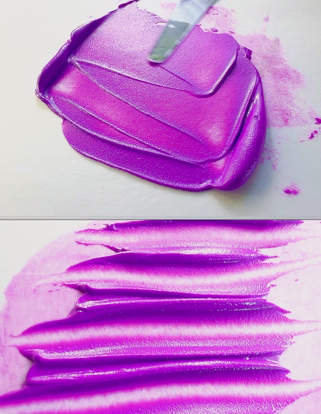
PBr 7, A Pigment with Many Moods
From green to red to brown to gold
PBr6 Iron Oxide Hydroxide Brown. A synthetic iron oxide brown that is associated with reclaimed mill sludge. See the Artist's Guide to Health and Safety for information about the hazards. It does contain Iron and possibly also manganese, as well as the potential for impurities, which is one of our concerns. The author's updated work can be found through her site. Artiscreation has a few notes as well such as not to breathe the dust and not to ingest (which is true for all artist pigments).
PBr7 - Brown Iron Oxide. This is one of the most common single-pigment paint categories in artists' oils. There is a dazzling amount of variety contained within one pigment code. We think of this as brown earth, and it's worth mentioning that there can be any number of problematic impurities in these earth tones, so just bear that in mind in terms of toxicity. The Artist's Guide to Health and Safety has more information about health issues associated with Iron and Manganese, and if there are other impurities the relevant sections need to be consulted. Her updated work can be found through her site.
Names for paints with PBr7 commonly include Burnt Siennas, Brown Ochres, Burnt Umbers, Raw Umbers, Violet Hematites, Burnt Yellow Ochres (which turn reddish), Raw Siennas, Cassel Earths, Van Dyke Browns, Turkey Umbers, certain Mummy Browns, and more. Each paint name has a sort of unofficial cannon of attributes associated with it.
We must briefly caution that burnt umber as well as other umbers may cause problems in oil painting-- more on this below.
These colors can range from yellow, orange, red, brown, violet, or even greenish. In brief,
Raw Sienna tends to be a warm gold color that has a bit of an orange note when mixed (a bit oranger or deeper than yellow ochre). This color is sometimes also made of PY42 or PY43 as well-- so see PY43 as well. Many raw siennas are semi-transparent.
Burnt Sienna tends to be a middle brown with a red tone that may even go a bit pinkish brown in tints. It is also found as PR101 or PR102. It is made of calcining or heating earth tones, hence "Burnt". It has a medium to fast drying time, though not as fast as the umbers. It's ideally semi-transparent.
Burnt Umber tends to be a dark chocolately brown that is warmer than Raw Umber. It is made by heating various earths or calcining them, which yields a deeper and redder tone. Some burnt umbers have a bit of transparency (semi-opaque) while it is also common to find opaque ones. The umbers sometimes have problems with a phenomenon called sinking-in. This is a pigment that tends to require a lot of oil but is also a very fast drier, possibly due to Manganese. A note of caution as rumblings of problems with burnt umber emerge in professional painting circles from time to time. Author Virgil Elliot in his book Traditional Oil Painting mentions the issues on p.127, and removed it from his palette. We also noticed a comment in The Artist's Handbook by Pip Seymour, "Because it darkens appreciably in oil use carefully". For more on these concerns see also Is Burnt Umber Evil for an additional citation from conservation on Caravaggio.
Raw Umber tends to be a cooler dark brown that may even have a very faint green leaning to it. Some Italian Green Umbers are raw umbers that are especially cool. The transparency varies but semi-transparency is common. These can vary from pale browns, tepid greens, or deep rich browns with a cool note. Similarly Turkey Umber sometimes has a note of green (or even some extra PG7) mixed into it, as it gestures to the lovely Cyprus Umbers. Raw Umber requires a high amount of oil, and can be associated with "sinking-in" in oil painting (see above), so it is helpful to understand the causes and plan one's painting accordingly and assess whether it is part of your palette. Umbers often contain manganese. Please see Monona Rossol's work for information about health hazards associated with manganese. This metal speeds drying, so despite high oil content, umbers are among the very fast driers. Some of the natural varieties have a degree of transparency.
Burnt Yellow Ochre is a somewhat rare name, however it is interested that when burnt (or calcined as they say) it turns reddish.
PBr8 - Manganese Brown. This has a toxicity rating of B, likely due to Manganese, which is a natural drier. Not to be confused with NBr8, which is genuine Cassel Earth- PBr8 is a different pigment. The Artist's Guide to Health and Safety has more information about health issues associated with Manganese. Her updated work can be found through her site.
PBr9 - Copper Ferrocyanide. This is not a lightfast pigment, with results ranging from moderate to poor. It also has toxicity as it is rated "B". More information about health issues associated with Iron and Silica can be found in The Artist's Guide to Health and Safety.
NBr8 Natural Cassel Earth (also sometimes called Van Dyke Brown or Cologne Brown). At the time of this writing, there does not seem to be any availability of natural Cassel Earth. Even some of the better lightfastness ratings for NBr8 show some lightfastness loss in tints. However depending on the source for the pigment, the lightfastness can vary widely. Today, Van Dyke Brown is usually a blend of pigments (convenience blend) to create a deep brown-black.
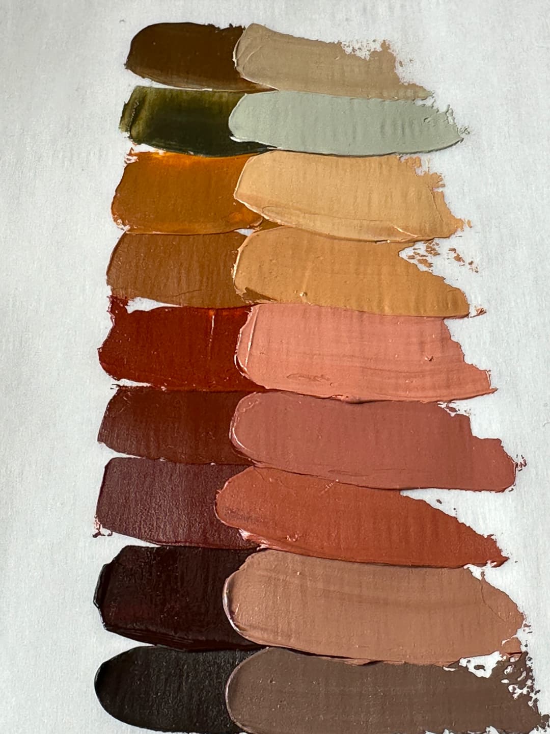
A wide range of Brown Earths- all marked PBr7
Brown Pigments
Brown pigments found in artist paints
PBr11 - Magnesium Ferrite. Reported to have good lightfastness.
PBr23 - Pigment Brown 23. The lightfastness may vary depending on the supplier, with some falloff in tints. However some sources report excellent lightfastness. This is a Disazo Condensation brown.
PBr24 - Chrome Antimony Titanate. A terrific pigment. This color is a viable substitute if looking for a single-pigment replacement for certain (but not all) Naples Yellow Genuine. This carmel-toned brown is a great addition to a palette. Called Chrome Antimony Titanium Buff Rutile. Artiscreation has a lot more detail on health and safety. Despite its relative good marks, it does contain Chrome, Antimony, and Titanium, so see Monona Rossol's book, The Artist's Guide to Health and Safety for information on working with pigments that contain each of those metals.
PBr25 - Benzimidazolone Brown. Monoazo with reportedly excellent lightfastness. This is a delightful brown that we'd love to encounter more often.
PBr26 - Oddly enough this is the same pigment as PV29 at different particle sizes. In her research, Monona Rossol highlights the lung hazards of working with this pigment so if it is one you use, please consult her writing and use best practices.
PBr28 - Pigment Brown 28. Reported to have good lightfastness. Fairly uncommon in artists paints. Usually used in dying cotton.
PBr29 - Chrome Iron Brown. Reported to have excellent lightfastness.
PBr33 - Zinc Iron Chromite Brown. Said to have excellent lightfastness.
PBr41 - Disazo Condensation Brown. Some sources report fading in tints, however others list this as excellent for lightfastness.
PBr43 - Iron-Manganese Oxide. This color is listed as B for toxicity, meaning it does have toxicity, likely due to the manganese. It is listed as an ASTM I for lightfastness. See the Artist's Guide to Health and Safety for information about the hazards associated with Manganese.
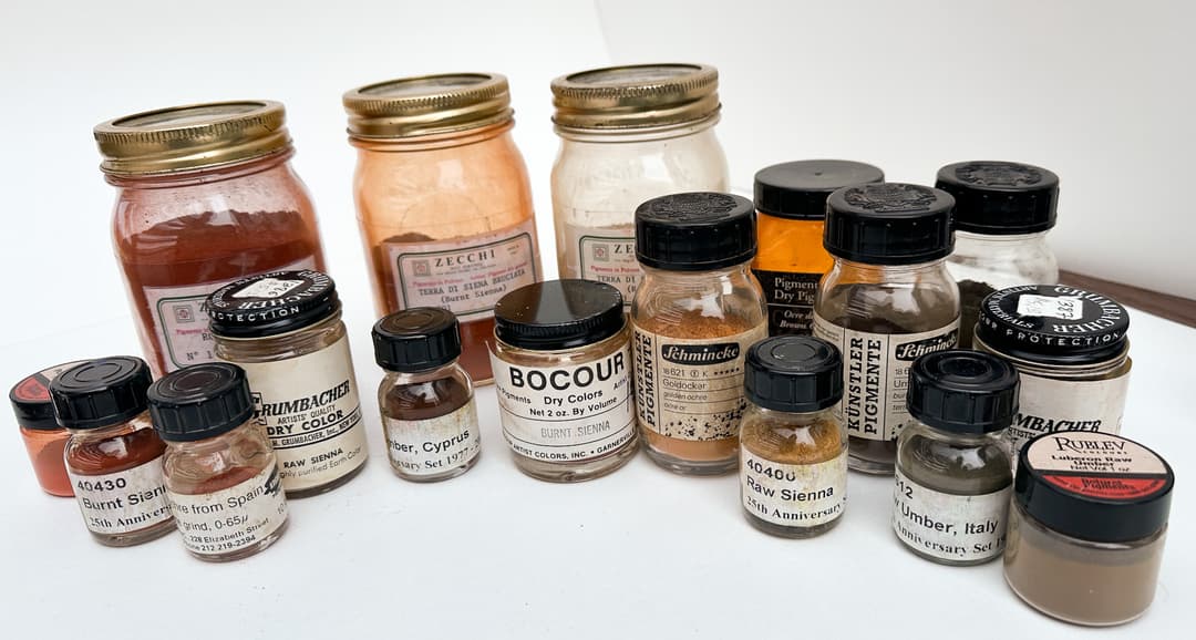
Glorious browns- more than meets the eye
Brown Earth Colors
Raw Sienna from Gamblin is a lighter PBr7
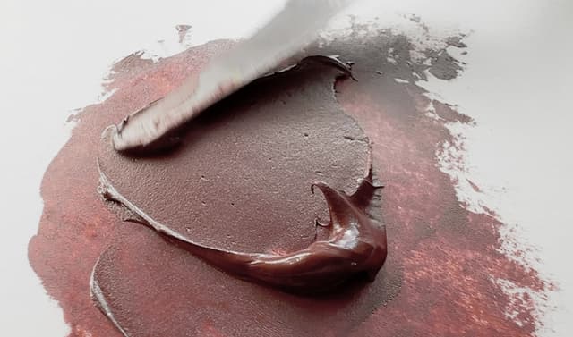

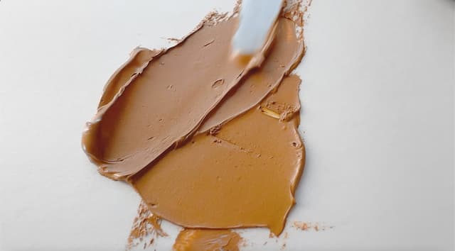
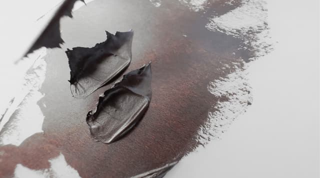
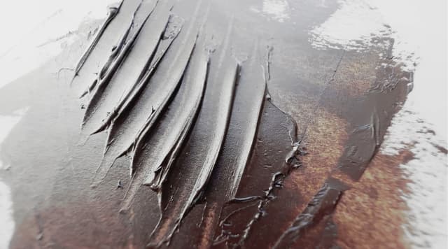
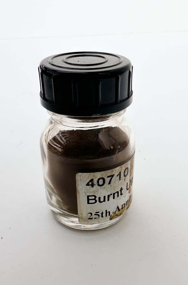
Black Pigments
A power color extraordinaire
Properties from pigment to pigment vary such as undertone, oil absorption, and and drying time. As an oil painter, I tend to think in terms of carbon blacks vs. everything else. There is a lot of name confusion among the carbon blacks and sometimes one feels as though someone came in and just enjoyed the idea of mixing and matching the historical names.
One of the issues among black pigments is the drying time. Mars Black, despite being rather high in oil, tends to be a speedier drier than the carbon blacks, which can be plagued with drying issues (this is often associated with Lamp Black, but as we shall see, Lamp Black can refer to PBk6, PBk7, or even PBk9 as the naming structure is fairly free in this part of the spectrum).
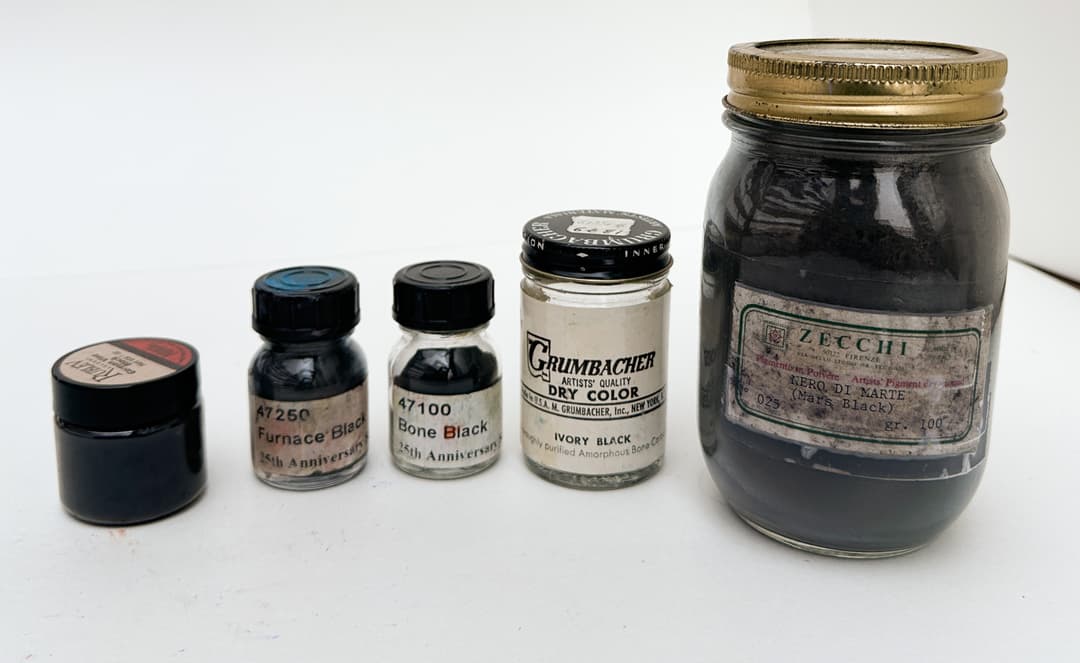
Black pigments
Aniline Black
Peach black- the blackest black?
Ok, we're not talking Stuart Semple black, but it was rumored long ago that Holbein's peach black was the blackest black for oil paintings.
PBk1 - Aniline Black, an ingredient found in some oils mixed with PBk6. This is a component of Holbein's Peach Black, which was at one time rumored to be the darkest black in oil paints. Whether that is still true is up for exploration. This addition of PBk1 to PBk6, which is carbon black, is interesting. Some sources suggest Analine black may not be super lightfast, though Carbon black is. Handprint suggests that perhaps one should not use this pigment in tints. Monona Rossol mentions in her work that some of the anilines are carinogenic (see link below).
On the topic of blackest blacks we recently heard that while research is still emerging, those cool nanotube black pigments like vantablack may actually have some serious health hazards associated similar to asbestos. Please consult Monona Rossol's work on artist safety if you are using these materials such as nanotube pigments. She writes, "Animal tests indicate they may have the same hazards as asbestos and they that they are promoters of other cancers."
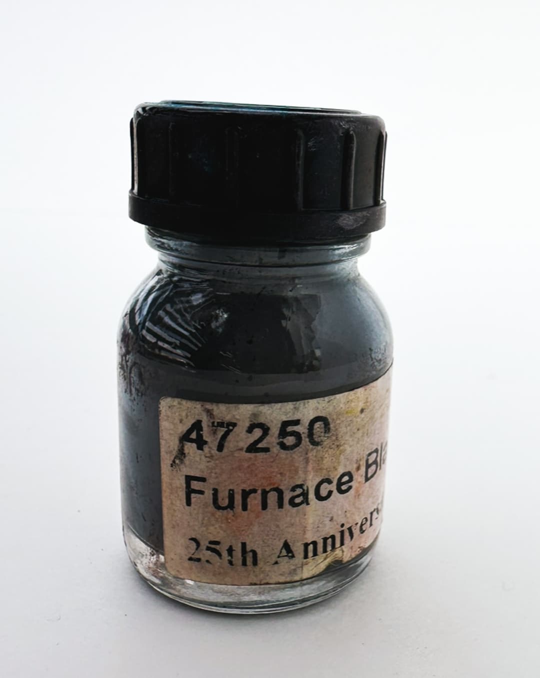
Furnace or Aniline Black.
Spotlight on Carbon blacks
The names for the carbon blacks are used somewhat freely by paintmakers. It can be a bit of a trick to figure out which is which, and this is one of many reasons pigment codes are handy. Carbon black itself is sometimes listed as a carcinogen, so like all pigments handle with care. According to Monona Rossol's work, in regards to both PBk6 and PBk7, "Old manufacturing processes create cancer-causing impurities. New manufacturing processes can produce it without," but it is difficult to know whether one's carbon black has impurities. She goes on to add that nanoparticle carbon black is actually toxic just by itself.
PBk6 - Carbon Black. Pure carbon. According to artiscreation, this is often by burning petroleum residue. Also note: Shungite shares this pigment code, however this is mostly in relation to Russian Icons. Natural Pigments sells this rare version of PBk6. Since this is only from Karelia, Russia, most PBk6 will refer to normal carbon black. Carbon black is associated with slow drying, and may slow drying of other colors when mixed with other pigments. This color is not always everyone’s favorite since it pulls blue-black in mixes and has a large dry shift in watercolors.
Some companies call their PBk6 oil paint Lamp Black, Ivory Black, Transparent Black, or Carbon Black.
PBk7 - Lamp black. Technically called Amorphous carbon from soot. This tends to be a fairly cool black. It is related to some significant drying problems in oil, so use with a bit of caution. Paintmakers may call this Lamp, Carbon black, or even Ivory Black, even though it is usually made by burning petroleum.
PBk8 - Vine Black. A rarer carbon black which is still found in oil paints. This variety is usually made from burning vegetable or organic matter and tends to be somewhat softened by impurities of various kinds. Monona Rossol's work on pigments mentions limits for total respirable dust (called PNOS) that are recommended, please consult her work for information.
PBk9 - Ivory Black or Bone Black. Thankfully this color is no longer made of real ivory, and Old Holland is one of the few brands that labels it correctly as a hue since no versions on the market are going to be made of charred ivory-- rather they are charred bones of other animals.
The color is a bit of a warmer black and has some transparency. Most paintmakers call their bone black Ivory Black, but at least one also labels this Lamp Black, so here the pigment code helps.
As a pigment this color requires a high amount of oil and tends to be a slow drier.
Something very surprising that we found in Monona Rossol's work was a note that there could be some concern of prion exposure through PBk9, which makes a lot of sense due to the sources for the bones to be burned. There is also a note for limits of respirable dust called PNOS limits, please see her work.
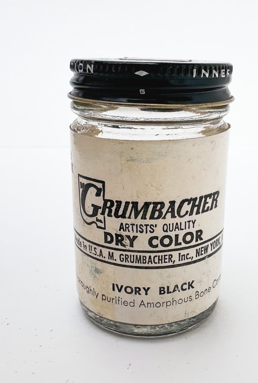
Ivory Black
Black Pigments
For PBk6 and PBk7, see the section below.
PBk10 - Graphite. We've found this to be an intense paint. Most artists will probably be encountering graphite through drawing or other activities. Monona Rossol's work highlights lung problems from breathing the dust as well as issues with graphite potentially containing free silica, which could cause a health problem, so we recommend consulting her research for more information. It is fairly rare to find this pigment in oils.
PBk11 - Mars Black. This is an important artist color which is actually, strangely, magnetic. It is reported to have excellent lightfastness. Technically Ferroso-ferric oxide, this can be thought of like a black earth or Black Iron Oxide. It sometimes contains manganese black, so keep that in mind as far as the health risks associated with manganese - see the Artist's Guide to Health and Safety for information about the hazards associated, as she notes it is sometimes mixed with PBk14, Manganese Black. Her updated work can be found through her site. There seem to be a few naturally occurring pigment sources, which have the nice effect of softening the intensity of Mars Black just a little - otherwise this is a powerful pigment. A couple of benefits are that it doesn't take as much oil to make a paint out of Mars Black as it does out of a Lamp Black and has better drying properties.
PBk14 - Manganese Black, or Manganese Dioxide. Has a toxicity of "B", so a pigment with some toxicity. This is not commonly found as a single-pigment paint, however it is a component of a lot of earth tones, such as umbers, and is sometimes mixed into Mars Black, or found in Black Iron Oxides.
Contains Manganese, so see the Artist's Guide to Health and Safety for information about the hazards. The author's updated work can be found through her site.
Tends to be a fast drier.
PBk19 - Slate Grey or Slate Black. We are weirdly enchanted by this color Slate Grey or Gray (whichever you prefer), as this pigment is the basis for several off-the-beaten-path grey earth tones such as Williamsburg's French Ardoise Gray. Made of Hydrated Aluminum Silicate or just "slate". It's fun to experiment with mixing the lighter forms of this pigment with lemon yellows. Monona Rossol mentions limits for respirable dust called PNOS, see her work for more.
PBk26 - Manganese Ferrite Black. A rare paint, this is one of the darker blacks, this is made of Manganese Ferrite Black Spinel. Interestingly Gamblin's Black Spinel is not this pigment but rather it is PBk28.
See the Artist's Guide to Health and Safety for the health issues associated with Manganese. The author also mentions in her updated work that Spinels have not been well studied in body fluids and that it should be assumed they release metals. Her updated work can be found through her site.
PBk28 - Copper Chromite Black. The pigment in Gamblin's famous Black Spinel- a pigment not often found in oil paints. The precautions for working with copper and chrome would apply- see the Artist's Guide to Health and Safety for the health issues associated with Copper and Chrome in pigments. Her updated writings can be found through her site.
This black pigment does not contain carbon, and Gamblin describes their paint as drying matte.
PBk31 - Paliogen® Black. We know this pigment as Perylene Green, and quickly fell in love with it as a green black. It has a low lightness but still have some chroma. It mixes beautifully with other colors and is reported to have excellent lightfastness.
PBk32 - Perylene Black. Also called Perylene Green, this color is not often found in oils.
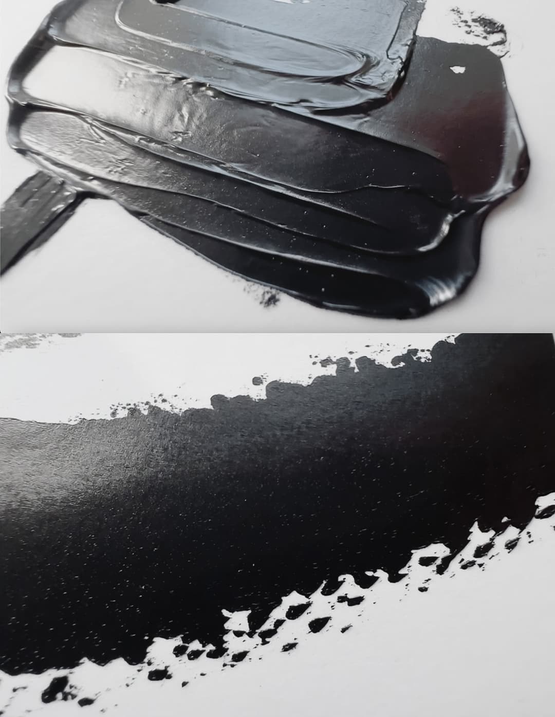
Mars Black tends to be super opaque
White Pigments
Mixed into Everything- Choose wisely
Which white to choose? It will affect nearly everything on your palette.
Special attention may be paid to the binding oil in one's white paint, as it is not just the pigment that matters.
Recently, Golden undertook lightfastness testing that explores how the choice of mixing whites affects the lightfastness of various pigments. In this test, binding oils in conjunction with the various white pigments seemed to be important factors.
The major pigments for white are Titanium, Zinc, and Lead. There are a few others such as Lithopone, however these are not generally widely used. Among white pigments, there are often undisclosed extenders or inert pigments, which tend to be transparent in oils. These are added mainly to use less of the expensive pigments, but sometimes they are also added to change the working properties of the paints.
In brief, Titanium White is a cool, opaque white which is toxic if inhaled, but was until recently was considered generally non-toxic. This is a ubiquitous color which has good covering power and is very bright. Titanium is a slower drier - and the issue is compounded in slower-drying oils- and so the paint may contain added driers.
Lead White is a toxic, warm, semi-translucent white which forms strong paint films but also yellows a bit more noticeably. Lead has drying properties so it tends to dry quickly on its own. The toxicity is a major drawback.
Zinc White used to be very popular, but has been linked (in larger amounts) to early embrittlement of paint films. It is a cool, semi-translucent white which was favored in convenience blends for imparting some softening to the opacity of titanium and for its own charming nature. Many brands have since removed zinc from their paint blends since it is unknown how much may cause cracking. A very slow drier.
Natural Pigments also has an article on Which White to Choose
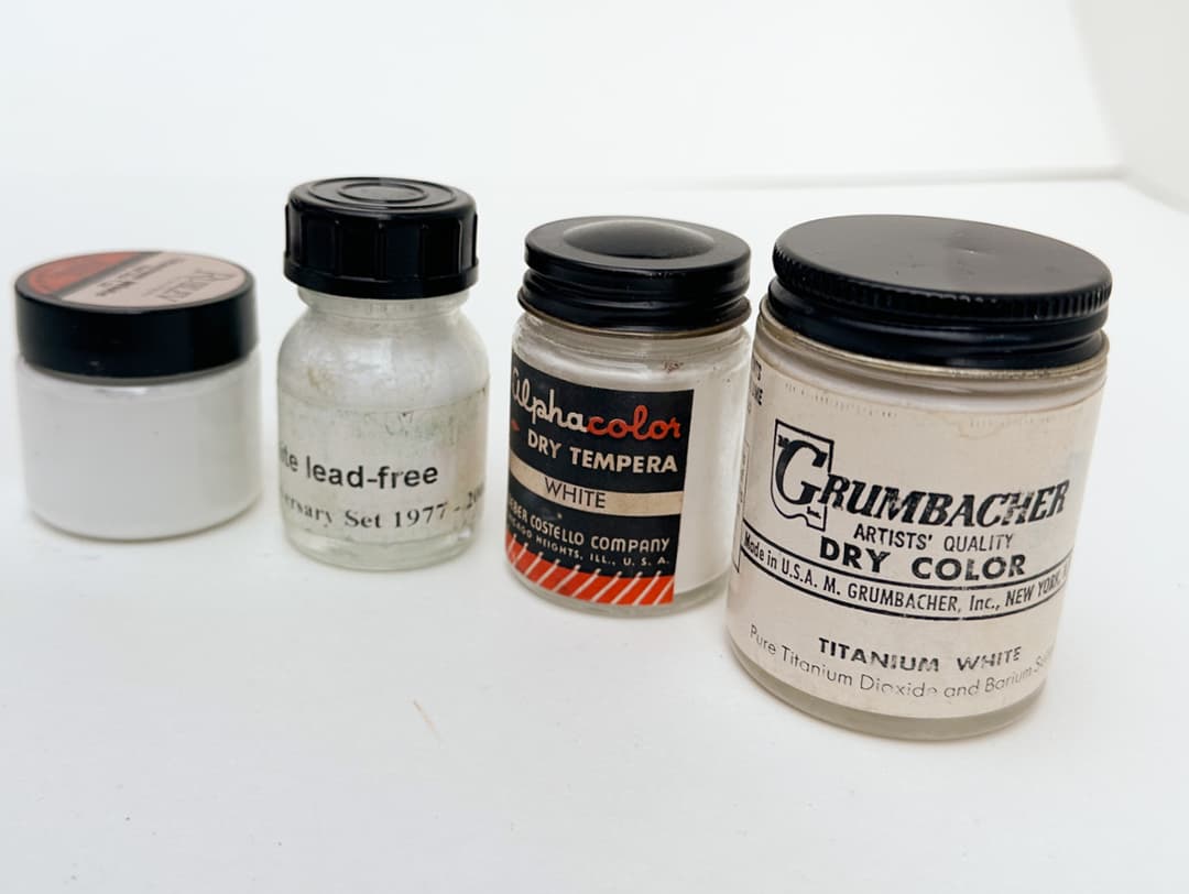
White pigments from Titanium to Zinc. Make or break a painting. Or both.
Lead White
Poisonous and Potent
...Since Permanent might be too strong a word.
But when talking about strength, it doesn't get much better than lead white when it comes to forming good paint films. However it is toxic!
PW1 - Lead White, Flake White. Basic Lead Carbonate. This is the main lead white pigment- an opaque warm white. Aside from it's toxicity, which is serious, this color is known for having translucency, more warmth, and gentler tinting strength than titanium. All these qualities make it prized for applications such as portraiture and flesh tones. Lead white is also a fast drier.
Modern lead white is not made in the same way as historical lead white, and one of the differences is the particle size of the pigment. The historical Dutch Process, sometimes called Stack Lead White leads to different properties in paint behavior (the five-dollar word for this is thixotropy).
As with any other white paint, which will be mixed into the other colors on the palette, binding oils make a huge difference. It's common to find Lead White in linseed oil or walnut oil. There are many names for lead white, which unfortunately have been used rather freely by paintmakers over the years, so it is often hard to determine exactly which name refers to which pigment variety or blend. Sometimes within a brand they will have a Flemish White, a Lead White, and a Cremnitz White, and they will use these historical names to differentiate between lead whites made with different oils, or different pigment blends. Lead White is also known as Flake White, Cremnitz White, Cremser White, Dutch Process White, Ceruse, and Silver White, to name just a few of the most common ones. Sometimes these names referred to blends of lead white with zinc or barium sulphate. For example Rublev/Natural Pigments offers a handful of lead whites which have different combinations of pigments or binding oils, as does RGH.
Lead will often react with sulfur, which is in various pigments as well as in the atmosphere, and can darken or blacken. It also dark yellows quite a bit, and in generally it just yellows. Additionally, lead was somewhat reactive with certain pigments in terms of lightfastness, as explored by Golden's recent testing.
Natural Pigments has made lead one of their specialties, and has a number of articles on Lead White:
Stack Process Lead White Historical Manufacture of Stack Lead White Flemish White and Lead Sulfate
Some companies are pursuing interesting alternatives. While they do not provide stronger paint films in terms of chemistry, the toxicity of lead white is such a drawback that the alternatives are always interesting to explore.
See health note on lead at the bottom of this section.
PW2 - Lead Sulphate White. Sometimes we see this referred to as Flemish White. Here we refer to artiscreation on this pigment. There is a bit of confusion sometimes between PW2 and PW3. At this time, we have not found any PW3 paints in oils, and PW2 is rather hard to find. According to the Artist's Handbook, PW2 is not suitable for works of art due to longevity.
IMPORTANT: The proper precautions for working with lead white go beyond what we can cover here, but please be advised that the toxicity is very serious and lead can be even absorbed through the skin. Do not breathe it, do not eat it, and do not let it sit on your skin. Special decontamination is also needed. Please consult the relevant health and safety authorities. For more information on the hazards associated with lead and barium pigments, see Monona Rossol's book, The Artist's Guide to Health and Safety. Her most recent work can be found through her site.
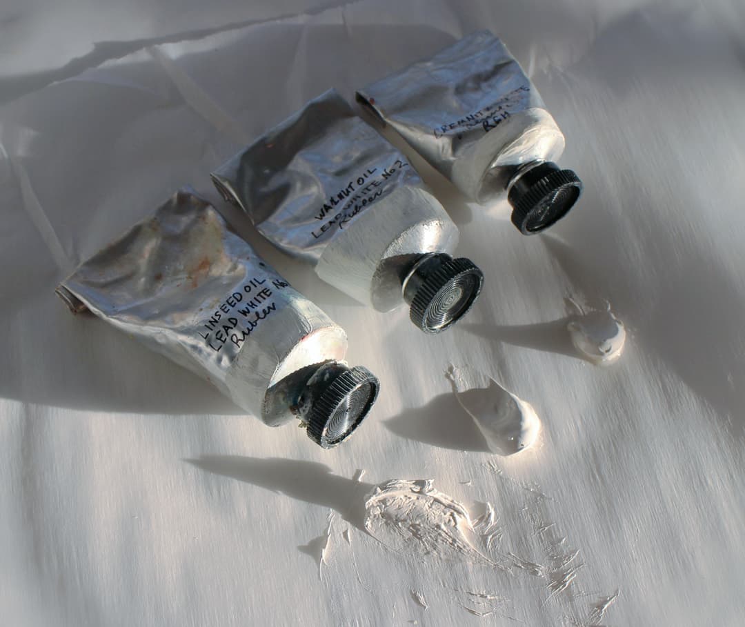
A handful of lead white oil paints in a variety of binding oils
Zinc White
Not so much for oils.
PW4 - Zinc Oxide White. There was that one time we sold off a bunch of expensive oil colors on ebay because they contained zinc. No looking back. There may be a helpful amount of zinc in oil paints, but it might be years before we know how much zinc is beneficial and how much will cause early embrittlement of a painting.
This color has been the subject of a lot of controversy in oils due to cracking, but zinc appears to be fine in watercolor, that is, if you even use white in watercolor. It is more often called Chinese White when used in watercolor.
Zinc Oxide is a crisp, cool white. We favored zinc for mixes with cyans to make tints, and many convenience colors contained a bit of zinc white to soften the overall look. It is hard to replace it entirely. Zinc was celebrated for its role in emulating some of the gentle, gauzy transparency of lead white without the lead-- though, shocker, zinc might actually contain lead sometimes (see below). Zinc's note of translucency is prized in many forms of realistic painting or to make atmospheric effects in abstract painting.
Zinc is a very slow drier.
In some cases, a brand's basic Titanium White contained a hearty dose of zinc as a matter of course because it imparted desirable working properties to the Titanium. Some brands may not actually be listing on the tube whether there is PW4 (unlisted) in their Titanium White, and in general disagreement about zinc white seems to be the rule see this discussion.
However, it is now widely recognized that too much zinc can be linked to early embrittlement and delamination. A name that comes up frequently in zinc research is Marion Mecklenburg. In 2018, Golden undertook research on zinc and embrittlement. They published a series of articles on their research:
Zinc Oxide Warnings, Cautions, and Best Practices Zinc Oxide Reviewing the Research Zinc Oxide Search for the Dividing Line Natural Pigments Zinc Free Zone
As an additional caution, Zinc white PW4 sometimes contains lead-- see Monona Rossol's work for more information. This explains why some dry pigment is marked "zinc white - lead free". For more information on the hazards associated with zinc pigments, see Monona Rossol's book, The Artist's Guide to Health and Safety.
Please note there are different ways in which zinc was prepared. Long ago, there used to be a version with a larger particle size.
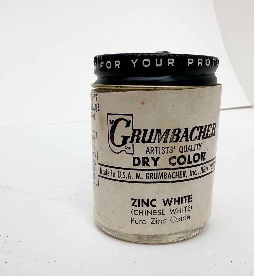
Vintage Zinc White
More white pigments
PW5 - Lithopone. "An insoluble mixture of barium sulfate and zinc sulfide" -Artiscreation. This has zinc in the name but it's not the same zinc white that causes cracking. A slow drying color, this is a gentler white than titanium. In a world where PW4 is on everyone's radar, we've been looking for white pigments that will yield that extra bit of cool blueness in cyan tints. Lithopone had been suggested as a potential route, as it's not as opaque as titanium and is somewhat similar to zinc white, however we're awaiting more information about its lightfastness over time.
A group of pigments fared a bit worse in terms of lightfastness in a lithopone-safflower blend (see Golden's lightfastness testing). The binding oil does matter, so bear in mind this was in safflower oil. Their findings stated, "...In fact, there were a few instances when mixes with lithopone Porcelain White were less lightfast than corresponding mixes with other safflower whites. The existence of this group—composed of Permanent Green Light (PG7/PY3), Ultramarine Blue (PB29), Permanent Yellow Light (PY3), Egyptian Violet (PV23), and Fanchon Red (PR112)—suggests that lithopone (in safflower oil) may reduce the lightfastness of certain pigments. It’s also notable that Green Gold (PY129) faded about twice as much with Porcelain White as with Titanium White Safflower, though both tints exhibited relatively low lightfastness."
Interestingly, The Artist's Handbook mentions a certain yellow-greenness in oils, which is something we had not heard mentioned anywhere else but makes some sense based on experience. It also mentions that this pigment is sometimes used to "bulk out" other white paints as it is not very expensive. That could be interesting or important when it comes to the lightfastness of a given mixing white, especially if the lithopone is not stated on the label.
While pure versions are not soluble some grades may contain toxic impurities. This is mentioned in Monona Rossol's recent work, which can be found through her site. Additional information on zinc and barium pigments can be found in her book, The Artist's Guide to Health and Safety.
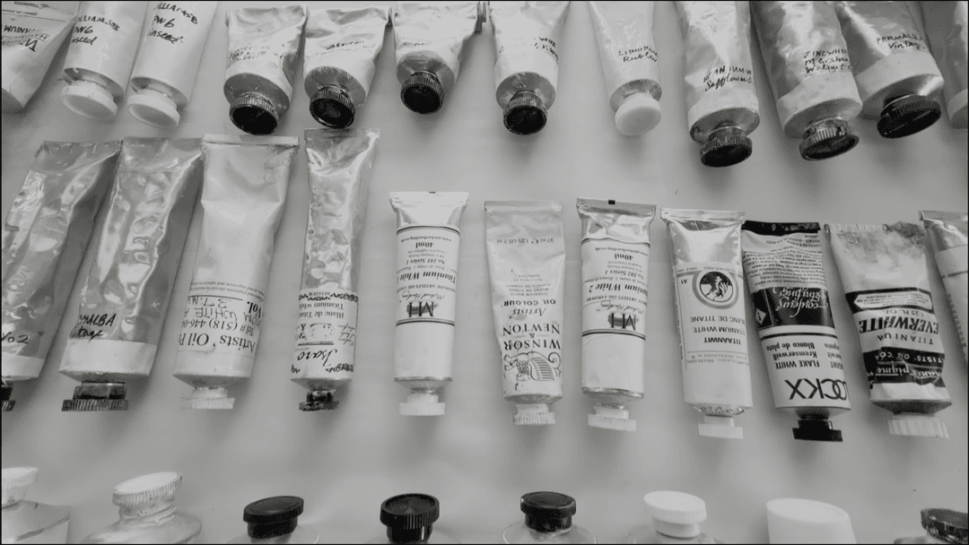
Various White Paints
Titanium White
The 20th Century Staple
PW6 - Titanium White, Titanium Dioxide. Love it, hate it, but could oil painters live without it? This powerhouse pigment is one of the most used pigments in oil painting. Titanium White is associated with coolness and opacity, which is why we love it in so many applications like Gesso and grounds. When we need to cover a surface with a white acrylic paint, we reach for Titanium White. In oils sometimes the opacity is cut with fillers, extenders, and zinc to make it a bit more nuanced in mixes. In oils it makes a buttery paint. It also has a reputation for high tinting strength as well as a "chalkiness" in tints that some consider overpowering. On the other hand, what would we use for the brightest highlights and speculars if not Titanium White.
The high tinting strength can partially be cut with fillers, modifiers, or other pigments, however we have grown fond of the super-high-tinting version by Rublev. The chalkiness can be amended by the addition of other pigments, and titanium is popular in many convenience blends which are tints of other colors.
Perhaps the greatest drawback for titanium is the less-strong paint film that it forms. In a way we would describe this as softer, but in the way that something crumbles, so some people describe it as more brittle.
The differences in binding oils will matter a fair amount to oil painters as will the effect of additives. Just take a look at pure Titanium White in Linseed oil in the pictures found here to appreciate the effects of just a little bit of chalk and beeswax. Extensive interest in this over the years reveals it's a complicated matter, but here are some more results from Golden on the binding oil specifically: On the Yellowing of Oils.
We have also found that Titanium White can darken a bit after it dries. This is important if one is doing work with tightly controlled values (such as a Munsell-informed workflow). We have also noticed other strange anomalies, mainly regarding Titanium White in safflower oil. We made inquiries about this and the best answer we have received so far was that the slow drying combined with small pigment sizes in inoragnic pigments can create flows within the drying paints. Sometimes it seems that organic paints with a small particle size may not dry evenly within a thick, slow-drying titanium dioxide passage. Also this is a slow drier, meaning many brands are probably doing something (like adding driers) to speed it along. We appreciate where brands disclose the driers as it gives artists more options and more control over their materials.
We're not health and safety experts, so consult them for that part. Sanding or breathing PW6 can be dangerous-- our understanding is that it can be carcinogenic if the dust is breathed ("cancer hazard by inhalation"), so consult those health and safety experts and protect yourself with the proper gear. We were interested to find out that Titanium White can sometimes contain undisclosed contaminants-- PW4 and lead-- so consult Monona Rossol's work for more information.
The Rutile kind is more common, the Anatase kind is seldom found.
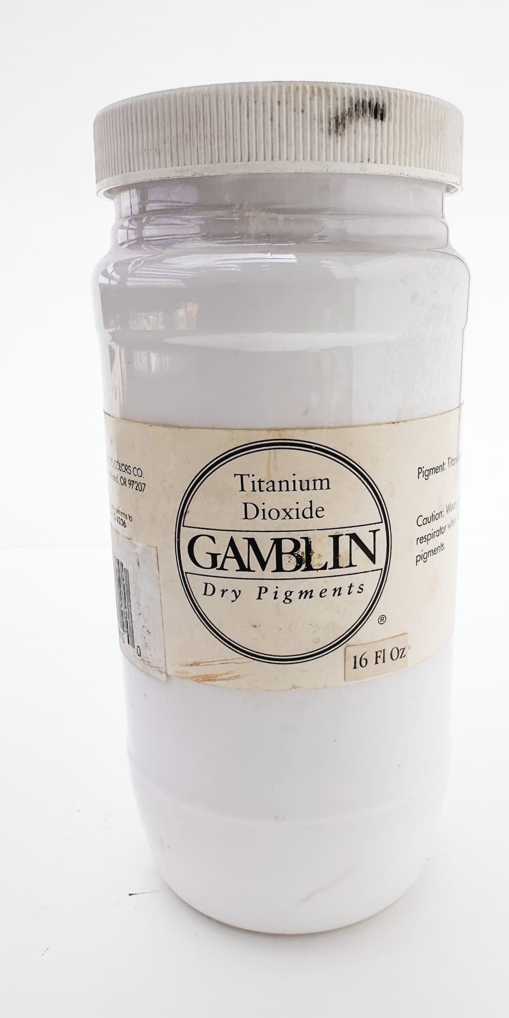
Titanium white in huge quantities- which seems fitting.
Titanium white is sometimes bound in other oils, such a poppyseed oil, even though poppyseed oil is associated with other issues. The relatively lessened yellowing is considered such a helpful trait (when used sparingly in the topmost layer of painting) that some painters will select Titanium White bound in alternative oils like poppyseed.
PW6:1- Natural Titanium Dioxide bound with Ferric Oxides. This often has a buff or oyster shell color that can be nice in realistic painting. Buff Titanium as it is often called has reportedly high lightfastness, however Golden found a few anomalies in some of their lightfastness testing.
PW7 - Zinc Sulphide White. We were shocked to learn that this pigment is highly toxic-- see Monona Rossol's work here. More can be found on hazards of Sulphides and zinc as a pigment in the Artist's Guide to Health and Safety.
We also found notes in the Artist's Handbook about a hydrogen sulfide gas that is released when heated. While this bears zinc in the name, it is not the zinc that causes cracking. PW7 is used in lithopone-- see PW5 for information on lithopone.
Artiscreation mentions its phosphorescence and use as invisible ink.
Strontium Titanate - Ceramic White. (No pigment code yet). We bought this color from Holbein as part of our explorations into lead white alternatives. While Titanium is amazing for so many things, its opacity can make it a bit challenging to work with for some applications. It is nice to have some white colors that borrow from the working properties of zinc or lead without the toxicity of lead. Based on a rare Siberian mineral called Tausonite, this is an interesting and less opaque white than Titanium. Currently this pigment is used by Holbein in Ceramic White.
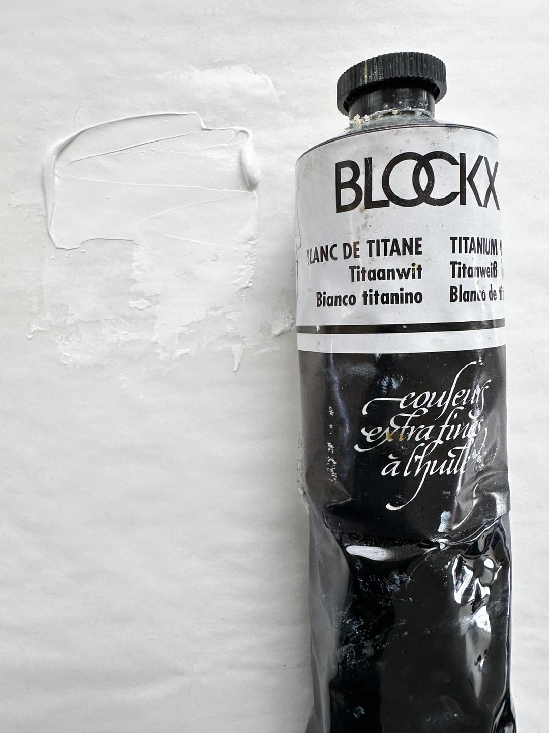
White Pigments
Which white pigment a person chooses makes a difference
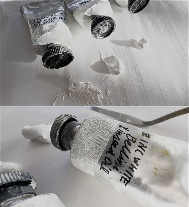
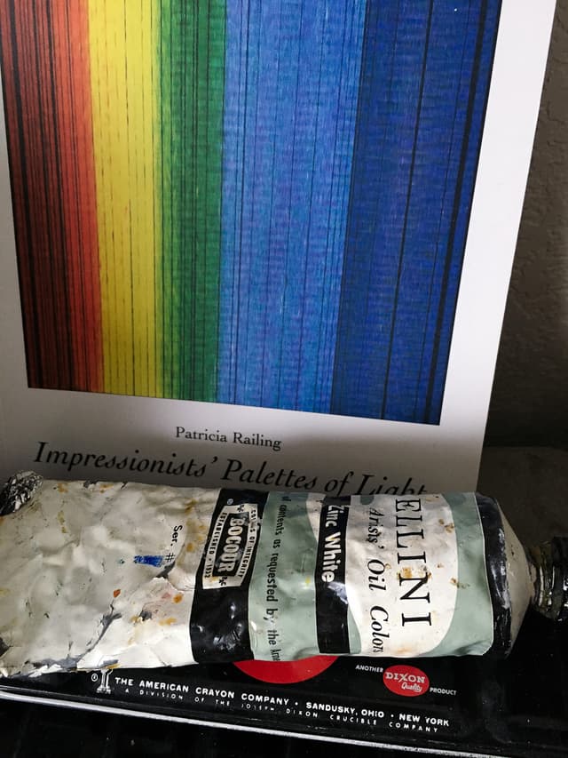
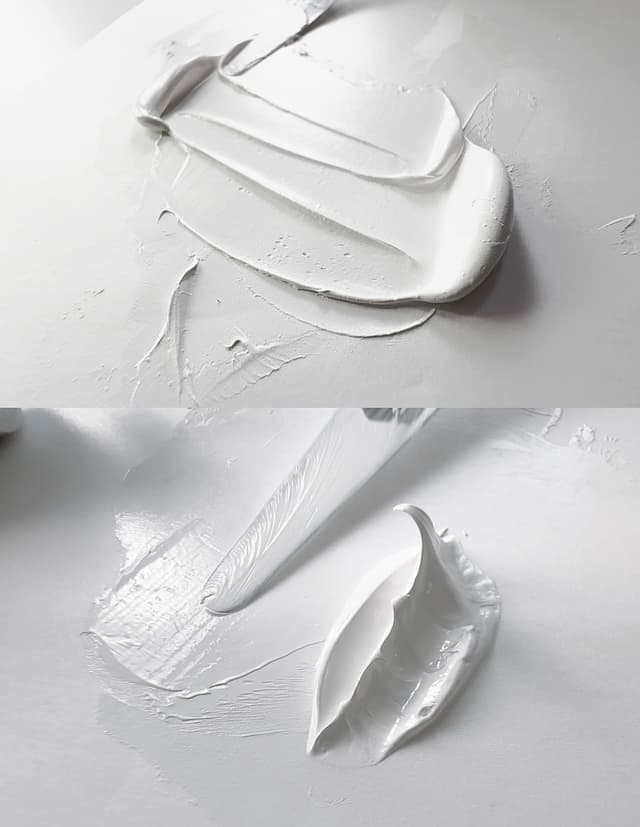
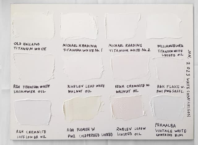
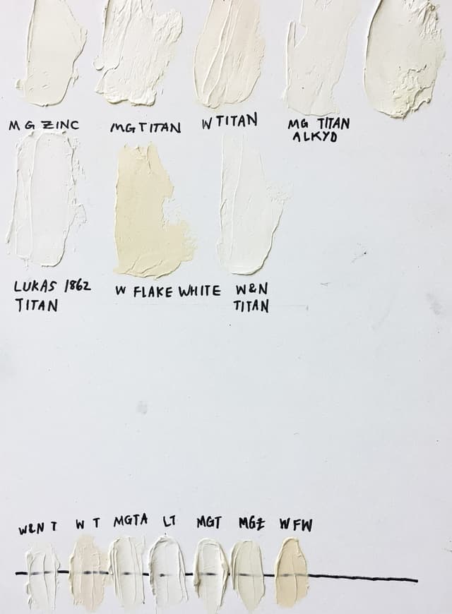
Other White Pigments and Extenders
Pigment companies don't always disclose these
PW18 - Chalk, Calcium Carbonate, Calcite, Precipitated Chalk. This pigment is used extensively- it is almost transparent in oil but it gives opacity to watercolor and is used in gouache. Can be limestone or marble. Also called whiting. This can also include marble dust, which comes in several very different particle sizes. Sometimes this is used as a base, and it is commonly used as an extender in oil paint. While this color has an excellent blue wool scale rating, its role in lightfastness is still being explored.
Monona Rossol mentions in her workto use the standards for nuisance dusts if working with chalk.
PW19 - Kaolin clay. Related to bentonite. PW19 is mostly hydrated Aluminium Silicate and may also bring along some impurities such as silica.
See Monona Rossol's work on pigments here for notes on kaolins and free silica hazards; also avoid breathing the dust. She writes "All clays are inert dusts that can cause respiratory problems at high exposures. Some may contain free silica." Kaolin is usually bright white but it can carry a color cast depending on the supplier.
PW20 - Mica, or Mica Titanate. There is quite a bit of diversity within this pigment code, and paint labeling doesn't help to sort it out very much. We think in terms of pearlescents which tend to have a whitish or pastel luster to the color, metallic-looking pigments -- sometimes called iridescents-- which imitate real metals and may be made of powdered metal (see the pigment codes at the very bottom of this page) or of PW20. The metallics don't have the same pastel pearl white that the pearlescents have but may also be made of mica. There also the shiny color change pigments called interference colors which are hard to say which color they are since they have a color change effect depending on the angle of viewing.
A rather serious heads up is given if one is working with dry pigments that this pigment code can contain some crossover with talc, which may contain asbestos. Monona Rossol has done extensive work on talc and asbestos. She writes, "Some talc minerals still contain silica and asbestos," so please consult her research even if you are using something labeled 'asbestos free' talc-- as it may not be, it is worth looking into what she has found.
In terms of labeling, sometimes we see PW20 listed alongside iron oxides, which may gesture to a certain iridescent process, or even just "Pearlescent pigment" listed for a pigment code, or no pigment code at all.
Mica, hydrous aluminium potassium silicate, can be processed in any number of interesting ways, some of which involve coating it with Titanium dioxide white or other pigments. The mica can also be coated with iron oxide, and sometimes we see things like Mica Titanate Iron Oxide.
Mica can also be used on its own as it is shiny, and can depending on the binder, chunks of it can be used whole. Artiscreation mentions that the larger sheets or bits of mica don't really work all that well in an oil film, which may be why some of the larger or coarser iridescent colors are seen in acrylic but not oil. In general there are a lot more acrylic pearlescents.
For more about pearlescent pigments, see What are Pearlescent Pigments and How do they Work? by Natural Pigments.
PW21 or PW22 - Baryte, Barite or Blanc Fixe. May be natural or artificially made Barium Sulfate. A filler or extender, which is often undisclosed, that reduces the tinting strength of a color and also makes a tube of paint feel heavier.
In terms of health and safety, according to artiscreation, it is possible that this could have soluble barium if it is not made with high standards, in which case that could be quite toxic. Monona Rossol's research also states that PW22 and PW23 may contain toxic impurities along with soluble barium and aluminum. Her book, The Artist's Guide to Health and Safety, also has sections on the health hazards associated with barium, and we recommend consulting her latest work through her website.
This is used frequently in commercial oil paints, probably too extensively, as it is inexpensive. Some emerging lightfastness testing suggests that baryte may actually affect the lightfastness interactions with pigments, but more research will need to be done on that point. It's reasonable to also infer that it may be added to titanium white and (possibly) not be disclosed on the paint tube, as it is less expensive than titanium and may soften the qualities of titanium. It is also likely that it is added to a great many other colors without being noted. We appreciate where paintmakers call out its presence as it gives an artist more control over their materials. Barite can be useful for flesh tones and other areas where reduced tinting strength is useful. When used alone barite does have a propensity to yellow but it may affect the overall lightfastness, which is one reason we wish it were more widely disclosed along with the health and safety reasons.
In the Artist's Handbook, mentions that this pigment is actually fairly heavy, and so when it is used to as an inexpensive filler in paint, an artist may pick up the paint tube and mistakenly think it is highly pigmented when in fact it is filler. In fact, in industry terms it's a "weighting agent" which is funny to think about in terms of artists' oils-- the name Barite actually derives from the word for 'heavy'. More on barite from Natural pigments.
Something that is interesting is that barite has a range of paradoxical behaviors depending on the both the painting medium and the quantity used. The Artist's Handbook mentions that in oil it can enhance some opaque pigments' opacity, while in general just adding a little can also enhance transparency. The quantity matters as well as the application. In oil it's a transparent, dingy whitish grey, but it is so bright in water-based media that it is used for a white standard, like a reference point for brightest whites. In water-based media, it is used in gouache, which is opaque.
PW24 - Alumina Hydrate, Aluminum Hydrate. Artiscreation identifies this as "Gibbsite (Natural form of Aluminum Hydroxide)." A common filler and extender, and also used as the basis for lake pigments (e.g., alizarin or phthalo).
In terms of health and safety, Monona Rossol mentions that this may contain soluble aluminum, see her work here. For more information on the hazards associated with aluminum pigments, see Monona Rossol's book, The Artist's Guide to Health and Safety.Aluminum hydrate also adds "buttery" feeling, but at a cost (see below).
The Artist's Handbook. Pip Seymour's book The Artist's Handbook discusses its use as a transparent filler in oil paints. Small amounts of it seem to have an initial benefit to the look of the paint, but may cause oil paint to yellow after it's dried along with other issues. Where they are using this, paint companies rarely disclose this among their pigment codes, perhaps because it is used so widely, and it is reasonable to infer that it shows up in mediums as well. Paint companies may be using the language of "stabilizer" instead of "additive" or pigment since it's transparent. For health reasons as well as lightfastness, we would like to see companies list this pigment where it is being used, especially over certain thresholds.
PW25- Gypsum. Hydrated calcium sulfate. An extender in paint. Also used in gesso and grounds. Artiscreation lists Calcium sulfate dihydrate as a high quality Terra Alba and Alabaster Natural Hydrated Calcium Sulfate under PW25. Monona Rossol notes that one should employ PNOS limits for respirable dust, see her work available through her site.
PW26 - Talc, may include natural mica. A warning if using dry pigments that talc may contain asbestos: Monona Rossol has done a lot of work on this, so please consult her research even if you are using something labeled 'asbestos free' talc-- it may not actually be, and it is worth looking into what she has found. Resources can be found at her site. Also please not that this may have silica which would be harmful to breathe. This ingredient is also not often listed on paint tubes, however it is an extender.
PW28 Wollastonite. This is a respiratory hazard, consult health and safety experts for proper protections.
Other inert pigments and paintmaking additives can be found at artiscreation. This collection of fillers and extenders for paintmaking lists a few which are available through Rublev: Bologna Chalk - see PW18, Clear Glass Powder, Aluminum Trihydrate (ATH) - see PW24, Calcined Kaolinite - see PW19, Perlite, Mica (Wet Ground) - see PW20 and PW26, Alabaster - see PW25, Marble dust - see PW18, Barite - see PW21, Silica, Nepheline Syenite, and Wollastonite.
Many of these require respiratory protection, please consult health and safety experts for details.
More about additives, which are not listed here as pigments, can be found in this section of Artiscreation. For example, aluminum stearate.
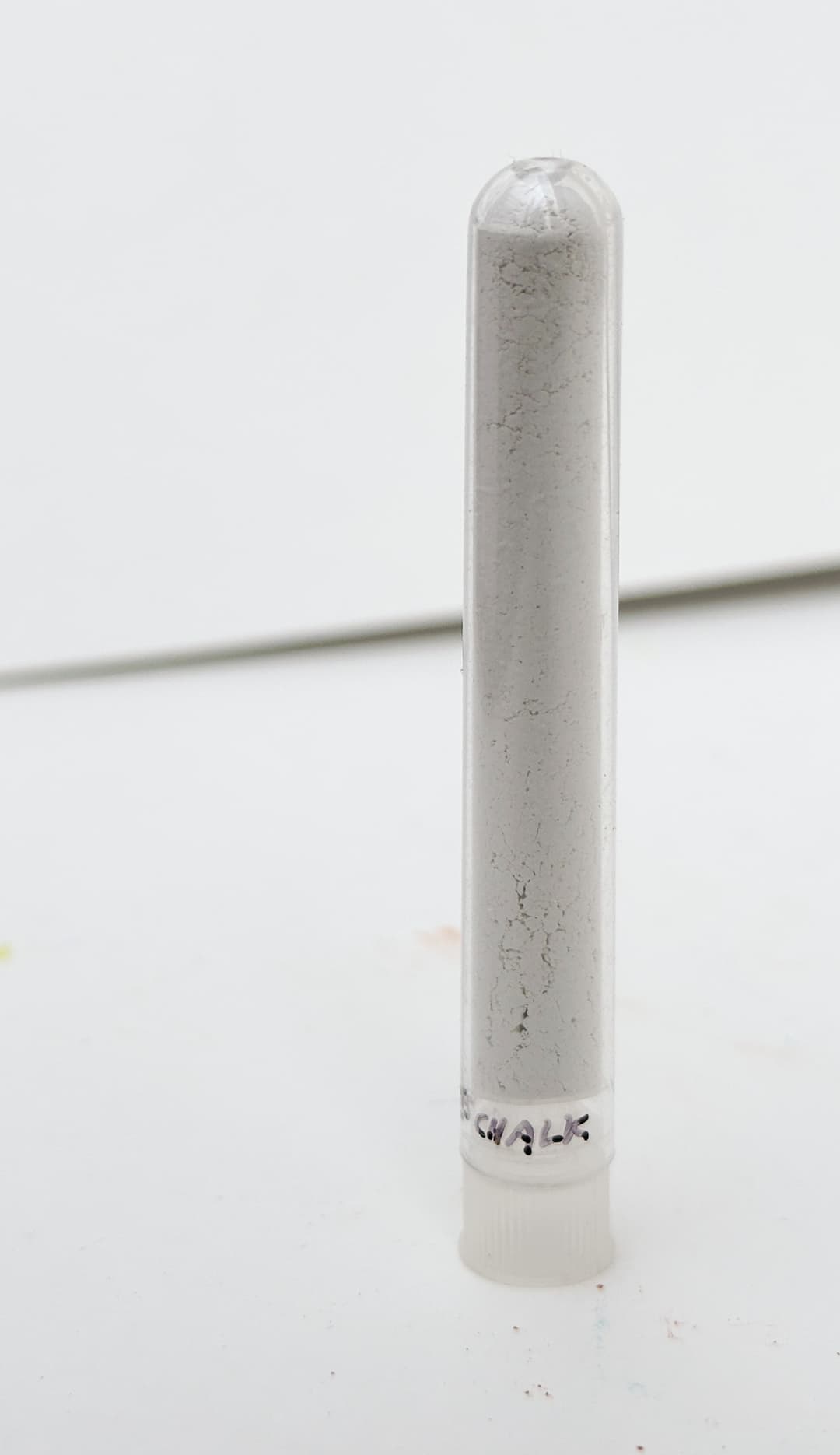
Chalk is a common additive to oil paint
More to the Story
Other Pigments
Fluorescent dyes, pearlescent pigments, and metallics that become the sparkling gold or faux copper sometimes found in paint lines. Here are some of the special effects pigments used in painting.
Fluorescent Colors. For information about fluorescent colors, see Golden's The Science and Seduction of Luminescent Colors.
Fluorescent colors are not lightfast.
A and AX pigments are thermoplastic fluorescent pigments "where resistance to strong solvents is not needed" -DayGlo
AX-11-5 - DayGlo Aurora Pink, Fluorescent Pink AX-16-N - DayGlo Arc Yellow, Fluorescent AX-17 AX-18-N - DayGlo Signal Green, Fluorescent AX-21 - DayGlo Corona Magenta Fluorescent
SG3 -Solvent Green 3 Dye. May possibly refer to this
SY163 - Sudacolor Yellow 163. According to this technical listing may actually be PY17 (Dairylide Yellow 17), which is a yellow with moderate to poor lightfastness.
SY33 - Solvent Yellow 33. Not much is known about its lightfastness.
VR1 - Vat Red 1. A thoindigo pigment
VR41 - Deep Red Solvent Dye, often used in fabric dying
Mica - see PW20
PM1, P Met 1, PMet1, or Pigment Metallic 1. Powdered Aluminum. Please note uncoated powdered aluminum is associated with several hazards- it can be explosive and it can also release harmful gasses. Check out artiscreation for more.
PM2 P Met 2, PMet2, or Pigment Metallic 2. Powdered Copper Alloy. This is flammable, see more here.
--
Article written by Melissa Carmon.
About the author: When a sudden urban firestorm threatened their studio, Melissa and her husband Jonathan rescued The Great Book of Color, about 800 pages of her handwritten notes gleaned from her years of painting. They co-founded the Paint List to empower fellow painters around the world. More can be found here. Read More.
Help improve this article! Please let us know if you see any errors or oversights as we would like to continually refine our information about pigments.
Discover more about each pigment in the Pigment Notebook.
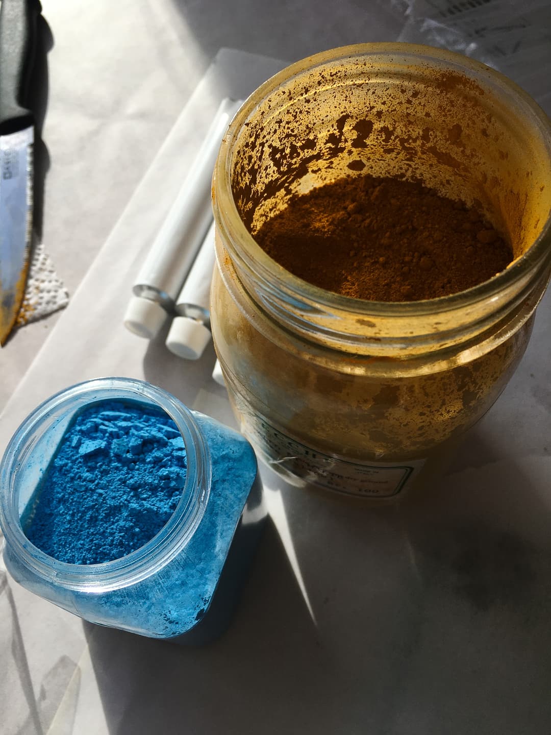
Dry Pigments from Sennelier and Zecchi
Subscribe for More Articles
If you'd like to receive the latest illuminations from the Great Book of Color and Paint List news in your inbox, subscribe to the newsletter here Thanks for reading and Happy Painting!
