
Mix Your Own YInMn Blue Hue, Part 1
Mix an approximation of this elusive paint with our three simple recipes. These mixes will get you close with paints you may already have in your paintbox
Featured Paints
What does YInMn blue look like? Can you actually mix a color close to YInMn Blue? And do you already have these colors in your paint box?
Three Quick Mixes that Get Close to YInMn Blue
How to get close to YIn Mn Blue with colors you might already have
Mix a YInMn Blue Hue
Getting close may be easier than you think
YInMn Blue is a color that you can mix in your studio (though it does not have the infrared reflecting properties that genuine YInMn has). This hard-to-find pigment rocked the art world a few years back, and while we love the real thing, for artists, the color can be approximated. In fact, you can get close to the color with paints that you may already have.
These mixes get close but not perfect— for perfect matches stay tuned for YInMn Blue Hue 2.
This set of mixes is where we ourselves started. It is amazing how easy it can be to get within a few degrees of noticeable difference.
Since we as artists are probably less focused on the industrial applications for YInMn and the interesting amount of reflectance it has in the off-the-visible-spectrum reds (it’s very cool, no pun intended, and we would love to explore that in our work sometime). Here we are just talking about its overall visual imrpession-- what can see as far as the hue, value, and chroma.
This article covers a less intense path to finding a similar hue to YInMn-- meaning we're not going to get into percentages and weights and we'll talk about where to find a visual reference instead. The more intense mixing article (coming soon) requires a scale and precise measurements to help make a mix exact. This article is for those who are curious but a little more chill. Below you'll also find information on how to locate a mixing reference to help get your mix close.
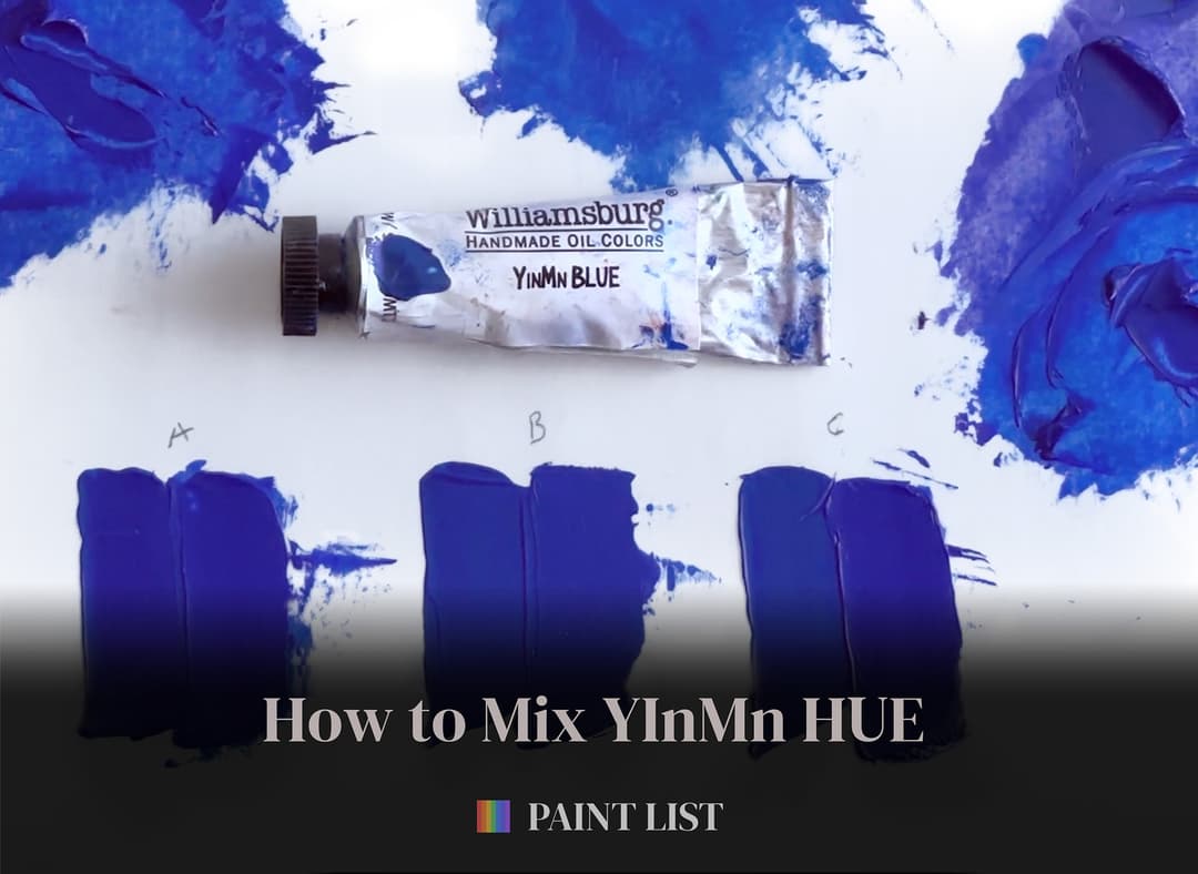
Three easy mixes for a YInMn Blue hue. Each mix is shown next to genuine YInMn
Three YInMn Blue Mixes: Overview
The Quick Guide
If you would like the recipes, here are three:
Mix A
Winsor and Newton French Ultramarine Blue, PB29(or any other ultramarine in the indig-blue zone listed below) Williamsburg Quinacridone Magenta, PR122 Williamsburg Titanium White, PW6 or other titanium white
Mix B
Old Holland Cobalt Blue Deep, PB74 Old Holland Cobalt Blue, PB28 Williamsburg Titanium White, PW6 or another Titanium White
Mix C
Williamsburg Ultramarine Blue French, PB29, PV15 Winsor and Newton French Ultramarine Blue, PB29(or any other ultramarine in the indigo-blue zone listed below) Williamsburg Titanium White, PW6 or a similar titanium white
YInMn Blue has some visual similarity to both Ultramarine and Cobalt. Both Ultramarines and Cobalts need a little bit of tuning toward the violets though to get closer to YInMn. To get even closer you'll have to add a subtle note of desaturation (which we'll cover in the next installment of this guide when we take a look at exact mixes).
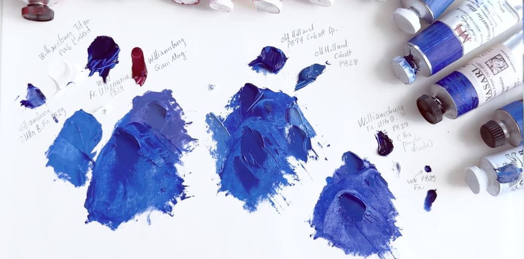
Three close mixes of YInMn Blue using different combinations of common paints
Colors we used to mix three different hues of YInMn Blue
To get a perfect match a few more colors are needed. However many painters will already have some combination of these in their paintbox.
First, Find a Visual Reference
Route 1: Munsell
Ways to Find a Visual Reference
Ok so we promised to keep this chill, without having measurements and weights. If you're going to eyeball it though you'll need to have a target.
First, if you have the Munsell Book, you already have the Rolls Royce of colors, but for many that resource is out of reach. You can find a digital approximation of Munsell from Richard Murdoch, though we have not tried that ourselves. Another idea is to find some paint chips from a hardware store that are close (see below).
The Munsell Route
YInMn Blue has a touch of desaturation to it— around 7.5PB 3/10 (with a small degree of difference - in technical terms less than 1 degree of noticeable difference at 0.73 Delta E). Visually with our set of chips it looks like it is between 3/12 and 3/10, however our spectrophotometer puts it closest to 3/10.
For those less familiar with Munsell, 7.5 PB 3/12 is the highest chroma on that hue page at that lightness, so YInMn falls within the Munsell chips, and the overall color impression that it makes on us is mixable.*
*The exact spectrophotometric curve across all wavelengths is another matter, however the overall visual impression is what we think of when we see a color, and it can be approximated pretty well.
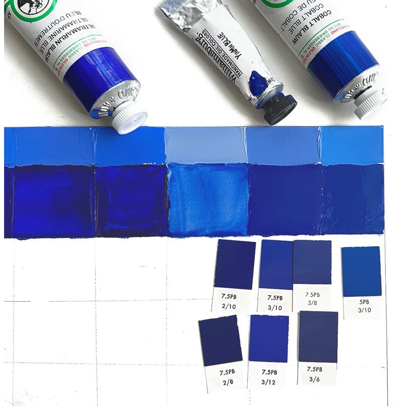
Munsell chips next to several speciality blues. YInMn Blue is second from the right.
Find a Reference Part 2: The Paint Chip Route
Some house paint brands actually carry something close
The Paint Chip Route.
Ok here things get a little more loose, but hey any reference is better than none. Since we don’t physically have all of these paint chips we’re going to have to take some educated guesses.
If you’re in the Netherlands, Sikken’s V0.47.19 is an almost exact match! Lucky Netherlands. If you’re in Germany, RAL’s 280 30 40 is a little less than two degrees of difference from YInMn.
If you’re in America, there are a couple of choices, all a little more than 2 degrees of difference. -Valspar’s Classic Royal Blue at 2.41 DE -Behr’s Tanzanite at 2.70 DE-Benjamin Moore’s Blue at 2.96 DE -Sherwin-Williams’ Honorable Blue at 3.28 DE
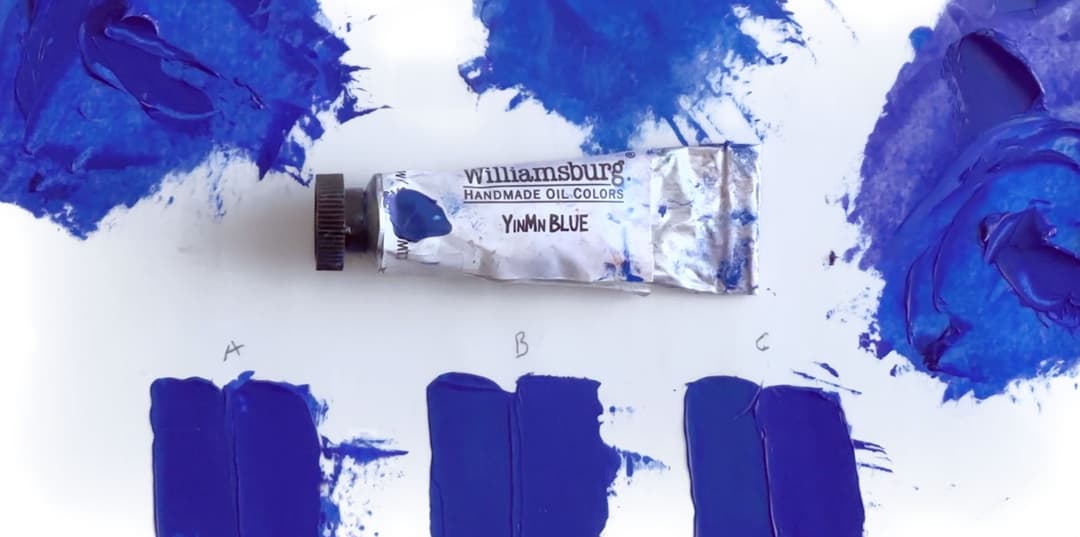
In our case, we used the paint itself as a mixing target- but having a paint chip or a Munsell swatch is the next best thing
Notes on the Three Mixes
More about choice of Ultramarines
Prologue: The Indigo-Blue Zone and the Indigo-Violet Zone
Ok, we just wanted to make a note on the whole French Ultramarine Blue naming structure. Why this matters: for these YInMn recipes, you’ll need a bluer version of ultramarine plus a way to spin it toward purple. So if you’re using a more violet-blue kind of Ultramarine you’ll need less to spin it towards the purples.
Among ultramarines, some are in the indigo-blue zone and some are in the more indigo-violet zone. We have some articles on this:
In the Indigo-Blue Zone: Vasari Ultramarine Old Holland Ultramarine Michael Harding Ultramarine Blockx Ultramarine Light Rublev Ultramarine Green Shade M Graham Ultramarine Blue
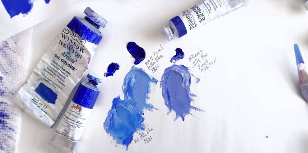
These colors are all named ultramarine but they differ slightly
The Blue Zone: Ultramarines
When we say blue, all of these qualify as indigo, but they are less purple than some other ultramarines
Between the Blue zone and the more Violet zone- Ultramarine Blue French
From here colors get more and more toward violet
Toward Indigo-Violet (roughly in order)
Blockx French Ultramarine Blue Deep Old Holland Ultramarine Blue Deep Schmincke Norma Ultramarine Blue Deep Maimeri Puro Ultramarine Deep
The In-Between Zone
These ultramarines are more indigo-violet while not being the all-time purplest
The More Violet Zone
The purplest of our ultramarine blues, these these actually contain some PV15
Definitely Indigo-Violet: Williamsburg Ultramarine Blue French Williamsburg Ultramarine Blue French (Safflower)
Indigo-Violet Ultramarine Blues
These actually contain a little violet boost with the addition of Ultramarine Violet pigment.
Mix A: Surprising
Notes on the Ultramarine-Quinacridone Magenta mix
Winsor and Newton French Ultramarine Blue, PB29(or any other ultramarine in the indigo-blue zone listed below) Williamsburg Quinacridone Magenta, PR122 Williamsburg Titanium White, PW6 or other titanium white
We chose these because we were shocked how close you can get to genuine YInMn with a very simple mixture with paints you may already have in your paint box: a PB29 and a PR122 with a little white.
Back when we first started mixing approximations for this color, there was a time we thought it was difficult. That is because the paints dry a little differently and so it's kindof difficult to hit the target later. You might need to make a few tries and let them dry to see how they fare. When dried, this simple mix was actually very close.
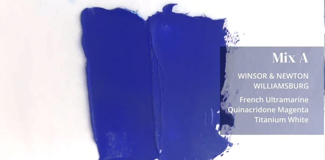
Mix A was close to YInMn. This picture shows a swatch while the paints are still wet, but when dried they were even closer.
Paints for Mix A
What we used to make a close YInMn Hue
More than one Ultramarine would work
Choice of ultramarine is not very specific in this recipe
Originally we tested this recipe with Rublev Ultramarine Green Shade, and we had terrific results. In fact it came within 2-3 DE of Genuine YInMn when the mix had dried.
Many different ultramarines will work here— we used Winsor and Newton because it is widely available, and we didn’t want to suggest that you need to buy a specific ultramarine to get the color in the ballpark.
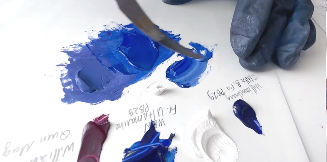
Many different Ultramarines will work
Ultramarines with a similar hue for Mix A
These are ultramarines with the a similar masstone hue as the one we used
Genuine YInMn Blue vs. Mix A
A Quick comparison
This blend got very close.
A few notes on the choice of magenta. The Williamsburg Quinacridone Magenta may be brand specific— we are not sure on that yet. Williamsburg’s PR122 is the most violet-leaning magenta of the PR122s we’ve tested so far. We’d have to do more tests to say definitively, but it is probably not a big deal to use any artist quality PR122.
We chose Williamsburg’s Titanium White in linseed oil but other brands would probably have similar results.
So there you have it: PB29, PR122 and PW6.
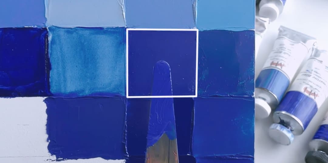
Mix A was very close. The mix is on the palette knife and the genuine YInMn is highlighted on the panel
Paints we used for Mix A
Three simple colors we used to make a close YInMn Hue
Mix B: Luxury
Old Holland Cobalts
Old Holland Cobalt Blue Deep, PB74 Old Holland Cobalt Blue, PB28 Williamsburg Titanium White, PW6 or another titanium white.
There are different pros and cons to using cobalts, and this isn't really the place to discuss those. If you have a cobalt blue deep and a regular cobalt blue on hand, a YInMn Hue is easy to mix.
Also these colors don't have to be the ones by Old Holland. We happened to have these on hand, and they make great cobalts.
Many different brands of cobalt would theoretically work here. We also got very close results on the spectrophotometer with some old Winsor and Newton cobalts we had from a long time ago. Basically the idea is to balance the more green-leaning regular cobalt with a more violet-leaning cobalt blue deep.
Cobalt blue deep is a color that may not be in everyone's paintboxes as it's a bit off the beaten path. Golden mentioned it in a few of their lightfastness tests recently (see their article on ASTM testing). We happened to have a few tubes of this mysterious color-- some vintage and some modern-- but they do vary a bit in color.
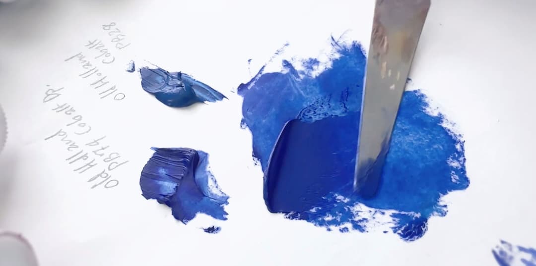
Mix B: Two cobalt blues
Colors that would be similar to the lighter cobalt (PB28) we used
Cobalt blues come in a few different colors. These are close to Old Holland Cobalt Blue (PB28), though Old Holland has a very slightly different hue.
Mix B in Progress
These appear easier to mix when wet but actually dry darker than they appear
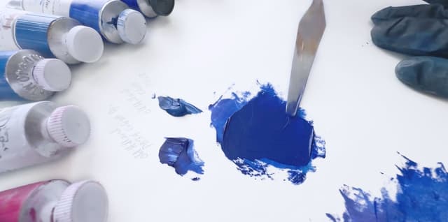
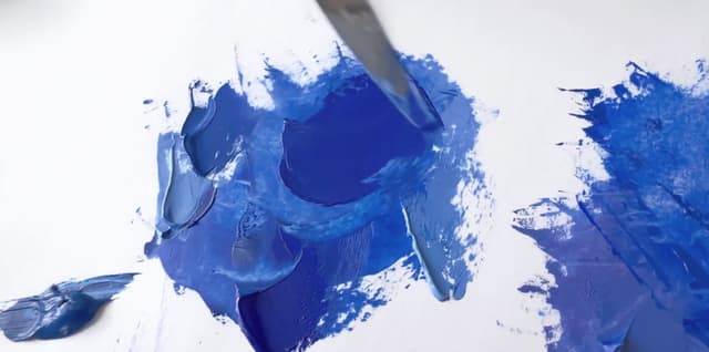
Mix B: Luxury
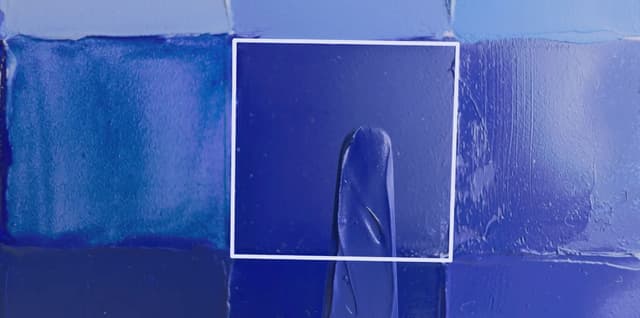
Before drying, this mix looked perfect
These colors can dry a little darker than they appear when wet so it might be helpful to lighten them ever so slightly when mixing. Some testing will reveal whether that is necessary for whichever cobalts you prefer.
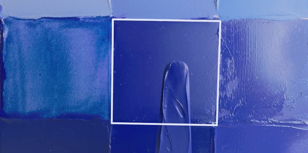
On the palette knife is our mix of the two Old Holland cobalts, and the highlighted background square is genuine YInMn Blue
Mix B
What we used
Mix C: Variety
Another Ultramarine Blend with a dose of Ultramarine Violet
Williamsburg Ultramarine Blue French, PB29 & PV15 (We used the linseed oil version) Winsor and Newton French Ultramarine Blue, PB29(or any other ultramarine in the indigo-blue zone listed below) Williamsburg Titanium White, PW6 or a similar titanium white
We chose Mix C to illustrate a variation on Mix A. The difference is how the ultramarine is brought towards violet. Mix A uses PR122, Mix C uses PV15. Interestingly, this mix seemed a bit higher in chroma in the end than Mix A, and YInMn Hue benefits from just a touch of desaturation.
So Mix C starts with a more violet shade of Ultramarine Blue French by Williamsburg (in the deep indigo-violet zone) and tunes it back towards blue with some of the Winsor & Newton French Ultramarine. Pretty much any of the ultramarine blues in the bluer zone listed above would do the trick for bringing Williamsburg's Ultramarine Blue French just a notch or two towards blue.
Williamsburg Ultramarine Blue French is actually a convenience blend that has a note of Ultramarine Violet PV15 added in. So another way to think of this mix is just ultramarine blue with an ultramarine violet added in a small quantity.
Also worth noting: we used the Ultramarine Blue French in Linseed for this video, but we could have used the Safflower version. We chose linseed for the YInMn blue just because it may yellow or discolor a bit more, which might help desaturate the hue a bit towards our target (genuine YInMn). However the safflower one is a bit more chromatic, and in general we love the safflower version more.
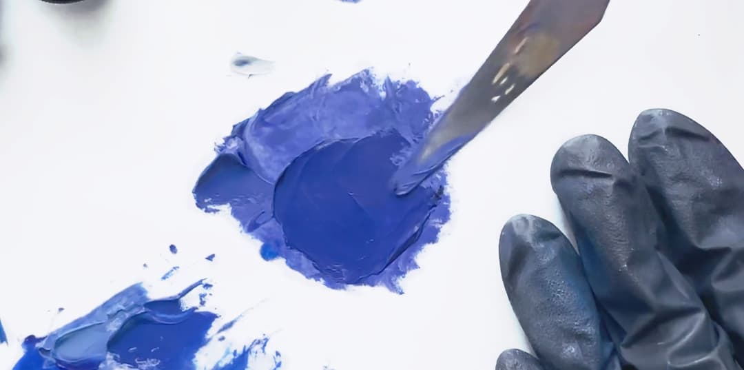
Two different ultramarine blends make up this YInMn Blue mix. One of the two colors we used here has some Ultramarine Violet PV15 in it
Genuine YInMn vs. Mix C
A close mix
So how close is this mix? Actually extremely close. It's amazing that just a little bit of ultramarine blue (and in this case, the mix with some ultramarine violet already in the paint) yielded such a close match.
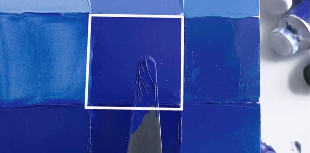
The palette knife shows our ultramarine mix while the highlighted square shows genuine YInMn.
And you can get get closer still
Stay tuned for exact mixes
Still wishing to get ever closer to the genuine YInMn Blue? Stay tuned for our next article on how to get exact mixes.
Search for genuine YInMn Blue
The genuine color is sold from time to time via special editions
