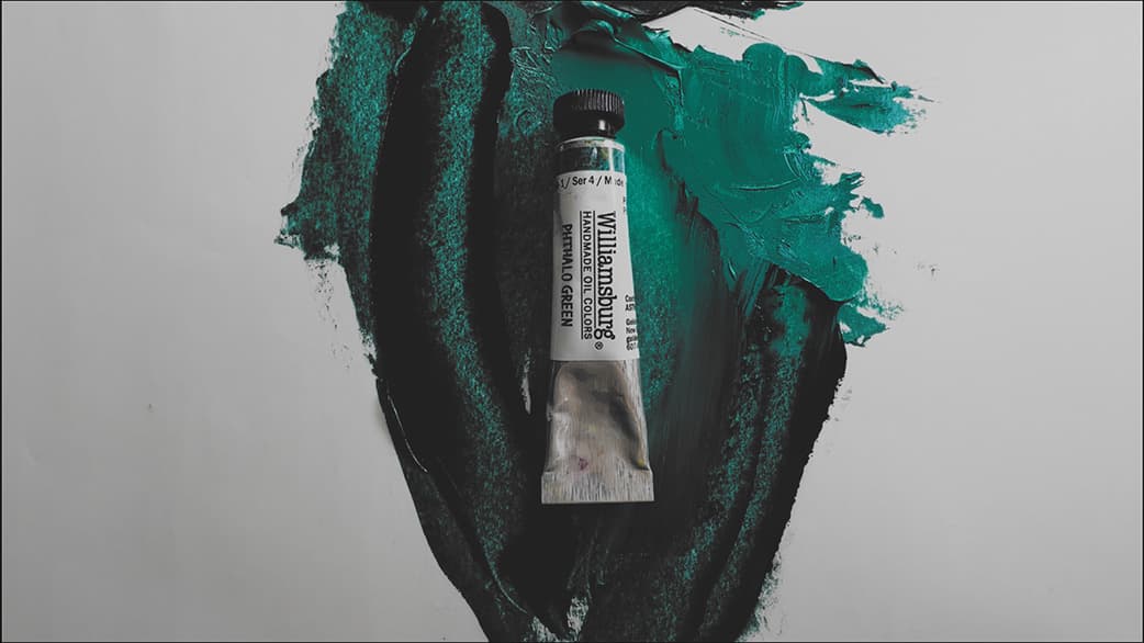
Phthalo Green Blue Shade PG7
The essence of green, this is an elemental gem of the palette
Featured Paints
Do you really need a single-pigment green on the palette? What's the deal with phthalo green blue shade and yellow shade? And will phthalo green ruin your paintings? All this and more!
We'll be talking about Phthalo Green Blue Shade as a pigment in oil paint. So pull out that palette and let's talk about color. For specific paint reviews, check out our in-depth article our article Phthalo Green Beryl and Aquamarine Paint Color Comparisons.
Phthalo Green Blue Shade is intense, transparent, and leans toward blue green
Though there are many greens out there, none are quite like Phthalo Green Blue Shade.

Phthalo Green Blue Shade: A Gem of Power
A super-green palette essential for some (but not all) kinds of painting
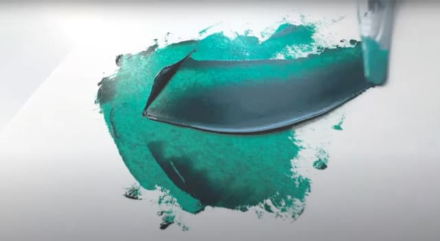
Naturally transparent, Phthalo Green Blue Shade comes out of the tube very dark, almost black, and reveals its chroma in tints and transparencies. When you turn over a tube, the code on the back reveals its pigment index, and in the case of this one it's PG7. This pigment tends to have excellent lightfastness with a couple of potential exceptions due to mixing whites, but overall its lightfastness is amazingly good. Be careful with older tubes of this color. Due to differences in manufacturing over the years the old tubes can contain PCB's. We're artists, not toxicologists, so be sure to do your own research on this - it's kindof a weird 'gotcha' if you're working with old paints, so just a heads up there. In this article we'll be talking about Phthalo Green paints in general. For specific paint reviews, check out the in-depth article Phthalo Green Beryl and Aquamarine Paint Color Comparisons.
When working on a massive color mixing project where I tubed over a thousand precision-matched colors to study every facet of the rainbow, I could describe PG7 as nothing but elemental. There are some pigments that are so intense that they are almost like the distilled essence of a color- I imagine these like colored gems on the palette, whether red, deep green, royal blue, opaque white, or any other hue of the rainbow. This is a color that is so powerful that one must work to break it into its constituent arpeggios of interstitial color-notes, and the work is worth it. There's a reason it's one of the most popular pigments that paint manufacturers use in their convenience blends.
Some painters find this color so powerful that they struggle to know how to use it. We'll talk about how to use it well. We'll also cover the areas of the palette where it is needed, as well as which types of paintings were it might best be applied. We'll also talk about some interesting applications for PG7 that aren't exactly green. And of course, we'll mention it's cousin, Phthalo Green Yellow Shade (PG36).
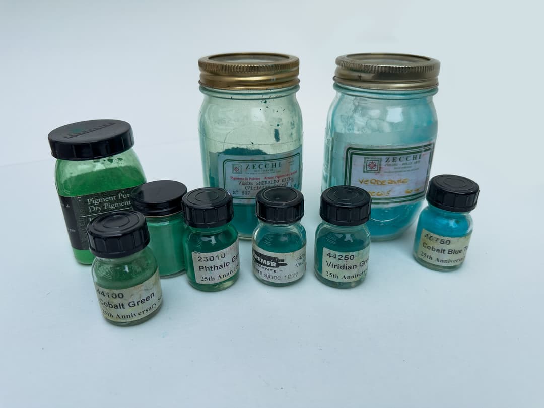
In some ways PG7 is similar to viridian, and it also has a cousin pigment Phthalo Green Yellow Shade. However no other green pigments are quite like Phthalo Green Blue Shade (PG7 dry pigment not shown here).
Phthalo Green Across Brands
Premium brands are deep, student brands may be lighter
We explored several brands of phthalo green blue shade in depth in our article Phthalo Green Beryl and Aquamarine Paint Color Comparisons. This color is so powerful that we have heard that even the pigment itself ships with a filler, and this is just to make it usable. In most areas of the palette, highest tinting strength is a virtue. However, since some painters find this color hard to handle, a more diluted version or student brand could work. However, there are sometimes other ways paint companies may cut costs in a student brand.
How does Phthalo Green compare to other green pigments? There is really no other pigment quite like Phthalo Green Blue Shade. In some ways it's like viridian, however in some circumstances viridian seems to have a color shift when dried. We'll explore this more in an article on viridian. In general, Phthalo Green blue shade seems capable of a bit higher chroma in some cases than viridian as well as a bit more depth in masstone. In this article, we'll be focusing on its use in oil paints. For more information on dry pigments, we've included some links at the bottom. Also, as an aside, you can search dry pigments on Paint List.
As far as its behavior in paint, it was actually phthalo green PG7 that first alerted me to the differences among paint viscosities. This is described in more detail in our review on Gamblin, but I was working with large quantities of this color for the big color mixing project. It was here that I noticed a gel-like consistency in the Gamblin version (I was using the professional grade, not the 1980 series). Every paintmaker has their own take on how they interpret this color and which additives they use to give it the feel they want it to have.
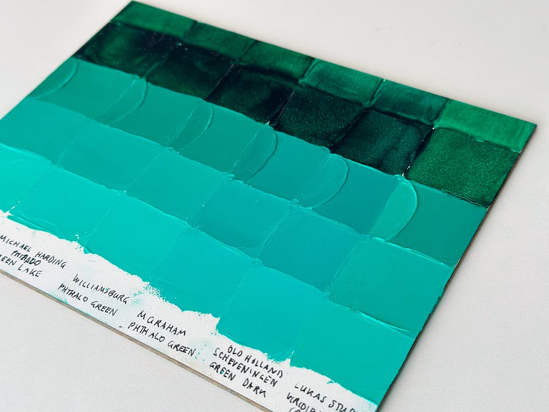
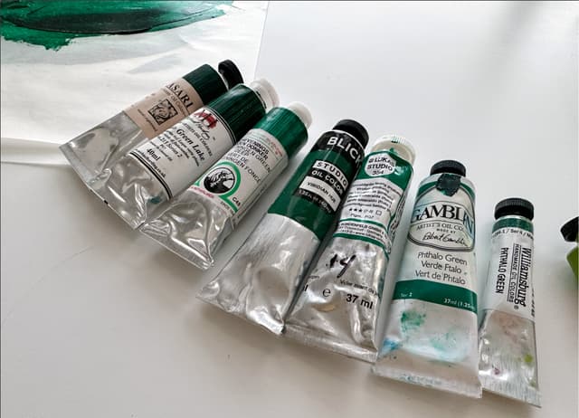
Phthalo green blue shade can vary slightly in hue across brands. Student brands, like the swatch of Lukas Studio in the foreground, may be less deep in masstone.
Phthalo Green Blue Shade
This color (PG7) is made by a ton of paint companies. Here are just a few. These will vary a bit in their handling due to each company's take on how to formulate this color.
Two Phthalo Greens
Phthalo Green Yellow Shade vs Phthalo Green Blue Shade
There are two Phthalo Greens in life and I have found that I use both of them for different tasks. The Phthalo Green Yellow Shade (PG36) is also a useful green, and leans a bit more toward yellow. When mixing the highest chroma limes, PG36 is super helpful.
The topic of this article is Phthalo Green Blue Shade, PG7, which is helpful for mixing the highest chroma teals (if one is not using cobalt teal for whatever reason) as well as high chroma middle greens and saturated forest greens.
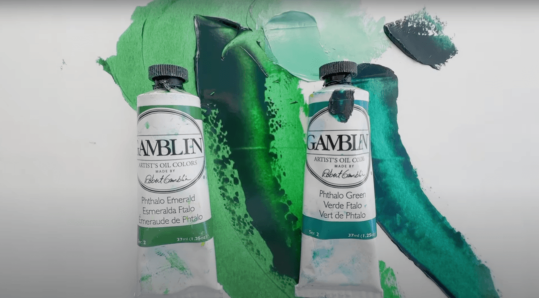
Two phthalo greens. To the left, PG36 is called Phthalo Green Yellowish or yellow shade. To the right, Phthalo Green Blue Shade makes deep enchanting emeralds and forest greens, as well as high chroma teals.
Phthalo Green Blue Shade vs. Yellow Shade
The two different kinds of phthalo green
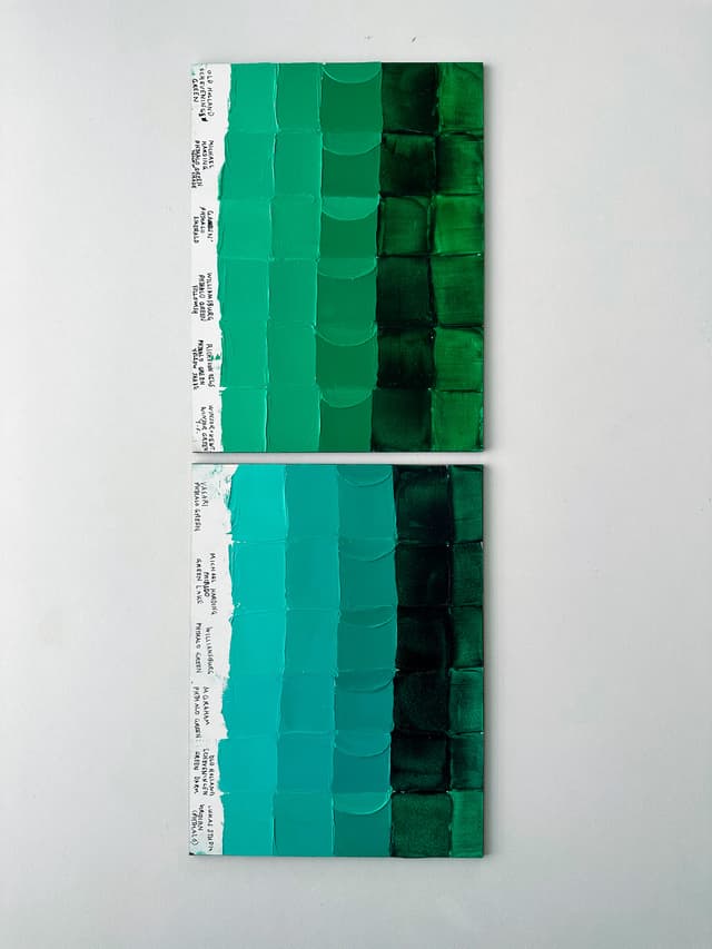
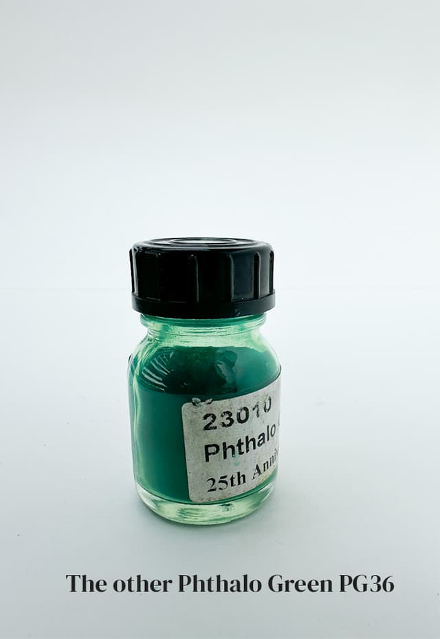
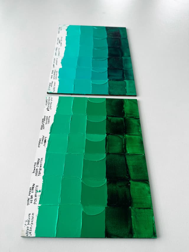
Phthalo Green Blue Shade
Single-Pigment Great Greens
Secrets of the Paint List
The first secret of using Phthalo Green Blue Shade...
... is not to use it. But you would expect something like this with a gem of power, right? I mean there has be a video-game-esque seemingly-contradictory rule when dealing with an power emerald like this.
Painters find this color really hard to handle, and there is a reason why, as well as way to learn how to do it. For example, I absolutely love Michael Harding's descriptions of this color. "The ruination of many a student’s work, use with great caution. Always check in a good light as it can silently destroy a painting till seen in a true light when it is too late. This colour, otherwise known as the embalmer... tends to invisibly leach into all other colours on the palette till one stands back and sees in a good light what has happened, caution." This is apt advice. So what to do?
The Great Book of Color
How to use Phthalo Blue Green Shade
The Counterintuitive Method
All right. So we have this situation where we have this super powerful emerald and yet people are using it a way that's adverse to their paintings. Here's what to do to learn how and if you need this color.
So, where phthalo green shines is the highest chroma greens, teals, mints, and in complements. However, you won't know exactly where those lie unless you figure out how to use what you already have without touching that tube of phthalo green.
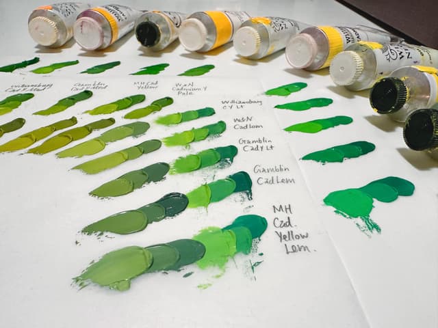
So here is one potential route. Take your yellows (at least a genuine cadmium yellow light and a genuine cadmium yellow deep or medium). Mix these with the blues on your palette (a starting point would be phthalo blue PB15:3 and ultramarine blue). See what kinds of greens you can get.
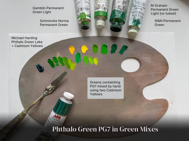
Then, when you have mixed these, take Phthalo green and mix it with your cadmium yellow light. Compare the character of these greens with your blue-and-yellow mixes.
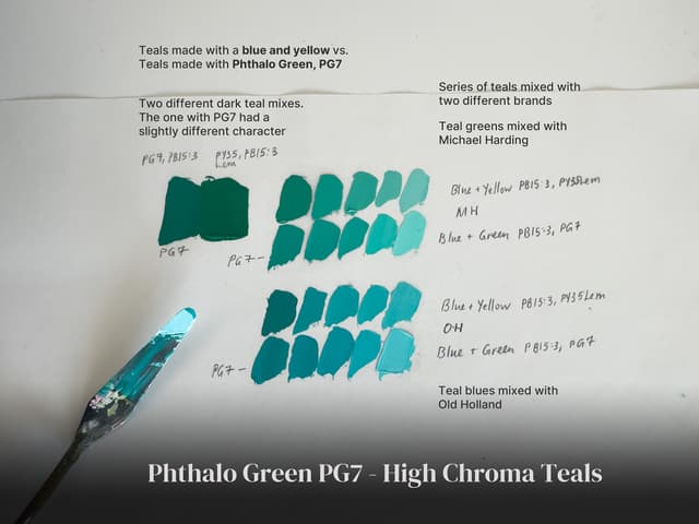
Then mix some teals. Mix blue with yellow to see what kinds of blue-greens you can make, and add a bit of white of these to explore the turquoise range. Then make a separate set of mixes using phthalo green with phthalo blue PB15:3 and also add some white. See what kinds of teals you can achieve.
The idea is that one doesn't need to go adding phthalo green to everything, and Michael Harding is absolutely right, overuse of this color can cause strange color casts. The phthalos have a way of making their presence known.
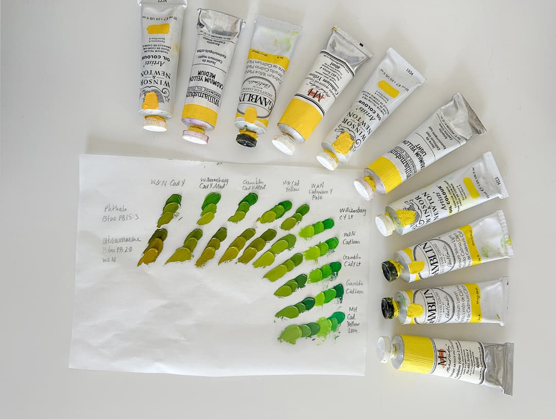
Greens that can be mixed without a PG7. These mixes show each yellow with Phthalo Blue PB15:3 and Ultramarine Blue PB29. The chroma gets pretty high for cadmium yellow lights and lemons without Phthalo Green Blue shade, so it may not be needed depending on the subject matter.
Basis for convenience greens for good reason
If you want a little extra chroma in the middle greens
Where phthalo green blue shade really shines without parallel is in the teals, but it's no slouch when it comes to super-bright greens. There is a reason it's the basis for many convenience greens, which in turn are used for starting points in tertiary mixes. Here there's a bit of chroma boost even in the leaf greens and middle greens (and it's even more clear when we get into the teals later). Whether this suits your work is of course a personal choice. As a side note, for high chroma limes we'd recommend PG36 (not shown here).
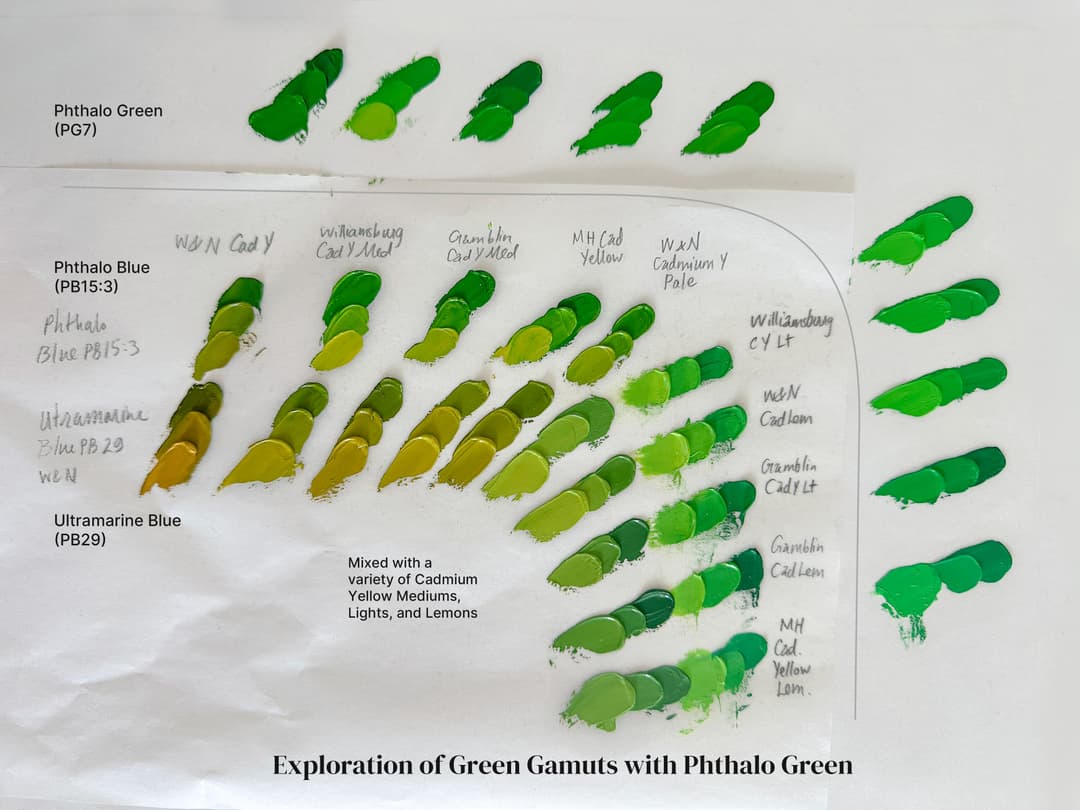
High chroma middle greens. Two rows show the greens that can be mixed with cadmium yellows and some of the main blues on the palette. The highest chroma middle greens in certain areas can be achieved through mixing yellow with Phthalo Green Blue Shade PG7. For higher chroma lime greens, try PG36 (not shown).
Phthalo Green as an ingredient in Green and Teal Mixes
Phthalo green can add extra high chroma to green mixes. These bright green blends can be mixed by hand, or a person may opt to purchase a convenience green. Paintmakers frequently use PG7 in their pre-mixed greens, such as Permanent Green.
Convenience Blends with Phthalo Green
Paintmakers have a point- mixing convenience greens with PG7 create some gorgeous greens. (Watch those yellows for lightfastness though!)
A different kind of popularity contest
One of the most common ingredients in mixtures
So while this color can wreck havoc when used improperly, there's quite a case for it being used well. Painters have an intuition that just a few powerful colors might be able to get them great color results, and it's just intriguing that phthalo green rarely makes it onto the short-lists for super-minimal palettes. However, their intuition that a few well-chosen colors can be maximized is not wrong. It's interesting to pan over to the world of paint manufacturers, and to take a look at what they are using in their blends-- and that is Phthalo Green PG7.
One of the most frequently used ingredients in paint blends besides white across the oil paint industry just so happens to be phthalo green blue shade. Part of the reason could be that it is inexpensive-- however expense is also a concern of many painters, so perhaps this really is a color to consider on the palette, even a limited palette.
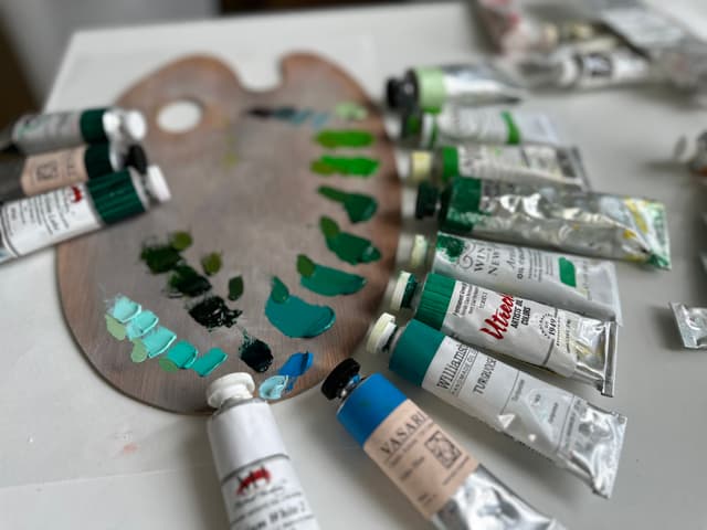
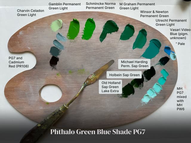
These are a few of the colors we had in the studio that show how versatile PG7 can be in mixes. The outer edge of the palette: Charvin Celadon Green Light, Gamblin Permanent Green Light, Schmincke Norma Permanent Green, M Graham Permanent Green Light, Winsor and Newton Permanent Green, Utrecht Permanent Green Light, Willliamsburg Turquoise, Vasari Video Blue, (with a bit of Vasari Video Blue Extra Pale shown for comparison- which does not list PG7 as an ingredient), and a string of mint green mixes made with Michael Harding Titanium White No. 2 and Michael Harding Phthalo Green Lake.
The inner row of colors next to the string of mint mixes are Sap Greens made with PG7. These include Michael Harding Permanent Sap Green, Holbein Sap Green, and Old Holland Sap Green. On the opposite side of the palette are a string of neutrals made with PG7 and Cadmium Red, PR108. There are also three kinds of Phthalo Green as a single pigment shown (Michael Harding Phthalo Green Lake, Vasari Phthalo Green, and Old Holland Scheveningen Green Deep).
Various blends that contain PG7. Paints named Permanent Green often contain Phthalo Green PG7, as do many Sap Greens, as well as phthalo-based turquoise colors. (The Vasari Video Blue is just a guess- the pale version does not list PG7 so it is shown next to the mint string for comparison). However there are many cyans that use PG7 as an ingredient alongside Phthalo Blue. As an aside, we also mixed several of these green blends with Old Holland Yellow Ochre Light, as Phthalo Green is often modified with earth tones in painting.
Phthalo Green in a variety of colors
Some convenience blends as well as a few mixes made by hand that feature PG7. From Sap Greens to Mint Greens to Neutrals, Phthalo Green Blue Shade is useful in blends
A Useful Ingredient in a Range of Colors
A handful of convenience blends that contain phthalo blue green shade- ranging from turquoise to sap green to mint green. As always with convenience colors look out for non-lightfast yellows as well as zinc white.
Mints and Complements
Common Uses for Phthalo Green
When we're looking at a pigment, it's interesting that some colors are really good at "being themselves" while others, for whatever reason, are found in a wide range of convenience blends. In other words, some colors are strongly valued for their role as a single pigment paint, while others also crop up as ingredients in a wide range of hues that are further from the nature of their single-pigment role. Naturally any color can be used in a wide variety of ways, and it's just interesting to see these patterns.
PG7 tends to show up in mint colors- it often plays the lead role in mint green convenience blends, and it also shows up in indigos and browns. This color also has potential for use as a complement to a handful of reds (like PR108 or PR254 to name a few). This gives it potential for use in a chromatic black (for example, Gamblin uses the cousin pigment PG36 phthalo green yellow shade as the green component in their chromatic black).
A variety of colors made from PG7. The greys are a blend of phthalo green blue shade (PG7) and cadmium red (PR108). Sap Greens often contain PG7 as well as many green earths. Some deep transparent sap greens are made with this color, such as the three shown here, as well as teals, turquoises, mints, and middle greens.
A Paintbox of Pastels
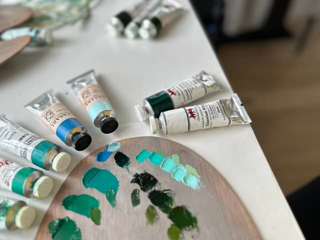
PG7 shines in pastels from pale greens to pale turquoises. Here are just a few examples of lighter blends with phthalo green.
Mint Greens with PG7
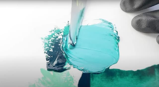
Phthalo Green Blue Shade and white make for an array of pale teals. Please note, the Vasari Video Blue Extra Pale only lists phthalo blue as a colorant, so it is shown for comparison with the string of pale greens created with PG7.
Some of the interesting uses for PG7
An ingredient in colors from blues to orange-browns, this color also pairs well with earth tones
A Green that Leans Bluer
There are two Phthalo Greens, and PG7 is the bluer of the two
Phthalo Green Blue Shade PG7 dips more towards blue than it's cousin pigment, PG36 (Phthalo Green Yellow Shade). Some of the convenience blends that paint companies have made reflect this leaning through deeper greens. PG7 is a helpful ingredient for a wide variety of greens which also include the warmer sap greens.
More Phthalo Green PG7 Blends
PG7 is a useful ingredient in a wide array of greens from middle greens, blue-greens, to warmer sap greens.
Tending Towards Turquoise
The land from middle green to teal
Every color is at home in certain territories of the gamut. When it comes to high-chroma middle greens blending cooler into Turquoise, PG7 is one of the main colors we think of. This pigment can be used in blends to make some of the highest chroma blue-greens. It is often used in convenience blends that aim at mimicking cobalt teals.
Cobalt teals are naturally turquoise, however they also tend to be more costly and also have different chemical compositions. Less expensive approximations of these colors are sometimes mixed by using phthalo blue and phthalo green.
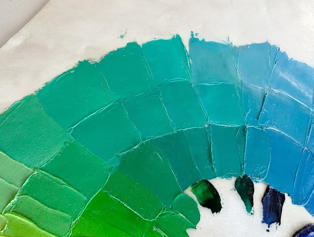
A gradient of greens. The leaf greens to the left have more of the other phthalo, PG36, while the middle greens have more PG7. Phthalo Green PG7 is an important ingredient in the high chroma turquoises.
Turquoises and Teals
One of the star roles of PG7
Where we would not recommend PG7
Not needed for every kind of painting
If you're going for a brown-on-brown Rembrandt-style of portraiture or even realistic portraits, you may not need PG7. Of course there a million roads to Rome, but many realistic subjects would not send me reaching for PG7 unless I was using it to neutralize something else (like certain red pigments).
However, certain marine paintings or tropical landscapes might be a different story. If one follows the suggestion outlined above to mix your greens out of yellows and blues first to find out how bright the gamut goes, you might not need to add a phthalo green, however it may be useful for high chroma middle greens and teals.
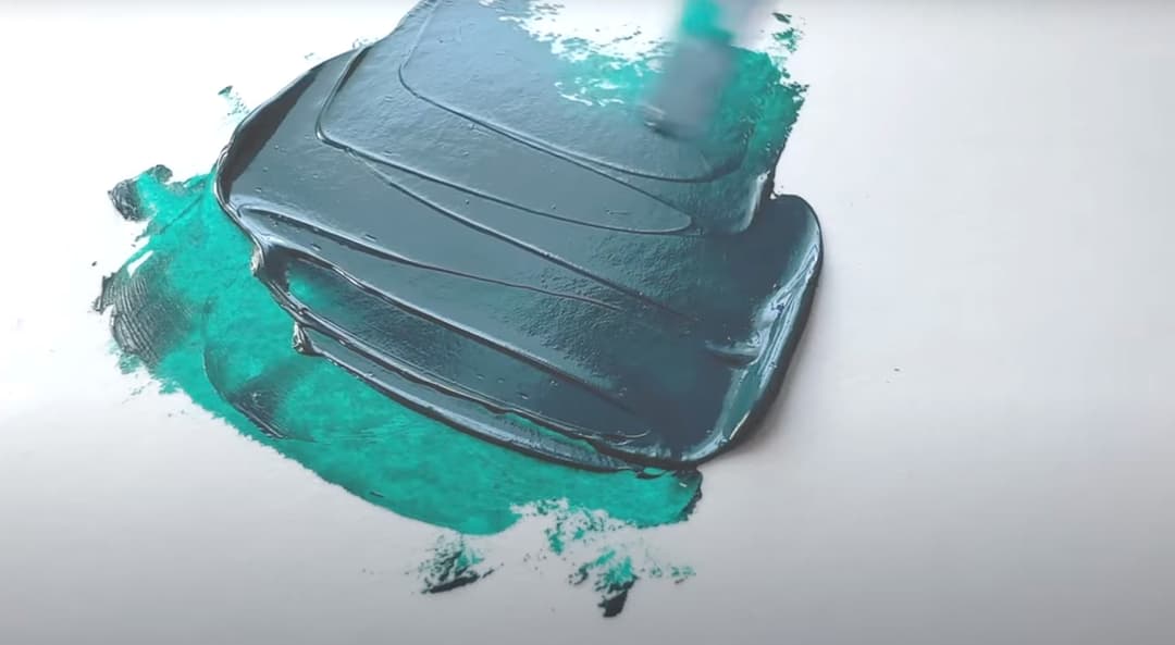
Phthalo Green is awesome for some things, but not everything.
Phthalo Green Blue Shade
Paints across brands
Lightfastness of Phthalo Green Blue Shade PG7
Great lightfastness with most mixing whites
Given the recent lightfastness testing results from Golden, Phthalo Green blue shade looked to us like it had remarkable lightfastness. There were a couple of exceptions- it didn't do as well in pure zinc, which has other issues, and for some reason it really tanked in certain versions of lead white. It appears there were some other anomalies like chalking in a certain mixing white under QUV. Otherwise, in normal uses in Titanium White, this looked remarkably lightfast.
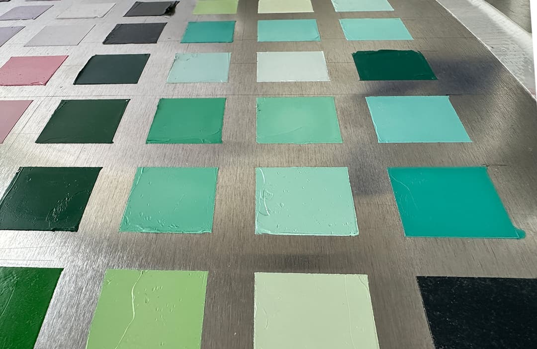
Phthalo Green Blue Shade tends to have good lightfastness, however watch the mixing whites as this can affect its lightfastness
Phthalo Green Blue Shade in Oil Paints
How this pigment compares across brands
We did a paint-out with premium brands in our article Phthalo Green Beryl and Aquamarine Paint Color Comparisons. Basically this is a color that is so powerful that having the highest tinting strength is not super important. However we did notice just a bit of color variation in some of the colors, which might be nice if you're using phthalo green for one of its specific applications (like mixing high chroma teals). Overall it's the paint consistency one is selecting here. However some student brands were so thinned down that they lost the blue-green look as well as the depth that PG7 usually has.

Phthalo Green Blue Shade across brands
Phthalo Green Blue Shade
With Power comes Great Responsibility
Well we've talked about teals, we've talked a bit about convenience greens, we've even talked about its use as a complement. There's so much more we could say about its transparency, its use in green earths and more-- but when it comes down to it, perhaps the main takeaway is that this color is extremely versatile as an ingredient. We recommend using this color when you need it, and really getting to know the specific things it can do for your painting.
Some resources on for information on the dry pigment can be found at artiscreation. Though aimed more at its use in watercolor, handprint has a section on phthalo green. One of the more robust pigment resource pages comes from Colour Lex.

An array of phthalo green blue shade PG7 paints
Phthalo Green Blue Shade
Single-Pigment Paints across brands
Find paints made with Phthalo Blue Green Shade
Phthalo Blue Green Shade- A powerful blue-green
