.jpg&w=3840&q=75)
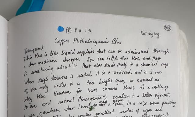
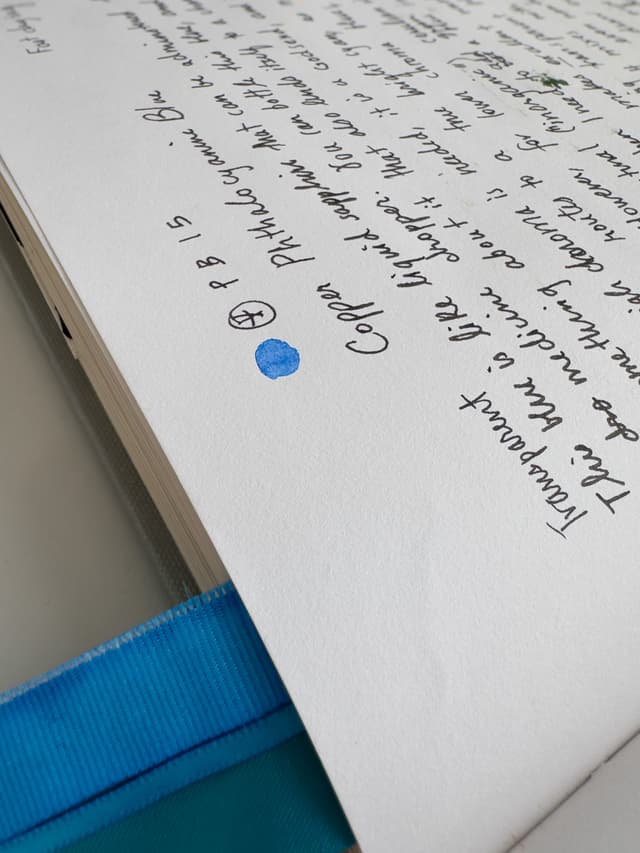
PB15 Phthalo Blue
Meet This Excelsior Cyan In A New Way
An intense cyan without compare
A blue-green powerhouse
Phthalo blue: cyan skies, blue lagoons, and teals galore.
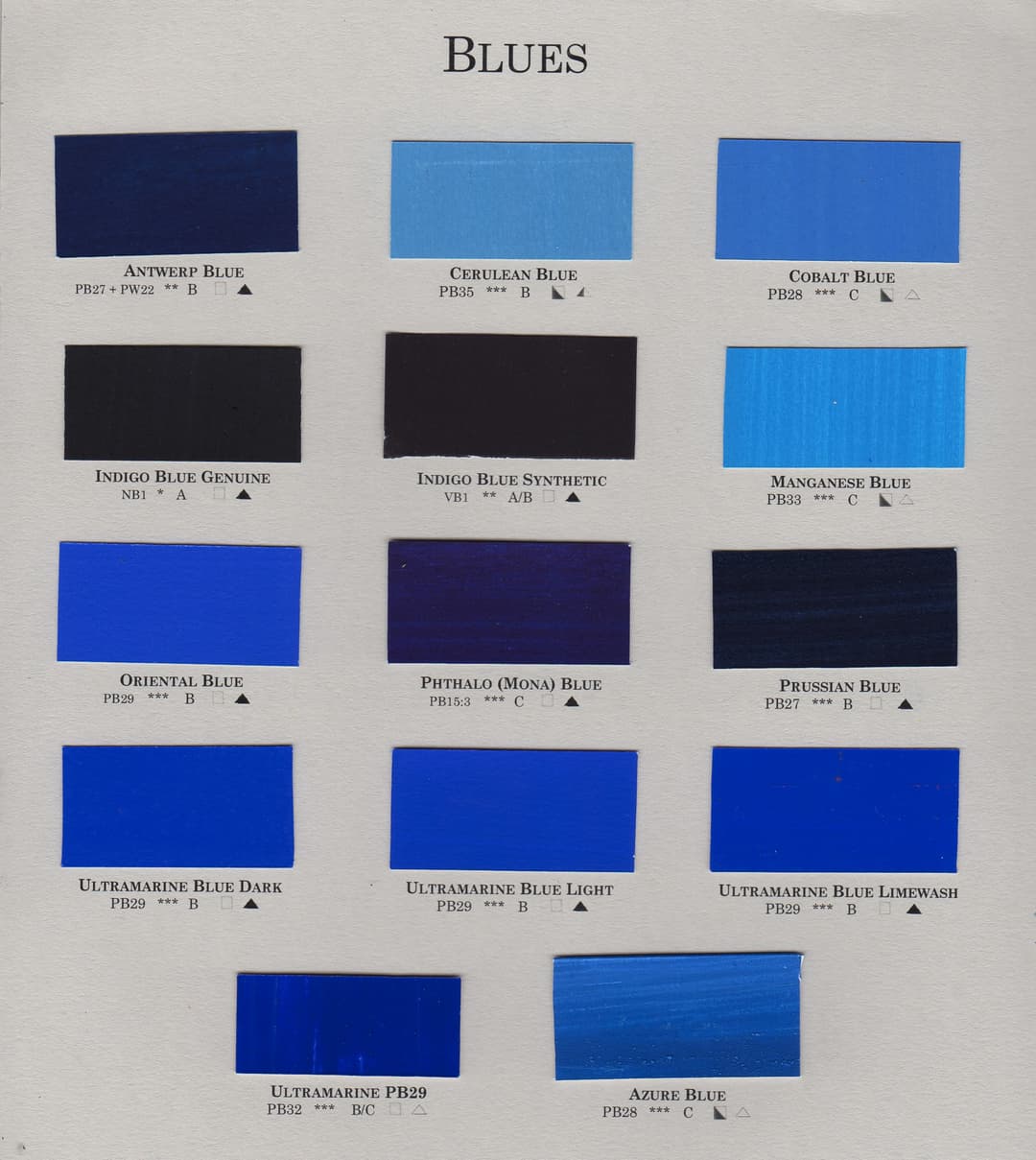
Comparison to Other Blue Pigments In comparison to other blues, Phthalo is:
-More chromatic than Prussian Blue -More green-leaning than Ultramarine -A much more powerful tinter than the gentler genuine Cerulean
We'd consider this an essential color to the palette.
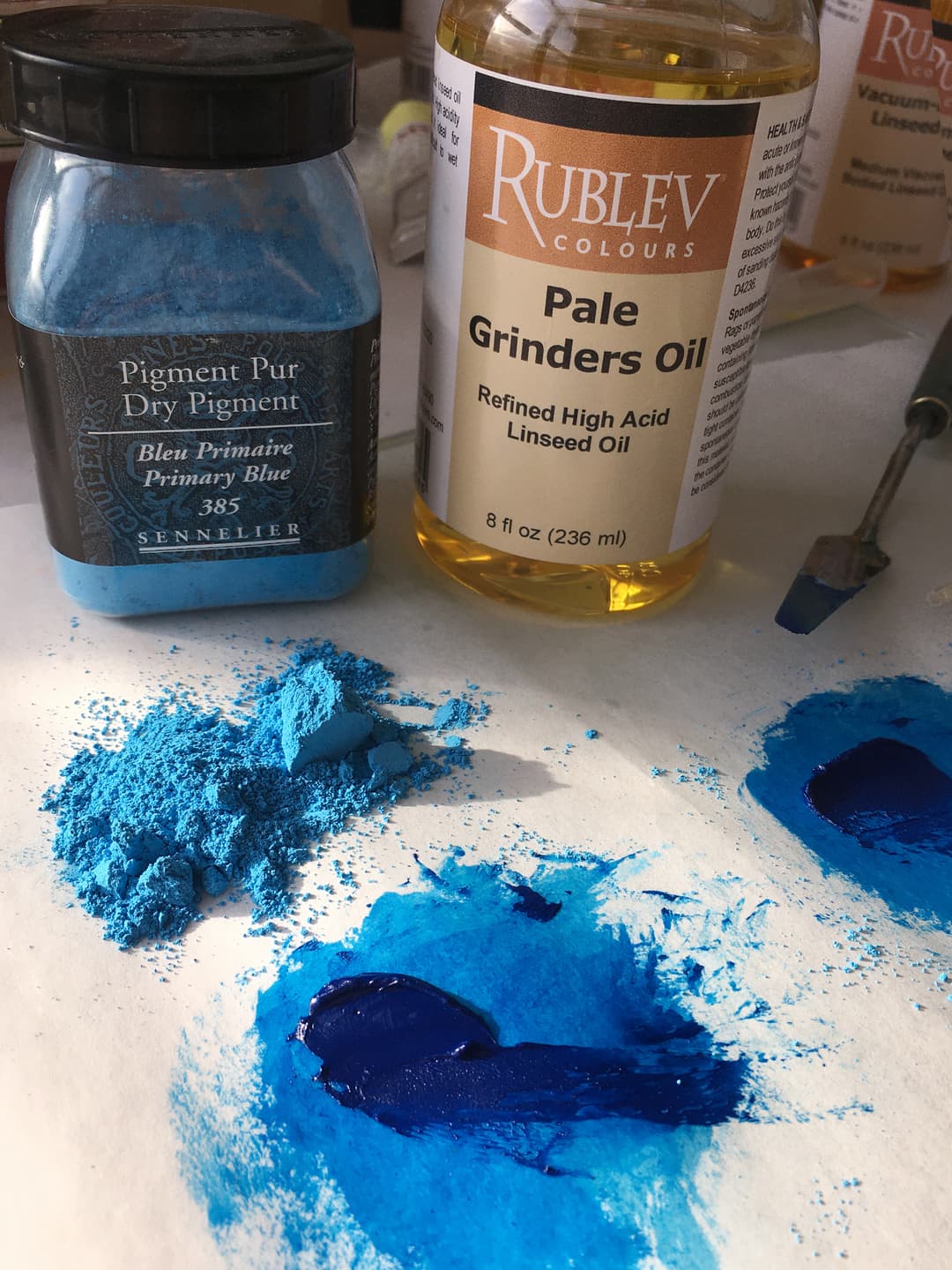
Phthalo Blue among other blue pigments from Cornelissen. Phthalo Blue is found in numerous binders. If painting in oil, you may find it in linseed, oil, safflower, walnut or poppyseed, or some combination of oils.
High Chroma Clear Cyans
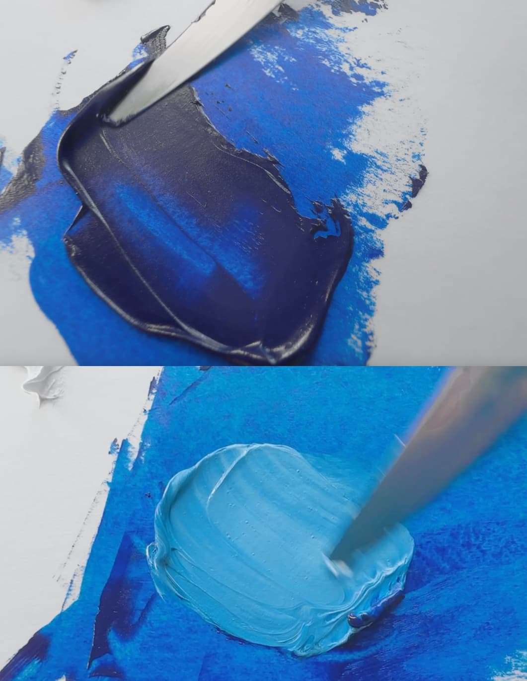
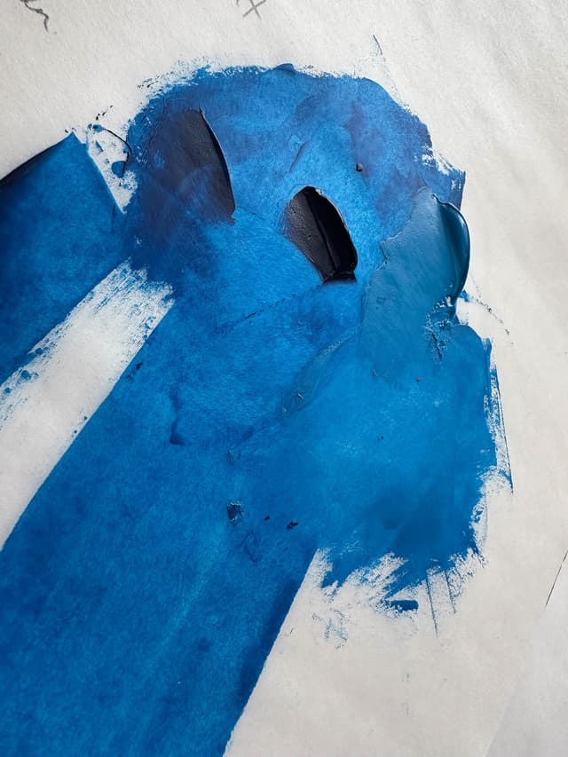
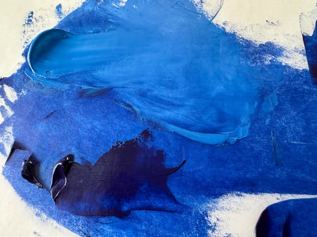
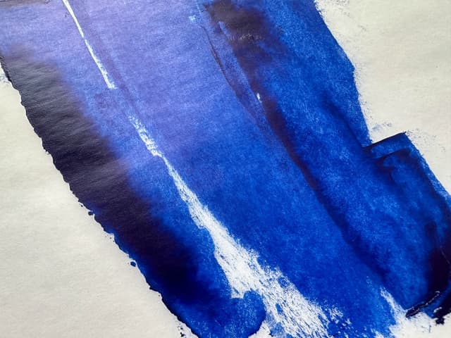
Near Black in Masstone, Saturated in Tints
This transparent paint comes out of the tube almost black in some cases, but just a drop of oil to thin it or the addition of a touch of white will electrify its chroma. It is hard to imagine what painters of the past would have given for such a clear cyan. This is one of the most intense colors on the painter's palette, so if you're new to Phthalo Blue, try using it in small amounts first (more tips on this below). We'll also include a brief guide to the different varieties of phthalo, which are often labeled somewhat confusingly "red shade" and "green shade."
Two Main Kinds: Red Shade, Green Shade
Both Kinds Are More Green-leaning Than Ultramarine
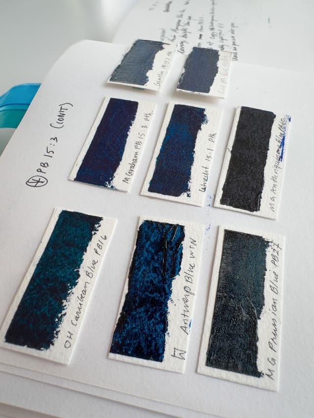
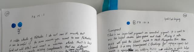
There are a handful of kinds of phthalo blue pigment. The two main forms of Phthalo Blue are sometimes labeled Phthalo Blue Red Shade or Phthalo Blue Green Shade, though both are both solidly blue. One or the other may be ideal for different color-mixing applications. Phthalo Blue has a handful of further variations which can thankfully be disentangled by an additional number that may follow the pigment code (e.g., PB15:1 instead of just PB15-- though sometimes that extra information after the colon is left off). The most common varieties are PB15:1 (red shade) and PB15:3 (green shade), however we'll talk about the others, too.
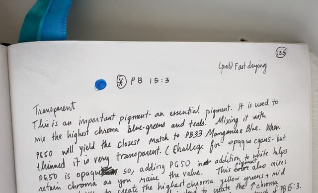
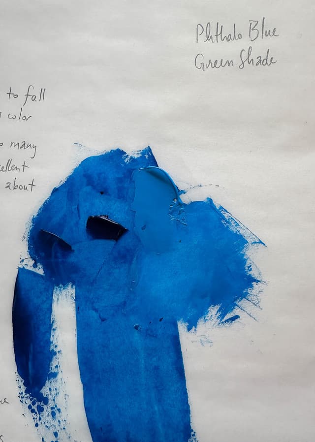
From the Great Book of Color
Notes on the usage and varieties of Phthalo Blue from the Great Book of Color. Phthalo Blue can be referred to as PB15, but specific varieties can be denoted such as PB15:1 or PB15:3 just to name a few.
Tips for Handling the Intensity of Phthalo Blue
How to work with this high-tinting color
This powerful blue-green may actually be too intense for some. This blue packs such a punch that we hear even the pigment comes diluted with an extender. When binder is added, the pigment appears much darker. Even though it is often heavily extended with filler pigments to make it usable, it still is known for packing a punch.
Strategies for working with Phthalo Blue For this pigment, the usual strategy of judging paint quality by tinting strength is less applicable, since some painters actually find the baseline strength a bit too strong. Here are a couple of ways to tame phthalo:
-Use a Palette Knife A painter can also use a palette knife to just tap the Phthalo and get a dot of it on the knife. This gives an artist more control than using a brush sometimes, which can be possibly a bit harder to wield. A toothpick-sized dot of phthalo can sometimes make its presence known!
-Pre-Mix Phthalo in Small Quantities into Another Color We recommend a technique that we call cutting the mix. This is a bit of a sophisticated strategy because a person needs to understand all of the colors involved in what they are mixing and how each pigment affects the final result. Speaking concretely, this strategy works well if a person is going to mixing a string of greens, or perhaps a series of sky blues. By mixing phthalo into another color (such as white) beforehand with a palette knife, smaller amounts of phthalo at a time can be added to the desired mixes (though of course the partner color will be added as well). The choice of which pigment to use to cut the phthalo depends on the final color desired. Mixes with white, green, or ultramarine could be useful depending on how a person intends to use phthalo.
-Student Versions and Extender Pigments Some painters like to use student versions of phthalo as they may be less intense, however we don't recommend this as a first strategy since sometimes student brands come with other additives which are not the greatest. A person can also experiment with adding an extender pigment of their own to an artist quality paint.
-If it's Still too Strong, Try a Different Blue Consider the blue for the task. If a person is doing a lot of realistic portraiture or landscape work (think Old Master's style), it's going to take more work to curb phthalo's high chroma. Phthalo has a certain look to it in a mix which is hard to describe but if you have been painting for a while you'll know it when you see it. Sometimes it takes a lot of counterbalancing in a mix to get the phthalo look out of the blend. It can certainly be done, however we've come to prefer genuine Cerulean Blue (PB35) for certain realistic applications as it mixes differently than Phthalo.
For a limited palette, Phthalo Blue is an extraordinary color, and the chroma is outstanding.
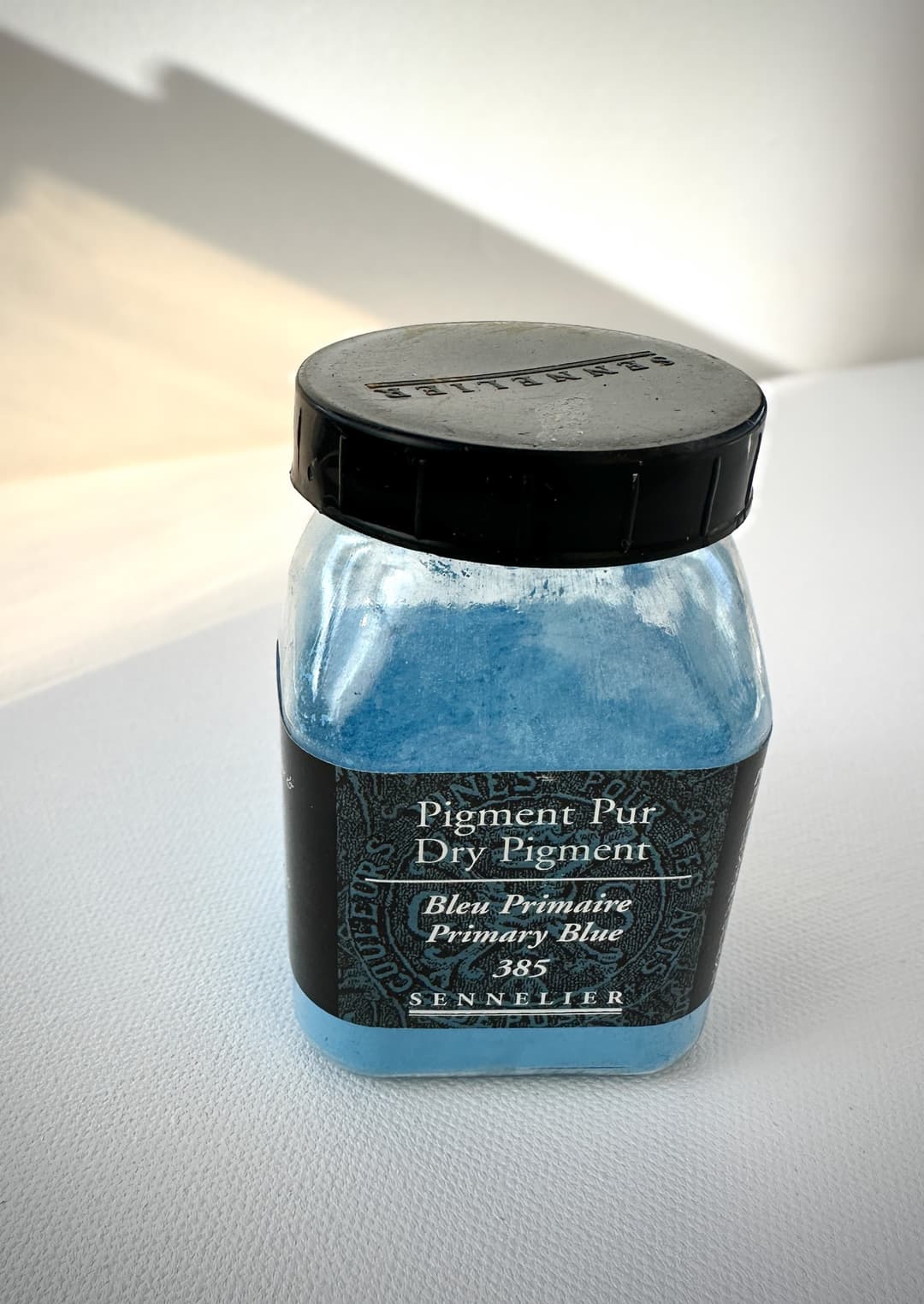
Phthalo Blue pigment from Sennelier
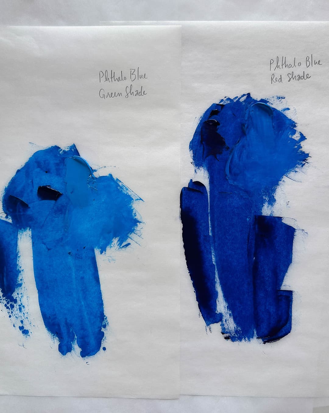
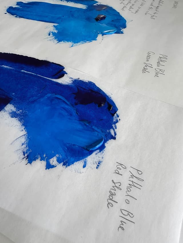
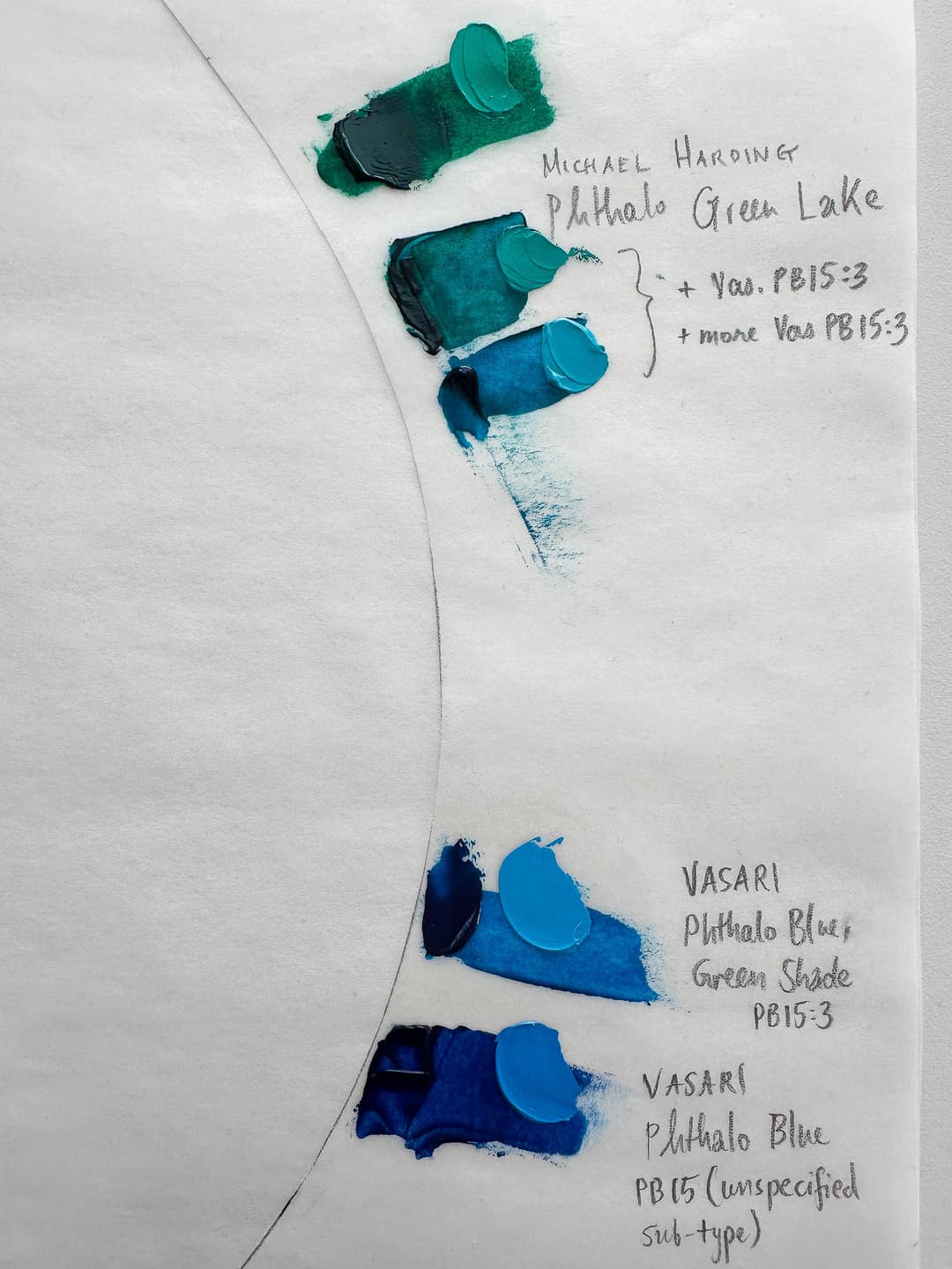
Phthalo Red Shade vs. Green Shade
Two Main Phthalo Blues
There are two main varieties of Phthalo Blue. They may appear similar, but they differ slightly in masstone and behave differently in mixes. Both Phthalo Blue Red Shade or "rs" and Phthalo Blue Green Shade, called "gs" could work as a green-leaning blue, but green shade has an extra degree of clarity when used to mix cyans and teals.
Compared to Other Blues Almost all Phthalo Blues are great for mixing clear greens. Phthalos of both varieties are dark in masstone, chromatic when glazed, and saturated in tints. Compared to other blue pigments, phthalos (whether red shade or green shade) could both be seen as generally leaning more toward green (or beyond green, pointing in the yellow direction on a traditional color wheel). However some phthalo varieties have more green potential than others-- these are the Phthalo Blue Green Shade types.
Phthalo Blue Green Shade Compared with other phthalos, these gorgeous blues also make fabulous teal mixes. Super chromatic and very powerful, these are similar to the Red Shade but lean more toward turquoise. When mixing the highest chroma blue-greens, this color is a must-have. Phthalo Blue Green Shade also mixes bright, clear greens when mixed with yellow. When thinned into a glaze, this color is close to cyan. When mixing an even more turquoise or green-leaning cyan, the only color which could have even begun to compare is the lovely-but-discontinued Manganese Blue. The pigment code for this helpful color is PB15:3.
Phthalo Blue Red Shade While it's a small degree of difference, this variety is a bit closer to a middle blue as opposed to a the more teal Green Shade. The word "red" may suggest that in comparison with other phthalos, this color is a tiny degree closer to purple (towards red on the color wheel) rather than green, however both phthalos are fairly green leaning as far as blue pigments go. So maybe we could call this the “less green” phthalo. In terms of pigment codes, it's most commonly listed as PB15:0 or PB15:1 (for more on these codes see below), though we have occasionally found a PB15:2. Phthalo Blue Red Shade is between Phthalo Blue Green Shade and Ultramarine.
Phthalo Blues vs. Ultramarine It’s a tiny degree of difference when we’re talking about Phthalo Blue Red Shade vs Phthalo Blue Green Shade. Both are going to be less indigo colored than an Ultramarine. In contrast to the Phthalos, an Ultramarine is further toward the reds on the color wheel than Phthalo Blue Red Shade. When mixed with yellow, Ultramarine will make a much duller green than either of the Phthalos-- Ultramarine will tend to yield an army/camouflage/olive green in comparison to the bright greens made by Phthalo Blues.
The pigment codes on the back of the tube can help to determine the precise variety of phthalo.
Phthalo Blue Green Shade
The brightest cyan in modern oil paints
Phthalo Blue Green Shade Paints
Beautiful Phthalo Blues which are slightly closer to cyan
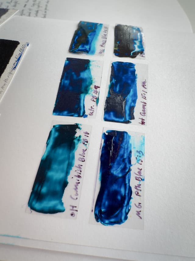
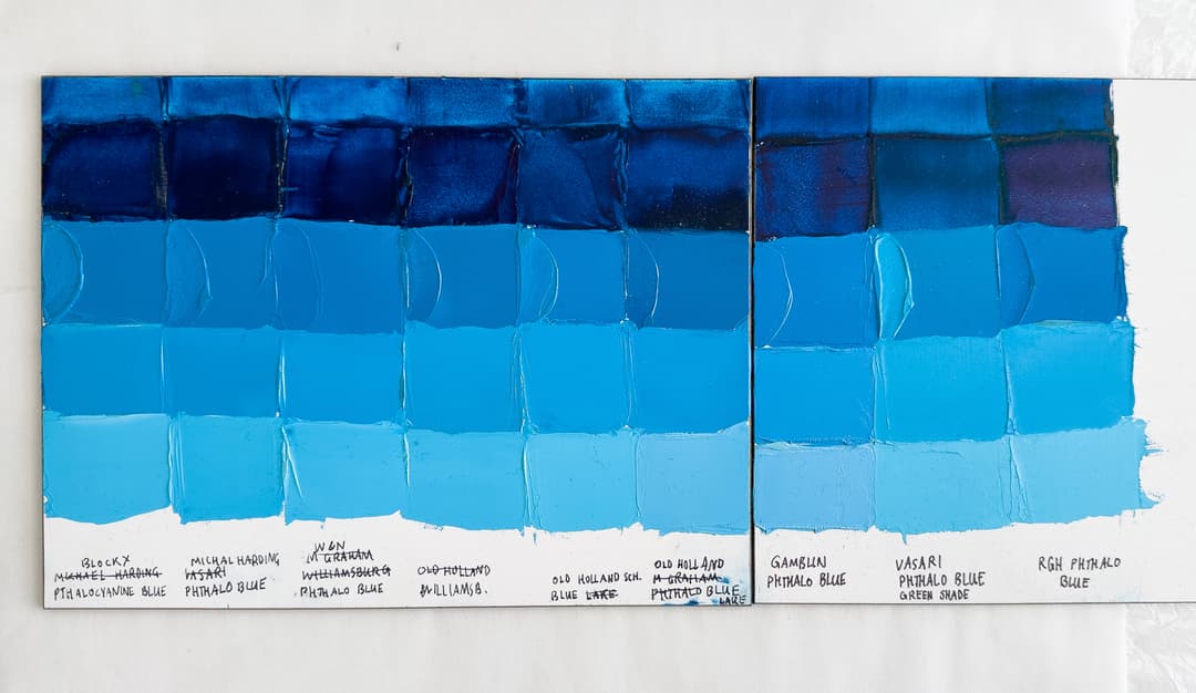
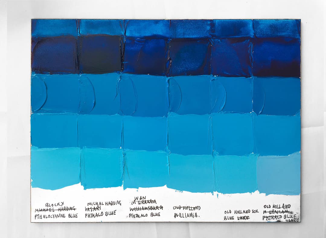
Some Phthalo Blue Green Shade Paints - A Comparison
Most of these paints are Phthalo Blue Green Shade- But Not All of Them
The convention of Green Shade and Red Shade is a bit of a wild one, but we see similar patterns in the way other pigments are named. In general the Phthalo Blue Green Shade makes the best teals. The Red Shade is a bit more of a middle blue, but the differences are subtle. Most of the paints here are Green Shade, but a few are not. Here the Gamblin, RGH, and Old Holland Blue Lake are listed as PB15:1 or Red Shade. It's interesting to note the differences. Colors such as the Vasari Phthalo are Green Shade as well as Old Holland Scheveningen Blue. These are both PB15:3.
Phthalo Blue Red Shade and Green Shade show their differences in tints
More PB15:3 - Phthalo Blue Green Shade Paints
More green-leaning phthalo blues
Alternative Binding Oils
Some Phthalos Are Made with Oils like Safflower, Walnut or Poppy
Phthalo Blue is one area where a person may wish to consider a different binding oil. Though it forms the strongest paint films, linseed oil does tend to yellow a bit. Tints of phthalo are an area of the gamut where painters will try to preserve more of the true bright cyan blue color.
However, alternative oils must be done carefully (be sure to do your research if you choose to use safflower or poppy oil-- we can't recommend using these in the lower layers of a painting). However with safflower there may be a tiny chroma boost, so there may be a case for using it judiciously if you understand the risks.
Here we've gathered a few of the oil paints which are listed as having alternative binding oils.
Phthalo Blue Green Shade Paints with Alternative Binders
In poppy, walnut, safflower oil, or a blend of linseed and safflower, these options have less linseed oil
Phthalo Blue Red Shade - PB15:1
From the Great Book of Color - Phthalo Blue Red Shade
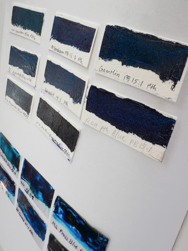
PB15:1 paints
Phthalo Blue Red Shade isn't always labeled in the paint name, so it's helpful to know the pigments
Phthalo Pigment Code Cheat Sheet
Decoding the World of Phthalos
The general pigment code for Phthalo Blue (this is the little letter-number combo printed on the back of the tube) is PB15. A specific variety might be denoted as PB15:1 (red shade) or PB15:3 (green shade).
So, with phthalos one can sometimes find an additional level of information--a colon with a number added to the code tacked on to the PB15 part. The number which follows can tell a person more about the pigment's specific properties.
Where the mystery comes in is that sometimes paintmakers will just list PB15 without an additional number. Yes, PB15 is Phthalo Blue, but we won't know if it's green shade or red shade.
Here is a brief synopsis of the various Phthalo Blue pigment codes:
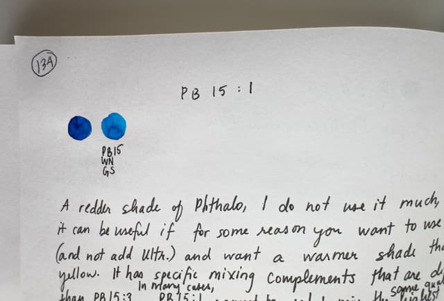
PB15:0 - A rare version of Phthalo Blue that is redder (in the one instance we know of it's labeled as Red Shade).
PB15:1 - A common version of Phthalo Blue (Red Shade)
PB15:2 - A rare version of Phthalo Blue that seems warmer, more like Red Shade. In the past, this type was used by Gamblin, and is currently used in Old Holland's Scheveningen Blue Deep.
PB15:3 - A common version of Phthalo Blue (Green Shade). Excellent for making teal mixes.
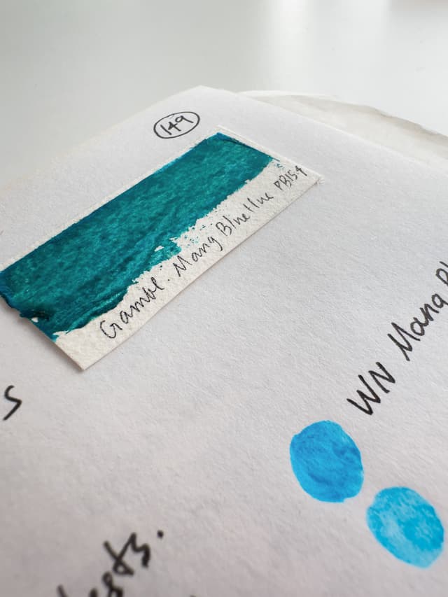
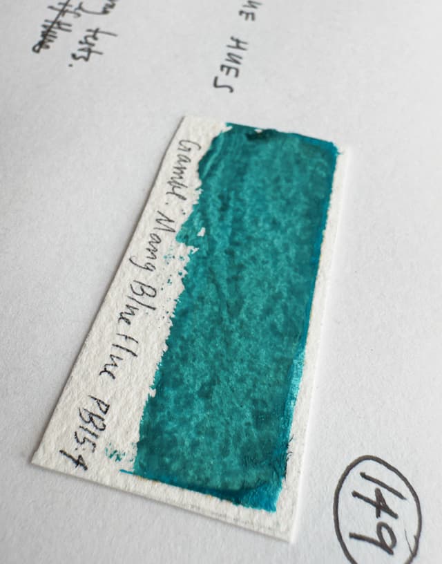
PB15:4 - We associate this with a more delicate cyan. It's commonly used in Manganese Blue Imitations. In one case it's labeled Red Shade, however in other cases it's labeled Turquoise. We've almost always seen it as a green-leaning clear cyan.
PB15:6 - In one case labeled Red Shade. May have slightly less reliable lightfastness, but we have not tested it specifically. It's a slightly different form of Phthalo than the others listed above.

A Different Sort of Phthalo Blue- PB15:4
From the Great Book of Color
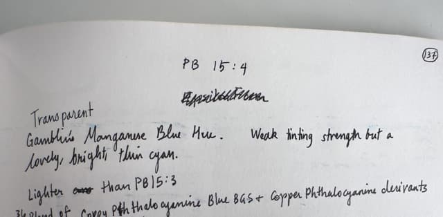
Some paints made with PB15:4
Sometimes a delicate cyan, we associate this pigment with Manganese Blue Imitations (for more see below)
PB15:6
A rare form of Phthalo Blue
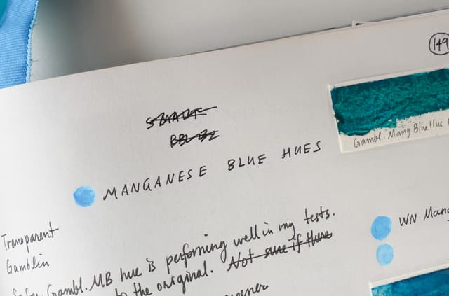
Mixes - Manganese Blue Hue
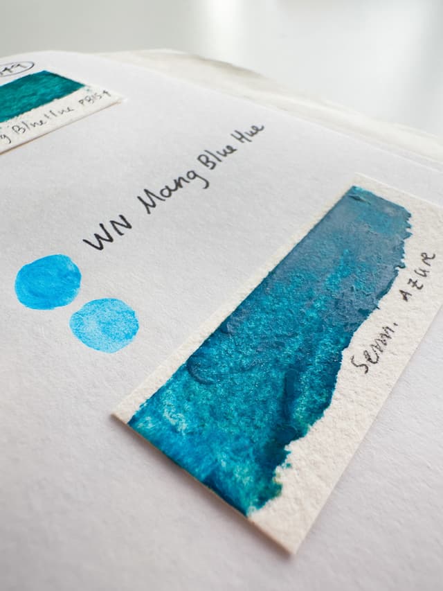
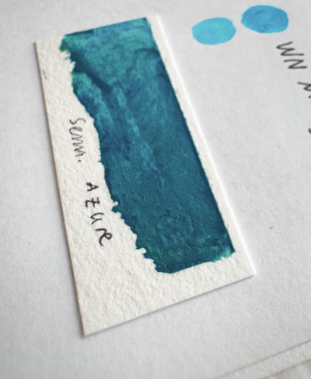
Manganese Blue Imitations Made with Phthalos
Sometimes paintmakers add other pigments to make a Manganese Blue facsimile. However the heavy lifters here are often Phthalos
Mystery Phthalos
Troubles in Paint Naming
Ok, so normally we like mystery, but not when it comes to our Phthalo Blues. Unlike so many other pigments, varieties of phthalo blue can often be sorted out by adding a number to the pigment code, and yet some paintmakers don't include this specific information.
This is a bit tricky, as a painter may be able to find out enough from the paint name, if the name that follows denotes red shade or green shade. However we'd still like to see the specific pigment listed.
Some of the PB15 paints without further designation may be called just plain Phthalo Blue-- meaning a painter does not know the undertone. Transparent Blue and Manganese Blue Hue are just a few of the other names these unspecified phthalos may be given. We'd love to see phthalos labeled so that painters have more information about the phthalos inside.

Paints just listed as PB15 - unspecified
Paints marked PB15 without a colon afterwards. These could be any of the phthalo varieties, and one must appeal to the paint name to make a guess as to their properties.
Challenges Navigating Phthalo Varieties - PB15 Without a Follow-up Number
Sometimes Paint Companies just give us the bare minimum
There are many paints which are just labeled PB15. This makes it trickier for painters to determine whether they are selecting red shade or green shade. We appreciate it when paintmakers add the additional number after the colon, however there are some good paints which lack the more specific labeling.
More unspecified PB15s
For these mystery Phthalos, the paint name is the best clue to their nature, as they do not include the extra colon (e.g. PB15:3), and just label the colors PB15.
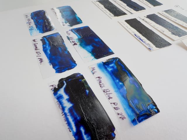
Comparing Phthalo Blues in Practice
A look at some popular Phthalo Blues in Oil Paint
A question that goes beyond pigment code is how a particular paint handles in practice. Paintmakers formulate their colors with different viscosities. We compared several Phthalo Blues across brands in our Phthalo Blue Comparison. Almost all of the paints we compared are Phthalo Blue Green Shade, PB15:3 (however there's a PB15:1, in there, too).
Phthalo Blues vary a bit in terms of color temperature in tints. However, Phthalos are one of the places where binding oils may also make a difference. All of these are strongly tinting Phthalos with very subtly different undertones.
Among the varieties of Phthalo, we prize the Phthalo Blue Green Shade PB15:3 most for its ability to create bright cyan tints as well as teals. On this panel, the paint to the far right is a Red Shade, while the others on the panel are Green Shade. Paintmakers will formulate the PB15:3 with different working consistencies, so even though the pigment codes are the same, each brand has a different viscosity. More details about the paints on this panel can be found in our Comparison of Phthalo Blue Paints.
Several Phthalo Blues across brands. Most of these are Phthalo Blue Green Shade (PB15:3), though the one on the far right is Red Shade.
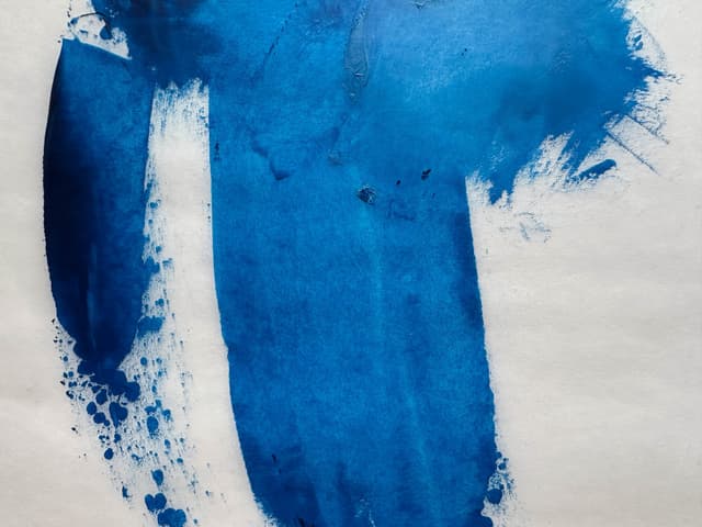
Mixes with Phthalo Blue
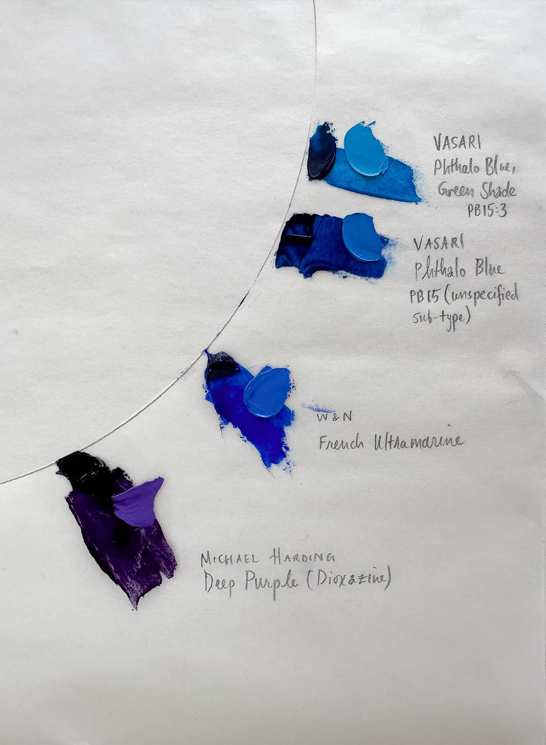
These mixes explore the variety of color transitions with green that can be achieved with phthalo blue and contrast them with a few other blues on the palette.
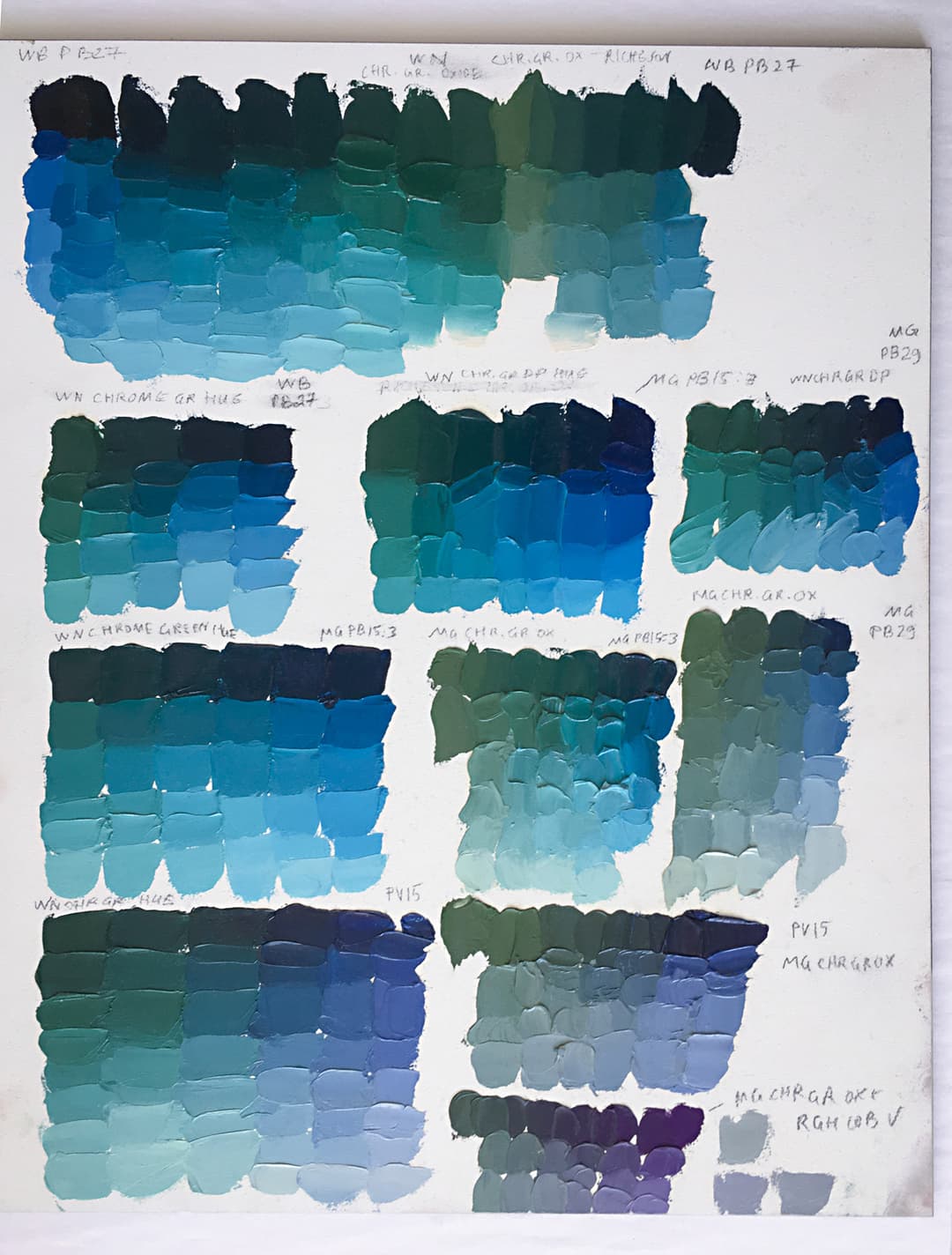
Phthalo Blue compared with other blues and purples in mixes with greens
High Chroma Teals
Phthalo Blue Green Shade vs Phthalo Green
Phthalo Blue mixes with Phthalo Green to make high chroma teals. Phthalo Green PG7 leans more toward teal than PG36. If seeking the highest chroma, the combination of Phthalo Green, PG7 and Phthalo Blue Green Shade, PB15:3 yields high chroma cyans.
How to Pick a Good Phthalo Blue for your Painting
Several Questions to Ask Before Choosing a Blue
Will the paint be used in the lower layers of the painting? If so, consider a phthalo blue bound only in linseed oil.
Are you looking for the brightest cyans or teals? We recommend Phthalo Blue Green Shade (PB15:3) for mixing the brightest blue-greens.
And if the phthalo is too intense, consider cutting the mix with another color. Complements to phthalo which can also tone it back are oranger versions of PR101 and Cadmium Orange PO20.
Sign up for our newsletter for more articles on pigments and painting. Happy Painting!