This site is community-supported. We may earn a commission (at no extra cost) when you buy through our links.
Sign in to see related paints

.png&w=3840&q=75)


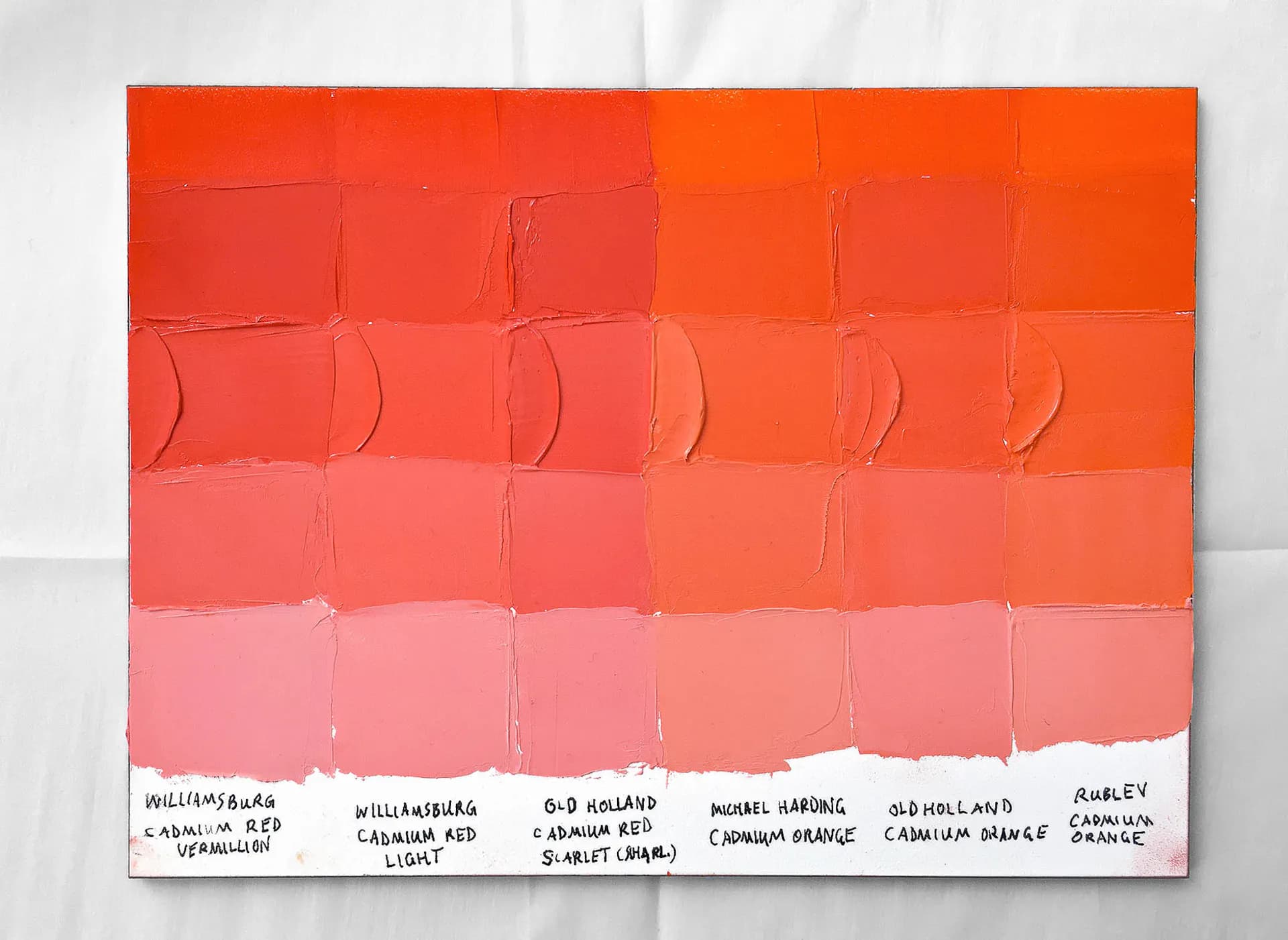
As always, if a certain spec matters, double-check with the manufacturer before purchasing.
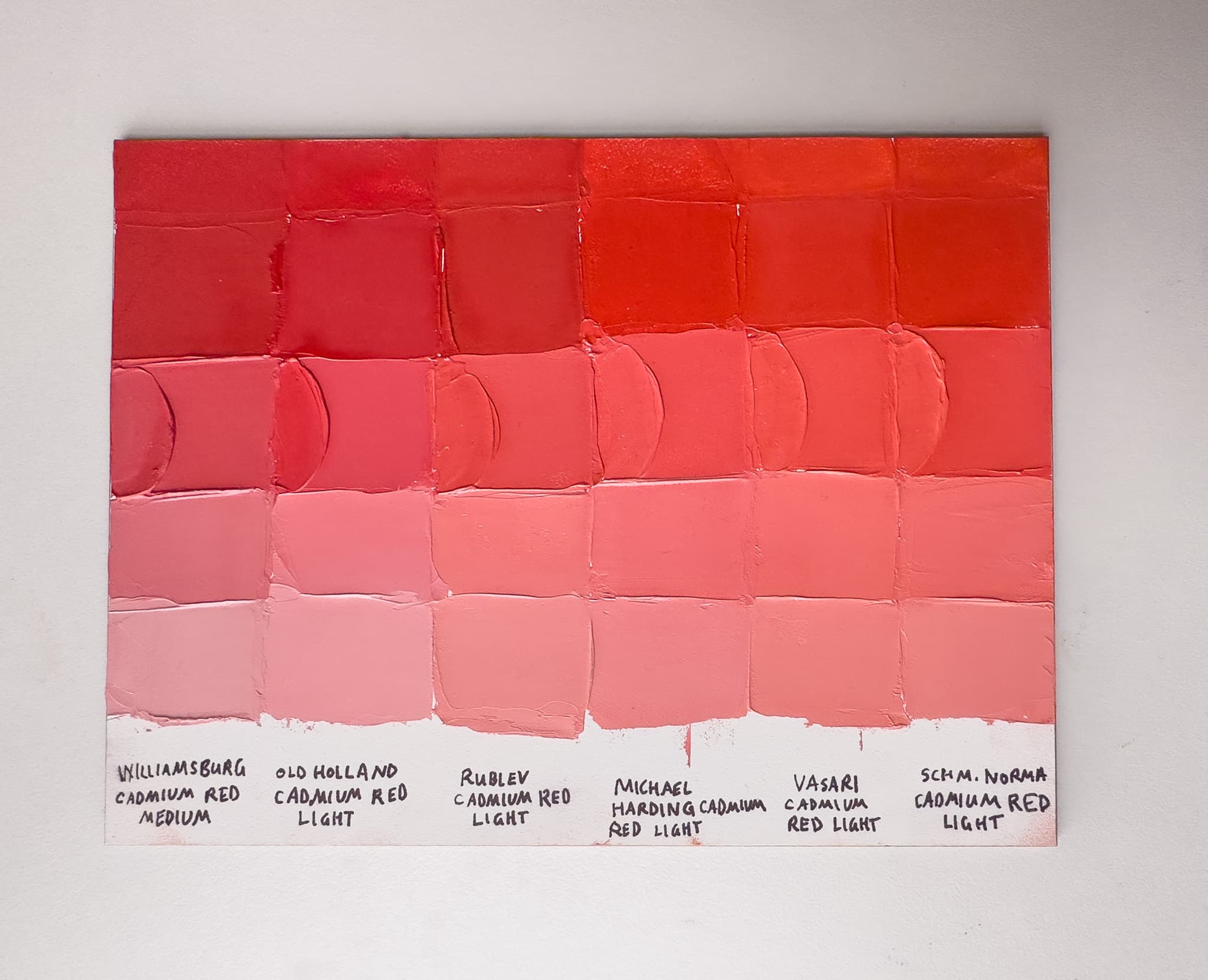
As always, if a certain spec matters, double-check with the manufacturer before purchasing.
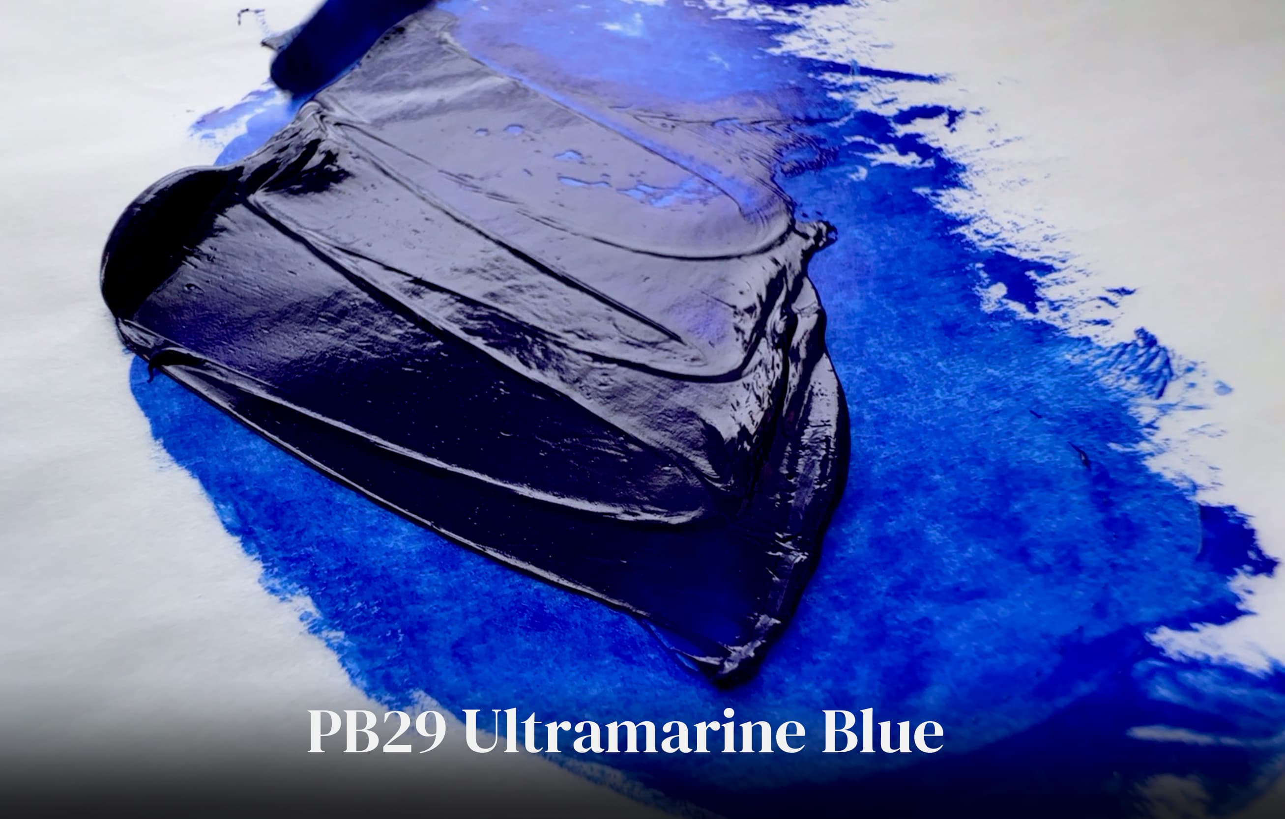
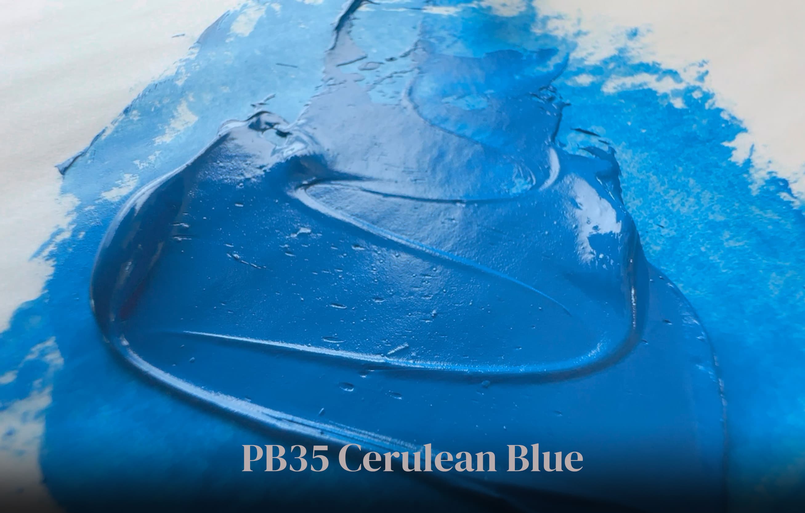
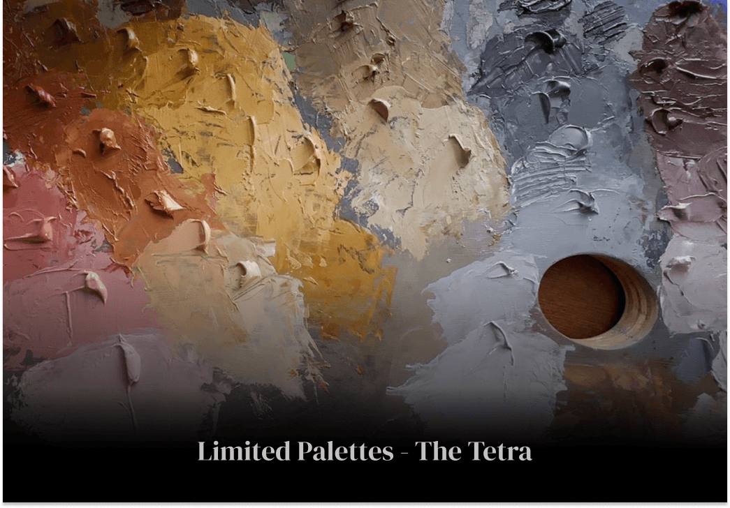
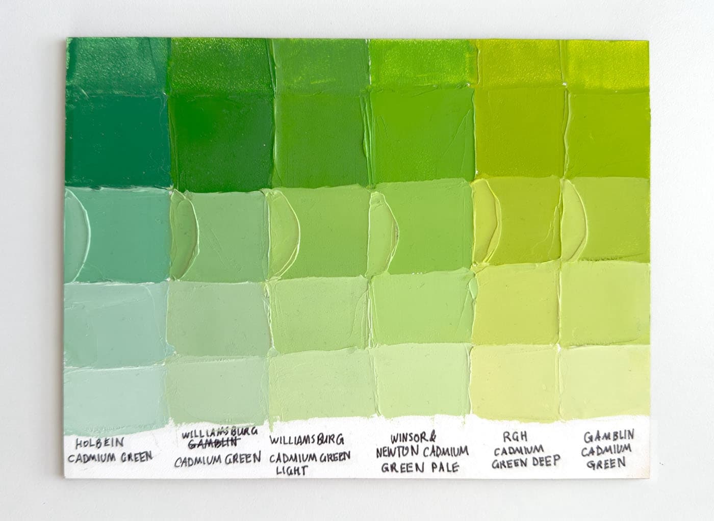
This is a deep grey, that has a blueness to it. The color is a sort of marine storm deep blue grey with high opacity. This color is a blend of colors, which unfortunately is not disclosed. However one of the ingredients is Cadmium Yellow. The colors in the blend will determine how the paint behaves in mixtures, which is true of mixtures generally. The brand literature describes this paint as having a subtle blue, and to us the blue looks pretty pronounced in the masstone, while still being a grey. The value is around a 4. Vasari recommends using this mix to transform Phthalos and other modern pigments. In general, we were more pleased with the Scott Christiansen convenience mixes than we thought we would be. If a person is doing realistic landscape painting, it does help to have certain blends pre-tubed, and as a whole set, Silver Point harmonizes nicely with the other colors.