This site is community-supported. We may earn a commission (at no extra cost) when you buy through our links.
Sign in to see related paints

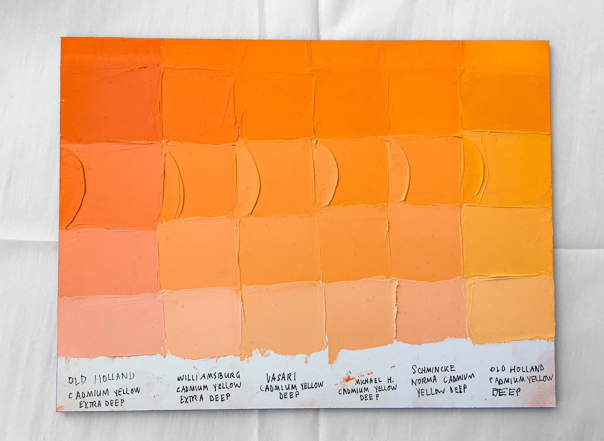
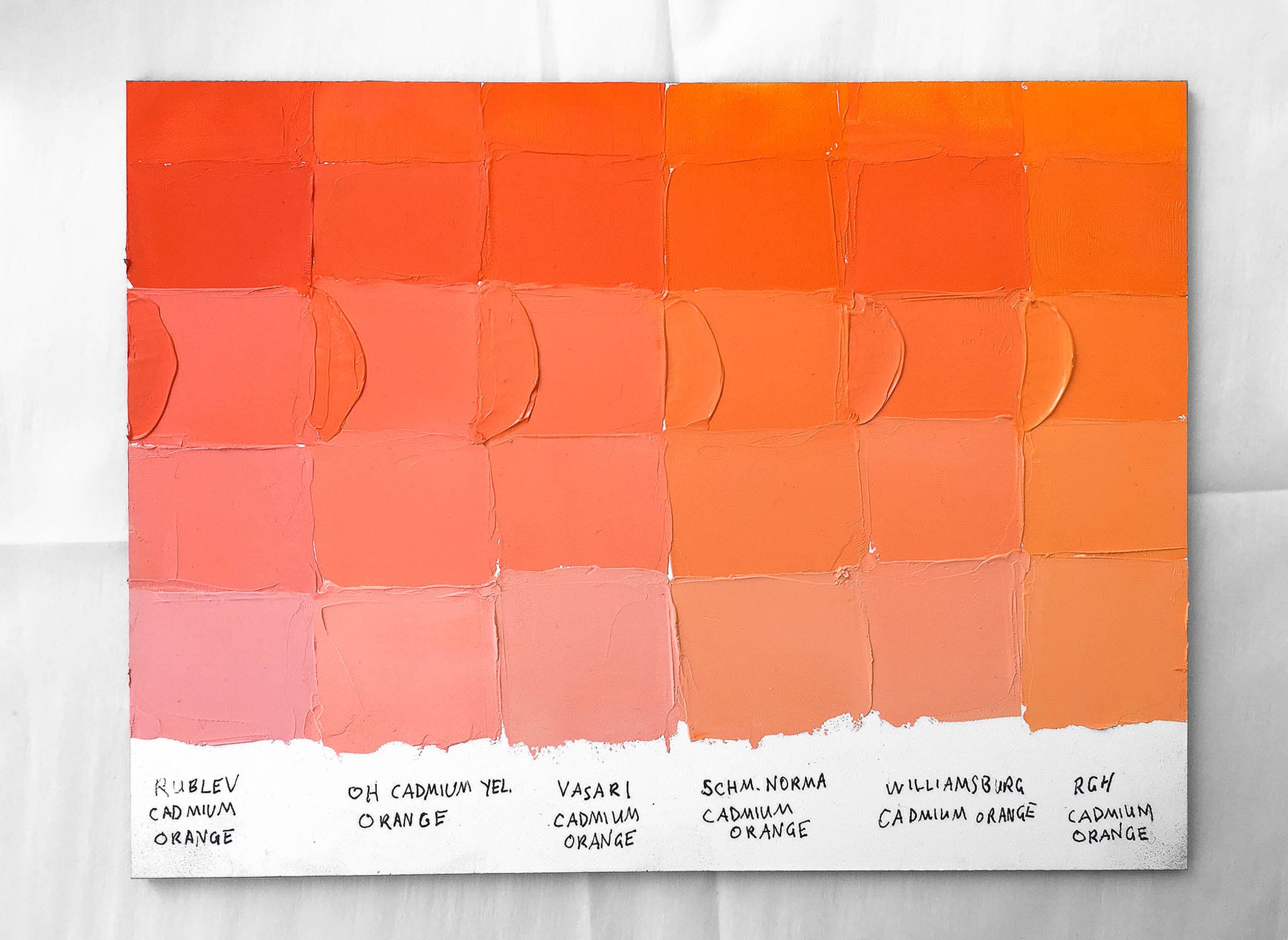
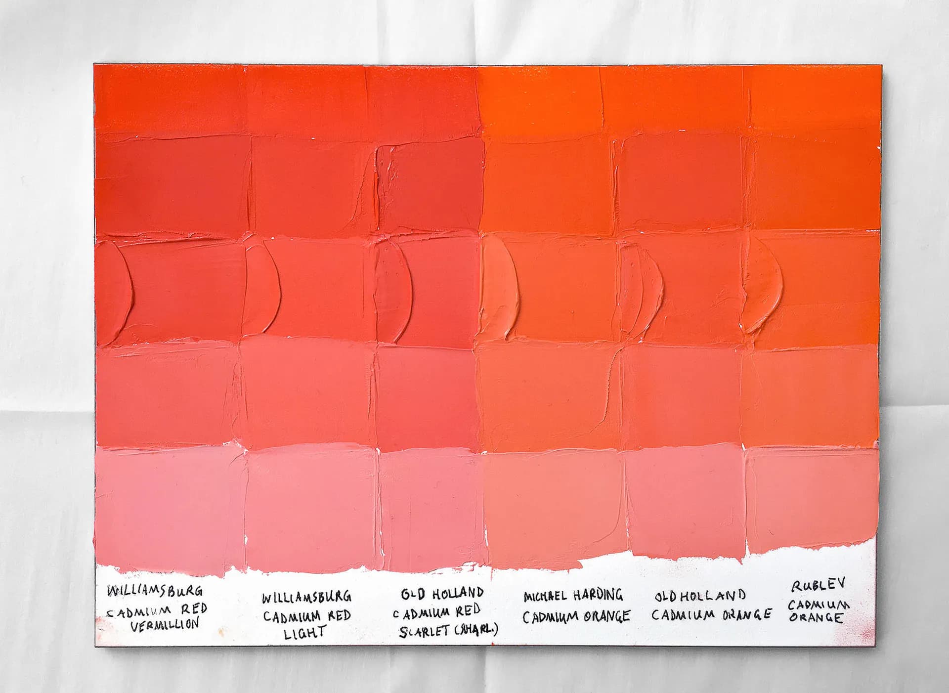
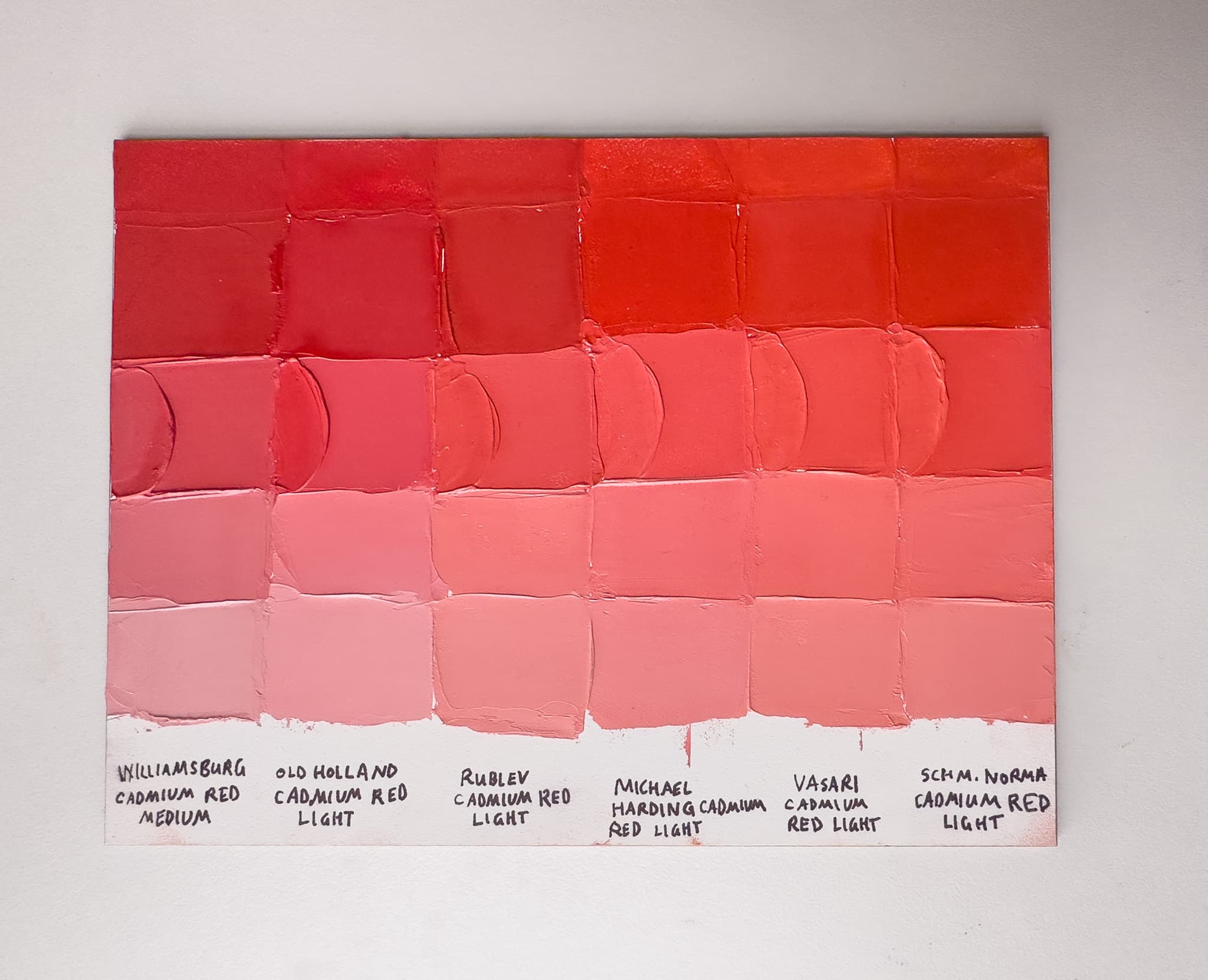
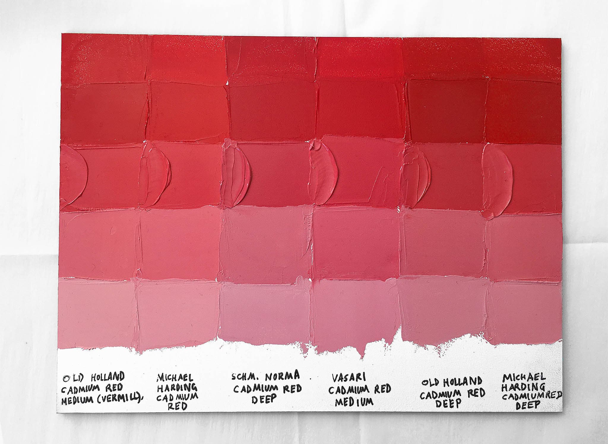
.png&w=3840&q=75)
As always, if a certain spec matters, double-check with the manufacturer before purchasing.
As always, if a certain spec matters, double-check with the manufacturer before purchasing.
This color has almost an orchid hue that is close to a light, desaturated 7.5R in the Munsell space. In concert with Vasari’s other Renaissance earth-plus-white blends, this one is almost purple looking. However it is a desaturated delicate cool red earth version of purple, not the chromatic pastels in other brands like Gamblin. This is fairly high in lightness as well.
This color is part of the set called The Renaissance Touch of Color. Here is what Vasari says about the set, as their brand statements here may shed more light on this individual color as an opaque pigment blend. “Uniquely formulated from the delicate transparent and semi-transparent natural earth pigments actually used by the Renaissance Masters of painting, this set of eight opaque tints offers subtle notes of light. Useful as whites for delicate changes of value or as neutrals to modify brighter colors for suggestions of space and time.
The eight extra pale colors in the set offer a range of warm or cool, exquisite color, and soft neutral tones.” -Vasari