This site is community-supported. We may earn a commission (at no extra cost) when you buy through our links.
Sign in to see related paints
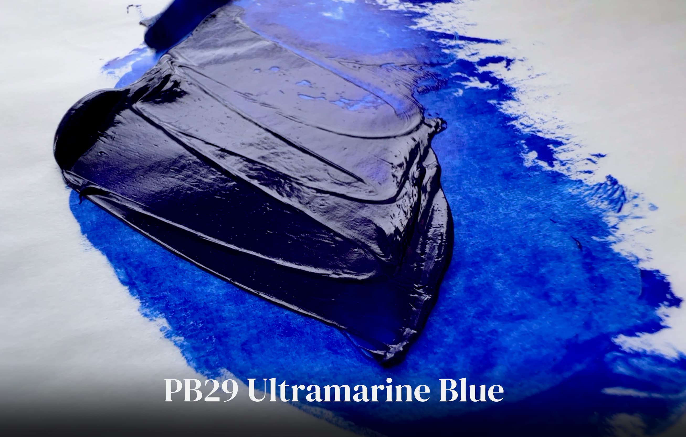

.png&w=3840&q=75)


As always, if a certain spec matters, double-check with the manufacturer before purchasing.
As always, if a certain spec matters, double-check with the manufacturer before purchasing.
Vasari’s Adobe is a paint blend that provides a yellower note in the realm of yellow ochre. Yellow Ochres, even the lemon variety are a little orange compared to this blend, so it is nice to have something like a yellow ochre which is shifted in hue a bit towards the yellows as opposed to orange. In other words, the color is yellower than the usual earth tone range, while keeping the feel of the range. Unfortunately the pigments used in this color are unpublished except for the presence of Cadmium Yellow, which makes its presence felt when mixing. The golden note of the cadmium yellow comes out a bit on the edges of a mix with other colors such as white. In masstone, it initially resembles PBr24 or yellow ochre (like a lemon ochre) in color except it is a little yellower. However Vasari’s Adobe is more smooth than yellow ochre and has a different look —as stated, one can feel the presence of the Cadmium Yellow. As a blend of colors the pigments in the mix will affect Adobe’s mixing behaviors and differentiate the blend from other single pigment paints in the way it behaves. (This is true of mixtures in general). This paint does not have an exact Munsell match. It may fall somewhere in the neighborhood of 2.5Y. It is one of the more chromatic of the Scott Christiansen convenience paints. Vasari calls it a “soft sandy orange” and describes the value as “medium light.” Truthfully we were more surprised by the Scott Christiansen set that we thought we would be, as the color notes are well suited to landscape painting.