This site is community-supported. We may earn a commission (at no extra cost) when you buy through our links.
Sign in to see related paints

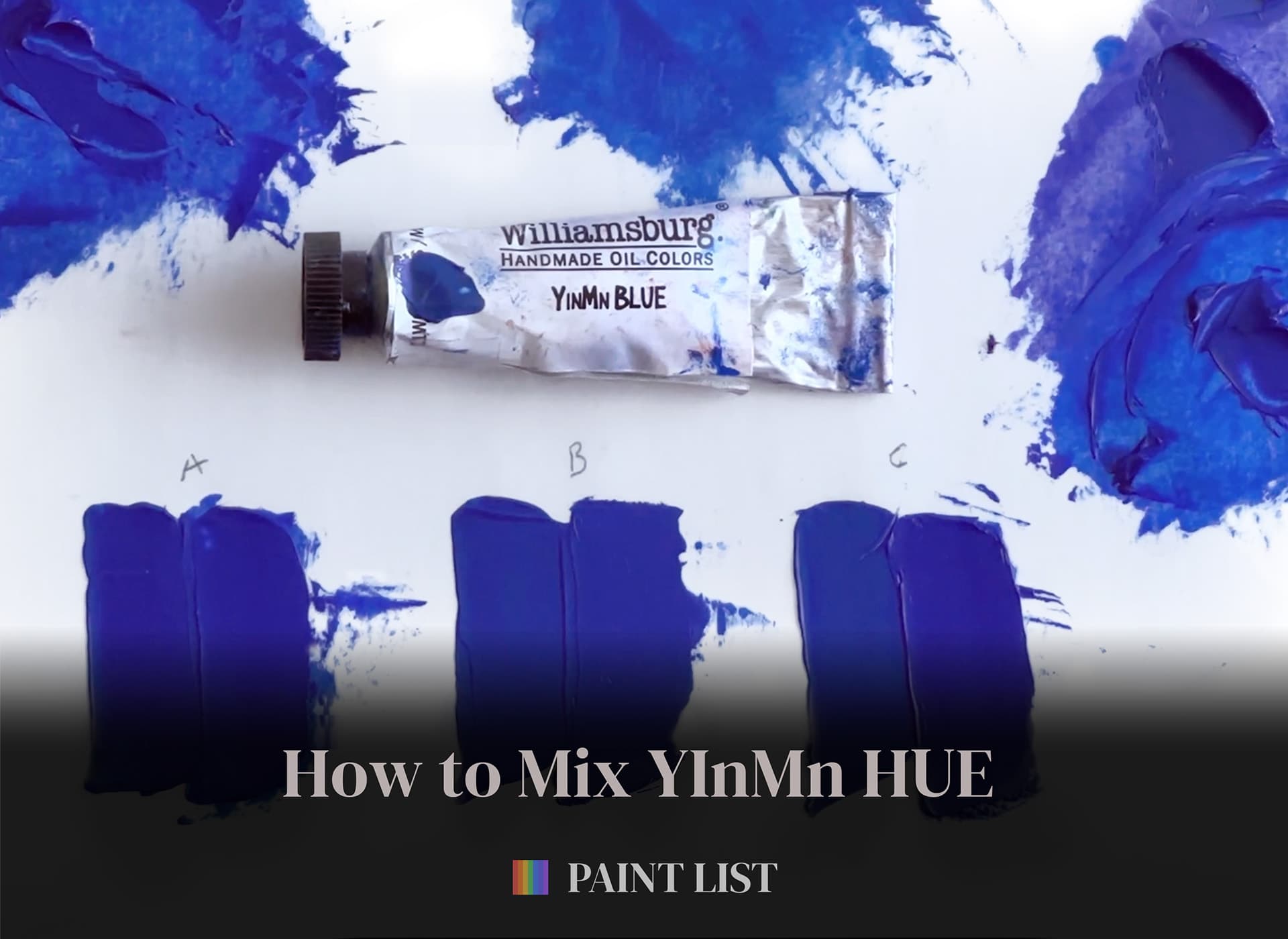
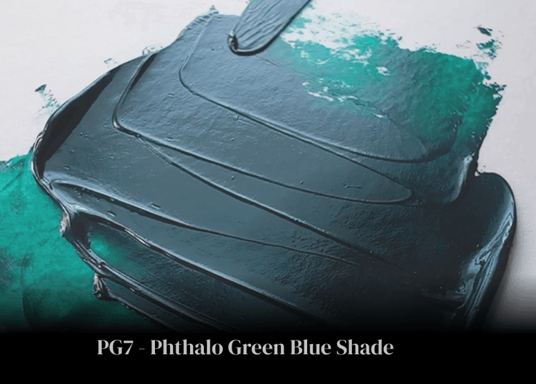
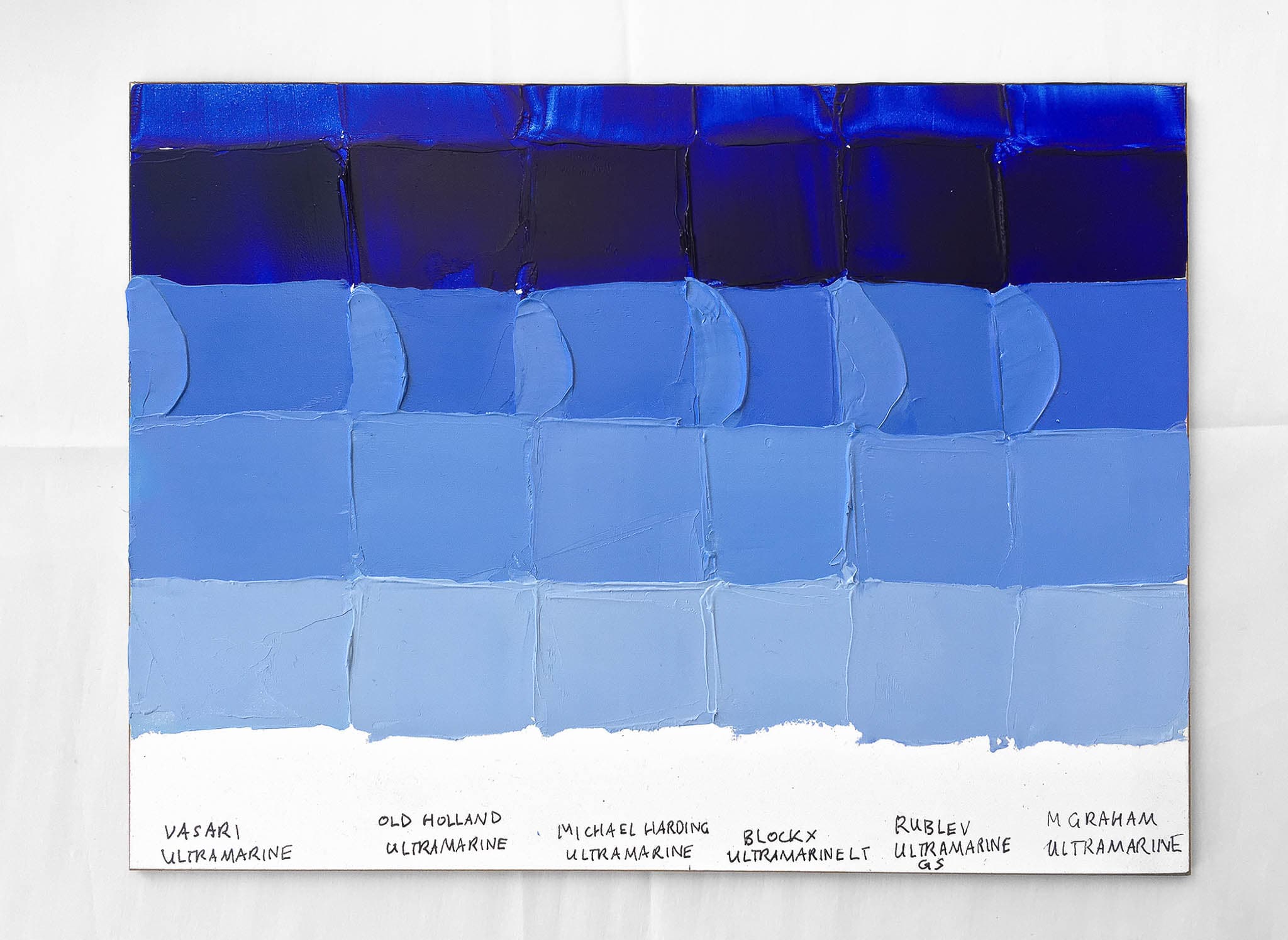
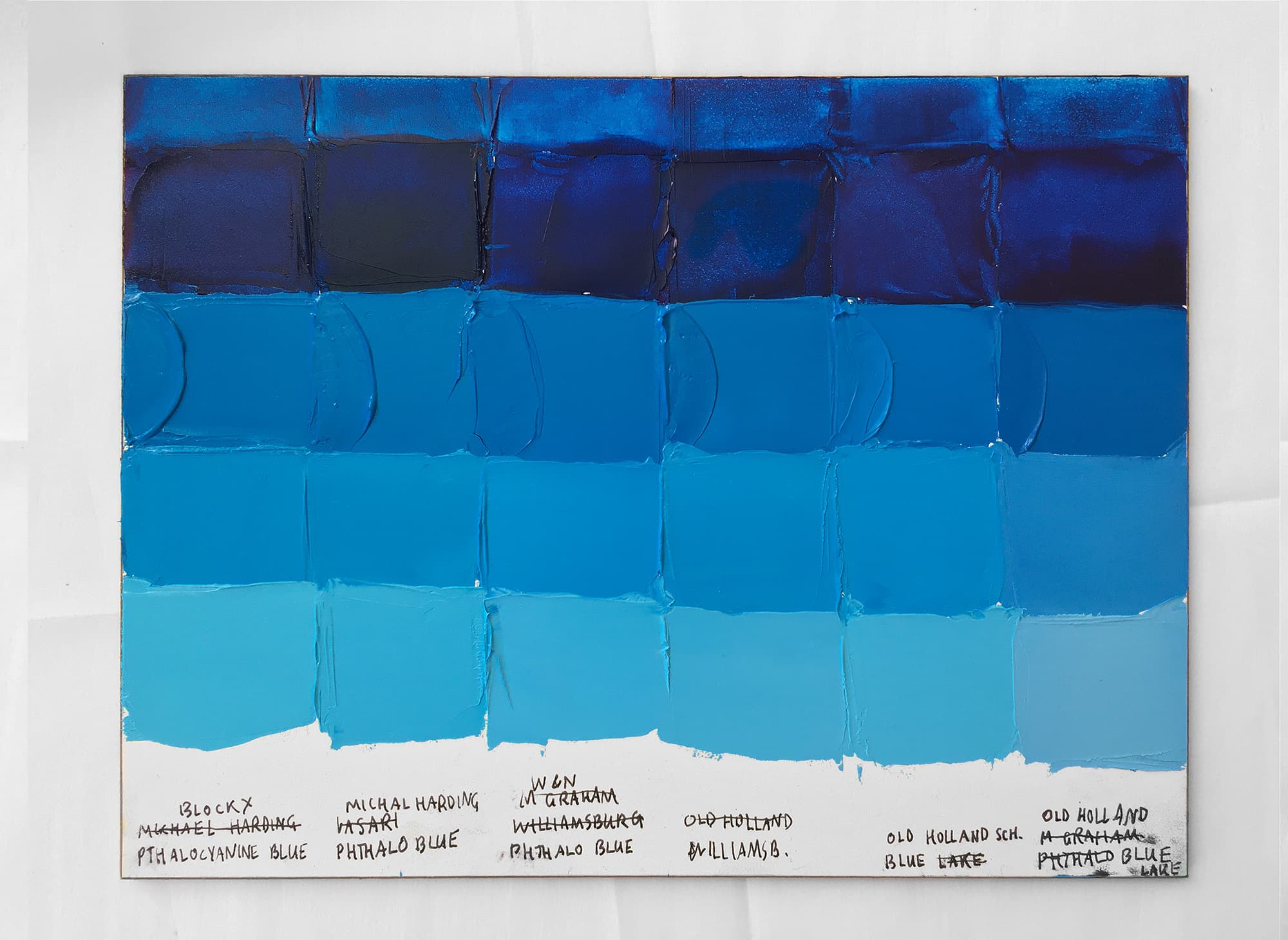
.png&w=3840&q=75)


As always, if a certain spec matters, double-check with the manufacturer before purchasing.
As always, if a certain spec matters, double-check with the manufacturer before purchasing.
This is a middle value blue with a touch of desaturation. Many blues in realistic landscape painting need a bit of toning down, and this one comes pre-toned down. Vasari’s Bice is still fairly chromatic— it seems to be about a Munsell 6 in chroma or maybe a little higher. Vasari recommends using it with warm tones to create complements. Unfortunately Vasari does not disclose the ingredients in their Bice mix. However one ingredient— Cadmium Yellow— is mentioned as part of the mix, as is true for all of the Scott Christiansen greys. This middle-lightness blue is a little deeper than sky blue and in Munsell terms is closer to a PB (purple blue) hue. When mixed with white the color was a little more desaturated than we would have at first expected.