This site is community-supported. We may earn a commission (at no extra cost) when you buy through our links.
Sign in to see related paints

.png&w=3840&q=75)


As always, if a certain spec matters, double-check with the manufacturer before purchasing.
As always, if a certain spec matters, double-check with the manufacturer before purchasing.
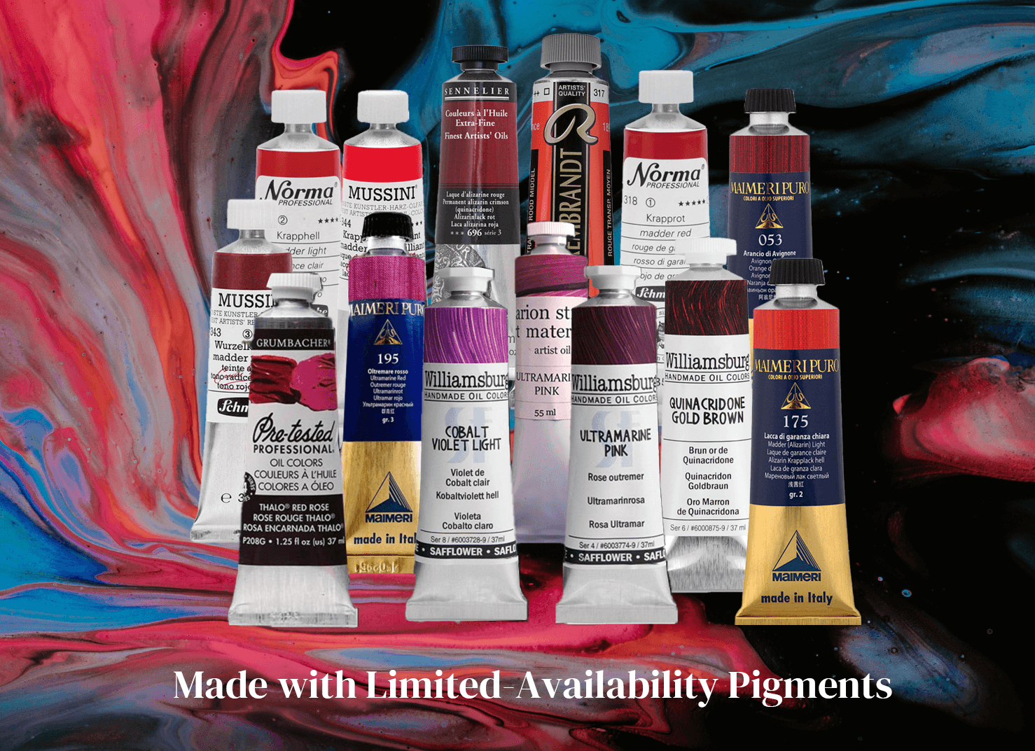
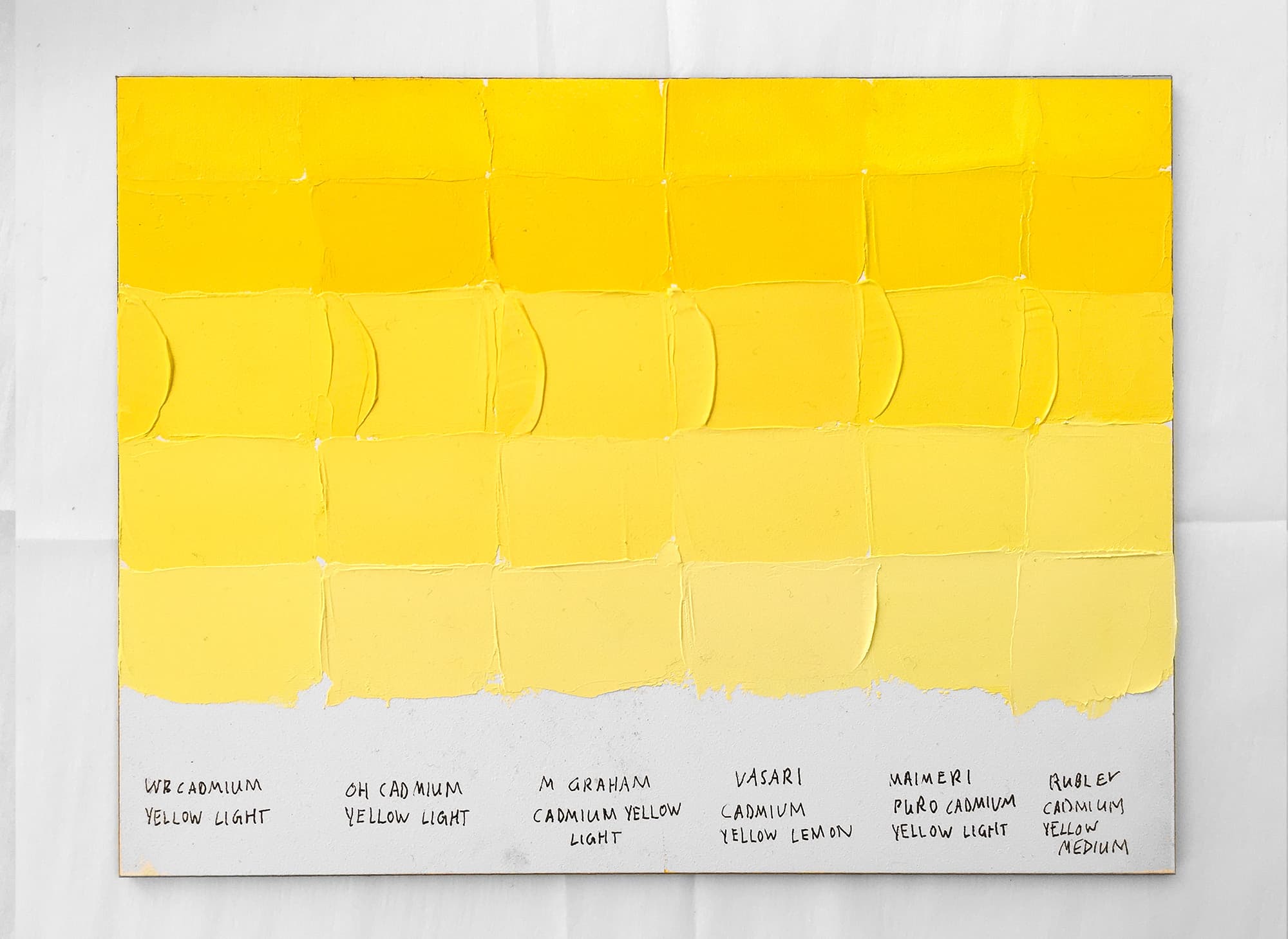
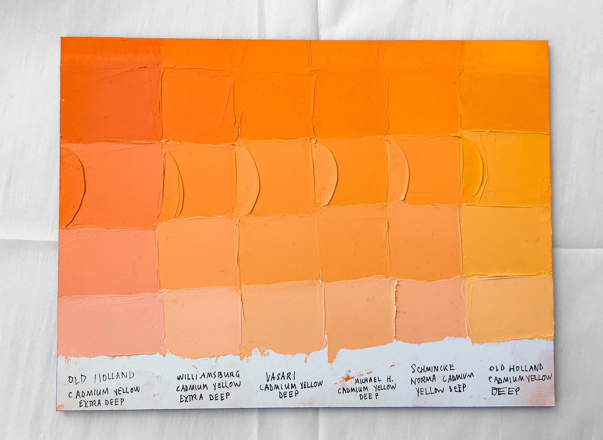
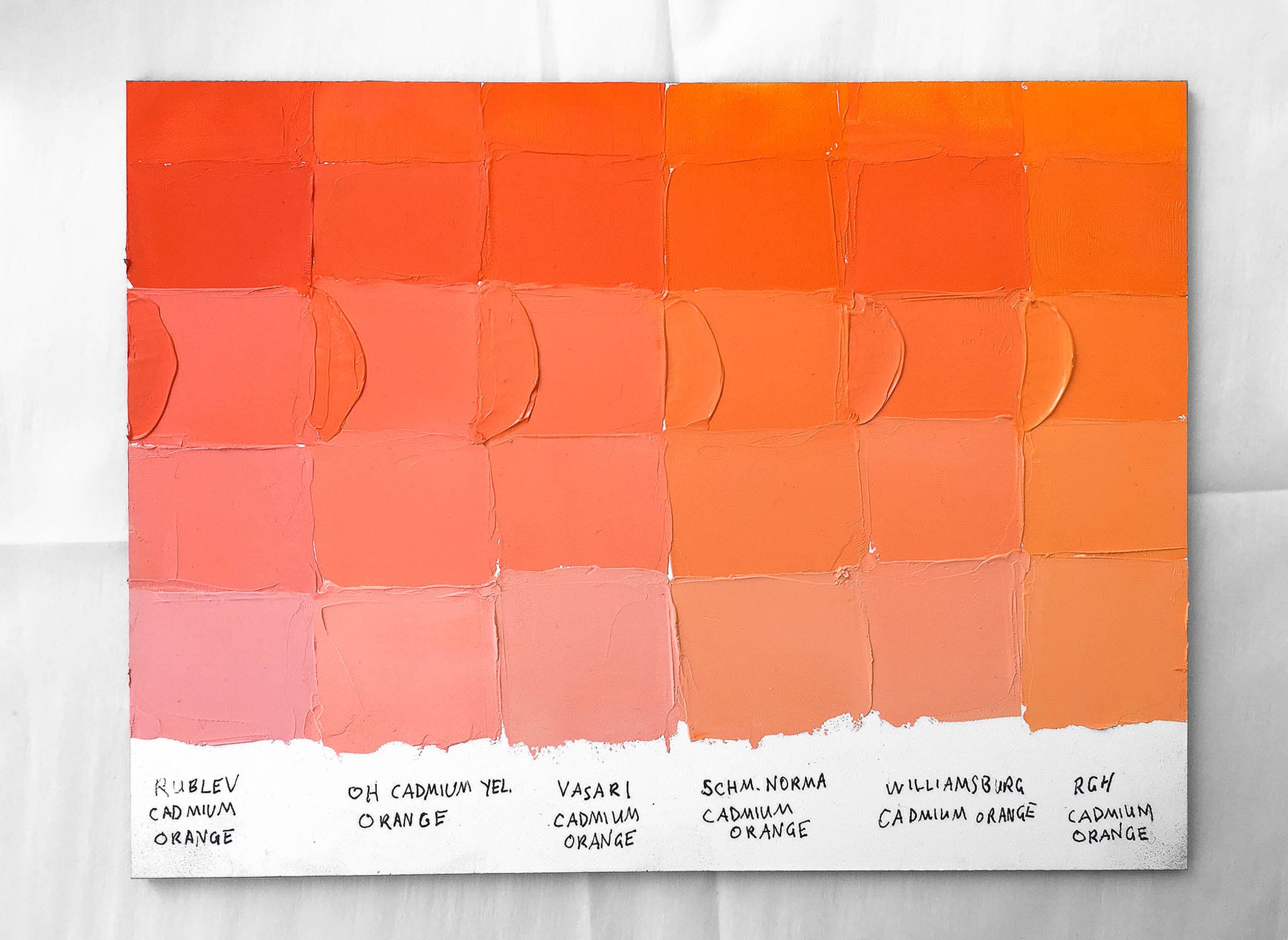
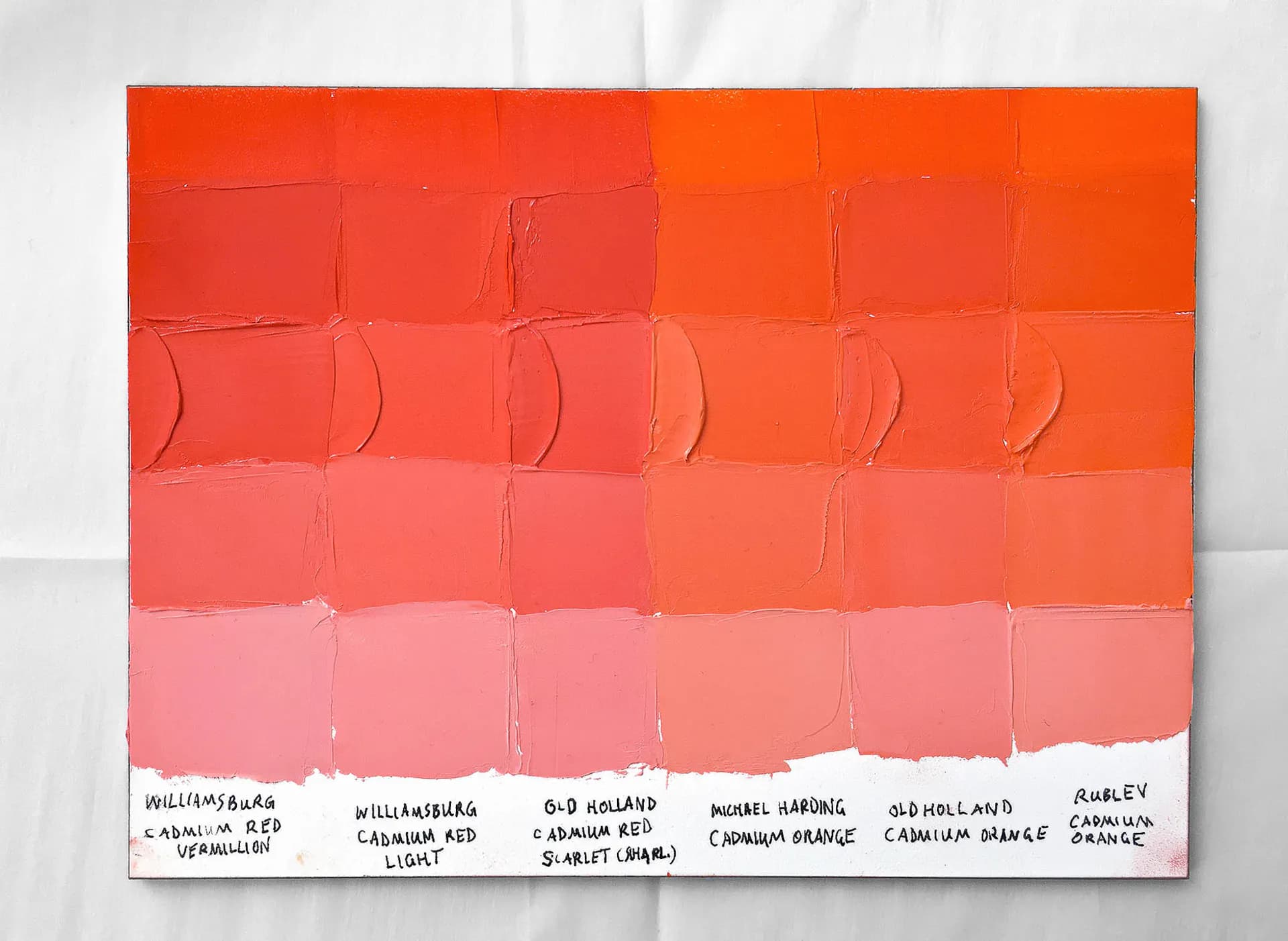
This is a very dark brown in masstone, however its undertone when thinned is violet. Other colors strike a similar note in masstone, and yet would have different mixing behavior, as Shale is a mix. The name can be a bit misleading as there are many forms of shale. The Vasari paint color is very dark and almost like the low notes of a dark raw or burnt umber when dried. While this looks like a burnt or raw umber in masstone, the dusky purple-red-violet is evident when the color is thinned out, as well as in tints. The tints turn a kind of dull purple. The only known ingredient in this convenience blend is Cadmium Yellow. Overall we found our impression of the Scott Christiansen set to be favorable— moreso than we expected. The colors in the set have a nice tonal relationship to one another, and if one paints realistic landscape work frequently, it is nice to have certain colors pre-tubed.