This site is community-supported. We may earn a commission (at no extra cost) when you buy through our links.
Sign in to see related paints

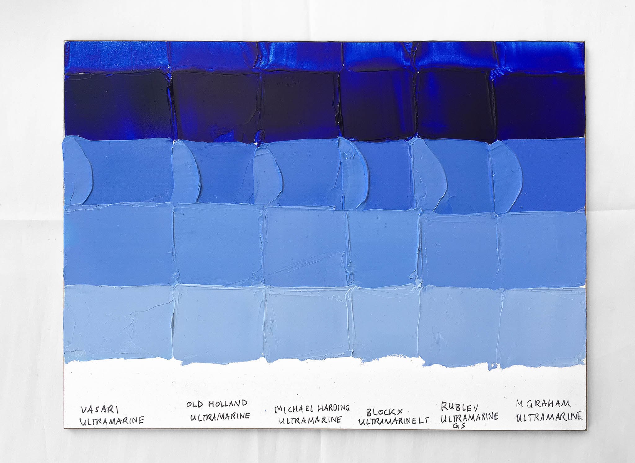
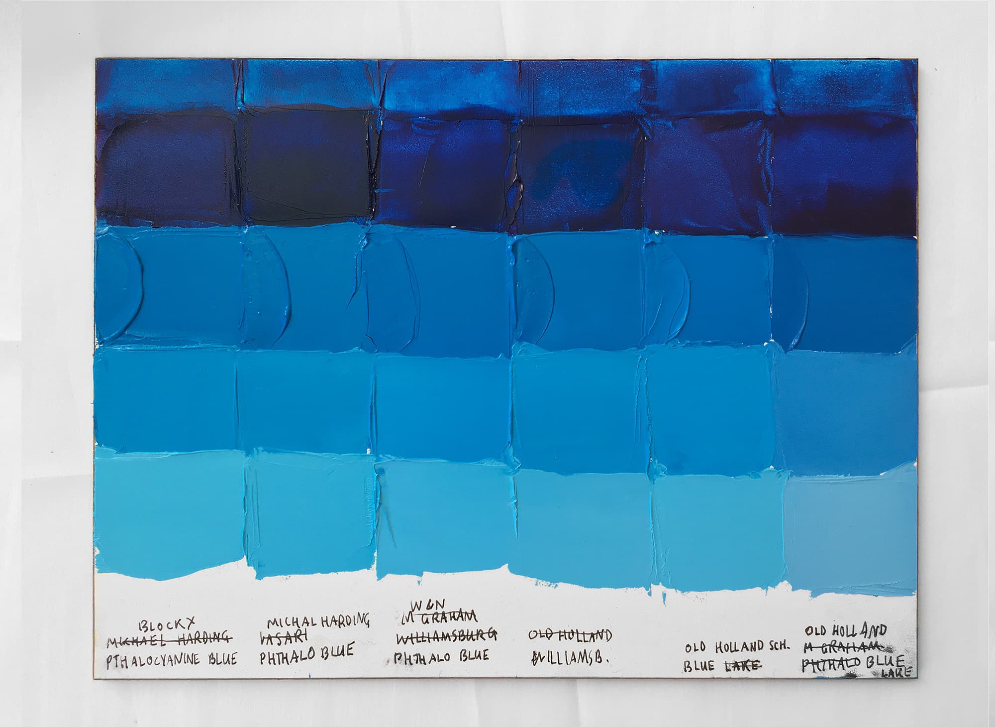
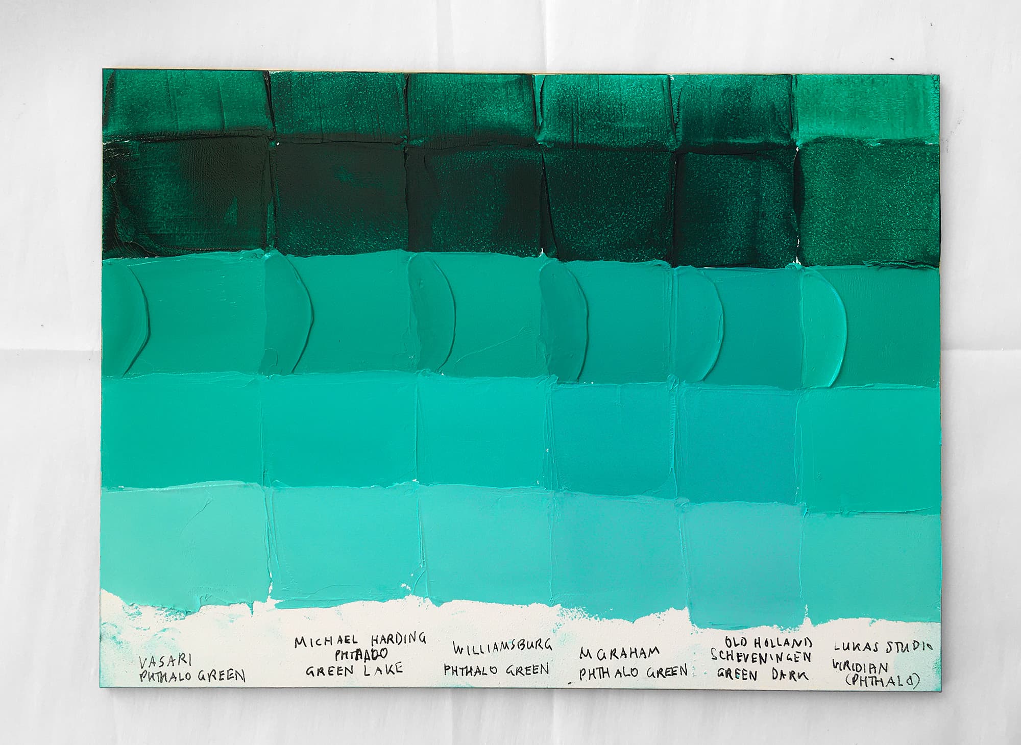
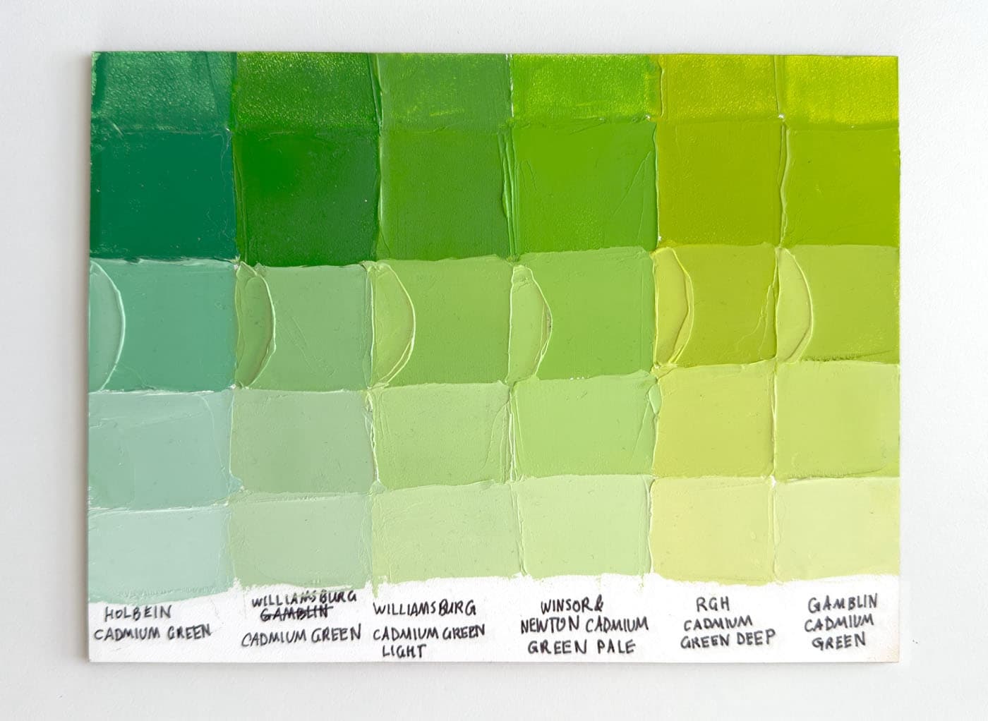
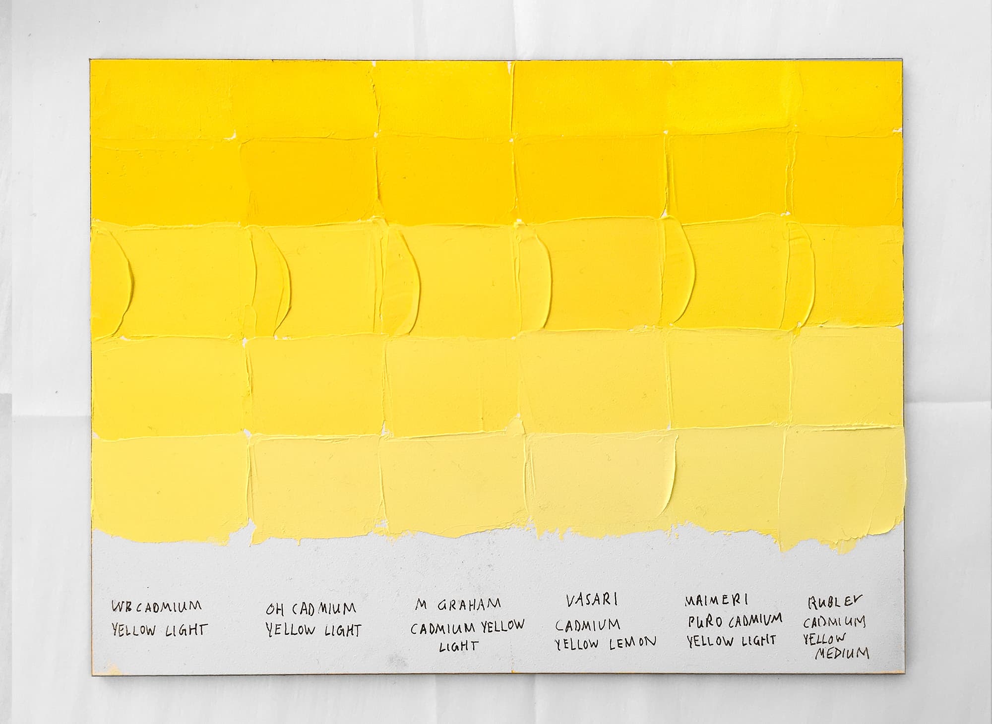
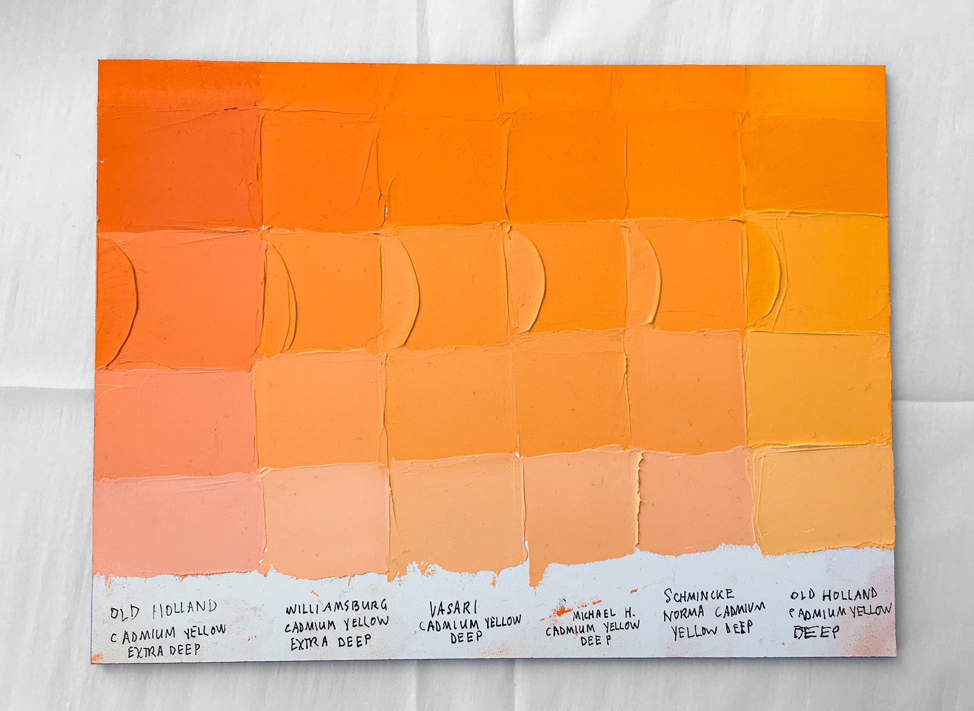
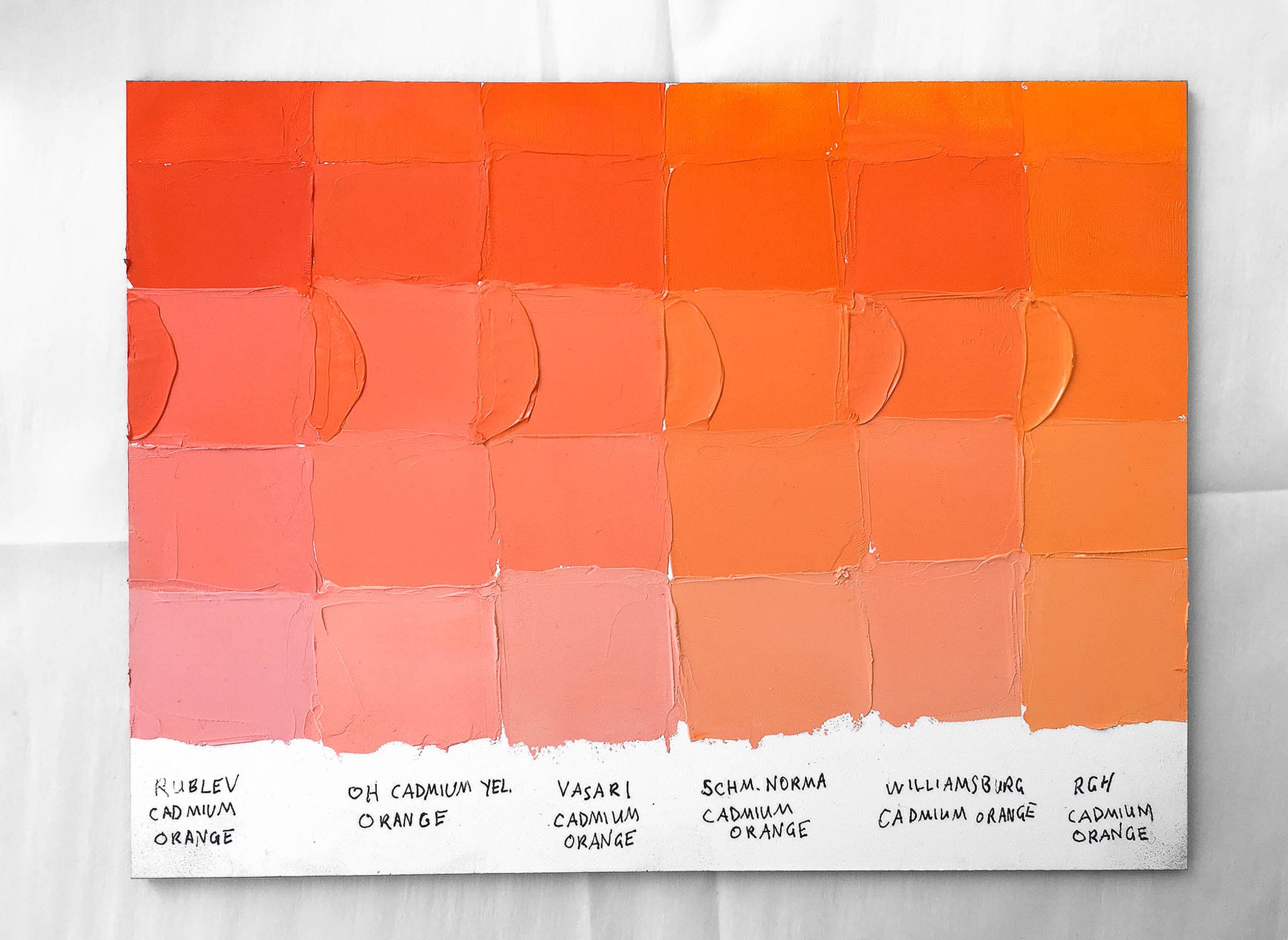
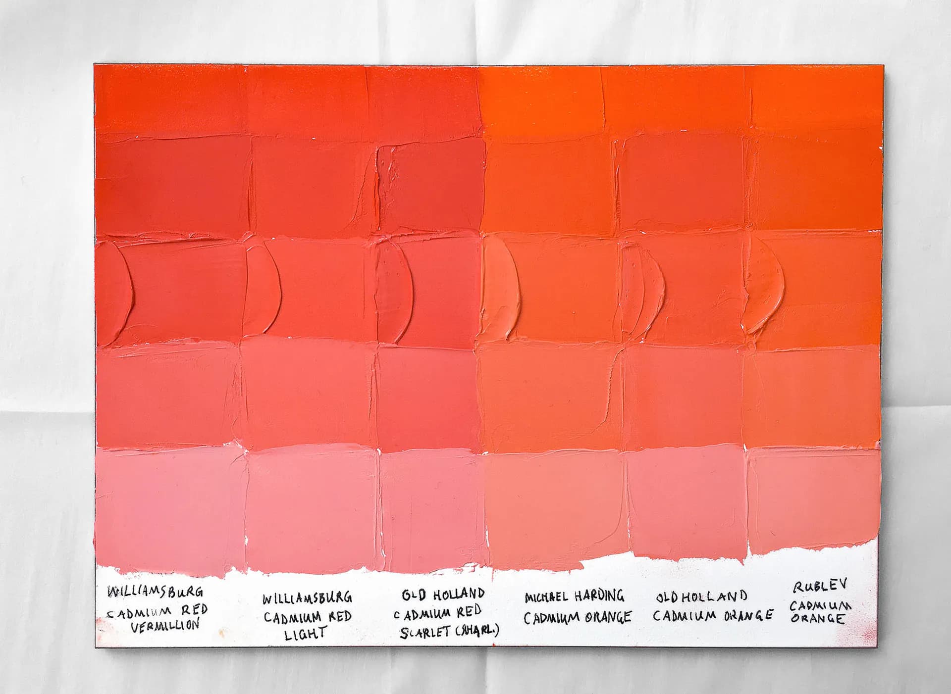
.png&w=3840&q=75)


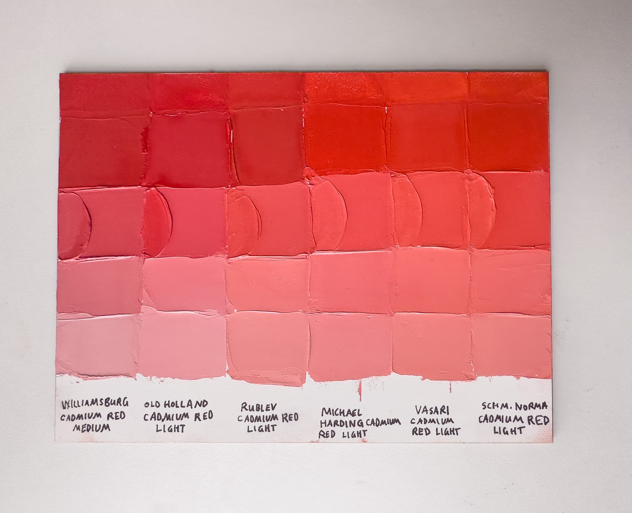
As always, if a certain spec matters, double-check with the manufacturer before purchasing.
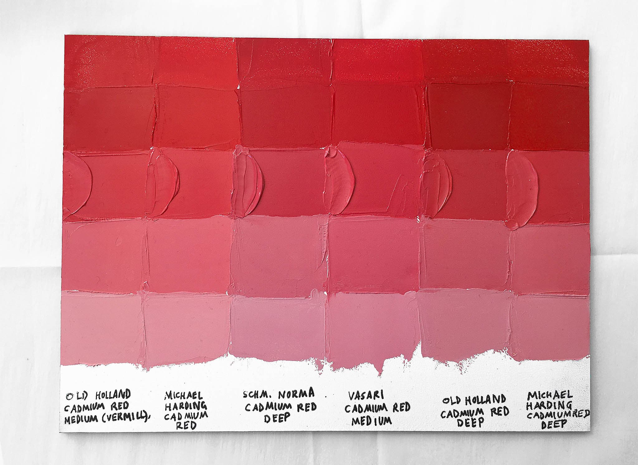
As always, if a certain spec matters, double-check with the manufacturer before purchasing.
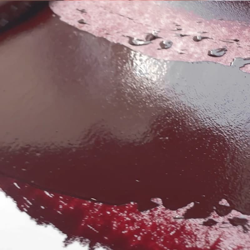
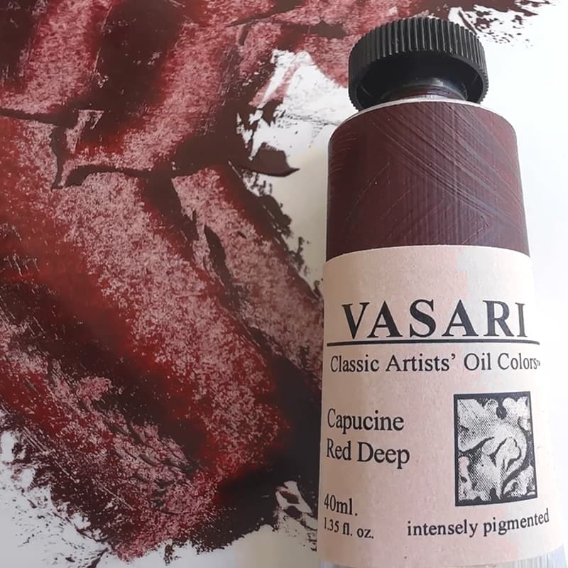
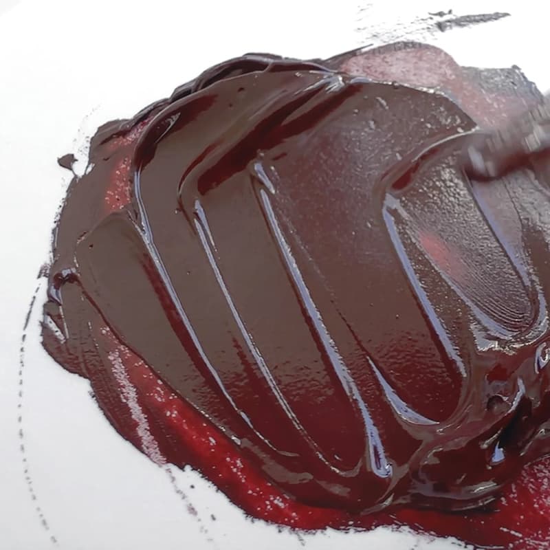
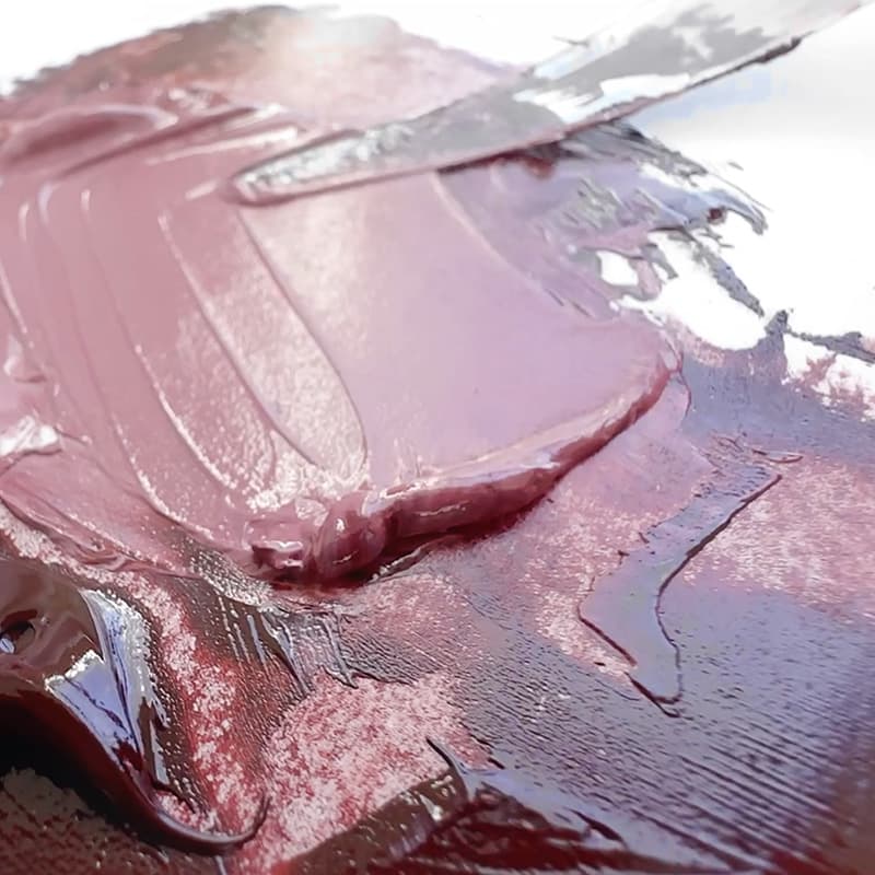
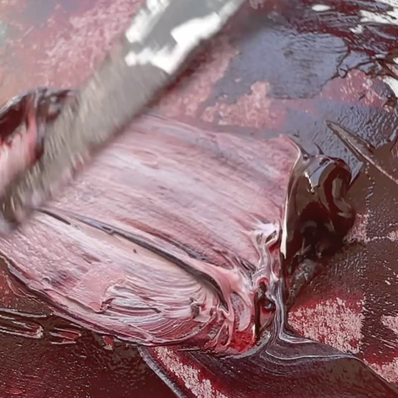
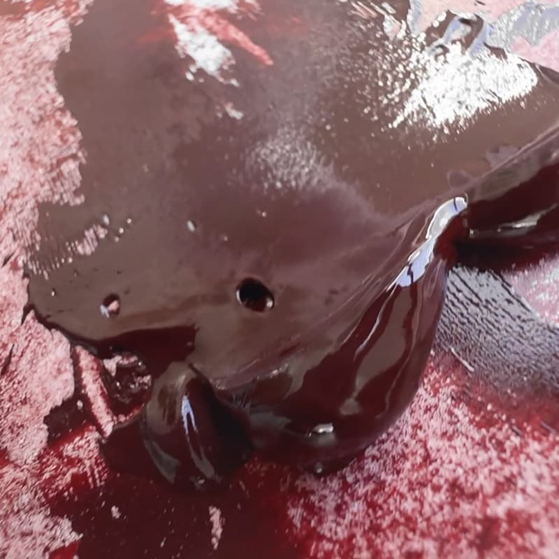
Vasari Capucine Red Deep is an inspired convenience blend, which fills a nice place in the palette. Basically this is a brown crimson, which is nice because it is less purely magenta than the single pigment crimsons and redder than most browns at this low lightness. The ever so slightly muted crimson is still very saturated when the paint is thinned, which it does readily, since it has transparency. There is an ever so slight grit to the color which reminds one of an earth tone. Painter lore has it that this color has Alizarin Crimson in it, so it is advisable to test it for lightfastness. Though, with the recent loss of genuine Alizarin we would not be surprised if it has another variety. This color has a related paint, Capucine Red Light. We could see Capucine Red Deep being extremely helpful for portrait work as well as useful in landscape. This color fills the role of a low, clear dark with high chroma for its low lightness.