A Palette Staple, Ultramarine Blue
Today we have a double feature-- a new article on PB29, Ultramarine Blue, as well as a refresh of our Ultramarine Oil Paint Comparison!
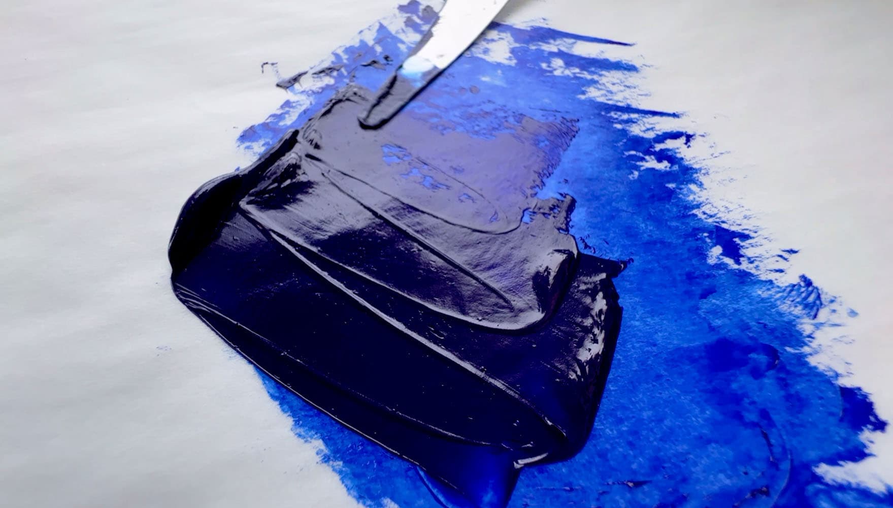
When we think about the colors for which we're most grateful, mysterious Ultramarine, with its gemlike depths makes our short list.
A person can kind of get lost in looking at Ultramarine-- I once made a painting which featured a big palette knife swoop of it, and it was almost impossible to translate to the screen or print, as Ultramarine can be out of gamut. From its inky oceanic blue-black masstone to the mesmerizing rich blues for which it's so esteemed, ultramarine is just gorgeous.
It's easy to take it for granted.
We love ultramarine so much we have a pigment article as well as a comparison of a handful of oil paints.
This particular one is one of our favorites, which we use sparingly in the top layer only, as is made of poppyseed oil. Featured paint: Blockx French Ultramarine Blue Light.
