.jpg&w=3840&q=75)
Guide to Oil Paint Brands
Think about brands in a whole new way
Like a Studio Break over a Cup of Coffee
Under the yellow spotlights of the studio, muffled thuds of shoulder bags slung down onto taborets encrusted with layers oil paint alternate with the scraping sound of easels and stools moved into position. Palettes clatter slightly when set on the tabletops, and heavy metal tubes of oil paint (so satisfying and weighty in one's hand) sort themselves into makeshift rainbows. If you're familiar with a traditional palette there are ochres, siennas, and crimsons, and the Ultramarine isn't as much of a middle blue; in the painter's rainbow it almost looks black it is so deep, and the series of browns must be puzzle-pieced in somewhere in the glorious lineup of colors.
The beginning of a painting session isn't when you'll hear about brands-- no one really cares what anyone else is painting with during the chaotic rush of dipping brushes into the powerful gem-tone globs that comprise a painter's palette. It's during the after hours studio chats and momentary painting breaks that painters start talking shop about brands.
Back as a student in the studio, during painting breaks or after long sessions, I used to enjoy comparing notes with a cup of black coffee in hand before getting back to work at the easel. It's hard to find that kind of discussion about brands online, but we always appreciate hearing from fellow painters who have painted a lot with whom to compare notes and experiences. The topic of paint lines is huge and we are always expanding our knowledge.
So pull up a taboret, and pour yourself a cup of coffee or the drink you prefer.
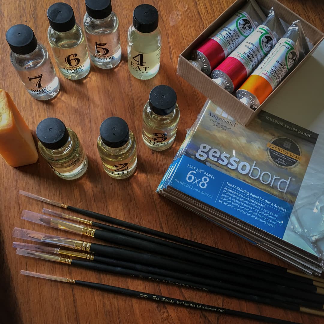
Things we look for when evaluating a brand
The question of the 'right' paint brand for you is going to differ depending on your needs, and may even differ from color to color. Thinking in terms of pigments is our preferred starting place, but brands tend to have an overall vibe.
Think in pigments, then consistency Here's a hot take: yes, we're here to talk about brands, but the logo is not always the most important consideration. A person can ask themselves which pigment is in a paint, as that is likely to give a person much more information about color mixing, toxicity, and lightfastness.
However, brands do matter as each one has a different take on a pigment.
Here's a quick list of things we look for when choosing a brand:
Pigment selection. How wide is the selection?
Lightfastness: Does the brand use lightfast pigments?
Do they label imitation hues properly?
What percentage of the paint line are single pigment colors?
Does the brand carry a wide selection of genuine cadmium and cobalt colors?
Does the brand include hard-to-find or expensive pigments?
Is zinc white still part of the paint line?
Does the brand commit themselves to a high pigment load?
No one of these questions alone tells the whole story, but taken together, the way each paintmaker navigates these questions reveals a lot about their overall paintmaking philosophy.
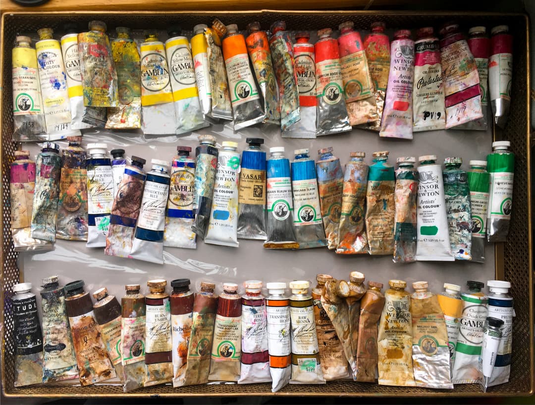
Tinting Strength, Pigment, and Consistency
Which brand is right for you? Well, there may be more than one. Perhaps nothing fascinates painters in their free time more than paint brands (besides painting that is). Are you a color person? An archival person? A texture person? Or some combination of all of them?
We've gotten to know some of the paint personalties of various brands over the years, such that we have a knowledge of which paint to reach for when we want a certain pigment with a certain consistency. This test shows different tinting strengths, which is another interesting element when trying to compare paints.
Seek a diversity of perspectives When it comes to preferred paintmakers, anecdotes, stats, questions, and sometimes even accusations fly when painters set down the brushes and take their coffee breaks, and all of it is valuable to sort out the multi-colored and ever-changing landscape that is the paint market. This guide isn't definitive, and as always we hope you'll seek out many voices and alternative opinions-- after all, that's what we love best about chatting in the studio.
.jpg&w=1080&q=75)
Tinting strength test. Here's a quick comparison of comparable colors across several premium brands. The tinting strength in some colors is comparable, and in other colors the tinting strength differs. Here we compared Cadmium Red PR108, Ultramarine Blue PB29, Brown Iron Oxides PBr7, and Cadmium Yellows PY35.
At Paint List, we paint with a lot of brands. Each paint is best evaluated individually. That said, we've noticed that one of the factors among Artist quality brands (which tend to have similarly high tinting strengths) is the difference in the paint's consistency-- as in its thickness. There are four main categories in which we tend to think about viscosity-- Impasto/stiff like peanut butter, sculptable like buttercream, light like whipped cream, or flowing and dripping like melted butter (more below).
After considering the pigment choice, the best brand for you may come down to what sort of a consistency you like-- thick or thin, impasto or flowing, short or long. This may vary a bit from color to color but each brand has some general patterns in how they make paint.
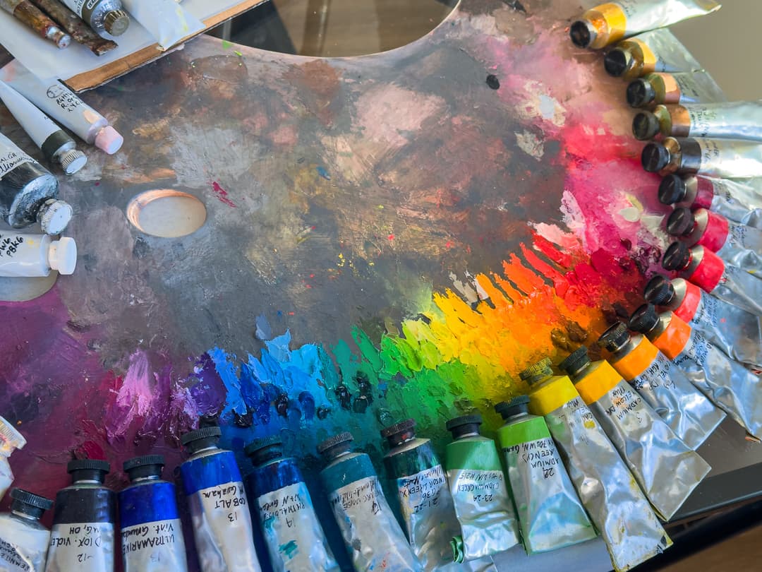
First and foremost, color
Just so you know our true bias, out of all of the material qualities of paint, our favorite thing is color. The tiny differences in hue and the ways the gamut can be explored are the most important qualities to us in a paint brand.
Lightfastness and chemical stability of the painting are a close second, because without those the beautiful colors will not last.
We love it when brands have a wide selection of single-pigment colors and take pride in the clarity and beauty of their whole line.
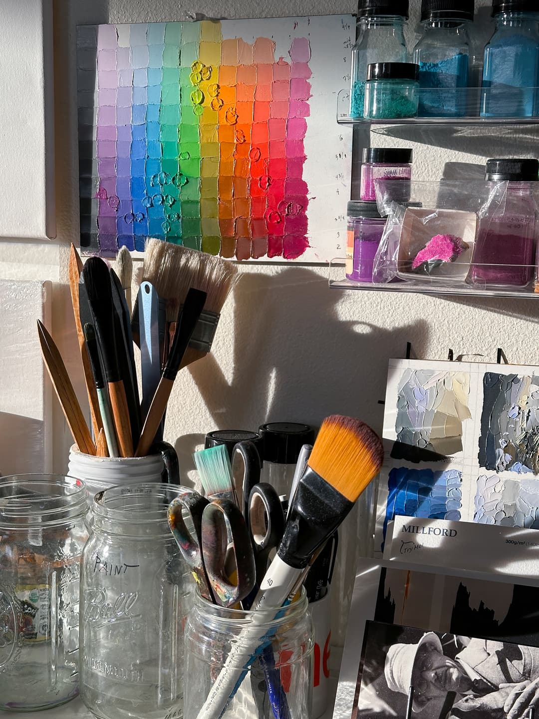
A focus on color and pigment
The quest for the paints that fill your needs
Another one of our biases in oil painting is toward realism, moreso for me (Melissa) than for Jonathan. Over twenty years of portrait painting, I've gotten to know a lot of different brands, and have come to appreciate the differences in their nuances.

The Philosopher (detail), 36" x 36", Oil on Linen, by Melissa Carmon
Tests with basic limited palettes
To compare brands, we've done numerous exercises, such as making basic color wheels. The slight differences in the way the paint handles are more noticeable in person than in photos, since most of what painters talk about when comparing brands is the experience of painting, not the finished paint.
Perhaps comparing artist grade paint brands is a bit like comparing the experience of driving different cars. Lots of different cars can reach a destination, but the driving experience to get there differs.
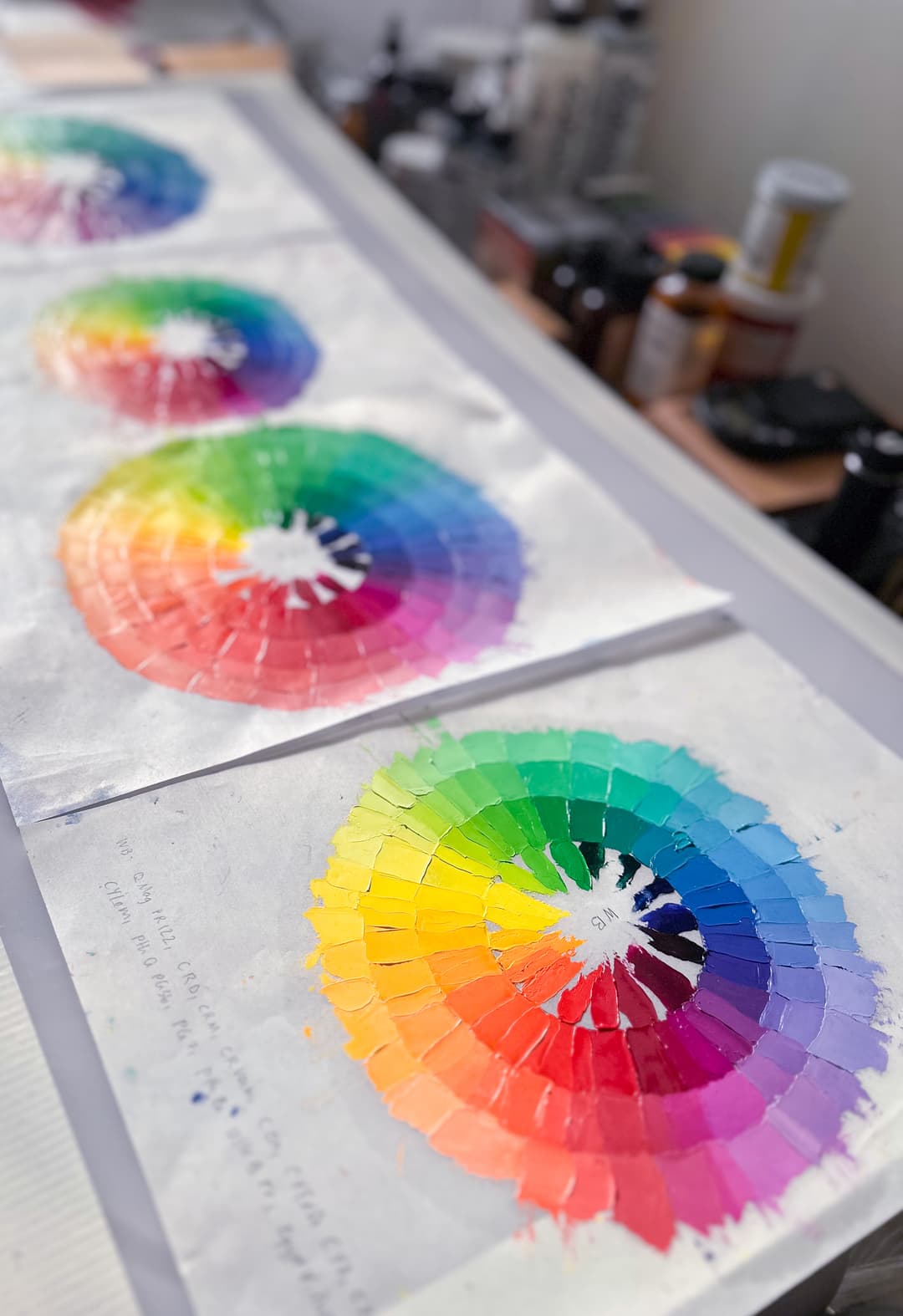
Brand-specific color wheels. This exercise ended up highlighting the consistency of the brands-- some were more pleasant to work with than others, and each had their own distinct feel
A Quick note on Cadmiums
Every brand has a different take on where to place their cadmium notes. Cadmium Yellow, PY35, Cadmium Orange, PO20, and Cadmium Red, PR108 each have a gradient to them, and a brand will choose both how many cadmiums they offer, as well as how to name and place each one. This means that one brand's Cadmium Yellow Medium will be a different color than another brand's Cadmium Yellow Medium, even though they share the same pigment.
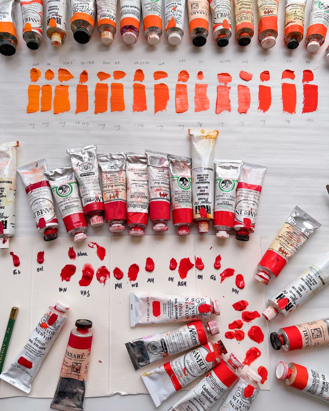
One of the reasons we made Paint List was to shed more light on the rainbow of cadmium colors out there. Cross-brand reviews can be found in the articles section
How We Began to Focus on the Paint Consistency
Things you can't unsee
Working with oil paint in large quantities
In 2020, while portrait painting, I became fascinated by a historical color system. This was not the first time I dove into color theory to inform my painting practice. A book on Color where Betty Edwards suggested that it is best to study color in the medium one plans to use inspired this particular quest. To explore color theory in oil paint, I decided to mix up enough of each dialed-in color in the Atlas and tube it as its own convenience blend. This involved making somewhere close to 1,000 precisely color-matched tubes of oils. With this in mind, I bought paint in large quantities (i.e. gallon-cans of Titanium white) and began to blend and mix up small batches of colors. Though I had been painting in oils for decades at this point, I came to experience the paint itself in a whole new way.
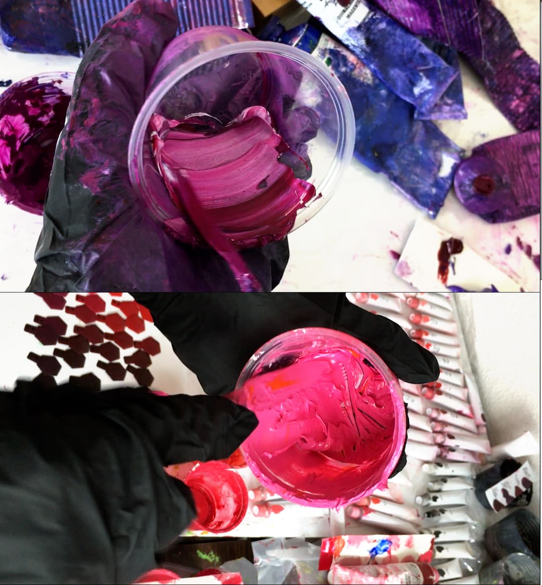
When painting, a small daub of paint on one's palette is so manageable-- a bit of medium or a drop of oil is often enough to alter the consistency sufficiently. However, I now found myself using large palette knives to wrestle whole cans of oil paint, and found myself mixing weighty cupfuls of oils by hand. When working with quantities of paint, the choices the paintmaker has made in formulation emerge to take a lead role. When experienced en masse, some colors are so stiff they are hard to even mix, while a drop of other paints will completely loosen up the whole blend.
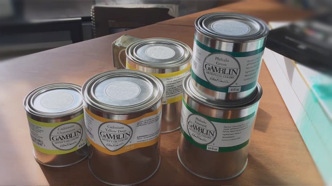
Canfuls of oil which were purchased for the color mixing project
Somehow, one afternoon, as I filled a dixie-cup full of dark green oil paint, the sight of the serpentine stream looping like a heavy rope into coils in the bottom of the paint cup was something I couldn't unsee. The semi-translucency of the gel-like paint struck me as somehow different from other phthalo greens I had worked with from other brands, and at first, I couldn't figure why. As I continued to work with that brand of paint, I started to notice little differences in the way that the light caught the edges of the paint, a sort of sub-surface scatter. Granted, when dried, one couldn't really tell the difference. The viscosity is something that affects the painter's experience more than the viewer's experience of the finished painting. I had never noticed this particular green's formulation before when I had just been working with little daubs on the palette. All of a sudden, I couldn't mentally separate the experience of the viscosity and the formulation. Where I hadn't been a strong brand adherent or detractor before, I began to really feel the differences.
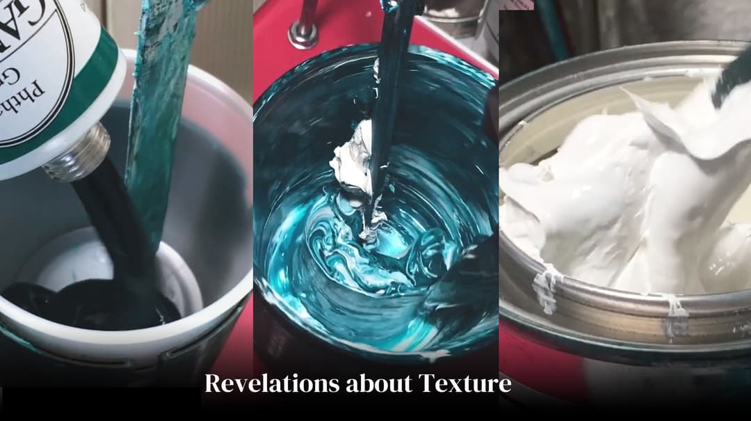
Gamblin Phthalo Green has a gel-like texture, and their Titanium White is extremely thick. This is especially pronounced when working with large quantities
Each brand interprets how to make a pigment into paint
As I continued to work on the large color theory mixing project, I began to shift from thinking primarily about pigment and surface color to developing preferences for a certain brand's interpretation of that color. When purchasing large quantities, these considerations and comparisons become louder in the decision making process.
For example, when purchasing PR177 for a series of low reds, I considered the pigment, the color, the binding oil, and the likelihood that the brand would test their product for lightfastness. I ended up buying Williamsburg's Permanent Alizarin Crimson, a brand I normally love, however for my purpose it seemed exceptionally stiff-- almost too stiff to use for the large mixing project.
I began to keep track of stiff paints and liquid ones. Some brands make paints so loose they could practically be administered with a dropper-- so soupy that I would use a drop to loosen a blend as well as tilt the hue. Through a wide variety of brands and paints, I learned how to drive through the color space, and it is not uncommon for me to have two versions at least of a given pigment on hand in painting, so that I could select the one with the qualities I need for a given task.
The end result of the project, along with finishing the mixing project for the color atlas, was immaterial-- a totally different view on paint brands.

Williamsburg Permanent Alizarin Crimson formed the base to this mix. Bits of other colors are shown streaking through the paint, as I blended it by hand with a palette knife. The overall mix was quite thick
When working with large quantities of paint, the qualities of a brand really shine through. Do you really want six 150ml tubes of M. Graham Phthalo Green? At that scale a person gets to know the paint really well. Here, we quite enjoyed the cans of Williamsburg Titanium White as well as jars of RGH.

Paint Quantities across Brands
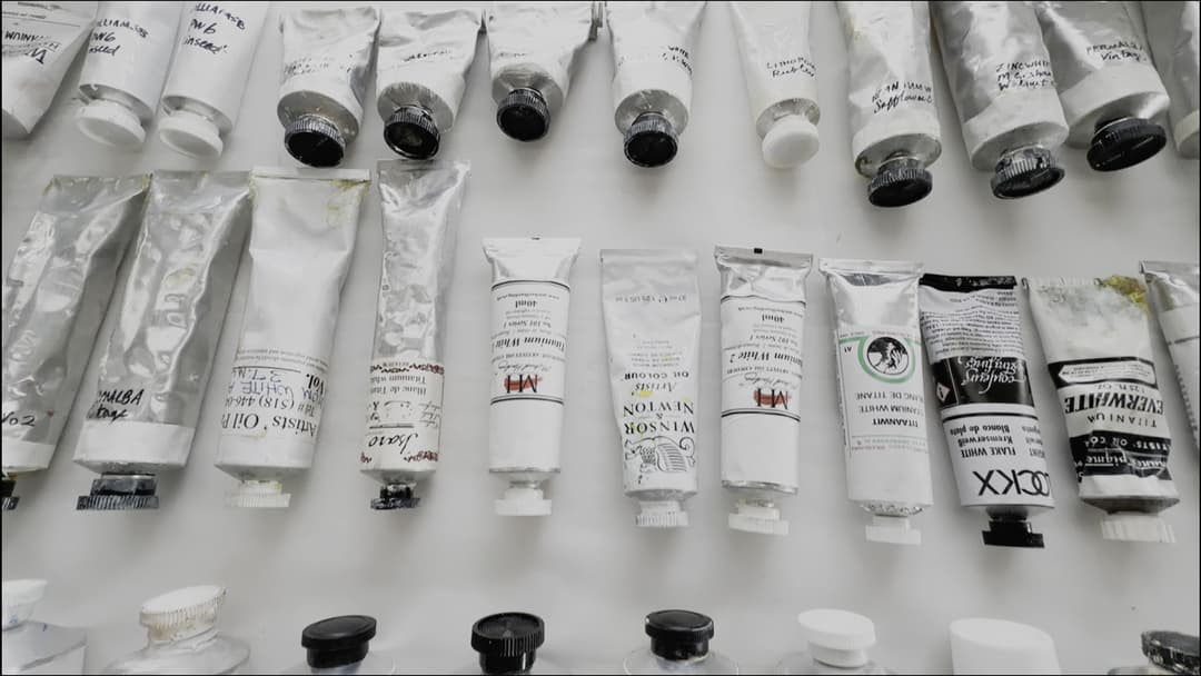
Here's a quick visualization of some common paint tube sizes. It's important when buying to double check how many milliliters or ounces the tube contains. For beginners, one quick gotcha is the Titanium White. Painters often purchase a large quantity of Titanium White since it's a color that tends to get mixed into everything.
Standard sized oil paint tubes run around 40ml, though some brands sell these as 37ml or 38ml. The smaller tubes shown here are around the standard size. For reference, 37ml is 1.25oz.
Larger sizes range from 150ml (Williamsburg) to 200ml (Blockx) to 225ml (Michael Harding).
Important note: On Paint List, the links on our pages usually go to the size closest to 40ml. To purchase larger sizes, make sure you select the correct size on the retailer's site.
Each brand has a range of sizes that it offers, and not every size is available in every country. We've noticed European retailers will sometimes offer sizes which are not available in the U.S.
Some brands offer alternate sizes for their standard offering Rublev (not shown here) offers 50ml as the standard size, which is larger than the usual 37ml.
On the other hand, some companies offer another trial-size option in smaller quantities (20ml) like Holbein and Charvin (not shown).
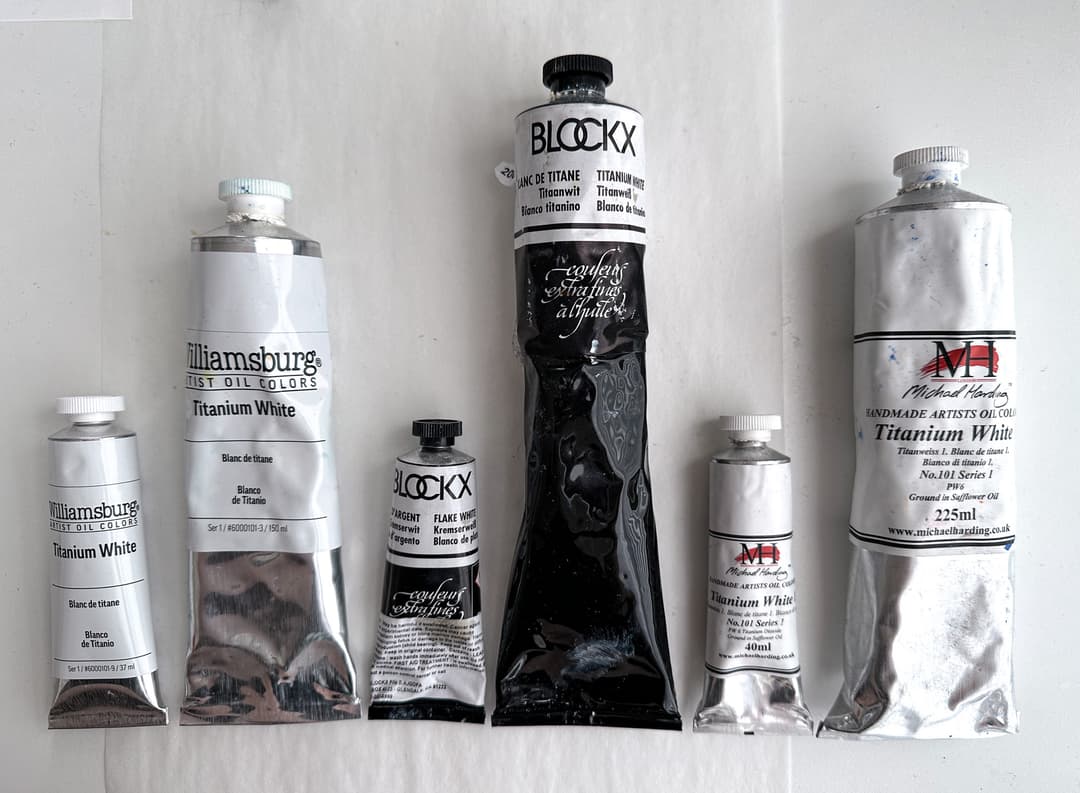
Some standard sizes. The small ones are the regular size, while the large ones are just large. The regular size varies from 35ml to 40ml, with 37ml being common. Large is anything at 150ml or over. In the photo the large sizes from left to right are Williamsburg at 150ml, Blockx at 200ml, and Michael Harding at 225ml. Many paint brands also sell can sizes as well. The oil paint listings on Paint List tend to link to the closest tube to 40ml, but paints come in various quantities.
Overcoming the Brand Mythos
Every brand has its own philosophy regarding how to make paint. Unfortunately, painters aren't told all the ingredients. Being the coffee-drinkers we are, we hate to compare paint branding to the way alcohol is marketed, but from a marketing perspective the tasks of both alcohol branding and paint branding have a lot in common. While this could be true for many things, the subjective experience and the shroud of mystery are strong in both markets. Both are made from raw materials, and both have hard-to-quantify little differences, some of which are trade secrets.
There is a great amount of mythos infused into each paint label. Little aesthetic choices such as metal tubes or hand-painted collars on the paint can do wonders in the eyes of painters (and yes, we are suckers for this too-- who can say no to real painted swatches).
Here are some questions to ask yourself to help cut through the marketing:
- How much does lightfastness matter?
- Do you like the consistency of the paint you're currently using?
- Do you paint in layers?
- How much do archival considerations matter?
- Do you have any health intolerances to solvents or certain oils?
- How much does tinting strength matter?
- And, since it does matter a little, does the brand's aesthetic appeal to you?
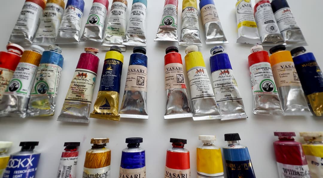
First, let's look at what paint is at its most basic.
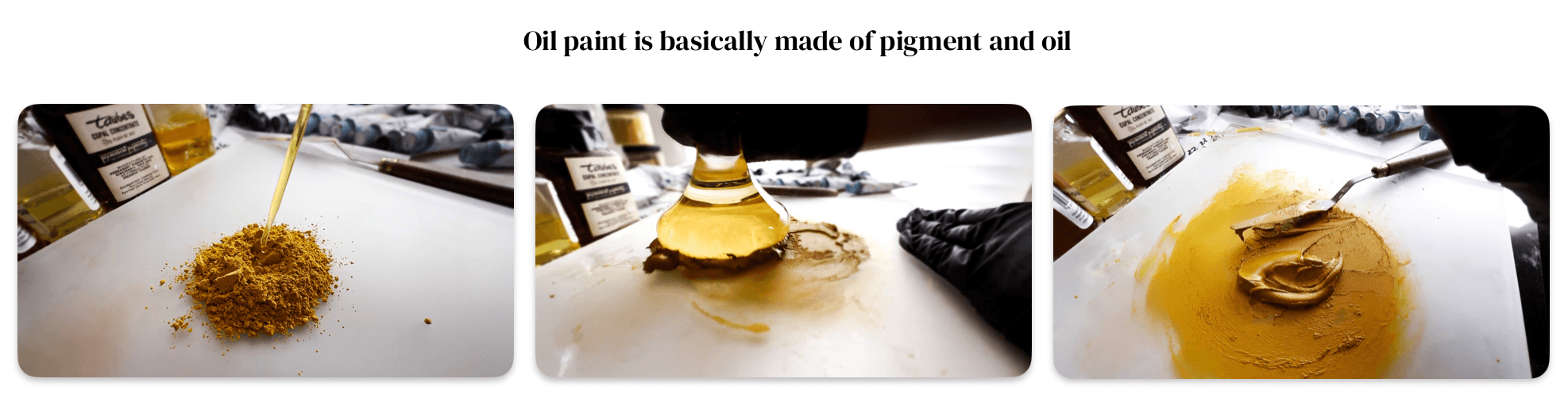
In the case of oil paint, the binder is linseed oil or another kind of oil. The pigment is what gives paint its color. In addition to these two basic ingredients, brands frequently add various undisclosed additives to adjust paint behavior or drying time. Additives are not all bad, but they may cause other problems or reactions down the road.
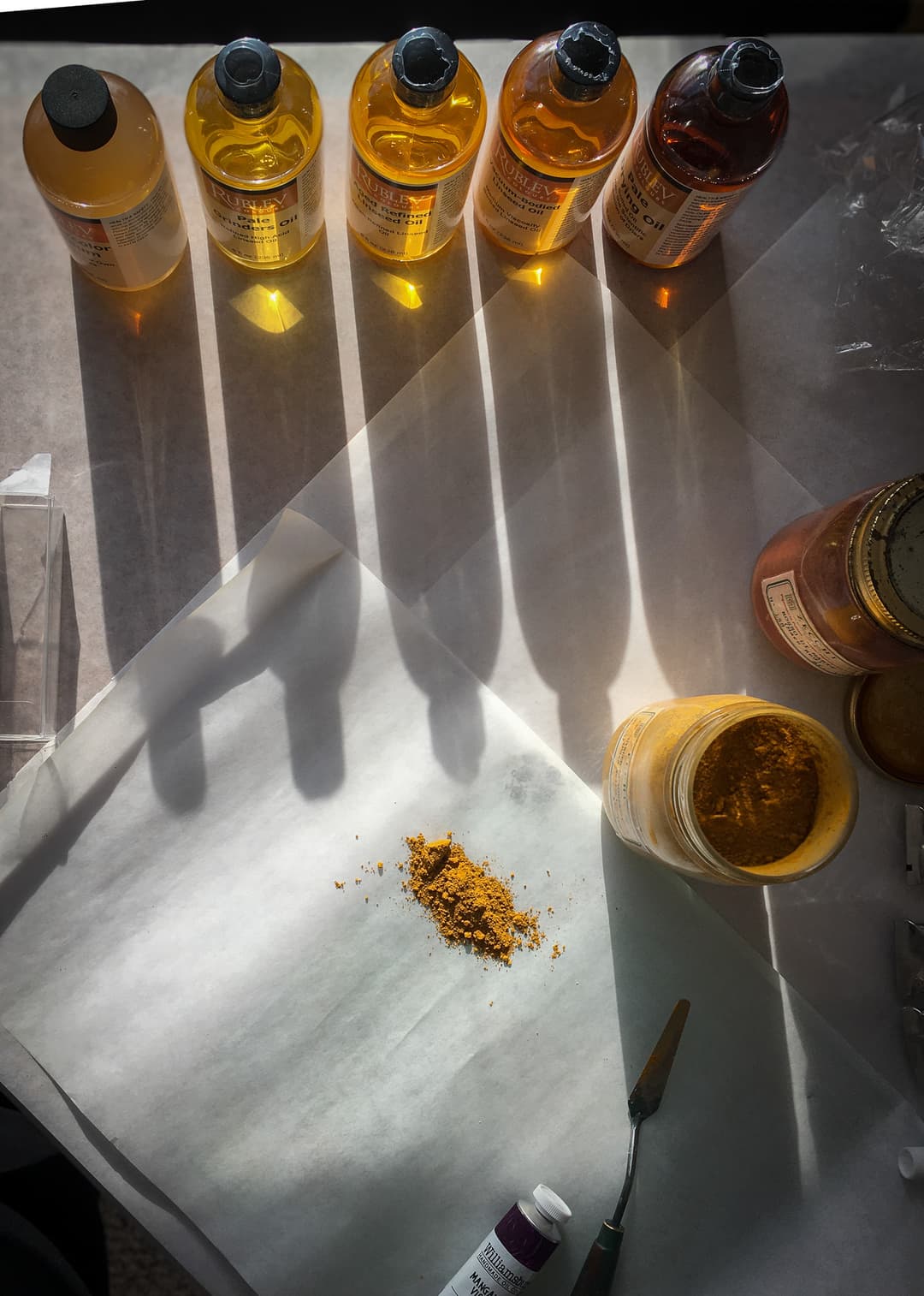
Different paint brands are formulated with slightly different oils. Some are made with linseed oil, others safflower, or walnut, or even poppy, or a blend of several. We feel its important to know the properties of the different oils and understand the strengths and drawbacks of each one.
Linseed oil forms the strongest paint films, however it yellows. There are several different varieties such as Alkali Refined, Cold Pressed, or Sun Thickened.
Safflower oil forms weaker paint films and at times may have some drying problems, however it tends to yellow less.
Walnut oil is a historical choice which may yellow less, but may have some issues depending on the substrate and formulation.
Poppyseed oil yellows least, and it is a very slow drier. It has long been rumored that Poppyseed oil may actually re-liquify sometimes, and this is also mentioned in a resource by Kremer Pigments.
1) Lightfastness
- How much does lightfastness matter? Even if a person finds a good brand, each individual paint will have to be judged on its own merits for lightfastness. The choices a brand makes in terms of the lightfastness of the pigments signals whether their paints are intended for use by professional painters.
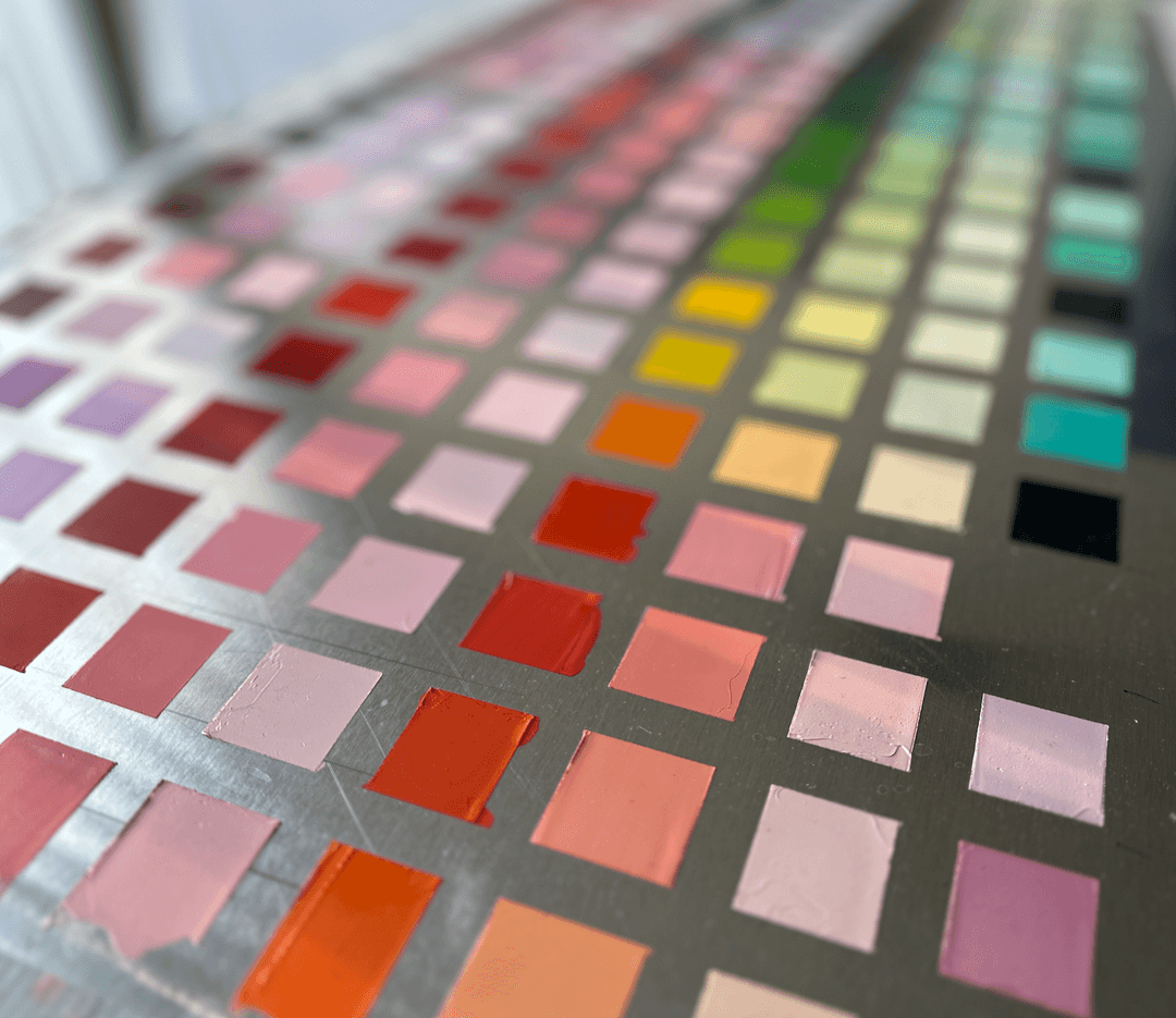
2) Consistency
Perhaps one of the most interesting questions to ask
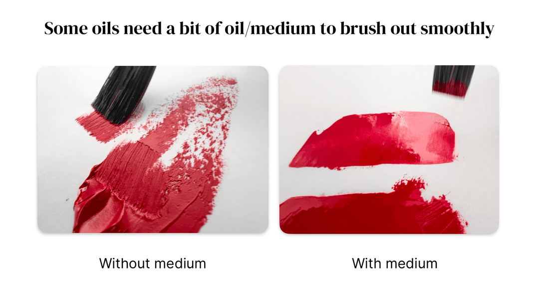
- One thing you can ask yourself is,Do you like the consistency of the paint you're currently using? Do you find yourself having to add a lot of medium to make the paint brushable?
On the other hand, perhaps the paint is too thin for thicker expressive passages.
While consistency can be adjusted either way, sometimes it's worth it to pick a paint that's closer to the consistency one wants right out of the tube.
When dried, it's harder to tell well-made paint brands apart. The consistency has more to do with your experience while painting. We've heard some painters complain about wrestling paints that are too thick, as well as painters who are struggling because their paints are too loose.
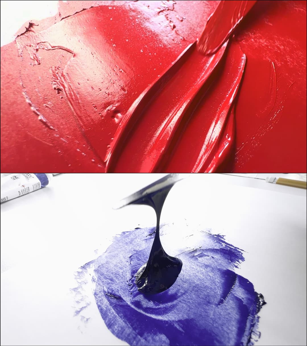
3) Layers, Oils, and Impasto
- Do you paint in layers? The type of oil (linseed, safflower, walnut, etc.) a brand uses may be very important. Oils have different drying times as well as other properties, and a couple of popular brands use oils which are known to have occasional drying problems.
All impasto painting can be a little risky, but some forms of oil are much more problematic in thick applications. Some impasto passages may have more bloom, chalking, alligatoring, or failure to dry completely.
Williamsburg is a brand that makes paint of varying consistencies according to the pigment. Cadmium Red is sculptural while Ultramarine Blue Deep is long and flowing.
4) Archival Issues and 5) Health Intolerances
How much do archival considerations matter? Some brands use a lot of fillers, additives, stabilizers, driers, etc. Others may use zinc oxide in blends, which some painters stringently avoid.
Do you have any health intolerances to solvents or certain oils? While many important pigments are toxic, some brands also formulate their paints with solvents.
Unfortunately, brands seem to be quite protective of their recipes and do not tend to disclose solvents on the tube.
Furthermore, sometimes painters who have an allergy to a certain kind of oil. In this case, the paint's binding oil is very important.
6) Tinting Strength
- How much does tinting strength matter? One test painters like to do involves seeing how much pigment is actually in the paint. Pigment tends to be one of the most expensive ingredients, and so paintmakers occasionally skimp on the pigment. For each pigment there is an upper limit to how much pigment the paint can hold. The tinting strength can be roughly gauged using a tinting test where a paint is mixed in a fixed ratio with white.
Each pigment should be individually evaluated for tinting strength. However, there are some patterns which could be said to apply across the brand as a whole (generally high or generally low). Artist brands and high end Luxury brands tend to have high pigment loads, while student brands tend to be much lower. Paintmakers differ widely when it comes to the tinting strength of their colors.
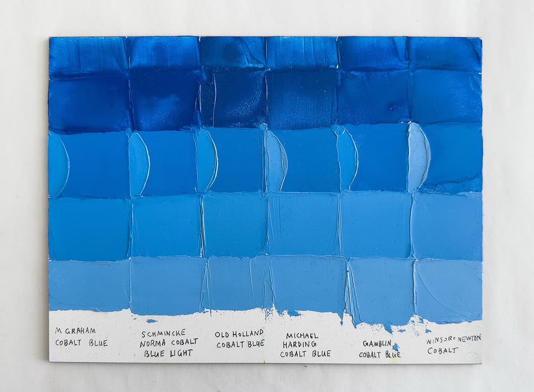
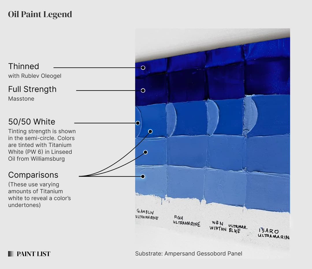
For more costly pigments such as genuine cobalt blue, PB28, differences in tinting strength matter even more than usual. The 'C' shaped strokes represent 50-50 mixes (the squares show undertone with varying ratios). Left to right M Graham, Schmincke Norma, Old Holland, Michael Harding, Gamblin, and Winsor and Newton Artist
Among premium and mid-tier brands, for some pigments, the tinting strength is pretty comparable. For these colors it may be even more important to focus on the consistency. For some reason when we painted with the Vasari Ultramarine blue, it seemed like it lacked a bit of tinting strength. However in the tests this difference was very subtle.
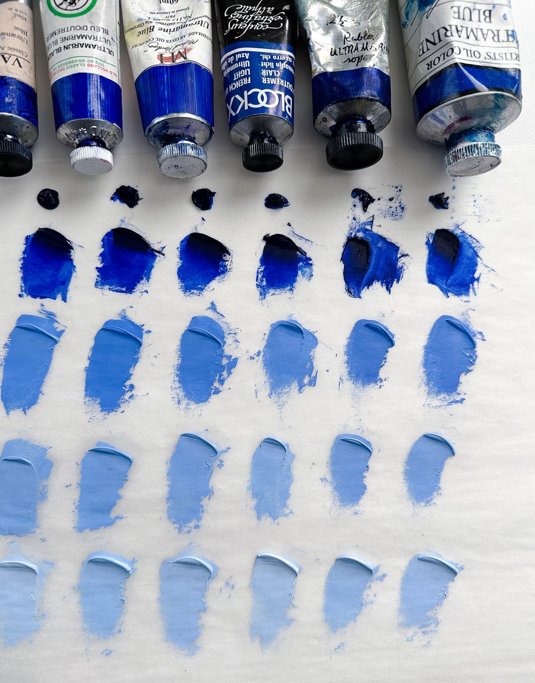
In some cases, tinting strength differences can be subtle. All of these Ultramarines are pretty strong tinters, however differences this small may actually be noticeable in practice
Cross Brand Reviews
We measure tinting strength in the little C-shaped swatches on our cross-brand review panels. These can be found in our articles section.
7) Overall Aesthetic
- Does the brand's aesthetic appeal to you? Are you a professional painter who is interested in quality paint? Do you want a palette others would envy? Or are you budget-minded?
Ok, so we said earlier that we were trying to cut through the brand mythology. But at the end of the day, the overall charm, beauty, myth, wonder, and beautiful packaging of a brand may be worth it to you. We know we love the brands that go the extra mile to make the experience beautiful.
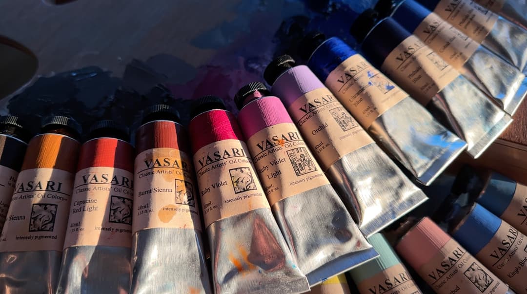
"This paint is so buttery."
When reading online reviews, it sounds like every paint is so "buttery." So "creamy."
These descriptors don't tell a person a whole lot about whether a person would want to choose one brand over another. After painting with a lot of different paint brands, one could say they are buttery in different ways.
We've got to say that more butter is not always better. This is a longer discussion for another day, but sometimes that buttery feeling can come at a cost to the long-term stability of the paint film.
.jpg&w=1080&q=75)
Multiple brands were mixed together to create these buttery mixes. There are almost as many kinds of 'buttery' as there are brands
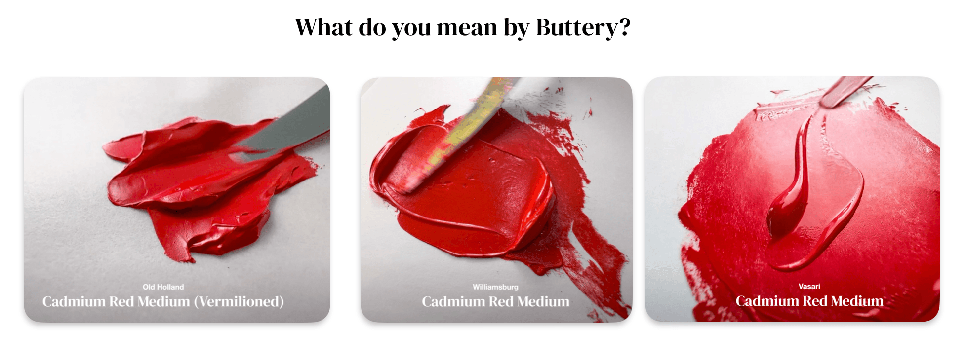
Stiff peanut butter? Buttercream? Or Melted Butter? Old Holland, Williamsburg and Vasari are all "buttery" but they are very different in feel
Consistency can be modified
We think of a tube of paint as having the medium already baked in. The paintmaker is making choices in how they formulate the paint, which result in its native consistency out of the tube. A person can fight against the nature of the paint by adding their own medium, but things get more complex at that point. Instead of fighting the consistency constantly, a painter can opt to start with paint that is already the way they like it. However there is no guarantee the way a paintmaker formulates their color is actually archival, as some studies of 20th century modern oil paints are beginning to show.
Many paint brands presuppose that painters will use medium to modify the paint. A medium can be many different things, such as turpentine, stand oil, linseed oil, oil gels, certain petroleum products, dammar, resins, balsams, copal... the list goes on. Some additives may affect the longterm archival stability of the paint.
Modern paintmakers think about how to help the paint remain shelf stable in the tube. However these stabilizers and additives sometimes come at a cost, and there are actual archival considerations to every choice that is made.
General Categories for Paint Consistency
Peanut Butter, Buttercream, Whipped Cream, Melted Butter
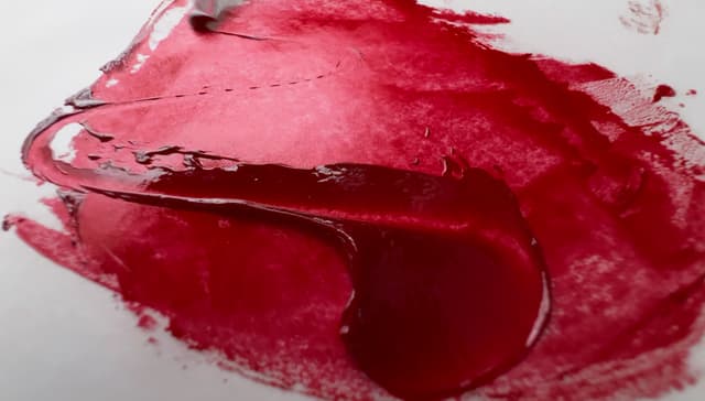
At least four different kinds of 'buttery' Once upon a time we thought of buttery-ness in paints in terms of butter temperature (cold to warm). Now we find it's more helpful to instead think of paint consistency in terms of analogies to other food types (though please never eat your paint). Think of a stiff jar of smooth peanut butter, now imagine the sculpted whipped topping of a buttercream cupcake with its dense creaminess and slightly ragged edge. Now imagine pillows of slouching white whipped cream, and now, yellow table butter on a warm day. Last but not least imagine how slippery completely melted butter can be. As a quick aside, more 'butter' is not always better. Sometimes the additives that make a paint feel more "buttery" can have adverse effects down the road, but that goes beyond the scope of this article.
It's extremely difficult to describe consistency, as the feel of a paint is experienced kinetically, but there are also visual clues to paint behavior which you can learn to identify.
So all three of these paint brands are buttery, but completely different experiences. Old Holland is stiff and feels more like smooth peanut butter, Williamsburg has a medium spreadability a lot of body and buttercream feel, while Vasari can have a light whipped cream feel or in some colors, it can be as gliding as melted butter.
Consistency often varies by pigment We'll try to give a sense of the overall viscosity, which is the feeling when paint is pulled with the palette knife. This quality usually varies from color to color as each pigment has its own natural quality in oil. Some pigments form a paint with a lot of body, and other pigments are notoriously tricky, so paint manufacturers may modify each color to create their take on it.
Let's take a look at three of our buttery categories just to get the lay of the land.
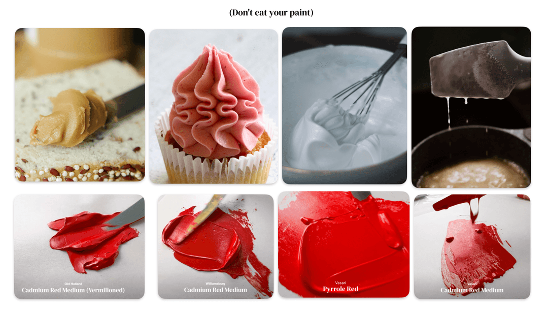
At least four different kinds of buttery. Peanut Butter, Buttercream, Soft Whipped Cream, or Melted Butter. Despite the culinary metaphors, please never eat your paint. Culinary photo credits via Pexels from Towfiqu Barbhuiya, Jess Bailey Design, Nadezhda Moryak, and Katia Miasoed
Similar colors, different consistencies
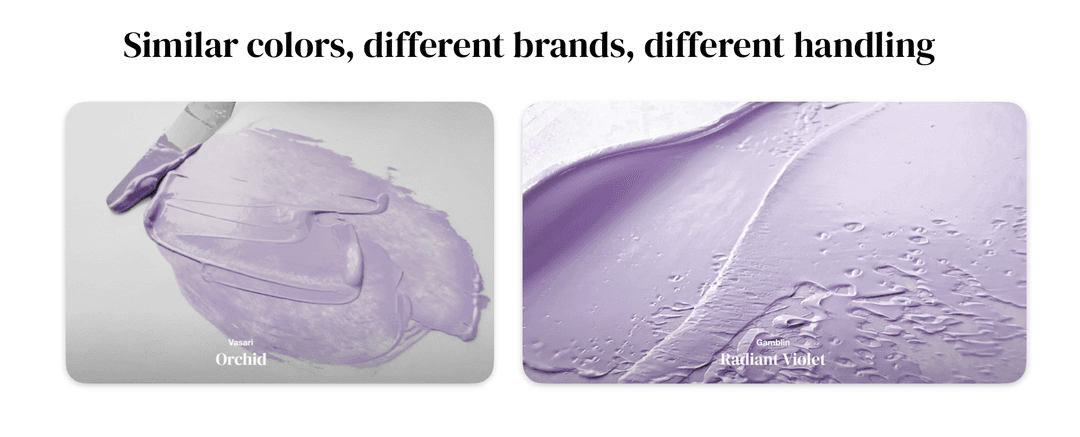
Gamblin is known for their thick paints (with a few exceptions). If a person wants a thinner version, they could dilute the Gamblin kind, but it might just be better to buy a similar color in a more flowing brand, such as Vasari.
On the flip side, if a person is painting with Vasari and wants thicker impasto passages, they could modify the paint with chalk or something else, but perhaps they would be more satisfied by a thicker paint brand such as Gamblin.
Similar colors, different brands, different consistencies.
1. Stiff but Buttery Consistency - Peanut Butter
Old Holland
Old Holland is a great example of a brand that's thick and stiff but is also really enjoyable to move around the palette.
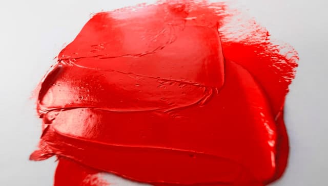
Here's a few descriptors of Old Holland's Cadmium Red:
-Stiff -Cuts with a knife -Sculpted Dimensionality -Chiseled edges -Doesn't want to spread -Holds peaks -Keeps to itself -Similar to peanut butter
Bear in mind there are some stiff paints which are not buttery and feel dry instead. These may for example contain too much chalk (calcium carbonate) or have other issues.
Brands that tend to be stiff but buttery: Old Holland, some Gamblin, some Williamsburg.
This does not include student brands, such as Winton, which have a totally different consistency while still being stiff. Some student brands achieve stiffness through chalk or other additives.
Stiff impasto paint is the hallmark of Old Holland Oil colors. These could still be said to be buttery, but the consistency is similar to smooth peanut butter. Here Old Holland's Cadmium Red Medium (Vermilioned) shows sculptural edges which hold their form
Stiffness in several forms - Gel-like and Drier Impastos
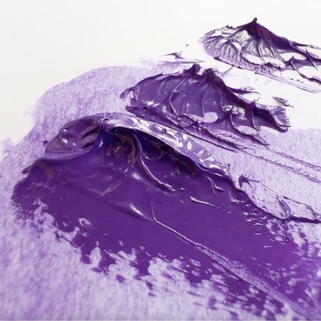
Gamblin is one of those brands that has some variety in textures, so its hard to generalize, but in working with their paint we've noticed some impasto colors have a gel-like consistency (such as Gamblin's phthalos, dioxazines, etc.) while others have almost a clay-like impasto, which could be described as drier or more brick-like, and less buttery in feel.
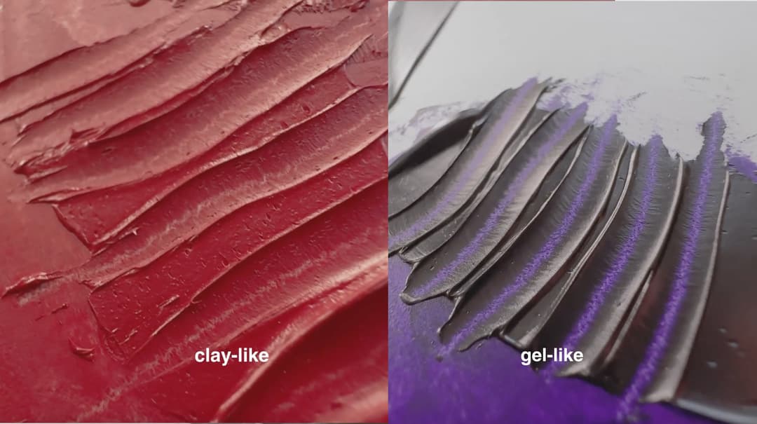
Gamblin Cadmium Red Deep has a claylike feel while Gamblin Dioxazine Violet has a gel-like consistency
Stiff impasto can also be drier
Some Gamblin colors are a clay-like impasto


2. Medium viscosity - Buttercream Variety
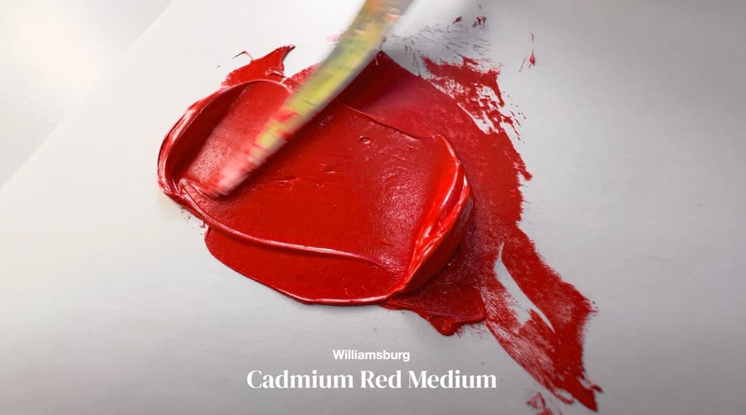
Williamsburg Cadmiums
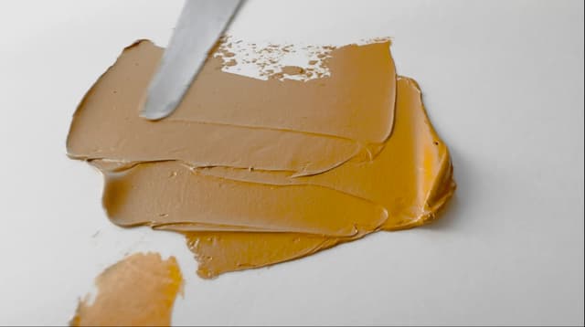
The next somewhat stiff buttery category has a lot of variety. As a brand, Williamsburg has a lot of internal variation (some colors are stiff and others flowing according to the pigment), but many of their colors such as this Cadmium Red or their Titanium White have something like a buttercream consistency.
Buttercream-feeling paints could be said to have these characteristics:
-Medium Stiffness -Paint has a lot of body -Gathers to a bulge -Gently rounded edges -Medium spreadability -Buttercream look
Brands with a buttercream feel: Some Williamsburg.
There are more variations in the medium category-- for example Michael Harding, which has a consistency of its own.
Other Mid-Consistency brands: Middle consistencies vary tremendously, so each one of these will handle differently. While not buttercream, middle choices include some Michael Harding, Some Charvin, maybe a few Winsor and Newton Artist colors, and a few Gamblin Artist colors.
3. Light Whipped Cream
There are a number of consistencies in what could be considered the middle of the gradient. When we think of the whipped cream consistency, this applies to paints that are oddly light in one's hand, but may still be strongly pigmented. These light, fluffy colors glide well, but aren't drippy.
-Easy to spread without medium -Good brushability -Not recommended for impasto -Edges are rounded -Light airy feel
Brands with a light consistency: Many Rembrandt colors, many Charvin Extra-Fine, one Gamblin (Radiant White), Some M Graham, some Blockx, some Vasari. Of course each one of these is different in feel.
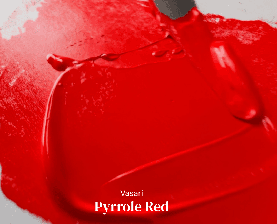
Most Vasari colors have a light consistency, and some Vasari colors are not quite as loose as others.
4. Flowing - Melted Butter
There are a lot of paints between medium and flowing--somewhere between dollops of whipped cream and melted butter.
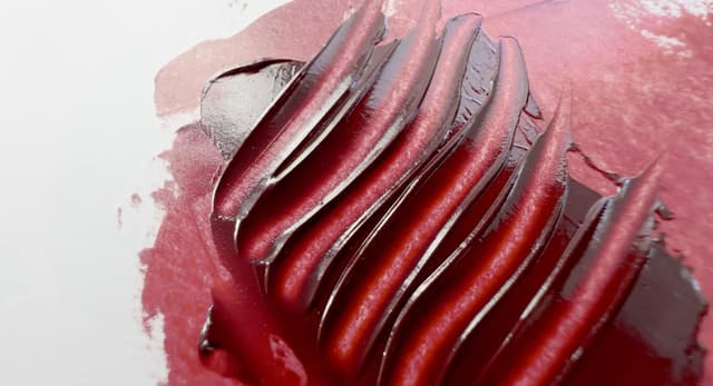
This particular Cadmium Red by Vasari is one of the most flowing genuine Cadmium Reds we've seen. Here are a few of its characteristics:
-Super flowing -Tendency to flatten -Paint is almost drippy -Edges are rounded, melting -Outstanding spreadability -Melted butter look -Will drip off of palette knife
Brands with a dripping consistency: Many Vasari, some Rublev.
Note of caution on Student Brands: When considering flowing paints, their covering power becomes quite important. Professional brands like Vasari and Rublev have paints which are both flowing and highly pigmented. In contrast, some student brands make very flowing paint which has terrible coverage and poor tinting strength.
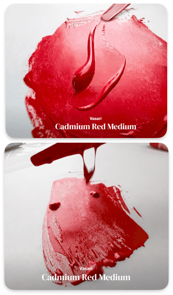
Flowing Paint
Sometimes, it's nice to have paint that is brushable right out of the tube. We paint with a variety of textures, but for certain thinner appliations having flowing, hihgly-pigmented paint saves a step. This Vasari paint comes out of the tube with a bit of oil, and when mixed together it is at a nice conistency for brushability. Normally we'd have to add oil or medium to get another color to behave like this. However if a person is accustomed to painting with thicker paints the transition is an adjustment.
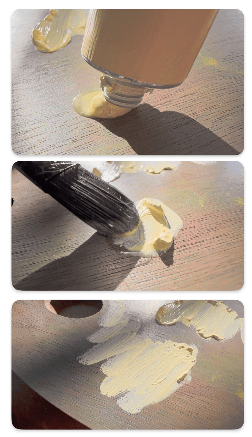
Managing Oil separation
Some flowing paints such as Vasari have natural oil separation. We've heard that in high end brands that (allegedly) don't use additives, the separation isn't a bad thing.
Some student brands and mid-tier brands do have separation (plus a lot of additives) so just the fact the paint separates isn't a good indicator of what a paintmaker is using or not using in the paint.
Either way, separation is pretty easy to deal with. Simply put the paint on some paper or something else to blot the oil (take care not to create an oily rag situation as that can be flammable). We've also heard it helps to store tubes cap-down.
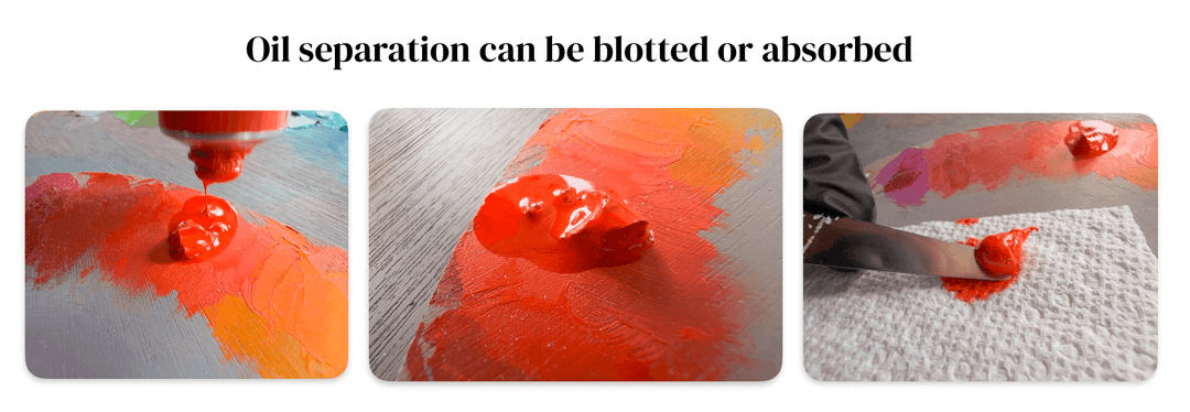
Vasari is a flowing paint that sometimes has some separation. Sometimes a person may wish to mix the oil back in, but other times it's best to let it absorb out and replace the daub on the palette
Similar pigments, different consistencies

Some tell-tale signs of consistency differences
Two different brands have two different interpretations of the same pigment. It's amazing that two paints which share PB29 (Ultramarine Blue) as a pigment have such totally different consistencies right out of the tube.
Old Holland lends itself to thick applications which need a bit of medium to be brushable, while Vasari is very loose and super spreadable without adding any medium.
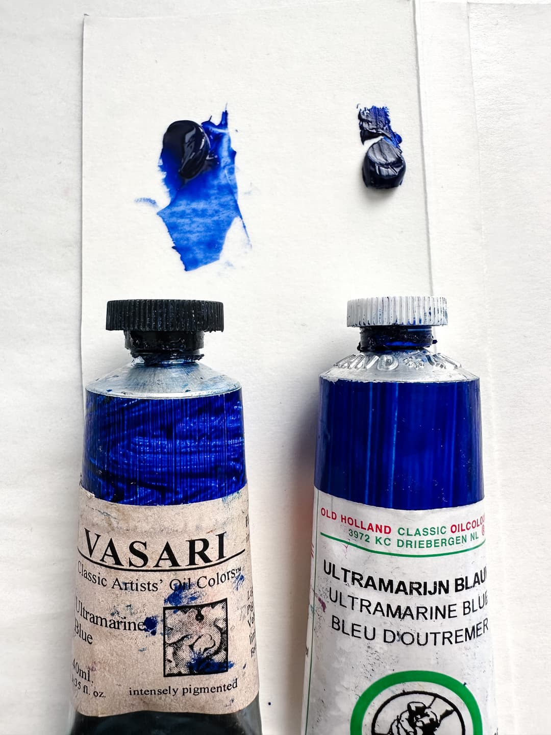
Differences in paint behavior out of the tube
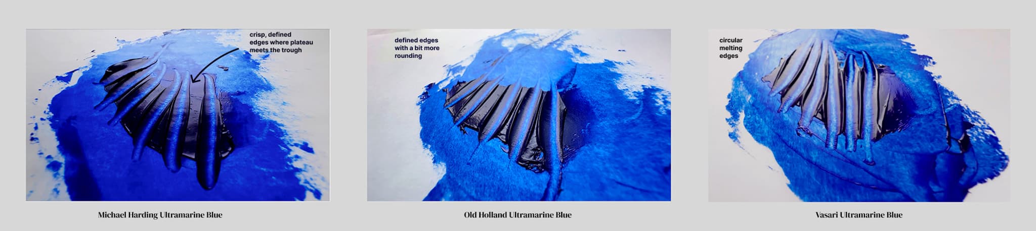
While each paint may be modified, it's kindof nice to know how it behaves so that you don't have to fight the formulation
Nobody knows what's in the paint!
A painter's terrible problem
Unfortunately, no one knows precisely how various brands formulate their paints. It is pretty common for paint brands to say that they only use pure pigment and oil. However, not all pigments are equally easy to make into oil paints, and some pigments seem to need a little more than pigment and oil to behave like a modern oil paint. However, serious concerns have emerged about the role of modern additives (from things added to make the paint shelf-stable in the tube to things which give it a 'buttery' quality).
Before we lambast additives, let's just say they are not all equal, and they are not all bad-- they do affect paint films differently over time though.
However, artists are in the dark when it comes to knowing what's in their materials. From both a health and safety standpoint the lack of disclosure is problematic (we'd like to know what is in them) as well as from a material standpoint, since some of the additives, fillers, and stabilizers have long-term drawbacks.
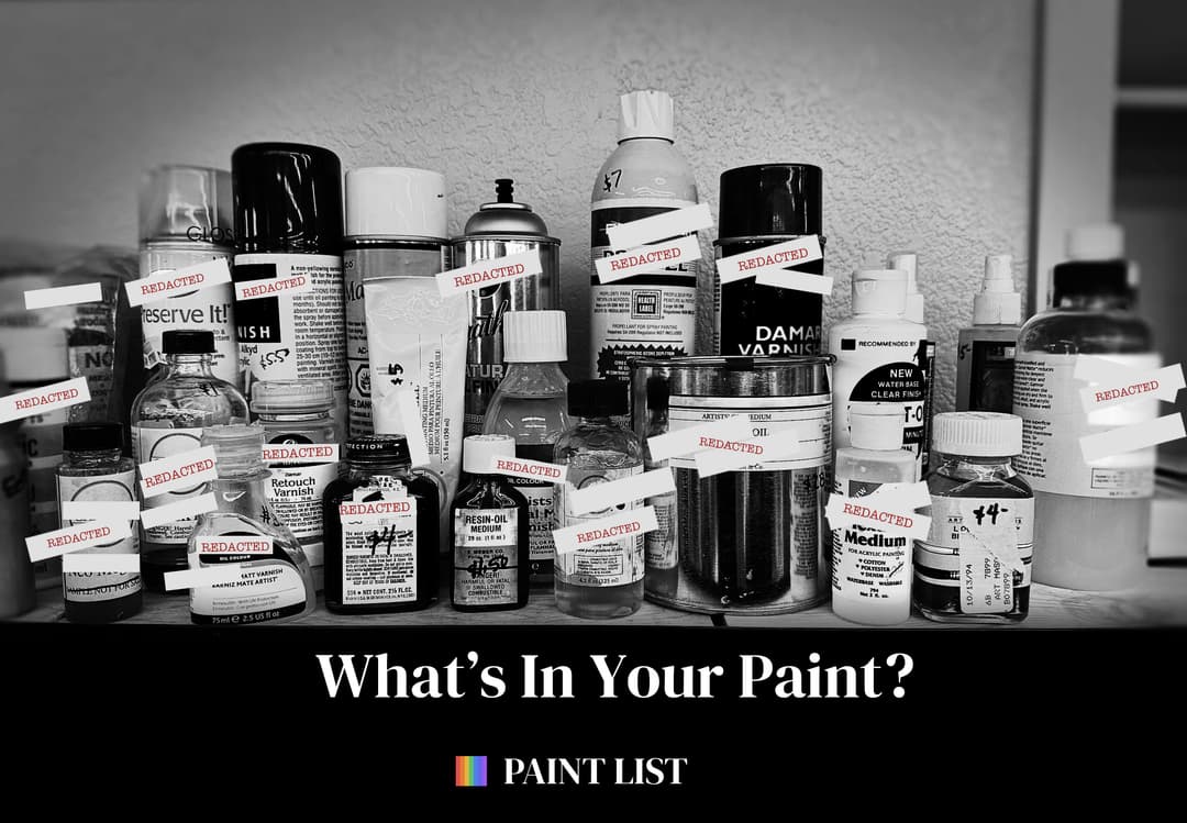
The number of potential undisclosed ingredients in a paint is very long. Unfortunately artists are in the dark about what is really in their paints.
'Only the Finest Ingredients' and other Fairytales
Most brands will tell you they only use the finest ingredients (maybe true), same with the triple role mill (we'd hope so) and that they use no additives (rarely true).
The common refrain of 'just pigment and oil,' sometimes strikes one as a little odd when it feels like the paint behaves in a different way. We can only guess, but it seems some paint brands try to get around the word "additives" by reclassifying a substance as a "stabilizer." Stabilizers often go unmentioned. Another major issue are those fillers-- which should be disclosed but perhaps could be said to be clear "pigments" which are not on the label, such as chalk, barite/barium sulfate, or aluminum hydroxide.
So while we wish we could put together a brand description based on what is in the paints, that information is not well known. Solvents (which can cause health issues), varnishes (which may interfere with conservation down the road), and aluminum stearate (which can cause bloom and also has been linked to later paint film problems) all may lurk in modern oil paints.
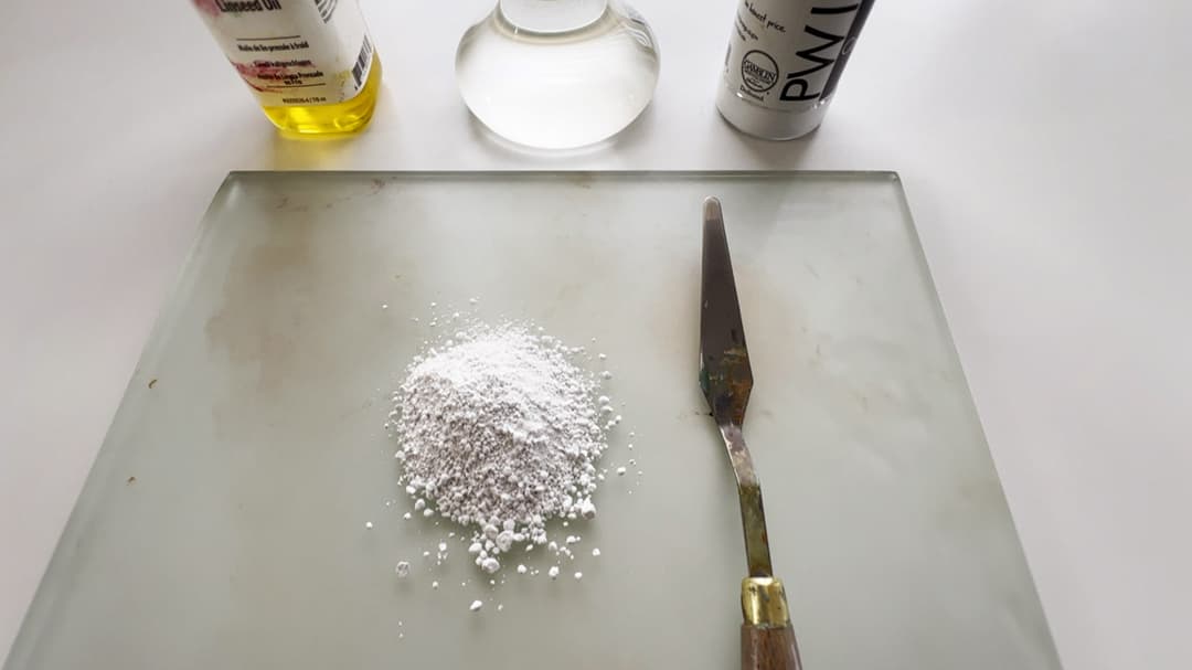
Chalk, made of Calcium Carbonate, or PW18, is a common undisclosed additive
Paints may be made with a lot of undisclosed ingredients
We truly don't know what is in most brands' paint. We've had formulators tell us there is nothing but 'pigment and oil' and that they 'don't have additives' when their colors are known to contain various waxes or modified oils. We're here to paint, and do not wish to engage in semantics with paintmakers, but if you have ever made your own paints before, it's pretty clear when there's a difference. We're not experts in formulation, so we can't field those kinds of questions, but let's just say there is sometimes a lot of ingredients in a tube of oil paint sometimes.
Each pigment has its own oil requirements (ratio of pigment to oil by volume), and each pigment has its own native upper limit for tinting strength. Getting to know pigments will help a person to evaluate the tinting strength of their paints. It will also become more clear when fillers are used excessively.
This diagram is inspired by the 1970 Artist's Handbook by Mayer. In his book, he shows some common ratios-- the illustration depicts an extreme showing some of the wild ingredients a person might find. Typically student grade paints have more extenders and possibly cheaper pigments and oils.
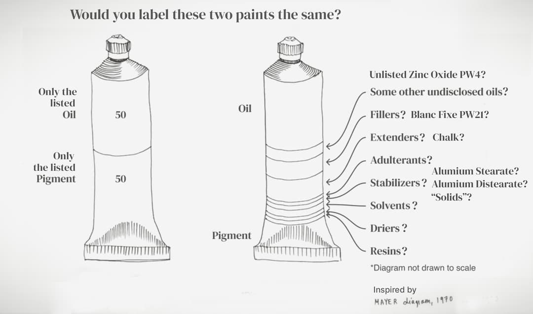
The image on the left is how most painters imagine their paints are made. The image on the right showing many additives, solvents, stabilizers, and extenders may be closer to the reality. Thankfully, reputable brands will list the pigments in their paints. Unfortunately many brands still consider the long list of other ingredients to be a trade secret.
Experimenting with Oil Paint Modifiers
Even though they don't tend to disclose the all the additives and ingredients (and they would love you to believe they do not add any), brands signal their philosophy in many ways-- such as the overall viscosity, and trends in whether they use genuine pigments in their colors or substitutes.
Perhaps one of the core problems for painters is that brands do not disclose enough of their ingredients. Painters have had to fight long and hard to get brands to disclose pigments, but we generally are not told which other things go into their paints to make them behave as they do. Painters are left with telling anecdotal stories and trying to describe how paint handles on the palette -- as well as afterward on the painting.
Experimenting with modifiers helps a person to make educated guesses about the kinds of additives which are used by their favorite brands. We wish paintmakers would be more transparent about their materials.
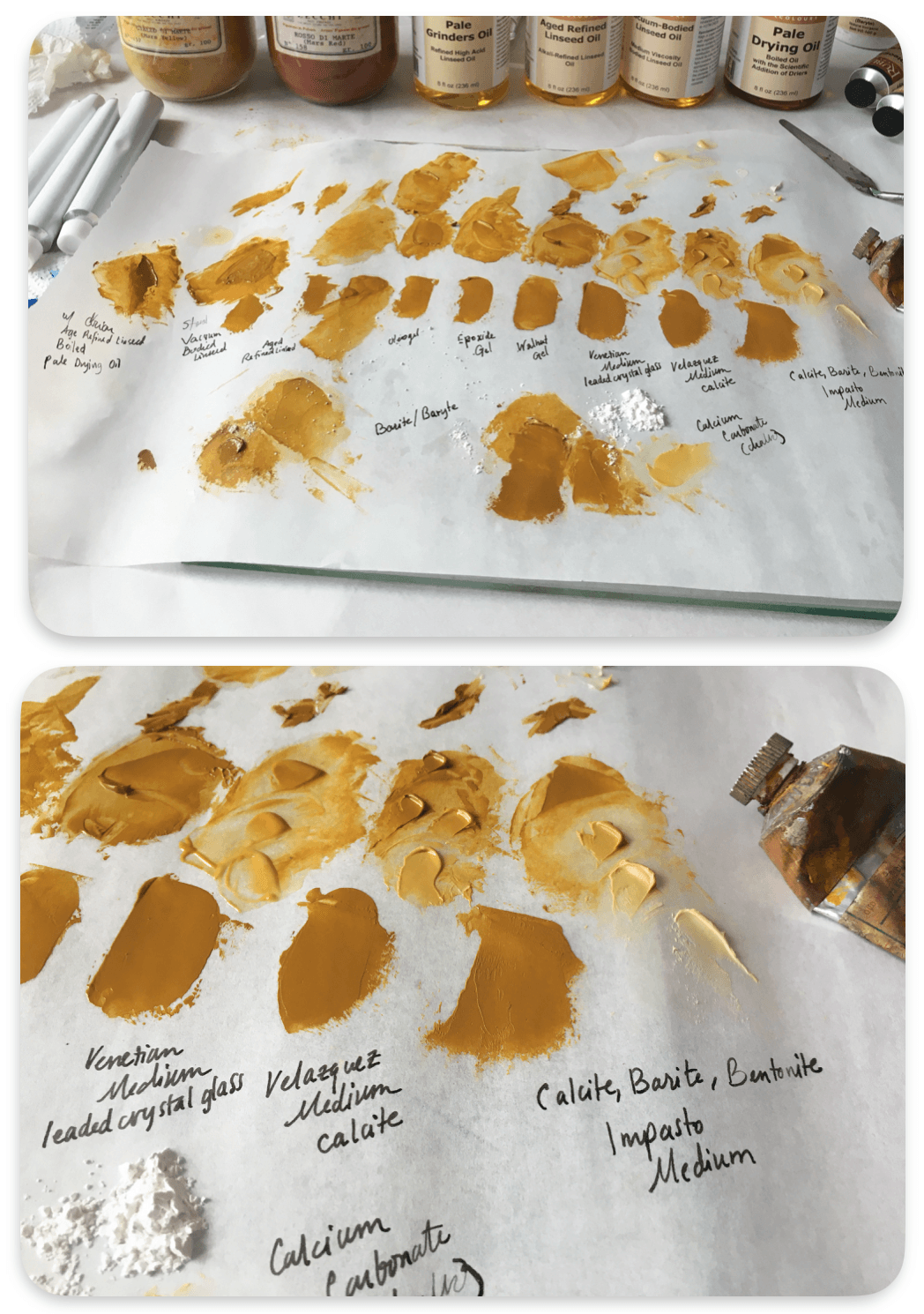
The corporate buyout
It's an odd feature of artist-life that the brand a person loved ten years ago may have completely changed since that time. Corporate buyouts, or even a new CEO that eyes a resume stating how much they "cut costs" or "eliminated needless spending" by cutting colors or compromising on quality can trigger terrible long-term changes in the brand that devastate the paint line over time.
On the archival side, it can also take some time for certain problems with oil paint films to emerge, so it is vital for painters to share information with each other on how these paints behave in the long run. As painters we rely on each other to share information about brands.
This document is a living one that is likely to change. We've looked on as mega-conglomerates have overtaken paintmakers that really had something good going for them, or at least we remember the paint being better in the past and slowly stopped buying the paint.
An actual diversity of paint brands is good for artists and good for the market.

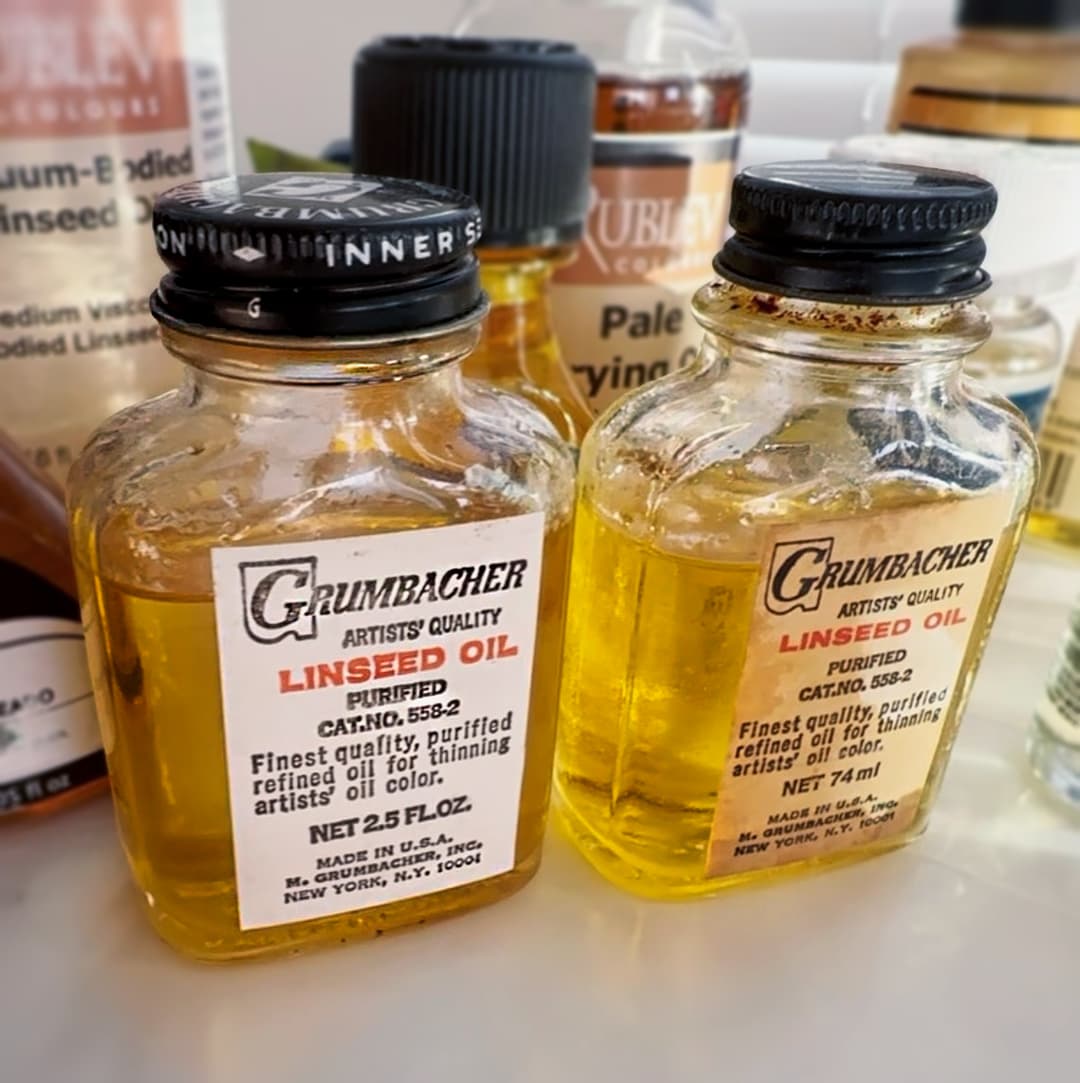
Paint brands change a lot over the decades. The older tubes of vintage Grumbacher Pretested paints behave differently from their modern counterparts. Sometimes the paint names stay the same but the paint itself changes as company decisions morph over time.
Let's Look at Brands - Pigment selection
Personally we love pigments and feel the more the merrier. Each brand has its own selection of pigments that they make into paints, and a wide range of single-pigment colors is one of the most important elements we look for next to tinting strength.
-Paint brands that offer quite a few single-pigment colors tend to signal that they are positioned with professional artists in mind. -Whether a brand chooses lightfastness pigments and avoids questionable pigments is a huge indicator. -Some boutique brands don’t win any prizes for most pigments, but they cover the bases, so this is not the only indicator we look for in a paintmaker.
- Among larger paintmakers, the variety of pigments is important. Williamsburg by Golden has really differentiated itself in this category. So has Michael Harding. Old Holland also stands out for having a wide array of single-pigment colors, while Wallace Seymour deserves a mention as a boutique manufacturer with a huge pigment selection.
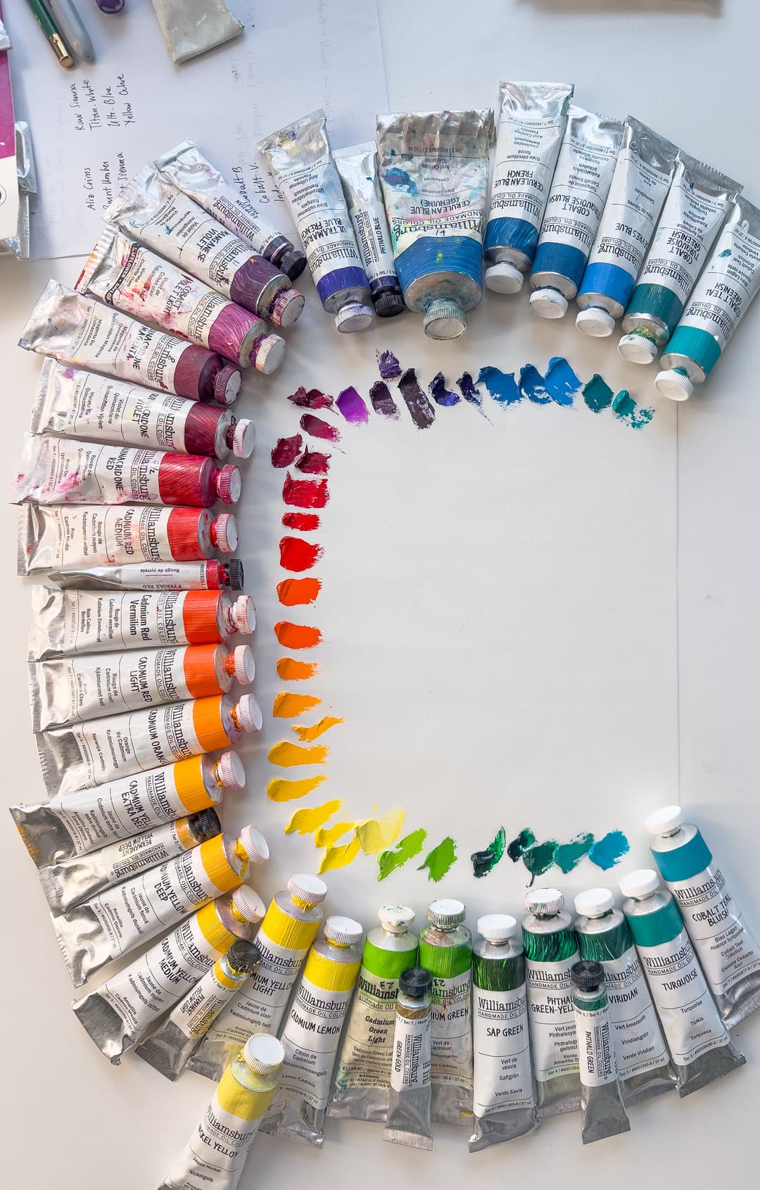
Williamsburg oils has a huge pigment selection. This is only a fraction of their colors
The zinc check
A brand's reaction to the news about zinc white also indicates quite a bit about their philosophy. Personally, we avoid zinc white PW4 as much as possible, but we know some painters who still seem to feel fine about using it, come what may. Some brands feel this way too and have continued to include it in their convenience blends. It's interesting to see how pervasive zinc oxide is in a paint line. Some questions we take a look at include: -How many colors still contain zinc, what percentage of the paint line still has it? -Is zinc mostly in the white paints, or is it in convenience color blends also?
All these are important questions regardless of how one feels about zinc white in oil painting. One thing to note is that some paint companies may indeed be using zinc oxide in their white or other paints, and may not be disclosing it on the label. So our tallies of colors which contain zinc only refer to tubes where zinc oxide (PW4) is listed.

When selecting a brand, the main thing to try to avoid is a failure of the paint, which should never happen but sometimes does happen-- it's buyer beware out there. Paint film problems can be due to a myriad of factors- everything from additives to things that have nothing to do with the paint, such as the substrate.
When it comes to evaluating a paint line, different paints are formulated for different tasks. We also all have different preferences and experiences. These reviews merely briefly summarize a few key points of our experience with paints without going in-depth, and we fully expect you to form your own experiences and opinions based on other sources for research. It should go without saying, but supplement this with your own exploration.

A vintage tube of zinc white. While it has been used historically, zinc white is associated with early embrittlement of oil paint films.
Brands discussed in this article
We took a look at some of the top artist paint lines we've used, and will possibly add more in the future:
Blockx Artists’ Oil (Huiles extra-fines) Charvin Gamblin Artist’s Oil Color Grumbacher Pre-tested Holbein Extra-Fine Artists' Oil Colors Isaro Oil Jack Richeson Shiva Series Lukas 1862 Oil Lukas Studio Oil M. Graham Maimeri Artisti Maimeri Classico Maimeri Puro Maimeri Terra Grezze Italia Michael Harding Natural Pigments Rublev Colours Artists Oil Colour Old Holland Rembrandt Talens RGH Artists’ Oil Paints, Inc. Robert Doak Schmincke Mussini Schmincke Norma Sennelier Artist Oil Color Utrecht Artists’ Oil Colors Vasari Weber Permalba Williamsburg Winsor and Newton Artist’s Oil Colours Winsor and Newton Winton Oil Colour (Student brand)
For all of the statistics listed below, the numbers of paint colors are approximate and based on the best information we have at this time. If you're a brand and you'd like us to update this page, please drop us a line through our contact form on the homepage.
Blockx
Famous for Poppyseed Oil
Blockx paint is gorgeous and we'd use it more liberally except we use poppy oil selectively. While Poppy Oil is its claim to fame, they have a handful of linseed oil paints too, which are excellent. Blockx tends to have a medium to soft amount of sculptability (think rounded edges) and yet is buttery and highly pigmented. It has a workable consistency as far as spreadability and some colors are almost bouncy. These paints are gemlike high tinters with a lot to love about them. If we weren't concerned about painting in poppy oil, we'd probably prefer Blockx for most colors. However, we are wary of poppyseed oil and use it carefully, reserving it for thin topmost-layer-only applications of blues and whites.
We've never met a Blockx color we didn't like, but watch out for zinc oxide in some of their blends. Once upon a time they made an enchanting historical yellow, which has since been discontinued.
Poppyseed Oil for most colors, but some are Linseed
Blockx is one of the few brands which has a significant amount of colors bound in poppyseed oil. Blockx offers a range of about 103 colors. However, not all of their colors are made with poppy oil.
Their "Series 1" colors (about 19 paints) are made with linseed oil, while the rest of the series are bound in poppyseed oil. We've enjoyed their linseed colors as much as the poppyseed ones, so if even if for the poppyseed averse, the Series 1 linseed oils may be fun to try.
Ranks exceptionally well for single-pigment colors The Blockx line has a better than average number of colors, and since a large percentage of those are single-pigment colors, the line is well stocked with interesting choices. The overall total number of paints, ~104 is interesting since more than 70% of the line is made from single-pigments. In terms of a ratio, three fourths of the paint line is made up of single-pigment colors (an estimated 75%), and in terms of sheer number of choices for single-pigment paints, Blockx is exceptional. They offer around 78-80 single-pigment colors. The number single pigments once earths are removed is still excellent. In terms of cadmiums, we appreciate that they offer a fine number of cadmium color choices.
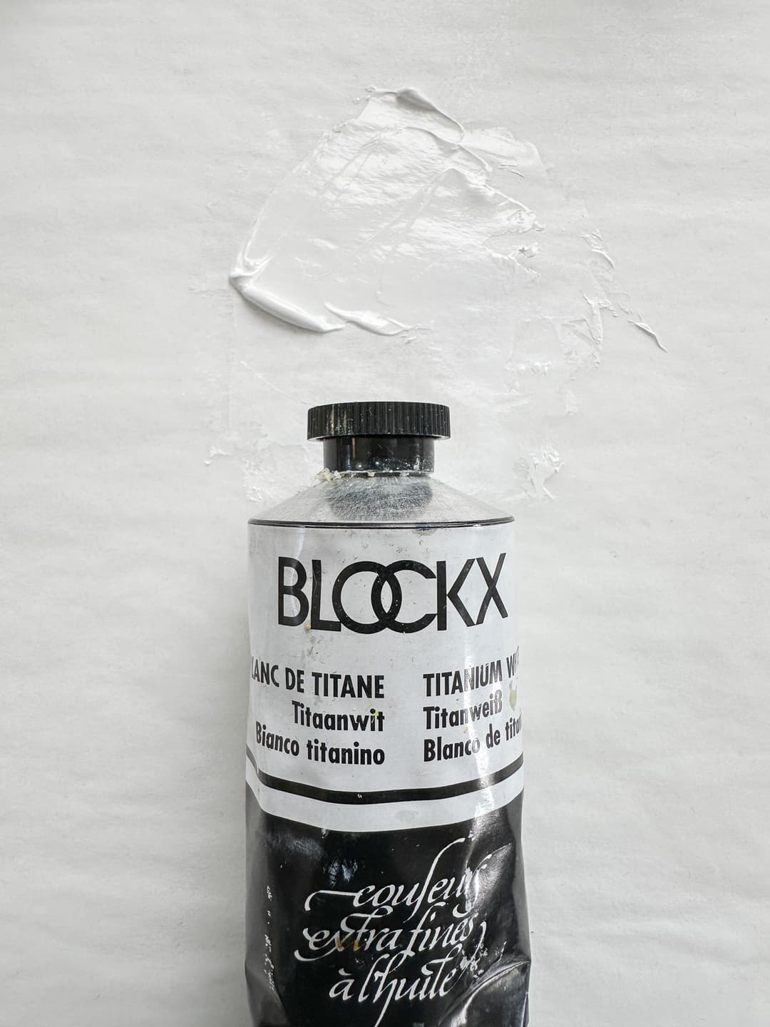
Blockx Titanium White is made of Poppyseed oil. This means less yellowing but poppyseed oil also has some drawbacks. Many painters may wish to use it judiciously in the top layer for a highlight or some other area that they wish to remain a brighter white.
Corporate Acquisition Blockx Artists' Oil Colors seems to have been acquired in 2012 by a large French conglomerate, and things shifted again in 2023. It is a little unclear, but it seems the family sold the business to the Exacompta Clairefontaine Group / Exaclair corporation. However, something may have shifted again, as in a 2023 annual report, Exacompta noted, "Blockx was liquidated following the transfer of its business activities to other Group companies," without much more detail.
Its history, which is less relevant after an acquisition, is that it was a family-owned company founded in 1865 by Jacques Blockx I in Belgium. Before the buyout, the company was passed down through five generations of the Blockx family, most recently with Jacques Blockx IV and his daughter Catherine Blockx (quoted from the Society of Figurative Arts site).
It sounds like the manufacturing facilities are still located in Belgium, but we do not know. We have noticed that our more recent queries about color charts have not been answered, and it seems like there is less communication overall. In the United States, Blockx products are distributed by Exaclair, Inc., located at 143 West 29th Street, Suite 1000, New York, NY 10001. (exaclairretailers.com)
May Contain Zinc Oxide in Blends Blockx is one of the premium continental brands that has still hung on to zinc white, and it is in 11 or so of their colors. Only one of those is a white paint, leaving 10 colors with PW4 baked into the blend.
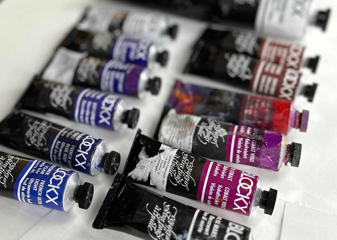
Blockx
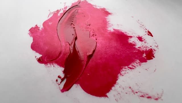
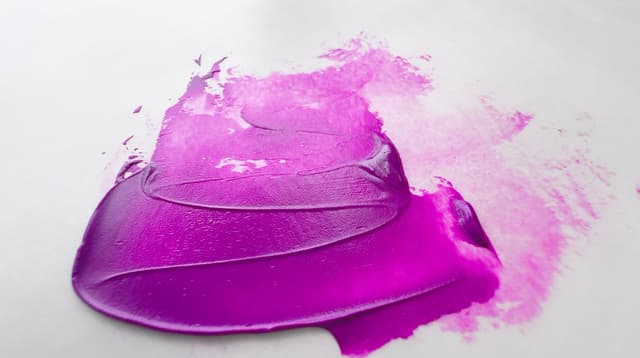
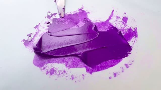
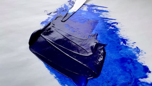
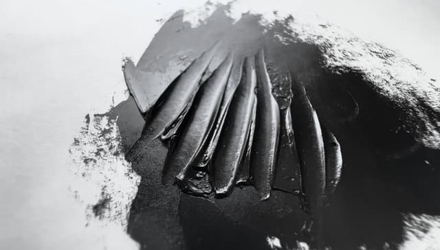
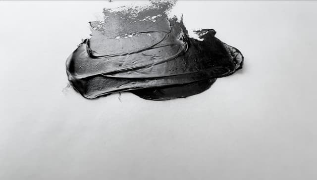
Blockx Paints
Some Blockx Paints We've Tried
Find Blockx Paints on Paint List
Charvin Extra Fine Oils
Tons of Convenience Blues and Greens
Charvin is brand from France that contains a dazzling array of colors and convenience blends. Charvin's great claim to fame is their enormous selection of convenience blends, particularly in the blues. If you're looking for a blue blend for a particular task and you don't want to mix it yourself, check out Charvin's line. They also offer an assortment of convenience greens that may be useful, as well as blends for every hue grouping. However, the paints do contain a blend of poppy oil and linseed oil.
As one of the largest, if not the largest, oil paint lines, they offer 218 colors. Charvin makes two lines, which are somewhat similarly named-- the Extra Fine, and the Super Fine. The Extra-Fine Oils are the artist-level paints, which are discussed here, while their other line, Super-Fine, is closer to a student brand.
There can be a bit of confusion between online listings in English and the paint names in French. We've done our best to sort out the French names and the English translations, so just be prepared to run into a bit of choppy water on that front from time to time.
We don't have very high confidence about which Charvin paints are single-pigment colors, since some of their colors are listed as only one pigment, and yet they are pastel (where the coloring pigment listed is not pastel) so there is not a high certainty whether all the pigments are listed, and we have reached out to them about this. When we inquired about this, we were directed back to the brochure.
We can say that Charvin seems to specialize in convenience blends as they have a large number of pre-mixed colors. Since the brochure left us with some uncertainty, it's hard to say much for sure about the ratio of single-pigments to blends, but based on the brochure, Charvin Extra-Fine seems to have an above average number of single pigments in the brand.
In terms of cadmiums, we appreciate that they offer a good amount of cadmium color choices. Sometimes it is not clear whether some of their colors are mixed with an undisclosed white pigment.
In regard to oil, the inclusion of poppyseed oil may be of concern to some painters.
At least four Charvin Extra-Fine white colors contain zinc, but unfortunately we were not able to ascertain whether more of their pastel colors may contain zinc white. A communication from Charvin was just a little unclear as to whether it is used elsewhere in the paint line.

Charvin specializes in convenience blends, especially in the blue and green ranges, such as this Charvin Light St. Remy Green
Search for Charvin Extra-Fine Oils
The artist quality tier of Charvin
Gamblin Artist Oils
A review video showing some Gamblin colors
Gamblin Artist’s Oil Color
Mostly impasto with some variety
Gamblin is an American paint company based in Oregon, and has two lines of paint, the Artist’s Oil Color and the 1980 line.
This is about their Artist-level line, which contains around 105 colors. Gamblin paints vary in consistency, but overall the paint line tends to be very thick. Even amongst the cadmiums there are a handful of consistencies with a few very thick examples like their Cadmium Red Deep. We've used a lot of Gamblin paint over the years. When we think of Gamblin we think of how thick some of the colors are. There are some with a really tough almost claylike thickness as well as others (like the Phthalo Green) which have a distinctive gel-like quality. Once we saw it we couldn't "un-see" it. The feel of the impasto in Gamblin feels different than other thick brands, such of Old Holland.
One may still need to watch out for some zinc white in the paint line, especially in whites and greys.
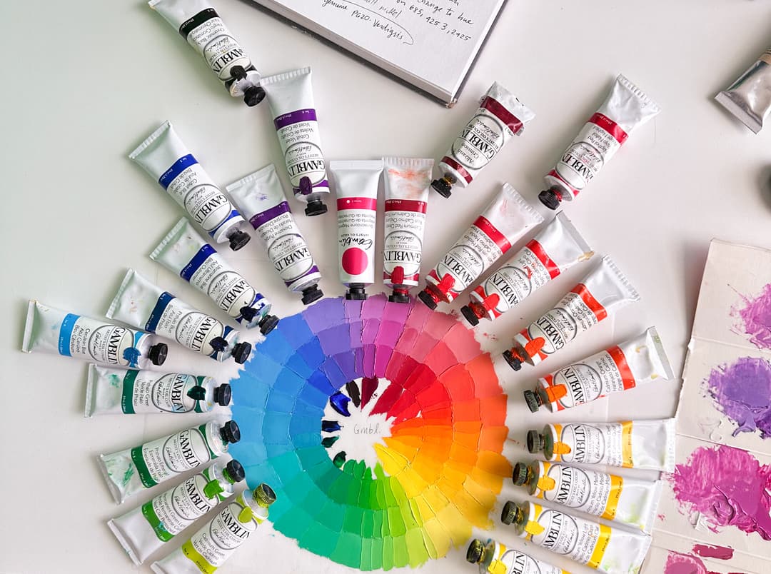
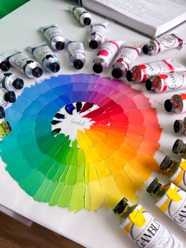
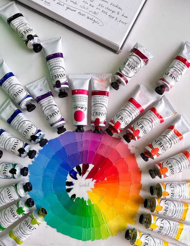
We don't know for sure as far as the paint's secret ingredients (true for everyone), so can only conjecture. The tinting strength of Gamblin tends to be decent but not outstanding in several expensive colors. We show a few Gamblin comparison panels in our video.
In addition to their main colors, they also offer 3 Reclaimed Earth colors, and their famous Torrit Grey, which is a mashup of all of the other colors.
Gamblin's Artist line has an above-average total number of paints. The overall number of paints, about 105, is not outstanding, but it is above the average compared to other artist lines. In terms of a ratio of single-pigments to blends, a little over half of the paint line is made from single-pigments. In terms of sheer number of choices for single-pigment paints, Gamblin Artists' Oil Colors is above average with around 60 single-pigment colors.
While we like Gamblin, we reached out to them about the new lightfastness standard. For whatever reasons, Gamblin didn't wish to participate in the making of the new standard, which seemed like an indicator of less interest in lightfastness testing overall. In short, the choice of mixing white affects pigments lightfastness-- a vital area of emerging research for artists, and Gamblin didn't end up participating when a third testing partner was needed.
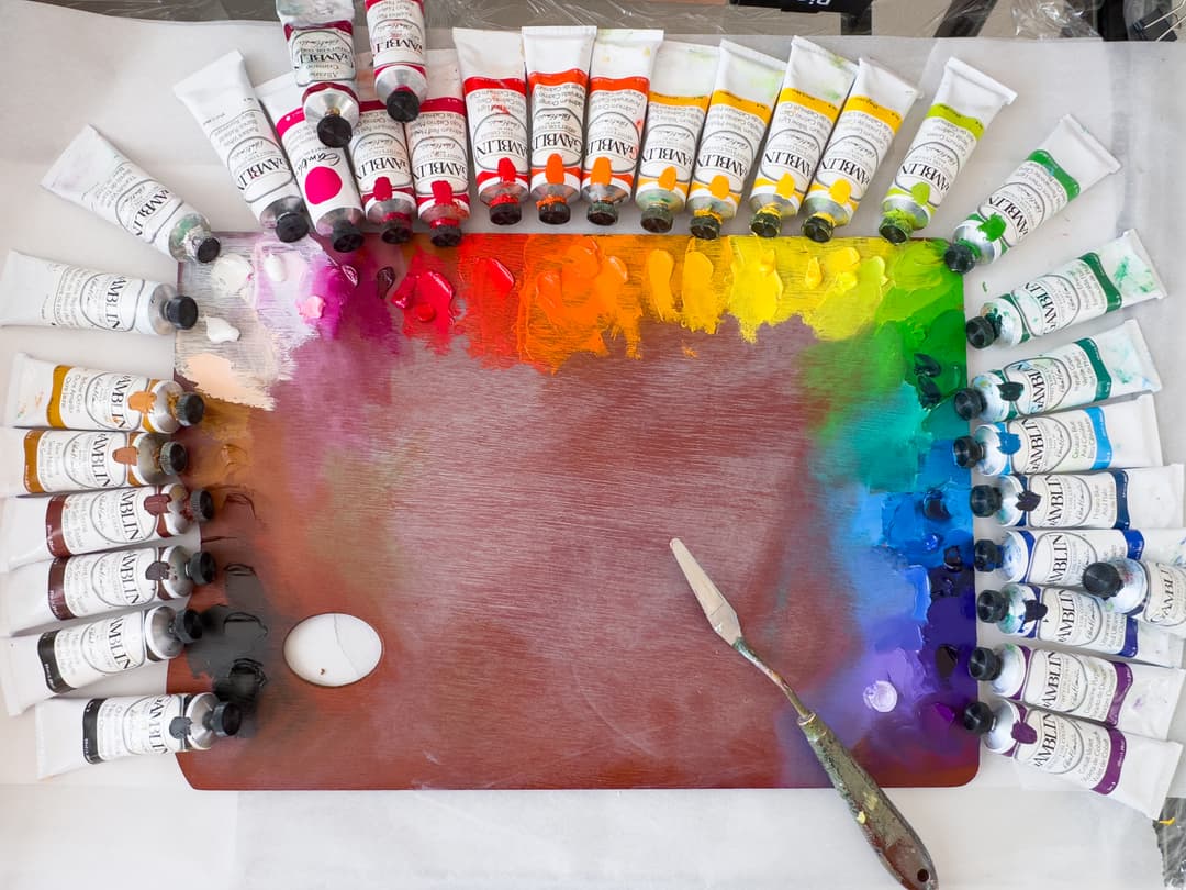
The single pigments once earths are removed are excellent. In terms of cadmiums, there's a nice range of cadmium color choices, however the consistency varies widely between the cadmiums. Cadmium Red Deep was surprisingly thick, while Cadmium Yellow Light was a much softer, more ribbon-like consistency. Some of the cadmiums have a light or matte quality when dried. Several of the cadmium yellows are the PY37 type of cadmium yellow pigment (cadmium yellows may be PY35 or PY37).
Watch out for zinc in whitish and greyish colors Gamblin Artist's line still contains zinc white (~7 colors). A handful of their whitish convenience blends do still contain zinc white, PW4, as of spring of 2026. Several of their well-known convenience grey blends do too.
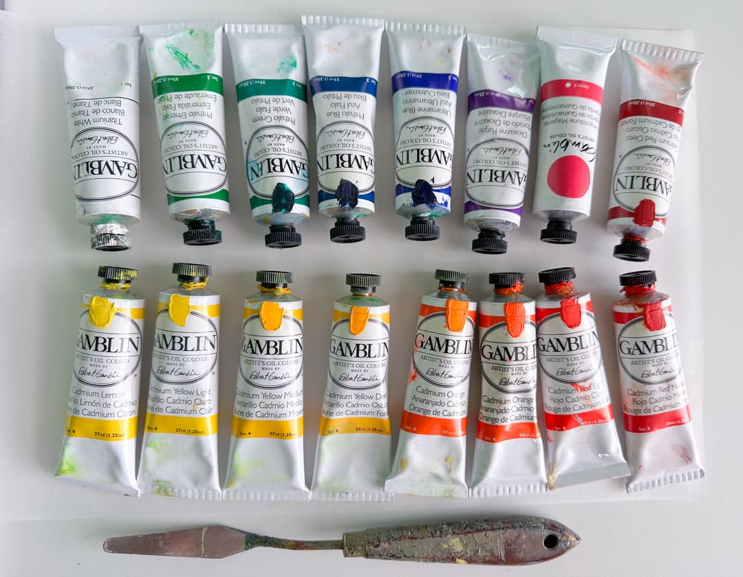
Gamblin- Generally Thick, with a Variety of Consistencies
Gamblin paints tend overall to be formulated to be thickly, and lend themselves to plein air, alla prima, and other impasto applications. However, not every color is equally thick. The way the paint behaves when the palette knife is pulled up reveals slight differences from color to color. One of the Cadmium Oranges is more stringy and the peaks fall, while one of the Cadmium Yellows forms crisp peaks which linger and hold a point.
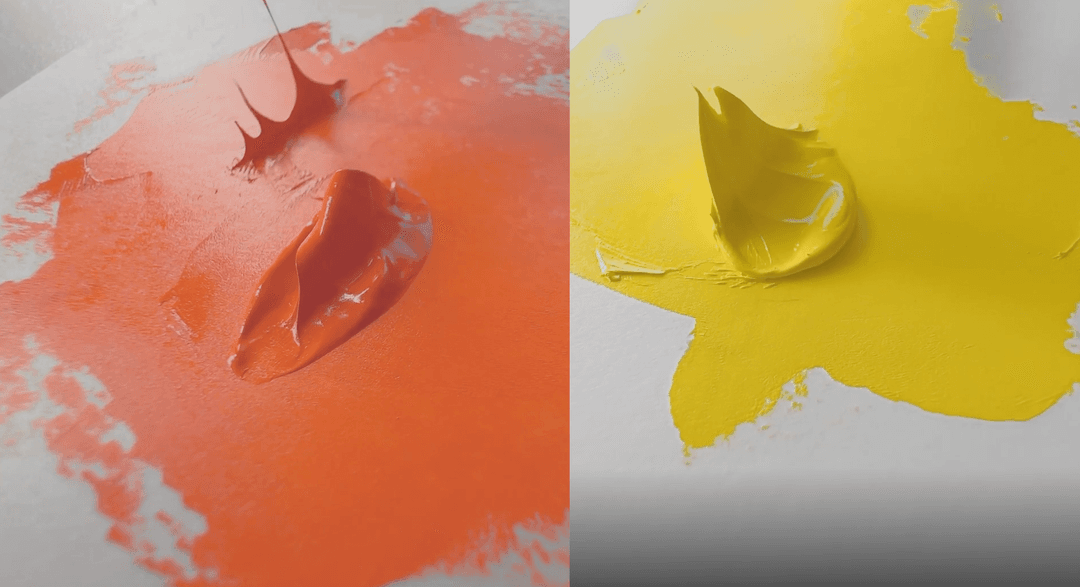
While generally on the thick or stiff side, a few Gamblin Artist colors are softer. This Cadmium Orange forms falling peaks and is also stringy, while the Cadmium Yellow on the right holds a stiff peak with points
Gamblin- New Labels
Somewhere around 2023-2024, Gamblin rolled out some new labels. There were a small collection of quiet formulation changes as well.
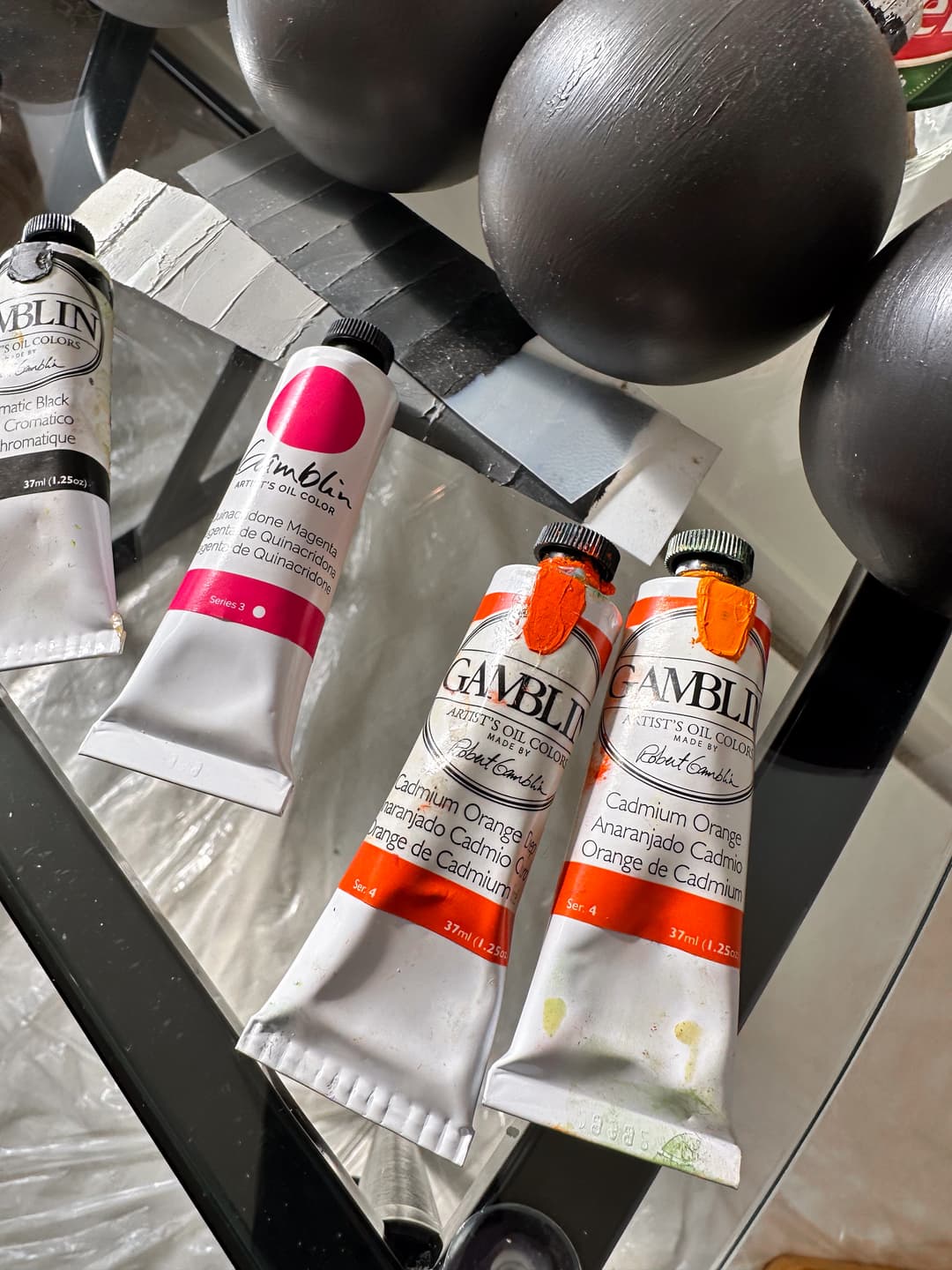
The paint tube second from the left with the printed circle is the newer Gamblin label.
Gamblin
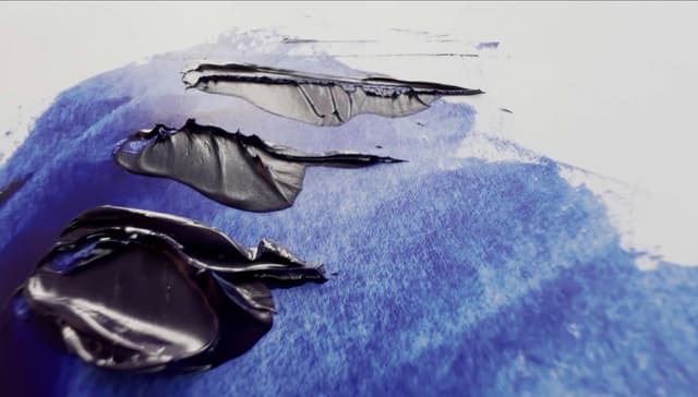
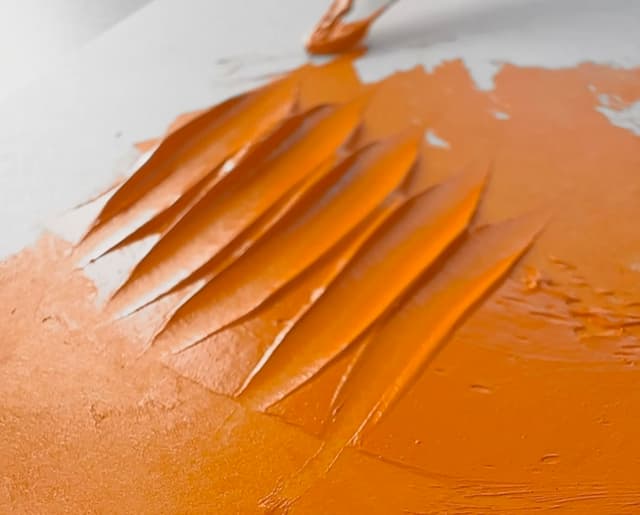
Gamblin Paints
Some of the Gamblin Paints We've Tried
Search for Gamblin Artist's Oils
Grumbacher Pre-Tested
Variety in consistencies
Of the two lines by Grumbacher, Pre-Tested is Grumbacher's more artist-level line. This is a brand that has had many faces and seasons as it's been bought and sold over the decades. Some people love Grumbacher and if it's one you love by all means stick to what works for you. For us, as we've used different brands, the more recent is Grumbacher wouldn't be our first pick. Some colors have a slick or glossy look to the paint, and it's a personal preference but we just weren't that excited about them. They tend toward a medium consistency.
Watch out for zinc in both whites and convenience blends.
An American company now owned by Chartpak, Grumbacher Pre-Tested has approximately 98 colors on offer.
Average
Grumbacher Pre-tested has just over the average number of colors, so not fantastic but not terrible either. The overall total number of paints, 96-98 is about average. In terms of a ratio of single-pigments to blends, just over half (an estimated 55%) of the Grumbacher Pre-tested paint line is single-pigment colors. In terms of the sheer number of choices for single-pigment paints compared to other brands, Grumbacher Pre-tested is still about average with around 54 single-pigment colors.
Once earths are removed from the single-pigment colors, the number of choices are above average. In terms of cadmiums, Grumbacher is known to have the more diluted form of cadmiums in red and yellow, hence the cadmium barium colors. One thing we appreciate is that they note this in the pigment code and on the paint tube.
Grumbacher Pre-Tested has a lot of zinc white still in the line at ~13 colors, though five of those are various kinds of white. About six convenience colors remain in the line with zinc white.
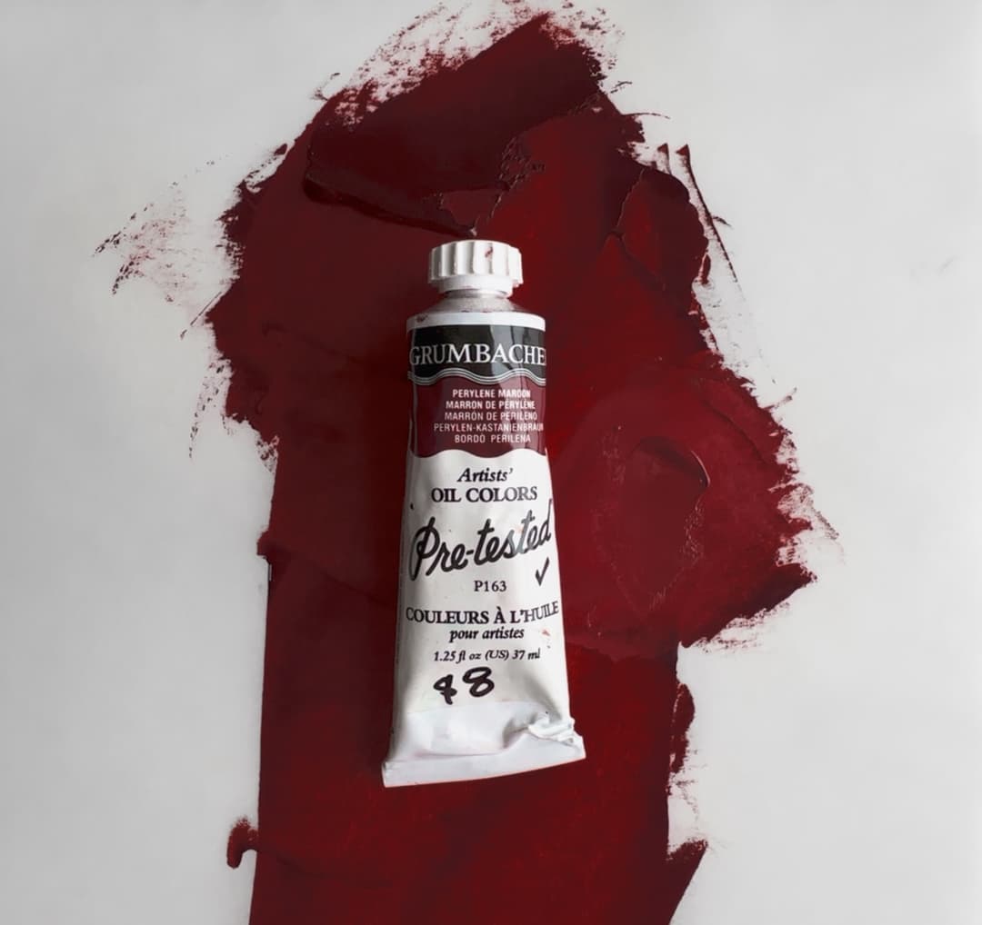
Grumbacher through the years
Legends about about finer oil paints in days gone by, and the rumors are partially true. Based on comments that older Grumbacher was outstanding, we got really into vintage oil paint.
There are several different iterations of vintage Grumbacher. One of the lines, the best of them, was called Grumbacher Finest. There was another line called Pretested, which differs quite a bit from the current version of pre-tested. Among the old Grumbacher Pretested colors, there was an era with colored caps.
While the paint feels great, sometimes the tubes have corroded badly. We also wonder a bit about the additives that were used back then (additives are also used in modern paints as well). The feel of the vintage paint does remind one of some of the higher quality brands available today.

A vintage paintbox with two different lines of Grumbacher paints, Finest and Pretested. The vintage paints differ significantly from the modern iteration


Some of the vintage paints mixed in with modern oil colors from a variety of brands. Most of the brands in this article are represented in this paintbox, as well as a few others.

A mix of modern and vintage oil paints for portraiture, including two versions of vintage Grumbacher Pretested. On the top row, one version has a circular logo with a check, and the other version has a rope-like typeface that says Pretested. A supplementary palette paintbox for portraiture from 2019
Grumbacher Pre-Tested (Modern)
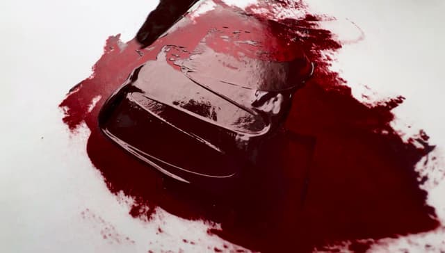
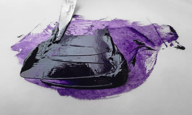
Search for Grumbacher Pre-Tested
Pre-Tested is the more artist level Grumbacher line
Holbein Artist Oil
On the thicker side, interesting pigment offerings
Holbein makes several tiers of artist oils, and their Extra Fine Artists' Oils are a well-established and respected brand, while their Vernet oils (not discussed here) are their extra premium line.
Holbein's Extra-Fine Artists' Oils the favored brand of some big-time 20th century artists. We've always enjoyed Holbein, though we have run across some colors which seem to have a stronger smell. One of our favorite things about Holbein is that their lightfastness ratings actually seemed to echo some of the findings that Golden turned up in their major lightfastness testing with mixing whites. Recently, a significant percentage of Holbein's line was discontinued, which was super sad. Holbein is known to have carried some interesting pigments thorough the years which are hard to find in other paint lines.
Their Ceramic white is an exceptionally interesting white paint with a unique pigment, Strontium Titanate. On the Holbein site they describe it was "titanic acid strontium" and the binder as poppyseed oil.
Holbein is a Japanese company with a global reach. Estimation of the current number of colors in their line is a bit in flux. They used to have about 170, but with discontinuations, there are fewer.
Recent discontinuations Holbein's Artist line used to have a very large number of paints from which to choose, and their line had an above-average number of choices, which is always desirable. However, somewhere around 2024 they cut a significant number of colors. The overall total number of paints was above average. In terms of a ratio, Somewhere around about 1 out of every 2 of their colors is a single-pigment paint, which means they offered more blends than most other artist-level brands. In terms of sheer number of choices for single-pigment paints, Holbein Artists' Oil Color is ample. It is close to average for number of pigment paints, with around 86 single-pigment colors.
The single pigments once earths are removed remains about average. In terms of cadmiums, in the past they had a very nice amount of cadmium colors. After the discontinuations, a lower number of cadmium colors are left.
This is a paint brand that has very little zinc in its line, though they still offer one paint, Neo Zinc White SF.
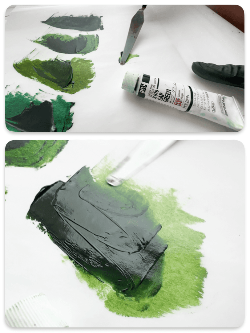
Holbein Sap Green. Holbein has made smaller tubes for some colors, which can be a helpful way to try them out.
Holbein Paints
A handful of interesting Holbein colors
Search for Holbein Extra-Fine
Extra-Fine is Holbein's Artist oil line
Isaro
Interesting variety in textures
Isaro paints, while sometimes hard to find, are interesting colors worth trying. We love that their Titanium White comes in a narrower elongated tube that has a lot of old-world charm.
The ultramarine blue has a diversity of texture like we've never seen before, and we enjoyed the cadmiums and cobalts. It's hard to generalize, but we'd describe these as medium to thick in consistency with soft but sculptable texture.
As an interesting aside, we ordered these from Isaro directly and the package got stuck in customs in LA in an indefinite limbo, and we had to get a second shipment. Through it Isabelle was awesome, and everything worked out. If you're ordering from the US it may be worth going through a store, though with imports these days there may be extra surprises.
Small but mighty boutique brand
Isaro is a Belgian paint brand, made by Isabelle Roelofs, part of a family of the paintmakers who also have some connection to the development of Old Holland paints. Isaro offers about 50 colors in their oil paint line.
Compared to brands that offer a larger array of colors, Isaro offers a little over half the average number of paints, though the selection is broad enough and the number is about on par with other bespoke paintmakers. The overall total number of paints, 50, could cover all the bases, if a high percentage are single-pigments. In terms of Isaro, just over 70% of the paint line is made up of single-pigment colors, which signals that this is a brand that is aimed at professional artists. In terms of sheer number of choices for single-pigment paints, Isaro is ample, but slightly below average in nubmer. The line is not terrible in terms of number of single pigment paints, with around 36 single-pigment colors.
Once earths are removed, Isaro's single-pigment paints still hold steady with a sufficient number of single-pigments colors. In terms of cadmiums, Isaro's range covers the main cadmium categories.
A few colors contain zinc oxide Four Isaro colors contain zinc white, and about half of those are white paints.
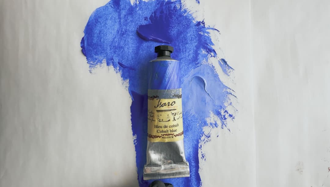
Isaro oil paints from Belgium
Isaro
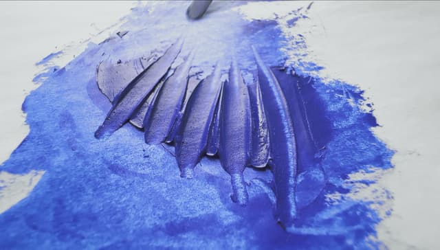

Some of the Isaro paints we've tried
As just a heads up, the Ultramarine is unusually textured
Isaro Paints
Jack Richeson Shiva Series
Value colors
Jack Richeson's paint line, sometimes known as Richeson, and sometimes by the name of Shiva, contains 87 paints (if their 6 special edition cadmiums are included). Sadly, Mr. Richeson passed away in 2023, but his company name continues. Jack Richeson might be an interesting budget brand to try. We've used various Richeson colors over the years and found them to fairly thick. However, watch out for Colors like their Cadmium Yellow Medium, which contains a Hansa yellow alongside the cadmium but is not labeled a hue.
The Richeson line has about the average number of colors. The overall total number of paints, 87 is decent. In terms of a ratio, about half of the paint line is made from single-pigments, but in terms of sheer number of choices for single-pigment paints, Jack Richeson's line is ample, and offers close to average for number of pigment paints, with around 44 single-pigment colors.
The single pigments once earths are removed remain about average. In terms of cadmiums, we enjoyed the six color special edition cadmium supplement. We are always fans of having more cadmium choices.
Some colors contain zinc oxide, mostly in whites Four Richeson white colors contain zinc, but it is mostly to be found in only their white blends. About five of their paints total contain PW4, so it is something to watch out for if removing zinc white is part of one's painting practice.
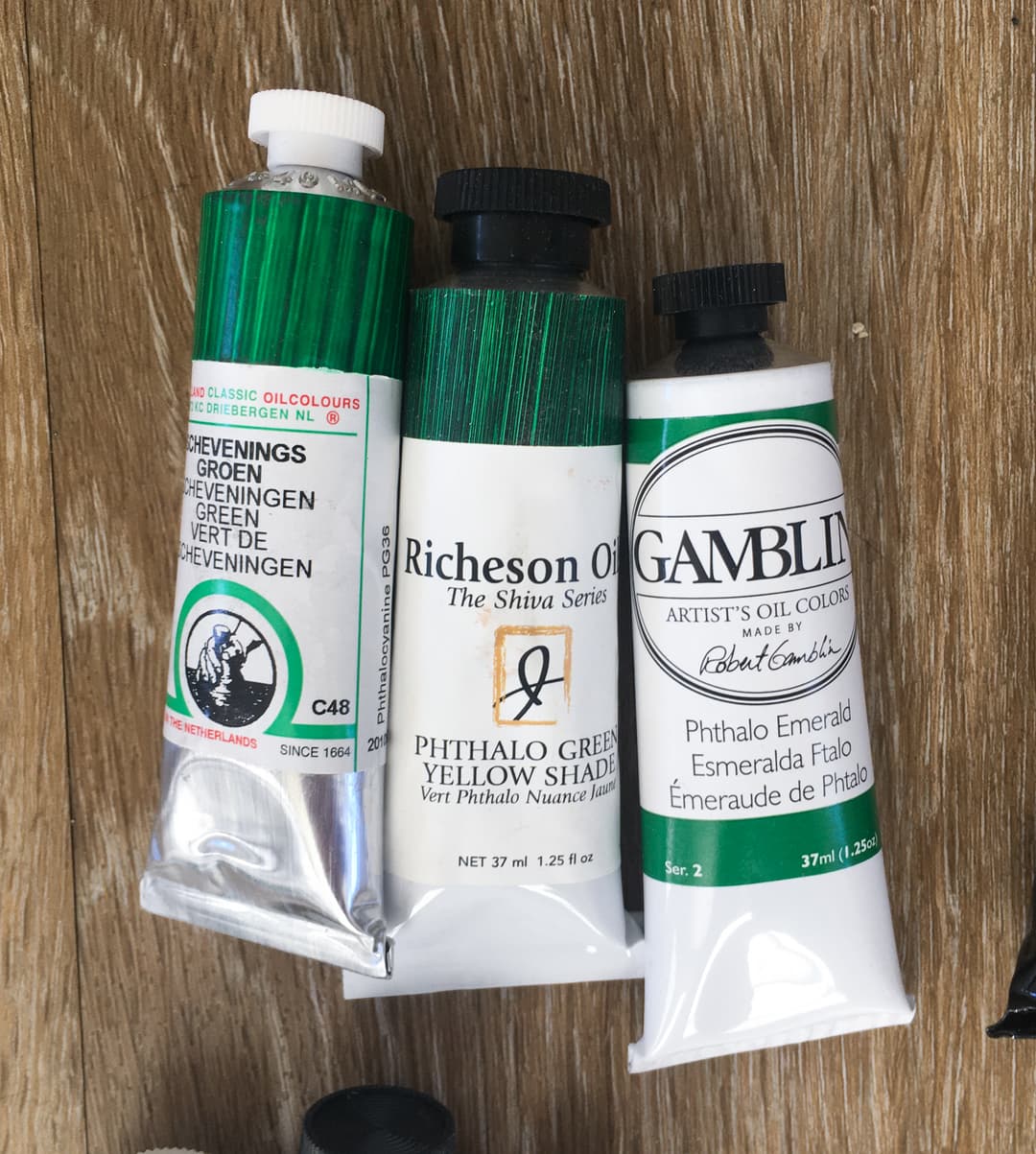
Old Holland, Richardson and Gamblin. Each makes a Phthalo Green with a different feel
Spot the Vintage Shiva Paint
In this paintbox piled high with colors, there is a tube with the older design of the Shiva paint.

A few Jack Richeson Paints
Asphaltum may not be as lightfast as we'd like
Search Jack Richardson's
Lukas 1862
Soft colors, some contain zinc white
We've painted with Lukas over the years and have found it trend toward being fairly soft and light in its consistency but can't speak for all the colors. We were introduced to Lukas through videos of seascape painting which called for some of their convenience blends as favorite colors such as their Indigo made of four pigments, and Bohemian Green Earth. While we normally privilege single-pigment colors, sometimes a blend saves time if one understands the component pigments. Around the time the zinc white evidence came in from Golden, we had be painting with a tube of Lukas 1862 Titanium White and were bummed to see it contained PW4.
Corporate Changes Over the Years Lukas was a German brand, and there are several paint lines. Lukas has been bought and sold, and in 2016 the F.I.L.A. Group took over Daler Rowney LUKAS. The Lukas 1862 line, which is the more Artist Quality line, contains a range of 80 paints.
In terms of number of colors in the line, Lukas 1862 Oil has almost 90% of the average number of paints. The overall total number of paints, 80, is decent. In terms of a ratio, not quite half of the paint line is made of single-pigment paints (about 46%). In terms of sheer number of choices for single-pigment paints, Lukas 1862 is ample-- it's not huge but not terrible. Lukas has around 37 single-pigment colors. The single pigments once earths are removed contain a sufficient number of pigments. In terms of cadmiums, Lukas covers the main cadmium categories.
Zinc in a couple of colors Four Lukas 1862 colors contain zinc, and about half of those are white paints. We were disappointed to find out a Titanium White of theirs contained zinc.

We don't paint with a ton of Lukas 1862, but you will spy a single tube of Indigo down on the bottom left in this paintbox from 2019
Some Lukas 1862 Colors
The indigo blend does contain one pigment with less than the best lightfastness
Search Lukas 1862 Paints
M Graham
Walnut oil colors
M. Graham is most famous for being a walnut oil paint. The consistency is extremely soft, but the colors are good tinters. The consistency is so loose that for some painters it would be an adjustment to start using M. Graham. We've painted with M. Graham for many years and have enjoyed their colors, and they don't tend to need much modification with medium as they are so workable right out of the tube.
One thing to watch out for is that the Titanium White contains zinc oxide in the blend. We have also experienced chalking in some M. Graham colors when painted on Ampersand Gessobord panels. This could be a function of the substrate, the paint formulation, or even the walnut oil.
Walnut Oil Colors M. Graham is an American brand from Oregon. Their unique claim to fame is that this is a walnut oil line, which is fairly rare. Walnut oil has been used historically with success, however it may not be the best in impasto. Their oil paint offerings are comprised of 74-75 colors.
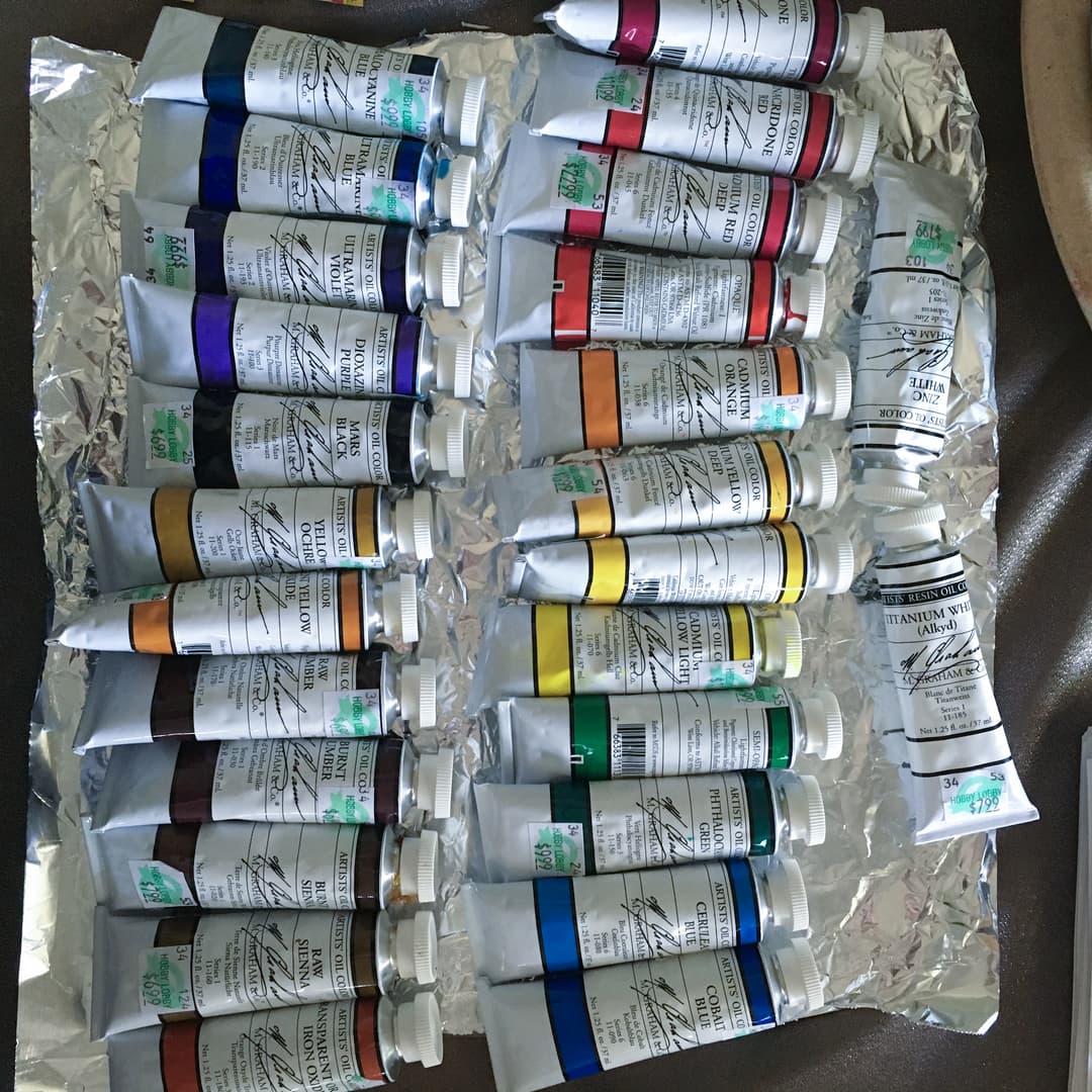
Back when we were looking for information on M Graham Oil Paint, there wan't much out there. These were from a closeout sale which ended up being a great purchase. M Graham isn't for everyone, some painters don't like the loose consistency, but we found them to be very workable without any medium.
At 80% of the average number of paints, the line is actually pretty well stocked with colors, since there is such a high percentage of single-pigment paints. The overall total number of paints, about 74, is enough to be interesting. In terms of a ratio, over 70% of the paint line is made up of single-pigment colors, a signal of a brand that is aimed at professional artists. In terms of sheer number of choices for single-pigment paints, M Graham is about average compared to other artist lines, with around 54 or 55 single-pigment colors.
The single pigments once earths are removed are above average. In terms of cadmiums, they have a lovely range. Their cadmium red light is especially useful, they have a terrific cadmium orange, and a great cadmium yellow light.
Watch out for Zinc Oxide Four M. Graham white colors contain zinc, so it is mostly to be found in only their white blends. About five of their paints total contain PW4, so it is something to watch out for if removing zinc white is part of one's painting practice.
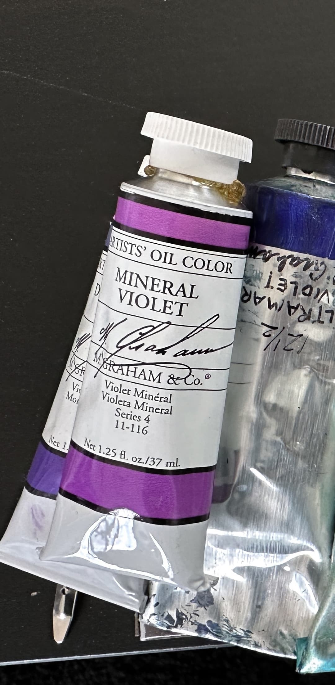
M Graham
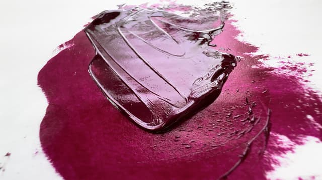
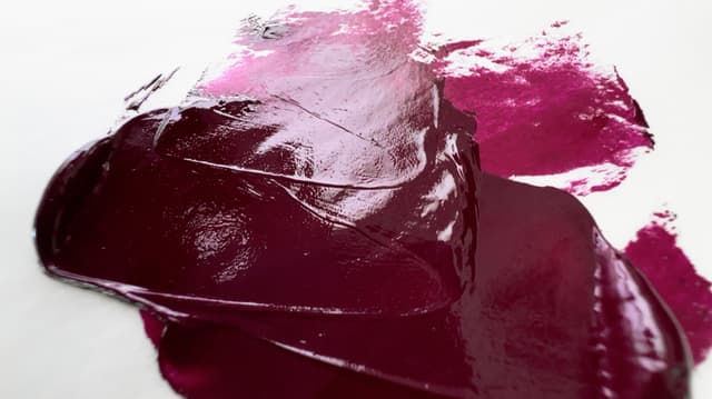
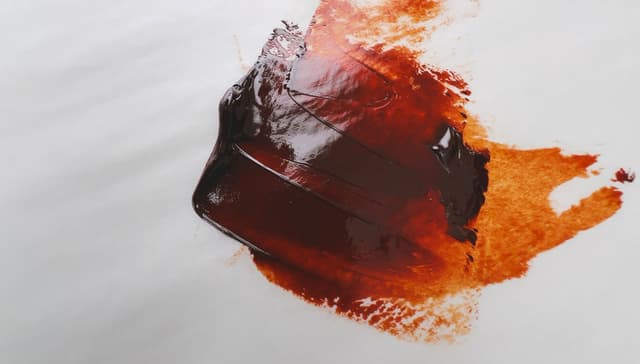
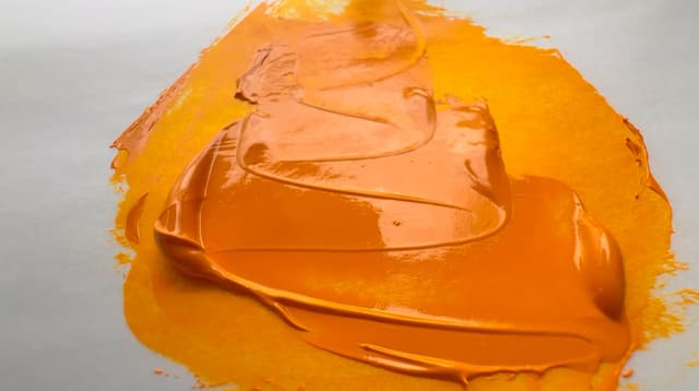
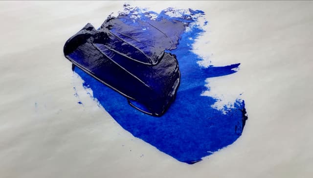
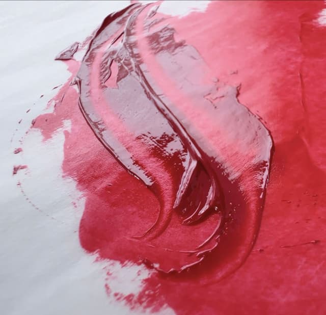
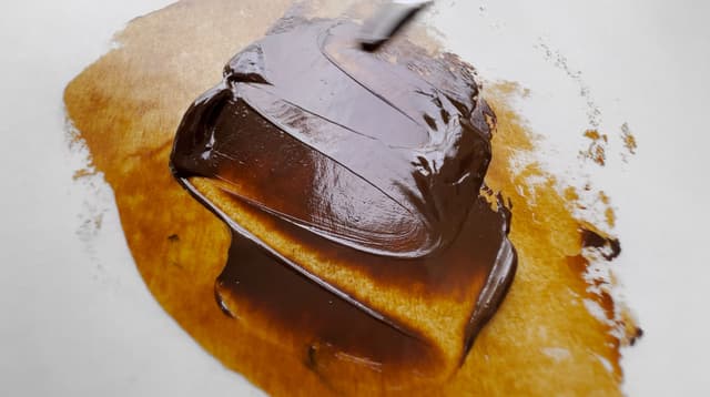
Some of the many M Graham colors we've enjoyed
Search for M Graham Oils
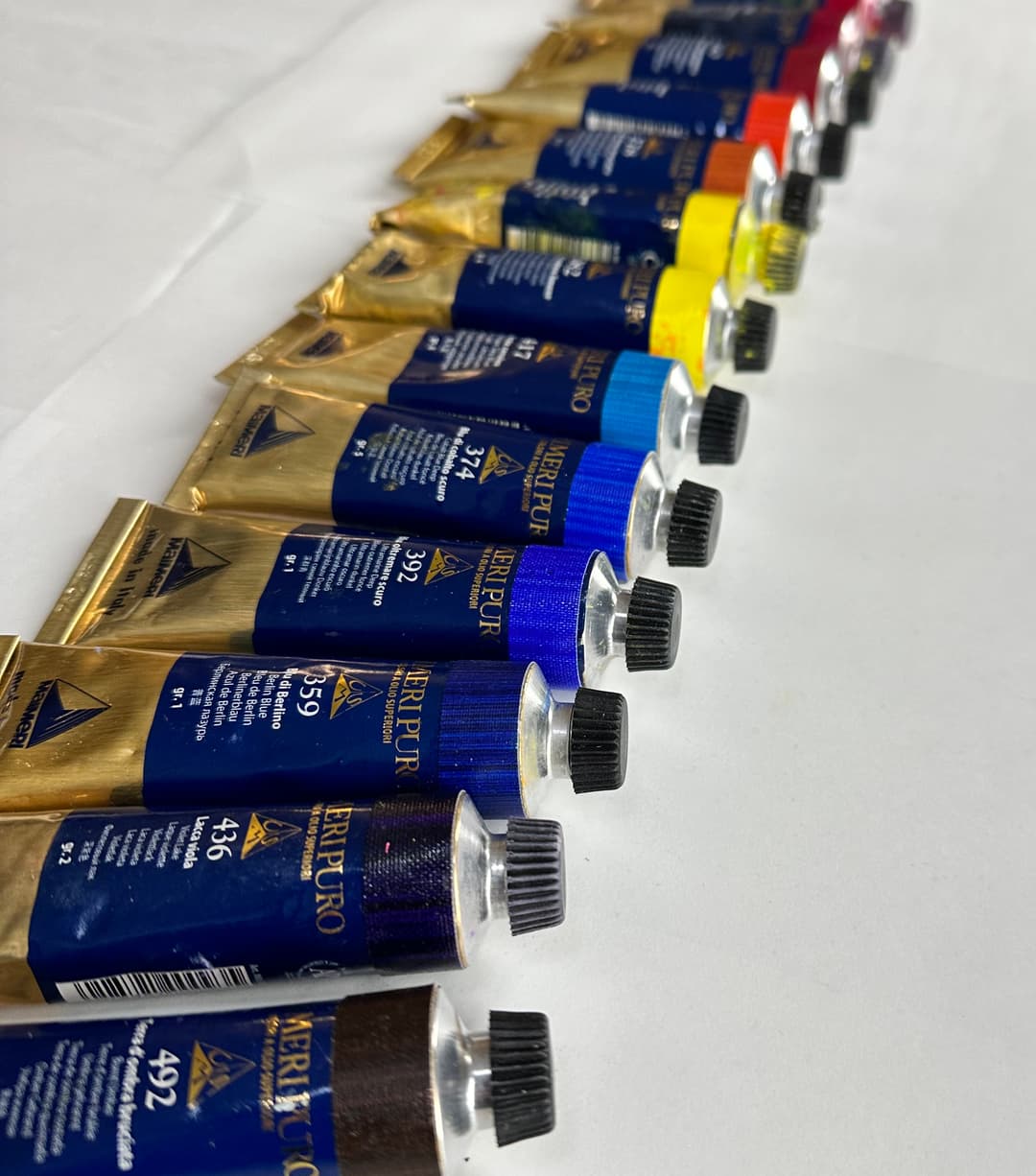
Maimeri Puro
Single-pigment colors with safflower and poppyseed oil
Maimeri Puro is the most premium line of Maimeri paints, with 81-83 colors, which are all single pigments. We love using Maimeri Puro even though they are a blend of safflower and poppy oil, which is not the strongest binding oil. The colors are bright, and there are some extra special versions of cadmium yellow light and lemon. We actually wrote a little ode to the Cerulean Sky Blue, and found their Cobalt Blue Deep to be enchanting. The consistency is not the main story with Puro, though the consistency tends to be soft and workable. We've noticed the cadmium (pigments which are usually pretty robust in most oil paints) almost have a tendency to be separated when opened and need some working on the palette to incorporate them. Expect a bit of separation out of the tube.
Corporate acquisitions The F.I.L.A. Group acquired the Maimeri brands around 2016.
In terms of the number of colors in the line, Puro has about the average number of paints. However, all of them are single-pigment, which make the selection stand out as exceptional. The entire paint line of 81 colors is made up of single-pigments, a strong signal that this brand is intended for professional users. While there are brands with more single-pigment colors, Maimeri Puro still stands out.
The single pigments once earths are removed are excellent. In terms of cadmiums, they have an excellent range. Their cadmium yellow lemon and light are colors we particularly enjoy.
This is a paint brand that basically does not use zinc their line (being single pigment colors), though they do still offer one if a person really wants to use it.
Maimeri Puro
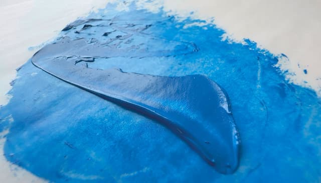
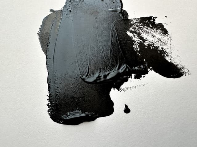
Search for Maimeri Puro
Michael Harding
Workable consistency, huge range of colors, mostly linseed oil
We have come to really love painting with Michael Harding colors. They have a signature consistency and generally very high tinting strength. For everyday professional painting, we enjoy them quite a bit. Michael Harding is a brand from the UK. They offer a wonderful array of 117-120 paints, with more to be released. We've enjoyed some of their historical colors and appreciate their cadmiums.
The paint has a medium thickness in most colors- a mix of thickness and softness. Their colors tend to be quite workable right out of the tube. We have heard reports of some technical problems with some of their umbers but have not tested this specifically ourselves. We have had a funny experience with one of their colors but need to perform further testing before saying more. For years, issues with the caps have been noted, and we have experienced this as well. However we love the painted tubes and the paint consistency is quite versatile.
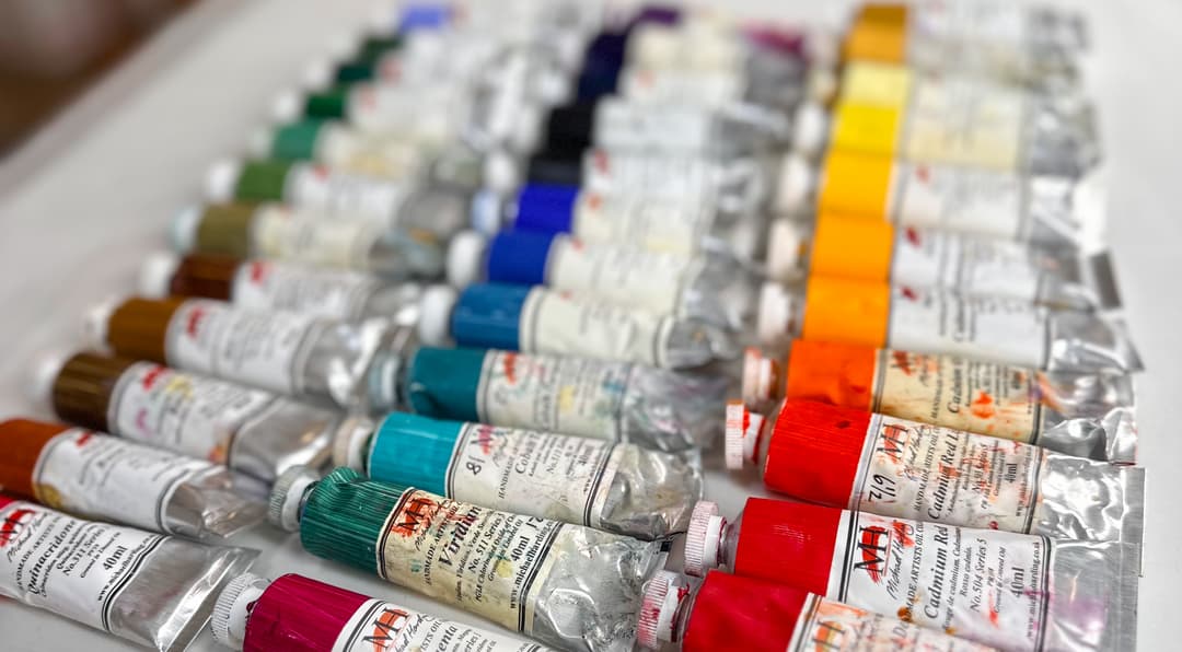
Michael Harding Historical and Interesting Pigments
Fabulous Array of Paints This brand has nearly 1.5x the average number of paints to explore, and combined with the high number of single-pigment colors, it is a real treat to experience the various colors in the paint line. The overall total number of paints offered, 127, is at the connoisseur level. At the time of this writing, about 70% of the paint line is made up of single-pigment colors, signaling dedication to professional artists. In terms of sheer number of choices for single-pigment paints, Michael Harding is exceptional, with around 89 single-pigment paints.
The single pigments once earths are removed are outstanding. When earth tones are removed, Michael Harding still has an outstanding number of single-pigments. These cadmiums have something going for them-- they almost seem extra bright (especially the Cadmium Red and the Cadmium Yellow Lemon). The Cadmium Yellow Lemon almost looks like it has a note of highlighter brightness in it. It's one of the lemony-est we have found.
Michael Harding used to offer a zinc white, but it appears to have been discontinued/reformulated. This seems to be a brand that has opted to remove zinc from its line.

Michael Harding
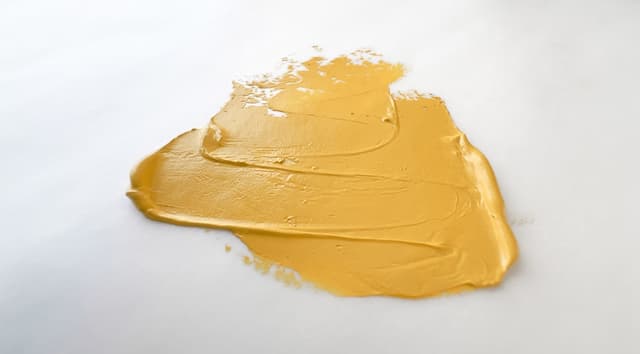
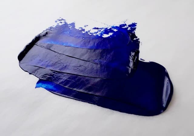
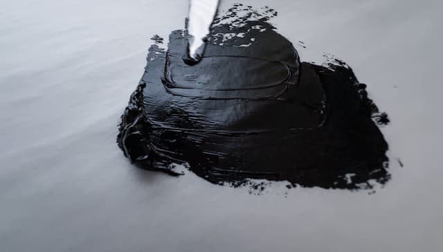
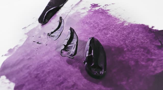
Search for Michael Harding Oils
Natural Pigments Rublev
Extremely loose, historical and sometimes toxic colors, uses mostly linseed oil
Some Rublev paint tends to be extremely loose and almost runny, but it depends on the color. Paints such as lead white are much more sculptural and have a thicker impasto. Rublev also makes a lot of earth tones. We have had problems with a sort of bronzing in one of the red earth tones, but most performed well. The Titanium White is almost like liquid, and very highly pigmented. Some earths are extremely gritty, but there is a diversity of textures. Rublev tends to have a philosophy of parting out the paint and the additives, which can give painters a sense of control.
Rublev is part of the Natural Pigments brand. It's hard to say how many paints they offer because there are frequent additions and subtractions to the line. Some of their listings experience temporary discontinuations due to the fluctuating availability of their materials, while other discontinuations appear to be more long-term. Rublev specializes in historical colors and they offer around 104-106 paints.
Some exceptionally toxic colors
Please be extremely cautious of some of their toxic colors - and we don't mean just an attitude of caution, we mean like actual hazmat caution with several of them. While there's a definite place for certain pigments in a museum restoration environment, few artists are educated or equipped to properly handle some of these colors. Once with a chemist we mentioned Chrome Yellow as a paint and it made his eyebrows leap. He could not believe it was being used glibly by artists and emphasized and re-emphasized just how carcinogenic it is. We are not toxicologists, so please contact the proper authorities for safe handling of any toxic pigments.
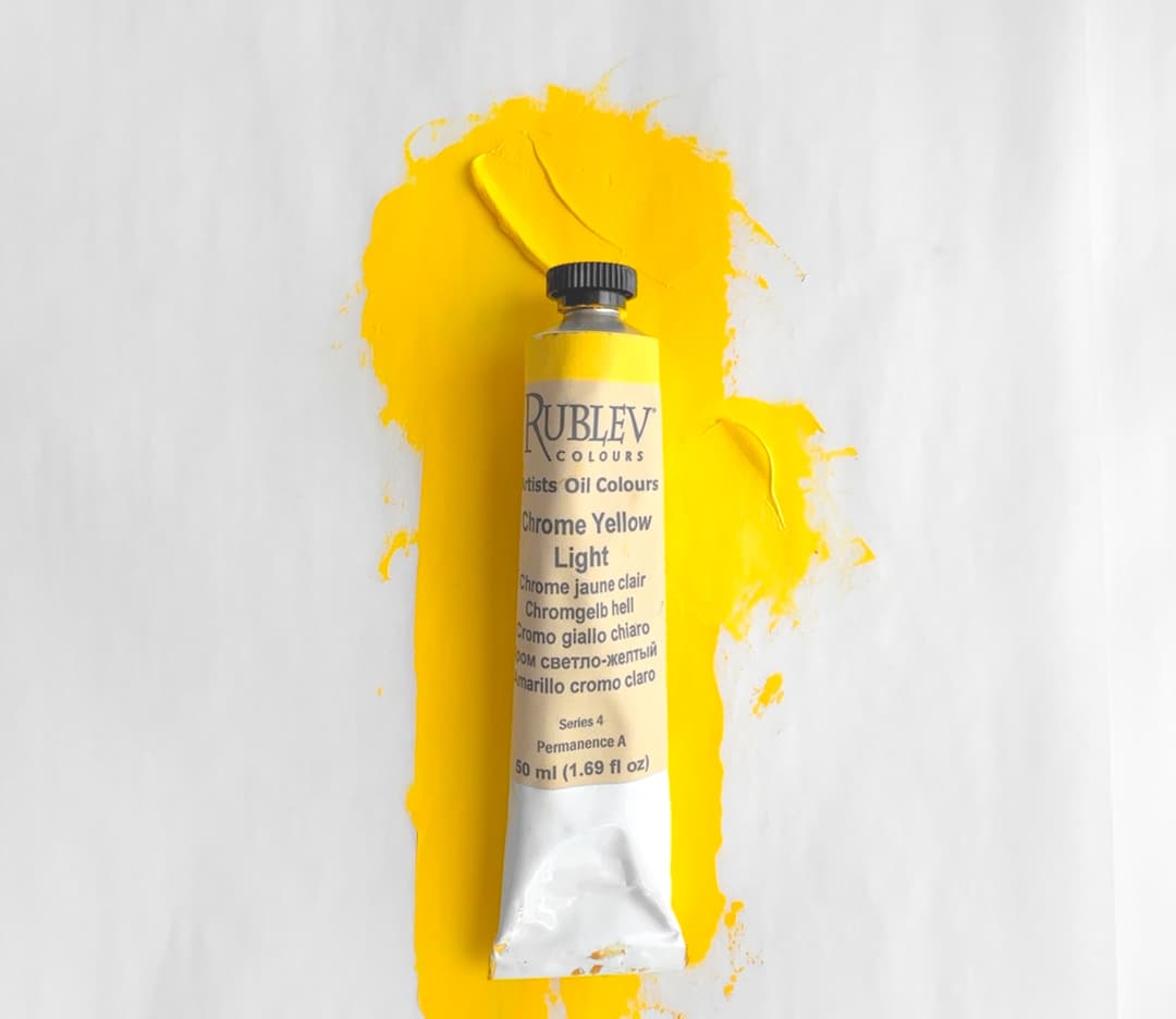
While there are some use cases for restoration work, most artists are not equipped to properly handle truly toxic paints in the studio. Rublev sells a few dangerous, toxic colors such as genuine Chrome Yellow, PY34
Rublev offers a wide array of painting mediums, extenders and ingredients so that painters may modify their own paints.
Natural Pigments/Rublev offers above the average number of paints, and combined with a high number of single-pigment colors, there is an interesting array of pigments from which to choose. The overall total number of paints, 106, is above average. In terms of a ratio, 85% of the paint line is made up of single-pigment colors, a signal that this brand is intended for professional users.
For the sheer number of choices for single-pigment paints, Natural Pigments has an exceptional number of single pigment paints. Overall, they offer about 90 single-pigment colors. Though they specialize in earths, the number of single-pigments once earths are removed are still excellent. They also offer a good range of cadmiums with thinner consistency and high pigmentation.
Early forerunner for zinc white research Natural Pigments was an early promoter of removing zinc white from a paint line, and did a lot of education toward that goal.
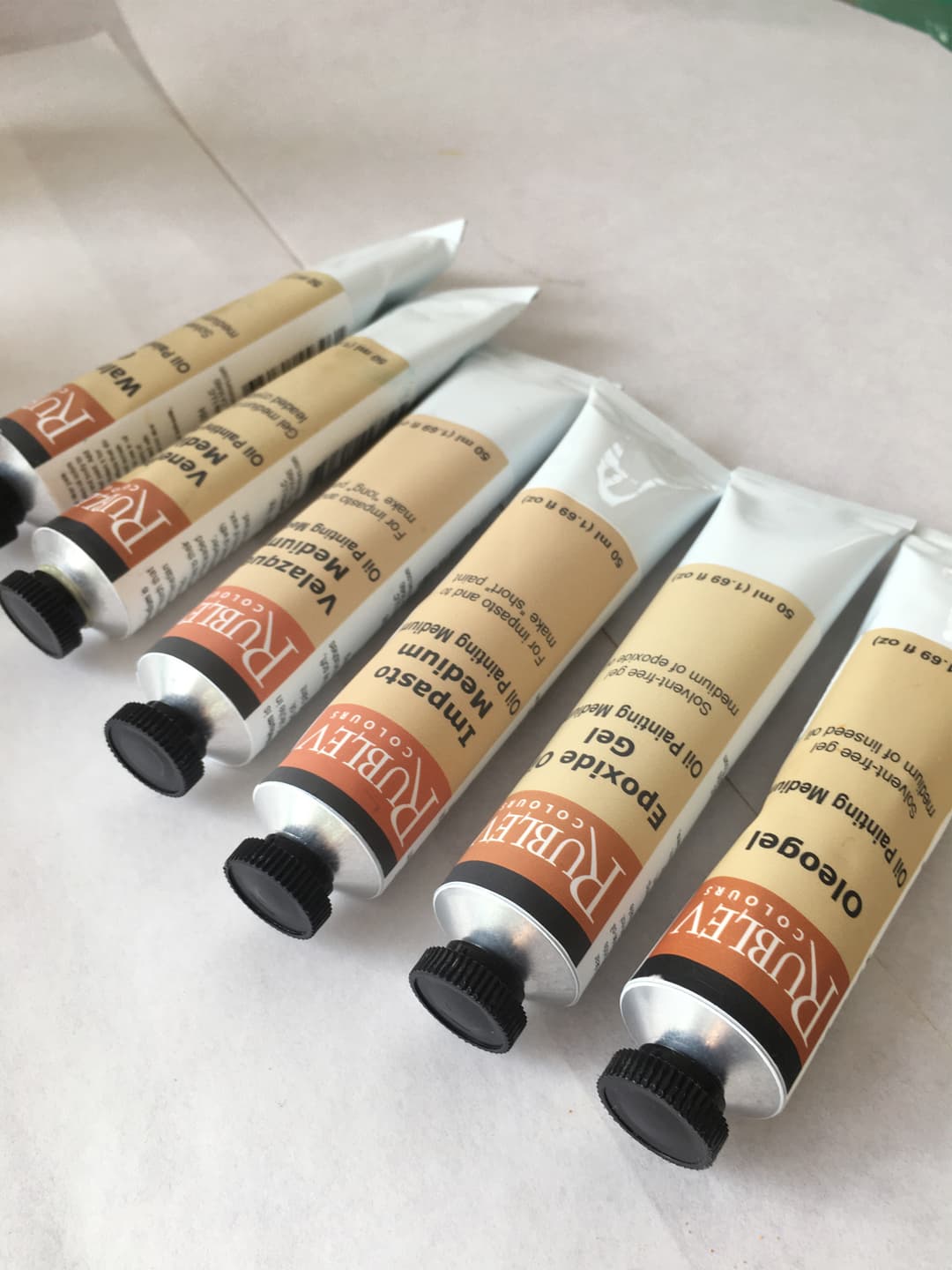
Mediums by Rublev/Natural Pigments
Rublev
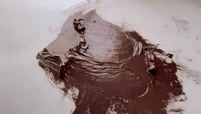
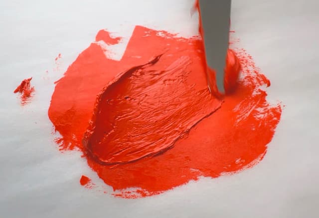
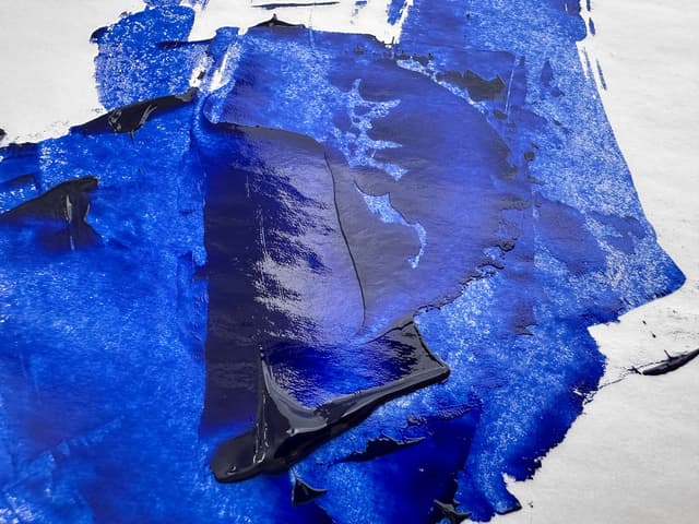
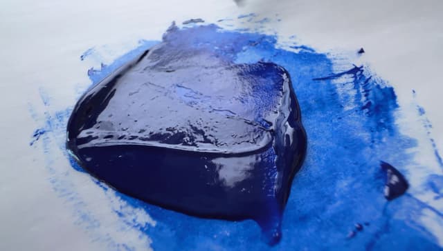
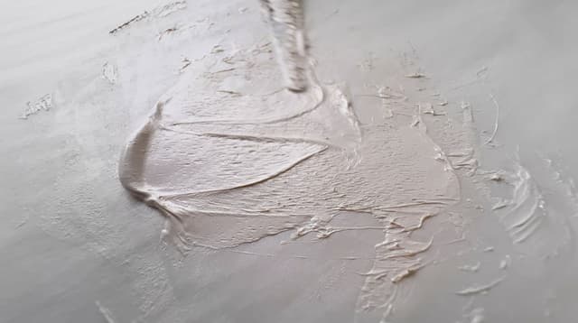
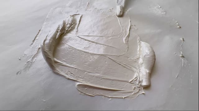
Search for Rublev by Natural Pigments
Old Holland
Stiff, impasto, highly pigmented
Everyone knows those glistening wooden-looking display cases filled with gleaming tubes of Old Holland behind glass. We can still remember seeing them in the art store with the diagram of how much pigment is in their cadmiums, emblazoned with gold. Old Holland is known for their signature thick consistency. The paint lends itself to impasto right out of the tube and many colors hold their shape as they are squeezed onto the palette. They are also revered for their high tinting strength, and we've especially loved their range of cadmium colors from red to orange to yellow. We love their cadmium range so much we put these together in their own palette.
We have quite enjoyed Old Holland's wide gamut of offerings over the years, including some of their convenience blends. Perhaps it is a little thing, but few companies have better painted labels, and there's something extremely lovely about even the metal tubes. The little lids are great, though we have had some lid failure at times over the years. If painting realistically, it's likely the paint will need to be thinned a bit whether by oil, medium, or something else. Old Holland has experienced some critique for lightfastness testing, which has appeared to be less of a priority for the brand historically. Also, do watch out for zinc white in the blends, as it is still in quite a few of their colors.
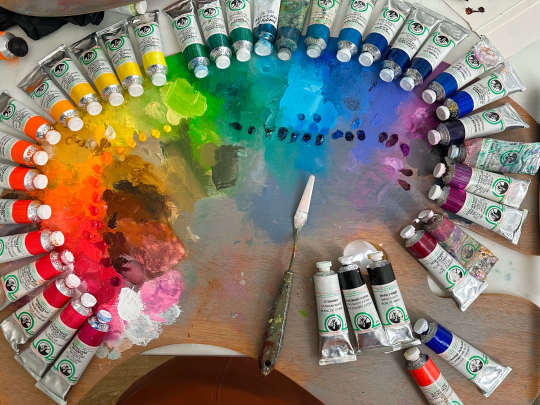
Old Holland Oil Colors
Old Holland - Variety of Colors
Large Paint Selection
One of the widest selections of paints Old Holland has around 166 paints in the paint line.
Old Holland offers one of the widest selections of paints. The overall total number of paints,168, is quite notable as far as overall selection. Though Old Holland is known for its famous blends, more than half of the paint line is single-pigment colors. In terms of sheer number of choices for single-pigment paints, Old Holland is exceptional. Their high number of single pigments paints is among the best (though by no means the highest) with around 93 total single-pigment colors.
The single pigments once earths are removed are outstanding. In terms of cadmiums, these are some of our favorite cadmiums, and we love how many different different cadmium notes they offer. Some have unique properties - several of their cadmium reds come to mind, and we love the way their cadmiums are keyed from cadmium yellow lemon to cadmium orange. Their cadmium orange is one of the redder cadmium oranges, but for more of a middle orange they offer several in-between steps that we adore. They are very strong tinters.
We also strangely love their Cerulean Blue, especially for unexpected roles, like portraiture.
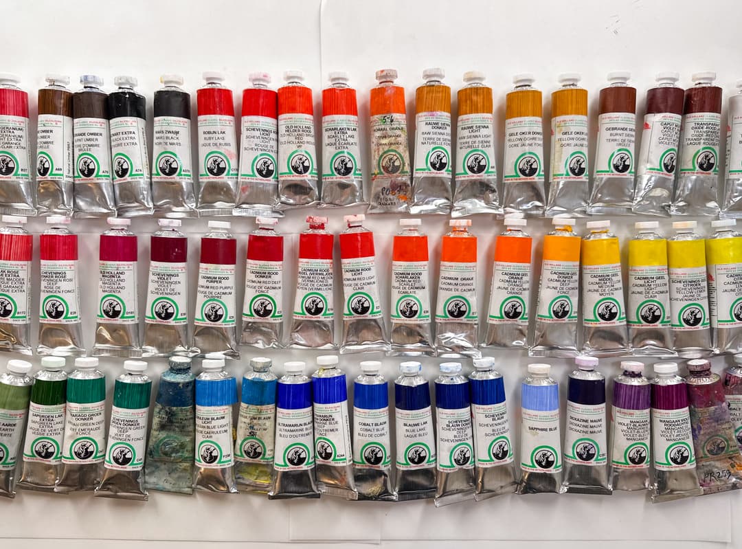
Old Holland and Zinc
Many colors contain zinc oxide Old Holland probably has the most zinc-containing paints (approx. 30 tubes), which comprises just a little less than a fifth of the overall number of colors (about 18% of the paint line). Old Holland has a statement as to their direction in zinc-inclusion. Currently three white paints contain zinc, so about 27 of their blends also contain this pigment. We do like the colors of the blends, and even though many zinc blends cannot be perfectly emulated with titanium, we wish they would offer an alternative/facsimile to the color recipes which currently contain zinc, as many of them are in useful colors which we now don't tend to use. Different artists' practice varies though, so this is just a heads up to check those convenience colors if removing zinc white is important to your painting process.
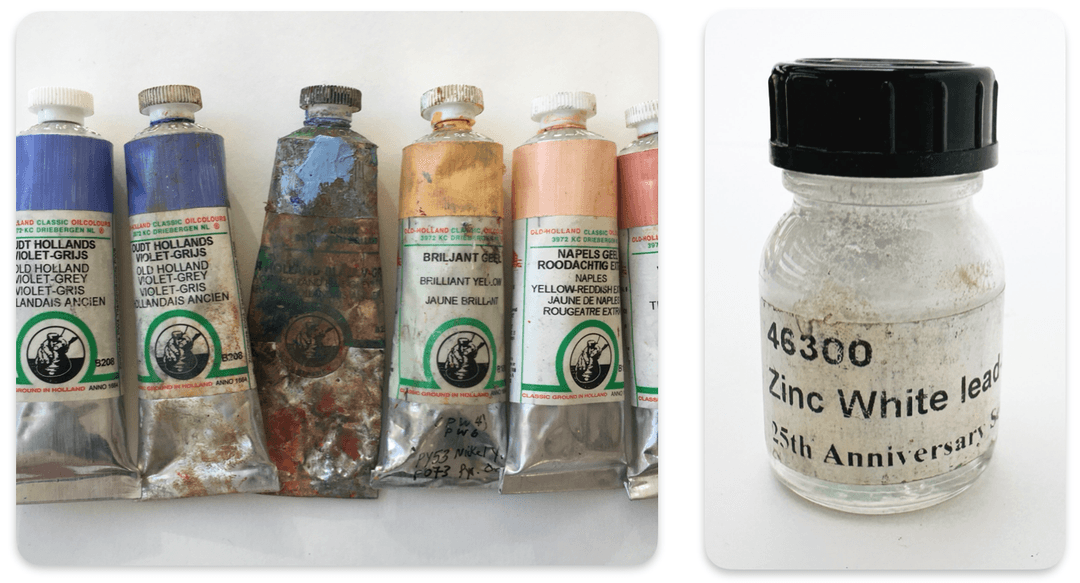
Several Old Holland blends contain the pigment Zinc White, PW4
Old Holland
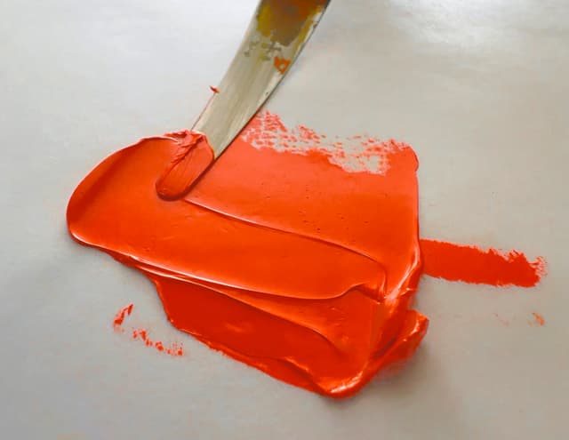
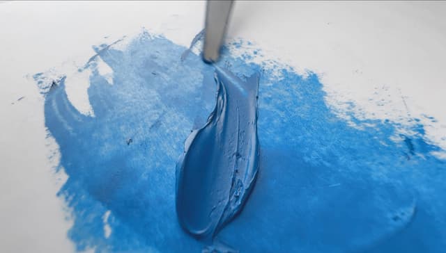
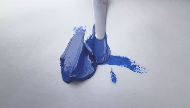
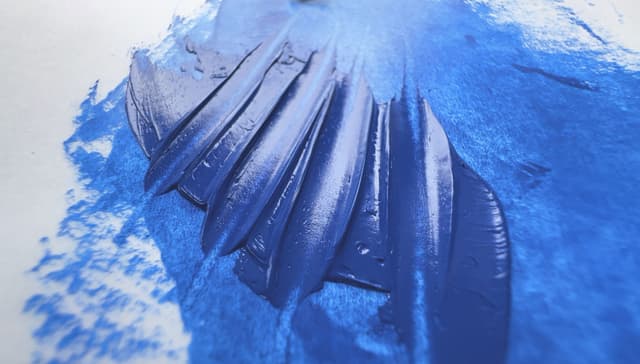
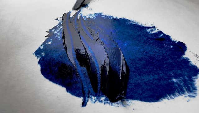
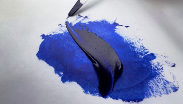


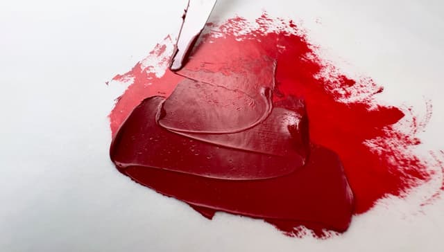
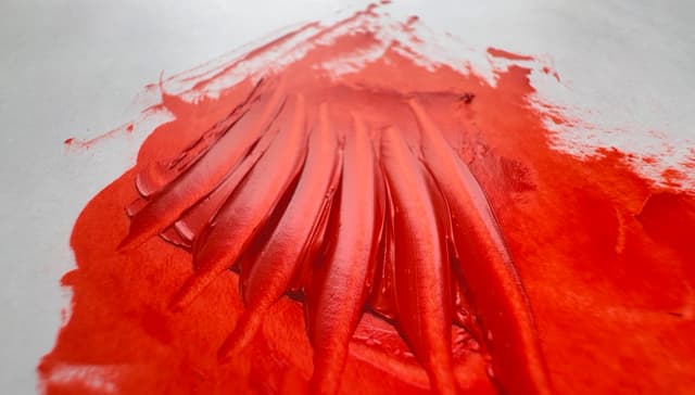
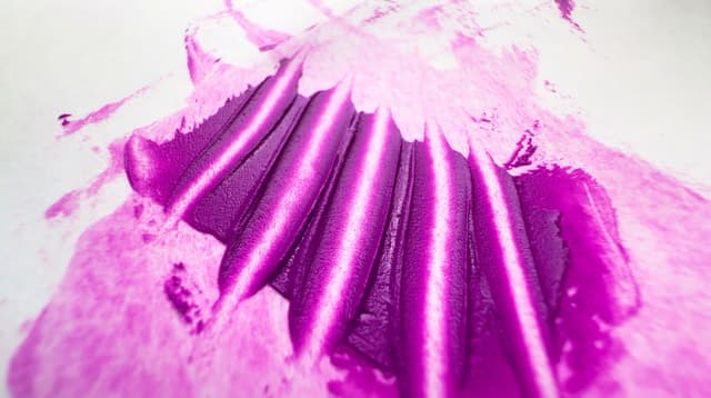
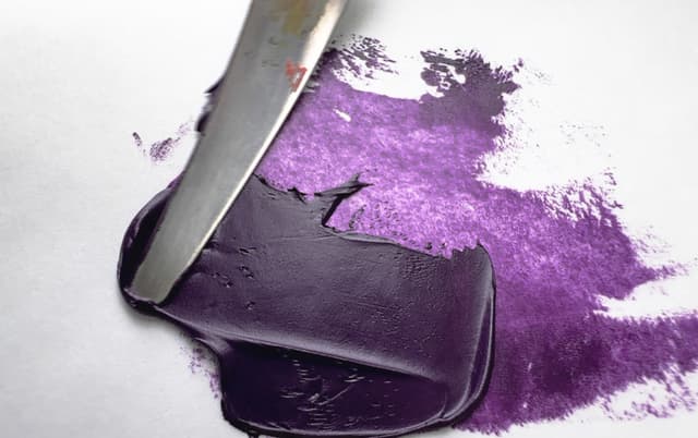
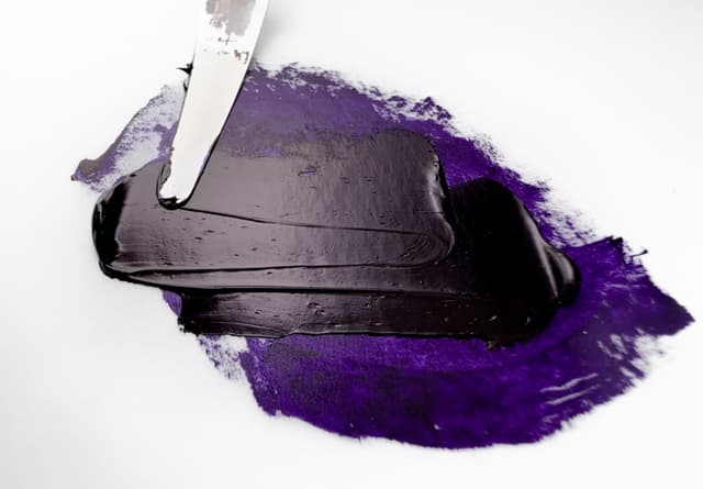
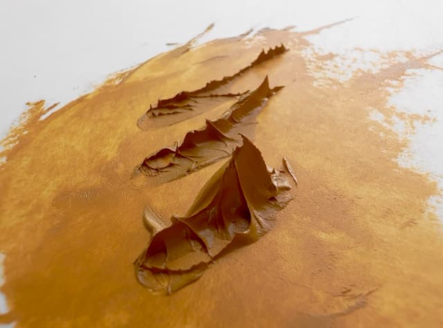
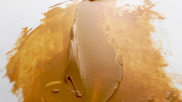
Search for Old Holland
Rembrandt
Soft and billowy, workable consistency
Rembrandt paints have a soft consistency, and tend to be extremely workable. We think of a pillowy, almost rounded-edges texture with Rembrandt. Sometimes they contain interesting pigments, such as PR255, one that we quite enjoy. Sometimes a color might have an unexpected pigment inside, such as their Ivory Black, which has some surprise PB29 (Ultramarine Blue) inside.
Rembrandt Talens was a Dutch company which has been bought and sold, and in the 90s became part of the Sakura Color Product brand from Japan. Royal Talens has several paint brands, and Rembrandt is the more artist-brand line. Around 120 colors comprise the Rembrandt Talens paint line.
Above Average Rembrandt Talens has an above-average number of paints to offer, at 120 tubes. In terms of a ratio, not quite half of the paint line is made of single-pigment paints (about 46%). In terms of sheer number of choices for single-pigment paints, Rembrandt Talens is above average with around 56 single-pigment colors.
The single pigments once earths are removed are still above average. In terms of cadmiums, we appreciate that they offer a good amount of cadmium color choices.
Lots of colors contain zinc oxide After to Old Holland, Rembrandt is in second place with about 20 zinc-containing paints as one of the most zinc-filled brands, and only about a fourth of the Rembrandt tubes that contain zinc are some kind of white. Six Rembrandt white paints contain zinc. That leaves about fourteen other colors that may have zinc white in their formulation. Be sure to check convenience blends if this pigment is a concern.
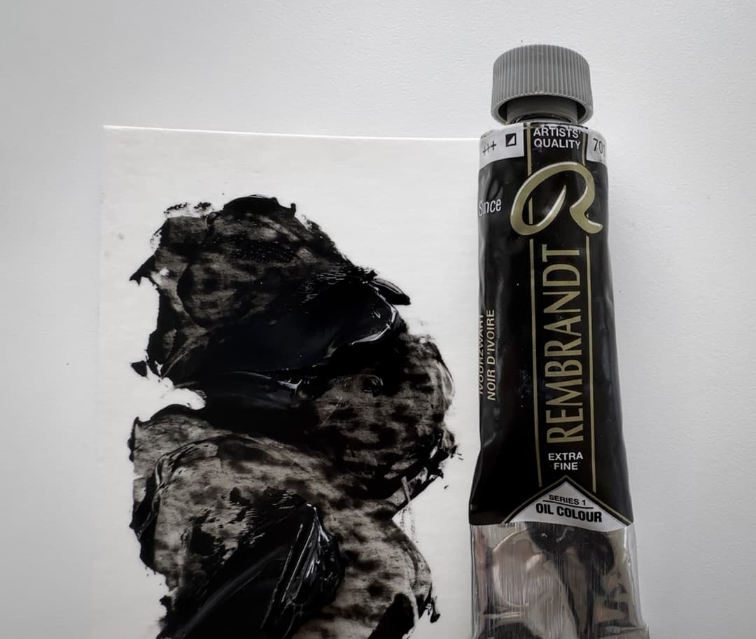
Rembrandt Ivory Black is a bit of surprise. Where we would have expected a single pigment (PBk9), Rembrandt has included Ultramarine Blue (PB29), making this a blend.
Rembrandt
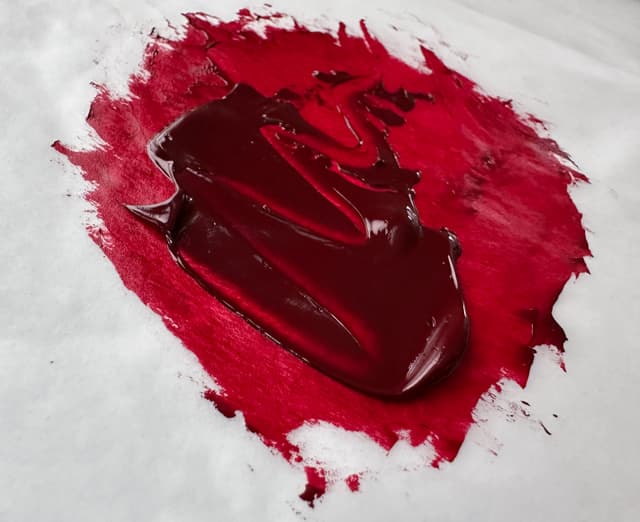
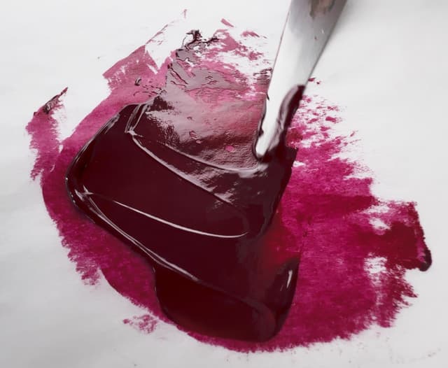
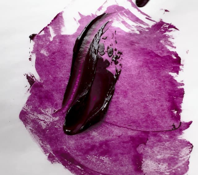
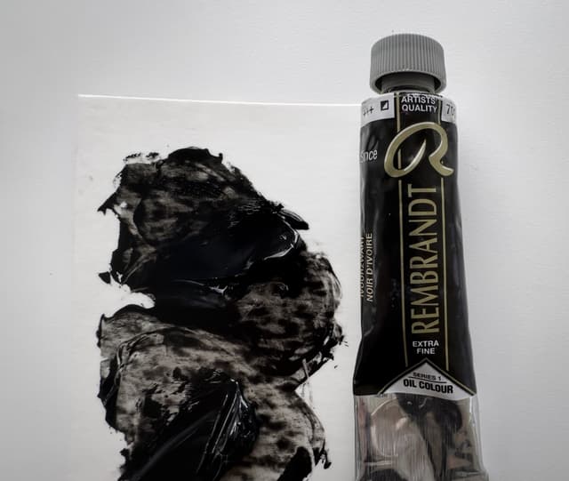
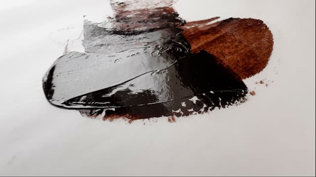
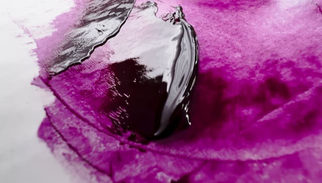
Search for Rembrandt
RGH Aritsts' Oils
Options for oil paint in large quantities
RGH is a boutique manufacturer owned by Rolf Haerem. We were drawn to RGH when we needed to paint in quantity-- and we really appreciate this option for professional painters. One can actually purchase oil paint in volume. Some of the colors come in jars or even caulking tubes. One one occasion we ordered two huge gallon-sized cans of oil paint. When ordering from RGH there may be some wait time, however it's always worth it when unpacking the colors from their box.
The colors are well-pigmented, however, you may wish to test the lightfastness of some of the pigments as they don't tend to come with lightfastness ratings. We have purchased quite a few paints from RGH over the years. We have really enjoyed their colors, particularly jar-fulls of their cadmium orange (we didn't have a problem with this, but if you're new to jars of oil paint, do look into how to prevent jar paints from drying out). We've painted with their cadmiums extensively and like them a lot, though some cadmium yellows may be keyed deeper in value (which we actually really like for specific use cases). Sometimes the tubes have leakage of the oil. They also make an Atelier series with washed linseed oil which has a special consistency and handling.
RGH is an independent New York manufacturer who offers around 112 paints, plus at least four more in their Artists' Atelier series, which brings the count somewhere around 116 paints-- an outstanding amount among small manufacturers.
In terms of a ratio, almost 60% of the paint line is made up of single-pigment colors, but in terms of sheer number of choices for single-pigment paints, RGH Artists’ Oil Paints, Inc. is exceptional. They offer around 69 single-pigment colors.
The single pigments once earths are removed are excellent. In terms of cadmiums, RGH offers an outstanding range of cadmiums in terms of variety. One of their cadmium oranges, at the time we purchased from them (pigment supply may or may not change) was exceptionally bright.
RGH has mostly removed zinc white, though it is still found in three of their white colors.
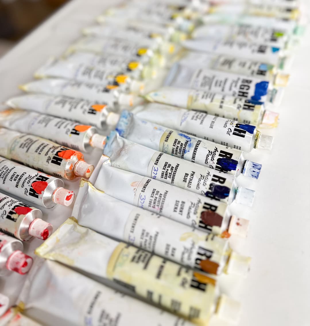
RGH is a fantastic brand for working professional painters, as there is no middleman. Here we've put a daub of the color on the label for quick visual idenitification.
This is a one gallon can of oil paint from RGH! This is Titanium White (in safflower oil unfortunately) but it was excellent paint. RGH makes cans of varying sizes which is extremely useful for professional painters.

RGH
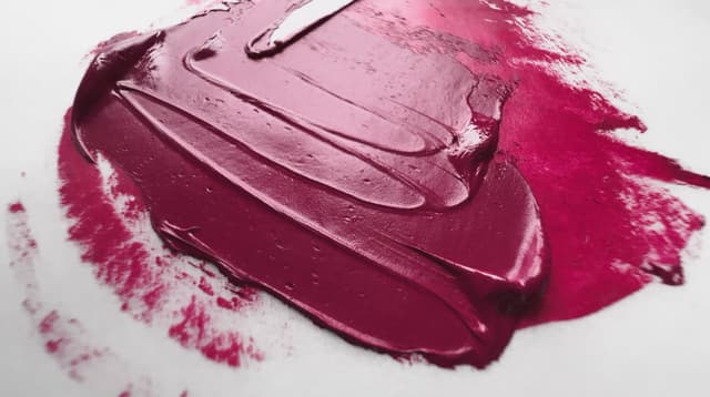
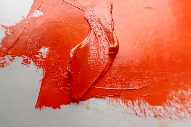
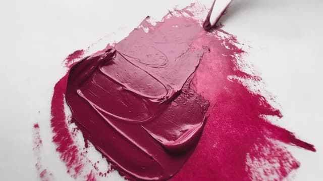
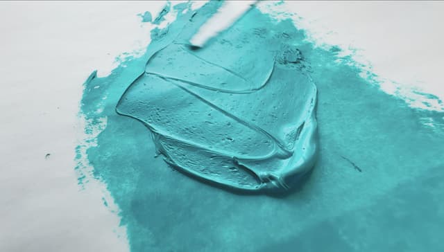
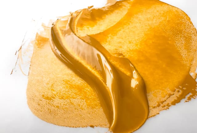
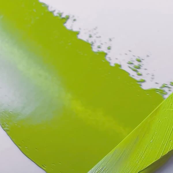
Search for RGH Artists' Oil Paints
Schmincke Mussini
Resins, solvent, and gemtones
Schmincke Mussini is one of two Schmincke oil paint lines, and of the two it is generally considered more premium. Mussini paints are formulated with resins, and some have a strong solvent smell. The colors are gorgeous. We've loved some of the unique pigment offerings from Mussini over the years, some of which are now discontinued. The resins make the colors gleam. We've heard that when paintings are cleaned over the years, the resin content in the paint may interact with the solvents used to clean the paintings, but as we are not experts in conservation we can't directly comment on this. Their colors are beautiful.
Schmincke Mussini's line has an above-average number of paints at 114, which is a nice selection. In terms of a ratio, a little more than half of the paint line is comprised of single-pigment colors. In terms of sheer number of choices for single-pigment paints, schmincke Mussini is above average with around 61 single-pigment colors.
The number of single pigments once earths are removed is excellent. They also offer a good range of cadmiums.
Mussini is a brand with a lot of zinc white. They're currently in third place for the most zinc-containing brand at about 19 paints, topped only by Rembrandt and Old Holland for number of paints that contain PW4. About four of their white paints contain zinc, which leaves about 15 convenience blends that still contain zinc in their formulation.
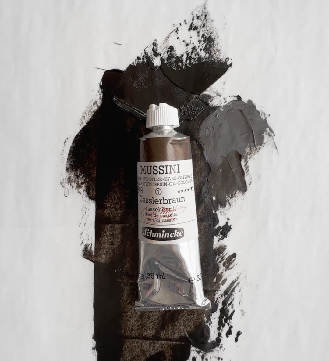
Mussini
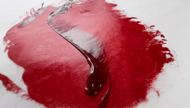
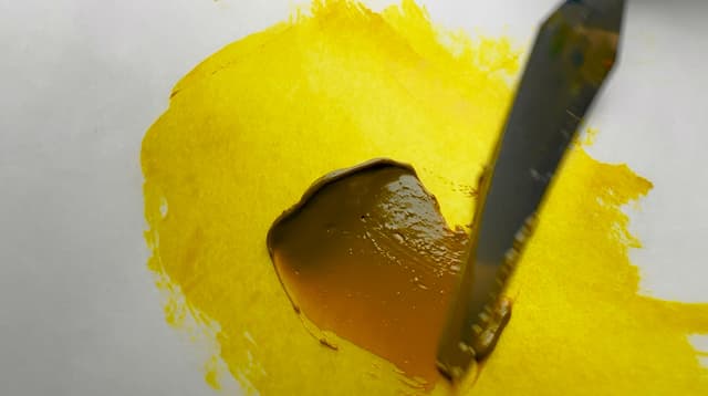
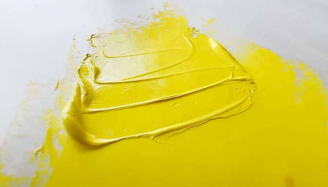
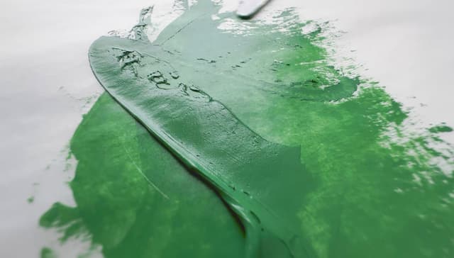
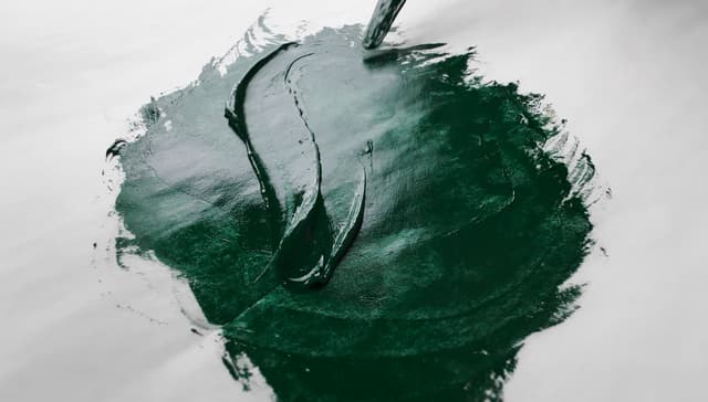
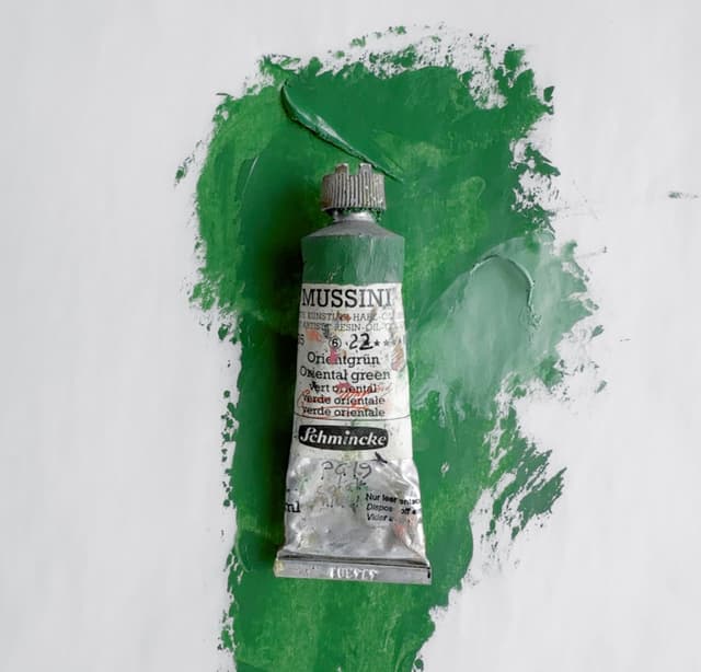
Search for Schmincke Mussini
Schmincke Norma
Schmincke Norma is usually considered a bit closer to an artist quality brand compared to the more premium Mussini line. Schincke Norma offers around 86 paints.
The Norma line has about the average number of colors in comparison to artist lines of paint. The overall total number of paints, 86 is decent. In terms of a ratio, about half of the Schmincke Norma paint line is made from single-pigments. In terms of sheer number of choices for single-pigment paints, Schmincke Norma is close to average for number of pigment paints with around 44 single-pigment colors.
The single pigments once earths are removed are still about average. In terms of cadmiums, the Norma line covers the main cadmium categories.
Norma has quite a few paints (~14) that contain zinc white, but actually not quite as many as Schmincke Mussini. Similar to Mussini, four of the Norma whites contain Zinc White in their formulation. About 10 convenience blends still contain zinc white.
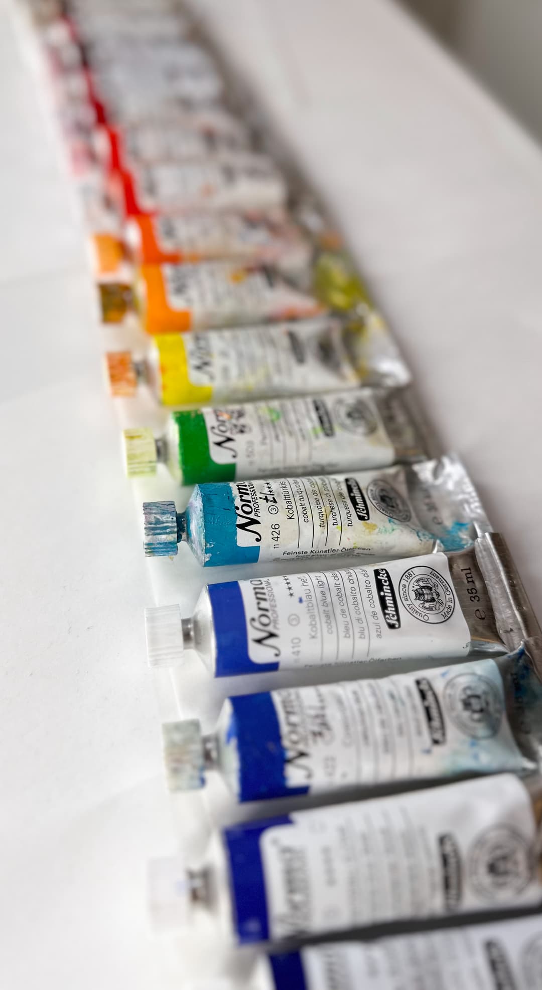
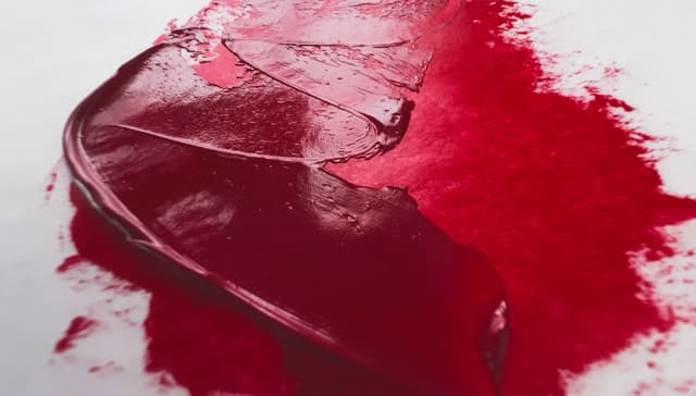
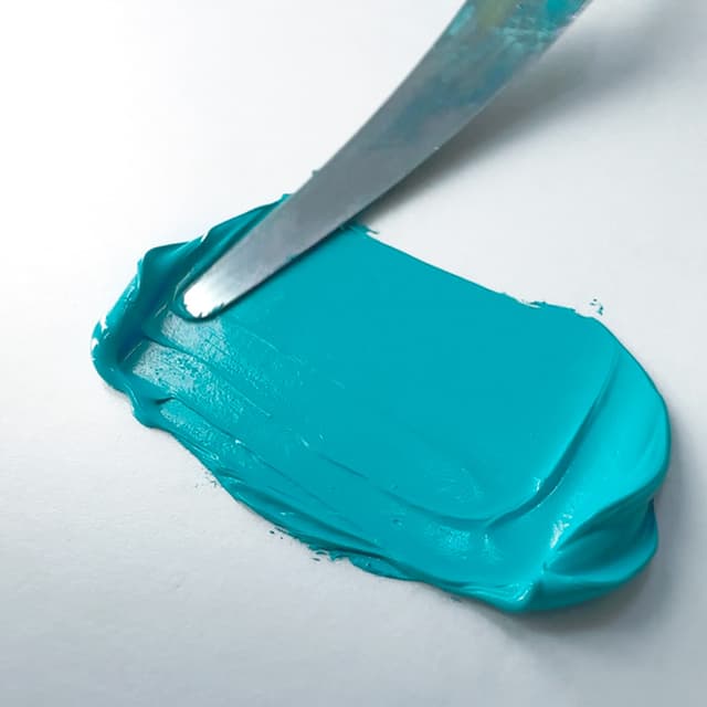
Search for Schmincke Norma Paints
Sennelier
Sennelier paints are all right, but we don't paint with them very much. They tend to have a fairly loose consistency.
Sennelier, now part of the global Max Sauer group, has several paint lines. Their Artist Oil Color is the more artist-quality line from Sennelier with 147 paints. They are manufactured in France.
This brand has over 1.5x the average number of paints to explore with a nice array of single-pigment colors. Of the overall total number of paints, 147 is above average. In terms of a ratio, just about 1 in 3 pigments is a single-pigment paint, which is more blends than most other artist-level brands. This means that in Sennelier Artist, blends outnumber single-pigments significantly. However, in terms of sheer number of choices for single-pigment paints, Sennelier is above average with around 57 single-pigment colors.
The single pigments once earths are removed are excellent. In terms of cadmiums, we appreciate that they offer a good amount of cadmium color choices.
Sennelier is another continental brand that has held on to using zinc white, PW4. Of the 11 colors that still contain zinc, four of them are whites, so something like seven convenience blends still include PW4 in their formulation.
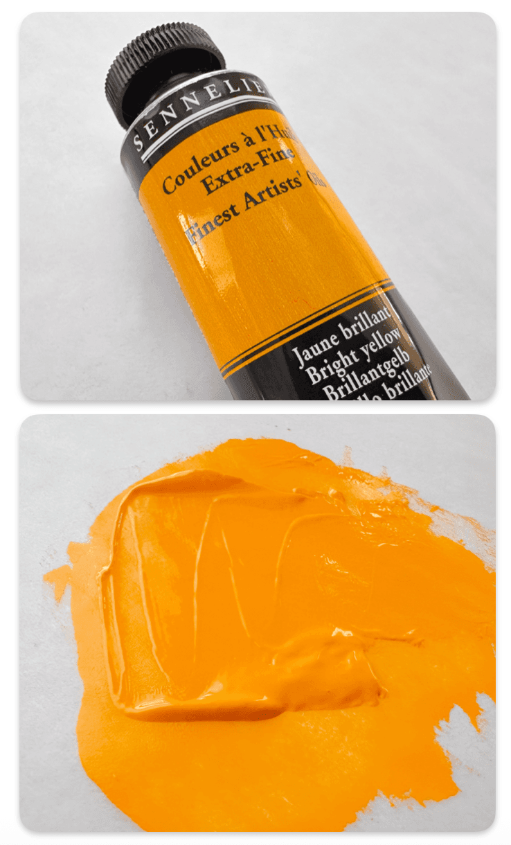
Sennelier Artist oils vary in consistency, but the ones we've tried tend toward having a fairly light consistency
Search for Sennelier
Utrecht Artists' Oil
Utrecht Artists' Oil colors was bought out by Blick years ago. As so often happens, the paint quality changed. They offer 92 colors in their line.
Sometimes the modern Utrecht line has had some discrepancies between the pigments listed in the brochure and what is on Blick as well as perhaps what is on the tube, so it may be good to double check the pigments if it's a blend.
The line has about the average number of colors. The overall total number of paints, 92 is average. In terms of a ratio, not quite half of the paint line is made of single-pigment paints (about 46%), but in terms of sheer number of choices for single-pigments, Utrecht is close to average for the number of pigment paints with around 42 single-pigment colors.
The single pigments once earths are removed are still about average. In terms of cadmiums, we appreciate that they offer a good amount of cadmium color choices.
Utrecht has a lot of zinc white in the paint line at around 14 paints. Only one of their white paints has zinc, so 13 convenience blends may contain PW4.
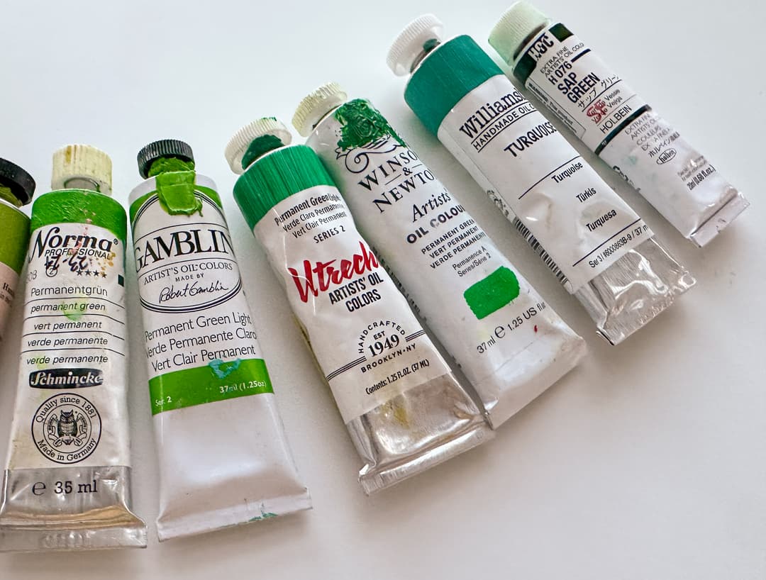
A Utretcht convenience green which contains white in its color listing
Some surprise Zinc White
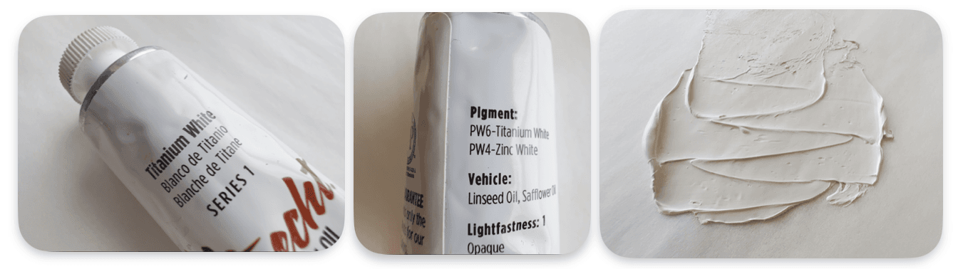
Search for Utrecht Paints
Vasari Review
Vasari Classic Artists' Oil Colors
Among the paint brands listed here, Vasari has a lot of mystique. They are a boutique American paint manufacturer in New York, and they are famous for flowing paints which are very highly pigmented. Vasari paints are sort of a special-order-only situation, and there is a minimum order of $100.
We've painted with a lot of Vasari. They aren't for everyone. For example, it's not made for those who love impasto. However, if you tend to paint realistically and enjoy paint with great spreadability (without adding any medium) Vasari is probably the top choice for flowing colors. Some Vasari paints have a tiny bit of body (but more tend toward the whipped cream consistency with melting edges to each dollop). Some Vasari colors are almost drippy like melted butter. No matter what though, every Vasari color we've worked with is pleasant, no matter whether it is the brush or a palette knife.
They offer about 150 paints in their line, which is an exceptional number of paints to explore, combined with the high number of single-pigment colors. The overall total number of paints, 150, puts Vasari in the Connoisseur tier. Though Vasari is known for its convenience blends, just under half of the paint line is single-pigment paints (an estimated 45% of the line is made of single-pigment colors). In terms of sheer number of choices for single-pigment paints, Vasari is high compared with other brands with around 67 single-pigment colors.
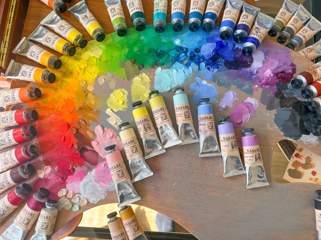
Vasari
When earth tones are removed, Vasari still offers an excellent number of pigments. In terms of cadmiums, they make gorgeous colors with a lot of flow. There is a wide variety of cadmiums available from Vasari. When selecting colors, bear in mind that their color names in the yellows are keyed in a way that feels offset from other brands. Their Cadmium Yellow Lemon is more like other brands' Cadmium Yellow Light. The Cadmium Yellow Medium is more like a Deep.
Vasari contains at least two white paints that list Zinc White, PW4. However since they do not list the pigments on a large number of their convenience blends, we do not know whether they contain Zinc White.
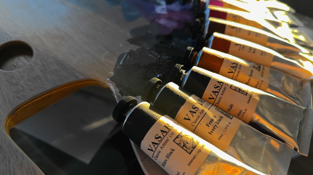
Vasari doesn't list the pigments on some of their blends. We feel artists have the right to know the pigment information, and that it's crucially important to understand the lightfastness and the toxicity.
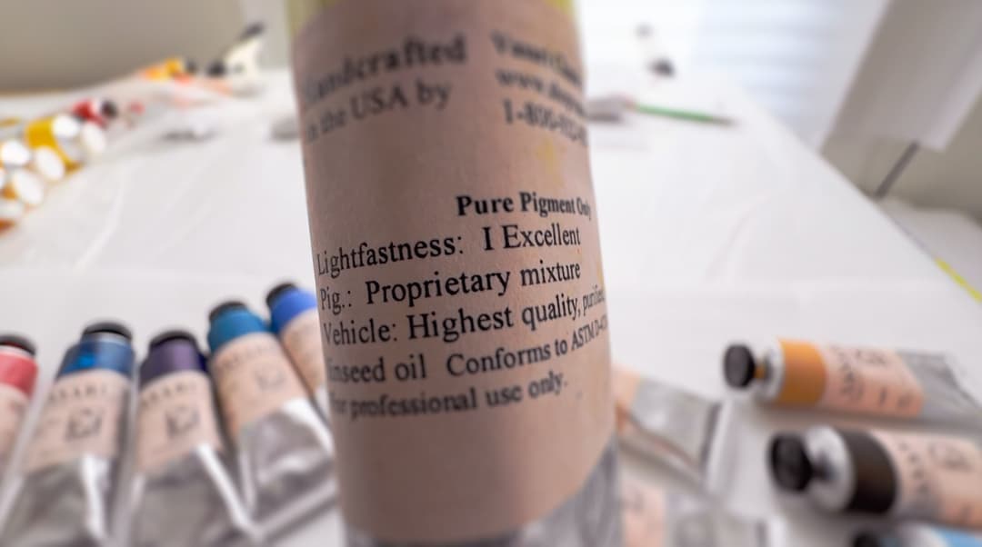
Sometimes Vasari does not list the pigments for their blends
Vasari
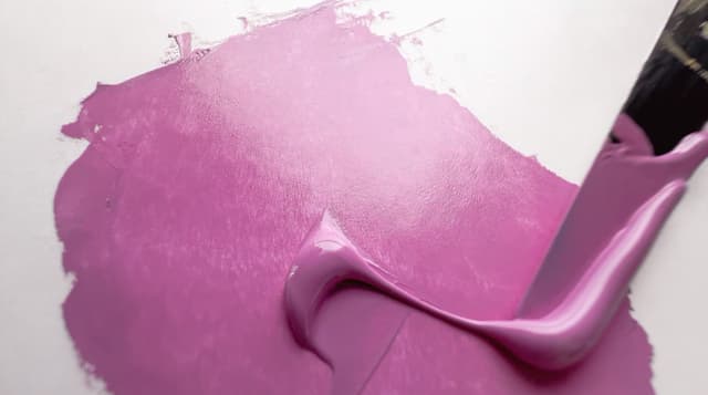
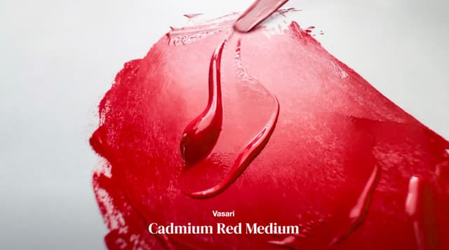
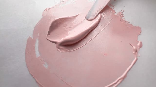
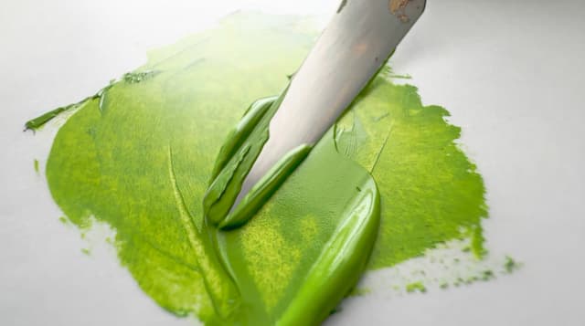
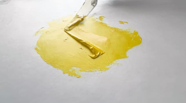
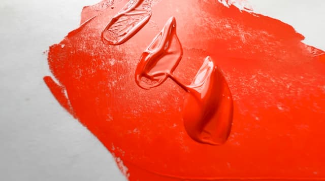
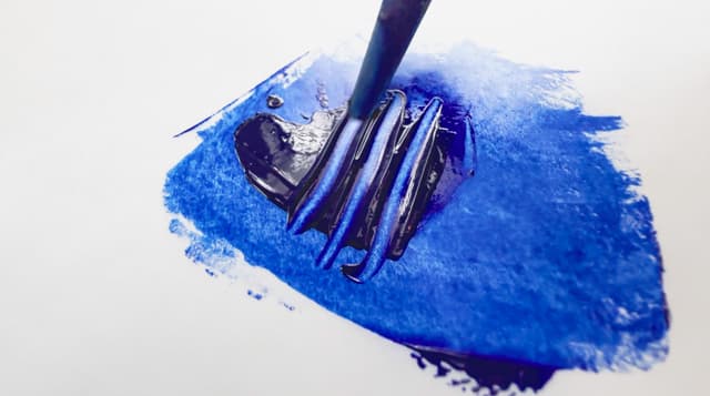
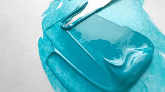
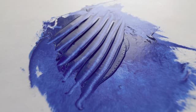

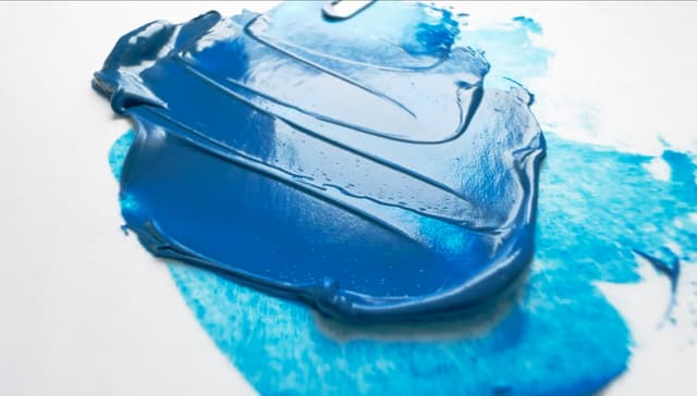
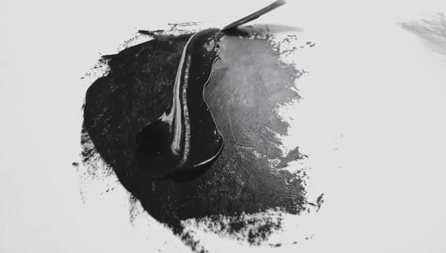
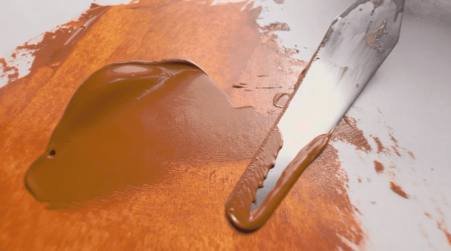
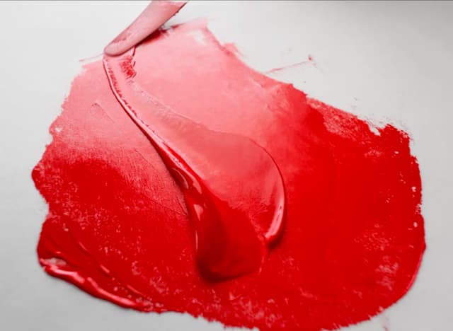
Search for Vasari Colors
Williamsburg Review
Williamsburg Artist Oil Colors
Ok there is a lot to explore about this paint brand. Williamsburg oils do tend to be on the stiffer side, but we like that they tend to let the qualities of each pigment shine through. Perhaps our favorite thing about Williamsburg is their commitment to research. Williamsburg was founded by the late painter Carl Plansky, and was later acquired by Golden Acrylics. Golden is one of the most research-oriented paint brands we have found. We also love the wide array of colors they offer, as it signals that these people love pigments.
We've written an in-depth article about Williamsburg here.
Their line of linseed-only paints is greatly appreciated by professional painters who do not wish to have a blend of oil types. Their thoughtfulness is also reflected in their collection of safflower-only paints for those colors where safflower makes the most difference to the paint color when dried.
Williamsburg offers a dazzling selection of single-pigment paints and makes around 172 colors. There are at least five special-edition colors, and they sometimes offer genuine YInMn Blue as well.
The overall total number of paints clocked in at around 177, and Williamsburg is in the top five for total number of paints. Perhaps one of the reasons we love Williamsburg is that they offer one of the widest selections of paints. Since this wide array has over 60% as single-pigment paints, they have set themselves apart as a brand for professional artists.
Williamsburg is exceptional in the number of single-pigment paint colors offered by brand, with around 113 single-pigment paints available (offered on an ongoing basis, give or take a small number of special edition paints). They still held the prize when we removed earth tones and are also in the top tier for the range of cadmiums on offer.
When we took a look at their single-pigments once earths were removed, Williamsburg had an outstanding number of pigments. Particularly we were impressed by the high number of continuously-offered single-pigments.
They make what is perhaps our favorite line of cadmiums for their high-chroma color choices and color spacing. We adore their Cadmium Yellows from Lemon to Light to Medium, to Deep and Extra Deep. They may have some of our favorite Cadmium Yellow Mediums and Deeps on the market. Their Cadmium Orange is a long-time favorite. We also love the specific color of their extra orangey Cadmium Red Light and Cadmium Red Medium. These are luscious colors.
This one of the paint brands (Golden) that have been leading the way in the research on the effects of zinc white on oil paint films. Williamsburg has published a lot of research and has diligently removed zinc white from their oil paint line. They have reformulated the colors which contained zinc and discontinued paints which could not be emulated without it. Zinc has been almost entirely removed from their line, though they do offer a Titanium-Zinc white.
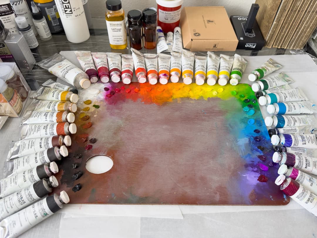
Williamsburg Artist Oils
Single-Pigment Paints
We love how many different varieties of cobalt blue and green Williamsburg offers
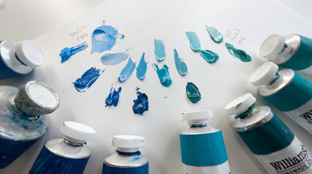
Williamsburg


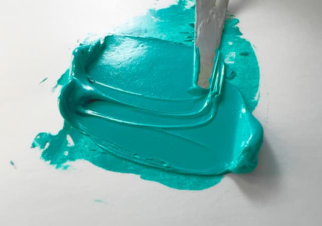
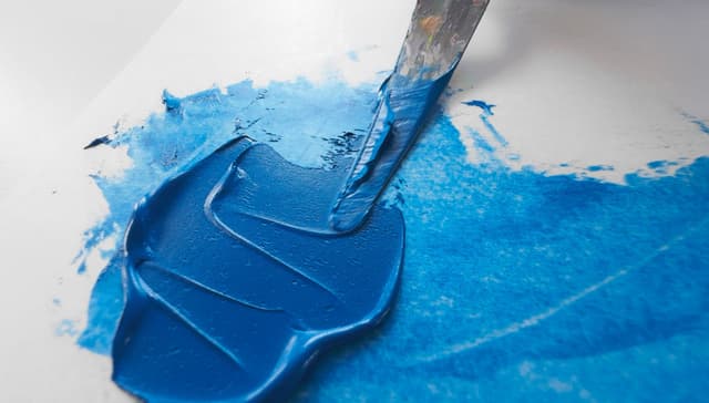
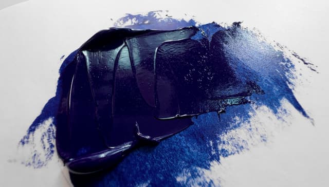
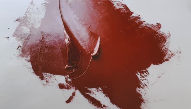
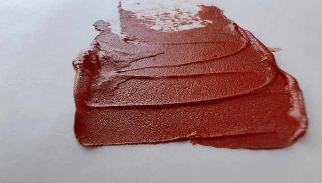
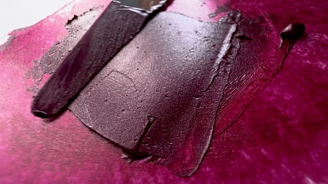
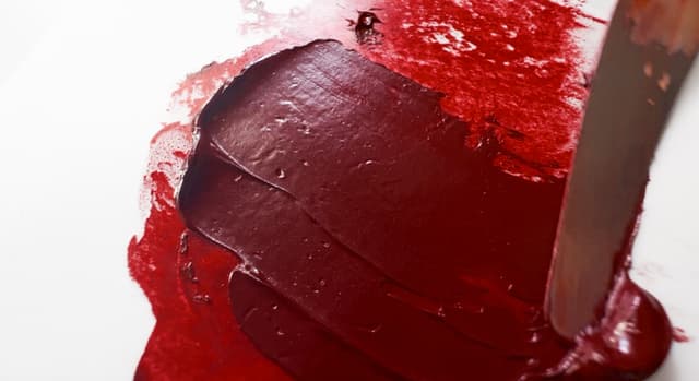
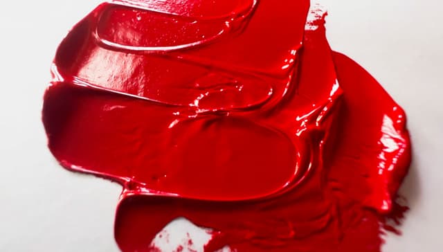
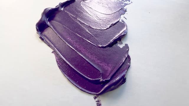
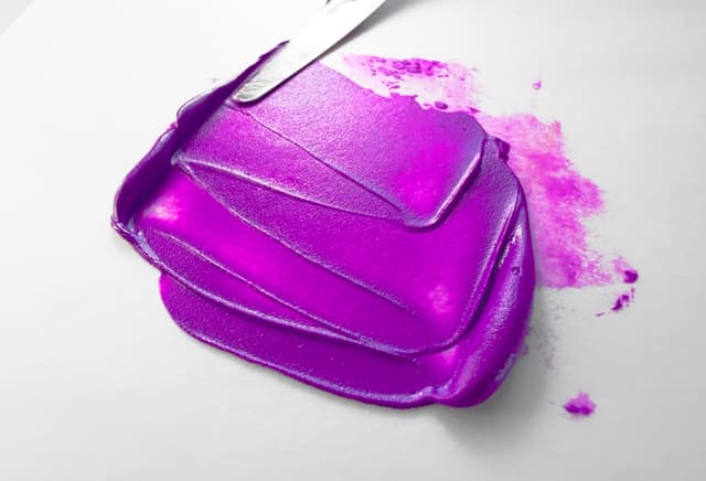
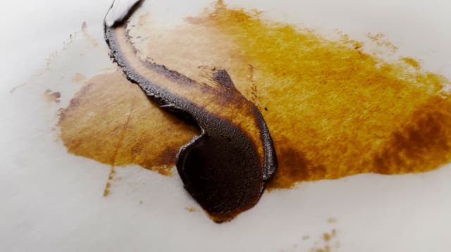
Search for Williamsburg Paints
Winsor and Newton Artist
Winsor and Newton Artist’s Oil Colours are the more artist-level of the Winsor and Newton lines. Most people, when the say W&N or W&N Artist are referring to this line.
Winsor and Newton Artist paints are sort of the lower end of the artist range. Winsor and Newton seems to have devoted themselves to riding the line as closely as they can to avoid falling out of the artist range while not setting themselves apart for excellence.
The paint has changed dramatically over the decades. Fans of vintage W&N Artist will be surprised by the current offering. Current paints tend to be on the lighter side. We did really enjoy their Cadmium Red Medium, and in general would use W&N except for a bit of caution regarding the mix of Linseed and Safflower oils. Aside from that, they feel pretty median. We wouldn't say no, but we're not especially excited.
In some ways, Winsor and Newton Artist feels like the softer analog to Gamblin Artist. Where Gamblin is stiffer, Winsor and Newton is usually softer than buttercream, and sometimes more like the whipped cream, but not as light as Rembrandt.
W&N has around 137 paints in the paint line, which is about 1.5x the average number of paints to explore with a nice array of single-pigment colors. In terms of a ratio of single-pigments to blends, just over 60% of the paint line is made up of single-pigment colors. As the total number of paints is large, the sheer number of choices for single-pigment paints is exceptional, with around 83 single-pigment colors.
The number of single pigments once earths are removed is excellent, in fact they receive an Honorary Mention for 4th highest number of single-pigment paints. In terms of cadmiums, we've painted with these a fair amount, and appreciate the Cadmium Red Medium. Their Cadmium Yellow Extra Deep is blend of cadmiums that is pitched at a particular hue which is nice out of the tube, and in the past, we've found ourselves buying it just for that note.
About five Winsor and Newton paints total contain PW4, so it is something to watch out for if removing zinc white is part of one's painting practice. However about four of those colors are white, so it is mostly to be found in their white blends.
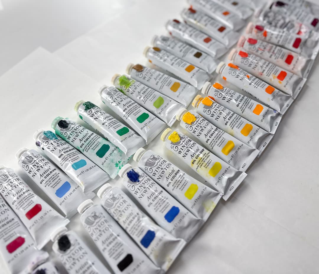
We added a dollop of paint color to the top of the tube for quick visual identification in the paint box.
Winsor and Newton Artist
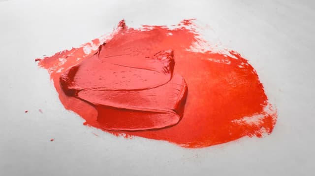
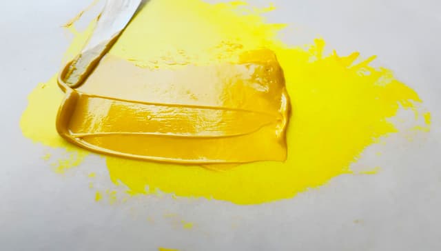
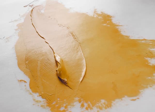
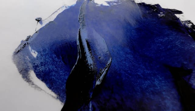
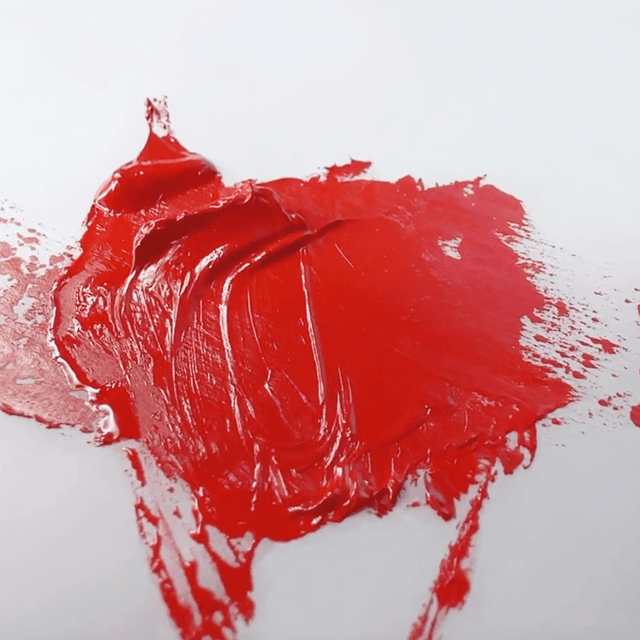
Search for Winsor and Newton Artist
Winton Oil Colour
Winton is the student oil paint brand from Winsor and Newton. We do hear that it is used by professional painters from time to time. They offer several genuine cadmiums and a cerulean, however the way the paint comes out of the tube sometimes is not great. While oil separation may be normal in paints without additives, Winton is certainly full of additives (based on how the paints handle) and there is a sort of orangey oil that separates from the paint at times. We've included some closeups below.
We did some color mixing with a basic palette and were surprised how dull the results were. The beginning stages of that are also included below.
On a recent trip to a university bookstore (namely Stanford) we noticed that Winton was one of the few brands that was available in the art supply section.
There is a distinctive kind of impasto that is found in Winton colors which is something of an acquired taste. When tinting strength is of moderate importance and heft is needed, they could be a good option. If archival qualities are wished for, we are not sure how Winton would fare.
Winsor and Newton Winton Oil Colour is Winsor and Newton's student line, and contains about 63 paints.
Winton offers just over 70% of the average number of paints, so the total selection is decent in terms of numbers. However, blends outnumber single-pigments significantly, which is common in student brands. Almost 1 in 3 pigments is a single-pigment (also on par with some of the other student brands). In terms of sheer number of choices for single-pigment paints, Winsor and Newton Winton Oil Colour is has a lower number of single pigments compared to average, with around 20 single-pigment colors.
The number of single pigments once earths are removed is low. In terms of cadmiums, Winton does contain some genuine cadmium colors.
Winton still contains zinc white, with 8 colors listed.
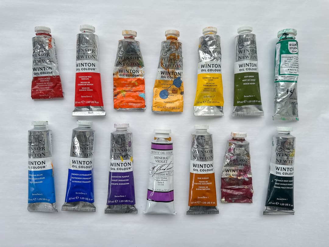
Mostly Winton. We sold off a lot of our Winton on ebay (as well as a much nicer M Graham tube to complete the rainbow for the buyer)
Winton
When fresh out of the tube, the off-color oils and other ingredients in Winton can be seen in some paint separation. When incorporated, one does notice these. However the Winton colors made a bit of a dull rainbow when mixed.